The historical data of a financial instrument is data about all the past prices at which a financial instrument was brought or sold. An algorithmic trading strategy is always vpot_candlestickirtually executed on historical data to evaluate its past performance before it's deployed with real money. This process is called backtesting. Historical data is quintessential for backtesting (covered in detail in Chapter 8, Backtesting Strategies). Also, historical data is needed for computing technical indicators (covered in detail in Chapter 5, Computing and Plotting Technical Indicators), which help in making buy-or-sell decisions in real-time. Candlestick patterns are widely used tools for stock analysis. Various types of candlestick patterns are commonly used by analysts. This chapter provides recipes that show you how to fetch historical data using broker APIs, how to fetch and compute multiple candlestick patterns – Japanese (open-high-low-close (OHLC)), Line Break, Renko, and Heikin-Ashi – and how to fetch historical data using a third-party tool.
In this chapter, we will cover the following recipes:
- Fetching historical data using the broker API
- Fetching historical data with the Japanese (OHLC) candlestick pattern
- Fetching the Japanese candlestick pattern with variations in candle intervals
- Fetching historical data with the Line Break candlestick pattern
- Fetching historical data with the Renko candlestick pattern
- Fetching historical data with the Heikin-Ashi candlestick pattern
- Fetching historical data using Quandl
Let's get started!
Technical requirements
You will need the following to successfully execute the recipes in this chapter:
- Python 3.7+
- Python packages:
- pyalgotrading ($ pip install pyalgotrading)
- quandl ($pip install quandl) this is optional and only needed for the last recipe
The latest Jupyter Notebook for this chapter can be found on GitHub at https://github.com/PacktPublishing/Python-Algorithmic-Trading-Cookbook/tree/master/Chapter04.
The following code will help you set up the broker connection with Zerodha, which will be used by all the recipes in this chapter. Please make sure you have followed these steps before trying out any of the recipes provided.
The first thing you need to do to set connectivity with the broker is to gather the required API keys. The broker provides unique keys to each customer, typically as api-key and api-secret key pairs. These API keys are chargeable, usually on a monthly subscription basis. You need to get your copies of api-key and api-secret from the broker website before you start this chapter. You can refer to Appendix I for more details.
Execute the following steps:
- Import the necessary modules:
>>> from pyalgotrading.broker.broker_connection_zerodha import BrokerConnectionZerodha
- Get the api_key and api_secret keys from the broker. These are unique to you and will be used by the broker to identify your Demat account:
>>> api_key = "<your-api-key>"
>>> api_secret = "<your-api-secret>"
>>> broker_connection = BrokerConnectionZerodha(api_key,
                                                api_secret)
You will get the following URL:
Installing package kiteconnect via pip...
Please login to this link to generate your request token: https://kite.trade/connect/login?api_key=<your-api-key>&v=3
If you are running this for the first time and kiteconnect is not installed, pyalgotrading will automatically install it for you. The final output of step 2 will be a link. Click on the link and log in with your Zerodha credentials. If the authentication is successful, you will see a link in your browser's address bar similar to https://127.0.0.1/?request_token=&action=login&status=success.
For example:
https://127.0.0.1/?request_token=H06I6Ydv95y23D2Dp7NbigFjKweGwRP7&action=login&status=success
- Copy the alphanumeric token and paste it into request_token:
>>> request_token = "<your-request-token>"
>>> broker_connection.set_access_token(request_token)
The broker_connection instance is now ready for performing API calls.
Only the procedure of setting up the broker connection will vary from broker to broker. You can refer to the pyalgotrading documentation to learn how to set up the broker connection if you are not using Zerodha as your broker. For Zerodha users, the aforementioned steps will suffice.
Fetching historical data using the broker API
The historical data of a financial instrument is time-series data for the timestamps in the past. It can be fetched using the Broker API for a given duration. This recipe demonstrates how to set up a broker connection and how to fetch historical data for a financial instrument for the duration of a single day.
Getting ready
Make sure the broker_connection object is available in your Python namespace. Refer to the Technical requirements section of this chapter to learn how to set it up.
How to do it…
Execute the following steps to complete this recipe:
- Fetch the historical data for an instrument:
>>> instrument = broker_connection.get_instrument('NSE',
                                                  'TATASTEEL')
>>> historical_data = broker_connection.get_historical_data(
                            instrument=instrument,
                            candle_interval='minute',
                            start_date='2020-01-01',
                            end_date='2020-01-01')
>>> historical_data
You will get the following output:

- Print the available columns of the historical_data DataFrame:
>>> historical_data.columns
You will get the following output:
>>> Index(['timestamp', 'open', 'high', 'low', 'close', 'volume'],
            dtype='object')
How it works…
In step 1, you use the get_instrument() method of broker_connection to fetch an instrument and assign it to a new attribute, instrument. This object is an instance of the Instrument class. The two parameters needed to call get_instrument() are the exchange ('NSE') and the trading symbol ('TATASTEEL'). Next, you fetch the historical data for instrument using the get_historical_data() method. This method takes four arguments, which are described as follows:
- instrument: The financial instrument for which the historical data must be placed. Should be an instance of the Instrument class. You pass instrument here.
- candle_interval: A valid string that denotes the duration of each candlestick in the historical data. You pass minute here. (Possible values can be minute, 3minute, 5minute, 10minute, 30minute, 60minute, and day.)
- start_date: The date from which the historical data must be fetched. Should be a string in the YYYY-MM-DD format. You pass 2020-01-01 here.
- end_date: The date until which the historical data must be fetched, inclusive of this date. Should be a string in the YYYY-MM-DD format. You pass 2020-01-01 here.
In step 2, you fetch and print the available columns of historical_data. You get the columns as timestamp, open, high, low, close, and volume.
Fetching historical data using the Japanese (OHLC) candlestick pattern
The historical data of a financial instrument is an array of candlesticks. Each entry in the historical data is a single candlestick. There are various types of candlestick patterns.
This recipe demonstrates the most commonly used candlestick pattern – the Japanese candlestick pattern. It is a type of candlestick pattern where each candlestick holds a duration and indicates all the prices the instrument would have taken on during that duration. This data is represented using four parameters – Open, High, Low, and Close. These can be described as follows:
- Open: The price of the financial instrument at the beginning of the candle's duration
- High: The highest recorded price of the financial instrument during the entire duration of the candle
- Low: The lowest recorded price of the financial instrument during the entire duration of the candle
- Close: The price of the financial instrument at the end of the candle's duration
The Japanese candlestick pattern is also known as the OHLC candlestick pattern based on these parameters. All the timestamps in a Japanese candlestick pattern are equally spaced (within market hours). For example, the timestamps on a trading day would look like 9:15 a.m., 9:16 a.m., 9:17 a.m., 9:18 a.m., and so on for a 1-minute candle interval, where each timestamp is equally spaced at intervals of 1 minute.
Getting ready
Make sure the broker_connection and historical_data objects are available in your Python namespace. Refer to the Technical requirements section of this chapter to set up broker_connection. Refer to the previous recipe to set up historical_data.
How to do it…
We execute the following steps to for this recipe:
- Import the necessary modules:
>>> from pyalgotrading.utils.func import plot_candlestick_chart, PlotType
- Create a green candle from one of the rows of historical_data:
>>> candle_green = historical_data.iloc[:1,:]
# Only 1st ROW of historical data
>>> plot_candlestick_chart(candle_green,
                           PlotType.JAPANESE,
                           "A 'Green' Japanese Candle")
You will get the following output:

- Create a red candle from one of the rows of historical_data:
# A 'Red' Japanese Candle
>>> candle_red = historical_data.iloc[1:2,:]
# Only 2nd ROW of historical data
>>> plot_candlestick_chart(candle_red,
                           PlotType.OHLC,
                           "A 'Red' Japanese Candle")
This will give you the following output:

- Plot a chart for the historical data of an instrument:
>>> plot_candlestick_chart(historical_data,
                           PlotType.OHLC,
                           'Historical Data | '
                           'Japanese Candlesticks Pattern | '
                           'NSE:TATASTEEL | 1st Jan, 2020 | '
                           'Candle Interval: 1 Minute')
This will give you the following output:

- Plot a chart for the historical data of another instrument:
>>> instrument2 = broker_connection.get_instrument('NSE', 'INFY')
>>> historical_data =
        broker_connection.get_historical_data(instrument2,
                                              'minute',
                                              '2020-01-01',
                                              '2020-01-01')
>>> plot_candlestick_chart(historical_data,
                           PlotType.OHLC,
                           'Historical Data | '
                           'Japanese Candlesticks Pattern | '
                           'NSE:INFY | 1st Jan, 2020 | '
                           'Candle Interval: 1 Minute')
This will give you the following output:

- Plot a chart for the historical data of yet another instrument:
>>> instrument3 = broker_connection.get_instrument('NSE',
                                                   'ICICIBANK')
>>> historical_data =
            broker_connection.get_historical_data(instrument3,
                                                  'minute',
                                                  '2020-01-01',
                                                  '2020-01-01')
>>> plot_candlestick_chart(historical_data, PlotType.OHLC,
                           'Historical Data | '
                           'Japanese Candlesticks Pattern | '
                           'NSE:ICICIBANK | 1st Jan, 2020 | '
                           'Candle Size: 1 Minute')
This will give you the following output:

How it works…
In step 1, you import plot_candlestick_chart, a quick utility function for plotting candlestick pattern charts, and PlotType, an enum for various types of candlestick patterns. The next two steps introduce two types of candlesticks, or simply candles – a green candle and a red candle. As we mentioned earlier, each entry in historical data is a candle. These two steps selectively extract a green and red candle from the data. (Please note that the indices that are passed to historical_data.iloc will be different if you choose a different duration for historical_data, as in the Fetching historical data using the broker API recipe). A Japanese candle is green in color if its close price is above its open price. A green candle is also called a bullish candle as it is indicative that the price was bullish, meaning rising, during that duration. A Japanese candle is red in color if its close price is below its open price. A red candle is also called a bearish candle as it is indicative that the price was bearish, meaning falling, during that duration.
In step 4, you plot the complete historical data held by historical_data using the plot_candlestick_chart() function. The chart is a combination of multiple candlesticks, each with a different length. Hence, such a chart is called a candlestick pattern chart. Note that the candle interval is 1 minute, meaning that the timestamps are equally spaced in intervals of 1 minute. Steps 5 and 6 demonstrate similar 1-minute candle interval candlestick pattern charts for the NSE:INFY and NSE:ICICIBANK instruments.
Fetching the Japanese candlestick pattern with variations in candle intervals
The historical data of a financial instrument can be analyzed in the form of Japanese candlesticks pattern with varying candle intervals. Brokers typically support candle intervals of 1 minute, 3 minutes, 5 minutes, 10 minutes, 15 minutes, 30 minutes, 1 hour, 1 day, and so on. A shorter candle interval hints at a localized price movement trend, while a larger candle interval indicates an overall price movement trend. Depending on the algorithmic trading strategy, you may need a shorter candle interval or a larger one. A candle interval of 1 minute is often the smallest available candle interval. This recipe demonstrates the historical data of a financial instrument for a duration of a day in various candle intervals.
Getting ready
Make sure the broker_connection object is available in your Python namespace. Refer to the Technical requirements section of this chapter to learn how to set up broker_connection.
How to do it…
We execute the following steps for this recipe:
- Import the necessary modules:
>>> from pyalgotrading.utils.func import plot_candlestick_chart, PlotType
- Fetch an instrument:
>>> instrument = broker_connection.get_instrument('NSE',
                                                  'TATASTEEL')
- Plot a chart for the historical data of the instrument with a 1-minute candle interval:
>>> historical_data_1minute =
        broker_connection.get_historical_data(instrument,
                                              'minute',
                                              '2020-01-01',
                                              '2020-01-01')
>>> plot_candlestick_chart(historical_data_1minute,
                           PlotType.OHLC,
                           'Historical Data | '
                           'Japanese Candlesticks Pattern | '
                           'NSE:TATASTEEL | '
                           '1st Jan, 2020 | '
                           'Candle Interval: 1 Minute')
You will get the following output:
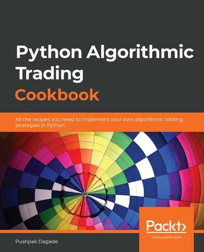
- Plot a chart for the historical data of the instrument with a 3-minute candle interval:
>>> historical_data_3minutes =
            broker_connection.get_historical_data(instrument,
                                                  '3minute',
                                                  '2020-01-01',
                                                  '2020-01-01')
>>> plot_candlestick_chart(historical_data_3minutes,
                           PlotType.OHLC,
                           'Historical Data | '
                           'Japanese Candlesticks Pattern | '
                           'NSE:TATASTEEL | '
                           '1st Jan, 2020 | '
                           'Candle Interval: 3 Minutes')
You will get the following output:

- Plot a chart for the historical data of the instrument with a 5-minute candle interval:
>>> historical_data_5minutes =
            broker_connection.get_historical_data(instrument,
                                                  '5minute',
                                                  '2020-01-01',
                                                  '2020-01-01')
>>> plot_candlestick_chart(historical_data_5minutes,
                           PlotType.OHLC,
                           'Historical Data | '
                           'Japanese Candlesticks Pattern | '
                           'NSE:TATASTEEL | '
                           '1st Jan, 2020 | '
                           'Candle Interval: 5 Minutes')
You will get the following output:

- Plot a chart for the historical data of the instrument with a 10-minute candle interval:
>>> historical_data_10minutes =
            broker_connection.get_historical_data(instrument,
                                                  '10minute',
                                                  '2020-01-01',
                                                  '2020-01-01')
>>> plot_candlestick_chart(historical_data_10minutes,
                           PlotType.OHLC,
                           'Historical Data | '
                           'Japanese Candlesticks Pattern | '
                           'NSE:TATASTEEL | '
                           '1st Jan, 2020 | '
                           'Candle Interval: 10 Minutes')
You will get the following output:

- Plot a chart for the historical data of the instrument with a 15-minute candle interval:
>>> historical_data_15minutes =
            broker_connection.get_historical_data(instrument,
                                                  '15minute',
                                                  '2020-01-01',
                                                  '2020-01-01')
>>> plot_candlestick_chart(historical_data_15minutes,
                           PlotType.OHLC,
                           'Historical Data | '
                           'Japanese Candlesticks Pattern | '
                           'NSE:TATASTEEL | '
                           '1st Jan, 2020 | '
                           'Candle Interval: 15 Minutes')
You will get the following output:

- Plot a chart for the historical data of the instrument with a 30-minute candle interval:
>>> historical_data_30minutes =
            broker_connection.get_historical_data(instrument,
                                                  '30minute',
                                                  '2020-01-01',
                                                  '2020-01-01')
>>> plot_candlestick_chart(historical_data_30minutes,
                           PlotType.OHLC,
                           'Historical Data | '
                           'Japanese Candlesticks Pattern | '
                           'NSE:TATASTEEL | '
                           '1st Jan, 2020 | '
                           'Candle Interval: 30 Minutes')
You will get the following output:

- Plot a chart for the historical data of the instrument with a 1-hour candle interval:
>>> historical_data_1hour =
            broker_connection.get_historical_data(instrument,
                                                  'hour',
                                                  '2020-01-01',
                                                  '2020-01-01')
>>> plot_candlestick_chart(historical_data_1hour,
                           PlotType.OHLC,
                           'Historical Data | '
                           'Japanese Candlesticks Pattern | '
                           'NSE:TATASTEEL | '
                           '1st Jan, 2020 | '
                           'Candle Interval: 1 Hour')
- Plot a chart for the historical data of the instrument with a 1-day candle interval:
>>> historical_data_day =
            broker_connection.get_historical_data(instrument,
                                                  'day',
                                                  '2020-01-01',
                                                  '2020-01-01')
>>> plot_candlestick_chart(historical_data_day,
                           PlotType.OHLC,
                           'Historical Data | '
                           'Japanese Candlesticks Pattern | '
                           'NSE:TATASTEEL | '
                           '1st Jan, 2020 | '
                           'Candle Interval: Day')
You will get the following output, which is a single candle:

How it works…
In step 1, you import plot_candlestick_chart, a quick utility function for plotting candlestick pattern charts, and PlotType, an enum for various types of candlestick patterns. In step 2, the get_instrument() method of broker_connection to fetch an instrument and assign it to a new attribute, instrument. This object is an instance of the Instrument class. The two parameters needed to call get_instrument() are the exchange ('NSE') and the trading symbol ('TATASTEEL'). Steps 3 and 4 fetch and plot the historical data for the candle intervals; that is, 1 minute, 3 minutes, 5 minutes, 10 minutes, 15 minutes, 30 minutes, 1 hour, and 1 day. You use the get_historical_data() method to fetch historical data for the same instruments and the same start and end dates, with only a different candle interval. You use the plot_candlestick_chart() function to plot Japanese candlestick pattern charts. You can observe the following differences between the charts as the candle interval increases:
- The total number of candlesticks decreases.
- The spikes in the charts due to sudden price movement are minimized. Smaller candle interval charts have more spikes as they focus on local trends, while larger candle interval charts have fewer spikes and are smoother.
- A long-term trend in the stock price becomes visible.
- Decision-making may become slower because you have to wait longer to get new candle data. Slower decisions may or may not be desirable, depending on the strategy. For example, for confirming trends, using a combination of data with a smaller candle interval, say 3 minutes, and data with a larger candle interval, say 15 minutes, would be desirable. On the other hand, for grabbing opportunities in intraday trading, data with larger candle intervals, such as 1 hour or 1 day, would not be desirable.
- The price range (y-axis spread) of adjacent candles may or may not overlap.
- All the timestamps are equally spaced in time (within market hours).
Fetching historical data using the Line Break candlestick pattern
The historical data of a financial instrument can be analyzed in the form of the Line Break candlestick pattern, a candlestick pattern that focuses on price movement. This differs from the Japanese candlestick pattern, which focuses on the time movement. Brokers typically do not provide historical data for the Line Break candlestick pattern via APIs. Brokers usually provide historical data using the Japanese candlestick pattern that needs to be converted into the Line Break candlestick pattern. A shorter candle interval hints at a localized price movement trend, while a larger candle interval indicates an overall price movement trend. Depending on your algorithmic trading strategy, you may need the candle interval to be small or large. A candle interval of 1 minute is often the smallest available candle interval.
The Line Break candlestick pattern works as follows:
- Each candle has only open and close attributes.
- The user defines a Number of Lines (n) setting, which is usually taken as 3.
- At the end of each candle interval, a green candle is formed if the stock price goes higher than the highest of the previous n Line Break candles.
- At the end of each candle interval, a red candle is formed if the stock price goes lower than the lowest of the previous n Line Break candles.
- At the end of each candle interval, if neither point 3 nor point 4 are satisfied, no candle is formed. Hence, the timestamps don't need to be equally spaced.
This recipe shows how we can fetch historical data using the Japanese candlestick pattern using the broker API, convert the historical data into a Line Break candlestick pattern, and plot it. This is done for multiple candle intervals.
Getting ready
Make sure the broker_connection object is available in your Python namespace. Refer to the Technical requirements section of this chapter to learn how to set up broker_connection.
How to do it…
We execute the following steps for this recipe:
- Import the necessary modules:
>>> from pyalgotrading.utils.func import plot_candlestick_chart, PlotType
>>> from pyalgotrading.utils.candlesticks.linebreak import Linebreak
- Fetch the historical data for an instrument and convert it into Line Break data:
>>> instrument = broker_connection.get_instrument('NSE',
                                                  'TATASTEEL')
>>> historical_data_1minute =
            broker_connection.get_historical_data(instrument,
                                                  'minute',
                                                  '2019-12-01',
                                                  '2019-12-31')
>>> historical_data_1minute_linebreak =
                              Linebreak(historical_data_1minute)
>>> historical_data_1minute_linebreak
You will get the following output:
       close       open                   timestamp
0     424.00     424.95   2019-12-02 09:15:00+05:30
1     424.50     424.00   2019-12-02 09:16:00+05:30
2     425.75     424.80   2019-12-02 09:17:00+05:30
3     423.75     424.80   2019-12-02 09:19:00+05:30
4     421.70     423.75   2019-12-02 09:20:00+05:30
        …         …                ....
1058  474.90     474.55   2019-12-31 10:44:00+05:30
1059  471.60     474.55   2019-12-31 11:19:00+05:30
1060  471.50     471.60   2019-12-31 14:19:00+05:30
1061  471.35     471.50   2019-12-31 15:00:00+05:30
1062  471.00     471.35   2019-12-31 15:29:00+05:30
- Create a green Line Break candle from one of the rows of historical_data:
>>> candle_green_linebreak = historical_data_1minute_linebreak.iloc[1:2,:]
# Only 2nd ROW of historical data
>>> plot_candlestick_chart(candle_green_linebreak,
                           PlotType.LINEBREAK,
                           "A 'Green' Line Break Candle")
You will get the following output:

- Create a red Line Break candle from one of the rows of historical_data:
>>> candle_red_linebreak = historical_data_1minute_linebreak.iloc[:1,:]
# Only 1st ROW of historical data
>>> plot_candlestick_chart(candle_red_linebreak,
                           PlotType.LINEBREAK,
                           "A 'Red' Line Break Candle")
You will get the following output:

- Plot a chart for the historical data of the instrument with a 1-minute candle interval:
>>> plot_candlestick_chart(historical_data_1minute_linebreak,
                           PlotType.LINEBREAK,
                           'Historical Data | '
                           'Line Break Candlesticks Pattern | '
                           'NSE:TATASTEEL | '
                           'Dec, 2019 | '
                           'Candle Interval: 1 Minute', True)
You will get the following output:

- Plot a chart for the historical data of the instrument with a 3-minute candle interval:
>>> historical_data_3minutes =
            broker_connection.get_historical_data(instrument,
                                                  '3minute',
                                                  '2019-12-01',
                                                  '2019-12-31')
>>> historical_data_3minutes_linebreak =
                    Linebreak(historical_data_3minutes)
>>> plot_candlestick_chart(historical_data_3minutes_linebreak,
                           PlotType.LINEBREAK,
                           'Historical Data | '
                           'Line Break Candlesticks Pattern | '
                           'NSE:TATASTEEL | '
                           'Dec, 2019 | '
                           'Candle Interval: 3 Minutes', True)
You will get the following output:

- Plot a chart for the historical data of the instrument with a 5-minute candle interval:
>>> historical_data_5minutes =
            broker_connection.get_historical_data(instrument,
                                                  '5minute',
                                                  '2019-12-01',
                                                  '2020-01-10')
>>> historical_data_5minutes_linebreak =
                            Linebreak(historical_data_5minutes)
>>> plot_candlestick_chart(historical_data_5minutes_linebreak,
                           PlotType.LINEBREAK,
                           'Historical Data | '
                           'Line Break Candlesticks Pattern | '
                           'NSE:TATASTEEL | '
                           'Dec, 2019 | '
                           'Candle Interval: 5 Minutes', True)
You will get the following output:

- Plot a chart for the historical data of the instrument with a 10-minute candle interval:
>>> historical_data_10minutes =
            broker_connection.get_historical_data(instrument,
                                                  '10minute',
                                                  '2019-12-01',
                                                  '2020-01-10')
>>> historical_data_10minutes_linebreak =
                            Linebreak(historical_data_10minutes)
>>> plot_candlestick_chart(historical_data_10minutes_linebreak,
                           PlotType.LINEBREAK,
                           'Historical Data | '
                           'Line Break Candlesticks Pattern | '
                           'NSE:TATASTEEL | '
                           'Dec, 2019 | '
                           'Candle Interval: 10 Minutes', True)
You will get the following output:

- Plot a chart for the historical data of the instrument with a 15-minute candle interval:
>>> historical_data_15minutes =
            broker_connection.get_historical_data(instrument,
                                                  '15minute',
                                                  '2019-12-01',
                                                  '2020-01-10')
>>> historical_data_15minutes_linebreak =
                            Linebreak(historical_data_15minutes)
>>> plot_candlestick_chart(historical_data_15minutes_linebreak,
                           PlotType.LINEBREAK,
                           'Historical Data | '
                           'Line Break Candlesticks Pattern | '
                           'NSE:TATASTEEL | '
                           'Dec, 2019 | '
                           'Candle Interval: 15 Minutes', True)
You will get the following output:

- Plot a chart for the historical data of the instrument with a 30-minute candle interval:
>>> historical_data_30minutes =
            broker_connection.get_historical_data(instrument,
                                                  '30minute',
                                                  '2019-12-01',
                                                  '2020-01-10')
>>> historical_data_30minutes_linebreak =
                            Linebreak(historical_data_30minutes)
>>> plot_candlestick_chart(historical_data_30minutes_linebreak,
                           PlotType.LINEBREAK,
                           'Historical Data | '
                           'Line Break Candlesticks Pattern | '
                           'NSE:TATASTEEL | '
                           'Dec, 2019 | '
                           'Candle Interval: 30 Minutes', True)
You will get the following output:

- Plot a chart for the historical data of the instrument with a 1-hour candle interval:
>>> historical_data_1hour =
            broker_connection.get_historical_data(instrument,
                                                  'hour',
                                                  '2019-12-01',
                                                  '2020-01-10')
>>> historical_data_1hour_linebreak =
                                Linebreak(historical_data_1hour)
>>> plot_candlestick_chart(historical_data_1hour_linebreak,
                            PlotType.LINEBREAK,
                           'Historical Data | '
                           'Line Break Candlesticks Pattern | '
                           'NSE:TATASTEEL | '
                           'Dec, 2019 | '
                           'Candle Interval: 1 Hour', True)
You will get the following output:

- Plot a chart for the historical data of the instrument with a 1-day candle interval:
>>> historical_data_day =
            broker_connection.get_historical_data(instrument,
                                                  'day',
                                                  '2019-12-01',
                                                  '2020-01-10')
>>> historical_data_day_linebreak =
                                Linebreak(historical_data_day)
>>> plot_candlestick_chart(historical_data_day_linebreak,
                           PlotType.LINEBREAK,
                           'Historical Data | '
                           'Line Break Candlesticks Pattern | '
                           'NSE:TATASTEEL | '
                           'Dec, 2019 | '
                           'Candle Interval: 1 Day', True)
You will get the following output:

How it works…
In step 1, you import plot_candlestick_chart, a quick utility function for plotting candlestick pattern charts, PlotType, an enum for various types of candlestick patterns, and the Linebreak function, which can convert historical data from the Japanese candlestick pattern in the Line Break candlestick pattern. In step 2, you use the get_instrument() method of broker_connection to fetch an instrument and assign it to a new attribute, instrument. This object is an instance of the Instrument class. The two parameters needed to call get_instrument() are the exchange ('NSE') and the trading symbol ('TATASTEEL'). Next, you use the get_historical_data() method of the broker_connection object to fetch the historical data for the instrument for the duration of December 2019, with a candle interval of 1 minute. The time-series data returned is in the form of the Japanese candlestick pattern. The Linebreak() function converts this data into a Line Break candlestick pattern, another pandas.DataFrame object. You assign it to historical_data_1minute_linebreak. Observe that historical_data_1minute_linebreak has only timestamp, open, and close columns. Also, observe that the timestamps are not equidistant as the Line Break candles are based on price movement and not time. In steps 3 and 4, you selectively extract a green and a red candle from the data. (Please note, the indices passed to historical_data.iloc would be different if you choose a different duration for historical_data fetched in the first recipe of this chapter.) Observe that the candles have no shadows (lines extending on either side of the main candle body) as the candles only have open and close attributes. In steps 5, you plot the complete historical data held by historical_data using the plot_candlestick_chart() function.
In steps 6 until 12, you fetch the historical data using the Japanese candlestick pattern, convert it into the Line Break candlestick pattern, and plot the converted data for candle intervals of 3 minutes, 5 minutes, 10 minutes, 15 minutes, 30 minutes, 1 hour, and 1 day. Observe the following differences and similarities among the charts as the candle interval increases:
- The total number of candlesticks decreases.
- The spikes in the charts due to sudden price movement are minimized. Smaller candle interval charts have more spikes as they focus on local trends, while larger candle interval charts have fewer spikes and are smoother.
- A long-term trend in the stock price becomes visible.
- Decision-making may become slower because you have to wait longer to get new candle data. Slower decisions may or may not be desirable, depending on the strategy. For example, to confirm trends, using a combination of data with a smaller candle interval, say 3 minutes, and data with a larger candle interval, say 15 minutes, would be desirable. On the other hand, to grab opportunities in intraday trading, data with larger candle intervals, say 1 hour or 1 day, would not be desirable.
- The price ranges (y-axis spread) of two adjacent candles don't overlap with each other. Adjacent candles always share one of their ends.
- None of the timestamps need to be equally spaced in time (unlike the Japanese candlestick pattern) as candles are formed based on price movement and not time movement.
Fetching historical data using the Renko candlestick pattern
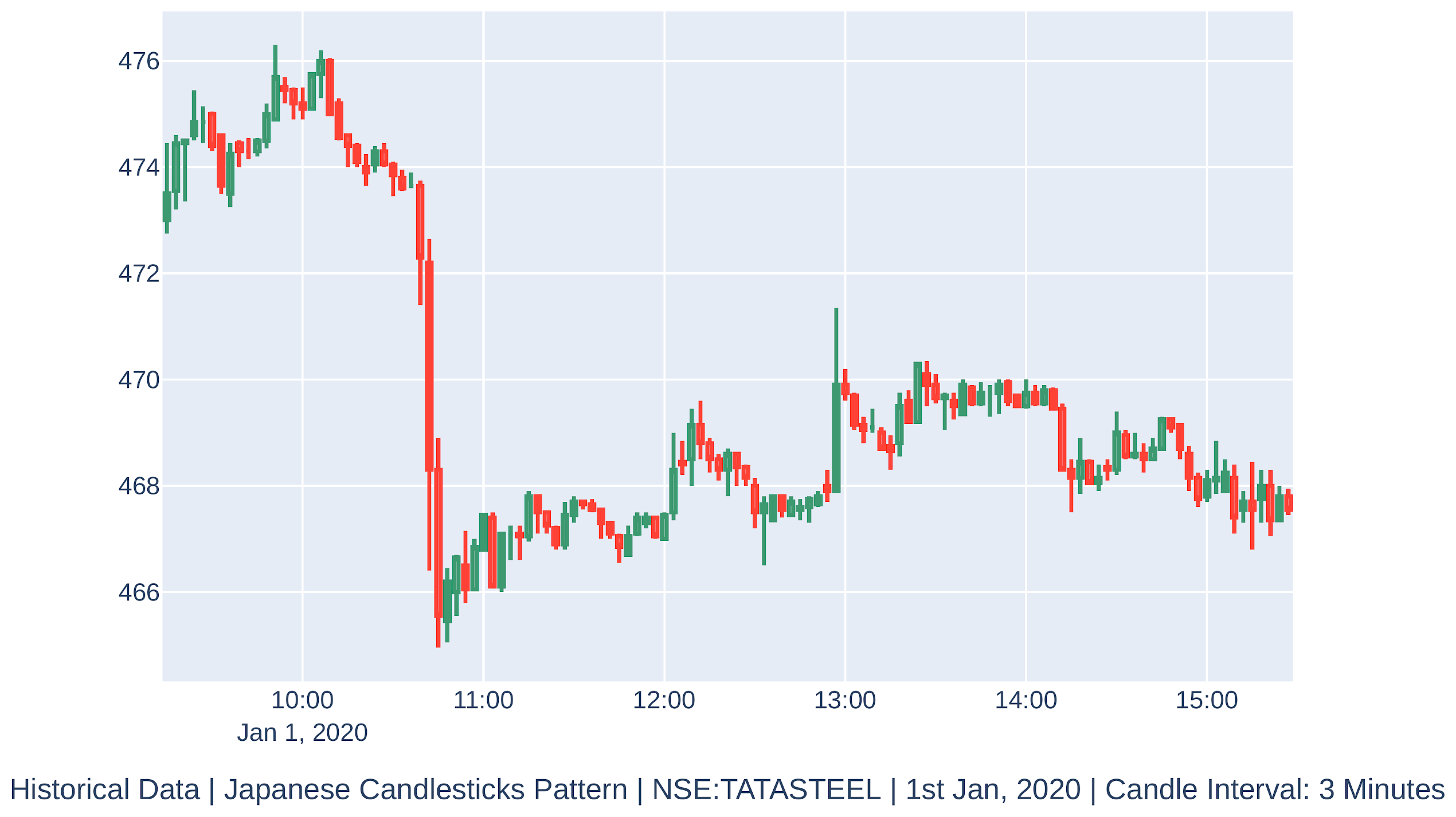
The historical data of a financial instrument can be analyzed in the form of the Renko candlestick pattern, a candlestick pattern that focuses on price movement. This differs from the Japanese candlestick pattern, which focuses on time movement. Brokers typically do not provide historical data as the Renko candlestick pattern via APIs. Brokers usually provide historical data by using the Japanese candlestick pattern, which needs to be converted into the Renko candlestick pattern. A shorter candle interval hints at a localized price movement trend, while a larger candle interval indicates an overall price movement trend. Depending on your algorithmic trading strategy, you may need the candle interval to be small or large. A candle interval of 1 minute is often the smallest available candle interval.
The Renko candlestick pattern works as follows:
- Each candle only has open and close attributes.
- You define a Brick Count (b) setting, which is usually set to 2.
- Each candle is always fixed and is equal to Brick Count. Hence, a candle is also called a brick here.
- At the end of every candle interval, a green brick is formed if the stock price goes b points higher than the highest of the previous brick. If the price goes much higher than b points in a single candle interval, as many Renko bricks are formed to account for the price change.
For example, say the price goes 21 points higher than the high of the previous brick. If the brick size is 2, 10 Renko bricks would be formed with the same timestamp to account for the 20-point change. For the remaining 1-point change (21-20), no brick would be formed until the price goes at least 1 point higher. - At the end of every candle interval, a red candle is formed if the stock price goes b points lower than the lowest of the previous Renko candle. If the price goes much lower than b points in a single candle interval, as many Renko bricks are formed to account for the price change.
For example, say the price goes 21 points lower than the highest previous brick. If the brick size is 2, 10 Renko bricks would be formed with the same timestamp to account for the 20-point change. For the remaining 1-point change (21-20), no brick would be formed until the price goes at least 1 point lower. - No two adjacent candles overlap with each other. Adjacent candles always share one of their ends.
- None of the timestamps need to be equally spaced (unlike the Japanese candlestick pattern) as candles are formed based on price movement and not time movement. Also, unlike other patterns, there may be multiple candles with the same timestamp.
This recipe shows how you can fetch historical data as the Japanese candlestick pattern using the broker API, as well as how to convert and plot the historical data using the Renko candlestick pattern for various candle intervals.
Getting ready
Make sure the broker_connection object is available in your Python namespace. Refer to the Technical requirements section of this chapter to learn how to set up broker_connection.
How to do it…
We execute the following steps for this recipe:
- Import the necessary modules:
>>> from pyalgotrading.utils.func import plot_candlestick_chart, PlotType
>>> from pyalgotrading.utils.candlesticks.renko import Renko
- Fetch the historical data for an instrument and convert it into Renko data:
>>> instrument = broker_connection.get_instrument('NSE',
                                                  'TATASTEEL')
>>> historical_data_1minute =
            broker_connection.get_historical_data(instrument,
                                                  'minute',
                                                  '2019-12-01',
                                                  '2020-01-10')
>>> historical_data_1minute_renko = Renko(historical_data_1minute)
>>> historical_data_1minute_renko
You will get the following output:
      close     open                     timestamp
0     424.0   424.95     2019-12-02 09:15:00+05:30
1     422.0   424.00     2019-12-02 09:20:00+05:30
2     426.0   424.00     2019-12-02 10:00:00+05:30
3     422.0   424.00     2019-12-02 10:12:00+05:30
4     420.0   422.00     2019-12-02 15:28:00+05:30
       ...     ...          ...        ...
186   490.0   488.00     2020-01-10 10:09:00+05:30
187   492.0   490.00     2020-01-10 11:41:00+05:30
188   488.0   490.00     2020-01-10 13:31:00+05:30
189   486.0   488.00     2020-01-10 13:36:00+05:30
190   484.0   486.00     2020-01-10 14:09:00+05:30
- Create a green Renko candle from one of the rows of historical_data:
>>> candle_green_renko = historical_data_1minute_renko.iloc[2:3,:]
# Only 3rd ROW of historical data
>>> plot_candlestick_chart(candle_green_renko,
                           PlotType.RENKO,
                           "A Green 'Renko' Candle")
You will get the following output:

- Create a red Renko candle from one of the rows of historical_data:
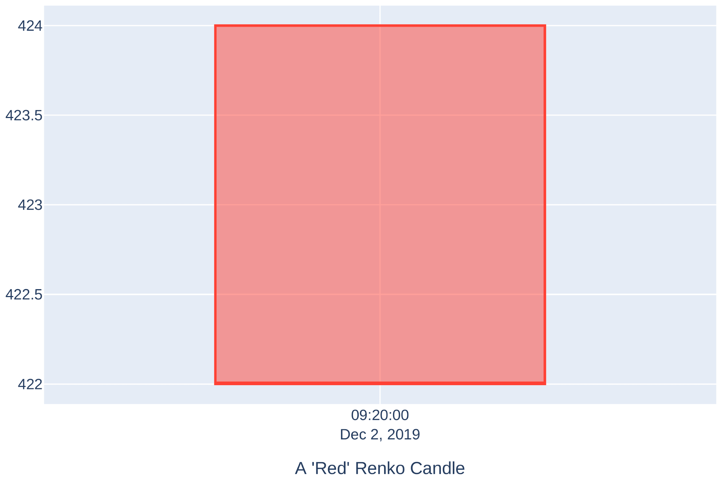
>>> plot_candlestick_chart(historical_data_1minute_renko,
                           PlotType.RENKO,
                           'Historical Data | '
                           'Renko Candlesticks Pattern | '
                           'NSE:TATASTEEL | '
                           'Dec, 2019 | '
                           'Candle Interval: 1 Minute', True)
You will get the following output:
- Plot a chart for the historical data of the instrument with a 1-minute candle interval:
>>> historical_data_3minutes =
            broker_connection.get_historical_data(instrument,
                                                  '3minute',
                                                  '2019-12-01',
                                                  '2019-12-31')
>>> historical_data_3minutes_renko =
                                Renko(historical_data_3minutes)
>>> plot_candlestick_chart(historical_data_3minutes_renko,
                           PlotType.RENKO,
                           'Historical Data | '
                           'Renko Candlesticks Pattern | '
                           'NSE:TATASTEEL | '
                           'Dec, 2019 | '
                           'Candle Interval: 3 Minutes', True)
You will get the following output:
- Plot a chart for the historical data of the instrument with a 3-minute candle interval:
>>> historical_data_5minutes =
            broker_connection.get_historical_data(instrument,
                                                  '5minute',
                                                  '2019-12-01',
                                                  '2019-12-31')
>>> historical_data_5minutes_renko =
                                Renko(historical_data_5minutes)
>>> plot_candlestick_chart(historical_data_5minutes_renko,
                           PlotType.RENKO,
                           'Historical Data | '
                           'Renko Candlesticks Pattern | '
                           'NSE:TATASTEEL | '
                           'Dec, 2019 | '
                           'Candle Interval: 5 Minutes', True)
You will get the following output:

- Plot a chart for the historical data of the instrument with a 5-minute candle interval:
>>> historical_data_10minutes =
            broker_connection.get_historical_data(instrument,
                                                  '10minute',
                                                  '2019-12-01',
                                                  '2019-12-31')
>>> historical_data_10minutes_renko =
                                Renko(historical_data_10minutes)
>>> plot_candlestick_chart(historical_data_10minutes_renko,
                           PlotType.RENKO,
                           'Historical Data | '
                           'Renko Candlesticks Pattern | '
                           'NSE:TATASTEEL | '
                           'Dec, 2019 | '
                           'Candle Interval: 10 Minutes', True)
You will get the following output:

- Plot a chart for the historical data of the instrument with a 10-minute candle interval:
>>> historical_data_15minutes =
            broker_connection.get_historical_data(instrument,
                                                  '15minute',
                                                  '2019-12-01',
                                                  '2019-12-31')
>>> historical_data_15minutes_renko =
                               Renko(historical_data_15minutes)
>>> plot_candlestick_chart(historical_data_15minutes_renko,
                           PlotType.RENKO,
                           'Historical Data | '
                           'Renko Candlesticks Pattern | '
                           'NSE:TATASTEEL | '
                           'Dec, 2019 | '
                           'Candle Interval: 15 Minutes', True)
You will get the following output:

- Plot a chart for the historical data of the instrument with a 15-minute candle interval:
>>> historical_data_15minutes =
            broker_connection.get_historical_data(instrument,
                                                  '15minute',
                                                  '2019-12-01',
                                                  '2019-12-31')
>>> historical_data_15minutes_renko =
                                Renko(historical_data_15minutes)
>>> plot_candlestick_chart(historical_data_15minutes_renko,
                           PlotType.RENKO,
                           'Historical Data | '
                           'Renko Candlesticks Pattern | '
                           'NSE:TATASTEEL | '
                           'Dec, 2019 | '
                           'Candle Interval: 15 Minutes', True)
You will get the following output:

- Plot a chart for the historical data of the instrument with a 30-minute candle interval:
>>> historical_data_30minutes =
            broker_connection.get_historical_data(instrument,
                                                  '30minute',
                                                  '2019-12-01',
                                                  '2019-12-31')
>>> historical_data_30minutes_renko =
                                Renko(historical_data_30minutes)
>>> plot_candlestick_chart(historical_data_30minutes_renko,
                           PlotType.RENKO,
                           'Historical Data | '
                           'Renko Candlesticks Pattern | '
                           'NSE:TATASTEEL | '
                           'Dec, 2019 | '
                           'Candle Interval: 30 Minutes', True)
You will get the following output:

- Plot a chart for the historical data of the instrument with a 1-hour candle interval:
>>> historical_data_1hour =
            broker_connection.get_historical_data(instrument,
                                                  'hour',
                                                  '2019-12-01',
                                                  '2019-12-31')
>>> historical_data_1hour_renko = Renko(historical_data_1hour)
>>> plot_candlestick_chart(historical_data_1hour_renko,
                           PlotType.RENKO,
                           'Historical Data | '
                           'Renko Candlesticks Pattern | '
                           'NSE:TATASTEEL | '
                           'Dec, 2019 | '
                           'Candle Interval: 1 Hour', True)
You will get the following output:

- Plot a chart for the historical data of the instrument with a 1-day candle interval:
>>> historical_data_day =
            broker_connection.get_historical_data(instrument,
                                                  'day',
                                                  '2019-12-01',
                                                  '2019-12-31')
>>> historical_data_day_renko = Renko(historical_data_day)
>>> plot_candlestick_chart(historical_data_day_renko,
                           PlotType.RENKO,
                           'Historical Data | '
                           'Renko Candlesticks Pattern | '
                           'NSE:TATASTEEL | '
                           'Dec, 2019 | '
                           'Candle Interval: Day', True)
You will get the following output:

How it works…
In step 1, you import plot_candlestick_chart, a quick utility function for plotting candlestick pattern charts, PlotType, an enum for various types of candlestick patterns, and the Renko function, which can convert historical data from the Japanese candlestick pattern into the Renko candlestick pattern. In step 2, you use the get_instrument() method of broker_connection to fetch an instrument and assign it to a new attribute, instrument. This object is an instance of the Instrument class. The two parameters needed to call get_instrument() are the exchange ('NSE') and the trading symbol ('TATASTEEL'). Next, you use the get_historical_data() method of the broker_connection object to fetch the historical data for the duration of December 2019, with a candle interval of 1 minute. The time-series data returned is in the form of Japanese candlestick pattern. The Renko() function converts this data into a Renko candlestick pattern, another pandas.DataFrame object. You assign it to historical_data_1minute_renko. Observe that historical_data_1minute_renko has timestamp, open, and close columns. Also, observe that the timestamps are not equidistant as the Renko candles are based on price movement and not time. In step 3 and 4, you selectively extract a green and a red candle from the data (Please note, the indices passed to historical_data.iloc fetched in the first recipe of this chapter.) Observe that the candles have no shadows (lines extending on either side of the main candle body) as the candles only have open and close attributes. In step 5, you plot the complete historical data held by historical_data using the plot_candlestick_chart() function.
In steps 6 until 12, you fetch the historical data using the Japanese candlestick pattern, convert it into the Renko candlestick pattern, and plot the converted data for candle intervals of 3 minutes, 5 minutes, 10 minutes, 15 minutes, 30 minutes, 1 hour, and 1 day. Observe the following differences and similarities among the charts as the candle interval increases:
- The total number of candlesticks decreases.
- The spikes in the charts due to sudden price movement are minimized. Smaller candle interval charts have more spikes as they focus on local trends, while larger candle interval charts have fewer spikes and are smoother.
- A long-term trend in the stock price becomes visible.
- Decision-making may become slower because you have to wait longer to get new candle data. Slower decisions may or may not be desirable, depending on the strategy. For example, to confirm trends, using a combination of data with a smaller candle interval, say 3 minutes, and data with a larger candle interval, say 15 minutes, would be desirable. On the other hand, to grab opportunities in intraday trading, data with larger candle intervals, say 1 hour or 1 day, would not be desirable.
- The price ranges (y-axis spread) of two adjacent candles don't overlap with each other. Adjacent candles always share one of their ends.
- None of the timestamps need to be equally spaced in time (unlike in the Japanese candlestick pattern) as candles are formed based on price movement and not time movement.
Fetching historical data using the Heikin-Ashi candlestick pattern
The historical data of a financial instrument can be analyzed in the form of the Heikin-Ashi candlestick pattern. Brokers typically do not provide historical data using the Heikin-Ashi candlestick pattern via APIs. Brokers usually provide historical data using the Japanese candlestick pattern, which needs to be converted to the Heikin-Ashi candlestick pattern. A shorter candle interval hints at a localized price movement trend, while a larger candle interval indicates an overall price movement trend. Based on your algorithmic trading strategy, you may need the candle interval to be small or large. A candle interval of 1 minute is often the smallest available candle interval.
The Heikin-Ashi candlestick pattern works as follows:
- Each candle has Close, Open, High, and Low attributes. For each candle, the following occurs:
- Close is calculated as the average of the Open, High, Low, and Close attributes of the current Japanese candle.
- Open is the average of the Open and Close attributes of the previous Heikin-Ashi candle.
- High is max of:
- Open of current Heikin-Ashi candle
- Close of current Heikin-Ashi candle
- High of current Japanese candle
- Low is the min of:
- Open of current Heikin-Ashi candle
- Close of current Heikin-Ashi candle
- Low of current Japanese Candle
- A green candle is formed when Close is higher than Open. (This is the same as the green candle in the Japanese candlestick pattern.)
- A red candle is formed when Close is lower than Open. (This is the same as the red candle in the Japanese candlestick pattern.)
- All the timestamps are equally spaced (within market hours).
This recipe shows you how to fetch historical data using Japanese candlestick pattern when using the broker API, as well as how to convert and plot the historical data using the Heikin-Ashi candlestick pattern for various candle intervals.
Getting ready
Make sure the broker_connection object is available in your Python namespace. Refer to the Technical requirements section of this chapter to learn how to set up broker_connection.
How to do it…
We execute the following steps for this recipe:
- Import the necessary modules:
>>> from pyalgotrading.utils.func import plot_candlestick_chart, PlotType
>>> from pyalgotrading.utils.candlesticks.heikinashi import HeikinAshi
- Fetch the historical data for an instrument and convert it into Heikin-Ashi data:
>>> instrument = broker_connection.get_instrument('NSE',
                                                  'TATASTEEL')
>>> historical_data_1minute =
            broker_connection.get_historical_data(instrument,
                                                  'minute',
                                                  '2019-12-01',
                                                  '2019-12-31')
>>> historical_data_1minute_heikinashi =
                            HeikinAshi(historical_data_1minute)
>>> historical_data_1minute_heikinashi
You will get the following output:

- Create a green Heikin-Ashi candle for one row of data:
>>> candle_green_heikinashi =
            historical_data_1minute_heikinashi.iloc[2:3,:]
# Only 3rd ROW of historical data
>>> plot_candlestick_chart(candle_green_heikinashi,
                           PlotType.HEIKINASHI,
                           "A 'Green' HeikinAshi Candle")
You will get the following output:

- Create a red Heikin-Ashi candle for one row of data:
# A 'Red' HeikinAshi Candle
>>> candle_red_heikinashi =
            historical_data_1minute_heikinashi.iloc[4:5,:]
# Only 1st ROW of historical data
>>> plot_candlestick_chart(candle_red_heikinashi,
                           PlotType.HEIKINASHI,
                           "A 'Red' HeikinAshi Candle")
You will get the following output:

- Plot a chart for the historical data of the instrument with a 1-minute candle interval:
>>> plot_candlestick_chart(historical_data_1minute_heikinashi,
                           PlotType.HEIKINASHI,
                           'Historical Data | '
                           'Heikin-Ashi Candlesticks Pattern | '
                           'NSE:TATASTEEL | '
                           'Dec, 2019 | '
                           'Candle Interval: 1 minute', True)
You will get the following output:

- Plot a chart for the historical data of the instrument with a 3-minute candle interval:
>>> historical_data_3minutes =
            broker_connection.get_historical_data(instrument,
                                                  '3minute',
                                                  '2019-12-01',
                                                  '2019-12-31')
>>> historical_data_3minutes_heikinashi =
                            HeikinAshi(historical_data_3minutes)
>>> plot_candlestick_chart(historical_data_3minutes_heikinashi,
                           PlotType.HEIKINASHI,
                           'Historical Data | '
                           'Heikin-Ashi Candlesticks Pattern | '
                           'NSE:TATASTEEL | '
                           'Dec, 2019 | '
                           'Candle Interval: 3 minutes', True)
You will get the following output:

- Plot a chart for the historical data of the instrument with a 5-minute candle interval:
>>> historical_data_5minutes =
            broker_connection.get_historical_data(instrument,
                                                  '5minute',
                                                  '2019-12-01',
                                                  '2019-12-31')
>>> historical_data_5minutes_heikinashi =
                           HeikinAshi(historical_data_5minutes)
>>> plot_candlestick_chart(historical_data_5minutes_heikinashi,
                            PlotType.HEIKINASHI,
                           'Historical Data | '
                           'Heikin-Ashi Candlesticks Pattern | '
                           'NSE:TATASTEEL | '
                           'Dec, 2019 | '
                           'Candle Interval: 5 minutes', True)
You will get the following output:

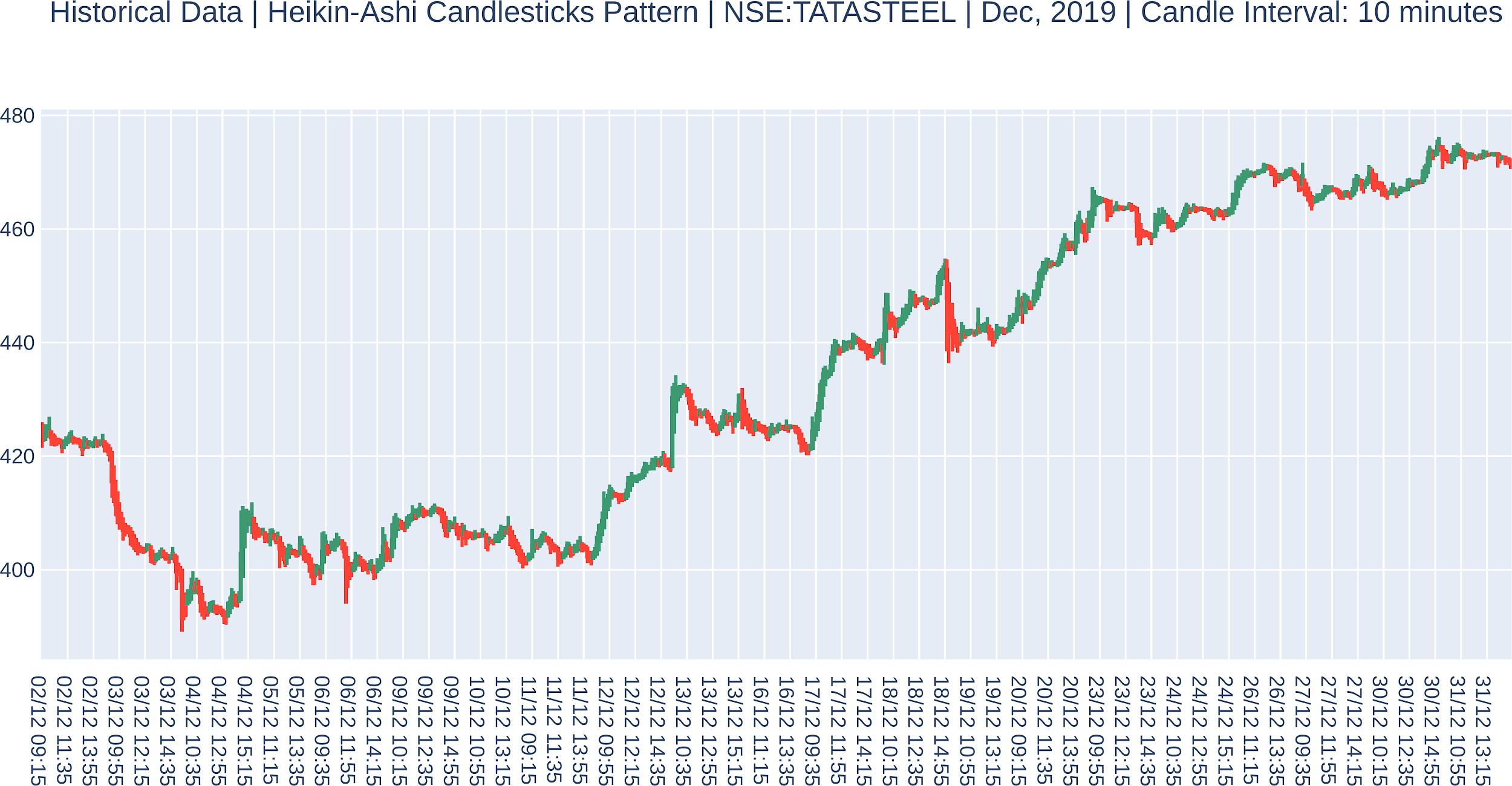
- Plot a chart for the historical data of the instrument with a 10-minute candle interval:
>>> historical_data_10minutes =
            broker_connection.get_historical_data(instrument,
                                                  '10minute',
                                                  '2019-12-01',
                                                  '2019-12-31')
>>> historical_data_10minutes_heikinashi =
                            HeikinAshi(historical_data_10minutes)
>>> plot_candlestick_chart(historical_data_10minutes_heikinashi,
                           PlotType.HEIKINASHI,
                           'Historical Data | '
                           'Heikin-Ashi Candlesticks Pattern | '
                           'NSE:TATASTEEL | '
                           'Dec, 2019 | '
                           'Candle Interval: 10 minutes', True)
You will get the following output:
- Plot a chart for the historical data of the instrument with a 15-minute candle interval:
>>> historical_data_15minutes =
            broker_connection.get_historical_data(instrument,
                                                  '15minute',
                                                  '2019-12-01',
                                                  '2019-12-31')
>>> historical_data_15minutes_heikinashi =
                           HeikinAshi(historical_data_15minutes)
>>> plot_candlestick_chart(historical_data_15minutes_heikinashi,
                           PlotType.HEIKINASHI,
                           'Historical Data | '
                           'Heikin-Ashi Candlesticks Pattern | '
                           'NSE:TATASTEEL | '
                           'Dec, 2019 | '
                           'Candle Interval: 15 minutes', True)
You will get the following output:

- Plot a chart for the historical data of the instrument with a 30-minute candle interval:
>>> historical_data_30minutes =
            broker_connection.get_historical_data(instrument,
                                                  '30minute',
                                                  '2019-12-01',
                                                  '2019-12-31')
>>> historical_data_30minutes_heikinashi =
                           HeikinAshi(historical_data_30minutes)
>>> plot_candlestick_chart(historical_data_30minutes_heikinashi,
                           PlotType.HEIKINASHI,
                           'Historical Data | '
                           'Heikin-Ashi Candlesticks Pattern | '
                           'NSE:TATASTEEL | '
                           'Dec, 2019 | '
                           'Candle Interval: 30 minutes', True)
You will get the following output:

- Plot a chart for the historical data of the instrument with a 1-hour candle interval:
>>> historical_data_1hour =
        broker_connection.get_historical_data(instrument,
                                              'hour',
                                              '2019-12-01',
                                              '2019-12-31')
>>> historical_data_1hour_heikinashi =
                           HeikinAshi(historical_data_1hour)
>>> plot_candlestick_chart(historical_data_1hour_heikinashi,
                           PlotType.HEIKINASHI,
                           'Historical Data | '
                           'Heikin-Ashi Candlesticks Pattern | '
                           'NSE:TATASTEEL | '
                           'Dec, 2019 | '
                           'Candle Interval: 1 Hour', True)
You will get the following output:

- Plot a chart for the historical data of the instrument with a 1-day candle interval:
>>> historical_data_day =
            broker_connection.get_historical_data(instrument,
                                                  'day',
                                                  '2019-12-01',
                                                  '2019-12-31')
>>> historical_data_day_heikinashi =
                                HeikinAshi(historical_data_day)
>>> plot_candlestick_chart(historical_data_day_heikinashi,
                           PlotType.HEIKINASHI,
                           'Historical Data | '
                           'Heikin-Ashi Candlesticks Pattern | '
                           'NSE:TATASTEEL | '
                           'Dec, 2019 | '
                           'Candle Interval: Day', True)
You will get the following output:

How it works…
In step 1, you import plot_candlestick_chart, a quick utility function for plotting candlestick pattern charts, PlotType, an enum for various types of candlestick patterns, and the HeikinAshi function, which can convert historical data from the Japanese candlestick pattern into data that's applicable to the Heikin-Ashi candlestick pattern. In step 2, you use the get_instrument() method of broker_connection to fetch an instrument and assign it to a new attribute, instrument. This object is an instance of the Instrument class. The two parameters needed to call get_instrument() are the exchange ('NSE') and the trading symbol ('TATASTEEL'). Next, you use the get_historical_data() method of the broker_connection object to fetch the historical data for the duration of December 2019, with a candle interval of 1 minute. The time-series data returned is in the form of Japanese candlestick pattern. The HeikinAshi() function converts this data to Heikin-Ashi candlestick pattern, another pandas.DataFrame object. You assign it to historical_data_1minute_heikinashi. Observe that historical_data_1minute_heikinashi has timestamp, close, open, high, and low columns. Also, observe that the timestamps are equidistant as the Heikin-Ashi candles are based on the average values of the Japanese candles. In steps 3 and 4, you selectively extract a green and a red candle from the data. (Please note, this indices passed to historical_data.iloc would be different if you choose a different duration for historical_data fetched in the first recipe of this chapter.) Observe that the candles have shadows (lines extending on either side of the main candle body) as the candle have high and low attributes, along with the open and close attributes. In step 5, you plot the complete historical data held by historical_data using the plot_candlstick_charts() function.
In steps 6 until 12, you fetch the historical data using the Japanese candlestick pattern, converts it into the Heikin-Ashi candlestick pattern, and plots the converted data for candle intervals of 3 minutes, 5 minutes, 10 minutes, 15 minutes, 30 minutes, 1 hour, and 1 day, respectively. Observe the following differences and similarities among the charts as the candle interval increases:
- The total number of candlesticks decreases.
- The spikes in the charts due to sudden price movement are minimized. Smaller candle interval charts have more spikes as they focus on local trends, while larger candle interval charts have fewer spikes and are smoother.
- A long-term trend in the stock price becomes visible.
- Decision-making may become slower because you have to wait longer to get new candle data. Slower decisions may or may not be desirable, depending on the strategy. For example, to confirm trends, using a combination of data with a smaller candle interval, say 3 minutes, and data with a larger candle interval, say 15 minutes, would be desirable. On the other hand, to grab opportunities in intraday trading, data with larger candle intervals, say 1 hour or 1 day, would not be desirable.
- The price ranges (y-axis spread) of adjacent candles may or may not overlap.
- All the timestamps are equally spaced in time (within market hours).
Fetching historical data using Quandl
So far, in all the recipes in this chapter, you have used the broker connection to fetch historical data. In this recipe, you will fetch historical data using a third-party tool, Quandl (https://www.quandl.com/tools/python). It has a free to use Python version which can be easily installed using pip. This recipe demonstrates the use of quandl to fetch historical data of FAAMG stock prices (Facebook, Amazon, Apple, Microsoft, and Google).
Getting ready
Make sure you have installed the Python quandl package. If you haven't, you can install it using the following pip command:
$ pip install quandl
How to do it…
We execute the following steps for this recipe:
- Import the necessary modules:
>>> from pyalgotrading.utils.func import plot_candlestick_chart, PlotType
>>> import quandl
- Plot a chart for the historical data of Facebook with a 1-day candle interval:
>>> facebook = quandl.get('WIKI/FB',
                           start_date='2015-1-1',
                           end_date='2015-3-31')
>>> plot_candlestick_chart(facebook,
                           PlotType.QUANDL_OHLC,
                           'Historical Data | '
                           'Japanese Candlesticks Pattern | '
                           'FACEBOOK | '
                           'Jan-March 2015 | '
                           'Candle Interval: Day', True)
You will get the following output:

- Plot a chart for the historical data of Amazon with a 1-day candle interval:
>>> amazon = quandl.get('WIKI/AMZN',
                         start_date='2015-1-1',
                         end_date='2015-3-31')
>>> plot_candlestick_chart(amazon,
                           PlotType.QUANDL_OHLC,
                           'Historical Data | '
                           'Japanese Candlesticks Pattern | '
                           'AMAZON | '
                           'Jan-March 2015 | '
                           'Candle Interval: Day', True)
You will get the following output:

- Plot a chart for the historical data of Apple with a 1-day candle interval:
>>> apple = quandl.get('WIKI/AAPL',
                        start_date='2015-1-1',
                        end_date='2015-3-31')
>>> plot_candlestick_chart(apple,
                           PlotType.QUANDL_OHLC,
                           'Historical Data | '
                           'Japanese Candlesticks Pattern | '
                           'APPLE | '
                           'Jan-March 2015 | '
                           'Candle Interval: Day', True)
You will get the following output:

- Plot a chart for the historical data of Microsoft with a 1-day candle interval:
>>> microsoft = quandl.get('WIKI/MSFT',
                            start_date='2015-1-1',
                            end_date='2015-3-31')
>>> plot_candlestick_chart(microsoft,
                           PlotType.QUANDL_OHLC,
                           'Historical Data | '
                           'Japanese Candlesticks Pattern | '
                           'MICROSOFT | '
                           'Jan-March 2015 | '
                           'Candle Interval: Day', True)
You will get the following output:

- Plot a chart for the historical data of Google with a 1-day candle interval:
>>> google = quandl.get('WIKI/GOOGL',
                         start_date='2015-1-1',
                         end_date='2015-3-31')
>>> plot_candlestick_chart(google,
                           PlotType.QUANDL_OHLC,
                           'Historical Data | '
                           'Japanese Candlesticks Pattern | '
                           'GOOGLE | '
                           'Jan-March 2015 | '
                           'Candle Interval: Day', True)
You will get the following output:

How it works…
In step 1, you import plot_candlestick_chart, a quick utility function for plotting candlestick pattern charts, PlotType, an enum for various types of candlestick patterns, and the quandl module. In the remaining steps, historical data for the Facebook, Amazon, Apple, Microsoft, and Google stocks are fetched using quandl.get() and plotted using the plot_candlestick_chart() method. The data that's returned by the quandl is in the OHLC (open, high, low, close) format.
So, whether you want to use this data depends on your requirements. It may be good for testing or flow flushing the existing code base, but not good enough for providing live data feeds, which are needed during real trading sessions.