When I was in college, a professor once told me that every artistic movement—whether musical, literary, or from the fine arts—could be seen as a response to the one that preceded it. Filmmakers of the sixties produced Bonnie and Clyde and The Graduate to counter such old Hollywood pictures as The Sound of Music. In Paradise Lost, John Milton actually writes his literary predecessors into the backdrop of hell—a not-so-subtle dig at their poetic street cred. And if it wasn’t for the tight arrangements of Duke Ellington and Benny Goodman, Charlie Parker might never have produced the wild-eyed experimentation of bebop.
One artist establishes a point; another sets the counterpoint. And this was especially true for the artists of the Modernist period in the mid-20th century. The Modernists were looking at the creative output of their predecessors, the Romantic period of the late 19th century, with, well, a little disdain. To them, Romantic art was just laden down with all this stuff—needless, embellished ornamentation that overwhelmed the artwork, and impeded its ability to properly communicate with the viewer (FIG 2.1).
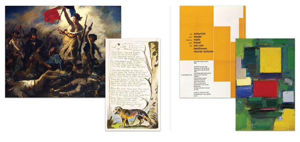
FIG 2.1: The Modernists heralded a shift away from the embellished realism of William Blake and Eugène Delacroix, to the more rational approach of Hans Hofmann and Josef Müller-Brockmann.
Now, the Modernist reaction to this took many different forms, spanning nearly every artistic medium. In painting, this meant reducing works to experiments in line, shape, and color. But graphic designers of the period, like Jan Tschichold, Emil Ruder, and Josef Müller-Brockmann, popularized this concept of a typographic grid: a rational system of columns and rows, upon which modules of content could be placed (FIG 2.2). And thanks to designers like Khoi Vinh and Mark Boulton, we’ve managed to adapt this old concept to the needs of contemporary web design.
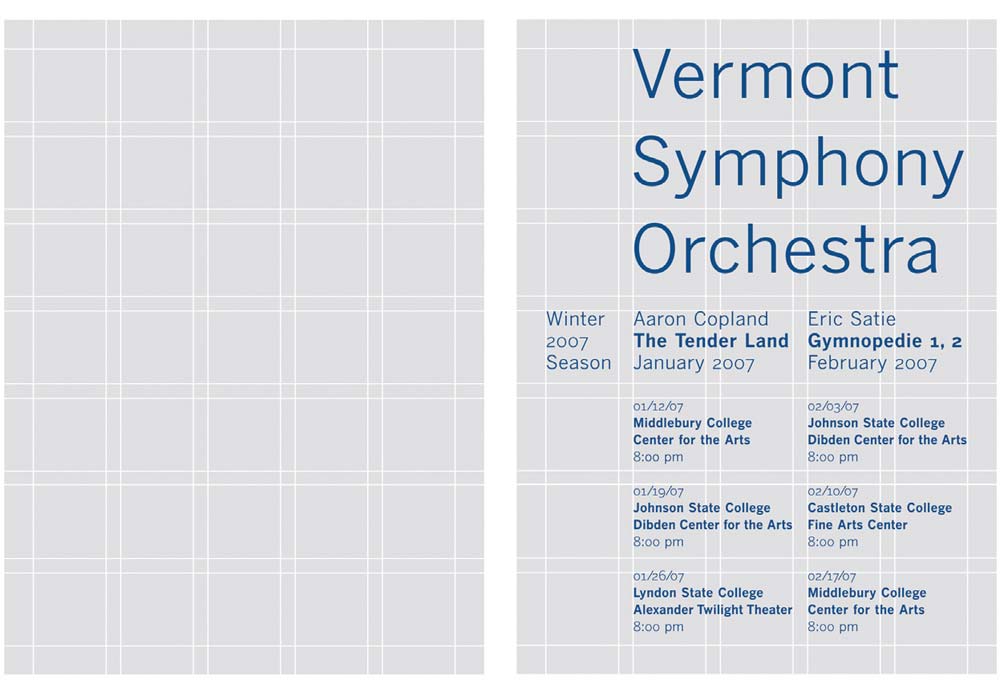
FIG 2.2: When tailored to the needs of your content as well as the page’s dimensions, the typographic grid is a powerful tool, aiding designer and reader alike.
In his book Grid Systems in Graphic Design, Müller-Brockmann referred to this process as “creating a typographic space on the page,” tailoring the proportions of the grid to the size of a blank piece of paper. But for a web designer, we’re missing one key component: the presence of an actual page. Our canvas, the browser window, can bend and flex to any shape or size, whether changed at the whim of the reader, or fixed by the phone or tablet they’re using to view our content.
Often, the first layer of our grid-based layouts looks like this:
#page {
  width: 960px;
  margin: 0 auto;
}
We create an element in our markup, give it a fixed width in our CSS, and center it in the page. But when we’re thinking flexibly, we instead need to translate a design created in Photoshop (FIG 2.3) into something more fluid, something more proportional.
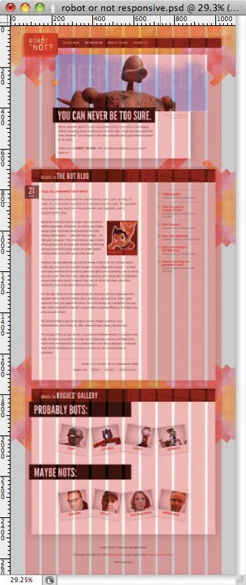
FIG 2.3: Our PSD is looking pretty, but that grid’s more than slightly pixel-heavy. How can we become more flexible?
How do we begin?
Flexible typesetting
To find an answer, let’s do a little role-playing. No, no—you can put away those twenty-sided dice. I had something a bit more practical (and a bit less orc-enabled) in mind.
Pretend for a moment that you’re working as a front-end developer. (If you’re already a front-end developer, well, pretend you’re also wearing a pirate hat.) A designer on your team has asked you to convert a simple design into markup and CSS. Always game to help out, you take a quick look at the PSD she sent you (FIG 2.4).
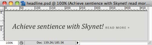
FIG 2.4: The mockup for our typesetting exercise. This should take, like, minutes.
There’s not much content here, true. But hey—even short jobs require close attention to detail, so you begin focusing on the task at hand. And after carefully assessing the content types in the mockup, here’s the HTML you come up with:
<h1>Achieve sentience with Skynet! <a href="#">Read More »</a></h1>
A headline with a link embedded in it—a fine foundation of semantic markup, don’t you think? After dropping in a reset stylesheet, the content begins shaping up in your browser (FIG 2.5).
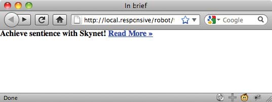
FIG 2.5: Plain, style-free markup. The stuff dreams (and websites) are made of.
It’s definitely a modest start. But with our foundation in place, we
can begin adding a layer of style. Let’s start by applying some basic
rules to the body element:
body {
  background-color: #DCDBD9;
  color: #2C2C2C;
  font: normal 100% Cambria, Georgia, serif;
}
Nothing too fancy: We’re applying a light gray background color
(#DCDBD9) to our entire document, and a fairly dark text color
(#2C2C2C). And finally, we’ve dropped in the font
characteristics: a default weight (normal) and a serif-heavy
font stack (Cambria, Georgia, serif).
Finally, you’ve probably noticed that the font-size has
been set to 100%. In doing so, we’ve simply set our base
type size to the browser’s default, which in most cases is 16 pixels. We
can then use ems to size text up or down from that relative baseline. But
before we do, we can see that our headline’s starting to shape up
(FIG 2.6).
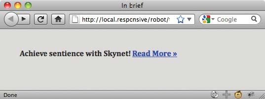
FIG. 2.6: With one simple CSS rule, we can set some high-level parameters for our design.
Wondering why the h1 doesn’t look, well, headline-y?
We’re currently using a reset stylesheet, which overrides a browser’s
default styles for HTML elements. It’s a handy way to get all browsers
working from a consistent baseline. Personally, I’m a big fan of Eric
Meyer’s reset (http://bkaprt.com/rwd/9/), but there are
dozens of fine alternatives out there.
At any rate, that’s why our h1 looks so small: it’s
simply inheriting the font-size of 100% we set on
the body element, and rendering at the browser’s default
type size of 16 pixels.
Now, if we were content with pixels, we could just translate the values from the comp directly into our CSS:
h1 {
  font-size: 24px;
  font-style: italic;
  font-weight: normal;
}

h1 a {
  color: #747474;
  font: bold 11px Calibri, Optima, Arial, sans-serif;
  letter-spacing: 0.15em;
  text-transform: uppercase;
  text-decoration: none;
}
And that would be fine—there’s nothing
actually wrong with setting your type in pixels. But for the
purposes of our relative typesetting experiment, let’s instead start to
think proportionally, and express those pixel-based font-size
values in relative terms. So instead of pixels, we’ll use our friend the
em.
Contextual healing
To do so, we’ll need to do a teensy bit of
math: we’ll simply take the target font size from our comp, and
divide it by the font-size of its containing element—in
other words, its context. The result is our desired
font-size expressed in relative, oh-so-flexible ems.
In other words, relative type sizes can be calculated with this simple formula:
target ÷ context = result
(Quick aside: If you’re at all like me, the word “math” causes immediate and serious panic. But speaking as someone who took a philosophy course for his college math credit, don’t run screaming into the hills quite yet. I rely on my computer’s calculator program heavily, and simply paste the result into my CSS. That keeps me from really having to, you know, do the math.)
So with our formula in hand, let’s turn back to that 24px
headline. Assuming that our base font-size: 100% on the
body element equates to 16px, we can plug those
values directly into our formula. So if we need to express our
h1’s target font size (24px) relative to its
context (16px), we get:
24 ÷ 16 = 1.5
And there we are: 24px is 1.5 times
greater than 16px, so our font-size is 1.5em:
h1 {
  font-size: 1.5em; /* 24px / 16px */
  font-style: italic;
  font-weight: normal;
}
And voilà! Our headline’s size perfectly matches the size specified in our comp, but is expressed in relative, scaleable terms (FIG 2.7).
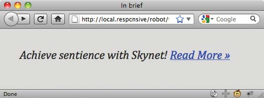
FIG 2.7: Our headline is properly sized with flexible, scaleable ems. (But what the heck is up with that link?)
(I usually put the math behind my measurements in a comment to the
right-hand side of the line (/* 24px / 16px */),
which makes future adjustments much, much easier for me to make.)
With that squared away, let’s turn to our lonely little “Read
More” link. Actually, as you can see in FIGURE 2.7, it’s not so little—and
that’s the problem. Sized in our comp (FIG
2.4) at 11 pixels in a generously kerned sans-serif, we need to
scale the text down. A lot. Because at the moment, it’s simply inheriting
the font-size: 1.5em set on its containing element, the
h1.
And that’s important to note. Because the headline’s text is set at
1.5em, any elements inside that headline need to be expressed
in relation to that value. In other words, our context has changed.
So to set the font-size of our link in ems, we’ll divide
our target of 11px not by 16px, the value set on
the body, but by 24px—the font size of the
headline, our new context:
11 ÷ 24 = 0.458333333333333
After that little division we’re left with one of the least sexy numbers you’ve probably seen yet today. (Oh, but just you wait: the chapter’s not over yet.)
Now, you might be tempted to round 0.45833333333333em to
the nearest sane-looking number—say, to 0.46em. But don’t
touch that delete key! It might make your eyes bleed to look at it, but
0.458333333333333 perfectly represents our desired font size
in proportional terms. What’s more, browsers are perfectly adept at
rounding off those excess decimal places as they internally convert the
values to pixels. So giving them more information, not less, will net you a
better result in the end.
In the spirit of accuracy, we can just drop that homely-looking number directly into our CSS:
h1 a {
  font: bold 0.458333333333333em Calibri, Optima, Arial, sans-serif; /* 11px / 24px */
  color: #747474;
  letter-spacing: 0.15em;
  text-transform: uppercase;
  text-decoration: none;
}
The result? Our tiny page is finished, perfectly matching our intended design—but with text set in resizeable, scaleable ems (FIG 2.8).
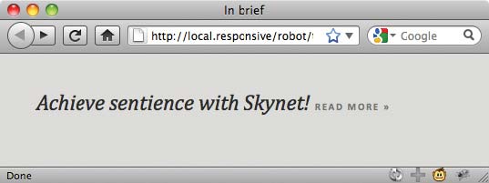
FIG 2.8: And with some simple math, our typesetting’s complete—without a single pixel in sight.
From flexible fonts to a flexible grid
It’s possible you’re very, very bored right now. I mean, here you are, knee-deep in what’s supposed to be a chapter about creating flexible, grid-based layouts, and this Ethan fellow won’t stop prattling on about typesetting and math. The nerve.
But the first time I had to build on a flexible grid, I had no idea where to begin. So I did what I do every time I’m faced with a problem I don’t know how to solve: I avoided it entirely, and started working on something else.
As I started work on setting the site’s type in ems, I had a minor epiphany: namely, that we can apply the same sort of proportional thinking to layout that we apply to relative font sizes. In other words, every aspect of our grid—the rows and columns, and the modules draped over them—can be expressed as proportions of their containing element, rather than in unchanging, inflexible pixels.
And we can do so by recycling our trusty target ÷ context =
result formula. Let’s dive in.
Creating a flexible grid
Let’s pretend that our designer sent over another mockup, since she was so impressed with our quick turnaround on that headline we produced. We’re now tasked with coding the blog section of the Robot or Not website (FIG 2.9).
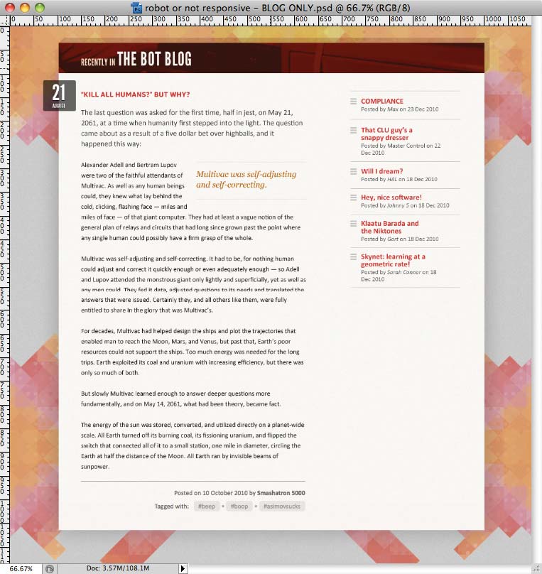
FIG 2.9: Our new assignment: converting this blog design into a standards-based, flexible layout.
As it turns out, our designer likes us so darn much she’s even included a quick content inventory of the page (FIG 2.10), which will save us some pre-production planning. We should really send her some cookies or something.
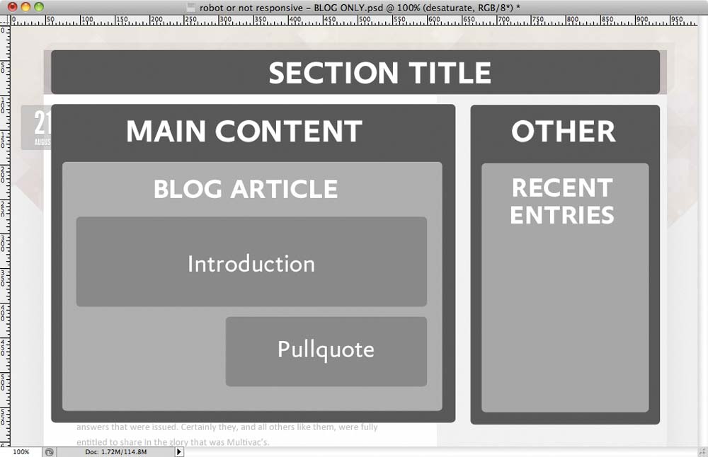
FIG 2.10: The content inventory for our blog module.
We can handily translate her schematic into a basic markup structure, like so:
<div id="page">
<div class="blog section">
<h1 class="lede">Recently in <a href="#">The Bot Blog</a></h1>
<div class="main">
…
</div><!-- /end .main -->
<div class="other">
…
</div><!-- /end .other -->
</div><!-- /end .blog.section -->
</div><!-- /end #page -->
Our skeleton markup is lean, mean, and
semantically rich, perfectly matching the high-level content inventory.
We’ve created a generic container for the entire page
(#page), which in turn contains our .blog module.
And within .blog we’ve created two more containers: a
div classed as .main for our main article
content, and another div classed as .other for,
um, other stuff. Poetry it ain’t, but poetry it doesn’t have
to be.
At this point, we’re going to skip a few steps in our exercise. In fact, let’s pretend that this is one of those cooking shows where the chef throws a bunch of ingredients into a pot, and then turns around to produce a fully cooked turkey. (This metaphor handily demonstrates how infrequently I watch cooking shows. Or cook turkey.)
But let’s assume that we’ve already done all the CSS related to typesetting, background images, and just about every element of our design that isn’t related to layout (FIG 2.11). With those other details finished, we can focus exclusively on producing our fluid grid.
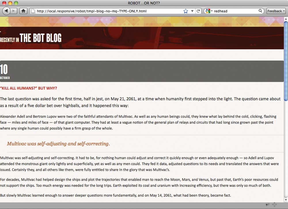
FIG 2.11: Our template is finished! Well, with the possible exception of, you know, an actual layout.
So how exactly do we turn those .main and
.other blocks into proper columns? With our content inventory
finished and some basic markup in place, let’s go back to our comp and
take a closer look at the grid’s physical characteristics (FIG 2.12).
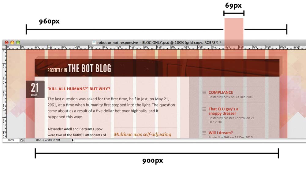
FIG 2.12: Grid-based layout is grid-based!
Reviewing the design tells us a few things: first, that the grid itself
is divided into 12 columns, each measuring 69 pixels across and separated
by regular 12px-wide gutters. Taken together, those columns
and gutters give us a total width of 960 pixels. However, the blog itself
is only 900 pixels wide, centered horizontally within that
960px-wide canvas.
So those are the high-level details. And if we take a closer look at the
two columns inside of the blog (FIG 2.13),
we can see that the left-hand content column
(.main in our markup) is 566 pixels wide, while the right-hand,
secondary column (.other) is only 331 pixels across.
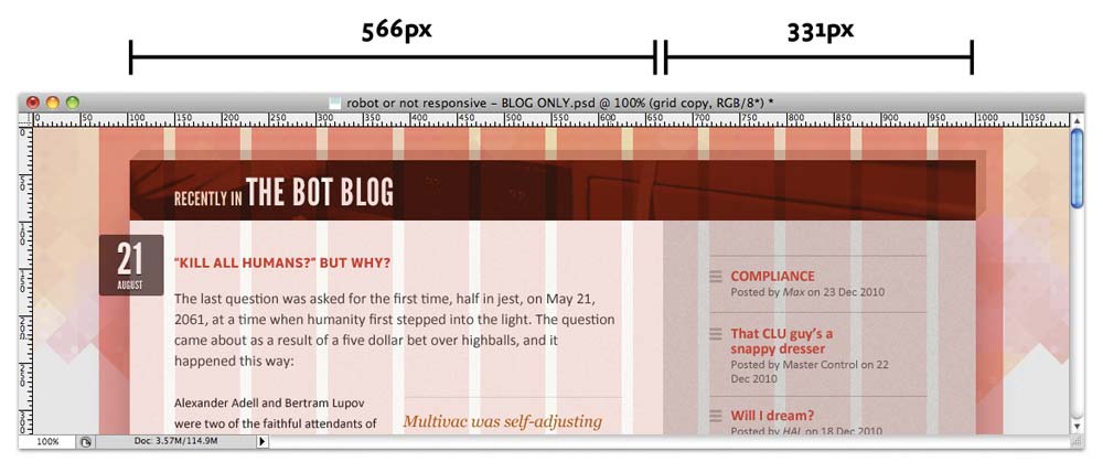
FIG 2.13: Let’s narrow our focus a bit, and measure the internal columns.
Well now. Quite a few pixel values floating around so far, aren’t there? And if we were content with pixels we could simply drop them into our CSS directly. (Hello, leading statement!)
#page {
margin: 36px auto;
width: 960px;
}
.blog {
margin: 0 auto 53px;
width: 900px;
}
.blog .main {
float: left;
width: 566px;
}
.blog .other {
float: right;
width: 331px;
}
Nice and neat: we’ve set the width of
#page to 960 pixels, centered the 900px-wide
.blog module within that container, set the widths of
.main and .other to 566px and
331px, respectively, and finally floated the two columns
opposite each other. And the result looks stellar (FIG 2.14).
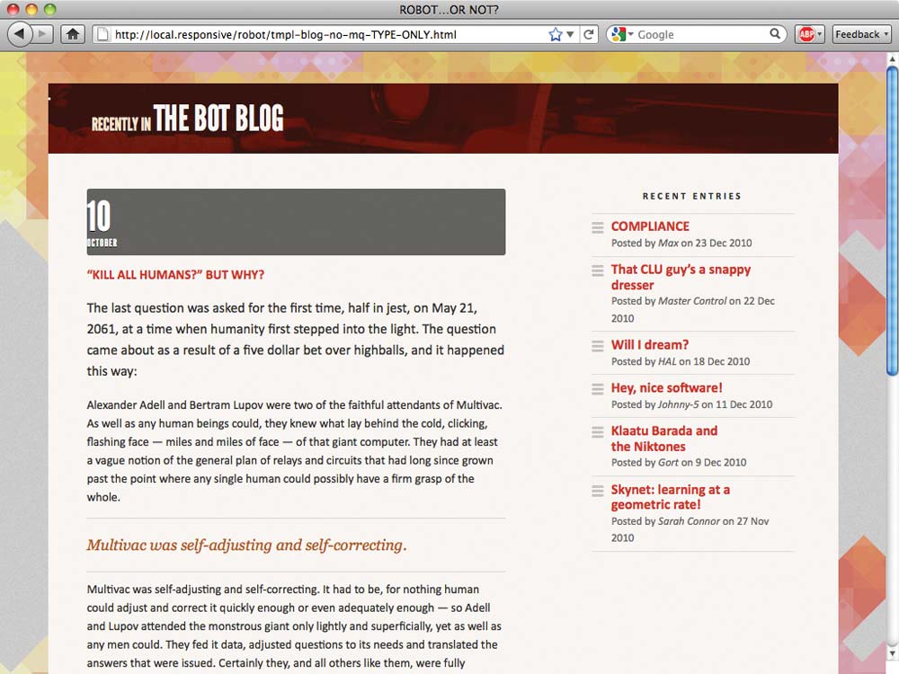
FIG 2.14: A few pixel-based floats later, and our design’s nearly finished. Or is it?
But while our layout’s matched the comp perfectly, the result is
downright inflexible. Fixed at a width of 960px, our page is
blissfully indifferent to changes in viewport size, forcing a horizontal
scrollbar upon the reader if the window drops even slightly below 1024
pixels (FIG 2.15).
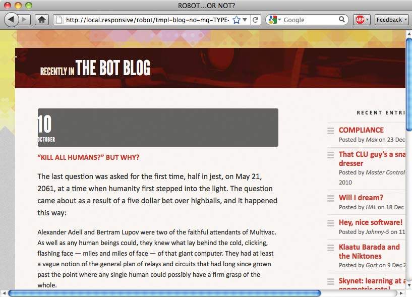
FIG 2.15: Our layout is lovely, but it’s so very inflexible. Let’s fix that.
In short, we can do better.
From pixels to percentages
Instead of pasting the pixel values from our comp directly into our CSS, we need to express those widths in relative, proportional terms. Once we’ve done so, we’ll have a grid that can resize itself as the viewport does, but without compromising the design’s original proportions.
Let’s start at the outermost #page element, which
contains our design, and work our way in:
#page {
margin: 36px auto;
width: 960px;
}
Nasty, evil pixels. We hates them.
Okay, okay: not really. Remember, there’s absolutely nothing wrong
with fixed-width layouts! But to move toward a more flexible grid, let’s
start with a percentage value to replace that 960px:
#page {
margin: 36px auto;
width: 90%;
}
I’ll confess that I arrived at 90% somewhat
arbitrarily, doing a bit of trial and error in the browser window to see
what looked best. By setting our #page element to a percentage
of the browser window, we’ve created a container that will expand and
contract as the viewport does (FIG 2.16).
And as that container is centered horizontally within the
page, we’ll be left with a comfortable five percent margin on either
side.
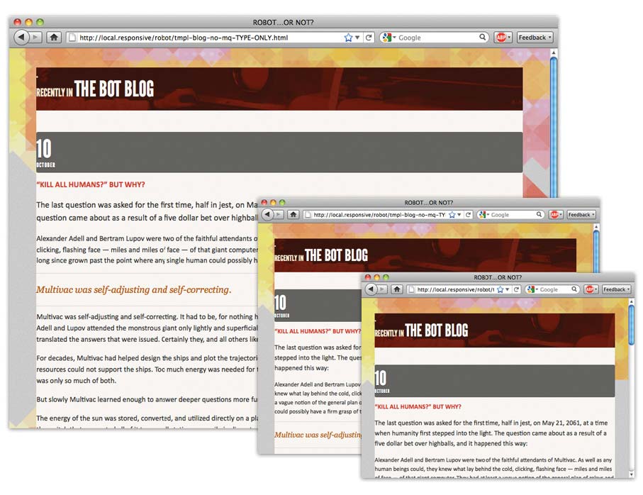
FIG 2.16: Our container flexes as the browser window does.
So far, so good. Moving down the markup, let’s set our sights on the
.blog module itself. Previously, when we were toying with
pixels, we wrote the following rule:
.blog {
margin: 0 auto 53px;
width: 900px;
}
Instead of a value set in pixels, we need to express .blog
’s width of 900px in proportional terms: specifically,
describing it as a percentage of the width of its containing element. And
this is where our beloved target ÷ context = result formula
comes back into play.
We already know our target pixel width for our blog: that’s
900px, as defined in our mockup. What we want is to describe
that width in relative terms, as a percentage of .blog’s
containing element. Since .blog is nested within the
#page element, we’ve got our context—namely, 960
pixels, the width of #page as it was designed in the
mockup.
So let’s divide our target width for .blog
(900) by its context (960):
900 ÷ 960 = 0.9375
We’re left with a result of
0.9375. Doesn’t look like much, I’ll admit. But by moving
the decimal over two places we’re left with 93.75%, a
percentage we can drop directly into our CSS:
.blog {
margin: 0 auto 53px;
width: 93.75%; /* 900px / 960px */
}
(Just as I did with our relative typesetting exercise, I’ve left the
formula in a comment off to the right of the width property.
This is a personal preference, of course, but I’ve found it to be
incredibly helpful.)
So that takes care of our two containing elements. But what about our content columns?
.blog .main {
float: left;
width: 566px;
}
.blog .other {
float: right;
width: 331px;
}
Our left-hand content column is floated to the left, and set at
566px; the additional content is floated opposite, sized at a
width of 331px. Once again, let’s replace those pixel-based
target widths with percentages.
But before we drop those values into our target ÷ context =
result formula, it’s important to note that our context has
changed. Last time, we divided the width of our blog module by
960px, the width of its container (#page). But
since they’re nested inside .blog, we need to express our
columns’ widths in relation to 900px—the width of the
blog.
So we’ll divide our two target values (566px and
331px) by 900px, our new context:
566 ÷ 900 = .628888889 331 ÷ 900 = .367777778
Once we move our decimal points we’re left with
62.8888889% and 36.7777778%, the proportional
widths of .main and .other:
.blog .main {
float: left;
width: 62.8888889%; /* 566px / 900px */
}
.blog .other {
float: right;
width: 36.7777778%; /* 331px / 900px */
}
Just like that, we’re left with a flexible, grid-based layout (FIG 2.17).
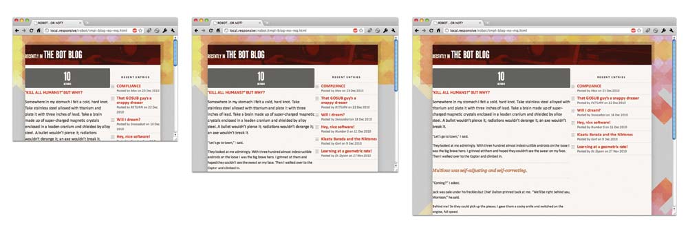
FIG 2.17: Our flexible grid is complete.
With some simple math we’ve created a percentage-based container and two flexible columns, creating a layout that resizes in concert with the browser window. And as it does, the pixel widths of those columns might change—but the proportions of our design remain intact.
Flexible margins and padding
Now that those two columns are in place, we’re done with the top-level components of our flexible grid. Marvelous. Wonderful. Stupendous, even. But before we haul out any more adjectives, there’s quite a bit of detail work to be done.
Can’t get no ventilation
First and foremost, our design may be flexible, but it is in serious need of some detail work. The two most grievous offenders? The title of our blog is flush left within its container (FIG 2.18), and our two columns currently abut each other, with no margins or gutters in sight (FIG 2.19). We definitely have some cleanup to do.

FIG 2.18: Our headline is in dire need of padding.
FIG 2.19: Margins? We don’t need no stinking margins. (Actually, we do. We really do.)
So let’s begin with that headline. In our comp, there’s 48 pixels of
space between our headline and the left edge of its container
(FIG 2.20). Now, we could use
pixels to set a fixed padding-left on our headline in either
pixels or ems, like so:
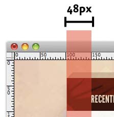
FIG 2.20: According to
the design, we need 48px of horizontal
padding on the left edge of our headline.
.lede {
padding: 0.8em 48px;
}
This is a decent solution. But a fixed value for
that padding-left would create a gutter that doesn’t line up
with the rest of our fluid grid. As our flexible columns expand or
contract, that gutter would simply ignore the rest of our design’s
proportions, sitting stubbornly at 48px no matter how small or
wide the design became.
So instead, let’s create a flexible gutter. So far, we’ve
been describing various elements’ widths in proportional terms. But we
can also create percentage-based margins and padding to preserve the
integrity of our flexible grid. And we can reuse the target ÷
context = result formula to do so.
Before we start in with the math, it’s important to note that the context is slightly different for each, and depends on whether you’re setting flexible margins or flexible padding:
- When setting flexible margins on an element, your context is the width of the element’s container.
- When setting flexible padding on an element, your context is the width of the element itself. Which makes sense, if you think about the box model: we’re describing the padding in relation to the width of the box itself.
Since we want to set some padding on our headline, our context is the
width of our .lede title. Now since the headline doesn’t
have a declared width, its width (and the context we need for our formula)
is the width of the blog module, or 900px. So out comes the
calculator, and we’re left with:
48 ÷ 900 = 0.0533333333
which translates to:
.lede {
padding: 0.8em 5.33333333%; /* 48px / 900px */
}
And there we have it: our 48px
padding has been expressed in relative terms, as a proportion of our
headline’s width.
With that issue resolved, let’s introduce a bit of whitespace to our
compacted content. To do so, it’s worth remembering that each column
actually has a smaller module contained within it: the left-hand
.blog column contains an .article, while the
.other column contains our .recent-entries
listing (FIG 2.21).
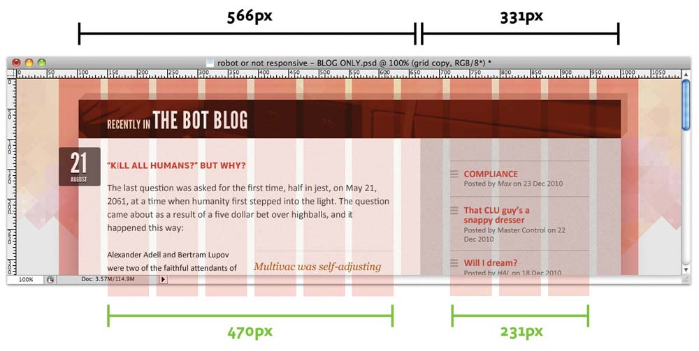
FIG 2.21: Taking a look at the comp, we can quickly size up their respective widths. Pun unfortunate, but intended.
We start with the recent entries module. Fortunately for us, our
work’s over pretty quickly. Since we know the width of the element
(231px) and the width of its containing column
(331px), we can simply center our module horizontally:
.recent-entries {
margin: 0 auto;
width: 69.7885196%; /* 231px / 331px */
}
Now, we could take the same approach with our article. But instead,
let’s make it a bit more interesting. Remember the 48px
padding we set on our headline? Well, our article falls along the same
column (FIG 2.22). So rather than just
centering our article within its container, let’s create another
proportional gutter.
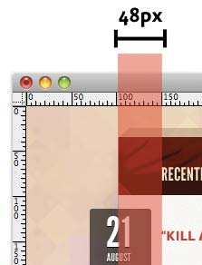
FIG 2.22: Our headline and article share a common padding.
Our target value is 48px. And since we’re working with
relative padding, our context should be the width of the article itself.
But once again, since there’s no explicit width set on
.article, we can simply use 566px, the width of
its parent (.blog), for our context:
.article {
padding: 40px 8.48056537%; /* 48px / 566px */
}
Voilà! Our flexible grid’s all but finished (FIG 2.23).
FIG 2.23: Flexible padding and margins! Hooray!
Getting negative
Let’s turn to our blog entry’s beleaguered
date header. Currently, it’s spanning the full width of the blog entry,
and that won’t do. Given what we’ve learned so far, it’s fairly
straightforward to fix its width: the comp tells us our date should be
floated to the left, and that it occupies one 69px column
(refer back to FIG 2.12). Since the date
sits within the 474px-wide article, we have our context.
Armed with that information, let’s write some quick CSS:
.date {
float: left;
width: 14.556962%; /* 69px / 474px */
}
So far, so flexible, so good. But there’s one key component missing: our date is currently floating neatly against the left edge of the article, with the title and copy floating around it (FIG 2.24). What we need to do is to pull that quote out of its container, and move it across the left-hand edge of the entire module.
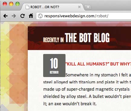
FIG 2.24: Something’s rotten in Demark. (By “Denmark,” I mean “our entry date.” And by “rotten,” I mean “entirely too close to the adjoining text.”)
And with negative margins, we can do exactly that. And we don’t have to change our approach because the margin is negative: just as before, we simply need to express that margin in relation to the width of the element’s container.
If we look at the mockup, we can see that there are 81 pixels from the left edge of the date over to the left edge of the article (FIG. 2.25). And if this was a fixed-width design, that would be our negative margin:
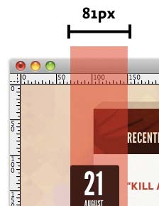
FIG 2.25: We need to draw
that date out to the left by 81px. Or, you
know, the relative equivalent thereof.
.date {
float: left;
margin-left: -81px;
width: 69px;
}
But hey: we haven’t used a single pixel yet, and we’re not about to
start now. Instead, we want to express that margin in relative terms, just
as we did with our pull quote. It’s going to be a negative margin, but
that doesn’t change the math. We still want to express our target
value—that 81px-wide margin—as a percentage of
474px, the width of the date’s containing element:
81 ÷ 474 = .170886076
Do the decimal shift and slap a minus sign on there, and we’ve got our proportional, negative margin:
.date {
float: left;
margin-left: -17.0886076%; /* 81px / 474px */
width: 14.556962%; /* 69px / 474px */
}
Now sit back, relax, and take comfort in the fact that you’ve built your first fully flexible grid (FIG 2.26). I feel a high five coming on.
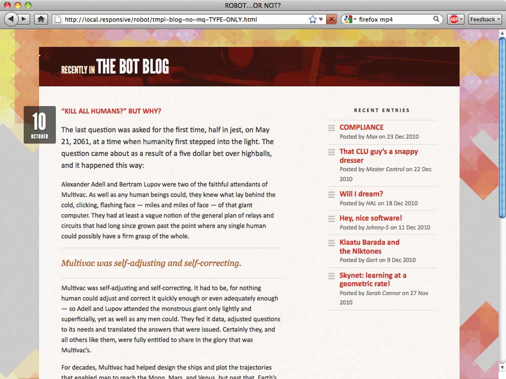
FIG 2.26: Our flexible grid is finally finished. Not a pixel value in sight, and we didn’t have to skimp on the aesthetics.
Moving forward, flexibly
I realize I just subjected you to a truckload of division signs. And as someone who gets headaches from balancing his checkbook, believe me: I sympathize.
But building a flexible grid isn’t entirely about the math. The
target ÷ context = result formula makes it easy to articulate
those proportions into stylesheet-ready percentages, sure—but ultimately,
we need to break our habit of translating pixels from Photoshop directly
into our CSS, and focus our attention on the proportions behind our
designs. It’s about becoming context-aware: better
understanding the ratio-based relationships between element and
container.
But a fluid grid is just our foundation, the first layer of a responsive design. Let’s move onto the next step.