
When you look up close at iPhone native and Web applications and compare their functionality, you will begin to see design patterns in how information is presented to a user. A list is presented this way. A page of menu options is presented that way. Some apps may break the rules, but by and large, applications follow common "look and feel" guidelines because they know users expect and rely on a consistent and intuitive way to perform a task.
To achieve that consistency and to avoid reinventing the wheel, developers often turn to application frameworks. In the generic sense, an application framework is a toolkit that you can use to implement a standard structure for an application for a given platform. Windows programmers utilize the Windows Software Development Kit (SDK) for creating apps for that desktop platform. So, too, developers writing native iPhone apps use the iPhone SDK.
In contrast, the Web development space often has been a virtual free-for-all, with each developer or shop coming up with its own toolkit to develop Web applications. Some programming languages may have application frameworks, but often these are designed for server-side issues, not for constructing the look and feel of an application over the Web.
As I've talked about already in this book, an iPhone Web app should be thought of from the ground up more along the lines of a native app than simply a Web site that users access from their iPhones. As such, the consistency and structure of an application framework can be extremely useful to the iPhone Web app developer.
In this chapter, I'll survey three popular freely downloadable iPhone Web app application frameworks that you should evaluate and consider adding to your toolkit. These include iWebKit, iUI, and UiUIKit. I cover each of them in slightly different detail. I spend the most amount of time with iWebKit as it offers considerable functionality and features. I introduce you to iUI, but explore it more in several chapters throughout this book. UiUIKit is less a framework than a set of HTML templates, so I provide an overview of its functionality.
Each of these frameworks gets to the same end—an iPhone UI—but does so using different techniques. Once you see each of these frameworks lined up against each other and compare their functionality differences, you can decide which one best suits your programming style and feature needs.
License: GNU
iWebKit may not have been the first iPhone Web app framework available, but it has grown in popularity and maturity since its release. iWebKit consists of a CSS style sheet, a JavaScript script file, and a set of common UI images that you can utilize in your app. The style.css and function.js files come in compressed and uncompressed versions, enabling you to use the uncompressed version for testing and then pointing your app to the compressed version when you are ready to deploy.
iWebKit divides the UI into different div elements for the top bar, content area, footer, and other block regions. You then assign a specific id to the div to classify it as a specific type of UI element. Side-to-side menu navigation is structured using ul lists and span elements for headings. Within each li menu item, you define its link destination as well as other enhancements, such as an icon, arrow indicator, and special comments.
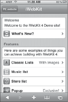
Figure 3-1 shows a page created using the iWebKit framework that takes advantage of many of its core features for a side-to-side navigation page. I will dive into the code that is used to create this page.
Along with standard iPhone Web app meta tags, every iWebKit-enabled page must include references to its CSS style sheet and JavaScript file in the document head:
<meta content="yes" name="apple-mobile-web-app-capable" />
<meta content="minimum-scale=1.0, width=device-width, maximum-scale=0.6667,
user-scalable=no" name="viewport" />
<link href="css/style.css" rel="stylesheet" type="text/css" />
<script src="javascript/functions.js" type="text/javascript"
language="JavaScript" ></script>
You'll incorporate several elements of the UI regardless of the application type or style. These are shown here.
The top application bar of an iPhone Web app is typically used to display the title of your app/page and provide one or more "rabbit trail" buttons for navigating the app. To define the top bar, use the following div definition:
<div id="topbar"></div>
Inside of the top bar, you add a title:
<div id="topbar">
    <div id="title">iWebKit</div>
</div>
Then you add a navigation button:
<div id="topbar">
    <div id="title">iWebKit</div>
    <div id="leftbutton">
      <a href="http://iwebkit.net">PC website</a>
    </div>
</div>
The id="leftbutton" specifies a single left button to include on the top bar. You can also use id="rightbutton" to add a single button to the right side of the top bar.
Alternatively, you can add multiple navigation buttons to the top of a page by using either <div id="leftnav"></div> or <div id="rightnav"></div>. Multiple buttons enable you to achieve "rabbit trail" functionality, providing hierarchical links above or below the current page in the app. For example, notice the navigation for the page shown in Figure 3-2.
The following HTML was used to define the top bar shown in Figure 3-2:
<div id="topbar">
    <div id="leftnav">
        <a href="index.html"><img alt="home" src="images/home.png" /></a>
        <a href="list.html">Lists</a></div>
    <div id="rightnav">
        <a href="storelist.html">Store list</a>
    </div>
</div>
If you do plan to use multiple navigation buttons, you should avoid using a title tag, or you run a high risk of running out of real estate on the top bar.
The content region serves as a container for the main elements of a page. It is defined using the following tag:
<div id="content"></div>
Inside of the content tag, you can define several elements, depending on your needs.
The content region of the page shown in Figure 3-1 contains two menus, each of which is contained inside a white box container. The box container is added using a ul element:
<ul class="pageitem"></ul>
Inside this container, you can add different types of elements. These elements are li tags identified by their class name.
You can add labels or descriptive text using the following tag:
<li class="textbox"></li>
You can add a single line of text or multiple paragraphs inside the text box. For example:
<li class="textbox">
    <p>Description:</p>
    <p>This app does this and that...</p>
</li>
You can also add standard HTML content inside a text box. Figure 3-3 shows a text box containing a bulleted list. Here's the code for that:
<ul class="pageitem">
<li class="textbox">
<ul>
<li>Popup now fully fullscreen compatible.</li>
<li>Now the blue store list background loads only when it is needed,
not always.</li>
<li>Footer font styles now apply to the footer div not only the link
in it.</li>
<li>Automatic "load 10 more" in list and musiclist views.</li>
<li>New wordpress icon.</li>
<li>Various bug fixes and enhancements.</li>
</ul>
</li>
</ul>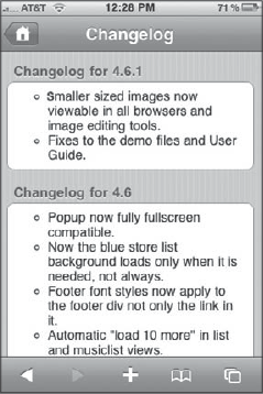
A blue header can be included inside a text box by surrounding the header content with the following:
<span class="header"></span>
That's what defines the Welcome header in Figure 3-1. As you can see, the heading is put in its own paragraph and then defined with the span:
<li class="textbox">
    <span class="header">Welcome</span>
    <p>Welcome to the iWebKit 4 Demo site!</p>
</li>
Menu items are at the heart of the navigation scheme of most iPhone apps. To define a text-only menu item inside a content box, use the following:
<li class="menu">
    <a href="goto.html">Menu item 1</a>
</li>
To add a bolded look to the menu item:
<li class="menu">
    <a href="goto.html">
        <span class="name">Menu item 1</span>
    </a>
</li>
To add an icon to the menu item, add an img tag inside the link:
<li class="menu">
    <a href="goto.html">
        <img alt="Description" src="thumbs/menuitem1.png" />
        <span class="name">Menu item 1</span>
    </a>
</li>
If you add an icon image, be sure it is a maximum of 32 pixels in height.
To add an arrow to the right-side:
<li class="menu">
    <a href="goto.html">
        <img alt="Description" src="thumbs/menuitem1.png" />
        <span class="name">Menu item 1</span>
        <span class="arrow"></span>
    </a>
</li>
The code that follows creates the What's New menu item shown in Figure 3-1:
<li class="menu">
<a href="changelog.html">
<img alt="changelog" src="thumbs/start.png" />
<span class="name">What's New?</span>
<span class="arrow"></span>
</a>
</li>You can also add special blue highlight text to insert a brief comment between the menu item and the right side arrow. The comment can call attention to the item ("Exclusive!") or can describe what users can expect to see if they select that option ("With Images"). Figure 3-4 shows a menu list in which three items add comments.
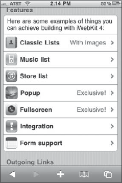
To add a comment, use a <span class="comment"></span> tag:
<li class="menu">
    <a href="list.html">
        <img alt="list" src="thumbs/contacts.png" />
        <span class="name">Classic Lists</span>
        <span class="comment">With Images</span>
        <span class="arrow"></span>
    </a>
</li>In the previous section, I showed you how to add a blue header inside a content box container. You can also add a gray header outside a content box. To do so, add the following as a direct child under the <div id="content"> element:
<span class="graytitle">Features</span>
Refer to Figure 3-1 to see an example of the gray header in action.
You can add a footer to the bottom of a page with the following declaration:
<div id="footer">
    <a href="http://iwebkit.net">Powered by iWebKit</a>
</div>
The footer div should be placed as a direct child of the body tag to get the gray-text-on-background look shown in Figure 3-5.
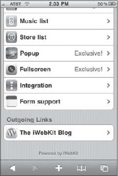
Using the elements described in this section, you can create a basic iPhone side-to-side menu navigation page, such as the one shown in Figure 3-1.
Besides the normal pages you can construct using the common UI elements described earlier, iWebKit features two special page types. However, when using them, you must follow their guidelines for the elements allowed in them.
iWebKit allows you to create a simple list with optional groupings, such as the page shown in Figure 3-6. The advantage of the simple list is that the paging logic is built into the page type, allowing you to define the content and let iWebKit determine its pagination simply by adding an autolist element.
To convert a normal page to a simple list page, add a class="list" attribute to the body tag:
<body class="list">
</body>
You should insert top bar, content, and footer divs into the body, just like any other iWebKit page. However, inside the content div, you'll want to define a special type of ul list:
<div id="content">
    <ul class="autolist">
    </ul>
</div>
All the content inside the ul should (naturally) be li items. The item itself can contain text and images and can contain links or static text.
The autolist class enables you to take advantage of iWebKit's automatic pagination, which I explain later in this section.
A normal list item text link looks essentially identical to the menu item described in the previous section:
<li>
    <a href="index.html">
        <span class="name">Go Home</span>
        <span class="arrow"></span>
    </a>
</li>
Because the li is contained inside the ul autolist, you don't need to identify a class for the li. A link, bolded item text, and right arrow are defined inside the item.
Here's an example of a more complex list item that uses familiar elements (such as an image and comments). However, the simple list page formats them differently. Here's the code used for the Buy Album on iTunes item in Figure 3-6:
<li class="withimage">
    <a class="noeffect" href="http://itunes.apple.com/WebObjects/
    MZStore.woa/wa/viewAlbum?id=130244757">
        <img alt="test" src="pics/californication.jpg" />
        <span class="name">Buy Album on iTunes</span>
        <span class="comment">Californication</span>
        <span class="arrow"></span>
    </a>
</li>
The list item expands to fit the size of the image. Also note that the comments are listed below the item text and displayed in a smaller, grayed font.
You may want to present information in a list structure that doesn't need hyperlinks. If so, just get rid of the <span class="arrow"></span> tag and then change the a link to simply be <a class="noeffect"></a>. For example:
<li>
    <a class="noeffect">
        <img alt="test" src="pics/milk.jpg" />
        <span class="name">Buy Milk</span>
        <span class="comment">Check the date</span>
    </a>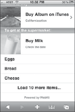
</li>iPhone UI conventions hold that if you are displaying a list of 10 or so items, it is fine to display them in a single one-page list. However, if you have 30 to 50 or more possible items, you'll want to break up the list into manageable chunks on the page. The logic to carry this out is not rocket science, but it sure is nice to have a framework do it for you. iWebKit does not disappoint; you can add pagination to your simple list by adding class="autolist" to the ul container and then the following line at the end of the list:
<li class="hidden autolisttext">
     <a class="noeffect" href="#">Load 10 more items...</a>
</li>
When you add this, iWebKit automatically splits up the list into multiple pages and adds the notification message you specify at the bottom (see Figure 3-7). When a user clicks the Load 10 more items link, iWebKit replaces the existing list contents with the next 10.
When you are dealing with a longer list of items, you may want to split up the list into multiple groups. To add a title to these subgroupings, use the following item:
<li class="title"> </li>
Figure 3-6 shows three group titles defined: navigation, Music to buy, and To get at the supermarket.
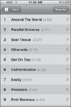
A second special type offered by iWebKit is the Music list type, as shown in Figure 3-8. This page is structured as a two-column list, much like you could use to display a list of songs on an album. However, you can also use it for a variety of other purposes.
You define a music list page by adding the following class to the body tag:
<body class="musiclist"></body>
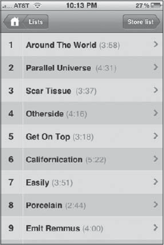
Much like the simple list, you can add a top bar, content region, and footer inside the body. Inside the content div, you define the following ul tag as a direct child of it:
<div id="content">
    <ul class="autolist">
    </ul>
</div>
The class="autolist" attribute specifies automated pagination.
Each item in a music list can have four fields of information: number, name, time, and link arrow. These are defined using spans, as shown here:
<li>
    <a class="noeffect" href="">
        <span class="number">1</span>
        <span class="name">Around The World</span>
        <span class="time">(3:58)</span>
<span class="arrow"></span>
</a>
</li>iWebKit provides support for styling form elements to emulate the look of iPhone form controls. To specify a form element, enclose the following within a special li tag:
<ul class="pageitem">
    <li class="form"></li>
</ul>
Inside the <li class="form"></li> tag, you can then specify different form elements.
To define a large text field, use an <input type="text"> tag:
<li class="form"><input placeholder="Name" type="text" /></li>
The placeholder attribute value is added as grayed text in the text box. When the user clicks in it, the placeholder text disappears.
To define a large password field, use an <input type="password"> tag.
<li class="form"><input placeholder="Password" type="password" /></li>
Like any password field, Safari substitutes dots for the characters that the user displays.
Figure 3-9 shows the large text and password fields.
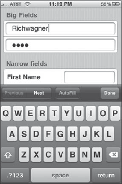
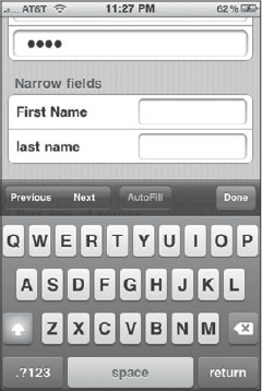
To define a narrow text field with a label before it, use the <span class="narrow"> tag combined with the <span class="name"> tag.
<li class="form">
    <span class="narrow">
        <span class="name">First Name</span>
        <input type="text" />
    </span>
</li>
Figure 3-10 shows the results.
You can create several other controls in a similar fashion. To define a text area, add a textarea inside of a <li class=textbox"> tag:
<li class="textbox">
    <textarea name="TextArea">Add your text here</textarea>
</li><li class="form">
<span class="check">
<span class="name">Label</span>
<input name="remember" type="checkbox" />
</span>
</li>Users can't slide these yes/no controls, but pressing them toggles between the two values.
You can define a set of radio buttons by enclosing a set of radio inputs inside a ul container and assigning the same name attribute value for the input tags. When you do so, a user can select a mutually exclusive option from the set. Here's how you can define a three-option radio button set. (Note that the common name for the input name values is music):
<ul class="pageitem">
    <li class="form">
        <span class="choice">
            <span class="name">option1</span>
            <input name="music" type="radio" value="other" />
        </span>
    </li>
    <li class="form">
        <span class="choice">
            <span class="name">option2</span>
            <input name="music" type="radio" value="Metal" />
        </span>
    </li>
    <li class="form">
        <span class="choice">
         <span class="name">option3</span>
         <input name="music" type="radio" value="Metal2" />
      </span>
    </li>
</ul>
Figure 3-11 shows the check box and radio option groups.
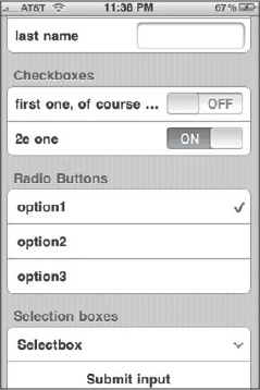
To create a select drop-down group, simply define an HTML select element and stuff it inside an li tag:
<li class="form">
    <select name="select">
        <option value="1">option1</option>
        <option value="2">option2</option>
        <option value="3">option3</option>
        <option value="4">option4</option>
    </select>
</li>
As you can see by now, there is a clear pattern for several form elements: define an HTML form element and place it inside an <li class="form"> tag. Here are additional examples:
Submit button:
<li class="form">
    <input name="Submit" type="button" value="submit" />
</li>
Reset button:
<li class="form">
    <input name="Reset" type="button" value="reset" />
</li>
Button:
<li class="form">
    <button name="button1">OK</button>
</li>One of the real innovative capabilities of iWebKit is that it enables you to create popup dialog boxes that emulate native iPhone dialogs (also known as action sheets) and are more sophisticated than the typical JavaScript alert box.
You define a popup dialog by using the <div class="popup"></div> tag. You should add this tag outside of the <div id="content"> as a direct child of the body, but place all popup definitions before the <div id="footer">. Here's a sample popup dialog:
<div id="popup1" class="popup">
    <div id="frame" class="confirm_screen">
    <span>popup example</span>
        <a href="index.html">
            <span class="gray">Home</span>
        </a>
        <a href="storelist.html">
            <span class="red">Previous feature</span>
        </a>
        <a class="noeffect" onclick="iWebkit.closepopup(event)">
<span class="black">Cancel</span>
</a>
</div>
</div>The <span> defines dialog box text, whereas the remaining a link definitions define different button styles: gray, red, and black. Figure 3-12 shows the dialog displayed in Safari.
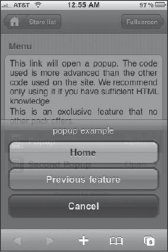
To call this dialog, you need to add an onclick handler to a link tag:
<a class="noeffect" onclick="iWebkit.popup('id')">When the link is clicked, the popup() method of the iWebKit object is called. The id parameter specifies the id of the div that defines the popup.
Table 3-1 provides a summary of all the major UI elements that can be defined using iWebKit.
Table 3-1. iWebKit UI Elements
Component | HTML Code |
|---|---|
Top bar |
|
Top bar title |
|
| |
| |
<div id="leftnav">
    <a></a>
    <a></a>
     ...
</div> | |
<div id="rightnav">
    <a></a>
    <a></a>
     ...
</div> | |
Content region |
|
Content box |
|
Text box |
|
Text box header |
|
Menu item | <li class="menu"> <a>Menu item</a> </li> |
Menu item with icon | <li class="menu"> <a> <img /> Menu item </a> </li> |
<li class="menu"> <a> Menu item <span class="arrow"></span> </a> </li> | |
<li class="menu"> <a> Menu item <span class="comment"></span> </a> </li> | |
Gray content header |
|
Footer | |
Simple list page type | <body class="list"> </body> |
Simple list group heading |
|
<li> <a> Menu item <span class="arrow"></span> </a> </li> | |
<li class="withimage"> <a> <img /> <span class="comment">Comment</span> <span class="arrow"></span> </a> </li> | |
Music list (2-column) page type |
|
Large text form field | <li class="form"> <input placeholder="Name" type="text" /> </li> |
Large password form field | <li class="form"> <input placeholder="Password" type="password" /> </li> |
Narrow text field with labels | <li class="form"> <span class="narrow"> <span class="name">Label</span> <input type="text" /> </span> </li> |
Check box | <li class="form"> <span class="check"> <span class="name">Label</span> <input name="remember" type="checkbox" /> </span> </li> |
Radio button group | <ul class="pageitem"> <li class="form"> <span class="choice"> <span class="name">Label</span> <input name="radiogroup1" type="radio" value="myvalue" /> </span> </li> ... </ul> |
Select list | <li class="form"> <select name="select"> <option value="1">option1</option> ... </select> </li> |
Text area | <li class="textbox"> <textarea></textarea> </li> |
Submit button | <li class="form"> <input name="Submit" type="button" value="submit" /> </li> |
Reset button | <li class="form"> <input name="Reset" type="button" value="submit" /> </li> |
Button | <li class="form"> <button name="button1">OK</button> </li> |
Popup dialog | <div id=" " class="popup"> <div id="frame" class="confirm_screen"> </div> </div> |
Home URL: code.google.com/p/iui/
License: New BSD
iUI is the granddaddy of iPhone Web app frameworks. Introduced by developer Joe Hewitt soon after the original iPhone launch, it was the framework of choice for all early adopters. Joe eventually stopped working personally on the iUI framework, but he opened it as an open source Google code project.
iUI offers less special features than either iWebKit or UiUIKit, opting to focus on clean side-to-side navigation pages, destination pages, and core UI controls. And, as you'll see in the walkthrough, it provides automated control over parts of the app.
Figure 3-13 shows a demo app built using iUI. As I begin to explore the iUI code that drives the app, you'll begin to see the similarities and differences that iUI has compared to iWebKit.
One of the unique aspects of iUI is that screens or pages displayed in an iUI app are HTML fragments; for example, a menu page is a ul element, and a destination page is a div. You can house these HTML fragments inside a single HTML file, or you can separate them into separate files. However, if you separate them into separate files, be sure you don't reference normal HTML files (with an html, head, and body). Instead, the file should contain just the HTML element that represents the page.
To enable the iUI framework for a page in your Web app, you'll want to reference its CSS style sheet and JavaScript file in the document head:
<meta content="yes" name="apple-mobile-web-app-capable" />
<meta name="viewport" content="width=device-width; initial-scale=1.0;
maximum-scale=1.0; user-scalable=0;" />
<link href="iui/iui.css" rel="stylesheet" type="text/css" />
<script src="iui/iui.js" type="text/javascript" language="JavaScript"></script>
Once you have these declarations added, you are ready to begin defining the different parts of the interface.
The top bar of the page is called a toolbar in iUI lingo. You can add one by defining a div and assigning it the toolbar class:
<div class="toolbar">
</div>
Each "screen" of the Web app defined inside the HTML file utilizes the same toolbar.
A top bar title can be added to the div by defining an h1 tag with a pageTitle id:
<h1 id="pageTitle"></h1>
Don't place content in the page title, because iUI adds that automatically for you for each screen.
For a left-aligned Back button, add the following:
<a id="backButton" class="button" href="#"></a>
iUI keeps track of the pagination order, so leave the href defined as href="#".
You can add a right-side action button to the top bar by defining an a link with the class button:
<a class="button" href="#searchForm">Search</a>
This button, which appears on each screen, points to a #searchForm section that I'll define shortly.
Combined, the application-wide top bar looks like this:
<div class="toolbar">
    <h1 id="pageTitle"></h1>
    <a id="backButton" class="button" href="#"></a>
    <a class="button" href="#searchForm">Search</a>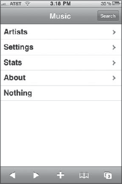
</div>Each screen (or page) is defined as a ul list, with each menu item as separate list items. Here is the code used for the main screen of the app shown in Figure 3-13:
<ul id="home" title="Music" selected="true">
    <li><a href="#artists">Artists</a></li>
    <li><a href="#settings">Settings</a></li>
    <li><a href="stats.php">Stats</a></li>
    <li><a href="http://code.google.com/p/iui/" target="_self">About</a></li>
    <li>Nothing</li>
</ul>
The title attribute of the ul is placed in the top bar title. Each list item defines a link that can point to another ul list, another HTML file, or an external URL.
To link to another ul section in the same file, add a # and its id. For example, the first list item links to the <ul id="artists"></ul> element (which is defined later). If you reference a ul in a separate HTML file, link to the file itself.
iUI automatically adds right-aligned arrows to each menu item.
A listing page (much like directory listing inside the native Contacts app) can be defined much like the previous screen:
<ul id="artists" title="Artists">
<li class="group">B</li>
<li><a href="#TheBeatles">The Beatles</a></li>
<li><a href="#BelleSebastian">Belle & Sebastian</a></li>
<li class="group">C</li>
<li><a href="#CrowdedHouse">Crowded House</a></li>
<li class="group">J</li>
<li><a href="#JennyLewis">Jenny Lewis</a></li>
<li><a href="#JohnMayer">John Mayer</a></li>
<li class="group">Z</li>
<li><a href="#Zero7">Zero 7</a></li>
</ul>You can add group headings by assigning a list item with the group class. Four group headings are defined in the preceding list. Figure 3-14 shows the list displayed inside Safari on iPhone.
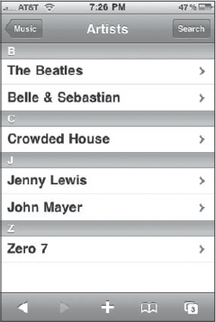
Notice that iUI updates the text and link of the Back button to point to the page that linked to it.
iUI provides a basic level of form controls, such as the ones shown in Figure 3-15.
Consider how this page is constructed using the iUI framework. The destination "panel" page is defined using the following definition:
<div id="settings" title="Settings" class="panel">
</div>
As with the menu page, the title attribute is used for the top bar title. The panel class gives the page its striped background.
Inside a destination page, you can define a heading using an ordinary h2 tag:
<h2>Playback</h2>
A rounded corner box is defined with a fieldset tag. For example, the next code defines a fieldset. Inside of it, it defines two divs that define toggle buttons:
<fieldset>
    <div class="row">
        <label>Repeat</label>
        <div class="toggle" onclick="">
            <span class="thumb"></span>
            <span class="toggleOn">ON</span>
            <span class="toggleOff">OFF</span>
        </div>
     </div>
     <div class="row">
        <label>Shuffle</label>
        <div class="toggle" onclick="" toggled="true">
            <span class="thumb"></span>
            <span class="toggleOn">ON</span>
            <span class="toggleOff">OFF</span>
        </div>
     </div>
</fieldset>
The <div class="row"> defines a row inside a fieldset that can contain different types of elements or controls. In this example, it contains a label and a toggle button.
As you can see from the code, the toggle button is not defined with a single element, but through a div container and a set of spans that are stitched together by iUI to create the control.
The second fieldset follows a similar pattern, except standard text input elements are defined:
<h2>User</h2>
<fieldset>
    <div class="row">
        <label>Name</label>
        <input type="text" name="userName" value="johnappleseed" />
    </div>
    <div class="row">
        <label>Password</label>
        <input type="password" name="password" value="delicious" />
</div>
<div class="row">
<label>Confirm</label>
<input type="password" name="password" value="delicious" />
</div>
</fieldset>Table 3-2 summarizes the main iUI elements.
Table 3-2. Common iUI UI Elements
HTML Code | |
|---|---|
Top bar |
|
Top bar title |
|
| |
| |
Menu-based page |
|
Menu item |
|
Group item |
|
Destination panel page | <div id="id" title="pageTitle" class="panel"> </div> |
Destination page heading |
|
Rounded corner white box |
|
Row inside box container |
|
iUI is used in several examples throughout this book. Refer to these for more information on how to implement iUI in your apps.
Home URL: code.google.com/p/iphone-universal/
License: GNU General Public License v3
UiUIKit (Universal iPhone UI Kit) is more like a starter pack for creating iPhone Web apps, a set of customizable graphics and templates that you can then extend for your own purposes. Unlike iWebKit and iUI, it does not include a JavaScript library for performing certain tasks, such as pagination, or automatically performing some of the styling. However, it does support a truly impressive set of CSS styles to emulate a vast array of iPhone UI elements that go well beyond normal side-to-side navigation and basic destination pages.
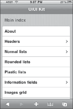
Figure 3-16 shows the main page of a sample UiUIKit app. Notice that its style, although similar, deviates slightly from iUI's more literal approach to Apple guidelines. In this section, I will show you the basic styles of UiUIKit and survey the special pages and elements you can re-create using this framework.
To use the UiUIKit framework in your Web app, you just need to reference its CSS style sheet file in the document head:
<meta content="yes" name="apple-mobile-web-app-capable" />
<meta name="viewport" content="width=device-width; initial-scale=1.0;
maximum-scale=1.0; user-scalable=0;" />
<link rel="stylesheet" href="stylesheets/iphone.css" />
Once you have this declaration added, you are ready to begin defining the different parts of the interface.
The top bar of an app is defined using a div with a header id:
<div id="header">
</div>
To add a page title, use an h1 tag:
<h1>UiUI Kit</h1>
A Back button is defined by adding a class and id attributes:
<a href="index.html" class="nav" id="backButton">Index</a>
Right-side action buttons are defined by specifying nav Action as the class name:
<a href="search.html" class="nav Action">Search</a>
You should define side-to-side menu navigation pages by adding an id of normal to the body tag:
<body id="normal"></body>
As with iUI, the actual menu is defined using a ul list along with child list items. For example, here's the HTML code used for the menu shown in Figure 3-16:
<ul>
    <li><a href="about.html">About</a></li>
    <li class="arrow"><a href="headers.html">Headers</a></li>
    <li class="arrow"><a href="normal-lists.html">Normal lists</a></li>
    <li><a href="rounded-lists.html">Rounded lists</a></li>
    <li><a href="plastic-lists.html">Plastic lists</a></li>
    <li class="arrow"><a href="info-lists.html">Information fields</a></li>
    <li><a href="images-list.html">Images grid</a></li>
    <li><a href="chat.html">Chat</a></li>
    <li><a href="forms.html">Forms</a></li>
    <li><a href="button-panels.html">Buttons Panel</a></li>

</ul>
As you can see, to add an arrow to the right of a menu item, you would add the arrow class to the li. Other than that, it looks like a standard HTML list.
To define highlight text on the right, add a <small> tag. For example:
<li><small>new!</small> <a href="normal-icon.html">Icon list</a></li>
You can also add extended ASCII characters inside the small tag to display symbols like stars and checkmarks.
UiUIKit does not stop there. It goes well beyond these standard side-by-side features and offers many more options.
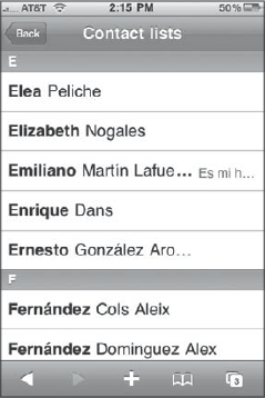
To create a contact list, with group headings and name emphasis, you can combine heading tags and ul lists for each subsection of the menu. Here's a snippet of HTML that makes up the contact list page shown in Figure 3-17:
<h4>E</h4>

<ul>
<li><a href="index.html">Elea <em>Peliche</em></a></li>
<li><a href="index.html">Elizabeth <em>Nogales</em></a></li>
<li><small>Es mi hermano</small> <a href="index.html">Emiliano
<em>Martín Lafuente</em></a></li>
<li><a href="index.html">Enrique <em>Dans</em></a></li>
<li><a href="index.html">Ernesto <em>González Aro...</em></a></li>
</ul>

<h4>F</h4>

<ul>
<li><a href="index.html">Fernández <em>Cols Aleix</em></a></li>
<li><a href="index.html">Fernández <em>Dominguez Alex</em></a></li>
<li><a href="index.html">Flavia <em>Olmedo</em></a></li>
<li><a href="index.html">Francesco <em>Esplugas</em></a></li>
<li><a href="index.html">Francisco <em>Perez Garzón</em></a></li>
</ul>
The only difference in code is the addition of the h4 group headings and the em tags to change the formatting for last names.
To add icons to the menu items, just add an img tag with a class="ico" attribute. For example, here's an icon menu:
<h1>Normal list with icons</h1>
<ul>
<li><img src="images/list-icon-1.png" class="ico" /> Example one</li>
<li><a href="normal-contact.html"><img src="images/list-icon-2.png"
class="ico" /> Example two</a></li>
<li><small>new!</small> <a href="normal-contact.html">
<img src="images/list-icon-3.png" class="ico" /> Example with label</a></li>
<li class="arrow"><a href="normal-content.html">
<img src="images/list-icon-4.png" class="ico" /> Example with arrow</a></li>
<li><a href="normal-metal.html"><img src="images/list-icon-5.png" class="ico" />
Metal list</a></li>
</ul>
Figure 3-18 displays this menu inside of Safari on iPhone.
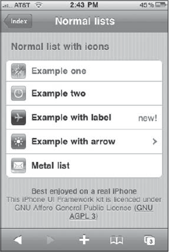
I did not mention it at the same time, but refer to Figure 3-18 for a moment. Notice that the menu is contained within a box, rather than being spread out from side to side. The reason for this is that the body tag did not have a id="normal" attribute added to it. Therefore, when a page has a plain body tag, the page is considered a destination page and is given the gray striped background.
You can define various elements on a destination page.
To define a heading on a destination page, use h1 as a direct child of the body:
<h1>Standard with content</h1>
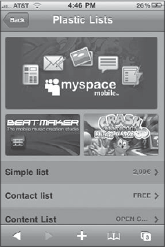
UiUIKit includes a page type that neither iWebKit or iUi does—something it calls a plastic page (see Figure 3-19). A plastic page loosely resembles the look of the iPhone App Store—changing both the page background and menu appearances. What's more, you can define image-based banners and mini banners.
To define a plastic page, you need to give the body tag a plastic id:
<body id="plastic"></body>
Large and mini banners can be defined, but you need to write some style definitions yourself. Here's the code for the banners shown in Figure 3-19:
<ul class="bigbanner">
<li class="one"><a href="index.html">Use this space as title tooltip</a></li>
</ul>

<ul class="minibanner">
<li class="one"><a href="index.html">Use this space as title tooltip</a></li>
<li class="two"><a href="index.html">Use this space as title tooltip</a></li>
</ul>
However, to reference the specific images, you need to add the following CSS code to the document head:
<style type="text/css" media="screen">
ul.minibanner li.one { background: url(images/banner-1.png) no-repeat; }
ul.minibanner li.two { background: url(images/banner-2.png) no-repeat; }
ul.bigbanner li.one { background: url(images/banner-3.png) no-repeat; }
</style>
Plastic lists are structured the same way as the previous side-to-side menu lists created earlier. Because it is on a plastic page, UiUIKit transforms its look for you automatically:
<ul>
<li class="arrow"><small>2,99?</small> <a href="normal-simple.html">
Simple list</a></li>
<li class="arrow"><small>Free</small> <a href="normal-contact.html">
Contact list</a></li>
<li class="arrow"><small>Open Source</small> <a href="normal-content.html">
Content List</a></li>
<li class="arrow"><small>35?</small> <a href="normal-metal.html">Metal list</a></li>
<li class="arrow"><a href="normal-metal.html">Metal list</a></li>
<li class="arrow"><a href="normal-content.html">Content List</a></li>
<li><a href="/flash/player_net9_20080425.swf?link=594&cate=2">Download</a></li>
</ul>
UiUIKit offers some additional styles for specific pages as well. See Figures 3-20, 3-21, and 3-22.
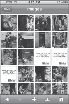
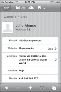
Table 3-3 summarizes the most commonly used components of UiUIKit.
Table 3-3. Common UiUIKit UI Controls
HTML Code | |
|---|---|
Top bar |
|
Top bar title |
|
| |
| |
Side-to-side navigation page |
|
Destination page |
|
Plastic page |
|
Navigation menu | <ul> <li></li> ... </ul> |
Menu item |
|
| |
<li> <small>Comment</small> <a href="url"></a> </li> | |
<li>
   <a href="url">
    <img src="" class="ico" />
    Label
   </a>
</li> | |
Group heading (side-to-side menus) |
|
Heading (destination page) |
|
In this chapter, I walked you through three popular iPhone web app frameworks that you can use with your iPhone web applications. iWebKit and iUI are full-fledged frameworks that can serve as the foundation for your web app. iWebKit is more feature-rich, while iUI aims to stick with standard side-to-side navigation and destination pages. UiUIKit is less of a framework than a set of styling templates that you can use as a basis for starting out with your app and as a way to avoid recreating the wheel on standard iPhone look and feel. Be sure to spend some time with each of these frameworks to determine which one is best for your particular needs.