
8
User Experience Testing
In the previous chapter, you learned about common error types: how to provoke them and how they should be handled. While there were some gray areas on how best to deal with error cases, most were clear-cut – errors should be identified as early as possible to give the most helpful feedback to the user. In this chapter, we will examine an area of testing with even more gray areas – user experience (UX) testing.
Not every feature will involve UX changes. Entire teams are often devoted to internal processing or external APIs, which function without human interaction. If you only work within one of these areas, then you can skip this chapter for now.
However, your product does have to interact with humans, even if only during its installation and setup. UX has a disproportionate effect on how the quality of your product is perceived; so, while it might appear like window-dressing compared to the main functions of your system, you can significantly improve the perceived quality of your product by focusing on this testing.
In this chapter, you will learn about the following topics:
- How to approach UX testing
- Testing interoperability
- Testing displays
- Optimizing text on user interfaces
- Localization and time zones
- Menus and information display
- Loading and user interaction
- Testing documentation
- UX during error conditions
- UX feedback
UX design is a fascinating area with a large and growing literature. This chapter only provides an overview of the key techniques and considerations, so for more information, please research further. We will begin by defining exactly what we mean by UX testing.
Defining UX testing
You should question the requirements throughout your testing process, checking whether they still make sense or whether there are better ways the same goals could be achieved. This is particularly the case in UX testing when there are many ways to present the information and controls. Still, not everything is in scope for your testing.
The colors the designers have chosen, whether the interface is skeuomorphic or abstract, the font they’ve chosen – none of those are the test team’s responsibility. There are two classes of such issues to check for. Firstly, you must check how easy it is to understand and interface. If fonts are hard to read or the colors make it hard to understand, those are problems that need to be fixed. Feel free to provide ideas and feedback on other aspects, but so long as your product reaches a minimum threshold of usability, trust your design team’s decisions.
Important note
Skeuomorphic user interface design mimics real-life objects. Early versions of Apple’s iPhone calendar app, for instance, had leather stitching around the edge and shaded buttons to make them look three-dimensional, as though you could press them. That’s as opposed to buttons with a constant color or a flat design.
Secondly, watch for consistency within the user interface. While a green or blue icon is fine, your product shouldn’t use green and blue icons randomly on different pages. This applies to products, too: if the fashion is for flat interfaces across your industry, you can question why your new interface is skeuomorphic.
Within those meta-requirements of being understandable and consistent, the design team has a broad scope to create interfaces. Your role as a tester is to point out anything that could be improved – anywhere you struggled to understand something or find what you were looking for, anywhere you could reach the same goal more quickly or easily. This chapter is filled with examples of common use cases to try on your product.
The subjectivity of UX testing means that raising UX bugs should be done politely and respectfully, even more than in other areas. Since there are often no clear answers, you will make suggestions rather than outright bug reports, and others may disagree. You should make your reports knowing that the developers and designers might have deliberately made the choices you are complaining about, and there may be different points of view. Unlike bug reports, where there is usually an obvious correct behavior, with UX, it’s often much easier to find problems than to design great solutions. Tact, discussion, and cooperation are vital.
If your company has the resources, you should conduct UX testing with real users to gain their feedback with genuine first impressions of your new feature. However, before you reach that stage, the internal test team should check the functionality, find improvements, and offer ideas. With those ground rules in place, next, we will describe the advantages and disadvantages of UX testing.
Advantages and disadvantages of UX testing
Unlike functional testing, where there are several different approaches to testing similar functionality, the areas of testing we will consider in this chapter – usability, security, and maintainability – each require specific considerations and find issues outside the core functionality of the feature or application. So, that is its first strength – by considering usability at all, you can discover a new class of issues:
|
Strengths |
Weaknesses |
|
Best way to detect this class of issue |
Mainly manual |
|
Can find blocking issues |
Subjective |
|
Directly affects users |
Difficult to predict what will cause problems for customers |
|
Costly to run usability studies |
Table 8.1 – Strengths and weaknesses of UX testing
The major strength of UX testing is that it is the best way to find usability issues. The specification might state that a particular function should exist, and it does, but only if you successfully navigate four layers of menus and select three unrelated options. It’s easy to hide features so that busy users never find them. After all the work has been done to implement a feature, UX considerations get it over the finish line so that users can use it in practice.
Far from being extra polish on a finished feature, UX concerns can require you to reconsider how entire features are implemented and presented. The sooner you find those issues, the sooner redesigning can begin.
Real-world example – Different kinds of muting
In the early days of video calling, we added a new feature to our product – the ability to mute other people during a conference. You could mute yourself on your video endpoint, or others in the conference could mute you. It was a significant feature to implement, but the idea sounded simple enough.
However, if you mute yourself for privacy reasons, others shouldn’t be able to undo that, so if you had locally muted yourself, only you should have the power to unmute. But if someone else had muted you, via a remote mute, they should be able to undo that. There were effectively two types of muting. How could we add that functionality without revealing that complexity?
We couldn’t, initially. After months of work setting up the protocol to communicate mute commands between different participants, we shelved the feature until we could work out how to present it to users.
UX testing can find blocking issues and should be prioritized accordingly, and it also directly affects your customer experience. Testing error cases, security, and maintainability are essential topics, but your customers won’t immediately see their effects. A hacking attempt will fail, or you’ll be able to find and fix a bug quickly, but from your users’ point of view, nothing will have changed. UX testing, in contrast, alters how your customers see your product.
The first disadvantage of UX testing is that it is primarily manual. Some can be automated – such as checking links on a web page or the behavior in different languages and on different screen resolutions. However, the more challenging part of UX testing is judging how others will understand your product, which requires a tester.
UX testing is far more subjective than other tests, which clearly show errors or how a product diverges from the specification. Just because one tester finds something obvious doesn’t mean your customers will, and vice versa. This can lead to debates about the correct implementation, which, while beneficial for examining the possible alternatives, also take time and resources. User interface reviews are vital for gathering opinions and ideas from the development team on the best way to present a feature. Even after those discussions, it is hard to pinpoint what customers will find surprising or confusing.
To find genuine customer reactions, you can conduct usability studies, although it requires significant effort to plan and run them and analyze their results. While they can provide valuable insights, you can only check a subset of your users, and their findings will never be complete.
Those are the weaknesses you need to be aware of and mitigate while you perform UX testing. First, we will consider the relationship between usability and the feature specification.
Understanding usability and the feature specification
You, and everyone on the development team, spend your working lives on this product and devote orders of magnitude more time thinking about it than your customers. They are teachers, entrepreneurs, or bankers who just happen to use your product, and if they can’t work out how to use it in 2 minutes, they’ll give up. They’ll complain your product is a piece of rubbish and get on with their actual job.
UX testing can be broken down into two different sections. First, you need to ensure that the product conforms to the specification – are the user-facing elements present, do they look correct, and is the text as described? This is objective and automatable – does the implementation match the specification? If a button is missing or the color is incorrect, that can be found and fixed.
More often, problems are due to the specification, which is the second class of issues. Your feature might be implemented and working perfectly and match the specification, but users will still find it hard to navigate and use. After all the work of adding a new feature, usability problems can still render it useless, such as if it is hidden away in a menu or keyboard shortcut that users can’t find. Usability is a vital part of customer-facing features.
You should review the specification as you do all forms of testing. Do these requirements make sense? Is there an easier way to achieve the same goal? Will this feature have undesirable flow-on effects? Ideally, you should have thought these through at the specification review, but it is never too late to raise them.
In UX testing, even more than in other areas, you should constantly review the specification. Is that the best place for a text box or a menu item? What did you find confusing? What is the best name for a new function? If you are in an organization large enough to have a dedicated UX team, they should have thought this through, but even then, there is always room for feedback and improvement. If developers or other non-specialists design the user interface, then your voice, as a tester, is just as valuable as theirs in determining the best outcome.
As a tester, you have the first view of a new feature as someone who is not closely involved in its design and implementation, so you have a unique perspective from which to comment. The naivety that helped you with exploratory testing is useful again here: how did you predict this feature will work, considering the product? If it behaves differently from your expectations, raise that as an issue. Of course, your naivety is far from perfect. As a member of the development team, you will have spent more time thinking about it than your customers ever will, increasing the importance of your findings. If you know the product well and still have trouble, your customers will likely fare even worse. Once you have acted as a newcomer, you can apply more knowledge using the techniques described here.
Feedback on the specification should be provided in a dedicated section of the feature specification review, as described in the next section.
Running UX reviews
The user interface presents so many possibilities, is so essential, and can generate so much discussion that it deserves its own review meeting. These follow the same guidelines as the main feature specification review, as specified in Chapter 3, How to Run Successful Feature Specification Reviews, although there are differences.
The guest list for the UX review should include the UX team, the developers, the project manager, and the testers working on the feature. The project manager and senior developers are still optional. This area benefits from multiple points of view, so make sure everyone can attend and is prepared to present their ideas. Having said that, from experience, it’s good to keep the guest list as short as possible; otherwise, having too many opinions can make these meetings take too long.
The timing for the UX review is also tricky. The developers should expect this meeting, or they may consider the interface finished when, in fact, the review is just starting. Like the specification review, the UX review should come after exploratory testing when an initial feature implementation is available for everyone to use. Seeing how a feature works in practice is especially important for UX testing.
The UX review aims to gauge users’ current expectations and how they will react to your changes. What do they already know? How far does this feature reuse existing designs and patterns, and how much is unique? How visible is the difference, and is that commensurate with this feature’s importance? Placing a new option on your home screen makes it very easy to find, but if only 1% of your users need it, 99% of people will see a more complex screen for no reason.
Judging your customers’ expectations is not an exact science, and debates in UX reviews can become heated. They are beneficial, however, so endeavor to keep them polite and respectful to gain the maximum benefits.
The best way to measure customer expectations is to perform usability studies so that you can watch a representative sample of users using your new interface. There are many options here, such as A/B testing, which involves offering two different views of a feature to see which has better usage, or recorded studies, where you video users trying to use a feature for the first time and check their response in detail. For more information, see the Running usability studies section. This research can provide fascinating feedback, but it is also slow and costly, only reaches a small subset of users, and explores only a few limited options out of all the possibilities. It may show where users have problems but not show how to solve them.
A theme we will return to throughout this chapter is that it’s far easier to say something is difficult to use than to propose a solution. Keep this in mind when raising usability issues. You can help the designers by suggesting improvements, but don’t be surprised if they aren’t implemented as you proposed. Usability studies are just the start of another round of design, implementation, and review to improve the interface.
Next, we will consider the two main use cases for any application: setup and ongoing usage.
Setup versus ongoing usage
Your product is likely to have two very different classes of user stories: those associated with setting the product up and those with its ongoing usage. In terms of total use, the ongoing cases vastly outnumber the setup ones – that is, unless you’re experiencing massive customer growth and turnover simultaneously.
Despite being the minority of interactions with your product, getting users onboarded takes a disproportionate amount of design time relative to other features. When first using your product, users will know the least but also have some of the most challenging tasks to perform around getting your product ready. Unless they can overcome that barrier, they’ll never become regular users.
You should devote similar proportions of time to testing onboarding tasks as setup tasks. On the plus side, this form of testing needs very little test data or equipment. The whole point is that you are a new user with no prior history with the product. Your challenge will be faking a clean installation. You will likely have installed your product hundreds of times or run through those same setup steps. Are they only working this time because you have performed them before?
This means the first step to testing product setup is ensuring you can fully uninstall your product or create an entirely fresh account. To correctly test signup, you’ll need to make sure your system is representative of a non-user. Does your uninstaller remove all the registry keys, all the directories, and all the configurations associated with your product? If not, you need to know the details of the installation so that you can perform the extra uninstall steps and check that they’ve been done.
Real-world example – A whole new node
At one place I worked, we ran a private cloud infrastructure that we maintained and expanded ourselves. Our latest release was running happily, and business was good, so we set up new locations to handle the future load.
Unfortunately, the installation failed. The same hardware and software version we were using was taking live traffic across the rest of the cloud, but despite them being identical, in this new location, they failed.
On investigation, a change we had made to one of the libraries had gone wrong, and a file was missing. So long as you upgraded from the previous version, you used the old file, and the system worked. However, new installations didn’t have the file and could never start.
Whether the installations are internal or external, make sure they are part of your test plan for all your supported environments and configurations.
For UX, a driving principle is that, as Mies van der Rohe said, “less is more.” You’re aiming to let users achieve their goals in as few steps and as few clicks as possible, and those should be clear. The difficulty is that making one task more obvious, by putting an option on your home screen, for instance, makes other tasks less prominent by making the home screen more complicated. Putting a thousand buttons on your home screen means that all those functions are just one click away, but it doesn’t give the best UX.
Step through the onboarding journey while looking for any steps you can prune. Every piece of information a user needs to provide is a little barrier to them using your service. What can you put off and collect later when the system is running? Stick strictly to the shortest route to make your service usable.
How much knowledge do you need your users to have? Don’t rely on anything. Even if they have personal information such as ID numbers or details, they may not have them to hand. Let users enter information in whatever order they want. This will create more work for the development and test teams – more options for the user means more internal states to handle and more code paths to test. However, this work is well worthwhile as it makes for a great UX.
For instance, you can still find examples of search boxes that require you to select which entity you are searching for: usernames, customer names, ID values, and so on. Compare Twilio’s search box, where we are searching for a number, to Google’s home page:
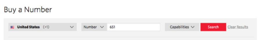
Figure 8.1 – A Twilio search box
Here is the Google home page:
Figure 8.2 – Google’s famously sparse home page
Every piece of information you require from a user is a chance for them to get it wrong. It’s much better for the user if the application accepts all possibilities and works out what to search for, even though it will take more effort from the development team to code and for you to test. Balance those costs, but look out for similar opportunities in your application where you could ask less of the user and do more within the program.
Finally, during the onboarding journey, look for any knowledge you require from the user. Do they have to know a setting is under a particular menu, or what step they need to take next? Setup wizards and similar systems are designed to solve these problems by guiding users through the necessary steps. If your product doesn’t have one, that is an important addition. Don’t rely on documentation – build the signup sequence into your product.
Having logged in and got the product working, you can start looking for common issues with the user interface.
Testing the user interface’s look and feel
The watchword for the look and feel of any interface is consistency – a small set of colors, fonts, and styles should be used throughout. Or, to return to the theme of this chapter: less is more. Fewer designs and colors provide a better experience for users.
As a tester, you can check that consistency. Do new pages use the correct company colors? Does the text use a consistent font that’s a uniform size? Are the buttons and links the same size and design as others? If there is a genuinely new element, does it use the same style as others in a new way?
Typically, adding new features simply involves extending the styles already in use, but every so often, there is a project to rebrand a product. Due to the amount of work and the marginal gain this involves, I’ve only seen it done when absolutely necessary.
Real-world example – The corporate takeover
One successful company where I worked was bought out by a larger competitor. They were great, and the takeover was a success, but one of the main changes it involved was rebranding. All the logos, all the names in all the documentation, and all the web pages had to change. Copies of our logo had been everywhere, but we purged them all.
The one place our name remained was in the messages we sent via our API. We supported standards-based messaging, and each product reported its version and manufacturer in its messages. We read that information and sometimes changed our behavior based on who they were. Since they might have done the same, we had to keep advertising our old name, just in case that broke anything. Changing everything else, however, was a considerable project.
The punchline? Just as we finished and got everything updated, we were taken over by an even larger competitor and had to rebrand all over again.
If you’re in a large company, there will be a design team responsible for keeping user interface elements consistent and designing new ones to go along with them. Then, you only need to check that the implementation matches their designs and that those designs make sense and are easy to use for you.
Check all the visible functionality. Standard tests should press every button and check every link. That is the simple, objective part of usability testing, and it’s easy to calculate the percentage coverage and automate it. As well as the complex, subjective tests listed here, ensure those fundamentals are also complete.
So long as your user interface is clear and consistent and works on at least one device, you can expand your testing across the full range of platforms your product supports. This process, known as interoperability testing, will be described next.
Interoperability
Picture this scene: you’ve designed a beautiful website or app that is clean and straightforward to use with a clear flow between tasks and provides all the complex functionality of your application at your users’ fingertips. This would be excellent, except it doesn’t load on their device.
There will always be a wide variety of operating systems and web browsers being used and supported at any time, with a spread of percentages from new to old and between competitors. Which platforms and versions does your application support? That’s the first interoperability question and will depend on the variety of versions your users are using. The product owner needs to trade off the technical effort of supporting those versions against the importance of those customers. You might include a version because many customers use it or because there’s a smaller number of highly important clients. Whatever the reason for their inclusion, as a tester, you need that list of versions you support so that you can try them all.
If you are testing a hardware appliance, you are spared these considerations and have the luxury of using an environment you control. You’ll just have to worry about different generations of your product and any component changes that might affect its behavior and performance.
There are far more software than hardware products, however, so if you are testing one of those, you’ll need to prepare for interoperability testing. In a large company, it may be worth running a lab with different systems, and there are external companies able to test on different platforms. From experience, running a lab can be costly in terms of both time and money and it’s a miserable task trying to keep old operating systems running correctly.
Real-world example – Juggling web browser compatibility
In one company where I worked, a customer reported being unable to add users. This came as a shock since no one else faced the same problem, and it turned out that they were using an outdated version of Firefox. It was so old that it was no longer officially supported, but it was the only version approved by the company’s IT team. They were such an important client that we had to provide a fix.
We removed the offending function call, and they provided an installer for us to test since it was no longer available. Our application passed regression testing and rapidly went live.
Then, a different set of customers reported issues. In fixing the old version of Firefox, we had broken an old version of Internet Explorer. While we had run regression tests, we hadn’t run the complete interoperability test plan. We made sure we included that for any future changes to our compatibility.
I recommend having two layers of interoperability testing: a sanity test that every build should pass and a more comprehensive set of tests to run when you have made changes that affect your interoperability. Within that extended test plan, look for any pages that are special or unusual within your websites such as WebRTC videos, embedded media, or any technologies not widely in use. Those are potential sources of bugs in general and interoperability bugs in particular.
As described in Chapter 5, Black-Box Functional Testing, you need to identify dependent and independent variables. Web browser and operating system interoperability are variables that interact with many others. If your test automation setup and time allows it, run those core tests on every version – for instance, creating, editing, and deleting a user.
With that test plan and the list of supported versions in place, you are ready to test and sign off the interoperability of your application. The last ongoing task is regularly reviewing the list of supported browsers and operating systems, removing old ones, and, more importantly, adding new ones. You should sign up for the beta programs of all operating systems and web browsers you work with to get an advanced warning of any compatibility problems. This will give you the chance to fix them before they are widely available.
Within each operating system, you need to consider the different displays it can work with since they will massively change the appearance of your product, as described in the next section.
Testing displays
A key variable in the user interface is the display showing your application. Whether high-resolution displays, mobile phones in different orientations, or web browsers that users can resize however they want, your application has to handle whatever it runs on. Again, if you’re testing a hardware appliance with a built-in screen, you have it easy with only a single possibility to try. Otherwise, there are many options you have to cover:
- Screen/window resolution:
- Maximum resolution
- Minimum resolution
- Aspect ratio:
- Landscape versus portrait
- Extreme settings:
- Tall and thin window sizes
- Short and broad window sizes
- Changing resolutions dynamically:
- Changing a phone screen from landscape to portrait and vice versa
- Resizing a web browser
- Second monitors:
- Using your application on a second screen
- Dragging the window from one screen to a second screen
- A second screen with a different resolution than the first
- Maximizing and minimizing the application:
- On a second monitor
I have seen bugs in all those areas at different times over the years. Some are more common than others – low-resolution screens can cause UI issues, for instance, but users would have to deliberately reduce the resolution on a modern screen to ever see them. Problems changing from landscape to portrait were incredibly rare until smartphones became ubiquitous.
Web pages need to be designed to work on both mobile and desktop screens in both landscape and portrait orientations. This is a challenging job for the UX team, so check whether it works. Even if it works on wide and narrow screens, does it work for resolutions in between?
Ideally, this testing should also be automated. Tools such as Chromatic are available to take snapshots of user interfaces and warn you about any unexpected changes as code is developed. By altering the viewport size, you can take a snapshot of how the screen is supposed to look at a range of resolutions, then rapidly check new releases are unchanged. While these tools can perform simple tests well, for more complex scenarios such as second monitors and dynamically adjusting screen sizes, you may need manual testing. Saving the hardest cases for manual tests keeps them as short as possible.
Sometimes, there is no neat way to display information when the screen is small or has a low resolution. The user interface has to make tradeoffs and remove some information, and there is no way for it to display everything. This may not be a bug as such. See the Comparing bugs to features section for other examples. In that case, work with the UX team to find out the desired behavior and what they are happy with, even if there is no good solution.
Scroll bars
Aim to limit your application’s use of scroll bars. Pages are much more usable if you can see all of them at once, although that requires careful design. Pages with lists can be paginated with search boxes, limited table widths, and text wrapping to ensure it fits into the available size. You’ll need to pick a minimum resolution to work within; anything bigger than that will also fit. Double scroll bars anywhere in your application are a sign of lazy design, and you can raise that as a bug.
Using touch screens
How well does your user interface work on a touch screen? Buttons you can distinguish with a mouse might be too close on a small phone screen. Pages often need to be completely redesigned, making them much simpler for those devices. If your company hasn’t got a dedicated UI for phones, you’ll need to check how usable your current interface is. If your application does have a dedicated interface for phones, that requires a separate test plan.
Not all touch screens are small, so also consider tablet or laptop touch screens. Are the elements readable, and are all the buttons accessible? There are different keyboard options when entering text; are yours appropriate? Multitasking abilities are limited on some hardware; does your application handle losing focus and being reactivated? Do you have an app design dedicated to larger screens?
Once you have tested the look and feel of your app and the screen it appears on, you can move on to the content of your user interface.
Choosing clear words
Clearly labeling your application avoids a host of user-related problems. Giving understandable names to options and buttons is harder than it looks, however, and if those are confusing, users will resort to tooltips and help text that also has to be written. At a basic level, you need to check that all the text is legible and displayed correctly, but the greater part of testing the words is to ensure they are as comprehensible as possible.
While technical writing is a topic I love (can you tell?), I don’t have space here to give an in-depth guide. As a tester, you won’t need to know every nuance, but there are certain checks that you can perform across many functions.
The first is simply consistency. If a group video call is referred to as a conference, then it should be a conference everywhere and not referred to as a meeting half the time. They may be synonyms as far as you’re concerned, but your application needs to pick one term and use it consistently. When an application reaches a certain size, and especially when two or more technical authors are working on the product, it’s vital to have a style guide to ensure they use the same terms and phrases throughout the application.
Certain words are difficult to translate into other languages and might confuse readers who aren’t native English speakers. I find this fascinating since wording that seems entirely equivalent to me appears very differently to novice speakers; for example, see the following:
- Once you have selected an option, then you can submit the change
- When you have selected an option, then you can submit the change
This is another example:
- The application may prompt you for your phone number
- The application might prompt you for your phone number
Once and when are used as synonyms, but when is more clearly about time and is easier to render in other languages. This is similar for may and might. While you can use either without changing the sentence’s content, might indicates the conditional more clearly. May has several other meanings that make it harder to understand.
As a tester, it’s not your role to design easy-to-understand language but look for any phrases you struggle with. Anything you need to read twice might cause far more problems for someone with less knowledge of English and your application. Again, use your naivety. Anything you have to try twice, anything you have to think about to understand – these aren’t your fault. They show that your application is not straightforward and needs more work.
Features should be carefully named to make them as straightforward as possible.
Real-world example – Struggling to find a name
I once worked on an obscure piece of functionality that changed the participants you would see in a video conference in different situations. We struggled to find a snappy name for it on the settings page and ultimately gave up. We named the options type 1 and type 2, and gave a longer explanation in the help.
Don’t do that. Even if the name isn’t perfect, always give your user some clue about what type 1 refers to, and provide a detailed description elsewhere.
Once the text in your native language has been chosen, reviewed, and agreed upon, then you can start working on the translations. These come with their own set of testing considerations.
Testing localization
Getting a feature to work in a single language is usually a challenge, but usability must also consider working in different languages and geographies. Translation bugs can be critical blockers – recall the example from Chapter 7, Testing of Error Cases, of a hardware unit that couldn’t boot when set to Danish. An error in rendering one of the variables in the string caused a critical issue, and we loaded the strings so early in the boot sequence that we couldn’t even upgrade them. It needed emergency intervention to fix. So, don’t underestimate the importance of translations and testing them well, even though they come with challenges. As with usability testing in general, there are both subjective and objective aspects to testing localization.
Objectively, all strings must have translations in place that render correctly. Remember to include both successful cases and error messages in your testing. When manually testing translations, it is a good idea to leave your product in the foreign language for an extended period when trying other features to see whether any issues appear in other situations. This provides much more comprehensive testing than only using translations when explicitly testing them.
Always check for the presence of translated strings, and test that they are displayed correctly. If your application is developed in English, then some languages, such as Mandarin, usually have fewer characters to represent the same string, which generally doesn’t cause problems. However, other languages, such as German, have longer word lengths, on average, which means the translated strings need more space. This might mean they are truncated or wrapped around, depending on the size of the text box they are in. The second objective test for translation is to ensure the user interface still looks correct in the other language.
Real-world example – It’s not what you say, it’s the way that you say it
In a video conferencing system I worked on, we used an external company to connect callers who dialed in by telephone. They would be greeted with a prompt welcoming them and asking them to enter their conference number, provided by a text-to-speech system. We sent the text and an automated system to a third party to read it out. As well as English, we supported a range of other languages and would send a message indicating the text and the language to be used.
Unfortunately, in one release, the French translation string was missing. We told the third party the text was French but sent English words. This resulted in us greeting our French customers in English, but with an insultingly thick French accent.
Presentation issues such as detecting text wrapping, pages looking incorrect in foreign languages, and problems in text-to-speech rendering are challenging to automate and may require a manual check.
Finally, on translations, you need to check the strings’ content. Even if the translated strings are present and rendered neatly, they may still have typos or be mistranslated. It’s best if you speak the language in question so that you can also comment on the quality of the translations and the presence of foreign text to avoid embarrassing omissions.
Real-world example – Half Mandarin
On one product I tested, we supported various languages and diligently tried them manually for each release. We verified that Mandarin characters were displayed for all our strings when set to the Chinese localization.
Unfortunately, we had introduced a bug in our Unicode rendering and only displayed every other character. Alternate characters weren’t shown at all, and the text was gibberish. Without someone who understood even basic Mandarin, we failed to spot that the strings were half the length they were supposed to be and had only checked for the presence of squiggly-looking letters.
String checking should be automated, although it may fail to detect strings that have not been translated. If only an English string is available, and the test system reads the strings from the same code, it may compare the English text to the English text and pass the test. To avoid that, you can keep a separate repository of strings in the test system, although that is a significant maintenance overhead.
A native speaker of that language should check the strings to verify the work of the original translator. Since you are unlikely to have a suitable range of polyglots in your team, you will need external help from other departments or a translation agency. Just as English needs a style guide, each language should ensure they are using the same terms and style consistently throughout.
You need to give translators the option not to update strings, even when the English changes. Previously, we saw an example of group video calls being called conferences or meetings. If we change the English from one to the other, foreign languages might be happy with the term they are already using and not want to change it. As well as tracking to ensure changes are picked up, you need the option to keep their existing strings.
Context can also be a challenge for translators. A string or a word in isolation could be translated in various ways, and they would need to see the application in use to know which is correct. If your translation system doesn’t allow translators to see the strings in the context of the application, then they will need to propose a translation that can be added to a build they can use, then have the chance to give feedback and make changes before it goes live. This can be time-consuming, so it needs to be prioritized and started early in a release cycle.
With all that in place – strings translations that can be seen in context, reviewed by another native speaker, informed by their style guide, and with the chance for feedback – you will be set up to ensure consistently strong translations. It takes a lot of work with no easy shortcuts, however. Next, you must check that dates and times are handled correctly throughout your application.
Testing time zones
Since almost all applications report time in some way, nearly all applications will need to handle different time zones. Even if your customers are clustered in a long thin stripe along the Greenwich Meridian, daylight savings time and leap seconds can still cause issues. Here are the considerations when adding them to your test plan.
Let’s examine the case of creating a conference since that demonstrates all the issues you are likely to come across. In that case, there are six time zones to consider:
- The initial time zone of the conference creator
- The initial time zone of the conference invitee
- The conference creator moving to a different time zone
- The conference invitee moving to a different time zone
- The initial time zone of the conference
- The updated time zone of the conference
In each case, you need to ensure that people seeing the conference both from within the time zone and outside it can see the conference reported correctly. Changing the time zone of the viewer should not alter when the conference occurs, although it should alter the time they see. To add extra complexity, use time zones that aren’t on 1-hour boundaries, such as in India, to check that those offsets are applied correctly.
Times should always indicate which time zone they refer to, either explicitly or from context. It is no use showing the conference is at 2 P.M. if it doesn’t say 2 P.M. in which time zone. You will also need to keep careful track of when these conferences are; this is an area where it’s easy to make mistakes.
As well as time zones, daylight savings can cause problems if your application isn’t suitably architected. Of course, the way to handle these changes is to use a single time zone, UTC, for all internal processing, only changing it to local time when it is presented. Due to this, there will be no problems with gaining or losing hours because the single time zone has not changed. Detecting problems with daylight savings time is difficult to uncover because it can be tricky to mimic a time change, but it’s well worth persevering to make sure the times are presented correctly.
More obscure but possibly more damaging are leap seconds, which need to be inserted or removed to keep time as measured by atomic clocks synchronized with solar time. These cause problems because they alter the trusted time zone, UTC, from which you derive all others. Applications need to be able to handle even UTC not incrementing monotonically. Again, they are tricky to test in practice, but if one has been scheduled for the future, make sure you take the time to try it out. The problems they can cause go well beyond incorrect presentation: crashes and database corruption can result from code that assumes constantly increasing time values. They may not come from your code but from libraries that you use, so system testing is essential to work out the application’s overall behavior.
Next, we will move on from the written word and look at what philosophies your app should take regarding the visual aspects of usability, starting with ensuring your application is accessible to all users.
Ensuring accessibility
How well can those with physical disabilities use your product? Most of the recommendations in this book are just that, recommendations, but accessibility requirements are enshrined in law in various jurisdictions. Failing to test this section of your product could result in lawsuits.
Luckily, the requirements for accessibility are generally good practice for all users. Here, we consider the example of testing web pages, although some of these considerations also apply to mobile and desktop applications too. For each web page, check the following:
- The title is present and clearly describes the contents of the page
- Each image has alternate text set so that screen readers can indicate its content
- Headings are present and are in a meaningful hierarchy
- The contrast ratio for your text is sufficiently high and configurable:
- Avoid text of a similar shade or tone to the background; for example, gray text on a white background
- Check that the text is readable when enlarged
- Tab ordering:
- Ensure that pressing the Tab key navigates through all the elements of your page
- The ordering should be predictable and not have random jumps
- Each element should be visibly selected when it’s in focus
- Moving content should have the option to be stopped
- Flashing content should have the option to be stopped
- multimedia alternatives for videos and text
- Correct form formatting and error handling
Web page titles and alternate text for images should be present and accurately describe their contents. Headings should have a correct hierarchy, only stepping down one level at a time, and should match the content they present. Watch out for text color that is too similar to the background, making it illegible. However, the colors should also be configurable since some people with dyslexia need lower brightness (luminance) text to help them read.
Real-world example – People matching the background
Probably the craziest bug I ever encountered was due to luminance calculations – not of text, but within a video stream. The flagship product of one video conferencing company where I worked had an entire room dedicated to video calls. Everything was specified: three huge screens, the desk, chairs, and even a glowing blue wall behind the participants. When you ordered it, it arrived on a lorry.
However, sometimes, we saw video problems. If you waved your arm, copies of your hand were left behind as it moved, staying in the background. That didn’t happen for our regular, cheaper video endpoints, so why did it happen here?
The problem was the blue wall. That shade of blue had the same luminance as some users’ skin tones. If you converted the picture into black and white, they would be the same shade of gray. Our video processing only used luminance to detect motion, so it couldn’t tell the difference between people’s skin and the background and left patches of the wrong color as it moved.
Your website’s text should be legible when it is enlarged because some users require that setting. It shouldn’t overlap as it grows, and the text should wrap so that it can all be reached, rather than getting cut off or requiring people to use scroll bars.
Pages should have a reasonable tab ordering for users who cannot use a mouse. If you press the Tab key repeatedly, all the different elements of your pages should be highlighted in order. The selection shouldn’t jump around randomly and each element should clearly show when it is selected so that users know where they are. Are all elements accessible by tabbing through them? And do all elements let you Tab away from them? For each element, you need to be able to select it and use it only when using the keyboard.
Moving and flashing content should be optional. This includes auto-playing videos and any scrolling text carousels. Users should be able to stop or hide that motion to avoid distraction. Media should offer alternatives – captions for those unable to hear the sound and audio descriptions for those with visual impairments.
Each element in a form should have a label associated with it, and those labels should be positioned consistently – to the left for text boxes and dropdown lists and to the right for radio buttons and checkboxes. Any required fields should be marked, and an error message should let the user know if a form is submitted without them. The other fields on the form should remain populated, even if there is an error, so that users don’t need to fill out all the information again.
Many of these requirements are helpful for all users, not only those with accessibility requirements, so ensure you pay attention to these aspects of UX testing. Many tools are available to perform these checks across your site, making it easy to automate and check that changes are working well.
Once the structure of your pages and fields is correct, you can consider the information that is being displayed, as shown in the next section.
Testing information display
Keep the screens that display information as simple as possible. To return to the theme of this chapter, less is more. This is easy to say, and the more egregious violations of this principle are easy to spot. The trick is seeing them early enough and finding even the mildest of examples. This is a large subject and deserves a dedicated team to focus on it. Here, I will only cover some simple examples to look out for while testing, but I thoroughly recommend reading further on this fascinating subject. Within the Packt library there is Practical UX Design by Scott Farnanella or Hands-On UX Design for Developers by Elvis Canziba.
Real-world example – Too many axes
One company I worked for produced an internal tool in which graphs of network activity had eight different axes, all plotted on the same chart. Sending bandwidth, receiving bandwidth, packet loss, jitter, and latency all had lines that were superimposed over each other by default. If you ever see a graph like that, that’s a bug to raise with the development team.
Here is an example of such a graph:
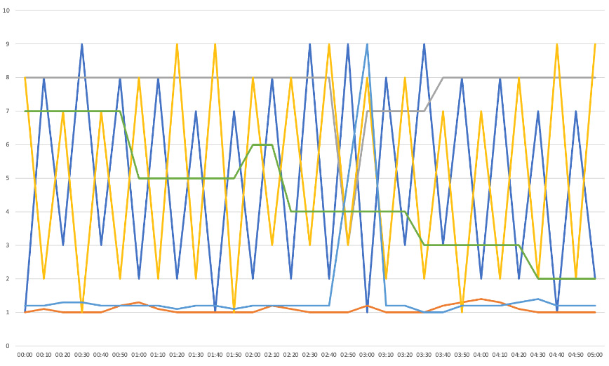
Figure 8.3 – An example of a graph containing too much information
Even if displays like this can be filtered and made simpler, they should not have to be. This applies to logs, tables, or anything else that can become too complicated. The default view should be readable and show you what you need without you doing anything. If not, raise that as a problem until it’s fixed. Then, from this simple top-level view, give users the option to drill down into the details they need.
This section presents examples of poor UX practices to look out for when testing your product, as well as more successful alternatives.
Displaying information in tables
To keep tables simple, they should contain one piece of information per column. This may seem obvious, but it’s very tempting to combine data, which makes searching, sorting, and filtering much harder. If the development team has implemented a table in that way, let them know they should make a change. For instance, consider the information grouping in this table:
|
User |
Connection |
Status |
|
UDP Rate up: 10 Mbps Rate down: 20 Mbps |
Online 5 minutes | |
|
TCP Rate up: 5 Mbps Rate down: 8 Mbps |
Offline 5 days | |
|
UDP Rate up: 10 Mbps Rate down: 100 Mbps |
On call 5 minutes |
Table 8.2 – A table with too much information in each column
When arranged like that, the data is harder to see, and you can’t sort the columns. Because there’s no one data type that they contain, it’s not clear what sorting would mean. Here’s the same data, now with one kind of data in each column:
|
User |
Connection Type |
Rate up (Mbps) |
Rate down (Mbps) |
Status |
Duration | |
|
UDP |
10 |
20 |
Online |
5 minutes | ||
|
TCP |
5 |
8 |
Offline |
5 days | ||
|
UDP |
10 |
100 |
On call |
10 minutes | ||
Table 8.3 – A table with the same data spread across columns
Everything is presented more clearly in this version, and you can sort by each data type individually. It can be tempting to group information if you have so many different data points that there would be too many columns. It’s best to break up the data if there is that much and make each table more specific or, if necessary, have a table you can scroll around rather than grouping entries together.
Also, avoid having two columns listing the same information at different levels – for instance, if there’s a list of wholesalers and customers, but where customers might appear in both lists. Again, this makes searching and filtering harder:
|
Inviter |
Invitee |
Date |
|
2/1/22 | ||
|
4/3/22 | ||
|
5/6/22 |
Table 8.4 – A table with the same data in two different columns
If Bob Bobson has invited 100 people, then finding the entry where he was invited isn’t easy. If your users notice, they should sort by the date because Bob will have been invited to the service before he asked anyone else. However, such tricks shouldn’t be necessary. This is an exception to the preceding rule that searching should be kept as simple as possible for the user by not giving them options. In this case, selecting which column to search for can usefully narrow down the result.
Visual elements
Colors can be a valuable tool for guiding users through complex workflows – for instance, always having one color indicates progressing to the next state or highlighting errors. They should be used sparingly, however. Only two or three meanings can be given to colors before pages become incomprehensible rainbows, so assign colors only to the most critical aspects of your page. The saturation of the colors is important too. Pastels and shades are less noticeable, so a page can tolerate more of them. If more than one color is fully saturated, the screen will be garish, especially if they cover a wide area rather than being limited to an isolated button or icon.
Colors should be consistent. Recall the bug from Chapter 5, Black-Box Functional Testing, where the same data points were displayed in different shades due to a bug in the rounding. If you are using color as an indicator, the same color should always mean the same thing.
Icons themselves need to be carefully chosen. Generally, they are small, so they can have a bold, saturated color. However, only use one unless you’re deliberately aiming for a rainbow effect, such as in the Windows or Google logos. Otherwise, the main requirement is that the logo is distinctive and should be sufficiently different from any others that might be shown with it. Watch out for aspect ratio problems and incorrect resolutions in icon files to ensure they aren’t stretched or degraded, even when displayed as thumbnails.
Testing notifications
Many applications make use of push notifications for users. These might be urgent and integral to a product, such as incoming call alerts on a communication platform or meeting reminders from a scheduler. Elsewhere, they can be reminders or prompts that don’t require immediate action and are just designed to get users engaged with that application again.
With this form of testing, the first stage, as ever, is to identify the scope. What is the complete range of notification messages your application can send? Once you have that list, you can generate each, in turn, to ensure it appears correctly.
Common variables recur in this area: what happens if the user has blocked notifications? Does your application still work without them? Notification systems are implemented differently in different operating systems, so your test plan needs to try them all. Your application can receive messages both while running in the foreground or background. Does it display notifications properly in both cases? If it wasn’t in the foreground when the message arrives, does it activate correctly and quickly enough for users to react, for instance, by answering the call?
Notifications can be of different types and priorities, so you must ensure you are sending the right kind. It’s tempting to always send high-priority messages, although systems such as Apple’s Push Notification system monitors and caps those. You might find all your messages are delayed if you attempt to abuse the system and claim that your daily prompt to use the app has the same importance as the next meeting starting. You may require specialist tools or code inspection to check which sort of message your application sends.
Information display overview
As mentioned previously, other than a few clear-cut cases, many user interface design decisions are subjective and don’t have a clear answer. When raising this class of issue, remember to flag that it is a UX issue, which implies that others’ opinions may differ. Spotting problems is vastly easier in usability testing than designing great solutions, and it may be that the design you think could be improved is, in fact, the least bad option, given the problems with other arrangements. Keep communication open. Discuss the issues and possible solutions, rather than assuming your proposal is the best or the correct behavior.
Many of the worst crimes against UX are perpetrated within internal tools as they are used far less and have a more forgiving audience than your customer-facing interfaces. Even then, developers should apply best practices in preparation for more important interfaces and help your internal processes.
These are just examples of problems I have encountered; exhaustive guidelines are beyond the scope of this book. Rely on your intuition. If you find something hard to use or difficult to understand, users who spend less time using your system will struggle even more.
Once a user can see this information, they’ll want to interact with it, as described in the next section.
Testing user interaction
As with displaying information, there is vast and growing literature on user interactions; I will only list a few particular examples here. As ever, trust yourself – if something annoys you, if you make mistakes, or if you have to carefully think through steps when using your product, then others will struggle even more. The fault is not necessarily yours, so first, check whether your application could be easier for users to use.
A good interface will guide users from the general to the specific: I want to change how I’m viewing this page (so I select View), I want to zoom in (so I select Zoom), I want to zoom to 200% (so select 200%). Are there clear routes through your application like that for all your user stories?
The other extreme is the Linux command prompt. While massively powerful and configurable, it provides almost no guidance. It’s simply a prompt; all the knowledge about how to use it comes from the user. In a way, it’s the worst possible user interface, one in which users are on their own. Consider your product – how much guidance does it give and how much, as with the Linux command prompt, has to come from users?
In this section, we’ll cover some basics of user interaction that apply to many areas.
Counting user steps
Consider the number of steps a user needs to take to achieve a particular goal. Can any of them be removed? For many years, I worked on a product with a long list of customer names, with further details available via links. But the customer names weren’t links. Every time I wanted to go to the customer page, I had to look up a customer’s name, then go over to the other side of the screen to click the pencil icon to edit it, as shown in the following screenshot. The customer’s name should have been the link to save that extra step:

Figure 8.4 – Information displayed with the edit icon separate from the name
Even worse, the edit icon (the pencil), which we often clicked, was right next to the delete icon (the rubbish bin), which we rarely used and would cause serious problems if used at the wrong time. While not wrong, the interface invited mistakes. How easily can users make errors on your pages? Separate options as much as possible, especially dangerous steps you can’t undo.
Each time a user has to click, each lookup and translation of information they have to do is another place where things might go wrong. This might mean looking up a user’s email address, navigating from a menu to a submenu, or any of a thousand different interactions. If you see an opportunity to remove a stage, flag it up. Simpler workflows make life easier for you and your customers because you are a major product user, and it simplifies your test plan.
To tell which steps a user will need to take, you will need to consider the everyday tasks a user will perform. User stories often capture these, but they are beyond the scope of this book. Product owners and designers should use them as a significant input into the feature specification. While you can generally work just from that specification, when testing user interactions, it’s helpful to go back to the user stories to see the overall flow of tasks on the product. Where do they start? What are they trying to achieve? What route do they take, and where do they end up? This will show you the different steps they must take and thus the ones you could avoid.
Required combinations of steps
Even worse than having steps you have to perform in order is having unrelated steps users have to do together – for instance, creating a user and adding them to security groups. Even worse are inconsistent requirements when the setup is sometimes automatic but sometimes requires manual steps.
This is a tripwire waiting to cause problems for unwary users, and again more often occurs in internal tools than in the interfaces you polish for your customers. Wherever inconsistency appears, it causes problems and supports cases when things go wrong.
Real-world example – Failing to enable the feature
In one company I worked at, we used flags to control the rollout of features to customers. First, they would be upgraded to the new version with the feature available, and then we would gradually activate them. The feature flag system had been implemented early in the company’s history, but we had outgrown it. For instance, to enable a feature for 1,000 customers, you needed to send 1,000 separate messages, since the API was per-customer only.
Even worse, for some (but not all features), you didn’t just have to enable a flag; you also had to set the default to be enabled. Because it wasn’t always required, this two-stage process repeatedly caught us out. It culminated in the rollout of a new feature being delayed for 2 months after we thought we had enabled it, but the default was still disabled. The feature was resilience to video errors, which we thought was happily working but was hard to see from normal usage.
Of course, the fix for requiring your users to perform unrelated steps is to combine them somehow. Sometimes, you can set a reasonable default – for our feature flags, assume that if the flag is enabled, the default should be too. If you add a user, maybe there are standard groups they should always be added to. When no single answer always applies, create a wizard or other interface to guide users through each necessary step so that they don’t forget about them. Even within a wizard, give users the option to skip steps. Maybe you hadn’t forgotten about adding the user to groups, but you don’t know which ones they should be a member of yet. In that case, prompt the user to add the necessary information, but give them the option to skip steps if they want to.
Requiring restarts
A special case of requiring combinations of steps is when a restart is required for new settings to take effect. The rule here is that the user needs to be informed of what is happening and why to give them control over the process. I know I’ve experienced that sinking feeling minutes before an important meeting when a computer shows a glacial progress bar instead of starting back up. Help your customers avoid that fate.
When it comes to restarts, the settings have three possibilities:
- The settings take immediate effect and do not require a restart
- The settings don’t take effect until the next restart
- Changing the settings causes a restart
Wherever possible, put in the effort to make settings take effect immediately, especially for anything customer-facing. That consistency is a massive help for usability. If you really can’t spare the time for that, clearly label the user interface.
Even more importantly, highlight any settings that will trigger a restart. If you have a page full of settings and only a few cause a restart, you are highly likely to surprise and annoy your users. Let your users know what will happen, and give them the option to change their minds to double-check they are sure before initiating the restart.
Providing freedom and feedback
Routes through the system should offer the user as much freedom as possible. If a user loves keyboard shortcuts, make sure they’re available for your new feature, along with menu items, or right-click options. Can the interface be used just with tabs and pressing Enter, as required for accessibility? These different possibilities add to the testing load but directly affect how your users experience your product.
A simple way to give users more freedom is to delay checking on fields until they submit a form. To change a date field from 1st September to 31st January, don’t throw an error if they changed the day first and set it to 31st September temporarily. Yes, it’s invalid, but they might be halfway through a change and be about to change the month. That’s a valid sequence, so there’s no need to warn the user part way through. See the Presenting errors section for more details.
Real-world example – VMWare – Changing memory always gives an error
The VMWare interface for assigning memory to a virtual machine annoyed me as it always threw an error when changing measurement units. By default, the interface gave the memory size in MB, which was less than helpful for modern machines. Instead of saying a machine had 8 GB, for instance, VMWare would say it had 8,192 MB.
To increase the memory from 8,192 MB to 10 GB, you needed to change both the value and the units. If you changed the units first, the interface would read 8,192 GB, and VMWare displayed an error that it was too high. Then, you would have to change the value to 10 GB to correct it. If you changed the value first, the interface read 10 MB, and VMWare displayed an error that that value was too low until you changed the units to GB. Whichever order you chose, VMWare always showed a warning.
While I can complain about unavoidable errors, this is a case where it may be the least bad option. VMWare wanted to let users know as early as possible that the values they had selected were invalid, and the cost of that was always displaying an error in some cases. The best fix would be to change the default measurement to GB, which is far more helpful for modern machines, and leave the checking for invalid values as is.
This demonstrates that checking for errors while a user is filling out a form can cause issues, but you should give users feedback as early as possible. If a system has reached its maximum number of users, for instance, then prevent users from even trying. They should not be able to reach the Add User page at all. That option should be grayed out with a message stating why. This avoids users from filling out lots of details before discovering that the operation will fail. See the Testing error feedback section for more information.
Recall Chapter 5, Black-Box Functional Testing, which lists string types to try in text boxes, modes of use such as copying and pasting, and responses to pressing Tab and Enter. You can combine those variables with the others in this chapter: does each text box still work well at low screen resolutions, with enlarged text, or using keyboard input only, for instance? Does each text box clearly state the inputs it accepts, and does it give a clear error when it doesn’t get them?
Hidden tools
You must make user interfaces as obvious to use as possible and lay out clear paths for users to reach their goals. However, sometimes, you can offer shortcuts for those in the know. These extra features aren’t necessary for users to use your product but make it quicker or better in some way. Generally, they use already visible buttons in a new way. There are many on the iPhone:
- Pressing the green call button in the phone app brings up the last number dialed
- Pressing and holding the spacebar lets you reposition the cursor
- Pressing and holding the Send message button lets you send the message with text effects
- The Apple symbol on the reverse of the phone is a configurable button
Among many others. These occasionally have clickbait articles written about them, publicizing their existence for anyone who hasn’t found them yet. Like every feature, these need testing, but they occupy a unique position from a usability point of view. Hidden tools aren’t a crucial part of any user journey but are a wonderful layer of polish. Usually, when you add a new option for a new feature, it comes at the cost of making a page more complicated, but by being hidden, these features avoid that.
Swiping on touch screens and touch pads can reveal hidden functions, such as bringing up options in messaging apps or moving between screens. With hidden options, make sure there are other ways to perform those actions and give hints about their existence where possible.
You should be wary of adding too many since users may accidentally trigger them and wonder what’s happening. Another risk is that you don’t optimize the more obvious ways of using your product because you know of the shortcut. Heavy users like you have a great experience, but most of your users may not. So, remember, these are shortcuts, not replacements for the main functions.
Otherwise, hidden features are a lovely addition so that power users can work more efficiently. The challenge is finding opportunities and ideas for them.
Irreversible operations
Irreversible operations need special consideration for usability. These include deleting information or removing configuration, which leaves the user with no way to recover the previous state. These should be protected with options to confirm the operation. However, they are imperfect, especially for heavy users who may get so used to agreeing that they also confirm accidental deletions.
It’s more powerful to have a temporary, intermediate state that allows the user to recover information for some time. This might be a recycle bin, a recently deleted folder, the option to disable rather than delete users, or similar functions. On the downside, these create extra states you need to consider in all your testing.
Temporary states can have a multiplicative effect on your test plan – for every operation that you can perform on a user, for instance, what happens if you do that while the user is disabled? So, recovery features can come at a high cost in terms of the ongoing test burden but are a valuable addition to usability. If you don’t have them, plan to add them in.
Another form of protection for unrecoverable operations is to require extra permissions to perform them. This restricts the number of users with access to those functions or can mean that users need to explicitly raise their access level to carry them out. Again, this helps prevent accidents, although it can be irritating to use regularly.
Menu systems
When my son was very small, he played games on an iPad. After a while, he learned how to use it himself. I still remember him, aged 1, selecting the app he wanted to use. This isn’t a story about how amazing my children are (although they are, of course). It’s about how fantastic the iPad user interface is: it is literally simple enough for a 1-year-old to use. It has no apps hiding in the Start menu, no icons that need double-clicking, no mouse to use, and not a single word to read. He could just see the picture he wanted and point at it.
While my son could navigate the iPad menu and play the simple games I’d downloaded, he still needed help every time he wanted to play because of the intermediate step – navigating the games’ menus. They used lots of text rather than pictures and sometimes had the main menu and then a submenu to navigate, which was beyond my toddler.
This story has a few morals. The first is that a task is as hard as its hardest step. The iPad was simple and the games were simple, but the menus were not. The second is that there’s no point in polishing the UX in one area if most customers fail to reach it due to a difficult or off-putting step earlier in the process. Finally, the most challenging step for users may not be initially apparent.
If you work on a small, new product, your company probably touts its simplicity as one of its selling points. Your product doesn’t have many features yet because you haven’t had time to develop them. If you are at that stage of development, these problems won’t be acute yet, and the challenge will be arranging the interface so that it can grow successfully. This is difficult because it requires predicting which features might be required and where they could be put. With a strong enough idea of the architecture, this is possible, but it’s harder because once you have a user interface in place, changes are likely to upset existing customers. They’ve learned to use your product in one way and won’t want to change. Any user interface mistakes are compounded as your product grows, so spend the time getting each new addition right.
Still, those are problems for the future. If you’re working on a mature product with many years of development, it will likely accrue menu items and options, like barnacles encrusting a boat. Anything customers wanted over the years is added on, and removing functionality is very difficult as, again, it may upset a customer relying on it.
Real-world example –The endpoint menu and the system menu
I once worked with a fantastic video endpoint. It was reliable, useable, and ahead of its time. However, its main menu always annoyed me. Half its main settings were under an option called System Settings, and the other half were under an option called Endpoint Settings.
But the system was an endpoint! I could never remember which settings were where, and half the time, I went looking in the wrong menu first. After years of development, there were dozens of settings under each heading, which only made the problem worse.
So, the first rule for your menu systems is to always find genuine distinctions between your headings to give your users the best chance to remember where items are. In the real world, there are gray areas and overlaps. A well-designed system enforces a structure that appears natural and obvious, but it took a lot of work to decide on that structure from all the possible options the designers had. Remember that users have a broader view than any single developer and will find inconsistencies or ambiguities between areas that are consistent within themselves.
Next, when designing menus, ensure the most used features are in the most accessible locations. Burying a commonly used tool three layers deep in a menu will annoy your users enormously, and the heavier the user, the more it will annoy them. Check out Ken Rockwell’s diatribes on camera menu systems for great examples. For this, you’ll need to know which options your customers use most – it may not be obvious how your customers like to use your product. If there are three ways to do the same thing, which do most people choose? Possibly different groups of users use your product very differently. See Chapter 10, Maintainability, for details on collecting that style of information.
Given that you have data or can at least make educated guesses, check that your menus are arranged suitably, and stay up to date as the product evolves. You will have to make tradeoffs and judgments about what percentage of users is worthwhile caring about. If 10% of people use a feature once a week, is that enough to have it on the main menu? Some customers will be more critical than others; perhaps you have a freemium model, and many of your users pay nothing at all. In such a case, how should their experience be weighed against paying customers’ experience? As a tester, it’s your job to ask such questions; answering them is beyond the scope of this book and belongs more in the domain of the product owner and UX designer.
Accessing features in multiple ways
Some features are so common that they are available via several different routes. In this case, as with so much UX, the key is consistency: however users choose to access that feature, they should get the same experience. The nightmare for users, and the bug for you to raise, is if different options provide similar but subtly different functionality.
Real-world example – The same page, only different
On one web interface I worked on, our customers had a settings page with two parts. The first was customer-facing, and another section was only visible to our internal staff.
We were users of our own equipment, so the customer I visited most often was our organization, to turn on new features or enable new configurations. For our organization, I could reach it in two ways – as an internal user or an admin. I repeatedly used the shortcut of being a real user, only to find half the settings page I needed was missing, forcing me to return to the same page from the admin route.
Test all the ways users can access each function on your product. The following are some examples:
- Main menu
- Right-click menu
- Keyboard shortcuts
- Commands revealed by swiping
Consider how functions are available – whether they’re on an application, hardware, or web page. Are they on an admin interface or a customer interface? APIs or user commands? There may be many more for your application, and the goal for all those different methods is that they should behave in the same way.
Ideally, they share an implementation, and other than their external interfaces, the same code is run each time. This will guarantee identical behavior; otherwise, differences will creep in. Testing all the interfaces is the only way to reveal that.
Data structure design
Make your data structures and priorities match your user priorities. This can be particularly difficult to get right since it involves making your low-level data structures align with customer preferences and behavior. However, it’s well worth getting right due to the ongoing pain it causes when it goes wrong.
Real-world example – I care about this, but you care about that
On one private cloud service I worked on, new users could be created on various physical servers based on variables such as the customer’s location, the cloud server version, and the cloud server loading.
Unfortunately, the variables that our customers cared about didn’t match up with the cloud decision. The cloud primarily used the server version to choose the location: it always used the lowest version for safety. Having identified the lowest version servers, it selected between their locations and which was most lightly loaded. However, our customers didn’t care about the server version; they just wanted to be placed close to themselves geographically.
We discovered this after leaving a server running an old version in our Chinese data center. Being the safest option, the cloud placed all new customers from across Europe and the US there, despite us having much more geographically appropriate sites. This was a designed functionality rather than a bug, but we constantly had to manage upgrades and check user placement to work around that fundamental mismatch.
To identify this class of issue, you must notice anything mismatched between your product and your users. In the previous example, the cloud worked exactly as designed when it placed all new users in China. This wasn’t a bug in the implementation but the specification.
Having altered the specification, fixes may require significant alterations being made to the product architecture. The mismatch exists for a reason, and the bug fix may not seem worth the effort of the necessary changes. Over time, however, these changes do pay back that investment. If you find areas where your product structure differs from your customer behavior and expectations, it’s well worth fixing it up.
User interaction overview
For your product, look for different ways to achieve the same thing: the same option in two places, setup wizards, shortcuts, and so on. Consider different ways of navigating the page, such as the tab order on desktop applications and web pages. Which box is selected by default when you first load a page? Does pressing Enter correctly submit the information? These may seem like minor issues, but they can annoy regular users.
The field of user interactions is rich and varied, and I cannot do it justice here. These are examples for you to generalize from and apply to your application. Remember these guiding principles: identify and minimize the customer steps, give users a choice over their route, and don’t throw errors during changes, but block invalid actions as soon as possible. How you apply them to your product is up to you.
The following section considers the product documentation and the tests it needs.
Testing the documentation
The best documentation is one you don’t even need because your product is so simple and easy to use. However, to help any users having difficulty, there should always be a description of how to use it. Ideally, most users will never need to refer to it; if they can work out the product from its interface alone, they don’t need documentation, and that’s great. The docs are there for when things go wrong.
Testing the documentation first involves specifying what types should be present, and there is a wide variety to choose from:
- Static manuals
- Tooltips
- Help web pages
- Instructional videos
Traditionally, documentation would be a physical manual describing each aspect of the application’s functionality piece by piece. Years ago, that would be printed on a dead tree; more recently, it would be a file you could download, but both options have been superseded. Manuals are slow to put together because you need everything ready before you publish the entire document, as opposed to publishing piecemeal as you can with the other types of help. Users have to navigate the document themselves to find the section they need, and it is limited to text and pictures.
Tooltips are a kind of context-sensitive help. Instead of downloading a document about the entire product and then finding the piece you need, a tooltip gives information about the user element they are currently looking at. On the plus side, these are simple and quick to read. However, they can’t give examples, answer questions, or use different media types.
Help web pages combine the best aspects of tooltips and user manuals. Like tooltips, they are context-sensitive: a help button on each page can bring up documentation for that page. But unlike tooltips, they can go into greater depth with examples and step-by-step guides and can include pictures and other media. Because they are written per page, you don’t have to prepare them all at once, but you can bundle help web pages into a document users can download if they desire.
Instructional videos show detailed guides about how to perform different tasks. They can be costly to set up and produce but provide an excellent description of the areas they cover.
If your application’s user base is sufficiently large, you should aim to have tooltips, help pages, and instructional videos. As a tester, you must check that information is present and up to date, with no old screenshots or deprecated advice, and do that for each update.
Feature flags make rolling out new features much easier but can complicate the documentation. You need to ensure that all screenshots and videos show the application with the correct feature flags enabled. They should activate all the new features, but none of the in-development features that haven’t been released yet.
Having checked its presence and correctness, the final check for documentation is its usability. Does it make sense? Can you follow it? And, most importantly, does it help you resolve your problems? I hate documentation so useless as to be tautological. The best help talks you through your problems. Compare these two tooltip texts:
- Username: The name of the user.
- Username: The name you will use to log in. It must be between 3 and 16 characters and include only letters and numbers. If your selected username is already in use, please choose another.
Only the second example helps you solve your problems and talks you through possible errors.
As well as documentation, error handling requires dedicated user interface considerations, as described next.
Testing error feedback
Testing the user interface for errors is simultaneously far less frequent and far more critical than that of your primary use cases. It is less important because, hopefully, users encounter error conditions far more rarely. However, once they’ve hit an error, they will rely on your interface to correct them and help them achieve whatever goal they were aiming for. While these might be rarer cases, handling them well is vital for users who need assistance. This section considers how to present errors and internal failures, how to find spurious errors, and how to avoid displaying errors in the first place.
Preventing errors
As described in Chapter 7, Testing of Error Cases, your application should catch problems as early and as specifically as possible. If there are problems in the user input, then let the customer know exactly what is wrong – is the entered text too long, or does it contain invalid characters? Is a number field too high or too low?
The best user interface prevents errors from even happening. If a field’s maximum length is 20 characters, stop the user from entering the 21st. If only positive integers are valid, don’t let users enter negative signs or decimal points. Protections like this stop errors before they begin. Ideally, your application should provide feedback if users hit these restrictions so that they know why their keystrokes aren’t being accepted since it’s immensely frustrating. Raise errors with the user as soon as possible, instead of letting them fill in an entire form and then letting them know they got half of it wrong, raise errors as they go.
Presenting errors
The best error messages let the users know what they should do next. There is a class of problems that users can solve for themselves, so you must empower them where possible, rather than them needing to call your support team, which will cost your company time and resources. Identify obvious, fixable problems and check that their error messages are clear. This includes cases such as the following:
- They’ve reached the maximum number of configured entities: The user needs to delete some entities or extend their allowance
- The feature is not available without a higher subscription: The user needs to purchase an upgrade
- The login session has timed out: The user needs to log in again
- The user’s security credentials are incorrect: The user needs to enter the correct details
Following our general rule of making tasks as simple as possible, fixable errors should have links to take users directly to the page that lets them fix the problem so that they don’t have to remember and navigate there themselves.
Errors should be as specific as possible. Consider the case of connecting two services. You run service A, in which users enter the address and access token for service B, run by a different company, company B. Unfortunately, the connection fails. You should let the user know the reason for that failure because the possible remedies are very different. Consider the different failure modes:
- The user might have entered invalid information: The user should correct their connection details.
- Service A might have had an internal failure and failed to send the request: The user should retry later or raise a support case with your company.
- Service A might have received no response from service B:
- The destination address might be wrong: The user should correct the address
- The network connection might have failed
- Service B might be offline and not responding: The user should retry later or raise a support case with company B
- Service A might receive a 500 failure message from service B indicating it failed: The user should retry later or raise a support case with company B.
- Service A might receive a 400 failure message indicating an invalid token: The user should correct the token.
If your service simply says Connection failed, then the user won’t know which of those situations has occurred. Should they double-check their access token or raise a support case? If service B has failed, you should let the user know that your service isn’t at fault so that users don’t mistakenly curse your unreliability. By being as specific as possible, you give the user the best chance to fix the issue.
Note that receiving no response has several possible causes. To help users diagnose that problem, you need to identify those causes and which of them is most likely. Then, you can present them in order for the user to work through them. In this case, they should check the destination address because they can fix that, but otherwise, they need to retry and raise a support case.
Just one action can have a host of failure modes. You will need to carefully survey them so that they can be tracked in requirements and included in your test plan. As you can see from the preceding cases, even simple functions can require many tests.
A final note on presenting errors: all these messages need to be correctly translated into every language you support. As described previously, this needs to be automated so that you can cycle through the possibilities for each failure mode you generate.
Avoiding spurious errors
Raising errors early can result in spurious warnings while you go through an intermediate step, as noted in the Providing freedom and feedback section:
- For instance, a date picker with dropdowns for the day and month is initially set to today’s date: 5 - June.
- You want to set it to the end of January, so you start to change it: 31 - June - error, invalid date.
- The application has quickly and specifically identified that you’ve entered an invalid date, but only because you were partway through. Then, you make the final change: 31 – January.
- We saw a similar example when selecting the disc size in VMWare. The error feedback was good; in both cases, the best solution was to be cleverer about the options you were presenting. In VMWare, they needed to choose a more up-to-date measurement of disc size by default. Here, you can swap the day and month fields: June - 5.
This little nudge should encourage users to select the month first so that the day can be validated correctly.
While preventing invalid inputs is usually good, it makes things worse in these situations. For instance, if the month is set to June, you can only give date options up to the 30th. Then, I can’t select the 31st without choosing the right month first. As a user, that’s likely to make my journey longer and more irritating as I discover I can’t set the day, have to select the month, then return to set the day a second time. Enforcing such a flow limits user options and provides a worse experience.
Real-world example – Do not push this button
One cloud product I worked on had a dedicated admin interface showing its configuration and state. It also had a handy button to display the most recent error messages to diagnose issues quickly.
Unfortunately, early versions of the product held those errors on the same disc as the running system. If the system’s problem was being limited by disc I/O, the last thing it needed was a massive new database query to run, filtering all events for recent errors. During one outage where the system was providing a slow but usable service, I managed to crash it by pressing the button to debug. Make sure presenting errors to your users doesn’t make the issue worse.
Why go into all this detail on error presentation in a book about testing? Especially around errors, there are many ways feature specifications could be implemented. The following is a perfectly reasonable requirement:
- Invalid dates are rejected with an error message
However, that still leaves the possibility of the poor user experience described previously. As a tester, you need to check not only that your product meets the requirement but meets it in a pleasing and understandable way. In the domain of UX, there are many options to consider and recommend, which is why I’ve described them in detail.
Policing errors
For policed limits, such as the configured number of users or connections, prevent users from going over the limit, but let them know why. Consider these:
- 1, Worst: Let users try to add another user, then silently fail and discard their information
- 2: Let users try to add another user, then silently fail but keep their information
- 3: Let users try to add another user, then fail with an error message explaining why
- 4: Prevent users from adding another user without explaining why
- 5, Best: Prevent users from adding another user and explain why
Don’t let your users waste their time filling in forms if you already know they will fail, especially if that failure is silent and throws away their work. If a form submission fails, keep it populated with their information so that they can try again, except for secure fields such as passwords and payment details that they shouldn’t save.
Instead, gray out the Add User button with a note explaining that they’ve reached the limit. This prevents users from causing an error, helps us avoid wasting their time, and lets them know how to achieve their goals.
Spurious errors
When error messages are a part of your application, there are two ways they can go wrong: they might not be shown when they should or they might appear at the wrong time. As well as checking that invalid data displays the correct message, you need to check that error messages don’t appear incorrectly. I’ve seen errors pop up when you type the first character into a text box but disappear when you enter the second, or appear if you click on a text box and then click away again.
Unfortunately, these tests are tricky to automate. You’ll need to know the error messages for each element on your pages and add checks to ensure they don’t appear. In practice, these can be simpler to run manually since you can easily spot if anything untoward is present.
Internal failures
Finally, consider the feedback you give users if your system cannot process their responses. Perhaps a third party you rely on is unavailable, or an internal part of your system has failed. Returning error messages or displaying obscure failure screens is unhelpful. The error you show to users should be general; they don’t know the system’s architecture, so all you can do is advise them to try again or, more likely, return later when you’ve had a chance to resolve the problem. For more details on triggering internal error states, see Chapter 11, Destructive Testing.
Even if your system isn’t experiencing a failure, its behavior under load can be quite different from running under ideal conditions, as considered next.
UX and loading
You should combine UX testing with load testing to check the behavior in the worst cases. While response times and pages may be acceptable under light load, this could be very different when the system is busier. See Chapter 12, Load Testing, for more details. Loading issues can manifest in several ways.
The most obvious is lists that grow in size. If there’s a page or a menu with a list of items that can increase over time, such as users or customers, ensure you have proper pagination and searching in place. When the lists are short, you can get away with loading and displaying the whole thing at once, but that rapidly becomes unmanageable if your system experiences any kind of popularity and growth.
Pagination involves loading a certain number of entries, with the remainder split over other pages. The number of entries per page should be configurable, and there should be options to jump to the next and previous pages and the first and last pages. A search feature should be available to search the entire list for anyone who had been relying on their web browser’s search feature previously. If those features are missing, raise the task to add them.
As well as static loading of entities, usage also counts as load. Check that response times remain reasonable. It does not matter if your app loads all the correct information if it takes 5 minutes to be ready; no user will wait that long. Response times should form a part of all UX testing, and those should have been explicitly stated in the feature specification. Keep checking those times as you add more system activity and scale.
Next, we will consider gathering more feedback on the user interface by running usability studies.
Running usability studies
A theme throughout this chapter has been the limitation of your point of view and the importance of gaining feedback from real users to find the areas that confuse them. At different times, you can use your naivety about a new feature, for instance, to play the role of a customer, but there is no escaping your experience since you work with your product so much. For that reason, getting feedback from real users is a vital part of UX testing, even more than beta testing or other types of testing the product with users.
There are many different ways to gather feedback from users, of which we will consider four key ones here: recorded sessions, questionnaires, A/B testing, and instrumentation.
Recorded sessions
Recorded sessions involve gathering volunteers and presenting them with the new feature and a task to complete. They get no other instructions but are advised to think out loud to explain what they are doing and why during the recorded session.
On the downside, this is an artificial setup. The user might be performing a task very differently from their everyday workflow, and they are aware of being filmed, which will change how they behave. Still, seeing their thought practices, wrong turns, and assumptions can be fascinating. Another disadvantage of this approach is that the result is an unstructured video recording that needs to be analyzed and broken down into usable findings. To work out that, for example, 70% of users couldn’t immediately find your new option, you will need to carefully watch all the videos to see how quickly users found it. It’s a time-consuming process, but one full of information if you can take the time to extract it.
Questionnaires
A more structured approach that takes less effort to implement is to send out questionnaires. This won’t uncover all the subtleties and assumptions of a recorded session but will let you know what issues your customers are aware of and what they like and dislike about using your product. Be aware that not everyone has time to fill out a questionnaire and your responses will more likely be from unhappy users. There may be many more happy users who don’t have the time to fill out a form simply to tell you that everything is fine.
Questionnaires can ask closed questions such as which options users prefer, but even more interesting can be the open questions. How do you perform that task? How do you use this product?
In the early days of the development of Microsoft Excel, the engineers were proud of its mathematical functionality. You could program complex, interactive equations to present detailed financial and other numerical data. Then, they asked their customers what they used Excel for. They discovered that a major use case was simply storing lists with it. I know I do. The designers had never considered that important, but based on that feedback, they added features to make managing lists easier, such as the ability to define a table with filtering and sorting on different columns.
Who knows what surprises are waiting for you to discover about your product?
A/B testing
A/B testing provides even more structured feedback by offering two or more different versions of a user interface to different groups of users. This is backed up with instrumentation to detect different usage: which buttons and options did they use? A/B testing is used extensively in sales and marketing to determine which adverts customers engage with most, but it is also helpful in purely technical contexts. For instance, does the option for your new feature fit better in one menu or another? Should the button be placed in different locations on a page? While you should still discuss this internally to decide on the best options, you can then present a selection to users to see which is used most.
The disadvantages of A/B testing are that it requires more development time. Unlike questionnaires or recorded sessions, A/B testing needs software changes to prepare the different options. It also needs a system to collect and present usage information. If you do this repeatedly, this becomes easier, but there is a cost to set it up and use it for each new feature. The options are also limited to those you place in front of customers. Maybe all the alternatives you present annoy users, but this method will only let you compare pre-selected choices.
On the plus side, you get very realistic feedback. These are normal users acting in their usual way, not while being recorded or answering questions about their behavior. You can also gather detailed information – for instance, how many milliseconds it takes a user to go through different steps in a process. This data is structured so that you can automatically generate graphs and charts of the results without reading freeform questionnaire replies or watching and categorizing video responses.
Instrumentation
The final method of user feedback considered here is similar to A/B testing but without providing alternatives – tracking user behavior through instrumentation. When you release a new feature, you can gather feedback on how many people used it and how they did so – for instance, by using menus or keyboard shortcuts.
This form of tracking is vital for monitoring sensitive steps such as user signup. Getting new users is essential for any application, especially those aimed at the consumer market and without a hardware component. Signing up always requires a few steps of setup and gathering information, even after these have been simplified as far as possible, so it’s important to track how far users get. If 90% of users open the application and enter their name successfully, but only 50% go to use the application, you need to find out why there is such a high failure rate and make that step easier.
Tracking interactions within your application provides the least UX feedback but is also the cheapest to perform. Once a method for gathering and presenting this information is running, adding a new feature has little extra cost. Events tracking different user actions should be added routinely to aid testing and bug diagnosis (see Chapter 10, Maintainability, for more details about that). On the downside, it will only show how your existing application performs. You need to use one of the other user feedback methods for other perspectives and ideas.
While you can raise possible issues as part of your testing, they will often need to be investigated with usability studies to confirm whether they are a problem. What might be obvious to some people will be obscure to others, and vice versa. This is especially the case when working out user expectations and determining which issues are features and which are bugs, as discussed next.
Comparing bugs and feature requests
Often, there is a gray area between a bug and a feature request, especially in user interface design. For example, old feature A works, and new feature B works, but you can’t use features A and B together. Whether that is a bug or a feature depends on your users’ expectations – would they think those features should work together? This is context-dependent and may require usability studies to figure out.
As a tester, you can discover and highlight these limitations. In a mature product, interactions between features may not be apparent and might have been missing from the specification. They will require knowledge and imagination to find whether you are using automated or manual testing.
In terms of wording, spelling and grammar mistakes are bugs; improving the phrasing is a feature request. Text wrapping awkwardly is a feature request, but having it overlap and become unreadable is a bug. Improving hard-to-find elements is likely to be a feature request, but if an option is unavailable, that’s a bug. I’ve seen web pages where the scroll bars were missing and the Apply button wasn’t accessible at the bottom of the screen. You could only use the page by tabbing to it or changing your screen resolution. Not all issues are so clear-cut. Discuss this with your product manager and make your case for improvements.
Summary
UX testing is a complex but vital part of feature testing. It is far more subjective than other areas, and clear-cut bugs are interspersed with choices that are tradeoffs or matters of opinion. Respectful discussions, which are important throughout testing, are especially needed here.
Some of those gray areas depend on user expectations. What might a user reasonably expect from your new feature? If that functionality is missing, is that a bug or a feature request? This needs consideration from the product owner, UX designer, and yourself.
In general, when performing UX testing, always look out for anything confusing that you struggle to remember or have to attempt twice. If a function is challenging for you, who uses this product full time, it will be even harder for your customers who only have a few minutes to devote to mastering it.
When you’ve found a problem, remember that identifying an area for improvement is vastly easier than finding good solutions to improve it. Make suggestions and offer ideas, but also defer to the design experience within the team.
In the next chapter, we will move on from aspects of features that directly affect your users to protections we hope they will not even notice: security testing.