
Take a look at the following definition of dashboard, taken from the Intelligent Enterprise magazine's March 2004 issue:
For an enterprise, a dashboard is a visual tool to help team members throughout the ranks of the organization to track, monitor, and analyze the information about the organization in order to make decisions to support its current and future prosperity. In this recipe, we will interact with Tableau's sample dashboards, which are constructed from worksheets. People often learn by example, and this is a straightforward way of inspiring you with dashboard samples while also learning about Tableau.
What do dashboards help you to do?
- Evaluate: Dashboards answer questions such as, "Have the goals and objectives been met?", "Are we on track?", and so on
- Reveal: Dashboards help you view and digest information very quickly, which means you have more time for strategic planning.
- Communicate: Using a visual tool can help to get the message across in a common format and create an impact.
- Certainty: Dashboards help you to have confidence in your insights.
Dashboards help key team members to gain insights and discern the health of the organization very quickly. Tracking, monitoring, and analyzing the organization's data is an essential part of making accurate decisions.
Tableau provides a number of example dashboards, both online and as part of the Tableau Desktop installation. We will find, open, and interact with sample Tableau dashboards.
We can also use the example dashboards as a basis to make our own dashboards. They can form a source of inspiration to make your own compelling visualizations. For the purpose of this recipe, we will focus on the sample Sales workbook.
A key feature of dashboards is their interactivity. There are different types of dashboards, and some references are included at the end of this recipe. Dashboards are not simply a set of reports on a page; they should tell a story about the business when they are put together. They should answer a clear business question. In order to facilitate the decision-making process, interactivity is an important part of assisting the decision-maker to get to the heart of the analysis as quickly as possible.
Fortunately, it is straightforward to interact with a dashboard that has been implemented in Tableau. This dashboard looks at sales commission models, based on quota, commission models, and base salary.
We will perform the following steps to see how we can interact with a dashboard:
- Open up the Tableau Desktop, and you can see the Getting Started page. The following screenshot is an example:

- At the bottom of the entry page, you can see a section called Sample Workbooks that contains some examples. Let's take a look at the Sales dashboard. If you double-click on the Sales example, it will open and you will see the sample Sales dashboard, as shown in the following screenshot:

- A worksheet is like a tab in Excel; it is a data visualization tool on its own. A workbook, on the other hand, is a collection of worksheets. In Tableau, a dashboard allows you to combine and manipulate the worksheets together. Let's interact with this dashboard straightaway using the Sales dashboard sample that has been provided by Tableau. On the right-hand side of the dashboard, you can see a box called Sort by. You can see an example of this in the following screenshot, where the relevant section has been highlighted with a box:
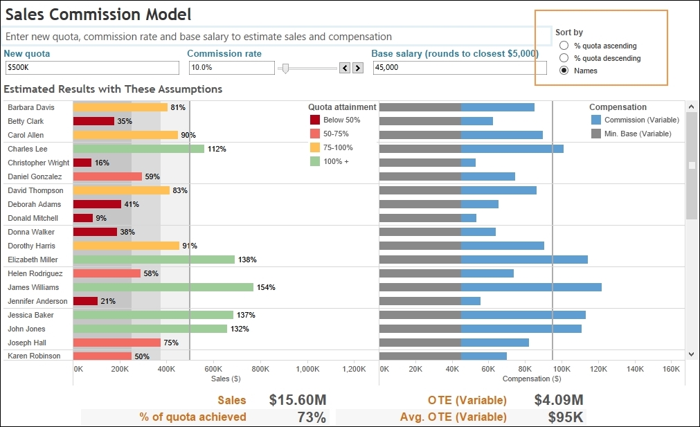
When you click on the middle item, denoted as % quota descending, you can see that the horizontal bar charts in the main area of the dashboard change very quickly in response to the user interaction. The dashboard now looks quite different from the previous Tableau example, where the bars were sorted by Names. The rapidity of the change means that decision makers can think as they click in order to focus on their analysis.
There are a number of different ways in which Tableau can offer useful interactivity for dashboards. For example, we can include sliders, filtering by color, moving from dashboard to dashboard, radio buttons, drop-down lists, and timelines. For example, another interesting feature is that users can enter values into parameters in order to see the impact of their activity. A parameter is a dynamic value that responds to user input. In this example, we use it to filter the data by replacing constant values in calculations.
We use the following steps to view the interactivity:
- Let's see the impact of interactivity on the performance information given by the dashboard. In the Sales dashboard, increase the New quota level to
$1,000,000. - Next, increase the value in the Commission rate textbox to 15.0% by moving the slider to the right.
- Decrease the base salary to
$40,000by inserting this value in the Base salary textbox. Note that the estimated results are now quite different. You can see from the following screenshot that the number of people making the sales target decreases, and the chart now shows a significant increase in the number of people nearing their target or missing it altogether:
- In the previous screenshot, note that the colors of the Estimated Results with These Assumptions bars have changed so that most of them now show red or yellow. All but two of the green bars have disappeared. This gives a visual cue that the estimated results have changed considerably for the worse after we made changes to the filter. We can also see this due to the presence of the target line, which shows whether the individual met his/her target or not. The following screenshot depicts this, with the target line identified by the tooltip quota reading New Quote = $1,000K and highlighted in the box:

Tableau gives you a series of sample dashboards as part of the installation. You can also see more samples online. Some samples are provided by Tableau team members, and you can also visit the Tableau website for samples submitted by keen data visualization fans from around the world. These samples can help to inspire your own work.
In this topic, we compared the changes on a dashboard in order to see how Tableau responded to changes. We noted that the color has changed along with the values. The dashboard provides quick feedback that the values do not change favorably for the new quotes, commissions, and base salary. When decision makers are interacting with dashboards, they are expecting quick-as-a-flash responsiveness from the dashboard, and the sample Tableau dashboards meet this expectation well.
Tableau offers a number of sample dashboards on its website, and it is worthwhile to check the site for ideas and brainstorming for your own dashboards. Take a look at www.tableausoftware.com for examples. If you are interested in the dashboard theory in general, then you can look at the following references:
- Dashboard Confusion, Stephen Few, Intelligent Enterprise, 2004
- 5 Best Practices for Creating Effective Dashboards by Tableau Software (http://www.tableausoftware.com/learn/whitepapers/5-best-practices-for-effective-dashboards)