
Dashboards rely on the power of visualization in order to let people see the message of the data, in order to make effective decisions. How can you show the power of a dashboard when compared to a crosstab table?
In this recipe, we will see how data visualization can have more impact than a straightforward crosstab. We will make a crosstab table in Tableau, and then turn it into a data visualization to see the impact in action. Understanding your data is an essential part of data visualization, regardless of the technology you are using. Tableau can help you to understand your data by automatically distinguishing between measures and dimensions. How do you know the difference? Look at the title of a report or dashboard. For example, if a dashboard is called Sales by Country, then anything that comes after the word by is a dimension and the item being counted is a measure. Dimensions and measures are explained as follows:
You can usually tell the dimensions and measures in the title of the report. For example, if you take a title, such as Sales by Region, then the measure comes before the word by, and the dimension comes after the word by.
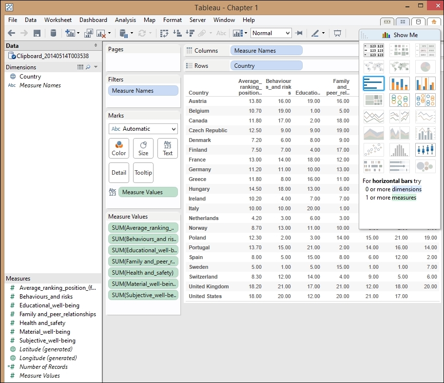
In this recipe, we will look at the difference between a plain table and a graphical representation of the data. While tables are data visualizations in themselves, Tableau's power lies in its ability to visualize data graphically and quickly. This recipe will demonstrate the ease of going from a table to a picture of the data. We will create a map, and the color intensity of the map coloring reflects the value. To do this, we introduce the Show Me button, which is Tableau's way of making data visualization simple and quick, so that the emphasis is on producing insights rather than focusing on creating the Tableau visualization.
Tableau distinguishes between worksheets and dashboards. Worksheets are analogous to worksheets in Excel, and they contain a single data visualization. Implemented in Tableau, dashboards are a canvas that contain one or more worksheets, which means they can display more than one visualization at a time.
In Tableau, there are many different ways to connect data. In this topic, we will just look at the simplest method, which is to copy and paste the data directly into the Tableau workbook.
Let's start by opening up Tableau to get ready for your first visualization.
We will need to get some data. To obtain some sample, download the UNICEF Report Card spreadsheet from the following link: http://bit.ly/JenStirrupOfficialTableauBookCode.
It will have the following columns:
CountryAverage ranking position (for all 6 dimensions)Material well-beingHealth and SafetyEducational well-beingFamily and peer relationshipsBehaviours and risksSubjective well-being
- In Tableau, click on File in the top left-hand corner and click on New. You can see this in the following screenshot:

- When you've clicked on New, you will get a blank Tableau workbook. This is shown in the following screenshot:

- Let's insert our downloaded data. To do this, go to the Excel spreadsheet and select all of the data by pressing Ctrl + A.
- Next, copy the data by pressing Ctrl + C.
- Once you have done this, go to Tableau and press Ctrl + V to paste it. Here is an example of the data when it is pasted into Tableau:
The following points describe the different panels in Tableau:
- Data: This holds the measures, dimensions, and calculations in the data. You can see this panel, which is situated under the File menu option; it is the long vertical panel found on the left-hand side of Tableau.
- Shelf: This is a place where you drag fields. There are a number of shelves: the Column and Row shelves, the Pages shelf, the Filters shelf and the Marks shelf.
- The Tableau canvas view: This shows the items held in the Rows, Columns, Marks, Pages, or Filters shelf. This is the large middle pane, where you can see your data and your visualizations. In the preceding screenshot, it shows you the data that you copied and pasted into Tableau.
The following steps can be performed to create a quick visualization:
- When you paste the data, it appears as a crosstab. We can see the data, but it is quite difficult to see any patterns in the data.
- Using the preceding list as a basis, it is very simple to create a quick visualization.
- Let's take a copy of our work so that we can compare before and after. To do this, click on the Sheet 1 tab at the bottom of the worksheet. Right-click on the worksheet tab at the bottom of the Tableau interface, and a pop-up menu appears.
- Select the Rename Sheet option and rename the worksheet as
Before. - Then, choose the option Duplicate Sheet, as shown in the following screenshot, to take a copy of the worksheet, and rename the new copy as
After: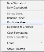
- In the
Afterworksheet, look for Tableau's Show Me feature. This is a key feature of Tableau, and you can see the Show Me toolkit in the right-hand side of the Tableau interface, as shown in the following screenshot:
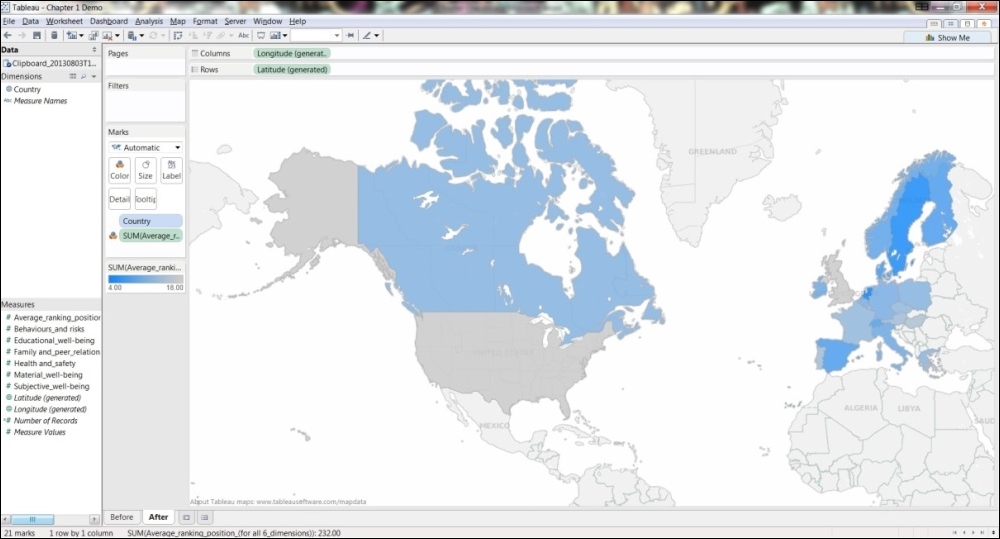
For the purposes of this recipe, we will choose a map visualization.
- Using the
Afterworksheet, click on the first Measures column called Average ranking position_(for all 6 dimensions) to select it. Right-click on the column and choose Keep Only. This excludes the rest of our measures, retaining only this column. The result can be seen in the following screenshot:
- When we exclude the other options, the Show Me toolkit changes in response to the amendments that have been made in the data table. Now, the map options are available to us. The changes in the Show Me toolkit can be seen in the following screenshot:

When we select the filled maps option, which is bordered with a heavy line at the top right-hand side row, our screen now changes to look like a filled map, in which each color corresponds to the average rank of each country. An example is shown in the following screenshot:

- To change the color settings, we right-click on the colors item that is located on the left-hand side of the screen, centered vertically. We can see an example in the next screenshot:

The Edit Colors dialog box appears. An example can be found in the next screenshot:

- Using the square box, you can change the color. Here, it has been changed to blue. The important item to note here is the Reversed option. This option allows us to reverse the color so that the lower numeric values are represented by higher intensities. When we click on OK, we get the final result as shown in the following screenshot:
The Show Me button helps you to choose the data visualization that is most suited to your data. The Show Me toolkit takes the guesswork out of what data visualization tool to choose, by offering you a selection of visualizations that are based on your datatypes.
It does this using an in-built, intelligent, knowledge-based system that is part of Tableau. This helps to take the guesswork out of selecting a data visualization, which can often be a contentious issue among data consumers and business intelligence professionals alike.
Data visualization is telling a story; the value is depicted by a corresponding color intensity. This example topic involved ranking data. Therefore, the higher the number, the lower the value actually is. Here, the value refers to the country rank.
How can we make the message clearer to the users? When we visualize the data in a map, we can still use color in order to convey the message. Generally speaking, we assume that the brighter or more intense a color is, the higher the value. In this case, we need to adapt the visualization so that the color is brighter in accordance with the rank, not the perceived integer.
Color theory is a topic in itself, and you will see practical applications as we proceed throughout this book. For further references, refer to the See also section.