
Filters are a useful way to help users focus on particular aspects of the data that they are most interested in. This helps them to investigate and compare data and perhaps look for outliers and exceptions in the data.
Filtering data is an essential part of a dashboard. Users like to interact with data in order to understand it better, and it is natural to filter data so that users can pinpoint the data that particularly interests them.
Tableau allows users to filter data based on measures, calculations, and dimensions, which is extremely useful in a dashboard. For example, take the case where you need to see sales that are less than a given amount over a period of time. Users have a lot of flexibility when it comes to combining filters, which means that you can have a lot of creativity in your analyses.
In this recipe, we will look at combining the high level with the detailed view. In dashboards, we tend to stick to the summary data only. However, very occasionally, business users may ask for details as well, and this recipe caters to this particular scenario.
We create a dashboard, make the dashboard appear more appealing to business users, and help to make it read better. Furthermore, we will explore some of the options to deliver detailed data to the business users.
Let's make the current dashboard look better!
For the exercises in this chapter, we will continue to use the Chapter Three workbook. In this recipe, we will duplicate the Bins Set Manually worksheet and rename the duplicated sheet to Bins Set Manually Table.
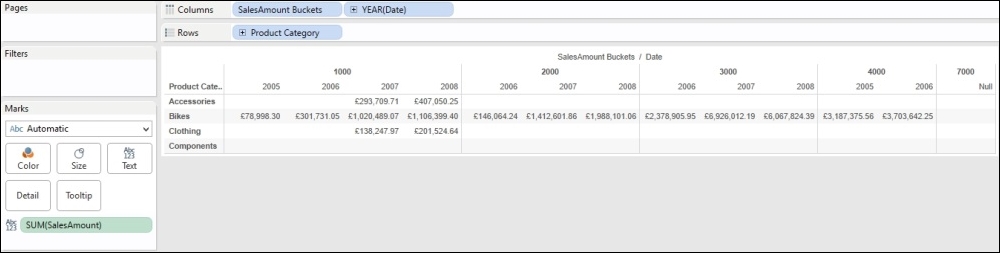
- Make sure that SalesAmount Buckets is in the Columns shelf.
- Ensure Year(Date) is on the Columns shelf to the right of SalesAmount Buckets.
- Drag Product Category to the Rows shelf.
- Remove everything from the Marks shelf.
- Drag Sales Amount to the canvas.
The visualization should appear as follows:
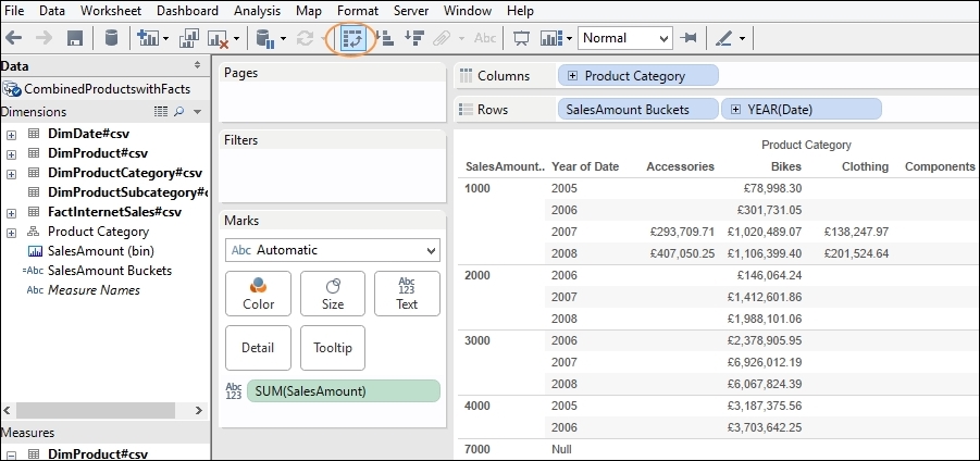
- We will swap the rows and columns so that the table does not use up as much space on the page. To do this, click on the Swap button that is located just under the Format menu item. The Tableau workbook will now appear as follows:
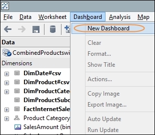
- Now, we need to show the chart and the table next to each another. To do this, we create a dashboard, which is how Tableau combines different charts and tables together.
- We create a dashboard by navigating to the Dashboard menu item and selecting the New Dashboard option. You can see an example of this in the following screenshot:
- A new dashboard will appear, and the tab will simply read Dashboard 1. To rename it, right-click and choose the Rename option. Here, we will call the dashboard,
Bucket Analysis. - Currently, our dashboard is empty, so let's populate it with some tables. On the left-hand side, you will see a section named Dashboard, which contains the names of other worksheets in the Tableau workbook.
- In our example, let's drag the workbook named Bins Set Manually to the dashboard area on the right-hand side. Then, drag the workbook named Bins Set Manually Table so that it sits under the Bins Set Manually chart. Your dashboard should now look like this:

- You will notice in the screenshot that we could make the columns align for each chart. So let's swap the bottom chart back to its original layout. To do this, go to the Bins Set Manually Table worksheet and select the Swap button again.
- Firstly, you will need to resize the bottom table so that it has the same width as the top chart. To resize, hover over the edge until the cursor goes into a double-ended arrow. Then, pull the edge to where you would like it to go.
- Then, to improve clarity, you will need to resize the columns in the bottom table so that the column lines match the lines in the top table. You may find that resizing has affected the readability of some of the numbers in Bins Set Manually Table. Tableau gives us the ability to change the number format plus the appearance of the data in the table. We can make changes in order to make the data more readable.
- We can easily change the format of the data so that it is much more readable, so let's do that first. To change the format properly, go back to the Bins Set Manually Table worksheet.
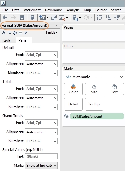
- In the first instance, let's change the format of the data in the table by going to the Format menu item. You can find it easily by going to the Marks shelf, then to the Sum(SalesAmount) pill and clicking on the downward-pointing arrow on the right-hand side. You can see this in the following screenshot:

- When you select the Format option, the left-hand side of the Tableau workbook changes to a specific format-based panel. Normally, the left-hand side panel is dedicated to Data. However, it changes flexibly in response to the user needs. You can see the Format panel in the following screenshot:
- As the first step, we can remove unnecessary data by changing the number format to remove the pennies. This costs us two extra characters in space, which may not seem very much per cell. However, across the 13 columns, this soon adds up to 26 unnecessary characters.
- To remove the pence, go to the Numbers option in the Default part of the Format panel and select the Currency (Custom) option.
- Then, under the Decimal Places option, reduce it to 0 and then save the file.
Make sure that the decimal places are set to zero; this will remove the pennies. This gives us more free space for more important data while retaining the width of the table to match the top chart.
- You can also reduce the font size by selecting the Font option under the Default heading, as shown in the following screenshot:

- Go back to the Bucket Analysis Dashboard, which now appears as you can see in the following screenshot:

- To change the sorting of the table so that the rows are sorted by the value of the data and not the name of the product category, we will need to go back to the Bins Set Manually Table worksheet.
- Go to the Rows shelf, and you will find the Product Hierarchy dimension attribute. Right-click on it, and you will get a pop-up menu. Click on Sort, as shown in the following screenshot:

- Once you have clicked on Sort, you will get a dialog box where you specify what you'd like to sort by. The following is an example of the dialog box:

- If we sort the data in descending order, by value, then it will be clearer for the business users to understand it quickly. As shown in the previous screenshot, you will find a series of options for sorting the data. Here, we have chosen Descending as the value of Sort Order, and we have sorted by the SalesAmount field.
- Now that the data is sorted, we can go back to our dashboard, and we see that the table corresponds much better with the chart. To make the dashboard flow better, we can remove some unnecessary items, thereby adhering to our earlier discussion on chartjunk as a distraction in dashboards. For example, if we right-click on the title of the Bins Set Manually table, we can hide the title so it does not form an interruption between the chart and the table. The option is shown in the following screenshot:

- Now that we have removed the titles, the image is simpler. Furthermore, the chart and table are consistent with one another.
- We can also add in text to make the dashboard clearer. To do this, go to the top workbook item and select Edit Title. Next, type in
What are my Sales Buckets by Category and by Year?.We can see this from the following final screenshot:

Tableau helps you to combine the summary and the detailed data by placing them together on the same page. When you click on a value in the legend, it highlights the appropriate values on the page. We have set up the configuration visually using Tableau so that we don't have to handcraft all of the programming language that occurs behind the scenes. This is stored in the .twb file, and we don't need to know any programming language to create dashboards.
Brushing the data gives us the opportunity to highlight and filter relevant data, which helps the business user to see emerging patterns in the data.
To summarize, we have used a combination of charts and details to create a dashboard. Normally, in dashboards, we focus on the summary of the most important information to help people make decisions. Occasionally, however, users will ask to be provided with the details and this technique allows people to see the pattern of the data alongside the actual detail. Some of you will notice, however, that there is something wrong with the ordering of the data in the table. The rows are ordered by the Product Category hierarchy, and these are ordered in alphabetical order. However, this does not match the data that appears in the chart above it. For example, if you take the 1000 bucket, you will see that the data points are accurately representing the value. So, the Bikes sales are represented by the values that appear at the highest point of the y axis. However, in the table below, the Bikes sales appear in the second row with the Accessories value above them.