
Removing some of the data can actually reveal more of the message of the data by narrowing the focus. Using filter controls in worksheets and dashboards is a way to pinpoint the data that you would like to show. Filters are very easy to set up, and their "clickiness" can help maintain "stickiness" in interacting with the dashboard itself.
In this recipe, we will create dashboards that provide a summary while adding filters to include an interactive aspect to the dashboard, thereby engaging users further in the data. We will filter by measure and then show how this filter can be used in a dashboard.
For the exercises in this chapter, we will continue to use the Chapter Three workbook. In this recipe, we will focus on the Bins Set Manually worksheet and rename the dashboard from Dashboard 1 to Sales Dashboard.
- Take the SalesAmount metric from the Measures pane and put it in the Filters panel.
- When you release the measure into the panel, you will see the following Filter Field dialog box pop up:

- We will filter on the Sum value, so select Sum and click on Next.
- Then, you will get the Filter dialog box, and an example of this is as follows:

- In the worksheet, you can get a slider filter by simply clicking on the OK button.
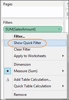
- If you want the filter to appear as a separate slider, then right-click on the SUM(SalesAmount) filter and select the Show Quick Filter option. You can see this option in the following screenshot:
- You can now see that the slider is located on the right-hand side of the dashboard. The following screenshot shows a close-up of the slider:

- The numbers look a little odd, don't they? Let's make it look better. If you click on the downward arrow on the SUM(Sales Amount) filter, you will see the option to edit the filter; you can change the values of MIN to
0and MAX to£7,000,000. Now it looks cleaner:
- We need to decide whether or not we should include the
NULLvalues. The option to show nulls is labeled Show Null Controls, and you can find it in the pop-up menu, as the following screenshot shows:
- The slider now has a drop-down list, which you can see in the following example:

- Now, if you go to the SalesDashboard worksheet, you cannot see the SalesAmount filter. How do we make it appear? Go to the Sales Dashboard worksheet and click on Bins Set Manually Table. If you click on the small downward arrow at the end of the dashboard representation of the table, you will get a pop up.
- Navigate to Quick Filters and select Sum of SalesAmount; you'll see the filter appear in the dashboard, as shown in the following screenshot:

- You can see the resulting dashboard in the next screenshot. Note that you can use the legend to filter along with the slider bar and the data points themselves. Users have many ways of interacting with the data, thereby increasing adoption.

Filters are one of the most important features that automatically come with Tableau. As we did earlier, we set up everything visually, and the programming code is automatically generated behind the scenes. This means that it is easy to create Tableau dashboards, as well as use them.
Using filters is a key part of dashboards, since it allows people to understand the data better so that they can make decisions based on the data. Filters help business users by allowing them to interact with the data. Further, "brushing" the data is a technique whereby we highlight the selected data points in order to see more details and gray out the irrelevant items.
Humans are thought to be able to hold only a limited amount of information in their heads at any one time; the "magic number" is thought to be seven, but it can often depend on the researcher. Highlighting selected data points helps us by focusing our attention on these data points and filtering the irrelevant material.