
Websites often have page trails that help users to find their way around the site. Similarly, in Tableau, we can add features that will help business users to reduce the number of actions that they need to take in order to navigate through the workbook. These actions can help to make worksheets more findable in a Tableau workbook. Findable refers to the ease with which a website can be found, and it is also relevant to finding pages within a Tableau workbook.
Linking workbooks together is an effective visual tool that helps the user to understand where they are in terms of the user's location within the workbook. It also helps to add context. In this recipe, we will look at user-oriented trails in a Tableau workbook.
In this recipe, we will use the existing workbook that you created earlier in this chapter. If you have taken the Number of Records field and put it onto the white canvas, remove it.
- First, let's rename the worksheet to
Overview. - Let's take the SalesAmount metric from the
FactInternetSalestable, and place it onto the white canvas. - Then, navigate to the DimSalesTerritory dimension, look for the
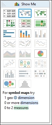
SalesTerritoryCountryattribute, and drag it onto the white canvas. - Once you have the fields in place, let's select the filled map from the Show Me panel. To help you find it, you can see the next screenshot:
- Let's work with the visualization of data. An example of data visualization is given in the next screenshot:

- Now, let's work on the color and the size. For the color, let's drag the SalesAmount metric from the
FactInternetSalestable, and place it onto the Color button on the Marks shelf. - When you see the SUM(SalesAmount) metric on the Marks shelf, right-click on the arrow on the right-hand side of the dialog box. Select the Edit Colors option. You can see this in the next screenshot:

- From the drop-down list, select the Blue option for color.
- Then, we will select the Stepped Color option.
- Next, select 3 steps and click on OK.
- Some of the colors might appear a little pale on the screen, so we will give a very light border to the shapes. To do this, click on the Color button on the Marks shelf.
- Look for the Effects section for the Border option. Here, you will get a drop-down list that gives you the option to change the color. In this example, the border has been changed to a mid-purple color, since it is softer than black or dark grey, as shown in the following screenshot:

Once you have made these changes, the screen will appear as you can see in the following screenshot:

- So, let's proceed towards creating our
Product Category Detailworksheet. Now that we have anOverviewworksheet, we will create aProduct Category Detailworksheet that we would like to navigate to. To do this, simply right-click on the tab and select Duplicate Sheet. - Rename the duplicated worksheet to
Product Category Detail. - Navigate to the
DimProductCategorydimension, look for theEnglishProductCategoryNameattribute, and drag it to the Rows shelf. - Next, let's add an action that will allow the user to simply right-click on country on the
Overviewworksheet, and they are presented with theProduct Category Detailworksheet. To add an action, go to the Worksheet menu item and choose the Actions… option. The following screenshot is an example of this:
- Now, when we click on the Actions… menu item, we get a dialog box. We should now click on the Add Action > button, and this will give us a number of options, as shown in the next screenshot:

We have three options, as follows:
- Filter: This action means that you can make a trail between worksheets—from the summary to more specific data—going down to the details
- Highlight: This action emphasizes specific data points dependent on the rules you set up
- URL: This action allows you to link to external data, such as a website or a SQL Server Reporting Services report
- In this example, we will choose a straightforward Filter example. When you select the Filter option, you will get the dialog box that appears in the next screenshot:

- Set the Name field to
ProductCategoryFilter. We will set theOverviewworksheet as the source sheet, and press on theSelectbutton on the right-hand side. Then, set theProduct Category Detailworksheet as the target sheet. - When you've selected the correct sheets, click on OK, and your action is all set up.
- We can test whether the action works simply by going to the
Overviewworksheet and right-clicking on a country, and then click on theProduct Category Detailoption at the bottom of the pop-up menu. So, for example, if you click on Australia, then theProduct Category Detailworksheet will appear with Australia in the middle of the page. - To summarize, we have set up a simple Tableau action that links worksheets together. This improves the user's experience in navigating through the data, in that, they can get the results from the dashboard quickly.
In this recipe, we have used actions so that we can create worksheets that are more detailed than the Overview worksheet. Research has shown that people tend to prefer navigating from the summary data down towards the details, so our page trails will work in the same way.
An important item to note is the item marked Target Sheets, in the Edit Filter Action dialogue box. There are options to Leave the Filter, Show All Values, or Exclude all Values. These features allow you to preserve the filter or release the filter when the user goes from one worksheet to another.
In our example, we preserved the filter. This means that we are facilitating user navigation by going from a summary view to a more detailed, filtered view.
Why did we only choose three colors to represent the SalesAmount value? We are not distinguishing the colors at a fine-grained level. Instead, we are using color to broadly distinguish the value of SalesAmount into three categories. The lower values are represented by a light color, and the higher values are represented by a darker color—a more intense blue. Research has shown that people tend to associate lighter colors with smaller values, and more intense, bright, or dark colors with higher values. You can follow this up by looking at Show Me the Numbers: Designing Tables and Graphs to Enlighten, Second Edition, Stephen Few, Analytics Press.
Using color in this way does not provide you with any details, but it can help you to see patterns in the data very quickly. This is extremely useful for dashboarding.