
Organizations often have their own definitions of geographic data. Although country names stay relatively static, their classification can change as the organization emerges from one level of maturity and progresses to another. Sometimes, for example, an organization can start with a very simple division: North America and EMEA. However, as the organization grows, it may split into North America, Europe, Asia Pacific, and Rest of the World. This can mean that the geography has a business context and meaning; it also describes a physical location.
Since some geography is fairly standard, Tableau offers a default interpretation of certain geographic data to help you automatically create maps from your data, for example, the default interpretation includes countries, states, and area codes. However, Tableau's default interpretation can be tailored to align with the business interpretation of geographic data.
In this recipe, we will add some customized geographic data by importing a custom file and then using the customization to create a data visualization. The data is taken from the Human Development Index research, which is part of the United Nations Development Programme, an organization with the goal of "advocating for change and connecting countries to knowledge, experience, and resources to help people build a better life." The Human Development Index (HDI) is a new way of measuring development by using metrics such as life expectancy, educational success, and income and combining them into one measure. You can find more information about the HDI metric at http://hdr.undp.org/en/statistics/hdi/.
In this recipe, we will look at importing custom geocoding. One interesting feature of this exercise is how we go about using color to indicate rank.
Let's continue to use the Chapter 5 workbook. You have an amended DimSalesTerritory to reimport, which contains the HDI rank of each country in the AdventureWorks database. To reimport this, replace the existing DimSalesTerritory.csv file with the DimSalesTerritory.csv file found in the Chapter 5 workbook. If you open the new file, you will see that it contains an additional column: HDIRank. To refresh the data, simply go to the Data menu option and select Refresh All Extracts. You should see a new column called HDIRank in the DImSalesTerritory dimension.
The data created to customize geocoding in Tableau must follow a number of rules:
- The filename must be the same as the key of the data
- The file must be in CSV format
For the purpose of this example, download a small file called HDIRank from http://bit.ly/JenStirrupOfficialTableauBookCode. The data file contains three columns: a nominal latitude and longitude of the countries contained in the AdventureWorks database along with their HDI ranks according to the HDI 2013 report.
- Once you have made a copy of the data file, open the
Chapter 5workbook in Tableau and proceed to import the custom data file. Doing this is simple. Go to the Map file menu item, then to the Geocoding file menu item, and then select the Import Custom Geocoding option, as shown in the following screenshot:
- Once you have selected this option, a small dialog box will appear asking for the location of the file. The following is an example of the Import Custom Geocoding textbox:

- When you have navigated to the file, select the Import button to complete your import. Once you have imported the customized geography, you should be able to see it as part of the geographical role options in the Tableau drop-down list. You can see this in the next screenshot.
- If you go to the DimSalesTerritory measures pane in the sidebar, you will see the new HDIRank column. Drag it to the Dimensions pane to make it a dimension.
- Now, if you right-click on the HDIRank column and look under Geographic Role, you will see a new option called HDIRank, as shown in the following screenshot:

- The next step is to assign the HDIRank geographical role to the HDIRank dimension attribute. To do this, right-click on HDIRank, navigate to Geographical Role, and then select HDIRank under Geographical Role. Once you have done this, you will be able to use HDIRank in the data visualization. You will see that the HDIRank symbol changes to show that it has custom geographical data. The following screenshot shows the new symbol:

- For example, we can use HDIRank to drive the color that denotes each country. To do this, drag it to the Color button. Since we are using a rank to distinguish the countries, we can use a sequential palette to show that the data is on a continuum rather than in separate categories.
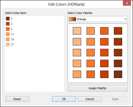
- In this example, we will select the color orange.
- Colors can be changed quite easily using the Edit Color dialog box. You will need to change each color so that the lower values have brighter and darker colors than the lower ranks. The following screenshot is an example:
- Once you have edited the colors, let's use Sales Amount to denote the size. Then, choose the Heatmap option from the Show Me panel. The visualization will now look like the following screenshot:

To summarize, we have used our custom geography to help identify the rank of each country. Since the new role appears in the drop-down list as part of the Tableau interface, it is easy for report developers to use it as part of their dashboards.
Once again, we see that color plays a vital role in conveying the message of the data. In line with research on how to visualize data, Tableau will assume that the lower values should be assigned a less intense color, and higher values should be assigned a darker, brighter, or more intense color. This would apply if our data was rational or interval in nature. However, we are looking at ranking data, so the situation is reversed. In other words, the lower the number, the higher the rank.
- If you'd like to see the full HDI 2013 report, you can find it at http://hdr.undp.org/en/media/HDR2013_EN_Summary.pdf.