
Sometimes people want an infographic rather than a data visualization. An infographic is a picture or a poster that illustrates a part of the story contained in the data so that the viewer understands it very quickly. Data visualization, on the other hand, allows viewers to make up their own minds about the data, which can often be a longer process.
In this recipe, we will look at adding an infographic or a picture to the Tableau dashboard and putting it together with data visualizations that tell a story of the comparison of certain results between the United Kingdom and Australia.
This recipe consists of a number of steps. Generally, we will use a background image and then configure the properties of the image using Excel. We will then go back to Tableau, and use the image and the Excel file to configure the appearance of the Tableau worksheet.
For the exercises in this recipe, make a copy of the Chapter 5 workbook and name it Chapter 6. We don't need to add in any more data for now.
Configure the dimensions of your image in an Excel workbook and save it separately to connect to it later. Record the length and width of the image as X and Y values.
First, choose your background image and use it as a base for your infographic. For the purpose of this recipe, we have provided you with a sample image that you can download from http://bit.ly/TableauImage. You can use your own background image as well. Then, perform the following steps:
- Create a new Excel workbook and call it
TableauImage.xlsx. - In the Excel workbook, create a headings row by typing the following three items into the following cells:
- Cell A1:
Country - Cell B1:
X - Cell C1:
Y
- Cell A1:
- Simply enter the word
Countryinto cell A2. - Next, record the width of the image in pixels in cell B2, which is the
Xvalue. For our example, the width is527. Your Excel workbook should look like the following screenshot: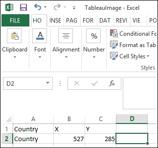
- Now, record the height of the image in pixels in cell C2, which is the
Yvalue. For our example, the height is285. - Save your Excel workbook as
TableauImage.xlsxand close it. - Go back to Tableau and create a new worksheet called
KPI Poster. - Next, connect to the Excel workbook that you just created. To do this, go to Data, then click on Connect to Data and select the option Microsoft Excel on the left-hand side.
- Navigate to the
TableauImage.xlsxfile and choose the option Connect live, and then select Go To Worksheet. - Next, connect to the image by setting it as a map. To do this, navigate to Map | Background Images and then select the Excel spreadsheet that contains the image dimensions, as shown in the following screenshot:

- Choose Add Image and then browse for the location of the image file in your
Chapter 6folder. Now, select the file, and you will see it appear in the Add Background Image box, as shown in the following screenshot:
- Next, enter the dimensions of the file in the X and Y axis fields. For the X field, choose X from the drop-down list.
- For the X field, leave Left as
0and enter the width of the image in the Right field. In our example, the width is527, so enter this value in the Right field. - For the Y field, leave Bottom as
0and enter the height of the image in the Top field. In our example, the height is285, so enter this figure in the Top field. - Click on OK, and you will return to the Tableau worksheet. Rename the worksheet to
KPI Poster. - Now, we need to plot our X and Y fields.
Drag X onto the Columns shelf, right-click on it, and select Dimension. Drag Y onto the Rows shelf. Your image will now appear.
- Right-click on the Y green pill on the Rows shelf and select Dimension from the pop-up menu.
- You may notice that you have the axis headers appearing on the x and y axes. To remove each axis, right-click on the axis and uncheck the Show Header option. A sample of this is illustrated in the following screenshot:

- Now, we can select the point at which we would like the data to appear. To do this, pick a spot to the right of the Australian flag, right-click on it, and select Annotate and then Point. When you click on OK, you will see the x and y coordinates for any point.
- Similarly, select a point for data related to the United Kingdom flag. To do this, pick a spot to the right of the United Kingdom flag, right-click on it, and select Annotate and then Point. When you click on OK, you will see the x and y coordinates for any point.
- When you have the points that you want, open the Excel workbook called
TableauImage.xlsx. - Enter
Australiain cell A2. - Enter
United Kingdomin cell A3. - Your spreadsheet should look like the following screenshot:

- Save and close the Excel file.
- Go back to your Excel worksheet.
- To refresh the data source, go to the Data field at the top left-hand side and look for the
TableauImagedata source. Right-click on it and select Refresh. - Next, set up a relationship between the Excel worksheet and the Tableau FactInternetSales+ table. To do this, go to Data and select Edit Relationships.
- Now, place the Country field on the Level Detail shelf of the Marks shelf.
- Drag KPI Difference between Actual and Target onto the Color button on the Marks shelf.
- Now, KPI Difference between Actual and Target is driving the color of the KPI. So, for the KPI data above, the color should be blue, and for the KPI data below, the color should be gray.
- You can choose to select the Square option to change the mark types. To do this, go to the Marks shelf, and then to the drop-down list right under the Marks label. Look for Square and select it, as shown in the following screenshot:

- Let's now turn this into a dashboard. Don't worry if the images look strange; the dashboard will be fixed when we put it together.
- Create a new dashboard, and call it
Infographic Dashboard. - On the dashboard, drag our new image to the top left-hand side.
- Drag the Golden Record sheet to the top right-hand side.
- Drag KPI Shapes to the bottom of the dashboard.
- For the Golden Record chart, simply right-click on France, Canada, Germany, and the United States and choose the Exclude option. Only the data for Australia and the United Kingdom should be displayed on the dashboard.
- To filter the Golden Record sheet, right-click on the arrow located at the top of the chart and select Go To Sheet. From there, drag the countryname attribute onto the Filter shelf and choose the Filter option. In the list of countries, select Australia and United Kingdom and then click on OK.
- Remove the title from each component of the dashboard. To do this, click on each of the components and look for the arrow at the top right-hand side. In the pop-up menu, click on Title to uncheck it.
- Finally, let's add a title so that the intent of the dashboard is clear. Drag the Text button from the left-hand side of the dashboard over to the top of the dashboard. For the text itself, enter
How does Australia compare to the United Kingdom overall?into the textbox, changing the font to royal blue.
Now, you've completed the steps. The dashboard will appear as follows:

In this section, we used a custom image and overlaid it with data points in order to produce an infographic that displays up-to-date data. This infographic can be used as part of a dashboard to complement and highlight the main message of the data.
To do this, we need a base image and an Excel workbook as a small data store. We use the Excel workbook to hold the image size of the picture, and we add to it throughout. When Tableau starts up, it loads the data, such as the file properties, from this Excel workbook so that the image is loaded properly. It provides some information that helps us locate the data points at particular points on the image.
- If you want to know more about infographics versus data visualization, visit http://www.jenstirrup.com/2010/12/data-visualisation-and-infographics.html