POWERPOINT PRESENTATIONS
PowerPoint presentations are created to provide visual aids during oral presentations, sales presentations, and as stand-alone computer-based training. (Figures 52–55.) When creating PowerPoint presentations, consider the following tips:
![]() Slide designs should focus the audience’s attention on a particular aspect of each slide.
Slide designs should focus the audience’s attention on a particular aspect of each slide.
![]() Use contrasting colors, different text sizes, bold, or italics to set apart a particular element on the screen.
Use contrasting colors, different text sizes, bold, or italics to set apart a particular element on the screen.
![]() Highlight individual lines of text that are the focus of the slide.
Highlight individual lines of text that are the focus of the slide.
![]() Bulleted text lines should be aligned to give the page an elegant look.
Bulleted text lines should be aligned to give the page an elegant look.
![]() Keep all bullets on the same level grammatically parallel.
Keep all bullets on the same level grammatically parallel.
![]() Indent text from the bullet symbols by a consistent space for all levels of bullets.
Indent text from the bullet symbols by a consistent space for all levels of bullets.
![]() Avoid big paragraphs of text that fill the slide.
Avoid big paragraphs of text that fill the slide.
![]() Use bullets, headings, and subheadings instead.
Use bullets, headings, and subheadings instead.
![]() Repeat visual elements and text throughout the presentation to focus on key points and to unify the presentation.
Repeat visual elements and text throughout the presentation to focus on key points and to unify the presentation.
![]() Repeat headings from slide to slide when appropriate.
Repeat headings from slide to slide when appropriate.
![]() Repeat text from slide to slide, while highlighting a different line on each slide.
Repeat text from slide to slide, while highlighting a different line on each slide.
![]() Group similar items on the slide to show a relationship.
Group similar items on the slide to show a relationship.
![]() Use subheadings with nested bullets for a list.
Use subheadings with nested bullets for a list.
![]() Use a graphic with associated text to show a visual connection to the text.
Use a graphic with associated text to show a visual connection to the text.
![]() Use sans serif fonts like Helvetica, Swiss, Arial, Avant Garde, and Modern.
Use sans serif fonts like Helvetica, Swiss, Arial, Avant Garde, and Modern.
![]() Avoid mixing serif and sans serif fonts within the same presentation.
Avoid mixing serif and sans serif fonts within the same presentation.
![]() Apply background shading for presentations that will be projected.
Apply background shading for presentations that will be projected.
![]() Use a white background for presentations that will be printed and distributed on paper.
Use a white background for presentations that will be printed and distributed on paper.
![]() If shading is used, use a gradient that gradually changes from light to dark or from one color to another to add visual depth to the presentation.
If shading is used, use a gradient that gradually changes from light to dark or from one color to another to add visual depth to the presentation.
![]() Apply a consistent color scheme to the entire presentation.
Apply a consistent color scheme to the entire presentation.
![]() Do not use differently colored backgrounds for each slide in the presentation.
Do not use differently colored backgrounds for each slide in the presentation.
![]() Create styles for the entire presentation using Slide Master to:
Create styles for the entire presentation using Slide Master to:
![]() Set the text placement as well as font size and color on all slides.
Set the text placement as well as font size and color on all slides.
![]() Keep the presentation consistent.
Keep the presentation consistent.
![]() Use Notes Master to insert speaker notes into the presentation.
Use Notes Master to insert speaker notes into the presentation.
![]() When printed on paper, the slide appears at the top of the page and the notes appear at the bottom.
When printed on paper, the slide appears at the top of the page and the notes appear at the bottom.
![]() Use Handout Master to add text and artwork to audience handouts.
Use Handout Master to add text and artwork to audience handouts.
![]() To save time when designing a presentation, use PowerPoint templates that are prebuilt and professionally designed.
To save time when designing a presentation, use PowerPoint templates that are prebuilt and professionally designed.
![]() Templates are available within the PowerPoint application.
Templates are available within the PowerPoint application.
![]() Additional templates can be downloaded from the Internet.
Additional templates can be downloaded from the Internet.
![]() Use charts, photos, or illustrations that communicate visually.
Use charts, photos, or illustrations that communicate visually.
![]() Free clipart is available within PowerPoint.
Free clipart is available within PowerPoint.
![]() Bar charts and pie charts can be created in PowerPoint.
Bar charts and pie charts can be created in PowerPoint.
![]() Organizational charts can also be created within PowerPoint.
Organizational charts can also be created within PowerPoint.
![]() The Smart Art Graphics feature, available within the PowerPoint program, allows you to insert nice looking diagrams.
The Smart Art Graphics feature, available within the PowerPoint program, allows you to insert nice looking diagrams.
![]() Digital cameras can be used to take photographs that can be imported into PowerPoint and placed on a slide.
Digital cameras can be used to take photographs that can be imported into PowerPoint and placed on a slide.
![]() AutoShapes allows you to create geometric shapes, arrows, and lines to help illustrate your slides.
AutoShapes allows you to create geometric shapes, arrows, and lines to help illustrate your slides.
![]() Videos, animation, and sound can be added to slides to create a multimedia presentation.
Videos, animation, and sound can be added to slides to create a multimedia presentation.
Planning a Presentation
Consider the following guidelines as you plan your presentation.
![]() Determine your goal and objectives.
Determine your goal and objectives.
Example: Do you want to persuade or inform?
![]() Keep the presentation simple and focused.
Keep the presentation simple and focused.
![]() A clear message with more impact is more likely to achieve results than an unfocused one.
A clear message with more impact is more likely to achieve results than an unfocused one.
![]() A complicated message is muddled and will leave the audience confused and frustrated.
A complicated message is muddled and will leave the audience confused and frustrated.
![]() Keep the number of topics covered to a minimum.
Keep the number of topics covered to a minimum.
![]() Design the presentation like creating a story.
Design the presentation like creating a story.
![]() Organize the content with a beginning, middle, and end.
Organize the content with a beginning, middle, and end.
![]() Design for drama.
Design for drama.
![]() Pique your audience’s interest toward the end of the presentation and deliver the central conclusion of your message when you have the full attention of everyone.
Pique your audience’s interest toward the end of the presentation and deliver the central conclusion of your message when you have the full attention of everyone.
![]() Plan your media selection.
Plan your media selection.
![]() Will you use slides and a digital projector, printed handouts, or both?
Will you use slides and a digital projector, printed handouts, or both?
![]() Think and plan ahead.
Think and plan ahead.
![]() If you give the audience handouts before the show, they can follow along and write notes directly on the handouts.
If you give the audience handouts before the show, they can follow along and write notes directly on the handouts.
![]() Handouts also give the audience something to reference if they have trouble seeing the screen.
Handouts also give the audience something to reference if they have trouble seeing the screen.
![]() If you distribute handouts at the end of the presentation, you can avoid giving away any planned surprises.
If you distribute handouts at the end of the presentation, you can avoid giving away any planned surprises.
![]() Consider the subject matter.
Consider the subject matter.
![]() The tone of your presentation depends on the type of presentation: training seminar, presentation to managers or employees, or a sales presentation to customers.
The tone of your presentation depends on the type of presentation: training seminar, presentation to managers or employees, or a sales presentation to customers.
![]() Consider the audience’s:
Consider the audience’s:
![]() Familiarity with the subject matter
Familiarity with the subject matter
![]() Composition (will the audience be exclusively employees, or customers, or mixed?)
Composition (will the audience be exclusively employees, or customers, or mixed?)
![]() Size (large audiences dictate the need for more structure and formality; small audiences may be less formal, giving you more room for improvisation and one-on-one interaction)
Size (large audiences dictate the need for more structure and formality; small audiences may be less formal, giving you more room for improvisation and one-on-one interaction)
![]() Consider the environment for the presentation.
Consider the environment for the presentation.
![]() How visible is the screen from each part of the room?
How visible is the screen from each part of the room?
![]() If visibility is in question, include handouts with printed versions of each slide.
If visibility is in question, include handouts with printed versions of each slide.
![]() If you are not familiar with the equipment, arrange time for setting up and rehearsing your presentation before delivering the real thing.
If you are not familiar with the equipment, arrange time for setting up and rehearsing your presentation before delivering the real thing.
![]() Practice delivering your presentation.
Practice delivering your presentation.
![]() Deliver your presentation to a coworker or friend and ask for a critique.
Deliver your presentation to a coworker or friend and ask for a critique.
Figure 52 Slide with Bulleted Lists,
a Graphical Background, and Photo
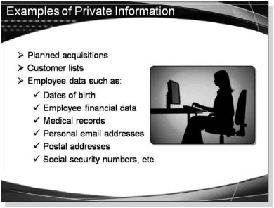
Figure 53 Slide with Title,
Bulleted Subtitle, and Pie Chart

Figure 54 Slide with
PowerPoint WordArt
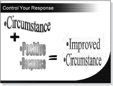
Figure 55 Slide with
Graphics Rather Than Text