21 Pictorial Guides
The eye analyzes a picture in a totally nonrandom way. Scientific research discovered a long time ago where the eye of a Western viewer will generally enter the picture: If one places a white sheet of paper in the shape of the golden ratio, the eye will first see the part of the picture located slightly to the left of the vertical and somewhat above the horizontal axis of symmetry. You can apply this rule to construct a photo so that the viewer’s gaze will be consciously guided across the picture.
It is also good to know that Westerners tend to read images from left to right. In a fully traditional composition it would make sense, for example, to allow the viewer to enter the picture on the left and then lead him to the right so that his gaze will rest in the middle, where the most important section of the pictorial message has been placed.
How do you guide the eye across an image in the first place? Contrast plays a very important role when trying to find out how the eye moves across an image. In black and white photography, the viewer’s eye is unconsciously attracted to the contrasty elements or parts in a photo. By consciously arranging the contrasty (and therefore dominating) elements in certain places of the photo, it is possible to guide the viewer’s gaze. The art of good black and white photography is, after all, the conscious application of contrast control with all available technical and pictorial means.
Three Contrast Points
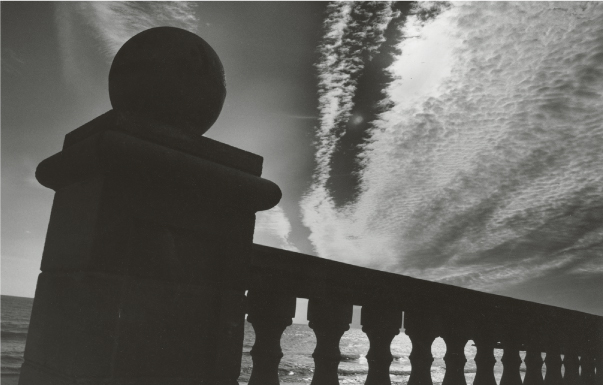
The photo in figure 21–1 has these three dominant elements: the sphere in the upper left, the sun that contrasts nicely with the sky, and the railing that provides a separation from the sea and determines the photo’s pictorial rhythm. The composition of these dominant elements leads your eye through the photo as follows:
- Your eye enters the image in almost the same location as the spherical structure on the wall.
- Your eye moves in the direction in which you read, in other words from left to right, until it reaches the brightest spot in the photo, which is the sun hidden behind the clouds in the upper right.
- Your eye moves a little bit along the fleecy clouds and then quickly toward the lower section of the image.
- Your eye is guided to the right, moving along the railing.
- Your eye begins the journey back to the sun and the sphere.

1 Vertical symmetry axis
2 Upper harmonic dividing line
3 Horizontal symmetry axis
4 Ascending diagonal line
5–6 Visual starting point (highest contrast) and viewing path
The magical effect of the backlit sky, intensified by a yellow filter and subsequent burning in the darkroom, is important for the mood of this photo.
The photo was taken with an analog camera and owes its depth of field to a 28 mm lens and aperture 16.
Contrast through Aerial Perspective
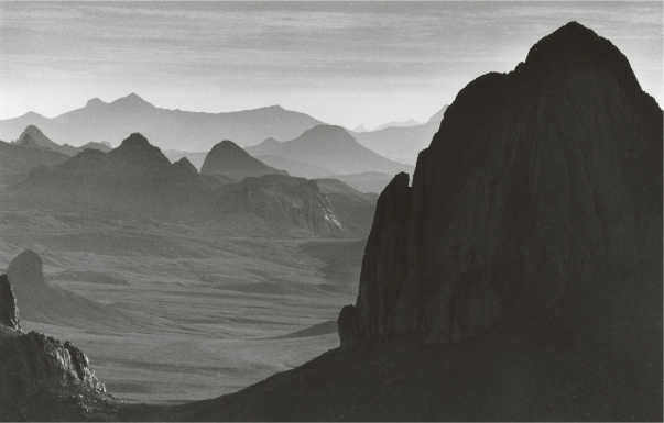
In the Hoggar Mountains of the Algerian Sahara, you can find sparse, rocky formations that divide the photo into brighter and darker parts (figure 21–2). This division creates strong contrast. The composition of the bright and dark elements leads your eye through the photo as follows:
- Your eye enters the image in a classical place of entry, where the largest number of different shapes lies. In addition, the contrast between the middle and far mountain chains is most pronounced in this spot.
- Your eye is magically attracted to the right, toward the section where the largest pictorial contrast is located, namely between the very dark mountain in the foreground and the mountain chains in the background or the brightest part of the sky. It is important for the front mountain to still have some texture so it doesn’t look like an inkblot.
- Your eye explores this mountain, moves along the left ridge to the bottom, and then moves along the arch of the shadow until returning to the point of entry.
This photo is a typical example of the intensity of so-called aerial perspective—the fact that objects become lighter as they recede into the distance, especially if the scene is backlit.
The photo was taken with an analog camera using a 300 mm telephoto lens on a tripod and shooting with f/11.
Arched Guidance of the Gaze
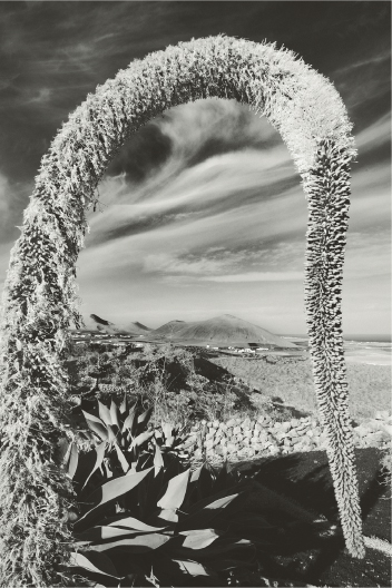
In the image in figure 21–3, the path on which your gaze is guided is quite obvious; the composition uses arch-shaped elements to lead your eye through the photo as follows:
- Your eye enters at a dark, semicircular spot in the sky below the upper left arch that is formed by an exotic plant, and your eye is captured immediately by the arch, of course.
- Your eye is quickly guided to the small volcanoes in the image center.
- Your eye is attracted by the pronounced contrast of the plant leaves at the bottom.
- Your eye is led along the shadow to the right and then moves around the arch to the left.
Such a perspective framework, which can also have the shape of an arch, guides the viewer’s gaze in a particularly strong way. The gaze, in fact, will always keep returning to the arch; from there it will move to the most varied spots in the image only to return to the arch over and over again.
The photo was taken digitally with a 25 mm focal length, aperture 14 and ![]() s, so both the plant and the background are in focus. A polarizing filter increased the contrast between sky and hazy clouds in the color photo, which was later converted to black and white. The yellow filter used during conversion also helped to create a magical effect in the sky.
s, so both the plant and the background are in focus. A polarizing filter increased the contrast between sky and hazy clouds in the color photo, which was later converted to black and white. The yellow filter used during conversion also helped to create a magical effect in the sky.
More Complex Pictorial Scene
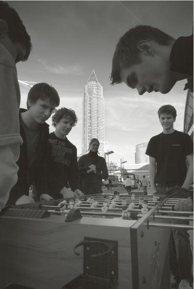
Even in more complex pictorial compositions the viewer’s gaze can be consciously guided. In the next image, several youths play table soccer on Frankfurt’s fairgrounds, a scene that would normally tend to look rather boring. Without a good compositional idea, the result is, in fact, boring (figure 21–4): They all stand in the shadow but are not used as interesting silhouettes—quite the opposite. In the right half of the picture, they cover one another and create a dark muddle. The huge floodlights towering above the left youth draw the viewer’s gaze toward them because of the contrast they create with respect to the sky, but they have nothing to do with what is really happening in the picture. Therefore, the floodlights have no place in the composition. What can be done here? A change of perspective would be a good idea because only a perspective from below would make the photo interesting. This superior view does away with the clutter and guides the viewer’s gaze; the youths stand out as silhouettes and no longer cover each other (figure 21–5).
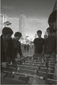
The composition uses silhouettes as elements to lead your gaze through the photo as follows:
- Your eye enters the photo at the face of the left youth.
- Your eye moves quickly to the tower.
- Your eye moves to the face of the other kid on the upper right because the kid stands out well from the sky.
- All the faces have something in common: They all look at the small soccer field.
- Your eye follows their gaze toward the soccer field.
I used Photoshop’s Dodge tool so the players would be bright enough and a rather bright corner would attract the viewer’s attention. The projecting head in the upper right also looks interesting because it seems to be detached from the torso and gives the impression of almost falling into the scene. It is precisely this head that makes the rather banal scene a fully composed picture, which guides your gaze back and forth between four objects: the second youth from the left, the tower, the head without a torso in the upper right, and the lower part of the soccer field.