
Chapter 3
Overbought/Oversold
Most market analysts use indicators to identify zones of high-risk or low-risk buying opportunity. They label these areas as either overbought or oversold. Typically, they associate overbought readings with selling and oversold readings with buying. Unfortunately, such classifications are more misleading than helpful. Once again, most seemingly intelligent and rational investors overlook numerous unprofitable signals and do not conduct the research required for explanations of why they failed. For years, this had bothered me.
It was never my nature to ignore or to dismiss the numerous shortcomings and failures of a market timing approach. I could have speculated why the interpretations assigned to the buy/sell zones were invalid or lacking, but I wanted substantive evidence and I pursued it relentlessly. Unfortunately, there exists no stronger incentive for involvement than to be engaged in a personal trade that quickly becomes unprofitable. My experience trading suggests a strong correlation between actively being involved—trading your personal account and applying techniques—and passively being involved—perusing a chart and making hypothetical trades. Every unprofitable price tick in your personal account seems to inspire more determination to uncover a decision rule that would prevent similar uncomfortable situations in the future. Through a process of trial and error over 15 years ago, I was able to uncover a set of rules to follow when interpreting indicators. The conclusions of my research are presented in this chapter.
Most commonly used indicators, such as RSI or stochastics, are followed religiously by their disciples. These individuals accept as doctrine the widely followed rules and interpretations assigned to these indicator values. It's surprising, however, just how little research they conduct themselves before they install such indicators into their trading regimen. Substantial amounts of money are placed at risk, yet little effort is expended to perform the minimum due diligence required to establish the indicators' efficacy. I'd like to share with you an incident I witnessed a number of years ago to substantiate this claim.
With the introduction of computers and market software in the late 1970s, it was not uncommon to see market analysts pore over short-term price movements and indicator gyrations. I observed one such individual in action and could not believe my eyes—it was an exercise in futility and foolishness. If it hadn't been so sad, it would have been great comedy. As is the case with most traders who use “canned program” indicators, this individual had no clue whatsoever of the composition of the indicator he was following. All he knew was that it appeared to work well historically. He should have known that that excuse alone was an invitation to trading suicide. As with most indicators, the entries on a chart are recorded after a particular time period has lapsed. The various movements that take place within the time period do not appear on the chart. As you might have expected, this individual was trapped in a game of indicator “false starts.” What I am suggesting is that camouflaged between two indicator entries are often moves that generate signals but then disappear by the time the official entry period is completed.
Within a 30-minute period, this individual entered a particular trade three times and exited all three at a loss. Unfortunately, with this pattern of trading, no one benefited but his broker. Such a situation is not unusual, once a trader becomes convinced he can easily realize success and wealth without doing his homework. I admonished this individual that to acquire a better understanding of and an appreciation for the construction and intricacies of the indicator he used required an effort on his part. Had he conducted such an exercise, he would have been aware of the vagaries and nuances of the indicator, as well as the fact that bogus intraperiod signals were inherent to the indicator. I recommended to him that, in order to get an accurate assessment of the indicator's value, he should (1) concentrate on the closing price, which coincided with the completion of the indicator time frame, to determine his true entry price, and (2) ignore ranges because a chart displaying daily highs and lows gives a false perspective of reality. My pursuit to prevent situations such as these resulted in my examination of the most widely followed indicators, as well as the creation of my own stable of indicators. The following discussion highlights what I have found to be the proper interpretation of most indicator-driven overbought/oversold readings.
Proper Interpretation: Mild versus Severe
In August 1982, the stock market recorded a low of major proportions. Soon afterward, the market exploded upside with unprecedented power and thrust. All widely followed price indicators immediately swung from mildly oversold levels to an extreme of severely overbought. As I expected at the time, the consensus of market followers was that, because of this excessive overbought condition, the market would experience a price decline. This never occurred (see Figure 3.1). Just as a rocket requires excessive thrust to be launched out of the earth's atmosphere and into orbit, so too, should the market enjoy a similar experience, a comparable fate would arise: the law of market gravity would at least temporarily be repealed. Observation and experience have proven that market conditions such as these are extraordinary. In this case, for example, an excessive overbought state would not translate into a high-risk buy situation or into a selling opportunity, but rather into an exceptional buying opportunity because of the stampede nature of the advance. The extreme sense of urgency to buy is not associated with a price peak. Generally, the previously defined supply–demand equilibrium level is so disrupted by this surge in demand that it takes a considerable amount of time to dissipate. In fact, I discovered some time ago that such imbalances had similar characteristics.
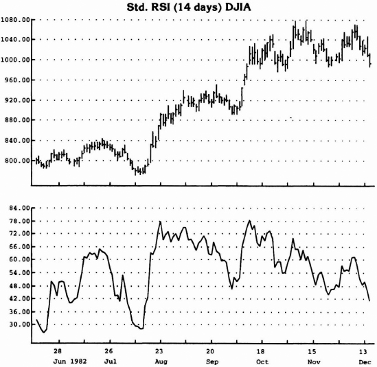
Source: Logical Information Machines, Inc. (LIM), Chicago, IL.
Figure 3.1 The 14-day RSI indicator remained in overbought territory—above 65—for an extended period of time throughout August, as well as in October. These extended periods of overbought are not selling opportunities; rather, they are times to step aside or even enter trades because the demand is so excessive that it first must dissipate (recycle) and then move into overbought and record a mild, not excessive, reading.
Through extensive research, I realized that there were instances of overbought and of oversold conditions that translated into price reversals. I identified a common denominator related to these cases. Specifically, mild overbought/oversold readings correlate well with price turning points. On the other hand, extreme or excessive overbought/oversold readings do not conform and consequently vex most analysts. My work suggested that all that was required was a “recycling” out of the excessive mode back into a neutral zone, and then a second—or third, if necessary—attempt to record a mild reading as a prelude to a price reversal (see Figure 3.2).
My conclusions regarding the proper interpretation of overbought/oversold contradict what most other analysts teach and believe. Specifically, in order to reconcile the fact that the messages sent by their indicators are often premature, most analysts tend to rely on a type of analysis referred to within the market timing industry as divergence analysis. In actuality, this approach misses the point entirely; it is merely the symptom, not the cause. Let me explain. Time is the crucial determinant, whether the condition is labeled mild or extreme. The degree or extent of overbought/oversold is incidental and secondary. Through trial and error, I concluded that, generally, if an indicator is rated overbought/oversold for a period of five or fewer days (other units of time may be substituted as well), the rating is mild. On the other hand, if an indicator is rated overbought/oversold for more than five days, the rating is extreme. As you can see, the key variable is duration (see Figure 3.3).
There does exist a rare instance when an indicator records almost the most extreme possible reading for an extended period of time. The implications are then identical to those of a mild reading, and the expectation is for a reversal (see Figure 3.4). In such an instance, the indicator is positioned at a level that corresponds to such an extreme that it appears to be off the chart.

Source: Logical Information Machines, Inc. (LIM), Chicago, IL.
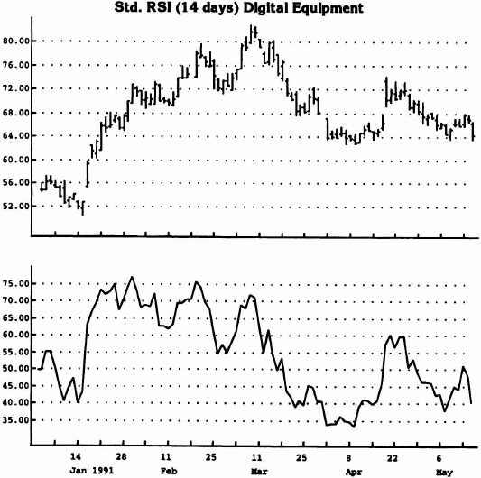
Figure 3.2 The readings of overbought—above 65—were for extended periods in July and August and for a short period of time in September.
Overall Market Environment
Other techniques can be employed to complement and enhance the performance of this approach of indicator evaluation and interpretation. Specifically, I recommend strongly that a longer-term wave perspective of price activity be followed as well, in order to serve as an overlay defining the market's direction. In other words, once the environment is identified, only accept trades that are in concert with that trend. For example, if the trend is up and the current indicator reading is mildly oversold, action can be taken. Conversely, if the trend is down and the current indicator reading is mildly overbought, action can be taken. Otherwise, if they should contradict one another, postpone initiating any activity.
Source: Logical Information Machines, Inc. (LIM), Chicago, IL.
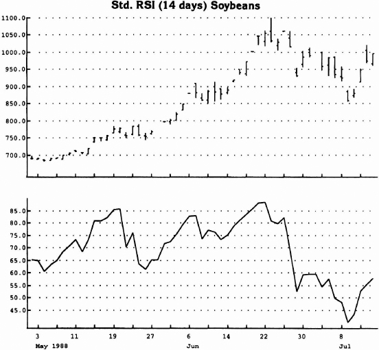
Figure 3.3 See how the period of overbought was for a shorter period of time in March, coinciding with the price peak.
My experience has been that the delineation between mild and severe overbought/oversold is a key factor overlooked by most analysts. I attribute this oversight to a lack of both research ambition and creativity. However, it is not my intention to represent that my procedure is superior to all others by any means. It's just a perspective on indicator interpretation that is original and universally applicable.
Source: Logical Information Machines, Inc. (LIM), Chicago, IL.
Figure 3.4 The number of days in overbought was for such a long period of time that demand finally exhausted itself. This is an exception to the general rule.
Range Expansion Index (REI) and DeMarker Indicator
I introduce here two indicators that I created and have used for some time: (1) the Range Expansion Index (REI) and (2) the DeMarker Indicator. I offer both as alternatives to the many widely followed publicly traded indicators—a number of which, incidentally, I also developed.
The REI and the DeMarker have been designed to identify price exhaustion areas that generally correspond with price peaks and troughs. The aforementioned discussion regarding the proper interpretation of overbought/oversold readings applies to these indicators as well, but because these indicators are arithmetically and not exponentially calculated, the likelihood of extended extreme levels being realized is diminished. Furthermore, the time period used for the REI is 8 days, and severe or excessive readings hardly ever appear and then only for a limited time. The formulas and the rationale for the REI and the DeMarker Indicator are presented below.
Range Expansion Index (REI)
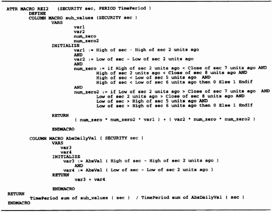
I have always been suspicious of the indicators commonly used by traders. I believed that universal usage and acceptance effectively canceled the benefits that could be derived from any of them. Consequently, either I improved on these indicators or created my own. One such indicator is the Range Expansion Index (REI). I wanted an indicator that was sensitive to periods of ascending and of descending prices but was silent during sideways price movement as well as during steep advances and declines. To accomplish this goal, I established the following guidelines. I compare the high and the low on a particular day with the high and the low two days before it. If the high price is higher than the high two days earlier, then a positive difference is recorded; if it is less than the high two days earlier, then a negative difference is recorded. If the low price is higher than the low two days earlier, then a positive difference is recorded; if it is less than the low two days earlier, then a negative value is recorded. Once these two values are calculated, they are summed together and a value is determined for that particular day.
Table 3.1 shows four possible relationships between today's price range activity versus the price range activity two days earlier. In relation to both the high and the low two days earlier:
- Both today's high and low are greater:
- Both are less than or equal to;
- The high is greater and the low is less than or equal to;
- The high is less than or equal to and the low is greater than or equal to.
By not comparing the current day with the previous day, short-term static is eliminated and there is greater assurance of a trending pattern. An additional condition requires that either the high two days earlier be greater than or equal to the close seven or eight days ago,
Table 3.1 Price Range Activity Comparison
| Price high today is greater than price high two days ago |
| AND |
| Price low today is less than or equal to price low two days ago |
| OR |
| Price high today is less than or equal to price high two days ago |
| AND |
| Price low today is less than or equal to price low two days ago |
| OR |
| Price high today is greater than price high two days ago |
| AND |
| Price low today is greater than price low two days ago |
| OR |
| Price high today is less than or equal to price high two days ago |
| AND |
| Price low today is greater than price low two days ago |
or the current high be greater than or equal to the low 5 or 6 days ago. This prevents buying into a steep decline by requiring price to exhibit some proof of slowing its decline. At the same time, either the low two days earlier must be less than or equal to the close seven or eight days ago, or the current low must be less than or equal to the low five or six days ago. Similarly, this ensures that the rate of advance is not excessive and helps prevent selling into blow-offs. In both these instances, a zero value is assigned if price action fails to confirm some slowdown in the rate of advance or decline. Over an eight-day period, all the positive and negative values are summed. The they are divided by the absolute value of the price movement, both positive and negative. An indicator (ratio) that fluctuates between 100 and –100 has been created.
My experience shows that, once the REI reading exceeds 60 and then declines below 60, price weakness should become apparent. Conversely, once the REI declines below –60 and then advances above –60, price strength should become apparent. The price charts in Figures 3.5 and 3.6 demonstrate this phenomenon. Included is the code prepared for the Logical Information Machine for the REI Macro, Table 3.2.
DeMarker Indicator
The DeMarker Indicator is constructed by making the following comparisons. The current day's high is compared with the high of the previous day. If the current high is higher, then the difference is determined and recorded. If, however, the current day's high is less than or equal to the previous day's high, then a zero is assigned and recorded. Then the daily differences are summed for a period of 13 days. This value becomes the numerator for the DeMarker Index and is divided by that same value plus the difference between the previous day's low and today's low, summed for a total of 13 days. If the current day's low is greater than the low one day ago, then a zero is assigned and recorded.

Source: Logical Information Machines, Inc. (LIM), Chicago, IL.
Figure 3.5 REI movement below –60 is generally associated with price lows. Conversely, REI movement above 60 is common at price peaks.
A simple indicator with sensitive and predicative properties has been created.
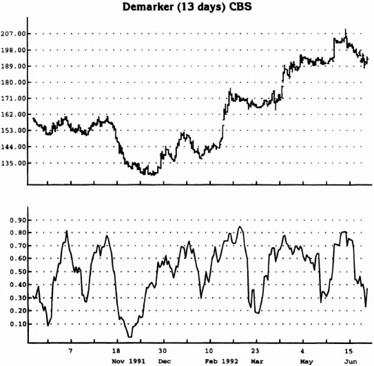
Figures 3.7 and 3.8 demonstrate this phenomenon clearly. As you can see, the indicator fluctuates between 0 and 100. Once the DeMarker Indicator declines below 30, a potential bottom has been identified. Conversely, once the indicator advances above 70, a potential top has been defined.
Just like the REI, the purpose of the DeMarker Indicator is to identify both high-risk and low-risk buy areas. Whereas the REI is designed to make price comparisons every other day to ensure proper trend identification, the DeMarker evaluates price movement from one day to the next. In addition, the REI is calculated over a 8-day period and the DeMarker is constructed using a 13-day average. (The time parameters for both indicators can be adjusted from the standard 8 and 13 days at any time.) Included is the code prepared for the Logical Information Machine for the DeMarker Indicator, Table 3.3.

Source: Logical Information Machines, Inc. (LIM), Chicago, IL.
Figure 3.6 Both charts (Figures 3.5 and 3.6) depict the relationship between the movement of the Range Expansion Index (REI) and the price activity of the underlying security. Activity above 60 and below –60 generally coincides with price peaks and troughs. Specifically, once price crosses above –60 from below and once price crosses below 60 from above, indications of reversal are present.
I recommend that you experiment with both long-and short-term versions of the indicators. By using long-term parameters, you can get a fix on the long-term trend or market environment. By using a short-term indicator to enter a trade at a low-risk entry point, you can fine-tune your entry and be confident that the trade is in the context of the market's trend.
I have included the REI and the DeMarker Indicator to illustrate how easy it is to create your own proprietary indicators. Along with a modicum of creativity, it takes a genuine desire to rise above the trading crowd. When I first attempted to accomplish such goals, there were no personal computers or software for me to rely on. This is definitely not the case today. In short, if you are determined to become successful as a trader, no such excuse exists for you not to perform such functions.

Source: Logical Information Machines, Inc. (LIM), Chicago, IL.
Figure 3.7 Note how movements above 70 and subsequently below in the DeMarker Index coincide with price peaks and, conversely, how index movement below 30 and then above 30 identifies price lows.
Source: Logical Information Machines, Inc. (LIM), Chicago, IL.
Figure 3.8 Note that, once the indicator declines below 30 and above 70, potential turning points are identified.
