
Appendix G
Windows Forms Controls and Components
This appendix summarizes the standard controls and components provided by Visual Basic .NET for use by Windows Forms applications. Some of these are quite complicated, providing dozens or even hundreds of properties, methods, and events, so it would be impractical to describe them all completely here. However, it’s still worthwhile having a concise guide to the most important controls so you know which to pick for a particular task.
Note that components inherit from the Component class and controls inherit from the Control class. Except where overridden, the components and controls inherit the properties, methods, and events defined by the Component and Control classes. Chapter 8, “Using Windows Forms Controls,” discusses some of the more useful properties, methods, and events provided by the Control class, and many of those apply to these controls as well. Appendix A, “Useful Control Properties, Methods, and Events,” summarizes the Control class’s most useful properties.
Figure G-1 shows the Visual Basic Toolbox displaying the standard Windows Forms controls.
FIGURE G-1: Visual Basic provides a large number of standard components and controls for Windows Forms.
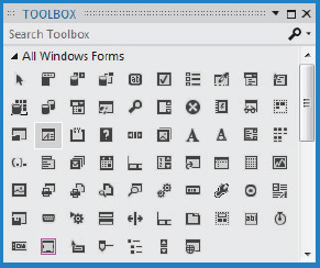
The following table lists the components shown in Figure G-1 in the same order in which they appear in the figure. Read the table by rows. For example, the first several entries (Pointer, BackgroundWorker, BindingNavigator, BindingSource, Button, and so on) correspond to the first controls in the first row in Figure G-1.
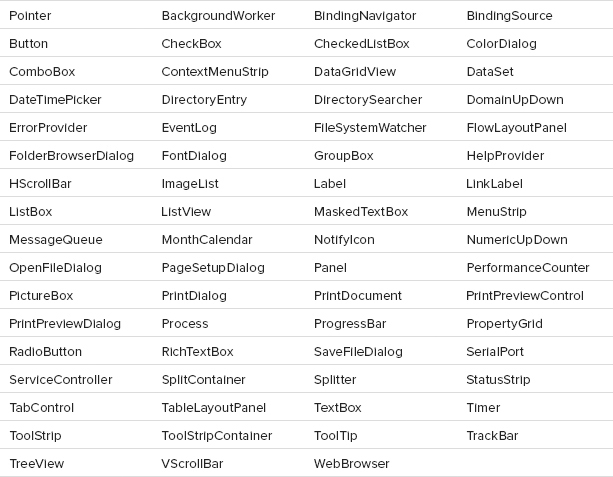
CONTROL PURPOSES
The following table summarizes the controls’ purposes.
| CONTROL | PURPOSE |
| Pointer | This isn’t a control, it’s a tool that lets you select controls in the Windows Form Designer. |
| BackgroundWorker | A component that simplifies multithreading. It lets you run code on a separate thread and receive events to indicate the code’s progress. |
| BindingNavigator | A control that provides a user interface so the user can control a data source. It initially appears as a toolbar docked to the top of the form, although you can move it if you like. |
| BindingSource | Provides control of bound data on a form. It provides programmatic methods for navigating through the data, adding items, deleting items, and otherwise managing the data at the code level. |
| Button | A simple push button. You can use it to let the user tell the program to do something. |
| CheckBox | Displays a box that enables the user to select or clear an option. |
| CheckedListBox | Displays a series of items with check boxes in a list format. This enables the user to pick and choose similar items from a list of choices. |
| ColorDialog | Displays a dialog box that enables the user to select a color from a standard palette or from a custom color palette. |
| ComboBox | Contains a text box where the user can enter a value. It also provides a list box or drop-down list where the user can select a value. |
| ContextMenuStrip | Represents a context menu that you can attach to other controls’ ContextMenuStrip properties. |
| DataGridView | Displays a table-like grid showing data from an underlying data source such as a DataSet or BindingSource. The program can also add rows and columns directly to the DataGridView. |
| DataSet | Holds data in a relational format. A DataSet provides all the features you need to build, load, store, manipulate, and save data similar to that stored in a relational database. For example, it can hold multiple tables related with complex parent/child relationships and uniqueness constraints. |
| DateTimePicker | Allows the user to select a date and time. The control can display one of several styles including a series of up/down controls that let the user scroll through date values (month, day, year), and a drop-down calendar display. |
| DirectoryEntry | Represents a node or object in an Active Directory hierarchy. (Active Directory is a service that provides a common, hierarchical view of distributed resources and services on a network.) |
| DirectorySearcher | Performs searches on an Active Directory hierarchy. See the online help for more information on Active Directory (http://msdn.microsoft.com/aa286486.aspx) and the DirectorySearcher component (http://msdn.microsoft.com/system.directoryservices.directorysearcher.aspx). |
| DomainUpDown | Displays a list of items that the user can select by using the arrow keys or by clicking the up and down arrow buttons beside the control. For example, the control might let the user select one of the values High, Medium, and Low. |
| ErrorProvider | Displays an error indicator next to controls. |
| EventLog | Lets an application manipulate event logs. Provides methods to create logs, write and read log messages, and clear logs. For more information, see the MSDN topic “Logging Application, Server, and Security Events” (http://msdn.microsoft.com/e6t4tk09.aspx). |
| FileSystemWatcher | Monitors part of the filesystem and raises events to let your program know if something changes. For example, it can notify your program if a file is created in a particular directory. For more information, see Chapter 30, “Filesystem Objects,” and Appendix U, “Filesystem Classes.” |
| FlowLayoutPanel | Displays the controls that it contains in rows or columns. |
| FolderBrowserDialog | Displays a dialog box that lets the user select a folder (directory) in the filesystem. The program can set the component’s root folder to indicate where the search should begin. |
| FontDialog | Displays a dialog box that lets the user select a font’s name, size, style (bold, italic), color, and other characteristics. |
| GroupBox | Displays a caption and border. |
| HelpProvider | When associated with a control, if the user sets focus to the control and presses the F1 key, the HelpProvider displays help for the control. The HelpProvider either displays a small tooltip-like pop-up displaying a help string or opens a help file. |
| HScrollBar | A horizontal scroll bar. |
| ImageList | Stores a series of images for use by other controls or by the program’s code. |
| Label | Displays a piece of read-only text. |
| LinkLabel | Displays a label that is associated with a hyperlink. |
| ListBox | Displays a list of items that the user can select. |
| ListView | Displays a list of items in one of five possible views: Details (item and sub-item text on a row), LargeIcon (large icons above the item’s text, List (small icons to the left of the item’s text with each item on its own row), SmallIcon (small icons to the left of the item’s text with multiple items per row), and Tile (large icons to the left of the item’s text). |
| MaskedTextBox | A text box that provides a mask to help guide the user in entering a value in a particular format. The mask determines which characters are allowed at different positions in the text. |
| MenuStrip | Represents a form’s menus, submenus, and menu items. |
| MessageQueue | Provides access to a queue on a message-queuing server. An application can use a message queue to communicate with other applications. For more information, see http://msdn.microsoft.com/system.messaging.messagequeue.aspx. |
| MonthCalendar | Displays a calendar that allows the user to select a range of dates. (This calendar is similar to the one that the DateTimePicker control can display.) |
| NotifyIcon | Displays an icon in the system tray that can indicate the program’s state. The icon can also display a context menu. |
| NumericUpDown | Displays a number with up and down arrows that you can use to change the number. If you click an arrow and hold it down, the number changes repeatedly. |
| OpenFileDialog | Displays a standard dialog box that lets the user select a file to open. |
| PageSetupDialog | Displays a dialog box that lets the user specify properties for printed pages. For example, the user can specify the printer’s paper tray, page size, margins, and orientation (portrait or landscape). |
| Panel | A container for other controls. By setting the Anchor and Dock properties of the contained controls, you can make those controls arrange themselves when the Panel is resized. The control also forms a grouping for any RadioButtons that it contains and provides a very useful auto-scroll capability. |
| PerformanceCounter | Represents a Windows NT–style performance counter. You can use the component’s methods to read, increment, and decrement the counters. For more information, see http://msdn.microsoft.com/system.diagnostics.performancecounter.aspx. |
| PictureBox | Displays images. A program can also draw on it in a Paint event handler. |
| PrintDialog | Displays a dialog box that lets the user prepare to print. The dialog box lets the user select a printer, modify printer properties, select the pages to print, and determine the number of copies to print. |
| PrintDocument | Represents an object that will be printed. The program generates a printout by responding to this object’s events, notably the PrintPage event. |
| PrintPreviewControl | Displays a print preview within one of the program’s forms. Usually it’s easier to use a PrintPreviewDialog instead. |
| PrintPreviewDialog | Displays a dialog box that shows what a print document will look like when it is printed. |
| Process | Provides access to the processes running on the computer. You can use this object to start, stop, and monitor processes. |
| ProgressBar | Lets a program display a visible indication of its progress during a long task. |
| PropertyGrid | Displays and lets the user edit information about an object in a format similar to the one used by the Properties window at design time. |
| RadioButton | Represents one of an exclusive set of options. |
| RichTextBox | A text box that supports rich text extensions such as text that is bold, underlined, italicized, indented, and in different fonts and has other special visual properties. |
| SaveFileDialog | Displays a dialog box that lets the user select a file for saving. |
| SerialPort | Represents one of the computer’s physical serial ports. It provides properties and methods for reading and configuring the port’s baud rate, break signal, Data Set Ready (DSR) state, port name, parity, and stop bits. |
| ServiceController | Represents a Windows service process. It provides methods that let you connect to a running or stopped service to control it or get information about it. |
| SplitContainer | Represents an area divided into two regions either vertically or horizontally. The control contains a bar (called the splitter) that the user can drag to adjust the amount of space given to each region. |
| Splitter | Provides the thin strip that users can grab to resize the two panes of a SplitContainer. A program can also use a Splitter directly to separate any two other controls. |
| StatusStrip | Provides an area where the application can display brief status information, usually at the bottom of the form. |
| TabControl | Displays a series of tabs attached to separate pages. Each page is a control container, holding whatever controls you want for that tab. When you click a tab at design time or the user clicks one at run time, the control displays the corresponding page. |
| TableLayoutPanel | Displays the controls that it contains in rows and columns. This makes it easy to build grids of regularly spaced controls. |
| TextBox | A typical everyday text box. The user can enter and modify text, click and drag to select text, press Ctrl+C to copy the selected text to the clipboard, and so forth. Note that a TextBox can use only one foreground color, background color, and font. For text that uses multiple colors or fonts, use a RichTextBox. |
| Timer | Periodically raises a Tick event so the program can take action at specific intervals. |
| ToolStrip | Displays a series of buttons, drop-downs, and other tools that the user can access quickly without navigating through a series of menus. |
| ToolStripContainer | Contains a ToolStripPanel along each of its edges where ToolStrip controls can dock. The control’s center is filled with another ToolStripPanel that can contain other controls that are not part of the tool strips. |
| ToolTip | Associates controls with tooltips that should be displayed if the mouse hovers over the controls. |
| TrackBar | Allows the user to drag a pointer along a bar to select a numeric value. This control is very similar to a horizontal scroll bar, but with a different appearance. |
| TreeView | Displays a hierarchical data set graphically. The user can click indicators beside nodes to collapse or expand their subtrees. |
| VScrollBar | Similar to the HScrollBar control, except that it is oriented vertically instead of horizontally. |
| WebBrowser | Displays the contents of web pages, XML documents, text files, and other documents understood by the browser. The control can automatically follow links that the user clicks in the document and provides a standard web browser context menu, containing commands such as Back, Forward, Save Background As, and Print. |