7. Movies Sites
In this chapter, we take a look at a framework from a niche industry in an effort to show you how different site types can contain their own frameworks—ones you’ll find only within that genre and that represent most of what sets the site apart from sites in other industries. Movie sites serve as a great example of this because, perhaps counterintuitively, while they frequently deliver fun and engaging experiences that appear completely unique, they are surprisingly consistent, and are therefore quite easy to pick apart and understand.
In the Design Criteria section later in this chapter, we’ll look at possibilities for improvement and innovation. For now, however, we’ll focus on the fun (and, of course, the list of framework elements).
Imagine, for a moment, that you’ve just clicked your way over to a movie site and begun to watch the trailer.
You see a man alone in the darkness, kneeling atop a metallic platform. White-hot sparks fly out from all around him. He is welding. You look closely at his goggles, searching for his identity, and as you do, he slowly lifts the goggles away from his eyes. His square jaw and enigmatic stare begin to build a mystery. Voices fade in and out. “30 seconds and counting.” The echo of a slow, drummed heartbeat pounds in the distance. “The eyes of the world now look into space.” Thump-thump.“The eagle has landed.” Your eyes dart around as you see more of the platform. It’s but a small piece of what appears to be an enormous machine, the silver of its outer shell reflecting light in all directions. “That’s one small step for man; one giant leap for mankind.” Thump-thump. A countdown emerges from the noise, barely audible. “Six,” the man says. It’s already down to six. Your nerves jump. Thump-thump. “Five.” The drumbeat speeds up. “Four.” Thump-thump. Another piece of the machine. More welding. More sparks. Thump-thump. A man’s deep and resonating voice boldly climbs above the noise.
“Space.”
Thump-thump.
The countdown quickens.
“Three.”
Thump-thump.
“Two.”
The voice booms.
“The final frontier.”
Thump-thump.
The music begins. You’ve heard it before. You know it well.
Chills.
You look upward and see the words written on the surface of the giant machine. It’s the USS Enterprise. Under construction. The picture comes clear. It’s the newest installment of the epic series of films and television shows that has served as the centerpiece of a worldwide cult following for decades.
You see the link to Facebook. You click it. You want to tell everyone you know.
You rush back to the site and step through the photo gallery. The panoramas. The character dossiers. Music plays the whole time, the mood swelling back and forth like an emotional tide. You download desktop wallpaper. Each click takes you to a new part of the ship. You are determined to learn everything you can. To hear everything you can hear. To see everything you can see.
These are the things that can happen on a great movie site. And StarTrekMovie.com is a great movie site.
Naturally, this is all made possible by the movie-site framework.
Thump-thump.
Description
The movie site is a brochureware site designed to persuade and entice moviegoers into seeing the highlighted movie. Essentially, it’s an elaborate advertisement—often so elaborate, in fact, that a well-done movie site is both experiential and informational, immersive and communicative, engaging and actionable. For most films, the site’s only real job is to convince people to spend a little of their hard-earned cash on a night at the movie theater. For other films, such as Star Trek, whose potential revenue extends far outside the theater into toys, clothes, and other merchandise, it’s to ignite a conversation so compelling that fans of the film will want to make it part of their lives, even if only for short time.
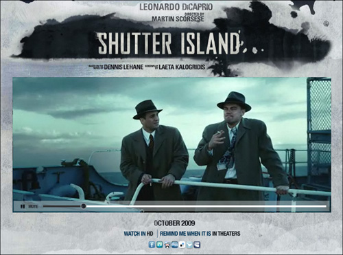
Figure 7.1 This support site is for the film Shutter Island
There appear to be just two major classifications for movie sites, which we’ll refer to as “stand-alone sites” and “network sites.”
Stand-alone sites, such as the one for Shutter Island, as shown in Figure 7.1, are exactly what the name implies—they are movie sites that stand entirely alone, like any other site about an individual product. A stand-alone site usually has a domain name that contains the movie’s title (for example, StarTrekMovie.com), has its own home page, boasts a completely custom design, and includes almost nothing unrelated to the movie.
Figure 7.2 FoxSearchlight.com offers a collection of movie sites

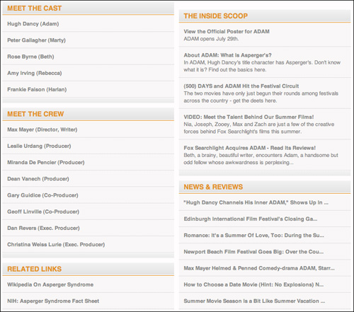
Network sites, on the other hand, are nested within a larger network of movie sites and therefore tend to take on the qualities of every site within the network. Fox Searchlight Pictures, as you can see in Figure 7.2 at FoxSearchlight.com, serves as the marketing home for a handful of upcoming releases, and offers tools and content for each one from the same pool of options. On FoxSearchlight.com, every movie site includes some combination of content modules on cast and crew information, related links, additional content, news and reviews, and polls, all of which appear directly below an animated (sometimes interactive) Flash piece or marketing image.
While certainly easier than creating a unique site for every movie, wrapping a movie site up into a larger network of sites can be problematic, as the tools appropriate for one movie aren’t necessarily appropriate for every movie. They can even result in poor marketing messages.
The network sites for Once (www.foxsearchlight.com/once) and Adam (www.foxsearchlight.com/adam), for example, at the time of this writing, are both part of the Fox Searchlight site. They draw from the same color palette, use the same labels, and have the same types of content. There’s nothing unique about the two sites, even though the two movies are dissimilar from each other. Worse, since these Fox Searchlight microsites feature a module for auto-rotating content about other movies, the site for Once (a slice-of-life movie whose story line revolves around two musicians who work through their respective struggles by writing songs together) occasionally includes a trailer, without any heading or explanation, for Driven to Kill, an action film starring Steven Seagal. Unfortunately, this implies that Driven to Kill is what the movie company thinks Once audiences, as unlikely as it may be, will want to see next.
Also thanks to auto-rotating content, the Adam site sometimes features an ad for Musicians Institute, an ad that would be perfectly appropriate and relevant on the site for Once, but is not relevant at all to the movie Adam.
When movie sites are simply clumped together under a larger brand, vital experiential elements can be lost. Doing this turns what should be a unique and compelling user experience into a generic, and potentially very cold, attempt to standardize. The myriad attempts to standardize movie sites by Fox Searchlight result not in a compelling standard, but rather in a homogenized user experience that lacks meaning and context.
This illustrates that even with frameworks, you have to pick and choose which elements to use in a given project and adapt them to your needs.
Stand-alone sites are generally much more engaging. They are very often built using Adobe Flash, with which designers can better influence a visitor’s emotional state through subtle visual effects, transitions, layered backgrounds, sound effects, and music (original scores, and songs from the soundtrack). These aesthetic elements come together to create a sense of immersion—to make the site feel like a place or a mood rather than a site.
People love to be entertained, and movies are a great way to make it happen. Movies can make you think, laugh, grieve, rejoice, and respond in any number of ways. A movie site’s job is to convince its user that this film is the one that will give her what she wants.
To do this, designers generally avoid building them up into monstrous and complex applications—rather, they focus the scope of these sites so much that they typically break down into just a few very key elements. Regardless of their context of use, movie sites, despite all their richness and sophistication, are really quite predicable. And that’s precisely why we’ve included a chapter about a niche—in this case, movie sites—in a book about significant web frameworks: to show you that frameworks are as equally discoverable and beneficial everywhere from the banking industry to the nonprofit sector. We only chose movie sites in particular because, well, it would have been very difficult to write such an action-packed description about a banking site.
Context of Use
Since we’re talking about a complete site type here rather than an aspect of a site, such as a search system, the context of use is less complicated to explain. Simply, a person who has heard about a movie and wants to know more goes to a movie site to read the summary, watch the trailer, find out who’s in the movie, and perhaps even collect an artifact or two. We’ll talk about this more in the Design Criteria section.
Elements
Movie sites are a little different than the average brochureware site in that they need not just offer compelling content full of persuasive points, they need to deliver this content in the form of rich media. They need to sell their wares by way of multimedia adventures. Here’s a look at the elements most commonly used to convince people just like you to eat a giant tub of popcorn, wash it down with a bucket of Coke, scarf a box of Junior Mints, put themselves through a two-hour emotional roller coaster, and pay for the privilege.
Splash page
In addition to its several compelling trailers, StarTrekMovie.com offers quotes from reviews, a way to find the nearest theaters and show times, a program for webmasters of fan sites, a link to a forum site, social networking options, and even an option to receive email updates. And all that is just the splash page!
Figure 7.3 The splash page for StarTrekMovie.com

A splash page is, basically, a movie poster with links. It can be as dense or as lean as any movie poster and has roughly the same goal: to entice people to find out more. To achieve this, it is usually filled with all the same advertising elements you’d expect to find on a movie poster, with the added ability to take action. On the Star Trek site, the main entry point is the large Enter the Site button, which takes you into the immersive Flash piece filled with animations and music, but you need not click it. You can skip the experiential aspects entirely and go straight to finding a show time, sharing a link to the site via Twitter, or becoming a “fan” on Facebook.
Splash pages are most frequently a part of stand-alone sites; network sites don’t usually include one.
What’s interesting about the splash page is how it attempts to achieve the goal of enticing people to learn more, as it’s a truly great example of how aesthetics can influence thinking. While most of the text that appears on a splash page is rather blatant (for example, “In theaters on July 26”), the power of the page is really in its visual design—the mood it creates and how it can affect a user’s reaction. Through the careful selection of just a few key images, or even a single image, designers can instill a sense of serenity, suspense, terror, nostalgia, or anything else, and a user’s visceral and emotional responses are absolutely essential to making a movie memorable. Movies are all about storytelling, and the images used on a splash page are a designer’s first chance (on the web, at least) to capture the audience’s imagination.
Figure 7.4 The splash page for Downloading Nancy
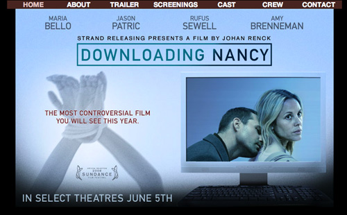
The splash page for Downloading Nancy (www.downloadingnancythemovie.com/), shown in Figure 7.4, offers the usual elements—the movie’s release date, its title, cast names, and navigation—but far more compelling than this, it features two images, side by side. The one on the right is a photo of the film’s two main characters superimposed on a computer monitor. It’s not quite enough to build a mystery by itself, but when juxtaposed with the left-hand image, a mystery indeed emerges.
The image on the left is of a raised pair of arms, tied at the wrists by thick white rope. Written across the image in red are the words “the most controversial film you will see this year.”
Together, these images create a mood—dark, if yet unplaceable. The text pushes the mood along, for sure, but even without it, the page as whole evokes loneliness. Desperation. An eeriness. A mystique.
The splash page’s job, in reality, lies deeper than the obvious. Its job is not simply to provide users to learn more—that can be done relatively successfully through the equivalent of psychological parlor tricks. Rather, the page’s job is to incite an emotional response strong enough that the user reacts to it and makes decisions. It’s to cause the user to internalize the message. To make her feel as if she is there only because she feels connected to the story. That she is negotiating the experience on her own terms. That marketing and good design had nothing at all to do with it. Whether dark and somber or light and airy, the user’s subconscious responses are what matter most in encouraging her to invest in the movie, emotionally and financially.
Ultimately, the movie site exists for people who want to know more. But once their web browsers are open, it’s up to the designer to trigger the right responses. The splash page is the doorway.
Teaser/Trailer
As there is usually some room for experimentation and because not every element makes sense for every project, frameworks require designers to pick and choose which elements to include. Some are essential, some are not. It’s up to designers to intelligently choose what to use and what to throw out. Keep this one, leave that one. Some elements can be excluded without any negative effect.
Trailers are not one of them.
As with the Star Trek trailer described in the beginning of this chapter, trailers on all movie sites have a nonnegotiable requirement to persuade. The pacing, flow, structure, and intensity of a trailer can have a huge impact on a potential moviegoer’s impression of a movie. The movie trailer is on a level of importance with a photo when you’re shopping online for cars (though a trailer is generally much more riveting). It would, quite frankly, be a serious error to create a movie site without one. Simply put, the trailer is the most important element on a movie site.
While it’s extremely unlikely a web designer will have any input on the making of a film’s trailer, she will most definitely have an impact on its presentation, which in turn can affect a user’s overall experience beyond that of the trailer itself. Not only does the user need to easily access the video, she also needs to encounter it in such a way that it elicits a compelling reaction. The trailer itself has an impact, but so does the page that envelopes it.
Interestingly, few movie sites try to exploit this notion in any unique way. Many of them simply offer the trailer on the site’s home page (presumably to make sure people see it) or on another page that has virtually nothing on it but the trailer.
While studying movie sites tells us that it’s uncommon to place the trailer in a compelling visual environment, we think it’s a very good idea to do so. Invoking visceral responses from viewers can only help establish the brand impression and reputation the designers are trying to achieve. It would be a shame to miss such an obvious opportunity to enhance that effort. Trailers presented against a backdrop of mood-setting imagery and effects create stronger impressions.
On the site for The Hurt Locker (www.thehurtlocker-movie.com), for example, a movie centered around an explosives expert doing the heady work of disabling bombs during a war, the trailer is shown against a still from the movie itself—a street clouded by a thick haze of dust, as shown in Figure 7.5. And this would be enough on its own to maintain the visual theme of the site, but the designers went one step further. As the trailer plays, unidentifiable object fragments float through the scene. It creates the unnerving feeling that an explosion has just occurred. The fragments could be burned sheets of paper from someone’s private files. Crude drawings by a four-year-old child. A map from within a military vehicle. It’s impossible to say. But since these fragments float through the scene the whole time the trailer is playing, what matters is that it can make the user feel like the thing being threatened throughout the trailer—an explosion—will indeed happen in the movie, which leaves doubt about the outcome of the story. Does the hero lose a limb? Does he die? Do his comrades die instead, leaving him to a life of grief and regret?
Figure 7.5 The site for The Hurt Locker features subtle visual effects that enhance the mood

Either way, it’s unsettling. This simple visual effect enhances the sense of fear and uncertainty that the trailer introduces.
If you’re going to spend all that money making a great movie and a great trailer, be sure to spend a little more on the trailer’s presentation. It has an effect.
Cast and crew
Cast and Crew is the About Us of movie sites. This section typically includes just the biographies of the people most prominently involved with a film, such as its stars, director, and so on. This information most frequently appears either on a single screen or on two separate screens—one for the cast, the other for the crew. Cast and crew information is less essential than the movie trailer, but because the list of people involved with a film can be a powerful selling point, it is by no means incidental.
That said, few sites seem to put much weight on the aesthetic of the information, and perhaps rightly so. How important is it, really, that a list of names that link to bios carry a movie site’s theme as effectively as the rest of it? Probably not important at all. Still, cast and crew pages can be made to fit in nicely.
On StarTrekMovie.com, you can find cast and crew information in the About section, but in this case, the About section also includes the movie’s synopsis (discussed in the next section) and production notes. More interesting, though, is that About is the only section of the site that takes visitors into the command center of the USS Enterprise, the most recognizable location on the entire ship for Star Trek fans. Somehow, this fact makes the About section a little more riveting. A little more enticing. Instead of offering just another list, this About section builds on a user’s sense of place in the site. The About section is not a site page—it’s a meet-and-greet stop during a tour of the ship (Figure 7.6).

Figure 7.6 The About section of StarTrekMovie.com take users to the ship’s command center
Synopsis
It’s long been rumored that the elevator pitch for a movie (known as a logline in Hollywood) can make or break its production deal. If it doesn’t sound like a moneymaker in under twenty seconds, it’s probably not worth paying attention to. It has to be interesting. Compelling. Attention grabbing.
On the site for Children of Invention (www.childrenofinvention.com), the About section begins with this line:
It’s the only site out of the twenty or so we studied that really nailed the elevator pitch. On most of these movie sites, the synopsis was several paragraphs long and was written so that the entire thing had to be read before the real gist of the film could be understood. For Children of Invention, the copy-writer got straight to the point. This is probably how the movie got its production deal in the first place.

Figure 7.7 The Children of Invention site gets the elevator pitch right
The synopsis for a film is an essential bit of information to include on a movie site, because it works in tandem with the trailer to reveal the film’s overarching plot line and persuade people to learn more. A user should be able to gain the same sense of story and theme from the synopsis as one who watches the trailer, albeit with fewer musical swells.
It’s perfectly fine to stretch this out over a few paragraphs, but summarizing the story in just a line or two can help people quickly discern whether or not they’re interested enough to stick around, and the way you treat users who leave can be just as important as the way you treat the ones who stay. The audience for movie sites includes people who watch a lot of movies, and movie-heads pay attention to cast and crew details, production companies, screenwriters, and just about every other detail that can be uncovered. It’s important not to waste their time. A single-sentence summary of a film can be just enough to help them feel respected. Even if unconsciously, they’ll remember that next time around. Positive experiences create positive memories.
Every site project should include a good writer. On sites where a specific piece of writing can be the single determining factor in a user’s commitment, it’s even more important.
Design Criteria
Despite the fact that StarTrekMovie.com is a relatively high-quality movie site, it does mostly the same things many others do. When you only have one job to do and you’ve already found a handful of ways to do it well, you stop looking for new ones. Many movie-site designers have, for the most part, stopped looking. But that’s exactly where they fail. The design and construction of a movie site has been, in many cases, reduced to factory work, even though the industry is a niche that offers plenty of room for innovation. Many of these designers have settled on a collection of elements that do the job of persuasion decently well and have simply stopped digging for new ideas. In fact, it’s as if there’s just one group of expert movie-site designers out there building all of them, and they’re getting bored. Apparently, even the excitement of working on experiential movie sites can wear off quickly when every new project has the same requirements as the last.
But if we take a look at the design criteria for a movie site, we get to the heart of what it’s really meant to accomplish, and we can start considering new ways to do it.
In an exercise Robert ran during a workshop on interaction design frameworks at UIE’s Web App Summit event in Newport Beach, attendees were split into four groups, and each group was assigned a different site type: finance, higher education, stock photography, and movies. Each group then sought out sites in its assigned category, studied them to identify commonalities, developed a list of design criteria based on what appeared to be the framework for that site type, and finally, brainstormed new solutions.
The criteria that follow are all the things the movie sites team came up with that day.
Establish and build a reputation
Job One for any movie site is to start building a reputation for the movie in conjunction with advertising campaigns. There are several ways to do this.
First, positive quotes from critics and media outlets (newspapers, magazines, and the like) can be effective, as they tap into the Authority principle from social psychology, which says people are generally willing to believe someone who appears to be an authority on a given subject. A movie critic’s job is to judge a movie’s quality and articulate those points to make a case for the audience to either see it or avoid it. Because of this, people assume, a movie critic is an expert on the subject and can be trusted, at least to some degree, making the critic a reliable source for advice.
Figure 7.8 Quotes from reputable sources can influence visitors

That said, many people simply don’t trust critics—perhaps especially movie critics—because they so often disagree with their own opinions, which can in turn represent the masses. A slapstick comedy that entertains loads of people may not be highbrow enough for many critics, whose disapproval of the movie may stand in stark contrast to the sentiments of the movie’s fans. Further, press quotes are inherently biased, as marketers almost never happily spread bad reviews in their campaigns. Finally, these quotes are often out of context of whatever larger piece of writing they came from (such as a full review in a magazine), making them frequently misleading.
So, while press quotes can certainly be helpful, especially when in reference to award-caliber films reviewed by sophisticated critics from reputable media outlets, they’re not enough on their own.
A well-edited trailer can be extremely convincing, even for a movie that later on gets terrible reviews. But again, designers are unlikely to have any control over or input on the trailer. The only piece of the puzzle that site designers really have influence over is, obviously, the design of the site. The best things, then, that designers can do are to present the trailer on a beautifully designed page that sets the right mood, establish a theme that permeates the site design, and use their best judgment to choose the right music, visual effects, and backgrounds.
In cases where a film has a particularly noteworthy cast or crew, information about these people can be persuasive and should be highlighted in some way. A cast that includes major stars—reputable and well-known actors and actresses—automatically helps people believe a movie may be worth seeing. Reputable directors or producers can have this effect as well. Clint Eastwood, for example, is well known not just for his acting prowess, but also for consistently directing and producing critically acclaimed films. The simple appearance of his name on a movie site can be enough to make a user want to learn more about it. When people with significant star power are involved with a movie, a movie site designer is wise to put their names and likenesses front and center.
Figure 7.9 Highlighting famous cast members can be persuasive

Of course, no marketing trick is ever more compelling a motivator than a simple recommendation from a friend, and here is one way movie-site designers can step up their game. When you want someone to become interested in a movie fast, make sure she hears about it from her friends.
Enable word-of-mouth marketing
Another principle of social psychology is Liking, which describes the fact that people have a strong tendency to value the opinions of those they see as similar to themselves. This principle, in fact, is probably one of the core reasons Amazon has been so successful over the years—customer reviews enable users to gather the opinions of other people who have similar tastes or needs as themselves, and these recommendations have incredible influence over purchasing decisions.
The movie industry is no different. People love to be entertained, sure, but choosing a movie in which they will make a two-hour and ten-dollar investment requires more insight than the simple desire to be entertained. This is where the recommendations of friends come in. Word-of-mouth is the single most powerful form of marketing there is, and a single positive mention from a friend can turn someone from prospect to customer. Hence, sharing and networking solutions are incredibly effective tools. Strangely, few movie sites make use of them, and those that do tend to use them poorly.
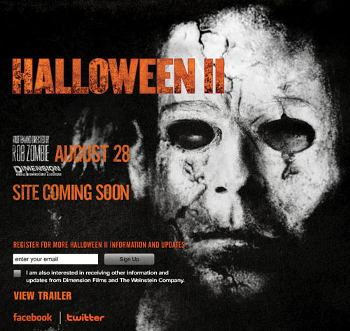
The movie site for Halloween 2 (www.halloween2-movie.com), as shown in Figure 7.10, for instance, offers links to the official Twitter and Facebook profiles for the movie. This appears to be a good idea until you consider how they’re used. These options do nothing but link to social network profile pages. They ask for attention. What they should do is create a way to spread the word. Instead of linking to Twitter, the site could offer a prewritten message for users to post to their own Twitter accounts, such as “Halloween 2 is coming out on August 28th. I can’t wait! http://www.halloween2-movie.com.” Users could then post the message to their own Twitter feeds and, with a single click, share their excitement about the film with all of their followers. This creates a point of investment for the user, makes the message viral, and requires only the effort of clicking a button.
Figure 7.10 There is nothing scary about social networking; it can help spread the word about a film
For users with blogs or MySpace pages, sites can offer a way to embed the movie trailer into their own posts, thereby sharing it with their friends and readers. Another option is to offer avatars featuring characters from the movie that users can download and use with their social network profiles. There are many possibilities. Most of them take very little effort to implement and have the potential for big rewards.
Robert’s workshop attendees had another fascinating idea: they suggested trying out a viral print campaign. The band Nine Inch Nails once promoted an album release by placing clues (postcards, stickers, and so on) in public places, such as restrooms in bars likely to be frequented by the group’s fans. This created an incredible buzz around the album, made those who found the clues feel powerfully unique, and generated a brilliant marketing story. Best of all, it shows that while the focus of this book is the anatomy of the web, the web isn’t always the answer.
Engage them
Of course, even before convincing users to share their excitement about a film, movie sites must, quite simply, engage people. They must trigger emotion. Connect to them in some way. And once that’s done, they have to leave users begging for more.
Fox Searchlight doesn’t seem to get this. Content is presented in modules, and the modules are presented the same way for every movie on the site. They’re in neutral colors to minimize contrast with the palette from the Flash piece. They appear in two columns, each module with a gray background and black text. Lots of it. There’s nothing exciting going on here at all.
Figure 7.11 This FoxSearchlight.com content page is too generic to be exciting
The Star Trek site, on the other hand, is filled with mesmerizing imagery, visual effects, and a roller coaster’s worth of musical ebbs and flows. There’s a gallery containing over forty images from the film.
And not to be outdone, there are three different trailers, twelve television spots, and just in case that’s not enough to build excitement, the site offers eight clips from the movie.
The idea is obvious, simple, and clear.
Build interest and leave them hanging!
Support lifestyle integration
One of the more interesting design criteria the workshop attendees noticed was that movie sites commonly try to create ways for fans to integrate the movie into their lives. Most frequently, this comes in the form of desktop wallpaper images, they noted, but this could be taken so much further.
Figure 7.12 Downloadable desktops for My Sister’s Keeper

Sites could offer the desktop wallpaper of the smart phone generation—wallpapers for cell phones such as the Apple iPhone. Avatars, again, could be doled out for social site profiles. T-shirts and posters could be sold. Visitors could customize postcards with personal messages and have them mailed to friends. Kids could print out coloring pages showing their favorite Pixar characters. Sites could offer ringtones. Just imagine the contemptuous satisfaction of having the Halloween theme play whenever your boss calls!
But where, you might ask, is the return on investment for doing all this additional work? For filmmakers, it’s loyalty. It’s the extra income from merchandise sales. It’s the chance to build up the star power of the film’s actors even more. It’s a lot of things.
For the audience, on the other hand, it’s far more. It’s the chance to identify with something they feel passionate about. Something that helps define them to others. Something that enables them to daydream and live vicariously through a fictional character. To see the world, almost literally, through a different lens.
Now that’s a user experience!
Thump-thump.