
Faceting is a mechanism to automatically lay out multiple plots on one page. This functionality is quite nice and useful in many situations and, for this reason, we will venture a little deeper into it and look at some examples. As already mentioned, if you are familiar with other plotting packages, this functionality is very similar to the concept of panels in lattice.
The plot is realized with the faceting option by splitting the data into subsets, and each subset of data is represented in an individual plot. Nevertheless, the individual plots are formatted in an overall plot page with a header at the top or on the side of the panels, which identify the data represented in the subplot. Faceting is particularly useful if you need to have a first impression of how different data sets behaves or if the representation of the data should be separated for any reason.
There are two main ways to perform faceting in ggplot2: grid faceting and wrap faceting.
This is probably the faceting you will use most of the time. Grid faceting consists of creating a faceting of the plot by splitting the data into subgroups relative to two or more variables, which are then used to produce subplots for the specific combinations of variables. In grid faceting, at least two variables are provided and if you are interested in splitting the graph by only one variable, the second one is replaced by a . (dot), indicating that all variables should be taken for the second splitting. Let's start with a simple example. We will work on the myMovieData dataset, which we created in Chapter 2, Getting Started, starting with the movies dataset available in R. We will work with the ggplot() function, so you can already begin to become familiar with this other function. In order to add grid faceting to a plot, we will use the facet_grid() function. The first argument of the function is the faceting elements and hence the variables for which we want to create facet plots. For instance, we could use facet_grid(x~y), indicating that we have one row for each value of the variable x and one column for each value of the variable y. If we were only interested in a split by the variable x, we would code it as facet_wrap(x~.), indicating that the variable represented in the plot will only be split by x in rows and all other subsets will be included in the plot. Similarly, the facet_grid(.~.)code will not produce any faceting.
Now, let's go to our example. We can now plot the histogram of movie budgets by splitting the data by budget. We will also plot the budget in the log scale in order to make the distribution clearer; you can also obtain the same result by just using the log() function on the budget variable, but in the example, you will also see the alternative function available in ggplot2. You have the possibility of splitting in to columns or rows, and as illustrated, they produce a result that is visually very different.
### Faceting with orientation by rows
ggplot(data=myMovieData,aes(Budget)) + geom_histogram(binwith=1) + facet_grid(Type~.) + scale_x_log10()

### Faceting with orientation by columns
ggplot(data=myMovieData,aes(Budget)) + geom_histogram(binwith=1) + facet_grid(.~Type)+ scale_x_log10()
The answer to the question as to which orientation of the plot better describes the data really depends on the distribution you are representing and the range of the data. For instance, if the range in x is much larger than the one in y, splitting by rows would often give you a much better visualization. In this specific case, the orientation of faceting by columns seems more adequate. In Figure 3.7, you can see the resulting graphs generated with the two different visualization options:

Figure 3.7: This shows the histogram of movie budget faceting by movie type. The faceting is done by rows (top graph) or by columns (bottom graph)
As already discussed, we can also generate plots by splitting by two different variables, so in this case it would be interesting to have a look at the movie budgets split by years and movie type. We have quite a few different years in the dataset—more than 100. Now, 100 plots would be quite difficult to visualize. So first of all, we will add a column to our dataset, rounding off the years of the movies to their decades. We can do that, for instance, by rounding the years to just three significant digits. The following code shows this:
myMovieData$roundYear <- signif(myMovieData$Year, digits = 3)
This new column will group the movies around the closest decade in which they were made, so, for instance, the 1980s decade will include movies from 1975 up to 1984.
We will use the column just created to have the histogram split by decade:
ggplot(data=myMovieData,aes(Budget)) + geom_histogram(binwith=1) + facet_grid(roundYear~Type) + scale_x_log10()
In Figure 3.8, you can see the resulting picture. In this case, we produced a matrix plot with rows and columns representing the possible combinations of the two variables: decades and movie type. You can also see how this visualization includes all the possible combinations between these two variables even if there is no data, so you can notice how, in some cases, the subplot could be empty.

Figure 3.8: This is a histogram of movie budget faceting by movie type and year rounded off by decades
One very useful argument of the facet_grid()function is the margin option. In this argument it is possible to provide additional facets that could be added to the plot. These additional facets can be provided as a vector of names listing the variables for which facets should be produced or as a logical vector, where TRUE indicates the creation of additional facets containing all the data. We will see an example of this option, which will add an additional column and row to the plot in Figure 3.8 where the distributions for all the data are represented:
ggplot(data=myMovieData,aes(Budget)) + geom_histogram(binwith=1) + facet_grid(roundYear~Type, margin=TRUE) + scale_x_log10()
The resulting plot is represented in Figure 3.9. As you can see, the intersection between columns and rows of all the data represents the budget distribution for all the data:
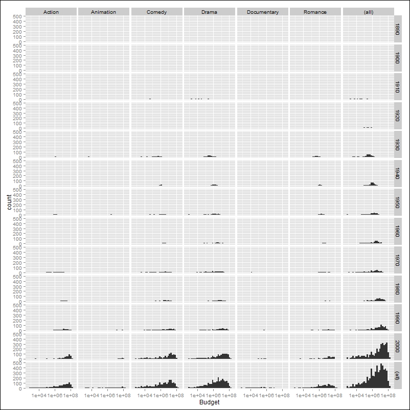
Figure 3.9: This is a histogram of movie budget faceting by movie type and year rounded off by decades containing a facet for all the data
Using the faceting option, it is also possible to produce facets for more than two variables. This can be done using the + operator to add additional variables to the row or column argument of the faceting. For instance, in our example, we could perform faceting for year and movie type—all by columns. In this case, to reduce the number of plots, we could look only at the movies after the 1980s. Also notice how only a subset of the data is used within the plot function. The following code shows this:
ggplot(data=subset(myMovieData, roundYear>1980),
aes(Budget)) + geom_histogram(binwith=1) + facet_grid(.~Type+roundYear) + scale_x_log10()
The resulting plot is showed in Figure 3.10. For instance, this kind of visualization would allow you to have the movie budgets for both the 1990s and the 2000s for each type of movie side by side, allowing easy comparison of the distribution of the budgets in these two different decades. As you can see, in this example, we have also used the
subset() function directly within the plot function to choose only a subset of the data. Such an approach may turn out to be very useful in some cases.

Figure 3.10: This is a histogram of movie budget faceting by movie type and the decades 1990s and 2000s with facets by columns
Wrap faceting produces a single ribbon of plots that are spread along one or more rows. This kind of faceting is particularly useful if you have faceting with many combinations; here the subplots can be arranged in several rows, making the plot much easier to read. To realize wrap faceting, we can use the facet_wrap() function. We will see a simple example using our simplified movie dataset. We will look at the movie budgets for each year from 2000 onwards. This will generate a relatively large series of plots, and wrap faceting will help us to have better representation of the data. The following code shows this:
ggplot(data=subset(myMovieData,Year>1999),
aes(Budget)) + geom_histogram() + facet_wrap(~Year, nrow=2) + scale_x_log10()
You can see the resulting plot in Figure 3.11.
As illustrated in the previous code, we used the facet_wrap() function in which we specified only one variable. This function uses arguments in the form of facet_wrap(~x+y+z), where the faceting variables can be listed. In this case, we can only provide arguments after the ~ sign. We can also specify the number of columns and rows we want to have in the faceting using the nrow and ncol arguments.

Figure 3.11: This shows a histogram of movie budget faceting by year from 2000 onwards using wrap faceting