
In this chapter, we will take a look at the different methods you can use to save or manipulate the output generated with ggplot2. We will cover the different methods of displaying multiple plots in a unique plot page and how to save the plots that you have created on your hard drive.
If you are already familiar with the graphics package, you know that in R, you have the opportunity to create plot windows on which you can arrange multiple plots. In ggplot2, there is no single function available to do that, but you will need to become familiar with certain basic concepts of the grid package, which was used to build ggplot2. In grid, you have the possibility of defining viewports, which are rectangular regions on a graphics device, and plots can be assigned to these regions. In order to do that, we can use a grid function called viewport(). Using this method, you have two main ways of combining multiple plots:
- Arranging plots by specifying the plot position in terms of rows and columns
- Specifying the exact position of each plot
In the following sections, we will see examples of both methods.
This approach of combining plots is very likely to be more convenient, and it will probably fit most of your needs. If you are already familiar with graphics, this method is very similar to the use of the par() function. In this approach, we simply define a plot area as columns and rows by specifying how many rows and columns we need, and then assign each plot to a specific area. As an example, we will recreate Figure 3.2, which was used in Chapter 3, The Layers and Grammar of Graphics, to illustrate the concepts of layers in ggplot2. Since you are already familiar with the different functions that enable you to modify the plot details, we will not discuss this point any longer, but we will focus on how to arrange the plots created in a single plot window. Nevertheless, you can take a look at the code used to realize single plots and use them as additional examples of personalization of the plot's appearance. This example was realized using data from the Orange dataset available in R. As a starting point, we will create the four individual plots, as shown here, but remember that you will also need to load grid for the following steps:
library(ggplot2)
library(grid)

data(Orange)

x1<- ggplot(Orange, aes(age, circumference)) + geom_point(aes(colour=factor(Tree)))

### Remove the legend
x2 <- x1 + theme(legend.position = "none")

### Remove aesthetic
x3 <- ggplot(Orange, aes(age, circumference)) + geom_point()

### Plot without data
x4 <- x3 + theme(panel.border = element_rect(linetype = "solid", colour = "black"))

x5 <- x3 + theme(axis.ticks = element_blank(), axis.text.x = element_blank(), axis.text.y = element_blank(), panel.grid.major = element_blank(), panel.grid.minor = element_blank(), panel.background = element_blank()) + ylab("") + xlab("")
As illustrated, we first created a basic, complete plot, x1, and then we modified the plot by changing its appearance. When working with plots, it is often convenient to save their ggplot2 objects as variables and reference them as needed. This coding style makes it easier to rearrange plots into different positions and makes your code easier to read. To combine these plots in one window, we will first specify to the grid function that we want to define four different plot areas, which can be considered as a grid of two rows and two columns. Then, we will assign the desired plot to each section, as shown here:
pushViewport(viewport(layout = grid.layout(nrow=2, ncol=2)))
print(x5, vp = viewport(layout.pos.row = 1, layout.pos.col = 1))
print(x4, vp = viewport(layout.pos.row = 1, layout.pos.col = 2))
print(x3, vp = viewport(layout.pos.row = 2, layout.pos.col = 1))
print(x2, vp = viewport(layout.pos.row = 2, layout.pos.col = 2))
A tree of pushed viewports can be maintained by the grid in each device, allowing navigation between plots. A viewport object must be pushed onto the viewport tree before it has any effect on drawing. The
pushViewport() function allows you to add viewport objects to the viewport tree and, in this function, we specify that we want to create a viewport with a layout composed of two rows and two columns. Afterwards, we assign plots to each plot area of the viewport by specifying its location in the plot area. As mentioned, the resulting picture is Figure 3.2 from Chapter 3, The Layers and Grammar of Graphics.
In the layout.pos.row and layout.pos.col arguments, you can specify a single position in the plot grid, as we did in our example, or a vector of length 2 units, which defines a range of rows or columns on which the plot should be represented. If one of these arguments is missing, it will be assumed that the plot will be present in all available rows and columns. For instance, we can modify Figure 3.2 by stretching the x4 plot across all the columns and removing the x5 plot. We can do that by simply removing the column argument, as shown here:
pushViewport(viewport(layout = grid.layout(2, 2)))
print(x4, vp = viewport(layout.pos.row = 1))
print(x3, vp = viewport(layout.pos.row = 2, layout.pos.col = 1))
print(x2, vp = viewport(layout.pos.row = 2, layout.pos.col = 2))
This code will produce the plot represented in Figure 6.1. As previously mentioned, you can also specify a range of columns, so, for instance, in this case, we could also have specified that the x4 plot should be represented in the first row from the first to the second columns, as shown here:
pushViewport(viewport(layout = grid.layout(2, 2)))
print(x4, vp = viewport(layout.pos.row = 1,layout.pos.col = c(1,2)))
print(x3, vp = viewport(layout.pos.row = 2, layout.pos.col = 1))
print(x2, vp = viewport(layout.pos.row = 2, layout.pos.col = 2))
This code will also generate the plot in Figure 6.1:

Figure 6.1: Example of multiple plots, with one plot represented along two viewports
In the previous section, we considered the case where you have several plots that you want to visualize in a single window, but you want to leave the plots substantially separated and next to each other. In some cases, you may need to control the position of the plots more precisely, for instance, if you want to partly superimpose the plots. This can also be realized with the viewport() function, but instead of specifying the position of the plot as rows and columns, we can also provide the exact position to the functions. In this function, you have the x, y, width, and height arguments available, which allow you to specify the x and y locations and width and height of the plot, respectively. The default unit of these parameters is
Normalized Parent Coordinates (NPC), where the coordinates (0, 0) represent the origins of the viewport's width and height of one unit. For instance, the position (0.5, 0.5) represents the center of the viewport. You can also specify the plot position in other units using the unit() function from the grid packages when providing the arguments. We already encountered this in the previous chapter. For additional details, you can take a look at the function help page by typing ?unit. Alternatively, the viewport() function also provides the default.units argument, where you can specify the unit you are using, and this unit will be used if the x, y, width, and height arguments are specified as numeric values instead of the unit() function. In order to know which units you can use, you can refer to the list of units available in the unit() function help page.
To demonstrate this approach, we will consider a simple example with the count dataset, which we already used in the previous chapters. Let's assume that we have our data represented in the normal scale and the log scale as well. In some cases, you will probably need to look at both plots at the same time since you may be interested in the behavior of the data when represented in the log scale. In our example here, we will create the data, represent it in the linear scale and the log scale for the y axis, and then include the plot in the log scale in a corner of the linear scale plot so that the plots of the data are visible next to each other. The following code shows this:
### We create the datasetcont <- data.frame(y=c(1:20,(1:20)^1.5,(1:20)^2),
   x=1:20,
   group=rep(c(1,2,3),each=20))

### We plot the data in two scatterplots, in linear and log-scale
myScatter <- ggplot(data=cont, aes(x=x, y=y, col=factor(group))) + geom_point()

myScatterLog <- myScatter + scale_y_log10() + theme(legend.position="none")


### We combine the two plots
print(myScatter, vp = viewport(width = 1, height = 1, x=0.5, y = 0.5))
print(myScatterLog, vp = viewport(width = 0.4, height = 0.4, x=0.315, y = 0.76))
In the resulting plot in Figure 6.2, you will notice how we removed the legend from the plot in the log scale since, with this representation, it is clear that the two plots refer to the same data and the legend applies to both of them. As illustrated, when representing the data with this approach, we obtain a different visual effect as compared to having the plots simply next to each other. This simple example shows how to control the exact position of your plot, but, of course, the possibilities are unlimited. You can start from here and try different possibilities of finding the best way to represent your data.
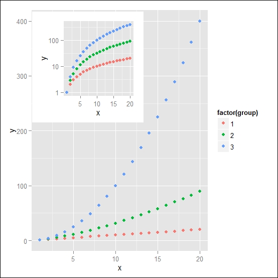
Figure 6.2: Example of one plot nested in the plot area of a second plot