
This chapter introduces responsive web design. Building a “responsive” web site basically means allowing the site to respond to the size of the screen it is being displayed on and reformat itself accordingly. The chapter will introduce CSS Media Queries to reformat the site for use on both mobile and tablet-sized devices and show you how to allow a development site running via Visual Studio to be viewed on another device on the same network.
Note
To complete this chapter, you must either have completed Chapter 17 or download the Chapter 17 source code from www.apress.com as a starting point.
Introducing Media Queries
CSS includes a concept called media queries, which let you assign styles to a page based on the browser’s width and height. Using media queries, you can create custom styles for phones, tablets, and desktop browsers, to tailor your site’s presentation so it looks its best on each type of device.
Media queries let you send different styles to browsers based on the screen widths, for example, less than 480 pixels, more than 480 pixels but less than 768 pixels, etc. These widths are known as breakpoints in responsive design. In the real world, a commonly used set of breakpoints are 480 pixels for a “mobile/cell” design, a screen between 481 and 768 gets “tablet” design, and anything over 768 gets a “desktop” design. We don't actually use these in the book simply to save some time and because we have a certain breakpoint at which we want to stop the navigation menu from wrapping around. There are several other more detailed standard breakpoints that target specific devices and these are constantly evolving.
As an example, to write these media queries in CSS, you would add the following code to a stylesheet and then add the relevant styles inside each query:
/*write desktop styles here...*/@media (min-width: 481px) and (max-width:768px) {/*write tablet styles here...*/}@media (max-width:480px) {/*write mobile/cell styles here...*/}
Designing a Responsive Site
One thing to consider when designing a responsive site is which device you’re designing for first. You should start with a default design, as we have done in the previous chapters, and then create media-query styles to override the default styles and reformat the page for your breakpoint screen widths. There are two main approaches to responsive design, known as desktop first and mobile first. In desktop first, you can add some styles with several columns and all the bell and whistles you want, and then tweak the site for other sized devices. Mobile first, on the other hand, creates a smaller page design as the default without several columns and then builds the site outward using media queries.
We’ve taken the desktop first approach in this book and as you see, for example with the shopping basket, everything can appear to be laid out fine in desktop but then can cause some small unexpected issues when you move to a mobile design.
Developing for Mobile/Cell Using Google Chrome
It might not seem very obvious at first, but the easiest place to start when developing for different sized devices is your desktop browser. Simply resizing the browser is one of the most useful tools you will find in your armory for getting started with developing for different screen sizes.
There is no substitute for actually testing your site in a physical device, but Google Chrome does offer an attempt to simulate behavior on popular devices, as shown in Figure 18-1. To use this simulation, you need to open the developer tools section of Chrome by pressing F12 and this will then allow you to use the device mode feature of Chrome. To use this, you press the toggle device mode button to the left of the Elements link in the developer tools menu. This is shown as the second button in from the left in the bottom menu in Figure 18-1. You can then choose a device to simulate by clicking on the menu at the top of the screen. Figure 18-1 shows how to select an iPhone6 device.

Figure 18-1. Using Chrome to simulate an iPhone6
You can simulate events such as hover by inspecting an element and right-clicking on it in the elements pane. You then choose the event you want to simulate from the pop-up menu. My normal preference is to start with just resizing the browser at first and then use the device mode if I want to inspect a style in more detail using the developer tools.
Making the Home Page Responsive
We are going to start with changing the style of the home page. This actually covers a few topics in one page so is a good place to start. Figure 18-2 shows the home page when we resize the browser to be a cell/mobile phone size. Ignoring the navigation bar for now, let's focus on the bestseller images. They overlap one another due to the fact that they appear in columns.

Figure 18-2. The current home page on a smaller screen
As a reminder, the HTML that generates the bestseller images is shown here:
<h2>Our best sellers</h2><div class="row"><div class="col-md-3"><a href="/Products/Details/6"><img src="/Content/ProductImages/Bibs1.JPG"></a><p><a class="large-bold-text" href="/Products/Details/6">3 Pack of Bibs</a></p></div><div class="col-md-3"><a href="/Products/Details/11"><img src="/Content/ProductImages/Pram1.JPG"></a><p><a class="large-bold-text" href="/Products/Details/11">Black Pram andPushchair System</a></p></div><div class="col-md-3"><a href="/Products/Details/5"><img src="/Content/ProductImages/Bottles1.JPG"></a><p><a class="large-bold-text" href="/Products/Details/5">3 Pack of Bottles</a></p></div><div class="col-md-3"><a href="/Products/Details/3"><img src="/Content/ProductImages/Lion1.JPG"></a><p><a class="large-bold-text" href="/Products/Details/3">Orange and YellowLion</a></p></div></div>
You can see from this HTML that each image is contained inside a div element with the class col-md-3 assigned to each div. In the current Contentstore.css file, this style is given a width of 25% and floated left with a padding of 5 pixels. We are going to add a media query to store.css but with a breakpoint at 900 pixels. I’ve chosen this breakpoint because below this, the navigation bar starts to wrap.
Tip
In Google Chrome, you can see the width and height of the current browser window in the top-right corner when using the developer tools.
To fix the issues with the home page images being squashed, we are only going to use columns in the site when the width is over 900 pixels (remember this is just an example and in reality you are likely to have more standard breakpoints). Add the following media query to the store.css file and cut and paste the column styles from store.css shown below into it:
@media (min-width:900px) {.col-md-1 { width: 8.333333333333332%; }.col-md-2 { width: 16.666666666666664%; }.col-md-3 { width: 25%; }.col-md-4 { width: 33.33333333333333%; }.col-md-5 { width: 41.66666666666667%; }.col-md-6 { width: 50%; }.col-md-7 { width: 58.333333333333336%; }.col-md-8 { width: 66.66666666666666%; }.col-md-9 { width: 75%; }.col-md-10 { width: 83.33333333333334%; }.col-md-11 { width: 91.66666666666666%; }.col-md-12 { width: 100%; }.col-md-1,.col-md-2,.col-md-3,.col-md-4,.col-md-5,.col-md-6,.col-md-7,.col-md-8,.col-md-9,.col-md-10,.col-md-11 {float: left;padding-right: 5px;}.col-md-offset-0 { margin-left: 0; }.col-md-offset-1 { margin-left: 8.333333333333332%; }.col-md-offset-2 { margin-left: 16.666666666666664%; }.col-md-offset-3 { margin-left: 25%; }.col-md-offset-4 { margin-left: 33.33333333333333%; }.col-md-offset-5 { margin-left: 41.66666666666667%; }.col-md-offset-6 { margin-left: 50%; }.col-md-offset-7 { margin-left: 58.333333333333336%; }.col-md-offset-8 { margin-left: 66.66666666666666%; }.col-md-offset-9 { margin-left: 75%; }.col-md-offset-10 { margin-left: 83.33333333333334%; }.col-md-offset-11 { margin-left: 91.66666666666666%; }}
This means that the web site will now appear with a column layout only when it is wider than 900 pixels. Figure 18-3 shows how the home page now appears with the column widths and floats removed.

Figure 18-3. The home page with columns removed on a smaller screen
Note
As mentioned in Chapter 15, CSS now supports an alternative to working with floats known as Flexbox. This can be used as an alternative to the methods used here to produce a responsive page layout. You can learn more about Flexbox at http://www.w3schools.com/css/css3_flexbox.asp .
There are a couple more issue with the main content of the home page. The Shop Now button overlaps the content above it and the images for the bestsellers are stuck to the left edge of the window. To fix the issue with the button, add a new media query for when the page layout is less than 900 pixels and add a bottom margin to each div as follows:
@media (max-width: 899px) {div {margin-bottom: 20px;}}
To fix the issue with the images being stuck against the left edge of the window, add a style above the first media query so that it always applies to the site as follows:
.body-content {margin: 0 10px;}@media (min-width:900px) {.col-md-1 { width: 8.333333333333332%; }.col-md-2 { width: 16.666666666666664%; }.col-md-3 { width: 25%; }...
The effect of these two new styles is shown in Figure 18-4, which shows the bottom of the home page.

Figure 18-4. The realigned Shop Now button and the images
Although we have only focused on the home page, these changes have also had profound effects on the rest of the site; for example, all the forms in the site now have the labels above each input, which makes for a much better appearance on a small screen.
Styling the Navigation Bar for Mobile/Cell
We are now going to restyle the navigation bar and add a very simple example of displaying the menu when a user hovers over it so that it can be viewed easily on a mobile/cell phone. We are not going to use the bootstrap button for hiding/showing the menu, because it relies on the bootstrap JavaScript files to function.
We are going to make the navigation bar still appear blue with white text but we are also going to remove all the animations when someone views the site on a smaller device. To achieve this, simply cut and paste the styles from store.css file shown below into the min-width: 900px media query as follows:
@media (min-width:900px) {.col-md-1 { width: 8.333333333333332%; }...code omitted....col-md-offset-11 { margin-left: 91.66666666666666%; }.nav {float:left;}.navbar-left {float: left;}.nav li, .navbar-form .form-group {display: inline-block;}.nav li {padding: 5px;}.navbar-collapse {position: relative;}.navbar-form {position: absolute;bottom: 40px;left: 30%;}.navbar .form-control {padding: 5px;width: 250px;}.navbar-form button {padding: 5px 20px;font-size:1.2em;}.navbar-right{float: right;}.nav li a{display: inline-block;background-color: rgb(14, 117, 204);border-radius: 2px;padding: 5px 10px;border: 1px solid rgb(14, 117, 204);max-width: 210px;-moz-box-shadow: inset 0px 1px 0px rgba(255,255,255,0.7);-webkit-box-shadow: inset 0px 1px 0px rgba(255,255,255,0.7);box-shadow: inset 0px 1px 0px rgba(255,255,255,0.7);-webkit-transition: ease-in .25s;transition: ease-in .25s;}.nav li a:hover {background-color: hotpink;border: 1px solid hotpink;transform: scale(1.1);text-decoration:none;}}
The navigation bar now only appears with animations when the browser is wider than 900 pixels. Figure 18-5 shows how the navigation bar appears in a smaller screen.

Figure 18-5. The navigation bar on a smaller screen
Showing/Hiding the Navigation Bar
We are now going to add some styles to initially hide and then show the navigation bar on smaller devices. First of all, add the Menu text to the top of the navigation bar and turn it white by updating the max-width: 899px media query as follows:
@media (max-width: 899px) {div {margin-bottom: 20px;}.navbar-header:after{content: "Menu";}.navbar {color: white;}}
This will change the navigation bar as shown in Figure 18-6.

Figure 18-6. The navigation menu with some "Menu" text added to the beginning (zoomed in)
Adding these styles has pushed the navbar-brand element down the screen slightly, so to correct this, add a new style to the max-width: 899px as follows:
@media (max-width: 899px) {div {margin-bottom: 20px;}.navbar-header:after{content: "Menu";}.navbar {color: white;}a.navbar-brand {bottom: 22px;}}
After this, add a style to apply a Clearfix before the navbar-collapse element to push the rest of the menu underneath the menu text:
@media (max-width: 899px) {div {margin-bottom: 20px;}.navbar-header:after{content: "Menu";}.navbar {color: white;}a.navbar-brand {bottom: 22px;}.navbar-collapse:before {content: " ";display: table;clear: both;}}
These two changes should now have formatted the navigation bar as shown in Figure 18-7

Figure 18-7. The navigation bar with the "Menu" text and branding positioned above the navigation bar on a small screen (zoomed in)
Now, to hide the navigation bar apart from the menu text, add the following style. This also sets the size of the items in the bar to be slightly bigger:
@media (max-width: 899px) {div {margin-bottom: 20px;}.navbar-header:after{content: "Menu";}.navbar {color: white;}a.navbar-brand {bottom: 22px;}.navbar-collapse:before {content: " ";display: table;clear: both;}.navbar-collapse {display : none;font-size: 1.2em;}}
With the navbar-collapse element hidden, the navigation bar now appears as in Figure 18-8.

Figure 18-8. The hidden navigation bar
We are going to make the navigation bar display when a user hovers over the menu bar (not just the menu text). The reason I’ve done this is purely technical. You can only display a related element when hovering over an element. You cannot display something completely unrelated, so in this case I’m going to display the navbar-collapse element whenever the user hovers over the navbar element. This will also ensure the bar stays visible when the user hovers anywhere over it. To achieve this, add the following style to the max-width: 899px media query as follows:
@media (max-width: 899px) {div {margin-bottom: 20px;}.navbar-header:after{content: "Menu";}.navbar {color: white;}a.navbar-brand {bottom: 22px;}.navbar-collapse:before {content: " ";display: table;clear: both;}.navbar-collapse {display : none;font-size: 1.2em;}.navbar:hover .navbar-collapse{display: block;}}
The navigation bar should now expand, as shown in Figure 18-9, whenever you hover over it.

Figure 18-9. The navigation bar as it now appears when hovered over (zoomed in)
Selectively Adding Columns
The changes made in restyling the web site have had a big effect on the web site and most of the pages now look fine for displaying on a smaller screened device; however, some of the pages don't look right at all and still need some work.
The first page that doesn't look right is the basket index page. Figure 18-10 shows how the basket currently appears on a smaller screen.

Figure 18-10. The current basket appearance. Note that the headings are out of line with the rest of the page
A quick inspection of the basket index page reveals that it uses HTML in the following format:
<div class="row"><div class="col-md-4"><label>Item</label></div><div class="col-md-3"><label>Quantity</label></div><div class="col-md-1"><label>Price</label></div><div class="col-md-1"><label>Subtotal</label></div></div>
The page uses columns within rows to display data. This represents a problem because we've added a style to tell the columns only to display when the web site is greater than 900 pixels in width. To fix this, issue we’ve simply going to add another class to the row elements within the page and then add some styles for this class within store.css.
First of all, update the ViewsBasketIndex.cshtml file as highlighted in bold to add a new class to each div with a row class assigned to it.
@model BabyStore.ViewModels.BasketViewModel@{ViewBag.Title = "Your Basket";}<h2>@ViewBag.Title</h2>@if (Model.BasketLines.Count() > 0){<div>@using (Html.BeginForm("UpdateBasket", "Basket")){@Html.AntiForgeryToken();<input class="btn btn-sm btn-success" type="submit" value="Update Basket" /><hr /><div class="row floated-cols"><div class="col-md-4"><label>Item</label></div><div class="col-md-3"><label>Quantity</label></div><div class="col-md-1"><label>Price</label></div><div class="col-md-1"><label>Subtotal</label></div></div><hr />for (int i = 0; i < Model.BasketLines.Count; i++){<div class="row floated-cols"><div class="col-md-4">@Html.ActionLink(Model.BasketLines[i].Product.Name, "Details", "Products",new { id = Model.BasketLines[i].ProductID }, null)<br />@if (Model.BasketLines[i].Product.ProductImageMappings != null &&Model.BasketLines[i].Product.ProductImageMappings.Any()){<a href="@Url.Action("Details", "Products", new { id =Model.BasketLines[i].ProductID })"><img src="@(Url.Content(Constants.ProductThumbnailPath) +Model.BasketLines[i].Product.ProductImageMappings.OrderBy(pim=> pim.ImageNumber).ElementAt(0).ProductImage.FileName)"></a>}</div><div class="col-md-3">@Html.HiddenFor(productID => Model.BasketLines[i].ProductID)@Html.TextBoxFor(quantity => Model.BasketLines[i].Quantity, new { @class ="form-control" })<p>@Html.ValidationMessageFor(quantity =>Model.BasketLines[i].Quantity,"", new { @class = "text-danger" })</p></div><div class="col-md-1">@Html.DisplayFor(price => Model.BasketLines[i].Product.Price)</div><div class="col-md-1">@((Model.BasketLines[i].Quantity *Model.BasketLines[i].Product.Price).ToString("c"))</div><div class="col-md-1">@Html.ActionLink("Remove", "RemoveLine", "Basket", new { id =Model.BasketLines[i].Product.ID }, null)</div></div><hr />}}<div class="row floated-cols"><div class="col-md-8">@Html.DisplayNameFor(model => model.TotalCost)</div><div class="col-md-1">@Html.DisplayFor(model => model.TotalCost)</div><div class="col-md-1">@Html.ActionLink("Order Now", "Review", "Orders", null, new { @class = "btnbtn-sm btn-success" })</div></div></div>}else{<p>Your Basket is empty</p>}<div>@Html.ActionLink("Continue Shopping", "Index", "Products")</div>@section Scripts {@Scripts.Render("∼/bundles/jqueryval")}
Following these changes, add a new set of styles to the max-width 899 pixels media query to float any columns that appear inside the floated-cols class, as follows:
@media (max-width: 899px) {div {margin-bottom: 20px;}.navbar-header:after{content: "Menu";}.navbar {color: white;}a.navbar-brand {bottom: 22px;}.navbar-collapse:before {content: " ";display: table;clear: both;}.navbar-collapse {display : none;font-size: 1.2em;}.navbar:hover .navbar-collapse{display: block;}.floated-cols .col-md-1 { width: 8.333333333333332%; }.floated-cols .col-md-2 { width: 16.666666666666664%; }.floated-cols .col-md-3 { width: 25%; }.floated-cols .col-md-4 { width: 33.33333333333333%; }.floated-cols .col-md-5 { width: 41.66666666666667%; }.floated-cols .col-md-6 { width: 50%; }.floated-cols .col-md-7 { width: 58.333333333333336%; }.floated-cols .col-md-8 { width: 66.66666666666666%; }.floated-cols .col-md-9 { width: 75%; }.floated-cols .col-md-10 { width: 83.33333333333334%; }.floated-cols .col-md-11 { width: 91.66666666666666%; }.floated-cols .col-md-12 { width: 100%; }.floated-cols .col-md-1,.floated-cols .col-md-2,.floated-cols .col-md-3,.floated-cols .col-md-4,.floated-cols .col-md-5,.floated-cols .col-md-6,.floated-cols .col-md-7,.floated-cols .col-md-8,.floated-cols .col-md-9,.floated-cols .col-md-10,.floated-cols .col-md-11 {float: left;padding-right: 5px;}}
The effect of these changes on the basket is shown in Figure 18-11. The columns now appear but need some work because the text is overlapping.

Figure 18-11. The basket with columns on a small screen
The issues with the text overlapping highlight that the some of the columns are a bit too wide and allocated too much space. Sometimes making a responsive layout is trial and error and what appears to be fine on a large screen can have issues when applied to a smaller screen. This situation is a good example. In this example, space can be taken away from the quantity column and given to the price and subtotal columns. To stop the overlapping issues, update the column widths in the ViewsBasketIndex.cshtml file as follows:
@model BabyStore.ViewModels.BasketViewModel@{ViewBag.Title = "Your Basket";}<h2>@ViewBag.Title</h2>@if (Model.BasketLines.Count() > 0){<div>@using (Html.BeginForm("UpdateBasket", "Basket")){@Html.AntiForgeryToken();<input class="btn btn-sm btn-success" type="submit" value="Update Basket" /><hr /><div class="row floated-cols"><div class="col-md-4"><label>Item</label></div><div class="col-md-2"><label>Quantity</label></div><div class="col-md-2"><label>Price</label></div><div class="col-md-2"><label>Subtotal</label></div></div><hr />for (int i = 0; i < Model.BasketLines.Count; i++){<div class="row floated-cols"><div class="col-md-4">@Html.ActionLink(Model.BasketLines[i].Product.Name, "Details", "Products",new { id = Model.BasketLines[i].ProductID }, null)<br />@if (Model.BasketLines[i].Product.ProductImageMappings != null &&Model.BasketLines[i].Product.ProductImageMappings.Any()){<a href="@Url.Action("Details", "Products", new { id =Model.BasketLines[i].ProductID })"><img src="@(Url.Content(Constants.ProductThumbnailPath) +Model.BasketLines[i].Product.ProductImageMappings.OrderBy(pim=> pim.ImageNumber).ElementAt(0).ProductImage.FileName)"></a>}</div><div class="col-md-2">@Html.HiddenFor(productID => Model.BasketLines[i].ProductID)@Html.TextBoxFor(quantity => Model.BasketLines[i].Quantity, new { @class ="form-control" })<p>@Html.ValidationMessageFor(quantity =>Model.BasketLines[i].Quantity,"", new { @class = "text-danger" })</p></div><div class="col-md-2">@Html.DisplayFor(price => Model.BasketLines[i].Product.Price)</div><div class="col-md-2">@((Model.BasketLines[i].Quantity *Model.BasketLines[i].Product.Price).ToString("c"))</div><div class="col-md-1">@Html.ActionLink("Remove", "RemoveLine", "Basket", new { id =Model.BasketLines[i].Product.ID }, null)</div></div><hr />}}<div class="row floated-cols"><div class="col-md-6">@Html.DisplayNameFor(model => model.TotalCost)</div><div class="col-md-2">@Html.DisplayFor(model => model.TotalCost)</div><div class="col-md-2">@Html.ActionLink("Order Now", "Review", "Orders", null, new { @class = "btnbtn-sm btn-success" })</div></div></div>}else{<p>Your Basket is empty</p>}<div>@Html.ActionLink("Continue Shopping", "Index", "Products")</div>@section Scripts {@Scripts.Render("∼/bundles/jqueryval")}
Figure 18-12 shows how this has now stopped the overlapping issues.
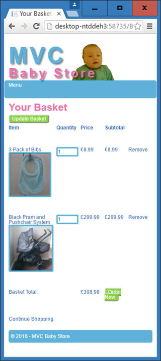
Figure 18-12. The basket with adjusted column widths
One issue still remains with this page. The Order Now button has been squashed and split in two because the text has wrapped. To fix this, update the style for a.btn and .btn to prevent text from wrapping as follows:
a.btn, .btn {border-radius: 5px;color: #ffffff;text-decoration: none;border: 2px outset buttonface;white-space: nowrap;}
The Order Now button should now appear correctly, as shown in Figure 18-13.

Figure 18-13. The basket with the Order Now button correctly displayed
Note
The ViewsOrderDetails.cshtml and ViewsOrdersReview.cshtml files also have similar formatting issues. The source code for the chapter contains the updated HTML for these pages should you want to view it.
Displaying Tables on Smaller Screens
HTML tables do not display very well on smaller screens. If you try to shrink them, they become unreadable. If you leave them as they are, you end up with a wide table on a small screen, which means that the user has to scroll across the screen a lot. Figure 18-14 shows how the Products Index page currently appears on small screens. A lot of the information is off to the right side of the screen, out of view.

Figure 18-14. Data displayed in a table forcing the user to scroll to the right to see it
I am going to show you make the table appear from top to bottom rather than from side to side by using a combination of HTML data attributes and the before pseudo-selector.
A snippet of the HTML that generates the table used to display products follows. This shows how the headings are generated and how a product is listed, plus I’ve highlighted in bold the relevant elements we need to manipulate:
<table class="table"><tr><th></th><th>Category</th><th>Product Name</th><th>Description</th><th>Price</th><th></th></tr><tr><td><a href="/Products/Details/6"><img src="/Content/ProductImages/Bibs1.JPG"></a></td><td>Feeding</td><td>3 Pack of Bibs</td><td">Keep your baby dry when feeding</td><td>£8.99</td><td><a href="/Products/Edit/6">Edit</a> | <a href="/Products/Delete/6">Delete</a></td></tr>
Start by adding the following style to the max-width 899 pixels media query:
@media (max-width: 899px) {div {margin-bottom: 20px;}…code omitted…td {width: 100%;display: inline-block;text-align:center;}}
This has the effect of displaying each cell underneath one another rather than side to side, plus the style ensures they stretch the width of the screen and that the text appears in the center, as shown in Figure 18-15.

Figure 18-15. Displaying a table's cells vertically rather than horizontally
You can see in Figure 18-15 that this single style has had a big effect on the table. There are still some issues though. The headings are displayed at the top of the page and there are no headings associated with the data shown in the table.
Hide the headings at the top of the table add a style below the one you just added:
@media (max-width: 899px) {div {margin-bottom: 20px;}...code omitted...td {width: 100%;display: inline-block;text-align:center;}th {display: none;}}
Next we are going to use HTML5 data attributes to associate a table heading with the relevant table cell in each row.
Note
HTML5 introduced data attributes to allow storage of data associated with an application, where there is no other appropriate element for storing it. You can make up your own data attribute names, but they must always begin with data- and be lowercase.
To store the appropriate table heading with each table cell, update the ViewsProductsIndex.cshtml file as follows, with the changes highlighted in bold:
@model BabyStore.ViewModels.ProductIndexViewModel@using PagedList.Mvc@{ViewBag.Title = "Products";}<h2>@ViewBag.Title</h2>@if (Request.IsAuthenticated && User.IsInRole("Admin")){@Html.ActionLink("Create New", "Create")}<p>@(String.IsNullOrWhiteSpace(Model.Search) ? "Showing all" : "You search for " +Model.Search + " found") @Model.Products.TotalItemCount products</p><p>@using (Html.BeginRouteForm("ProductsIndex", FormMethod.Get)){<label class="col-md-2"> Filter by category:</label><div class="col-md-3">@Html.DropDownListFor(vm => vm.Category, Model.CatFilterItems, "All", new { @class= "form-control" })</div><label class="col-md-2">Sort by:</label><div class="col-md-3">@Html.DropDownListFor(vm => vm.SortBy, new SelectList(Model.Sorts, "Value","Key"), "Default", new { @class = "form-control" })</div><input type="submit" value="Filter" class="btn btn-default col-md1" /><input type="hidden" name="Search" id="Search" value="@Model.Search" />}</p><table class="table"><tr><th></th><th>@Html.DisplayNameFor(model => model.Category)</th><th>@Html.DisplayNameFor(model => model.Products.First().Name)</th><th>@Html.DisplayNameFor(model => model.Products.First().Description)</th><th>@Html.DisplayNameFor(model => model.Products.First().Price)</th><th></th></tr>@foreach (var item in Model.Products) {<tr><td>@if (item.ProductImageMappings != null && item.ProductImageMappings.Any()){<a href="@Url.Action("Details", new { id = item.ID})"><img src="@(Url.Content(Constants.ProductImagePath) +item.ProductImageMappings.OrderBy(pim =>pim.ImageNumber).ElementAt(0).ProductImage.FileName)"></a>}</td><td data-th="@Html.DisplayNameFor(model => model.Category)">@Html.DisplayFor(modelItem => item.Category.Name)</td><td data-th="@Html.DisplayNameFor(model => model.Products.First().Name)">@Html.DisplayFor(modelItem => item.Name)</td><td data-th="@Html.DisplayNameFor(model => model.Products.First().Description)">@Html.DisplayFor(modelItem => item.Description)</td><td data-th="@Html.DisplayNameFor(model => model.Products.First().Price)">@Html.DisplayFor(modelItem => item.Price)</td><td>@if (Request.IsAuthenticated && User.IsInRole("Admin")){@Html.ActionLink("Edit", "Edit", new { id = item.ID })@Html.Raw(" | ")@Html.ActionLink("Delete", "Delete", new { id = item.ID })}</td></tr>}</table><div>Page @(Model.Products.PageCount < Model.Products.PageNumber ? 0 : Model.Products.PageNumber)of @Model.Products.PageCount@Html.PagedListPager(Model.Products, page => Url.Action("Index", new { category =@Model.Category, Search = @Model.Search, sortBy = @Model.SortBy, page}))</div>
Now, we’ll use the new data-th attributes add a style inside the max-width 899 pixels media query to display them before each td element, as follows:
@media (max-width: 899px) {div {margin-bottom: 20px;}...code omitted...td {width: 100%;display: inline-block;text-align:center;}th {display: none;}tbody td:before {content: attr(data-th);display: block;font-weight:bold;}}
This new style sets the content before a td element to the data in the data-th data attribute. Display: block ensures the content appears above each td element. Figure 18-16 shows the completed table in the Products Index page.

Figure 18-16. The restyled table displayed on a smaller screen size
Note
The ViewsOrderIndex.cshtml file has similar formatting issues. The source code for the chapter contains the updated HTML for this page and some associated styles should you want to view it.
Viewing a Visual Studio Project on Another Device
So far in this book, we've always viewed the web page through a desktop browser. However, it is crucial for a commercial project that you test your site on as many physical devices as possible. There are also online simulators that can be used for testing purposes. When choosing one, always try to test it against a real device to ensure the emulator works. To allow physical device testing, it is possible to enable a site running in Visual Studio to be viewed on another device by taking a few simple steps as follows.
First of all, run a command prompt as an administrator and the run the following command netsh http add urlacl url= http://computername:port/ user=everyone. Replace computername with the name of your computer and port with the port number of the site. For example, I entered the netsh http add urlacl url= http://desktop-ntddeh3:58735/ user=everyone command.
Also run the netsh http add urlacl url= http://localhost:port/ user=everyone command at this point to allow the site to continue to run using localhost. This will ensure if you run the source code of any previous chapters, then IIS will still allow it to run. Replace port with the port number the site is running on.
Next open the $(solutionDir).vsconfigapplicationhost.config file (this may be hidden by default) in Visual Studio and edit the bindings section for the port number of your project as follows:
Change this from:
<bindings><binding protocol="http" bindingInformation="*:port:localhost" /></bindings>
To:
<bindings><binding protocol="http" bindingInformation="*:port:computername" /></bindings>
where computername is the name of your computer and port is the port number of the site. For example, I changed this setting:
<bindings><binding protocol="http" bindingInformation="*:58735:localhost" /></bindings>
To:
<bindings><binding protocol="http" bindingInformation="*:58735:desktop-ntddeh3" /></bindings>
Next, right-click on the project in Solution Explorer in Visual Studio and view the project's properties. In the web section, update the Project Url setting so that it uses your computer name rather than localhost. Figure 18-17 shows the settings updated for my computer.

Figure 18-17. Updating the Project Url setting
Next, stop IIS Express if it is running by using the IIS Express Windows tray icon and choosing Exit (as shown in Figure 18-18). Alternatively, you can use Task Manager to stop IIS.

Figure 18-18. Stopping IIS Express via the Windows tray icon
Now start the site without debugging. It should open in your browser using your computer name in the address bar rather than localhost. Figure 18-19 shows how this local site now appears complete with an updated address.

Figure 18-19. The web site running using the computer name in the address bar
Assuming this has worked as expected, one final step remains to allow another device to access the site. You need to add a firewall rule for incoming traffic. Open the application named Windows Firewall with Advanced Security and choose to add a new inbound rule for a port. To add a rule, right-click on the Inbound Rules icon and choose New Rule from the menu. Choose to create a rule based on Port and then choose the option TCP plus enter the Specific Local Port as the port your web site is running on. Next, choose the option Allow the Connection and apply the rule to your private network. Finally, give the rule a name. You should now be able to view the site from another device on your network, e.g., from a mobile/cell phone. Figure 18-20 shows the site running in Chrome on a Sony Experia Z2 phone.

Figure 18-20. The site as viewed on a remote mobile/cell phone
Tip
In order to get the web site to resize itself on a mobile/cell or tablet, you must include the code <meta name="viewport" content="width=device-width, initial-scale=1.0"> in the HTML of every page.
Summary
This chapter covered how to make the site use a responsive design using CSS media queries, starting with tips on how to utilize Chrome’s built-in developer support. We then moved on to restyling the home page, followed by how to add a simple hidden menu to replace the navigation bar. We also covered how to format tables for smaller devices and finished the chapter with instructions on how to view your local site on other devices. That concludes the book. I do hope it has been helpful to you and thanks for reading. If you wish to continue to enhance your knowledge of ASP.NET MVC then consider learning further topics, including unit testing and dependency injection, plus using Web API to allow web pages to be built in technologies such as knockout rather than Razor syntax and cshtml files.