
Part 2
ADVANCED CSS IN PRACTICE
The conceptual frameworks introduced in the first part of this book are the foundations on which a thorough understanding of CSS is laid. Document flow, the various positioning schemes and formatting concepts, and stacking contexts are what make it possible for CSS rules to define the form of content so completely. Transforming a piece of content into multiple alternative presentations is at the core of most CSS development, even if you're ostensibly only working with a single design mock-up.
In this part of the book, we're going to move further into the practical aspects of working with CSS and what it can do. Each chapter focuses on a different cross section of CSS development that draws on numerous concepts from the previous part. Let's dive right in, beginning with exploring the specifics of CSS-generated content.
| Chapter 3 |  |
CSS-GENERATED CONTENT |
|
In addition to providing many means to present the content that already exists within a document, CSS provides a mechanism for rendering additional content. This content is called CSS-generated content, or pseudo-content, because it doesn't actually exist as part of the document structure. Instead, it exists in a sort of ghost state, rendered and painted on screen (or in whatever other way is being presented) but not “physically” there. In many instances, interaction with such content is therefore restricted so that it can't be selected by a cursor, accessed via scripting APIs, and so on.
In this chapter we'll explore CSS-generated content in more detail and showcase some of the ways it can be used to enhance presentation. It's important to remember that CSS-generated content, despite its name, is still a presentational effect. Therefore, we'll also supply some guidelines for using CSS-generated content in ways that adhere to development best practices such as progressive enhancement.
How generated content works
Whether or not you realize it, you've probably already used CSS-generated content in your day-to-day web development tasks. In CSS2.1, there are two mechanisms you can use to generate content with style sheets. The one you're already familiar with from previous chapters in this book is the markers, such as bullets and numbers, at the side of list items.
Thanks to their ubiquity, ordered (numbered) lists are a great example of where CSS-generated content is useful. In such lists, each item in the list is numbered according to its position relative to the other items. The first one therefore has the numeral 1 next to it, the second has the numeral 2, and so on. If we were marking up the notes in an ascending scale in such an HTML ordered list, the markup would look like this:
<ol>

    <li>A</li>

    <li>B</li>

    <li>C</li>

    <li>D</li>

    <li>E</li>

    <li>F</li>

</ol>
The actual rendering of this list would predictably look something like this:
- A
- B
- C
- …
Interestingly, the numerals at the side of the notes are rendered as well. How is this happening, since nowhere in the HTML are these numerals specified as content? The answer has two distinct components.
First, CSS-generated content provides a means to render CSS boxes and attach them to CSS boxes created by “real” content. As shown earlier, one way to generate these pseudo-content CSS boxes is to create list items or—more precisely—to declare display: list-item on an element (indeed, any element). Elements with the list-item value to the display property automatically generate a marker box, one kind of CSS-generated content. We'll examine marker boxes in much more detail later in this chapter.
The other way to render CSS-generated content is to declare a value for the content property in a CSS rule that selects the :before or :after pseudo-elements. These pseudo-elements are abstracted hooks that allow you to attach CSS boxes to any arbitrary element and then flow whatever content you specified with the content property into that newly generated box. This mechanism of generating pseudo-content is discussed in the next section.
The second piece of the puzzle to an ordered list's automatic numbering is that CSS also provides a simple mechanism for counting the occurrences of a particular thing (in this case, <li> elements). The count of these occurrences is saved in a counter, which is somewhat analogous to a simple variable. Each time one of these counters is rendered using CSS, the counter value is retrieved and used to number each of the individual instances being rendered.
The capability to render additional content not in the document itself and to number instances of elements that are in the document tree provides authors with a number of conveniences beyond additional styling hooks. For instance, let's say we want to include sharp notes on our ordered list of the musical scale. In that case, we need to add new list items in between the ones we currently have. Our new markup will therefore look something like this:
<ol>

    <li>A</li>

    <li>A sharp</li>

    <li>B</li>

    <li>B sharp</li>

    <li>C</li>

    <li>C sharp</li>

    <li>D</li>

    <li>D sharp</li>

    <li>E</li>

    <li>E sharp</li>

    <li>F</li>

    <li>F sharp</li>

</ol>
Thankfully, we don't have to worry about renumbering any of the elements ourselves, since the original list was numbered with CSS in the first place. The new list is numbered correctly, too.
- A
- A sharp
- B
- B sharp
- C
- C sharp
- …
As you'd expect, you can manipulate both aspects of this behavior through CSS properties. Let's dive in by generating some pseudo-content first, and then take a closer look at how CSS counters work later in this chapter.
Generating content :before or :after any element
Pseudo-content is generated with CSS by taking advantage of the :before or :after pseudo-elements. These pseudo-elements, which can be applied to any element in a document, are effectively placeholders where you can inject other content. The content property determines what actual content gets injected.
The simplest value you can give the content property is a string. Unsurprisingly, the result of using a string value is that the generated content is a line of text inside an inline CSS box. For example, if you were feeling particularly poetic, you could prepend the phrase “Quoth the raven” in front of every quoted paragraph in your document like this:
blockquote p:before { content: "Quoth the raven, "; }
When you link this CSS with an HTML snippet such as this one:
<blockquote>

    <p>Nevermore.</p>

</blockquote>
the result is a CSS box tree that behaves as though the underlying HTML were changed to something like this:
<blockquote>

    <p><span>Quoth the raven, </span>Nevermore.</p>

</blockquote>
In particular, notice that the trailing space character in the content property results in a trailing space character in the generated content right before the (theoretical) </span> tag. This is important for inline CSS boxes when concatenating text strings. Also notice that the generated content results in a CSS box that lives “inside” the element to which it is attached. This way, the generated content can naturally inherit the CSS properties of its associated “real” content.
Conversely, using the :after pseudo-element as shown in the CSS that follows, the CSS box rendering would change accordingly but the “real” HTML content can't be altered.
/* CSS using :after instead of :before */

blockquote p:after { content: ", quoth the raven."; }

<!-- HTML might therefore look like this: -->

<blockquote>

    <p>Nevermore.<span>, quoth the raven.</span></p>

</blockquote>
To override a previous rule that renders CSS-generated content, you need to specify a value of none to the content property instead of to the display property. Technically, specifying display: none does prevent CSS-generated content from being displayed, but the content may still be generated and kept in the user agent's memory. Therefore, it is more explicit and possibly less resource-intensive to say content: none in the context of pseudo-content. You can also use content: normal, which does the same thing but takes slightly longer to type (and sounds somewhat strange).
In addition to the none value or simple strings, the content property can also accept a url() value. When a url() value is used, the user agent determines the appropriate rendering based on the MIME type1 of the referenced URI. In other words, if the url() value references an image, then the image is rendered as though it were an <img> element placed in the normal document flow. If the url() value references an audio file, then screen readers will play the audio when they encounter the element to which the generated content is attached. Some user agents can also render other files such as SVG or PDF documents this way, inserting them directly in line with the rest of the flow of content.2
Here's an example like the one earlier but instead of inserting a string of text, we'll insert an image of a raven:
blockquote p:before { content: url(http://example.com/raven.jpg); }
Again, this has the basic effect of modifying the CSS box tree so that the resultant HTML would look like this:
<blockquote>

    <p><img src="http://example.com/raven.jpg" />Nevermore.</p>

</blockquote>
Using CSS-generated content functions most reliably on non-replaced elements (that is, elements that have intrinsic layout dimensions). None of the major browsers save for Opera will apply CSS-generated content to replaced elements such as images because the rendering engine needs to actively change the element's structure to do so. Additionally, as replaced elements reference external resources, they rarely have children. Generating content on an <img>, for example, forces the browser to render CSS boxes that can be represented in markup like this:
img:before { content: "Hello"; }

img:after { content: "world."; }


<img src="http://example.com/raven.jpg">

   <:before>Hello</:before>

   <:after>world.</:after>

</img>
Nevertheless, this works beautifully in Opera and isn't technically in violation of the CSS2.1 specification. However, the CSS specifications are unfortunately vague, offering little implementation guidance on how generated content should function with regard to replaced elements. As a result, some of the more compelling uses for generated content are still not cross-browser compatible, although it is hoped that the CSS3 Generated and Replaced Content module will address these concerns.
__________
1. A MIME type is the term used to catalog different kinds of data in a standard, conventional way so that they can be attached to various forms of networked communications, originally email messages. For example, image/gif is the MIME type for GIF images.
2. Most notably, this includes WebKit-based browsers such as all versions of Safari. Sadly, as of this writing, the Mobile Safari derivative that runs on iPhones and iPod touch devices does not yet support SVG at all.
Exposing metadata through the CSS attr() function
The attr()function is similar to the url() function just shown, but instead of referring to another resource it refers to the value of an attribute of the element to which the CSS-generated content is attached. Using an attr() value with the content property can therefore expose some metadata about the content to the user, since such metadata is often encoded in an element's attributes. This can be used to enhance visitors' experience by providing contextual but possibly peripheral information about the content they are viewing.
In fact, many user agents already do this with built-in features. For example, when you provide an element with a title attribute, web browsers will often reveal the contents of that attribute as a tooltip whenever users hover their cursor over that element. Generating pseudo-content with the attr() function takes this idea one step further. Instead of relying on individual user agents to expose this multilayered interaction in limited ways, you can proactively feature it and style the information as you see fit.
Here's one example to do exactly that. Along with providing a meaningful semantic value to <img> elements in their alt attributes, you could use their title attributes to provide a caption.3 We'll use Opera to do this, as it's the browser with the most support for CSS-generated content. If you had an <img> element such as the one shown next, you could use its title attribute to automatically generate its caption with no markup beyond the element's required attributes:
<img

src="http://upload.wikimedia.org/wikipedia/commons/2/27/

Edgar_Allan_Poe_2.jpg"

alt="" width="100"

title="This photograph of Edgar Allan Poe was taken in 1848 when he was

39, a year before his death." />
The title attribute in this <img> element provides everything you need for a caption, so to render it you could use the following CSS rule. The result is shown in Figure 3-1.
img[title]:before {

    content: attr(title);

    display: block;

}
You use the attr() function to the content property to extract the title attribute's contents. The display property is simply used to present the caption and the image their own lines, instead of in the same inline box. Alternatively, you could place the image on top of the caption instead of beneath it by injecting the generated content (the caption) :after the image instead of :before it.
__________
3. Not only is providing both an alt attribute (itself required for validation) and a title attribute sort of handy, it's also a best practice accessibility guideline. See Joe Clark's book, Building Accessible Websites (New Riders Press, 2002), for a detailed explanation of the accessibility uses for the <img> element's alt and title attributes, and how they compare with each other.
The [title] attribute selector is used to ensure that only <img> elements with title attributes are selected by the rule. If the element you select doesn't have a title attribute, the result of the call to attr(title) will be the empty string (i.e., it will be the same as ‘’). Alone, this isn't problematic, but when combined with the display: block; declaration, even an empty string value creates a line break, which will result in some unintended vertical spacing.
Another interesting characteristic of the content property is that you can supply it with multiple values and each of them will get injected one after the other, in the order you prescribe. So, for example, using the image caption example earlier, you might want to not only provide the caption but also explicitly name the image's source in the caption itself. You could manually write out the source of the image in the title attribute, of course, but CSS offers this better way:
img[title]:before {

    content: attr(title) " Image retrieved from " attr(src);

    display: block;

}

Figure 3-1. Extracting the contents of an element's attribute renders as text
This time, we provide three distinct values to the content property. Once again, note the leading and trailing single spaces within the quotation marks for the second (plain string) value. With this declaration, your image captions will show the contents of the <img> element's title attribute, followed by a space, followed by the words “Image retrieved from” and then another space, and finally ending with the address of the image file itself, as Figure 3-2 shows.
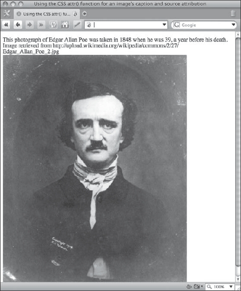
Figure 3-2. The attr() function can be used any number of times in the content property.
Another thing to note is that our selector hasn't changed. That's because the src attribute is required on <img> elements (for somewhat obvious reasons), so we can safely assume it's always going to be there.
You may also attach CSS-generated content both :before and :after any single element, which means that every real element in your markup has at least two (and sometimes up to three) styling hooks for generated content. (:before is one, :after is another, and if the element is display: list-item, that gives us a third.) So, for example, if you wanted the caption above the image and the image source below it, you could use the following CSS to do that:
img[title]:before, img[title]:after { display: block; }

img[title]:before { content: attr(title); }

img[title]:after { content: "Image retrieved from " attr(src); }
In this case, we use the [title] attribute selector in every rule, even in the rule that uses attr(src), since that's how we've determined that an image has a caption.
The key point is to realize that today you always have at least N × 3 potential CSS boxes to style in any document, where N is the number of real elements in your markup (unless these are replaced elements, as noted earlier). Usually, thanks to the prevalence of lists, you actually have a little more than that (although see our cautions on avoiding “list-itis” later in this chapter). You can't attach CSS-generated content to CSS-generated content, however, so you don't get an infinite number of potential CSS boxes to work with, although this capability is included in the current working draft of the CSS3 Generated and Replaced Content module.4 That means that while the following two rules are both valid CSS, the second one will never be used because it can't possibly apply to anything in CSS2:
p:before { content: "I'm a generated box."; }

p:before:before { content: "I'm not ever going to be rendered."; }
If you think you need to do something like this in a style sheet, you may not be making full use of the document's structure. Look at the markup around the element you want to style and see if there are any other styling hooks available to you, such as other nearby elements. If you still can't come up with a way to achieve what you want, you probably have poorly structured markup that you might need to rework.5
Additionally, though we hate to temper any sudden enthusiasm for the incredible potential of CSS-generated content, there are some important styling restrictions that such pseudo-content adheres to. Despite this, styling CSS-generated content can be an incredible boon to many, if not all, designs.
Replacing content with pseudo-content
A number of techniques are used in web development today that allow one element to be entirely replaced with another. Typically, this is a presentational effect that lets web designers use images or other media such as Flash movies in place of more limited options. Textual headings are frequent candidates for such media replacement.
Although not widely supported today, the current working draft of CSS3's Generated and Replaced Content module provides this capability directly by building on the functionality provided by previous levels of CSS-generated content. The familiar syntax merely uses the content property and applies it to a real element, that is, without the use of the :before or :after pseudo-classes.
/* Replace a textual headline with an appropriate image. */

h1#company-name { content: url(/company-name.png); }
__________
4. It is proposed that nesting CSS-generated content function merely by chaining ::before or ::after pseudo-elements to each other, as described at http://www.w3.org/TR/css3-content/#nesting.
5. Speaking of reworking markup structure for better semantics and styling hooks, might we recommend Paul Haine's book, HTML Mastery (friends of ED, 2006).
Replacing content in this way can also be used for easily creating low-fidelity alternatives to hi-fi content, instead of the other way around, as we discuss further in Chapter 5. Sadly, as of this writing, the only mainstream browser that the previous CSS rules work in is Opera 9.6. However, we hope that since replacing content in addition to generating content is such a powerful mechanism for web development other browsers will implement this capability sooner rather than later.
Limitations on styling CSS-generated content
As we mentioned earlier, pseudo-content doesn't actually exist as part of the document structure. Once it is generated by a CSS rule, however, it behaves in the same way “real” content would—but only as far as CSS is concerned. This is an important caveat because it means that even after the content is rendered, it is still not accessible outside of CSS (such as by JavaScript) via the DOM. In other words, CSS-generated content is kept very strictly segregated in the presentation layer of your page.
That said, since CSS-generated content is rendered with real CSS boxes, the generated box obeys most of the rules you might expect. They inherit properties from the content to which they are attached as though that content were their parent elements, they have the same interactions with their neighboring CSS boxes according to the rules of document flow, and so on.
One notable difference, however, is that CSS-generated content always remains positioned statically. That is, CSS-generated content always has position: static and the various values of the position property do not affect generated content as they would “real” content. The same is also true for the float property. Sensibly, this is to ensure that CSS-generated content always renders near the content to which it is attached. Due to this restriction, all the following CSS rules are effectively identical to the image caption example in the previous section:
img[title]:before {

    content: attr(title) " Image retrieved from " attr(src);

    display: block;

    position: absolute; /* This does nothing to pseudo-content. */

    position: relative; /* Neither does this. */

    top: 50px; /* Naturally, this is also ignored. */

}

img[title]:before {

    content: attr(title) " Image retrieved from " attr(src);

    display: block;

    float: right; /* This also has no effect. */

}
Another limitation of the :before and :after pseudo-elements is that regardless of their contents, they can only generate a single CSS box. Practically, this means that there is no way to specify that, for instance, the attr(title) portion of the previous example's declaration should be a block-level box (with display: block) while the rest of the content property's values should be inline. In other words, any additional CSS properties you declare in a declaration block that targets CSS-generated content applies to all the content property's values.
Finally, as hinted at earlier, in all mainstream browsers except for Opera, CSS-generated content will not apply to any replaced elements (that is, elements whose layout dimensions are determined by external resources). Such elements include <img> elements, <object> elements, and a number of form controls. Even in Opera, only some elements work this way, and they function because the browser jumps through a number of rendering hoops. The CSS2.1 specification made no restrictions regarding where generated content could be applied, but implementation proved difficult. As the CSS3 specification is still not complete, browser makers are unlikely to enable CSS-generated content on replaced elements in the near future.6
In most situations these limitations are not an issue because generated content should be kept succinct. If you're trying to fit too much into pseudo-content, you might consider reevaluating whether the pseudo-content you're presenting is actually real content. If it is, you should provide the content as part of the underlying document itself instead of declaring it in a style sheet.
Although using strings in the content property is relatively simple and somewhat limited, there are nevertheless some remarkably useful things you can do with them. For example, you can force text into multiple lines much like you might have done with an HTML <br /> element. Since we're inside of CSS and not HTML, though, using an HTML line break won't work. To understand why that is, let's examine CSS string values and escape sequences in detail.
Understanding escape sequences in CSS strings
Regardless of where they appear, string values in CSS behave in a similar way. The most important thing to remember about them is that they are not HTML. This means, for instance, that inserting literal angle brackets without escaping them as HTML entity references (< and >) is perfectly legal. In other words, the rule
#example:before { content: "3 < 5"; }
would result in a pseudo-element whose contents are the five characters (including spaces) 3 < 5 and not a broken HTML start tag. Similarly, this rule
#example:before { content: "<"; }
results in a pseudo-element whose contents are the four characters < and not an HTML-escaped less-than glyph. This tells us that the < and & characters are not treated specially by CSS string parsers, even though they are characters with special meaning in SGML-derived languages like HTML and XML.
Within CSS strings, the only character with any special meaning is the backslash (). This character delimits the beginning of an escape sequence, a sequence of characters used to collectively represent a different character, in much the same way as the ampersand (&) does in HTML code.
Escape sequences are useful because they allow style sheet authors to represent characters that would normally be ignored or interpreted differently by traditional CSS parsing rules. The most obvious example of this is representing a literal backslash in a CSS string. At first, you might think that the following CSS rule would produce a backslash at the start of every paragraph, but you'd be mistaken.
p:before { content: ""; }
__________
6. The issue with CSS-generated content with regard to replaced elements is in the difficulty of determining its dimensions correctly when the element's initial rendering depends on an external resource to begin with. A Mozilla Firefox bug discusses this issue specifically and may prove interesting. It can be found at https://bugzilla.mozilla.org/show_bug.cgi?id=169334.
When a CSS parser reads the declaration in this rule, it thinks that the backslash is the start of an escape sequence, and so it ignores it. Next, it encounters a straightened double quote and, since this character is not a legal component in an escape sequence, it recognizes it as the end of the string value and returns. The result is an empty string, sans backslash: “”.
To get the backslash to appear, we therefore need to escape it, or “undo” its special meaning. This is simple enough. We merely prepend the backslash with another one, like this:
p:before { content: "\"; }
This time when a CSS parser reads the declaration in the rule, it finds the first backslash, switches into its “escape sequence mode,” finds a literal backslash character as part of the string value it is parsing, and then finds the end-of-value straightened quotation mark. The result is what we were originally after, and the value that the CSS parser returns to the renderer is a single backslash: “”. Note that CSS makes no distinction between single-quoted or double-quoted strings, so in either case two backslashes are needed in code to output one.
A similar situation exists if you wish to produce a literal double-quote within a double-quoted string. Instead of writing content: ““”; you would write content: ““”; to tell the CSS parser to treat the second quote as part of a value instead of the end-of-value delimiter. Alternatively, you could use single quotes as the string delimiter (content: ‘"’).
After the starting backslash, only hexadecimal digits (the numerals 0 through 9 and the English letters A through F) are allowed to appear within an escape sequence. In such escape sequences, these digits always reference Unicode code points7 regardless of the character set used in the style sheet itself. As a result, it's possible to uniformly represent characters in a style sheet that are not possible to embed directly inside the style sheet itself. Accented characters (like the “é” in résumé or café) is an example of one class of characters that would need to be escaped in a CSS string if the style sheet were encoded in plain ASCII instead of, say, UTF-8.
One useful application for this is to embed line breaks into generated content. The Unicode code point for the newline character is U+00000A. In a CSS string, this can be written as �0000A. In a way similar to the way a hex triplet for color values can be shortened, escape sequences can also be shortened by dropping any leading zeros from the code point, so another way to write a newline is A. Here's a CSS rule that separates the two words “Hello” and “world” with a newline, placing each on their own line.
#example:before { content: "HelloAworld."; }
Something to be careful of when using escape sequences in CSS strings is ending the escape sequence where you intend to. Observe what happens if our “Hello world” text changed to “Hello boy.”
#example:before { content: "HelloAboy."; }
Now, instead of a newline (code point A), our escape sequence is a left-pointing double angle quotation mark, or « (code point AB). Our generated content now reads “Hello«oy.” This happens because the “B” in “boy” is interpreted as a hexadecimal digit. The escape sequence terminates at the next character, the “O,” because that letter isn't also such a digit.
__________
7. Actually, all CSS string escape sequences are really references to Universal Character Set (ISO-10646) encoded characters. However, for nearly all intents and purposes, these values are equivalent to Unicode code points.
You can explicitly conclude an escape sequence in one of two ways. First, you can specify the sequence in full using all six hexadecimal digits (including leading zeros, if there are any). Second, you can append a space. The following two CSS rules are therefore equivalent:
#example:before { content: "Hello�0000Aboy."; }
#example:before { content: "HelloA boy."; }
Knowing this, we can now split our earlier image caption example across two lines just where we want to. Pay close attention to the addition of the white-space: pre; declaration. Since we're generating whitespace characters and in most situations all whitespace in HTML gets collapsed to a single space, the white-space declaration is needed to interpret the newline literally (as though all the generated content were inside a <pre> element).
img[title]:before {

    content: attr(title) "AImage retrieved from " attr(src);

    white-space: pre;

    display: block;

}
If you wish to be explicit about it, you can declare an @charset rule at the very start of your style sheet to give user agents a hint of what the character encoding of your style sheet is. For instance, to declare UTF-8, use @charset “UTF-8”;. If you do include an @charset rule, it must be the very first thing in your style sheet, before any preamble—even before comments or whitespace. If it's not, the rule simply gets ignored. Being explicit like this is often helpful when working with larger teams, but you should be wary of relying on the @charset mechanism too heavily. Like HTML <meta> elements, some user agents ignore @charset rules in style sheets in favor of the HTTP Content-Type headers set by the server.8
Advanced list styling: marker boxes and numbering
The HTML language gives us three different basic structures to encode lists. These are an ordered list, an unordered list, and a definition list (<ol>, <ul>, and <dl>, respectively). Of the three, the definition list is the oddball; the children of both ordered and unordered lists must be the somewhat nondescript list item (<li>) element. The <li> element, however, must not be the child of a definition list and instead only definition terms (<dt>) and definition descriptions (<dd>) are permitted.
Each kind of HTML list element comes with some interesting default styles. Both <dt> and <dd> elements in definition lists create block-level CSS boxes. However, <li> elements in ordered and unordered lists typically create list-item CSS boxes. As briefly mentioned at the start of this chapter, these list-item boxes are special because as well as having the characteristics of a block-level CSS box, they have an additional CSS box, known as a marker box, that is “attached” to one of its sides. Predictably, the marker box is attached to the left side of the list-item box in an element with left-to-right document flow and is attached to the right side in a right-to-left document flow.
__________
8. The CSS specifications actually specify that a server's HTTP headers have precedence over any @charset declarations in the style sheet itself. Additionally, they demand that a user agent that doesn't recognize the character encoding of a CSS style sheet ignore the entire file. Though rare, some combinations of user agents and server or style sheet (mis)configurations can therefore cause confusing bugs during development that appear to drop CSS rules. At the very least, it behooves front-end web developers to pay attention to how the server is delivering style sheets to the end user's device.
Marker boxes have some unusual characteristics. First, because they are not physical structures—indeed, they are a form of CSS-generated content—they can be used to great effect for stylistic purposes. Second, because they are automatically generated, they provide a certain amount of automation for convenience's sake. Take a simple ordered list, for example:
<ol>

    <li>I'm the first item.</li>

    <li>I'm the second item.</li>

</ol>
When rendered with a CSS-capable user agent, the first list item will probably have the number “1” next to it and the second will have the number “2” next to it, perhaps like this:
- I'm the first item.
- I'm the second item.
Those numbers are nowhere to be found in the HTML source code, yet they appear in the correct order anyway. Indeed, if we add a third item to the end of the list, we'll likely see a “3.” Even better, if we insert a new item before the end of the list, all the list items will automatically renumber themselves based on their new position relative to the other list items.
This turns out to be extremely useful, and we can do a number of things (no pun intended) to control the way these lists get numbered. We'll take a closer look at numbers in the next section on CSS-generated counters. In the meantime, however, let's take a closer look at those marker boxes that these numbers are living in and explore what else we can do with them.
Using built-in marker box styles
Several default styles are available for marker boxes. To pick one, you use the list-style-type property. CSS2.1 defines 14 built-in list marker styles. These are all keyword values that fall into one of three types: glyphs, numbering systems, or alphabetic systems.
The disc, circle, and square values are the three types of glyph values, and using them gives you discs (bullet points such as •), circles (white bullets such as º), or squares (black square bullets such as ▪) as your marker box contents. For the most part, web browsers initialize an unordered list with list-style-type: disc. Nesting one unordered list inside another is less consistent. In all cases, though, unordered lists nested within other lists use either the circle or the square value to the list-style-type property.
Using one of the glyph marker styles, all the list items in a list will use that glyph. Both the numbering and alphabetic marker styles that CSS2.1 specifies behave differently. With these, the specific glyph used depends on the position of the individual list item relative to all the others. In other words, the specific glyph increments with each new list item element added to the list.
Of course, this is pretty intuitive since both numbering systems and alphabetic systems have a well-known sequence. Three comes after two, which comes after one, and so on. The numbering systems available in the CSS2.1 spec are decimal, decimal-leading-zero, lower-roman, upper-roman, georgian, and armenian. Sensibly, decimal is often used as a default for ordered lists.
In addition to sequential numbering, you can also specify the following alphabetic systems: lower-latin (or its synonym, lower-alpha), upper-latin (or its synonym, upper-alpha), or lower-greek. In some of the world's languages, alphabetic systems also double as numbering systems. A prime example is Hebrew, which uses the first letter of its alphabet ( ) as both a letter and the symbol for the numeral one. CSS3 is expected to add support for additional alphabetic systems, including
 hebrew as well as the Japanese hiragana and katakana syllabary.9
For lists of any significant length, the numbering system styles are preferred over the alphabetic ones because CSS doesn't define what happens to markers for which no subsequent letter is available. For example, lists of 27 or more items using the lower-latin alphabetic system might only display markers for the first 26 elements, since the English alphabetic only contains 26 distinct glyphs. In the majority of instances, lists that are longer than the alphabetic system used in their markers will revert to the decimal style at that point.
Naturally, any markup structure can be made to render as a list-item CSS box and thus can accept any of the list styling properties. This becomes useful when you have a design that needs lots of background images but are running out of elements that you can attach those background images to. In such tight situations, you can sometimes get away with transforming one or more block-level elements to list-item elements and then replacing the built-in marker box style with one of your own, which is discussed in the next section.
Here's a trivial example that makes a series of paragraphs look like an unordered list:
p {

    display: list-item;

    list-style-type: disc;

    margin-left: 2em;

}
Now each paragraph generates a block-level box as well as a marker box. It's generally only useful to do this when you intend to provide your own custom imagery to fill the marker box with using the list-style-image property, since the counters in either the numbering or alphabetic systems will not actually increment as they would with a real <ol> or <ul> element using the above CSS rule.
Replacing marker boxes with custom images
The list-style-image property lets you choose your own image in place of the built-in marker box styles using a url() value. Any valid URI is acceptable here. When this property is used and is not declared to be none, the value of list-style-type is ignored.
__________
9. Some of these systems were already present in earlier CSS specifications, but due to a dearth of real-world implementation support, they were removed in CSS2.1 to make the specification leaner. Recently, with additional focus on the W3C's internationalization efforts, these requirements are finding their way back into the proposals for future CSS specifications. Nevertheless, some mainstream browsers do currently support marker styles such as hebrew.
Traditionally, this is used to provide custom bullet images for lists in a gracefully degrading way. If the custom image can't be fetched, the value of list-style-type (whether inherited or explicitly declared) is used instead. Such CSS could look like this:
ul li {

    list-style-image: url(http: //example.com/fancy-bullet.gif);

    /* degrade to normal bullets if the fancy ones are unavailable */

    list-syle-type: disc;

}
Another interesting use for custom marker boxes is as limited background images, as mentioned in the previous section. Since marker boxes grow the size of their associated list-item CSS box, you can use them to provide an additional styling hook for one side of a complex visual element's background image. Specifically, a marker box's height is either the height of its associated list-item CSS box or the height of its own content, whichever is greater.
Manipulating the marker box's position
Like other CSS-generated content, markers are not quite as flexible as “real” elements. Sadly, the original CSS2 specification actually provided more control over the styling of marker boxes than the later CSS2.1 revision. Nevertheless, you can still influence where a marker box is rendered using a couple different techniques.
Positioning marker boxes outside or inside normal document flow
A list-item's marker box is unique among CSS-generated content because, by default, it renders outside of the CSS box it is attached to as opposed to inside it. This behavior has its heritage in traditional typography, where (believe it or not) the bullets of lists were actually intended to sit in the margins of pages and protrude out from the main body text.10 Nevertheless, if you'd like to present lists in your page with the more contemporary typographic alignment, you can change this behavior using the list-style-position property.
Using the list-style-position property, you can control whether a list-item CSS box's marker box is rendered outside or inside the list-item CSS box itself. Specifying a value of inside (instead of the default, outside) on list-style-position tells marker boxes to mimic the behavior of other CSS-generated content. More precisely, when the marker box is positioned inside the list item, the marker box's contents become part of the inline CSS box created by the list item's contents themselves.
In code, you can see this by observing that the following two rules create an equivalent effect as one another, but the first does so with list-item marker boxes while the second does so with pseudo-content generated using the :before pseudo-element:
ul li {

    list-style-type: disc;

    list-style-position: inside;

}
ul li:before {

    content: "2022 "; /* Unicode for a bullet */

}
__________
10. For an absolutely fascinating history of typography as well as an infinitely practical reference to it, we highly encourage you to read The Elements of Typographic Style by Robert Bringhurst (Hartley & Marks Publishers, 2002). Also see http://WebTypography.net for ways in which you can apply Bringhurst's lessons to the Web.
Once the marker is positioned inside the list-item CSS box, it becomes part of the inline box in the normal document flow. Interestingly, however, the :first-letter pseudo-element still refers to the first letter of the list-item's contents and not the marker box, which means you can use it to precisely position the marker at a horizontal offset from the start of the text. Here's how you can position a bullet exactly 10 pixels away from the beginning of a list item's text in all conforming browsers:
ul li { list-style-position: inside; }

ul li:first-letter { margin-left: 10px; }
Marker offsets and marker pseudo-elements
Interestingly, CSS2 defined a marker-offset property whose intent was to provide a more flexible mechanism for specifying how far aside a marker box should be rendered relative from its list-item CSS box, but this was later removed in CSS2.1 and as of this writing marker-offset is slated for obsolescence in CSS3.
In the future, marker boxes will hopefully become more generically useful as CSS3 attempts to bring some capabilities lost in CSS2.1 back. In the CSS3 List module, markers are subject to the traditional CSS box model so they can be manipulated using margins and the like. Further, you can target them wherever they appear using the ::marker pseudo-element. Recall that all CSS3 pseudo-elements (such as ::marker and ::selection) are prepended with a double semicolon, while CSS2.1's syntax uses single semicolons. Sadly, as of this writing, support for the ::marker pseudo-element (and many other CSS3 pseudo-elements) is negligible.
Automatic numbering using CSS-generated counters
Since CSS2, the automatic numbering mechanism used to display sequential markers for list items has been available for use by style sheet authors directly. One of the major advantages of exposing this mechanism is that it gives developers the capability to automatically number any element or set of elements that appear within their document markup, so we're not limited to list items inside of lists. Moreover, because the numbering system builds on all the fundamentals of CSS-generated content we explored earlier in this chapter, designers have far greater stylistic control over the appearance of these numbers.
A counter is merely a named reference to a set of elements to count. If you're familiar with programming, you can think of it like a kind of limited variable. Automatic numbering in CSS works by setting various counter-related properties on different elements. The following three CSS rules, for example, is one way to replace an ordered list's default marker box numbering with your own implementation to achieve an equivalent (although not identical) visual appearance.
ol {

   list-style-type: none; /* turns off the built-in marker boxes */

   counter-reset: mylist; /* create the named counter */

}

ol li { counter-increment: mylist; } /* increment the counter at each list item

*/

ol li:before { content: counter(mylist) ". "; } /* display the counter's value */
There's nothing magical in these rules. There are only two new properties and one new value: counter-reset, counter-increment, and counter(), respectively. Together, these three pieces form the building blocks of CSS counters.
All CSS counters follow the same basic pattern: reset, increment, and render, in that order. The counter-reset property initializes a new counter whose name is the value you specify. It also creates a counter scope, which is simply the hierarchical context of the markup tree that this particular counter operates within (in this case, that's <ol> elements). A counter's scope is discussed later in the section “Counter scope: exposing structure with nested counters.” The counter-increment property defines when and by how much the counter should increment (or decrement). Finally, the counter() function is used to display the counter in the normal way all CSS-generated content is displayed.
In the previous example, we've initialized a new counter called mylist, so that's the identifier we'll use to reference the same counter in subsequent declarations. By default, counter-reset initializes counters to 0, but you can specify an integer for initialization by declaring it after the counter's name. The previous declaration is therefore really shorthand for counter-reset: mylist 0;.
After resetting the counter on <ol> elements, we select <li> elements and apply the counter-increment property to them. In English, these two rules read, “Number list items for each ordered list.” Similar to counter-reset, the counter-increment property can also take an integer value after the counter name to specify by how much the counter should be incremented, which defaults to 1. Again, this means the declaration in the example is really shorthand for counter-increment: mylist 1.
Finally, we can then display the value of the counter by generating pseudo-content :before the list item and accessing the current value of the counter by passing its name to the counter() function. By default, a counter's value is rendered as a decimal number, but again, this can be changed by providing a second parameter to the counter() function. This second parameter takes any of the supported values you can give the list-style-type property. Therefore, the above declaration is really shorthand for content: counter(mylist, decimal);.
Atypical numbering: counting backward, skipping numbers, counting with letters, and more
By using different starting and increment values with the counter-reset and counter-increment properties, you can do some interesting things. These are quite illustrative, so here are some examples.
Initializing a counter to 0 means that the first number displayed is a 1 because counters are incremented before they are rendered. Here's how to start numbering list items at the number 5:
ol {

   list-style-type: none;

   counter-reset: mylist 4; /* start counting at number 5 */

}

ol li { counter-increment: mylist; }

ol li:before { content: counter(mylist) ". "; }
If your document is marked up in HTML4.01 Strict or XHTML, these CSS rules are the only way to start an ordered list at an arbitrary value because the start attribute for <ol> elements is deprecated.11
You can use the counter-increment property to count in even (or odd) numbers only. For example, to count using only positive even integers, you can use these CSS rules:
ol {

   list-style-type: none;

   counter-reset: mylist;

}

ol li { counter-increment: mylist 2; } /* increment by two each time */

ol li:before { content: counter(mylist) ". "; }
To do the same thing but starting with 1 and only counting odd numbers, use the following somewhat counterintuitive values:
ol {

   list-style-type: none;

   counter-reset: mylist -1; /* initialize to a negative value */

}

ol li { counter-increment: mylist 2; }

ol li:before { content: counter(mylist) ". "; }
This works because the counter begins at negative one (−1) and is then incremented by 2 to produce a value of positive one (1). Further additions of 2 at each list item produce odd numbers only.
Given ten items, here's how to count backward from 10 to 1, perhaps for a "top-ten" list:
ol {

   list-style-type: none;

   counter-reset: mylist 11;

}

/* decrement by 1 instead of incrementing */

ol li { counter-increment: mylist −1; }

ol li:before { content: counter(mylist) ". "; }
And, given 26 items, here's a CSS counter that displays all the letters of the English alphabet backward:
ol {

   list-style-type: none;

   counter-reset: mylist 27;

}

ol li { counter-increment: mylist −1; }

/* count with Latin letters instead of numbers */

ol li:before { content: counter(mylist, lower-latin) ". "; }
__________
11. There is some disagreement over whether the start attribute is presentational, and as a result this deprecated attribute, along with its relative (the value attribute), may both be revived in the forthcoming HTML5 specification.
Since CSS counters are completely decoupled from their display, we can count occurrences of one kind of element and display the count somewhere else entirely. For example, these CSS rules will display the total number of quotations in an HTML document at the very bottom of the page:
body {counter-reset: number-of-quotations; }

q, blockquote { counter-increment: number-of-quotations; }

body:after {

    content: "Total number of quotations on this page: "

        counter(number-of-quotations);

}
Given the following example HTML page, the above CSS will count three quotations:
<body>

    <h1>A CSS counters example</h1>

    <p>The quick brown fox said, <q>jump over the moon!</q>.</p>

    <p>

        <q>No, no, no!</q> the cow retorted, and continued to recite the

        lullaby improperly itself:

   </p>

    <blockquote>

      <p>There once was a muffin maid named Jim.</p>

   </blockquote>

</body>
However, if we change the CSS so that the number-of-quotations counter is displayed :before the <body> instead of :after it, we'll get a different result. Specifically, the counter will report that there are 0 quotations on the page. This happens because at the start of the document the counter has not encountered a <q> or a <blockquote> element yet, so it has not been incremented beyond its initial value of 0.
Using multiple counters
There is no limit to the number of counters you can use in a single page, or even in a single scope. Using multiple counters is mostly a matter of referring to additional counters in the appropriate places. However, due to CSS's declarative nature, the syntax used for multiple counters may feel strange at first blush.
To reset (initialize) multiple counters at the same time, do so in a single counter-reset declaration. The following example resets both counter1 and counter2:
#example { counter-reset: counter1 counter2; }
In contrast, this next example only resets counter2 while leaving counter1 untouched, which is almost certainly not what was intended by the style sheet author. This is because the second counter-reset property overrides the first, as per normal CSS cascading rules:
Numbering groups of elements and their siblings
Another way to think of CSS counters is that they let you expose information about an element's source order and its hierarchal context in a flexible way. You can reset and increment any number of counters on the same elements, which lets you automatically number not only groups of elements but also their sibling and child elements.
For instance, let's assume you were given the script to a three-act play where the title of each act was marked up in an <h1> element, each scene in <h2> elements, and each line in <p> elements. Using CSS counters, you can number each actor's lines so that you can all refer to them easily. The CSS rules for doing this might look like the following:
/* Initialize and increment act, scene, and line counters. */

body { counter-reset: act; }

h1 {

   counter-increment: act;

   counter-reset: scene;

}

h2 {

   counter-increment: scene;

   counter-reset: line;

}

p { counter-increment: line; }

/* Display act, scene, and line counts appropriately. */

h1:before { content: "Act " counter(act, upper-roman) ": "; }

h2:before { content: "Act" counter(act, upper-roman) ",

              Scene " counter(scene) ": "; }

p:before { "[" content: counter(act) "-" counter(scene) "-"

              counter(line) "] "; }
With this styling, the three act titles (<h1> elements) will be labeled “Act I,” “Act II”, or “Act III.” Each scene (<h2> elements) will also be labeled appropriately; the first act in the first scene will be labeled “Act I, Scene 1.” while the sixth scene in the third act will be labeled “Act III, Scene 6.” Finally, each of the actors' lines (<p> elements) will have a three-digit reference number prepended to them so that the line that begins with “[3-1-7]” will be the seventh line in the first scene of the third act.
It's worth noting that, just like lists, since all of these numbers are automatically generated with CSS, shuffling an actor's lines around while editing the script will not require you to renumber anything even though there isn't a single list structure used in the markup. Moreover, the script is hierarchically flat; all the elements it contains are siblings of one another. Using counters this way is therefore also a powerful technique to avoid symptoms of “list-itis” that sometimes plague badly structured markup.
“List-itis” is a term used to describe poorly structured markup that overuses lists to various ill effect. One common cause of list-itis is an attempt to give large portions of a document numbered labels without CSS counters. For example, the play script example just discussed could theoretically also be marked up in a nested list like this:
    <ol>

        <li>

            <h1>Act I: Title Here</h1>

            <ol>

                <li>

                    <h2>Act I, Scene 1: Title Here</h2>

                    <ol>

                        <li>

                            <p>1-1-1: Actor's line here.</p>

                        </li>

                    </ol>

                </li>

            </ol>

        </li>

    </ol>
Of course, this works, but it's obviously an enormous amount of additional markup when compared with the lean markup that doesn't use the nested lists. Moreover, it's not quite as stylistically flexible as compared to the CSS counters example. On the other hand, the script for a play might philosophically be an ordered list, since you have a set sequence of acts, scenes, and lines, right?
Well, the answer—as you might expect—is “it depends.” Theoretically, every piece of textual content is indeed sequential by virtue of the linearity of the medium. You read one sentence or paragraph, then the next, and so on. Despite this, it still seems ridiculous to nest all paragraphs on your pages inside of an ordered list even though it might be technically appropriate.
There is a balance to be struck here. Taking this too far down the road of creating lists results in “list-itis.” I've seen some web designers get so excited about lists that every single element in their pages become one list nested within others. Unfortunately, lists that span from the opening <body> tag to the closing </body> tag are not actually that useful, and carry some of the same problems that <table>-based layouts did.
It's important to be aware that the structural flow of “one to the next” is already implicitly defined by the content's source order, so using a list to make this implicit linearity explicit is wasted effort. Second, and probably more important, forcing unnecessarily rigid structure like this makes it difficult to reuse the same HTML code later. Rather than working with the content naturally, you now have to fight against all the opposing style rules that you've defined for lists elsewhere in your CSS.
All that said, avoiding list-itis is very much a judgment call. Our example is extreme, but is actually based on a real HTML mockup we received. Be mindful of the semantics of your content, and you should easily be able to discern where one list should end and another one should begin.
Displaying total counts
Since you can have multiple counters, and since anything that can be targeted with a CSS selector can be counted with them, you can use CSS counters to supplement or, in some cases, completely replace JavaScript-generated statistics. Here are a few CSS rules that count the total number of headings, paragraphs, links, and quotations, in a blog post. Of the total number of links, the number of them that are rel-tag microformats and the number that refer to other blog posts on the same site (assuming the site uses a URI path that begins with /blog/ for blog posts) are shown distinctly.
.hentry {

    /* Initialize all counters. */

    counter-reset:

        num-headings

        num-paras

        num-links

        num-links-tag        /* rel-tag microformats */

        num-links-internal

        num-quotations

    ;

}

/* Count paragraphs. */

.hentry p { counter-increment: num-paras; }


/* Count entry headings. */

.hentry h1,

.hentry h2,

.hentry h3,

.hentry h4,

.hentry h5,

.hentry h6 { counter-increment: num-headings; }


/* Count link totals. */

.hentry :link { counter-increment: num-links; }

.hentry :link[rel="tag"] {

    counter-increment: num-links num-links-tag;

}

.hentry :link[href^="/blog/"] {

    counter-increment: num-links num-links-internal;

}

.hentry q, .hentry blockquote { counter-increment: num-quotations; }


.hentry:after {

    content:

        "This entry has a total of " counter(num-headings) " headings, "

        counter(num-paras) " paragraphs, " counter(num-links) " links "

        "(of which " counter(num-links-internal) " point to other blog "

        "posts on this site and " counter(num-links-tag) " are tags),
       and "

       counter(num-quotations) " quotations."

    ;

}
Of special note in the previous code listing are the counters for the links: num-links and num-links-tag or num-links-internal. For the first link counter using the selector .hentry : link, we only need to increment num-links. However, for both subsequent link counters, we increment both the num-links counter and the second, more-specific counter.
If we fail to increment the num-links counter at this more specific selector, then at the time the user agent is ready to display the results, we'll have an incorrect total for the num-links counter because our capability to increment the counters is directly tied to the markup. Further, due to this same limitation, we can only display totals like this :after the content we've counted, not :before it. In other words, CSS counters can only increment as the markup of a document is parsed.
Counter scope: exposing structure with nested counters
As mentioned earlier, when you initialize a counter with counter-reset you also create a counter scope of the same name. Setting counter-reset on an <ol> element, for instance, means that an additional instance of the counter you initialized is also initialized at every child <ol> element of the first <ol> element. This facility makes it possible for CSS authors to create counters that can refer to elements nested at any arbitrary depth without needing to know how deeply nested the document markup will be ahead of time.
The counters() function concatenates all counters in the named scope provided as the first parameter with a string provided as the second. An optional third parameter defines what numbering or alphabetic system to use to style the counter with (again defaulting to decimal). In this way, a single counter can be used to expose an element's hierarchical context.
A common use for the counters() function is in creating outlines out of nested ordered lists. Only two CSS rules using one counter, such as those that follow, are necessary to do this:
ol {

   list-style-type: none; /* turn off built-in counting*/

   counter-reset: item; /* set up an "item" counter */

}

ol li {

    counter-increment: item; /* increment only the current instance */

    /* but display all of the instances together */

    content: "[" counters(item, ".") "] ";

}
When this CSS is combined with the HTML that follows, the result is the rendering shown in Figure 3-3:
<body>

    <ol>

        <li>Lorem</li>

        <li>ipsum
            <ol>

                <li>dolor</li>

                <li>sit</li>

                <li>amet

                    <ol>

                        <li>consectetuer</li>

                        <li>adipiscing</li>

                    </ol>

                </li>

            </ol>

        </li>

        <li>elit,</li>

    </ol>


    <ol>

        <li>eiusmod</li>

        <li>tempor</li>

    </ol>


</body>

Figure 3-3. The counters() function uses the markup's hierarchical structure to determine when and how to increment each individual scope's counter.
Summary
Using generated content gives CSS the capability to not only style content, but to actually use that content as the basis for additional, supplementary content that can be similarly styled. As we discussed, generated content turns out to be something relatively low-level, as it is used by default in the marker boxes of lists. Despite a frustrating lack of support in some areas, creative use of these low-level capabilities makes using CSS-generated content a compelling addition to your CSS development toolset.
Each element in your markup gives you at least an additional two CSS hooks that you can style by taking advantage of the :before and :after pseudo-elements. For any element that you declare display: list-item on, you gain an additional, if more limited, styling hook in the form of the marker box. These three generated content CSS boxes can be filled with almost anything you like by using the various values to the content or list-style-image properties.
The counter() and counters() functions, along with their various CSS properties, are a mechanism for automatically numbering the occurrences of anything you can target with a CSS selector and then displaying the results. You have a great deal of flexibility using counters, as you can use any of the list-style-type property's numbering or alphabetic systems to display the counter's number. The trickiest thing about counters is making sure you set counter-reset on the appropriate element, but this becomes easier with experience.
Using CSS-generated content to expose metadata such as element attribute values, source order, or hierarchical context are techniques to provide visitors with valuable supplementary information in line with the development principles of progressive enhancement. However, as we all know, with power comes responsibility, so be certain to use CSS-generated content thoughtfully and in moderation or for accentuating other facets of your desired presentation. A lot of what could be generated content could also be actually in the markup, particularly if your project uses a decent content management system and makes effective use of server-side template tools.
CSS-generated content can also be useful in a variety of arenas beyond traditional browser- and screen-based environments. One notable area where such pseudo-content makes a lot of sense is in the headers and footers of printed pages, for page numbering or for displaying metadata about a printed page originally published online. Indeed, many capabilities that exist in CSS-generated content originated from printed forms of publications (such as marker boxes), so you'll next examine the impressive capabilities that CSS gives you for styling printed media.