
Part 4
THE FUTURE OF CSS
We have come far from the early, heady days of CSS 1.0 and the initial implementations scattered about in browsers that attempted to support it. With the completion of CSS2.1 support in Internet Explorer 8, the major browsers now feature solid support for this version of Cascading Style Sheets.
That is so 2009. Browsers are already experimenting with implementing features of the emerging version of the specification, CSS3. Now let us look to the future of CSS and take a peek at what's in store in the coming months and years.
| Chapter 11 |  |
EXPLORING THE EMERGENCE OF CSS3 |
|
Because of the scope and complexity of the CSS3 efforts, the specification has been organized into multiple modules. Previous editions of the CSS specification were written as single entities, but with so much more being added to CSS3 it made sense to bring certain sections of the spec online as modules. That way, a spec could be developed, ratified, and implemented more quickly than if everything had to be in place in a single document. These modules are organized into specific topics such as color, media queries, paged media, text, and multicolumn layout.
Additionally, the W3C categorizes CSS projects according to priority: high, medium, or low. As of this writing, there are four publications classified as “high priority,” 27 classified as “medium priority,” and 19 classified as “low priority.” See http://www.w3.org/Style/CSS/current-work for the latest list of publications.
In this chapter, we will focus on CSS3 modules that have made solid progress in their publication development and have had experimental features implemented or scheduled to be implemented in at least one of the major web browsers. For the purposes of this discussion, we consider “major” web browsers to be using one of the four most widely used rendering engines: Trident-based browsers such as Internet Explorer, Gecko-based browsers such as Firefox, WebKit-based browsers such as Safari, and Presto-based browsers such as Opera.
When will it be done?
The list of CSS3 modules is a moving target. The modules are continually in flux and more modules are being added all the time. Just during the writing of this very chapter, four new modules were added (as of March 20, 2009): CSS 2D Transforms Module (http://www.w3.org/TR/css3-2d-transforms), CSS 3D Transforms Module (http://www.w3.org/TR/css3-3d-transforms), CSS Transitions Module Level 3 (http://www.w3.org/TR/css3-transitions), and CSS Animations Module Level 3 (http://www.w3.org/TR/css3-animations).
With that said, each module can have various levels of completion. Some may be classified as “candidate recommendations,” others as “working drafts,” and so on. The final status is called “recommendation,” but in practical terms many of these features in the precursory drafts may already be implemented in several browsers, while other components that make it all the way to final status may be ignored by most or all of the browser market indefinitely.
Using CSS3 today
We have already touched on several CSS3 features throughout this book and illustrated where they might be effective. For instance, in Chapter 4 we mentioned how CSS3 is set to transform everyday web pages into a powerful print platform using @page. When we discussed mobile web design, we looked at media queries for more fine-grained targeting of user agent environmental conditions, and took a stab at working with box positioning features that haven't even made it into the emerging specs yet.
Using vendor extensions and “beta” features
The convention with vendor extensions and features that aren't fully baked yet is to include a dash at the beginning of the rule. This dash immediately identifies rules that will be outside of the specifications, and will likely only work in one browser. Be prepared to write multiple lines for the same thing. This is not necessarily a bad thing—it's experimental territory and browser vendors will have different ideas on how to implement a feature that is still in flux in the specification.
Browser support
This is an interesting time in the browser market. New advanced features are being added to browsers all the time, and especially interesting for our purposes, that includes features borrowed from the emerging CSS3 specification. After years of just trying to get to where we felt safe writing CSS2.1, along come all these shiny new CSS3 toys that we can actually play with. What's an easily distracted web developer to do? That's right—play along, experiment, and see what works.
Many of the new CSS3 features have already made their way into today's web browsers. The fun thing with all of this is that if something doesn't work, your site likely won't collapse in on itself. If a browser doesn't recognize a feature and you've architected your CSS accordingly, the site should still work. Write your code to the principles of progressive enhancement and watch the cool kids flock to your site with their shiny new browsers to see it in action!
Opera (Presto)
Opera is often the first to adopt many of the CSS3 specifications and can be a great place to start experimenting with new CSS features. Opera is also the most widely deployed browser on mobile handsets and can be useful when designing for modern mobile devices. The Opera browser is built on Opera's own Presto rendering engine, which also drives output for Nintendo's DS and Wii browsers and a few other specialized mobile browsers.
The bleeding-edge version of the Opera browser as of this writing is beta version 10, and this should be at general release by the time you read this. Opera 10 includes numerous improvements to CSS3, including string support for CSS3 selectors and most new declarations, but no support yet for certain declarations such as transitions, transformations, and animations, border-radius, or box-shadow.
Safari (WebKit)
WebKit is the rendering engine behind Apple's Safari browser, and is used as the rendering engine for many other third-party web browsers such as OmniWeb and Google Chrome. Many mobile platforms such as Google's Android, Nokia's S60, and of course the iPhone OS base their default web browsers on WebKit. WebKit is often on the cutting edge for supporting CSS3 features, and what is especially compelling about this platform is the large number of iPhone OS mobile users who can use these features right away. (Whereas Opera is the most widely deployed browser on mobile, WebKit is the most widely used.) When designing mobile sites, pay attention to this platform.
As of this writing, Safari 4.0 is the latest release. Safari 4 and current versions of WebKit include excellent support for CSS3 selectors and declarations. WebKit is the only platform so far to have implemented CSS3 transitions, transformations, and animations.
Firefox (Gecko)
Firefox and other up-to-date Gecko-based browsers have strong support for emerging CSS3 features. And since Firefox is the second most widely used web browser platform after Internet Explorer, this makes a good initial platform target for incorporating those new CSS3 features that you'd like to give some attention to.
Firefox 3.5 is currently in beta and should be generally available by the time you read this. Firefox and other browsers that use the latest versions of Gecko have strong support for CSS3 selectors and declarations.
Internet Explorer (Trident)
Internet Explorer 7 greatly improves support for the CSS specs over its predecessors, but where you really want to pay attention is IE8 and beyond. IE8 does make great strides toward better support for CSS and has begun implementation of a few CSS3 features that you can use today.
Unfortunately, while the Internet Explorer browser still leads in terms of market share, it has had the least support for the CSS3 features as of this writing. The goal of IE8 was to complete CSS2.1 support. However, there are a couple of CSS3 features such as substring matching selectors that have made their way in to the IE browser platform, and for some of the other features there are workarounds.
Using new CSS3 features
Now that we've illustrated what you might be able to expect from browsers, let's look at some of the new features of CSS3 in practice. The principle for using any of these techniques is to understand that it is probable that not all browsers will have implemented the given technique you wish to use, and that these should be used for progressive enhancement and not for mission-critical design elements until the browser market has for the most part universally implemented these features.
CSS3 color units and opacity
CSS3 adds several new ways to write color values. You can now write color values using HSL values (similar to HSB for you Photoshop buffs) and add the idea of transparency via a new opacity property. Opacity can be further incorporated as alpha values in the HSLA and RGBA color declaration constructs.
HSL is composed of three values: hue, saturation, and lightness. If you can imagine a color circle, the hue value represents a degree on that circle—a value between 0 and 360. The specification defines 0 and 360 (which would be the same position on a circle) as equal to the color red. Saturation is a percentage, with 100% indicating full color and 0% indicating gray. Lightness is also represented as a percentage, with 50% the normal value (consider this your default for most cases), 100% fully washed out to white, and 0% completely black. To illustrate, a few examples are in order. The following code demonstrates how some of these values would look in code, and Figure 11-1 shows what you can expect when the code is rendered in a supporting browser:
<!DOCTYPE html PUBLIC "-//W3C//DTD XHTML 1.1//EN"

"http://www.w3.org/TR/xhtml11/DTD/xhtml11.dtd">

<html xmlns="http://www.w3.org/1999/xhtml" xml:lang="en">

<head>

    <meta http-equiv="content-type" content="text/html;

charset=utf-8" />

    <title>HSL Color Boxes</title>

    <style type="text/css">

        div {

            width:30px;

            height:60px;

            float:left;

            border:2px outset #666;

        }

        div#red { background-color: hsl(0, 100%, 50%) }

        div#green { background-color: hsl(120, 100%, 50%) }

        div#blue { background-color: hsl(240, 100%, 50%) }

        div#black { background-color: hsl(0, 100%, 0%) }

        div#maroon { background-color: hsl(0, 100%, 35%) }

        div#pink { background-color: hsl(0, 100%, 80%) }

        div#white { background-color: hsl(0, 100%, 100%) }

    </style>

</head>

<body>

    <div id="red"></div>
<div id="green"></div>

    <div id="blue"></div>

    <div id="black"></div>

    <div id="maroon"></div>

    <div id="pink"></div>

    <div id="white"></div>

</body>

</html>

Figure 11-1. Boxes using HSL color values
Try experimenting with your own HSL color values without relying on an editor and see if you can get the hang of it. Try making a deep purple, a pale violet, or a nice shade of ocher. Many believe that the HSL scheme is easier to work with because you have more intuitive control over the hue in one value rather than having to mix three separate values. Also, you can control those saturation and lightness values directly, which can be simpler to visualize than getting the balance right when mixing three buckets of paint.
opacity is a stand-alone property for enabling some transparency when coloring an element. To get some use out of opacity, it helps to have text or an image underneath to illustrate the effect. opacity may have a value from 0 to 1, where 1 is fully opaque (think 100 percent) and 0 is fully transparent. A value of 0.5 would mean 50 percent transparent. To illustrate this, let's add the opacity property to our <div> elements in the previous example. But simply changing the opacity of an element on a white background isn't going to give us the full picture here—visually all we'll see is faded pastel versions of our original color bars. To show how the opacity change lets background items appear, we'll throw in a background image on the <body> element, the output of which is shown in Figure 11-2:
body { background: url(eagbd.gif) no-repeat; }

div {

    width:30px;

    height:60px;

    float:left;

    border:2px outset #666;

    opacity: 0.7;

}

div#red { background-color: hsl(0, 100%, 50%) }

div#green { background-color: hsl(120, 100%, 50%) }

div#blue { background-color: hsl(240, 100%, 50%) }
div#black { background-color: hsl(0, 100%, 0%) }

div#maroon { background-color: hsl(0, 100%, 35%) }

div#pink { background-color: hsl(0, 100%, 80%) }

div#white { background-color: hsl(0, 100%, 100%) }
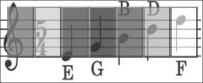
Figure 11-2. Transparency allows objects beneath to show through.
Internet Explorer browsers prior to version 8 in strict mode do not support the opacity property, but there is a workaround. Use filter:alpha(opacity=70) alongside our opacity:0.7 declaration to get the same effect in IE6 and IE7. IE8 still doesn't support the opacity property, and has replaced their old proprietary filter with a new one: -ms-filter: "progid:DXImageTransform.Microsoft.Alpha(Opacity=70)";. Think of the filter values for Internet Explorer as percentages, where 70 = 70 percent or 0.7, 40 = 40 percent or 0.4, 100 = 100 percent or 1, and so on.
opacity can further be incorporated into HSL and RGB color properties by adding a fourth value, alpha, to the rule. The opacity-supporting versions of HSL and RGB are known as HSLA and RGBA, respectively. alpha works in exactly the same way as the opacity property, where 1 is opaque and 0 is transparent, and levels in between will show transparency accordingly. Here is CSS code for the same example illustrated in Figure 11-2, but with alternating HSLA and RGB values instead:
body { background: url(eagbd.gif) no-repeat; }

div {

    width:30px;

    height:60px;

    float:left;

    border:2px outset #666;

}

div#red { background-color: hsla(0, 100%, 50%, 0.7) }

div#green { background-color: rgba(0, 255, 0, 0.7) }

div#blue { background-color: hsla(240, 100%, 50%, 0.7) }

div#black { background-color: rgba(0, 0, 0, 0.7) }

div#maroon { background-color: hsla(0, 100%, 35%, 0.7) }

div#pink { background-color: rgba(255, 153, 153, 0.7) }

div#white { background-color: hsla(0, 100%, 100%, 0.7) }
General sibling combinators
The General Sibling Combinator (GSC) is a mouthful of a name, but it does have some simple yet powerful functionality. The GSC performs the function of selecting a specified element that is at the same node level after another specified element appears in the order of your markup. The following example and Figure 11-3 will help clarify:
<!DOCTYPE html PUBLIC "-//W3C//DTD XHTML 1.1//EN" "http://www.w3.org/TR/xhtml11/DTD/xhtml11.dtd">

<html xmlns="http://www.w3.org/1999/xhtml" xml:lang="en">

<head>

    <meta http-equiv="content-type" content="text/html;

charset=utf-8" />

    <title>The Violas of Rome</title>

    <style type="text/css">

        h1 ~ p {

            font-weight: bold;

        }

        h2 ~ p {

            font-style: italic;

            font-weight: normal;

        }

    </style>

</head>

<body>

    <h1>The Violas of Rome</h1>

    <p>It was the best of times, it was the worst of times. It was a

dark and stormy night.</p>

    <p>Her heart was racing as she walked towards the stairs. No one

would play her viola again. The nightmares would end - tonight.</p>

    <h2>A soldier's tale</h2>

    <p>It all began many years ago, in a small hamlet by the seaside.

Her cousins would knock at the door and they'd go into the village to

see their aunt at the shop. Never in her life would she suspect that

the hamlet would be the very place that they would come first - the

druids that came in from the sea.</p>

    <p>That Saturday was Salame and Cheese night. Would she be able

to tell her girlfriends the sad truth about her nightmares?</p>

    <div class="aside">

        <p>As an aside, we should note that one should never trouble

trouble unless trouble troubles you.</p>

    </div>

</body>

</html>

Figure 11-3. Using the GSC to differentiate between content after the first-level heading and after the second-level heading
In this example, the markup contains a first-level heading followed by two paragraphs, and then a second-level heading followed by two paragraphs. Finally, there is a paragraph contained within a <div>, nested at a nonadjacent level from the other paragraph elements in this document.
For the styling, we've created two GSCs: one for general siblings of the <h1> element, and one for the general siblings of the <h2> element. For the <h1> siblings, we have set the font weight to bold. For the <h2> siblings we have set the font style to italic, and in addition to that we have set the font weight back to normal. We just wanted italics—not bold italics—so we had to reset this property. This property is reset to normal because the font-weight property still would apply for the rest of the document, as long as a paragraph element were at the same hierarchical level in the node tree as the <h1> elements, including any <p> elements occurring after the <h2>.
The great thing about using the GSC is that all of the major browsers now support it, including IE7 and higher. If you can live without IE6 support, this is a CSS3 feature you may start implementing in your web page designs right away.
CSS3 attribute matching selectors
Attribute matching selectors are a useful method for pinpointing specific elements based on their attribute values, and CSS3 lets you take things a step further by allowing you to match substrings of attribute values. You can match the beginning, end, or any substring within. The following is a list of the new CSS3 attribute selectors (where “E” is an HTML or XML element or equivalent selector):
E[instrument^="bass"]: Selects any attribute beginning with the string “bass”. Given a list of standard orchestral instruments, “bassoon”, “bass clarinet”, “basset_clarinet”, “basset_horn”, and “bass_drum” would be matches. Other instruments containing the string “bass”, such as “contrabassoon” and “double_bass”, would be omitted.E[instrument$="bass"]: Selects any attribute ending with the string “bass”. Going back to our list of orchestral instruments, “double_bass” would be a match and the rest would be skipped.E[instrument*="bass"]: Selects any attribute beginning with the string “bass”. This time the entire list of instruments from the first example containing the string “bass” would be matches.
CSS3 pseudo-classes
CSS3 adds a lot of new pseudo-classes. These pseudo-classes were designed to further target the nodes of an XML or HTML document tree with increased flexibility and precision. The names assigned to these pseudo-selectors are more or less intuitive as to what the function is that they represent, so they shouldn't be too hard to learn, understand, and begin implementing in your own code.
CSS3 pseudo-classes have been implemented in major web browsers as of Safari 3.1, Firefox 3.5, IE8 in standards mode, and even partial support in IE7 if you don't need generated content. They are usable today in your own designs.
E:root
E:root selects the root element of a document. In your typical HTML cases, this will be the <html> element. For XML documents, this would be the outermost element node. In HTML contexts, this pseudo-selector is nearly useless since you can be certain that <html> is going to be the root. But in XML it can be valuable for web developers to be able to select the root element with no prior knowledge of the markup structure's actual root element name.
E:nth-child(n)
E:nth-child(n) selects the “nth” child of the given element's parent. The (n) part is an expression with a prototype of an+b, in which the an part defines the frequency of any repeating that may occur, and the +b part is a modifier that indicates on which order of the nodes the counting begins. The an part or the +b part may each exist on their own, and the operator in between the two may be a plus or minus symbol. The keywords odd and even may be used as well.
Got all that? Neither do we—but the premise is quite simple if you visualize it. Let's look at some examples and things will become clearer in the following code example and in Figure 11-4:
<!DOCTYPE html PUBLIC "-//W3C//DTD XHTML 1.0 Transitional//EN"

    "http://www.w3.org/TR/xhtml1/DTD/xhtml1-transitional.dtd">

<html>

    <head>

        <title>nth child</title>

    </head>

    <style type="text/css">

        p {

            height:30px;

            width:110px;

            margin:0;

            padding:2px;

            float:left;

        }

        p:nth-child(3n+1) { background-color: #6CF; }

        p:nth-child(3n+2) { background-color: #6FC; }

        p:nth-child(3n+3) { background-color: #FC6; }

        p:nth-child(7) {

            font-size:1.8em;

            font-weight:bold;

            text-align:center;

            color:#e00000;

        }

        p:nth-child(even) { color:#fff; }

        p:nth-child(5n) { font-style:italic; }

    </style>

    <body>

        <div id="string_instruments">

            <p>Violin</p>

            <p>Viola</p>

            <p>Cello</p>

            <p>Double Bass</p>

            <p>Viola da Gamba</p>

            <p>Guitar</p>

            <p>Banjo</p>

            <p>Mandolin</p>

            <p>Mandola</p>

            <p>Mandocello </p>

            <p>Lute</p>

            <p>Theorbo</p>

            <p>Erhu</p>

            <p>Pipa</p>

            <p>Guzheng</p>

            <p>Sitar</p>

        </div>

    </body>

</html>
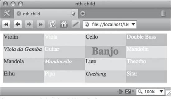
Figure 11-4. Various methods of using nth child pseudo-selectors
In this example, the first three nth-child declarations set three alternating background colors for the <div> elements. The first nth-child declaration is passed a value of p:nth-child(3n+1), which might be read in English as “select every third sibling paragraph, starting with the first one.” The next one, p:nth-child(3n+2), selects every third paragraph element starting with the second one, and p:nth-child(3n+3) does the same starting with the third one. The result is alternating background colors. The same treatment might be applied to conveniently create zebra-striped table rows, for instance.
The next selector, p:nth-child(7), targets the seventh sibling paragraph. In this case, we are highlighting the node with the string “Banjo” in the content (although why anyone would want to highlight the banjo is beyond us). If the an value of the argument is absent, the b component is used to select a node.
After that, the p:nth-child(even) is next, and this selector illustrates the ability to use a keyword instead of a set of numeric values as the argument. In this case, we set the text color for all even-numbered nodes to white. An equivalent way to represent (even) in our code would be (2n), while (odd) is equivalent to (2n+1). Finally, the p:nth-child(5n) selector is used to set every fifth sibling in italics.
All this should illustrate the an+b pattern. To recap, an sets the repeating property, while b modifies where the repeats start or selects a single node. We will use this construct again in the next three pseudo-selectors, so it is important to understand how this pattern works.
The E:nth-last-child(n) pseudo-selector works just like the previous example in reverse, counting back from the last child. To illustrate this, try replacing every instance of nth-child in the previous example with nth-last-child and observe what happens:
p {

    height:30px;

    width:110px;
    margin:0;

    padding:2px;

    float:left;

}

p:nth-last-child(3n+1) { background-color: #6CF; }

p:nth-last-child(3n+2) { background-color: #6FC; }

p:nth-last-child(3n+3) { background-color: #FC6; }

p:nth-last-child(7) {

    font-size:1.8em;

    font-weight:bold;

    text-align:center;

    color:#e00000;

}

p:nth-last-child(even) { color:#fff; }

p:nth-last-child(5n) { font-style:italic; }
The elements become colorized in an order that begins from the last element (“Sitar”), the seventh element from the last node containing the word “Mandolin” is highlighted in red, the selection of even elements to be colored white begins from the last node, and the fifth and tenth nodes containing the strings “Theorbo” and “Viola” are italicized, as shown in Figure 11-5.

Figure 11-5. Demonstrating how :nth-last-child selects elements starting from the last node
E:nth-of-type(n)
This pseudo-selector works similar to :nth-child, but only selects elements that are of the same type. This can be particularly useful if you have images in a storyline and want to alternate floats left or right, which is a common algorithm used when embedding multiple images in a story. Again, the following example will help clarify, which is illustrated in Figure 11-6:
<!DOCTYPE html PUBLIC "-//W3C//DTD XHTML 1.0 Transitional//EN"

    "http://www.w3.org/TR/xhtml1/DTD/xhtml1-transitional.dtd">

<html>

    <head>

        <title>nth child</title>

    </head>

    <style type="text/css">

        img {

            margin-bottom:2em;

        }
        img:nth-of-type(2n+1) {

            float: right;

            margin-left:2em;

        }

        img:nth-of-type(2n) {

            float: left;

            margin-right:2em;

        }

    </style>

    <body>

        <div id="string_instruments">

            <img src="violin.gif" alt="violin" />

            <p>Lorem ipsum dolor sit amet, consectetur adipisicing

elit, sed do eiusmod tempor incididunt ut labore et dolore magna

aliqua. Ut enim ad minim veniam, quis nostrud exercitation

ullamco laboris nisi ut aliquip ex ea commodo consequat. Duis

aute irure dolor in reprehenderit in voluptate velit esse cillum

dolore eu fugiat nulla pariatur. Excepteur sint occaecat cupidatat

non proident, sunt in culpa qui officia deserunt mollit anim id est

laborum.</p>

            <img src="cello.gif" alt="cello" />

            <p>Lorem ipsum dolor sit amet, consectetur adipisicing

elit, sed do eiusmod tempor incididunt ut labore et dolore magna

aliqua. Ut enim ad minim veniam, quis nostrud exercitation

ullamco laboris nisi ut aliquip ex ea commodo consequat. Duis

aute irure dolor in reprehenderit in voluptate velit esse cillum

dolore eu fugiat nulla pariatur. Excepteur sint occaecat cupidatat

non proident, sunt in culpa qui officia deserunt mollit anim id est

laborum.</p>

            <img src="bugle.gif" alt="bugle" />

            <p>Lorem ipsum dolor sit amet, consectetur adipisicing

elit, sed do eiusmod tempor incididunt ut labore et dolore magna

aliqua. Ut enim ad minim veniam, quis nostrud exercitation

ullamco laboris nisi ut aliquip ex ea commodo consequat. Duis

aute irure dolor in reprehenderit in voluptate velit esse cillum

dolore eu fugiat nulla pariatur. Excepteur sint occaecat cupidatat

non proident, sunt in culpa qui officia deserunt mollit anim id est

laborum.</p>

            <img src="romanbugle.gif" alt="roman bugle" />

            <p>Lorem ipsum dolor sit amet, consectetur adipisicing

elit, sed do eiusmod tempor incididunt ut labore et dolore magna

aliqua. Ut enim ad minim veniam, quis nostrud exercitation

ullamco laboris nisi ut aliquip ex ea commodo consequat. Duis

aute irure dolor in reprehenderit in voluptate velit esse cillum

dolore eu fugiat nulla pariatur. Excepteur sint occaecat cupidatat

non proident, sunt in culpa qui officia deserunt mollit anim id est

laborum.</p>

           </div>

    </body>

</html>

Figure 11-6. Demonstrating nth-of-type to float images in a story alternating from right to left
E:nth-last-of-type(n)
This pseudo-selector works like E:nth-of-type(n) but counting from the last sibling instead of the first. Using the previous XHTML example, try using this CSS instead:
<style type="text/css">

    img {

        margin-bottom:2em;

        float:right;

    }

    img:nth-last-of-type(-n+2) {

        float:left;

        margin-right:2em;

    }

    img:nth-last-of-type(1) {

        float:none;
display:block;

        margin:0 auto;

    }

</style>
These changes are reflected in Figure 11-7.

Figure 11-7. Showing :nth-last-of-type being used to target the last two image elements in the document
The rule selecting img:nth-last-of-type(-n+2) will select the second <img> element from the last one, floating the image to the left. The img:nth-last-of-type(1) selects the last <img> element. Try changing the values here to see how things move about. This construct would be very useful for conclusions, special treatment of lists, and so on where the ending needs some special emphasis or style treatment.
E:last-child
This is the same as writing :nth-last-child(1) and is the corresponding -last pseudo-selector to CSS2.1's E:first-child. It selects the last child of the element in question. To illustrate this, add italics to the last paragraph of the preceding example:
<style type="text/css">

    img {

        margin-bottom:2em;

        float:right;

    }
img:nth-last-of-type(-n+2) {

        float:left;

        margin-right:2em;

    }

    img:nth-last-of-type(1) {

        float:none;

        display:block;

        margin:0 auto;

    }

    p:last-child { font-style:italic; }

</style>
Now, the last paragraph will appear italicized, as shown in Figure 11-8.
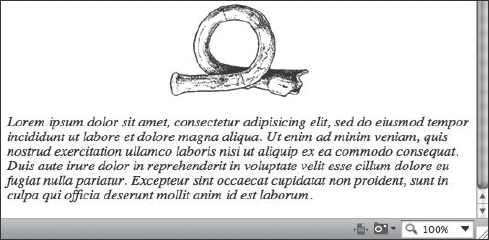
Figure 11-8. The last paragraph of the previous code example now has italicized text using the :last-child pseudo-selector.
E:first-of-type
This selector is a pseudonym for E:nth-of-type(1), and selects the first child of the indicated element. Again using the previous HTML example, modify the CSS as shown:
<style type="text/css">

    img {

        margin-bottom:2em;

        float:right;

    }

    p:first-of-type { font-style:italic; }

</style>
This should result in a rendering similar to Figure 11-9.

Figure 11-9. Using p:first-of-type to select the first paragraph and convert it to italics
E:last-of-type
The :last-of-type pseudo-selector targets the last sibling of the indicated element's parent. The following code will select the last <img> element in the document and float it to the right, which is illustrated in Figure 11-10:
<style type="text/css">

    img {

        margin-bottom:2em;

        float:right;

    }

    img:last-of-type {

        margin-right:2em;

        float:left;

    }

</style>

Figure 11-10. Using :last-of-type to float the last image in another direction
E:only-child
The :only-child pseudo-selector will target the indicated sibling elements when there is only one child element and there are no more element children:
<!DOCTYPE html PUBLIC "-//W3C//DTD XHTML 1.0 Transitional//EN"

    "http://www.w3.org/TR/xhtml1/DTD/xhtml1-transitional.dtd">

<html>

    <head>

        <title>only-child</title>

    </head>

    <style type="text/css">

        p:only-child

        {

          font-weight:bold;

          font-style:italic;

        }

    </style>

    <body>

        <h1>Trout Quintet - Instruments</h1>

        <div id="string_instruments">

            <p>Violin</p>

            <p>Viola</p>

            <p>Cello</p>

            <p>Double Bass</p>

        </div>

        <div id="keyboards">

            <p>Piano</p>

        </div>

    </body>

</html>
There is only one <p> element under the <div id="keyboards"> hierarchy, so that is what will be selected, which in this case emphasizes the word “Piano,” as shown in Figure 11-11.

Figure 11-11. Using the :only-child pseudo-selector to target the only child of the <div id="keyboards"> element
E:only-of-type
The :only-of-type will select children of the parent element where there is only one of the given element type:
<!DOCTYPE html PUBLIC "-//W3C//DTD XHTML 1.0 Transitional//EN"

    "http://www.w3.org/TR/xhtml1/DTD/xhtml1-transitional.dtd">

<html>

    <head>

        <title>only-of-type</title>

    </head>

    <style type="text/css">

        div:only-of-type

        {

          font-weight:bold;

          font-style:italic;

        }

    </style>

    <body>

        <h1>Trout Quintet - Instruments</h1>

        <div id="string_instruments">

            <p>Violin</p>

            <p>Viola</p>

            <p>Cello</p>

            <div>Double Bass</div>

        </div>

        <div id="keyboards">
<p>Piano</p>

        </div>

    </body>

</html>
In this case, the words “Double Bass” are wrapped by a <div> instead of a <p>, so they become the only element of their type within the sibling group, as shown in Figure 11-12.

Figure 11-12. Highlighting the unique element within a node using :only-of-type
E:empty
E:empty selects an empty node, where there are no child elements or even text content. This example selects any empty paragraph elements and instructs the browser to show them as red boxes (as shown in Figure 11-13), perhaps for the purpose of cleaning up any extraneous markup:
<!DOCTYPE html PUBLIC "-//W3C//DTD XHTML 1.0 Transitional//EN"

    "http://www.w3.org/TR/xhtml1/DTD/xhtml1-transitional.dtd">

<html>

    <head>

        <title>only-of-type</title>

    </head>

    <style type="text/css">

        p:empty {

            background-color:#f00;

            display:block;

            border:1px solid black;

            width:200px;

            height:20px;

        }

    </style>

    <body>
        <h1>Trout Quintet - Instruments</h1>

        <div id="string_instruments">

            <p>Violin</p>

            <p>Viola</p>

            <p>Cello</p>

            <p>Double Bass</p>

            <p></p>

        </div>

        <div id="keyboards">

            <p>Piano</p>

        </div>

    </body>

</html>
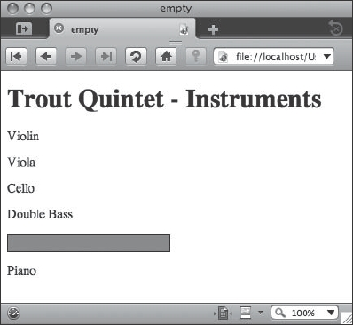
Figure 11-13. Using :empty to highlight elements with no content
E:target
The :target pseudo-class will select the target of referring URIs. This is especially useful to modify ID elements on a given page after clicking on a link:
<!DOCTYPE html PUBLIC "-//W3C//DTD XHTML 1.0 Transitional//EN"

    "http://www.w3.org/TR/xhtml1/DTD/xhtml1-transitional.dtd">

<html>

    <head>

        <title>target</title>

     </head>

     <style type="text/css">

        div:target {

            background-color:#F66;

            border:1px solid black;
        }

    </style>

    <body>

        <h1>Trout Quintet - Instruments</h1>

        <a href="#string_instruments">Strings</a> |

<a href="#keyboards">Keyboards</a>

        <div id="string_instruments">

            <p>Violin</p>

            <p>Viola</p>

            <p>Cello</p>

            <p>Double Bass</p>

            <p></p>

        </div>

        <div id="keyboards">

            <p>Piano</p>

        </div>

    </body>

</html>
Figure 11-14 illustrates what the user would see when the Strings link is clicked.

Figure 11-14. The string section is highlighted after clicking the Strings link, thanks to the :target pseudo-selector.
E:enabled, E:disabled, and E:checked
The E:enabled, E:disabled, and E:checked pseudo-elements are used for form input elements such as text fields, radio buttons, and any other form element that supports the disabled property. As we will see from the example, certain elements are not very conducive to styling in CSS using the current array of modern browsers, and are often best left alone. This is especially true of browsers that use native form elements such as the Mac OS X Aqua themed check box of browsers such as Safari. Here to compensate we've implemented a margin-left property to illustrate support of the element in Safari and other browsers that use Aqua for the check box and radio button elements:
<!DOCTYPE html PUBLIC "-//W3C//DTD XHTML 1.0 Transitional//EN"

    "http://www.w3.org/TR/xhtml1/DTD/xhtml1-transitional.dtd">

<html>

<head>

<title>enabled, disabled, and checked</title>

</head>

<style type="text/css">

  label {

    display:block;

    margin-top:1em;

  }

  input:enabled {

    border:2px solid green;

    font-weight:bold;

    background-color:#edfdda;

  }

  input:disabled {

    font-weight:normal;

    border:2px solid #666;

    background-color:#ddd;

  }

  input[type="radio"], input[type="checkbox"] { border:none; }

  input[type="radio"]:disabled, input[type="checkbox"]:disabled {

visibility:hidden; }

  input:checked {

    background-color:#edfdda;

    color:#800000;

    border:2px solid blue;

    margin-left:4em;

}

</style>

<body>

<form action="193232.11.16.html" method="post">

  <label for="instrument_name">Instrument Name</label>

  <input type="text" name="instrument_name" id="instrument_name" />

  <label for="instrument_name">Legacy Instrument Name</label>

  <input type="text" name="legacy_name" id="legacy_name"

disabled="disabled" />

  <p>

    <label>

    <input type="radio" name="category" value="strings" />

    strings</label>

    <label>

    <input type="radio" name="category" value="woodwinds" />

    woodwinds</label>
<label>
<input type="radio" name="category" value="brass" />
brass</label>
<label>
<input type="radio" name="category" value="percussion"
disabled="disabled" />
percussion</label>
<label>
<input name="nonstandard" type="checkbox" disabled="disabled"
value="true" />
Non-standard instrument</label>
<label>
<input name="nonstandard" type="checkbox" checked="checked"
value="true" />
Modern instrument</label>
</p>
<p>
<input type="submit" value="Continue →">
</p>
</form>
</body>
</html>
These form element treatments are illustrated in Figure 11-15.

Figure 11-15. Demonstrating the :enabled, :disabled, and :checked pseudo-selectors in a form
Remember to keep accessibility in mind when modifying the display of form elements. If you change the selection color to a combination with low contrast to the nonselected text, it may be harder for some users to see the edges of their selection.
E::selection
The E::selection pseudo-selector actively targets the text being selected, allowing the web author to specify things like background colors and font colors for the selection:
<!DOCTYPE html PUBLIC "-//W3C//DTD XHTML 1.0 Transitional//EN"

    "http://www.w3.org/TR/xhtml1/DTD/xhtml1-transitional.dtd">

<html>

    <head>

        <title>::select</title>

    </head>

    <style type="text/css">

        p::selection {

            color: purple;

            background: yellow;

        }

    </style>

    <body>

        <p>Select some text! Lorem ipsum dolor sit amet, consectetur

    adipisicing elit, sed do eiusmod tempor incididunt ut labore et

    dolore magna aliqua. Ut enim ad minim veniam, quis nostrud

    exercitation ullamco laboris nisi ut aliquip ex ea commodo

    consequat. Duis aute irure dolor in reprehenderit in voluptate velit

    esse cillum dolore eu fugiat nulla pariatur. Excepteur sint occaecat

    cupidatat non proident, sunt in culpa qui officia deserunt mollit

    anim id est laborum.</p>

        </body>

    </html>
Using the mouse to select some text in the paragraph will result in output similar to Figure 11-16.

Figure 11-16. Using ::selection to modify the text color and background color of selected text
E:not(s)
E:not(s) selects all elements except the one specified in the argument. This example, which is illustrated in Figure 11-17, selects all <div>s that are not using id="keyboards" to be italicized:
<!DOCTYPE html PUBLIC "-//W3C//DTD XHTML 1.0 Transitional//EN"

    "http://www.w3.org/TR/xhtml1/DTD/xhtml1-transitional.dtd">

<html>

    <head>

        <title>empty</title>

    </head>

    <style type="text/css">

        div:not(#keyboards) { font-style:italic; }

    </style>

    <body>

        <h1>Trout Quintet - Instruments</h1>

        <div id="string_instruments">

            <p>Violin</p>

            <p>Viola</p>

            <p>Cello</p>

            <p>Double Bass</p>

        </div>

        <div id="keyboards">

            <p>Piano</p>

        </div>

    </body>

</html>
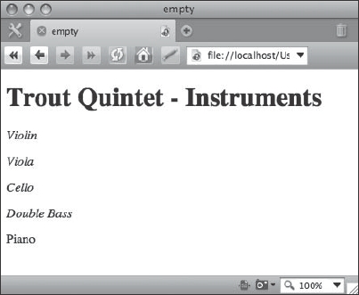
Figure 11-17. Using :not to exclude the keyboards <div> from being italicized
Typographic effects and web fonts
CSS3 includes three modules for dealing with text-related styling. The first one, which will be the most familiar, is the CSS Fonts module (http://www.w3.org/TR/css3-fonts/). This module includes, for the most part, the familiar text-oriented CSS properties that you are already familiar with by now, such as font-size and font-family. CSS Text (http://www.w3.org/TR/css3-text/) again should be mostly familiar to you; this module deals with text-based attributes such as alignment, word wrapping, justification, letter spacing, and so on. CSS Web Fonts (http://www.w3.org/TR/css3-webfonts/), on the other hand, is for the most part completely new, and designed to cover a new set of functionalities around the concept of being able to download more specialized fonts that might not necessarily exist on the client. This frees us from the constraints of having to guess an array of possible acceptable typefaces using the font-family declaration. Let's look at some of the more interesting typographic features of CSS3: the new word wrap and text shadow properties, and the web fonts module.
Word wrap
In the normal text flow of an HTML block, words will invariably run up against the edge of the box that contains them. At that point, the text has to do something—it gets clipped off, it flows past the box, or it wraps to the next line. The word-wrap property aims to tackle some of these issues by governing how a long word gets broken, or not, when it is displayed within a box that is too narrow to contain all of the characters on one line. As we see in the following example, word-wrap:break-word will cause long words to wrap within their containing element (where the default is to not break and have the word extend past the box). This is illustrated in the following code example and in Figure 11-18:
<!DOCTYPE html PUBLIC "-//W3C//DTD XHTML 1.0 Transitional//EN"

    "http://www.w3.org/TR/xhtml1/DTD/xhtml1-transitional.dtd">

<html>

    <head>

        <title>word-wrap</title>

    </head>

    <style type="text/css">

        li {

            width: 10em;

            border: 2px dashed #aaa;

            padding:0.4em;

            margin-bottom:0.5em;

        }

        .broken { word-wrap:break-word; }

        .unbroken { word-wrap:normal; }

    </style>

    <body>

        Long words, like rules, were meant to be broken:

        <ul class="broken">

            <li>Antidisestablishmentarianism</li>

            <li>Supercalifragilisticexpialidocious</li>

            <li>Aequeosalinocalcalinoceraceoaluminosocupreovitriolic

</li>

        </ul>

        On the other hand, why break up a good thing?

        <ul class="unbroken">
        <li>Floccinaucinihilipilification</li>

        <li>Honorificabilitudinitatibus</li>

        <li>Chargoggagoggmanchauggagoggchaubunagungamaugg

</li>

        </ul>

    </body>

</html>

Figure 11-18. A list styled with word-wrap:break-word, followed by a list styled with word-wrap:normal as rendered in Firefox 3.5
In most Western scripts, hyphens are needed to properly break a word as is done in the first example. However, this construct might be particularly useful in the context of handling the breaking or preservation of long strings such as URLs or code examples where the hyphen is not typically used.
Text shadow
A number of cool and interesting effects may be applied to text using the text-shadow property. This property can take four values: a color value and three dimensional values. The dimensional values are, in order, an X offset coordinate, a Y offset coordinate, and a blur radius. Sets of these shadow values may be concatenated together to apply multiple shadows to the same element, which can create some interesting effects, such as the ones that appear in Figure 11-19:
<!DOCTYPE html PUBLIC "-//W3C//DTD XHTML 1.0 Transitional//EN"

    "http://www.w3.org/TR/xhtml1/DTD/xhtml1-transitional.dtd">

<html>

    <head>

        <title>word-wrap</title>

    </head>
    <style type="text/css">

        .quote {

            text-shadow: 2px 2px 4px #666;

            font-size:1.4em;

        }

        p.author {

            font-style:italic;

            text-shadow:

                hsl(280,100%,50%) 2px 2px 4px,

                orange 10px 6px 12px,

                hsla(140,100%,50%,0.6) -5px -3px 12px;

        }

        .author::before { content:"2014"; }

    </style>

    <body>

        <div class="quote">

            <p>A painter paints pictures on canvas. But musicians

paint their pictures on silence.</p>

            <p class="author">Leopold Stokowski</p>

        </div>

        <div class="quote">

            <p>You must play the violin so that fathers will want to

keep you away from their daughters.</p>

            <p class="author">Eric Rosenblith</p>

        </div>

    </body>

</html>
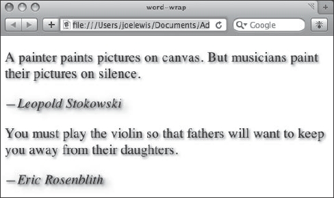
Figure 11-19. Using text-shadow on quotations in Safari 4
Here's an exercise to try making your own text-shadow effects: make it so that three instances of the text appear that are progressively each 5 pixels higher in their x, y values; 1 pixel higher in the blur radius values; and 25 percent lighter in their color values. Using HSL color values might be particularly useful for this need.
Web fonts
The CSS3 Web Fonts module is often touted as the way that web authors can finally specify font varieties that venture beyond the usual Verdana/Arial/Courier/Helvetica/Georgia/Times suspects, and this is indeed the most widely anticipated feature. But there is a bit more to the web fonts module. It includes descriptions about how to match a font (based on properties such as the x-height, serif treatment, slant, and so on). It also includes a mechanism to generate fonts on the fly based on the appearance and metrics of the requested font.
Before we go any further, we should mention a bit of history here: web fonts are not new to the CSS3 spec. They were first proposed in CSS2, and have had varying degrees of support in some older browsers. But today, with a reinvigorated CSS3 module and shiny new web browsers that support this feature, it is now possible to use web fonts in a more or less interesting and reliable way. And hey, if the browser doesn't support your specified downloadable font choice, give them something nice to look at in the font-family anyway.
Web fonts are initiated by the @font-face at-rule. The @font-face rules set up a definition within a style sheet for the name of a font, which can be used elsewhere in the style sheet as part of a font-family or shorthand font rule. Such a rule might look like the following:
@font-face {

    font-family: "BiauKai";

    src: url("http://www.example.com/assets/fonts/BiauKai.ttf");

}
This in turn makes it possible for us to write “BiauKai” as part of another font-family or font shorthand rule later in the style sheet:
html:lang(zh-tw) div.post { font-family: BiauKai, serif }
What happens behind the scenes here isn't just a simple routine of looking on the client to see if the BiauKai font exists. In this case the user agent should go one step further and download the font from the URL indicated in the src property within the @font-face rule, but only in cases where the specified font does not exist already on the client.
It is important to note right up front that most fonts are intellectual property under some form of copyright and should be treated as such. Do not assume you can freely and legally distribute any old font on your system as uploaded to a web server. Be sure to check the license carefully first. Public domain fonts or licenses where distribution via embedded web fonts is explicitly granted are the way to go. The Open Font Library (http://openfontlibrary.org/) is one of many sites that caters to just this need.
Using our previous markup example with the music quotes, let's try out applying a web font to the style sheet and see how that looks in Figure 11-20:
<style type="text/css">

    @font-face {

        font-family: "Ink Calligraphy";

        src:url(ZemusuInkCalligraphy.ttf);

        /* public domain font by zeimusu @ Open Font Library

           from http://openfontlibrary.org/media/files/zeimusu/15
           please visit and support the Open Font Library at

           http://openfontlibrary.org/

        */

    }

    .quote {

        text-shadow: 2px 2px 4px #666;

        font-size:1.4em;

        font-family:"Ink Calligraphy", sans-serif;

    }

    p.author {

        font-style:italic;

        text-shadow:

            hsl(280,100%,50%) 2px 2px 4px,

            orange 10px 6px 12px,

            hsla(140,100%,50%,0.6) −5px −3px 12px;

    }

    .author::before { content:"2014"; }

</style>
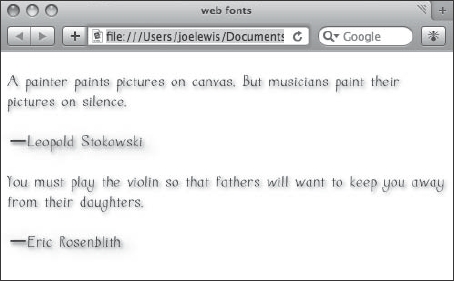
Figure 11-20. Using @font-face to import a specific font into the quotations page, as shown in Safari 4
Here we've defined a font called “Ink Calligraphy” in the @font-face rule, linked it to a local source file, and called it on the .quote rule. How cool is that? Try finding some of your own fonts with open licensing and experiment with this technique in your own pages.
Border and background effects
Box borders and backgrounds are fundamental concepts behind web page layout. We discuss box properties in terms of padding, margin, and content as well as boxes and borders, but it is the borders and backgrounds that we see as visual manifestations of the box itself. CSS3 includes several features to ease and improve our ability to manipulate background and border properties.
Rounded corners
Ninety-degree angles abound in the older generations of the Web. And then it became cool to break that cycle and design using rounded corners. But before browsers supported anything remotely resembling a rounded-corner CSS rule, web authors were forced to achieve this technique through contrived hacking of inserting up to four correctly shaped images into the corner of the box in question. This was no small feat since browsers and the CSS spec also lacked the ability to display more than one background image at a time! Clearly there should be an easier way.
And so there is: using border-radius, web authors can bend the borders of their box elements to their will. As of this writing, all implementations of it (Mozilla, WebKit) use vendor extensions. Let's use those for now with the expectation that this will be sorted out sometime in the next decade, again building on our previous markup example and just modifying the style sheet:
<style type="text/css">

    @font-face {

        font-family: "Ink Calligraphy";

        src:url(ZemusuInkCalligraphy.ttf);

        /* public domain font by zeimusu @ Open Font Library

           from http://openfontlibrary.org/media/files/zeimusu/15

           please visit and support the Open Font Library at

           http://openfontlibrary.org/

       */

    }

    div {

        width:50%;

        background-color: #FFFEEA;

        -moz-border-radius:20px;

        -webkit-border-radius:20px;

        border-radius:20px;

        border:1px solid red;

        padding:1em;

        margin-bottom:1em;

    }

    .quote {

        text-shadow: 2px 2px 4px #666;

        font-size:1.4em;

        font-family:"Ink Calligraphy", sans-serif;

    }

    p.author {

        font-style:italic;

        text-shadow:

            hsl(280,100%,50%) 2px 2px 4px,

            orange 10px 6px 12px,

            hsla(140,100%,50%,0.6) −5px −3px 12px;

    }

    .author::before { content:"2014"; }

</style>
Figure 11-21 shows how these borders will now appear in a supporting browser.

Figure 11-21. Rounded corners in our music quotes example
The things to pay attention to here in this example are the -moz-border-radius, -webkit-border-radius, and of course border-radius declarations. The two vendor-specific properties are required at this point since the specification isn't fully baked as of this writing, and the border-radius rule is included with the expectation that this will be in the final specification.
Individual corners may be further targeted by using specific properties. This is where the browser vendors begin to really show their differences. Try modifying the following code on the above <div> rule as shown:
div {

    width:50%;

    background-color: #FFFEEA;

    -moz-border-radius-topleft: none;

    -webkit-border-top-left-radius: none;

    -moz-border-radius-topright: 10px;

    -webkit-border-top-right-radius: 10px;

    -moz-border-radius-bottomleft: 20px;

    -webkit-border-bottom-left-radius: 20px;

    -moz-border-radius-bottomright: 80px;

    -webkit-border-bottom-right-radius: 80px;

    border-radius:20px;

    border:1px solid red;

    padding:1em;

    margin-bottom:1em;

 }
Now observe in Figure 11-22 how this changes the appearance of the quotation borders.

Figure 11-22. Targeting specific corners using border-radius
Be sure to check the latest version of the specification and the current state of web browsers as things unfold in the future. The details of this one in particular are sure to change.
Box shadow
The box-shadow property declarations are constructed in a similar way as the text-shadow properties we saw earlier, using values for x-offset, y-offset, blur radius, and color. This can make for a nice drop shadow effect on boxes such as images and pull-quote boxes. Again using the markup and style sheet from the previous example, set the <div> back to use a 20-pixel border radius on all the corners and set a drop shadow using the highlighted code:
div {

    width:50%;

    background-color: #FFFEEA;

    -moz-border-radius: 20px;

    -webkit-border-radius: 20px;

    border-radius:20px;

    border:1px solid red;

    -moz-box-shadow: 6px 6px 14px #999;

    -webkit-box-shadow: 6px 6px 14px #999;

    box-shadow: 6px 6px 14px #999;

    padding:1em;

    margin-bottom:1em;

 }
Figure 11-23 shows how these box shadows should appear.

Figure 11-23. Using box-shadow on the musical quotes example
Multiple backgrounds
It has long been a desire of CSS developers to have the ability to place more than one background image on an element. Enter multiple backgrounds and background resizing. The capability prior to these features was limited to a single background image and the ability to position it vertically and horizontally, and the option to tile the images (or not). This resulted in some creative solutions to achieve complete coverage of a designer's goals, but they often involved extra markup or larger-than-necessary images.
For achieving multiple backgrounds in CSS3, the developer simply separates the standard background shorthand value sets with commas. Try modifying the previous example by inserting the highlighted code into the <div> rule:
div {

    width:50%;

    background: url(openquote.tif) 1% 5% no-repeat,

url(closequote.tif) 99% 96% no-repeat;

    background-color: #FFFEEA;

    -moz-border-radius: 20px;

    -webkit-border-radius: 20px;

    border-radius:20px;

    border:1px solid red;

    -moz-box-shadow: 6px 6px 14px #999;

    -webkit-box-shadow: 6px 6px 14px #999;

    box-shadow: 6px 6px 14px #999;

    padding:1em;

    margin-bottom:1em;

    opacity: 1;

    -webkit-transition: opacity 2s linear;

 }
This will result in having quote mark graphics in the upper-left and lower-right corners of the <div> elements, as shown in Figure 11-24.

Figure 11-24. Quote marks using multiple background images
Background image resizing
The other side of this background image coin is the ability to resize a background image. In olden times, developers were stuck with the native pixel resolution of an image for display as a background image in a given element. But with the ability to resize this image using the background-size property, you may now let an image fill the space of a given <div>, or resize it to any number of ways depending on your design requirements.
The background-image property can accept percentage values, length units (such as px or em), and the keywords auto, cover, and contain. The auto property works to automatically resize if, say, the width was set to 15em while preserving the aspect ratio of the image. The contain keyword scales an image proportionally to fit inside an element, while the cover keyword proportionally scales an element to completely cover the element.
In addition to the background-image property, developers may use the background-origin property to specify which box the background image is being positioned against using the value padding-box, border-box, or content-box.
Animations, transitions, and transforms
We saw a few of these cutting-edge features when we were looking at styling for mobile Safari browsers on devices such as the iPhone earlier in this book. These visual effect features were introduced as proposed recommendations to the CSS3 specification in March 2009, and pose some really interesting and easily implemented alternatives compared to prior methods such as JavaScript or Flash. Let's touch on some of these new features, keeping in mind that these are proposals and may change over time.
Transitions
Transitions allow CSS properties to change from one value to another over a period of time. The two key properties introduced to enable transitions are transition-property (used to define which property is affected), transition-duration (used to set the duration of the transition effect), and timing-function (used to set how the timing will accelerate, decelerate, or otherwise change during the transition effect). These can be combined in a shorthand property called transition.
Try using the previous example and modifying the CSS as shown. This will create the effect of having each <div> element slowly disappear when you move the mouse over it. Currently Safari and other browsers using current versions of WebKit are the only ones that will support this, using the -webkit- prefix:
div {

    width:50%;

    background-color: #FFFEEA;

    -moz-border-radius: 20px;

    -webkit-border-radius: 20px;

    border-radius:20px;

    border:1px solid red;

    -moz-box-shadow: 6px 6px 14px #999;

    -webkit-box-shadow: 6px 6px 14px #999;

    box-shadow: 6px 6px 14px #999;

    padding:1em;

    margin-bottom:1em;

    opacity: 1;

    -webkit-transition-property: opacity;

    -webkit-transition-duration: 2s;

    -webkit-timing-function: linear;

 }

 div:hover {

       opacity: 0;

 }
Now test it in Safari 4. Each <div> should fade gradually as you move the mouse in front of it. If desired, you might choose to write the previous transition statements using a single line of shorthand:
-webkit-transition: opacity 2s linear;
Transforms
Transforms allow you to perform things like size, rotation, and positioning changes. There is a 2D version of the Transforms module, and another for 3D.
A 2D transform might be written like this (using the -webkit- prefix if you would like to try this in Safari):
img {

    -webkit-transform: translate(20px, 80px) scale(2.5, 2.5)

rotate(20deg);

  }
This transform takes an image and offsets it using the translate function 20 pixels to the right and 80 pixels down, uses the scale function to increase the size by 2.5 times the native size, and rotates it clockwise 20 degrees with the rotate function. This is a simple way to add much more capability to your page layout using one simple property. Arguably the translate and scale functions could be achieved by manipulation of other CSS properties such as with typical CSS positioning techniques and the width and height properties. But rotate does add a new and powerful feature, and it is very convenient to keep all of them in one concise and well-organized construction.
Animation
Animation in CSS introduces the concept of keyframes. If you've done any animation work in, say, Adobe Flash, then the concept of keyframes will be familiar to you. Animation is in fact similar to transitions, but they differ in that the animation effects are more specific about when and where things happen and allow for greater flexibility and precise timing, while transitions pretty much just get you from one state to the next. Animation has not yet been implemented in WebKit, but you can read the specification at http://www.w3.org/TR/css3-animations/ and keep an eye on some of the sites mentioned in the chapter summary to find out when this might become available for tinkering.
Summary
In this chapter we looked at the emerging features of CSS3 and explored ways to experiment and incorporate these tools into your own code. Many of the features discussed in this chapter are still evolving, but they are quickly making their way into browsers in one form or another and are becoming available for you to try out. We suggest you take advantage of them whenever you can—perhaps to provide a little extra polish for your advanced browser users if you don't have to worry too much about legacy browser support.
Keep on top of the developments in CSS3 as they unfold by reading web sites that discuss such issues. Great places to look for this information include (but are by no means limited to)
- IEBlog:
http://blogs.msdn.com/ie/ - Surfin' Safari:
http://webkit.org/blog/ - Opera Desktop Team:
http://my.opera.com/desktopteam/blog/ - The Mozilla Blog:
http://blog.mozilla.com/ - A List Apart:
http://www.alistapart.com/ - CSS3.info:
http://www.css3.info/ - W3C CSS home page:
http://www.w3.org/Style/CSS/
When you write emerging CSS3 features that rely on vendor extensions into your production code and release style sheets into the wild, it may be a good idea to give your best guess as to what the final declaration might be and include that in your code as well. On the chance that it does become more widely accepted, your designs will continue to work as new browsers adopt the feature.