
| Chapter 4 |  |
OPTIMIZING FOR PRINT |
|
As CSS developers, we spend most of our time writing styles for screen or continuous media platforms. This is no surprise since the vast majority of content on the Web is consumed via computer screens. Paged media, the kind of media where output is articulated into specific distinct pages (such as printing to paper) doesn't get nearly as much love as its continuous media counterparts, but paged media is still quite important for web developers to consider.
People print web pages less frequently than they browse sites on-screen, but when they do take the action to print, it is usually for a specific reason where screen output falls short. Perhaps some user is headed off to a meeting and wants to print out and distribute a few copies of the latest press release from a competitor. Some individuals have a habit of putting together some reading material for the evening commute or for that long wait at the dentist. It could be an intended need, such as printing a form that needs to be signed on paper and handed in. For whatever the reason users choose to print pages, without the developer's consideration for this media, the result is usually inadequate at best, or completely overlooked at worst.
When printing to paper, users typically are interested in accessing the content of the specific page in question. They aren't likely interested in the navigation tools and unrelated sidebar content, and they tend to get put off when articles print in a narrow column in the center of a dozen sheets of what used to be a majestic, carbon-sequestering tree. Now imagine that when your content-rich site becomes wildly popular, articles are going to be printed from tens, hundreds, and possibly thousands of users worldwide on a regular basis. By reducing the amount of paper your content prints on and maximizing the efficiency of the space used in your paper-based layout, you can help protect the environment!
Sadly, through much trial and experience, you will find the average web browser's print media to be less rich and less precise than other methods of producing printed material. PDF files, for example, provide a much more exacting method of delivering print output. When printing web pages, we will find many limitations when it comes to things like color, layout precision, and line dimensions. There is no way for the designer to predict what color or size sheet of paper their dear users have chosen to insert into their printer's paper feeder, although it is typically safe to assume white US Letter or A4.
When styling for print, it is important to remember what your users will experience and what special constraints CSS developers are faced with. People can't click on links printed to the physical page. Printing to paper means a fixed page size that is opaque and easy to read, carry, and fold. Only so many characters and images can fit on the printed page. In this chapter, we will examine the reasoning for optimizing for print output using Cascading Style Sheets (CSS). We will look at some of the basic constructs in CSS that work in today's browsers. Following that, we will examine considerations that will arise when styling for print, cover a few of the advanced page selectors, and wrap up with a working example to see how some of these techniques might be applied to a web page as it goes to the printer.
Targeting a print style sheet
Historically, the solution to achieving printer harmony was to provide a button or link labeled something along the lines of “Print this article,” which redirected the user to a completely separate web page formatted in a way that allowed the user to have a nicer print output than what the previous page was able to provide. But this alternate version of the content is largely unnecessary. Every web browser already has a print command that virtually all computer users are very comfortable with—File 
Print. This menu command is consistent across all platforms, and even comes with its own native keyboard shortcut:  +P on the Mac, Ctrl+P on Windows and Linux.
CSS has a wonderful built-in construct to handle this sort of output media automatically, which will take care of your reformatting needs. Therefore, asking users to learn your own custom way to print a page effectively, rather than taking advantage of the established convention on their platform, is not the best idea from either a usability or a technical perspective. Using CSS's innate ability to target print media will save you time and money, so put away the idea that you have to direct your users to a separate version of your content for printing.
There are three methods we can use to target styles for print media. We can use the media=“print” property for the <link> HTML tag, and we can use the @import or @media at-rules within a style sheet with the print media type specified. Let's take a look at an example for each.
At The Guardian (http://www.guardian.co.uk/), a hybrid approach is used to solve the problem of printing articles that speaks to a wide range of users. A print icon appears next to the content, which takes the user to a print version of the page with a separate URL. All this actually is, though, is the same piece of content with the print style sheet swapped out to the screen media. This helps people see an approximation of what they're about to print without having to run it through the browser or system's print preview function. As an added benefit, many people prefer reading a print version of such articles on screen, which presents far less distracting clutter around the content of prime interest. Implementing both solutions is an effective strategy for making your site content more accessible and user friendly from the print perspective.
Linking to print styles in HTML
To target a style sheet specifically for print, indicate the print media type: <link rel=“stylesheet” type=“text/css” media=“print” href=“print.css” />. We might choose this method of linking if we have flexibility in how the HTML is constructed, and using this method is easy to keep track of from a developer's perspective.
It is easy to use the HTML <link> element for adding style sheets, especially in the case of adding multiple style sheets. However, each byte you add linking style sheets is a byte that won't be cached as a shared asset when your pages load, and extra bandwidth will be incurred. When using multiple style sheets, it might be better from a bandwidth perspective to use the @media and @import rules, which are discussed next. At any rate, using the <link> method is the only method we can use to target specific style sheets using the conditional comments feature in the Internet Explorer line of web browsers.
Targeting print styles using @media
Using @media constructions can be quite handy when you have a limited number of style sheets that you can work with and can't add more via the <link> element, or when you otherwise might want to have a single self-contained CSS file that has all the media types handled in one file. All @media rules appear within an existing style sheet, and are followed by a set of curly braces ({}), which are used to contain our print rules. For example:
<style type="text/css">

    @media print {

        body { font-family: Georgia, serif; }

        a {

            text-decoration: none;

            border-bottom: thin solid #ccc;

            color: #000;

       }

   }

</style>
In this brief example we have specified within the @media print block that the body element will use a serif font family, which tends to be more readable on paper than the sans-serif font varieties. And since hyperlinks no longer are clickable elements in the print media, it really no longer makes much sense to have them visually separated from the content in any extreme way. So with that in mind, we've removed the default underline and instead replaced it with a thin gray underline to hint at the existence of a link back in the online version without creating a major distraction for the reader.
Targeting print styles using @import
Targeting print styles using @import is very similar to the prior example of using @media rules. The difference is that instead of embedding a particular set of media styles in a style sheet, you are linking to a separate file. There are two ways to write the @import rule:
<style type="text/css">

    /* uses the url() construct to contain the path to the file

       quote marks are optional */

    @import url("/styles/print_example1.css") print;

    /* loses the url() construct, quoting becomes compulsory */

    @import "/styles/print_example2.css" print;

</style>
The url() wrapper is not necessary, but this can be very helpful to define things, especially when searching around for file paths that need to be changed. The quotes should be used for valid XHTML in an embedded style sheet, even though modern browsers seem not to care.
One of the wonderful things about using @import within CSS is that you can create a rich network of CSS style sheets that are all linked from a master CSS file. This is particularly advantageous when dealing with templating systems that are part of a locked-down content management system, where you might only have access to a single style sheet to start with and no rights to edit the HTML. Or perhaps the developer has a preference for keeping the HTML as lean as possible, and linking to only one style sheet in the HTML can cut down several bytes' worth of precious file size. Since CSS files are usually cached as assets in the browser, placing as much of your code into cacheable resources outside the HTML—which has to be downloaded each time as the user moves to each unvisited page—can help speed things up a bit. This is useful in mobile and resource-constrained settings. In high-traffic web sites where there might be a large cluster of servers and high-bandwidth dedicated network connections, a simple thing like reducing a couple of lines of the HTML template might add up to several thousand dollars' worth of savings in hardware and bandwidth requirements annually.
As with using multiple <link> elements to bring in external style sheet assets, using multiple @import rules can incur some overhead. This becomes especially apparent during the initial page loads for new visitors, or in cases where caching has been disabled by the site authors or on the client side. For higher-traffic web sites where bandwidth is a concern, it may be advisable to merge all linked and imported style sheets into one file as part of a build system, and have the media types separated in @media rules.
The only web browser with remaining significant market share that has problems with @import as of this writing is Internet Explorer 6. Versions of IE6 and lower ignore @import rules for which a media type is specified. Thankfully, those numbers are falling in favor of better browsers such as IE7 and Firefox, and given that IE8 is in beta also as of this writing and will likely be released by the time you read this, IE6 is looking like less and less of a concern.
The @import rule construction was largely unsupported until the version 4 generation of web browsers, and transitional browser generations between then and now have had varying degrees of support. These variances have resulted in a number of interesting CSS filters and hacks used to show or hide certain styles. While frustrating on many levels, such variances were the basis of techniques that worked to solve additional deficiencies.
Now that we've looked at some of the basics with creating a print style sheet, let's examine some of the practical issues that we must consider when developing printer-friendly output. Issues such as dealing with layout, page size, color, measurement units, and image resolution all have different behaviors in print than what you might be used to with screen-based output.
Printer style considerations
Most of the time when composing a print style sheet, you're going to reformat a page that exists on screen such that it will print nicely on a white sheet of standard US Letter or A4 paper coming out of someone's inkjet or laser printer. Typically the first goal is to reduce wasted white space on the page by removing unnecessary elements such as banners, advertising, and navigation, and widening the content to the maximum printable width of the paper. The next design considerations might strive for improving readability. Serif fonts are typically considered to be easier to read on paper, so you might choose a good serif font family that is well suited for that purpose. Be sure to include a few similar serif varieties in your preferred order, such as
#content { font-family: Garamond, Georgia, Times, sans-serif;}
Garamond looks great in print, but not everyone has that font installed on their system. In its absence, the Georgia font is a common option included on Windows and Macintosh systems. Georgia is designed especially to be a readable serif-based web font for screen output, but it looks good and is comfortable to read in print as well.
In this section, let's look at the issues of color, units, and image resolution. As you will see, color handling can be problematic, especially when dealing with typography. Units have different meanings in the print media than in the screen media that you're probably used to. And images can look grainy and pixelated in print where they look fine on screen. We will present some strategies for helping ease the burden of these issues.
Printing in color
Another critical point to consider is font color. Remember that you can't be 100 percent sure what type of paper your end users have stocked in their printers, but it is reasonable to assume that the paper is going to be white letter or A4 the vast majority of the time. Also consider the fact that most browsers by default are set to not print background images or colors. Think about that: this would be an enormous use of expensive ink or toner, and can make for some soggy pages. Now if your web page is on a dark background on screen and you have light-colored text, this is going to fail in print. White text will be completely invisible, and pale colors applied to text will not be fun to read. Furthermore, a large percentage of printers are going to be black and white only, and if colors are important for contrasting shapes in print, then these items will likely appear washed out or indistinguishable in print.
Color printers usually deliver their output in the CMYK color model. CMYK stands for Cyan, Magenta, Yellow, Black, which refers to the four inks used in the standard printing process. Compare this with RGB (Red, Green, Blue), which is the typical color space for computer screens. The color range for CMYK is not as rich and vibrant as what you see on a good PC monitor, and often colors will vary considerably from what you would have expected looking at the screen version. Going from screen to print will typically mean all those RGB colors that are “out of gamut” will be matched to their closest CMYK equivalents, which can yield some unexpected results. Savvy design programs such as Adobe Photoshop have built-in features to distinguish the expected color output differences between RGB and CMYK, which can help deal with these issues up front. To elaborate more on the Photoshop example, you can force an image to be in the CMYK color space by choosing Image CMYK Color. This is a lossy process, meaning your RGB colors will be discarded in the conversion, and this may not be what you want. Fortunately, there is a way to preview color conversion in Photoshop without actually having to switch the color space. Choose View Proof Setup Working CMYK to establish that we're in CMYK proofing mode, and then use View Proof Colors (+Y on the Mac, Ctrl+Y on Windows) to see the difference. Run the Proof Colors command again to toggle back to the normal view. Usually differences won't be too significant, but you will likely notice an overall loss of saturation, and green hues tend to be affected more than the others.
The tragedy of font color
If you thought you had a reasonable amount of control over the color of your typography using CSS, you thought wrong. One of the absolute flakiest, inconsistent issues you will ever encounter in CSS is trying to get accurate color applied to your fonts. In all major browsers, certain color values are modified if the browser deems them to be “too light for print,” and it will render a color that it thinks will be better suited for your output on a printed page.
Now the reason why the browser vendors have made this assumption is fairly obvious: printing light text on what is almost always white paper is largely unreadable, and it is sadly very rare that web authors will take the time to style their pages for print using an alternate print style sheet (if they ever style it for print at all). Furthermore, printing in pure black, devoid of any complex color mixing, can make printing much faster, because the printer doesn't have to mix in any red, green, or blue ink and can focus on getting the task done. But what is maddening to the designer trying to achieve accurate color representation in print from their web pages is that all of the major browsers assume that they are smarter than you, and recolor the text based on their own inconsistent algorithms. If you wanted a string of text to appear very light gray in Firefox, too bad. You are getting black whether you like it or not. Let's look at some of the problems you might encounter.
In Safari 3 (see Figure 4-1), gray colors print fine up until rgb(107,107,107). After that point there will be a strange conversion to a light gray shade, arguably the lightest gray you can get in text on Safari, between rgb(108,108,108) and rgb(127,127,127). At rgb(128,128,128), the text color then jumps to black and as you ascend the values toward an expected white color, Safari yields a progressive amount of additional lightness to the text until it finally winds up at around rgb(171,171,171), where it should be 255 for all values. This problem also occurs in the red, green, and blue colorspaces. If we fix red at 127, about halfway between the minimum value of 0 and the maximum value of 255, we get a dead zone between rgb(127,100,100) and rgb(127,127,127). The same ratios happen starting at rgb(100,127,100) and at rgb(100,100,127). Finally, Safari renders rgb(0,255,255), rgb(255,0,255), and rgb(255,255,0) inconsistently from their adjacent color values.

Figure 4-1. Clip from a print test showing where the break is between rgb(107,107,107) and rgb(128,128,128)
Gecko browsers such as Firefox (before version 3), Camino, and Flock print the entire gray space in black. You cannot specify a light gray such as rgb(127,127,127) or anything else. It will always default to pure black whether you like it or not. If you fix a color bucket at 0, you will get semi-accurate color for the rest of the gamut, but the other color combinations will trend toward black text the lighter it gets. The exception here is Firefox 3, which will print your color exactly as specified. As of this writing, Firefox 3 is the only browser we've tested that gets the color matching between screen and print relatively correct.
Interestingly, the marker (the little bullet to the left of each list item) will display the correct color value in print for Firefox and Safari, even though the text itself won't match! So at least here you can use the markers to see what the color was supposed to be…
In Opera 9, gray shades render accurately up until rgb(185,185,185), and then higher values default to black. In the points tested, the same conversion to black happens in various other colorspaces at different points. For instance, color values higher than rgb(127,211,211), rgb(255,156,156), rgb(87,255,255), rgb(209,209,0), rgb(193,193,127), and rgb(177,177,255) will stop rendering their expected colors and just print black instead, thank you very much.
IE7 never gets any lighter than rgb(108,104,102) for grayscale, and the rest of the color spaces don't seem to allow anything lighter than a midrange hue equivalent in any given color range.
Since all the major browsers have made the assumption that you've neglected to pay appropriate attention to your print output with regard to color and contrast, you have to live with that and deal with some fairly tricky constraints. One argument is to give in and just go for all black text on all white paper, and certainly there's an argument for that in terms of readability and performance. But for that argument we should all be designing white web pages with black text too and just toss out all our assumptions about color theory, design, and inspiration. We know clearly that the primary function and goal for printing a page is for reading purposes, but what if you wanted to do something else. Something more artistic, perhaps? For truly accurate printing from the Web, you may want to stick with PDF or similar output. But there's still plenty we can do with print using plain-old HTML and CSS, and it can be an interesting academic exercise to try to design within these constraints. Think of it as a challenge that will make your professional world that much more interesting!
Units
As we mentioned earlier, certain CSS properties and units are more appropriate for print, or are even only going to work in the print media alone. The units mentioned earlier include inches (in), centimeters (cm), millimeters (mm), points (pt), and picas (pc). Twelve-point type is fairly readable in most typefaces and is a good choice for your standard body text, although you can often go to 11-point or 10-point for many situations. Points are a common unit of measurement, although if you're using 12-point then why not just use 1 pica instead? One pica is equal to 12 points, and you get to shave a byte off of your total file size. But for whatever size you go with, just remember that the more youthful eyes that you may have may be quite a bit keener than an older counterpart—do the world a favor and test your print output on your vision-challenged friends and colleagues.
Images
Images in web pages typically look poor when printed. This is because of the low default resolution of 72 dpi, and printers like things to be a bit more in the 300 dpi range and higher. Your photos may not look as sharp in print as they do in the browser, so either we learn to accept this degradation or we find ways to compensate.
To get around this issue, there is a simple solution. You can use a large image that is at, say, 72 dpi and use CSS to shrink it down to a ratio that would result in a 300 dpi image in print. For instance, take an image that is 180×240 pixels wide and looks good on screen in the placement you want for the printed page. For this to work as a 300 dpi image, you would need your source image to be at 750×1000 pixels.
The obvious drawback here is bandwidth. An image at 750×1000 pixels is excessive, especially when considering how fast your pages should load. It is probably a good idea to use such a technique conservatively and set expectations when doing so.
Advanced page selectors
When you design for paged media, such as designing for print, you have a number of additional CSS constructs to help you out.
When working with printed media, your canvas changes from a browser viewport to something known as a page box. The page box is more informally known as the “printable area” of a sheet of paper. It's here that printers will put ink, and therefore it's here—and only here—that you can put and style content.
Unlike the browser viewport, however, you can control certain elements of the page box using CSS. To do so, you need to use a special at-rule selector to target the page box itself. This rule is the @page rule.
What properties can you specify on the @page rule? For one, you can set page margins. These margin values are applied to all pages as they are printed and are applied before any other styles are applied to the normal styling of the page content. This example will set four centimeters of margin to the top, left, right, and bottom aspects of all pages:
@page {

    margin: 4cm;

}
In the context of book printing, there exists the concept of having a left page and a right page that face each other, together constituting a spread. This is commonly handled in word processors and desktop publishing programs, and CSS includes constructs for handling these conditions as well. Using the :left and :right pseudo-classes, you can specify different rules for pages that face each other:
@page :left {

    margin-left: 6cm;

}

@page :right {
margin-right: 6cm;

}

@page :first {

    margin-top: 8cm;

}
Unfortunately, @page selectors are not very well supported at this time. The Opera web browser handles @page selectors nicely, but as of this writing this feature of CSS is unsupported in all shipping versions of Internet Explorer, Firefox (and related Gecko-based browsers), and Safari.
Inserting and avoiding page breaks
Another area where paged media differs from continuous media is in the fact that content must be split across multiple items. With CSS, you can influence where these splits occur by making use of the page-break properties.
For example, you typically don't want to print headlines at the end of pages. Specify this in your print style sheet like so:
h1, h2, h3, h4, h5, h6 {

    page-break-after: avoid;

}
The page break properties in the CSS 2.1 specification are page-break-before, page-break-after, and page-break-inside. Setting the value to avoid in all cases will instruct the user agent to not allow a page break before, after, or within a given element, respectively.
Again here browser support is incomplete, although considerably better than the @page rules. Safari, Opera, and Firefox and related Gecko browsers support the page-break-before and page-break-after rules. Opera supports all of the page break rules fully. Internet Explorer supports page-break-before and page-break-after for versions 5.5 and 6, but in IE7 this implementation has regressed and is flawed. The Microsoft-recommended solution is to insert a conditional comment with a break tag immediately after the element that is assigned page-break-before:
<!--[if IE 7]><br style="height:0; line-height:0" /><![endif]-->
This is a less-than-optimal hack that involves insertion of meaningless markup into your document. However, it may prove handy in cases such as with enterprise deployments, where you must have to resolve printing issues on corporate applications where IE7 is a dependency.
Orphans and widows
The concept of orphans and widows is based on the idea of having page breaks occur at the beginning or end of a block. It is considered more readable and visually balanced if a page break occurs toward the middle of a text block, and the idea here with defining page breaks using orphans and widows is to avoid having one or two lines appear at the top or bottom of a page.
The orphans property is used to define the number of lines on a page that are allowed to display before a page break is inserted. For example, p { orphans: 4; } would mean that if a paragraph at the end of a page were to show four or fewer lines before breaking to the next page, that paragraph should instead start at the beginning of the following page. In contrast, the widows property is used to define the number of lines on the following page that would be allowed. The rule p { widows: 4; } would select any paragraph where four lines would appear on the following page, and then move that paragraph unbroken to the top of said following page.
Support for orphans and widows is weak at this time. At the time of this writing, only the Opera browser handles these properties, and Firefox, Safari, and Internet Explorer 7 and lower will ignore these rules. Internet Explorer 8 is expected to have support for orphans and widows, and the implementation exists in the current release candidate.
Establishing a page size with @page
Page sizes and orientation may be set using at-page rules. Page sizes are set using print units such as centimeters or inches for the width and height dimensions, or a page size keyword may be used such as A4 or letter. This feature is supported in Opera and will be supported in IE8, but is not currently handled in Safari or Firefox. To set a page size and orientation, use the size property:
@page {

    size: legal landscape;

}
This rule will print to a legal sheet of paper (8.5×14 inches) and it will print in landscape mode, a combination of properties that might be a good setting for printing data tables. To change this to specific units instead of the page size keyword, we could write size 8.5in 11in landscape;.
The landscape keyword means that the widest edge will be in the left-right aspect, while portrait means that the widest edge is presented top to bottom. These keywords are
A3: 297mm×420mmA4: 210mm×297mmA5: 148mm×210mmB4: 250mm×353mmB5: 176mm×250mmledger: 11in×17inlegal: 8.5in×14inletter: 8.5in×11in
Setting @page margins with :left, :right, and :first pseudo-classes
With the :left and :right pseudo-classes, you can assign different values to page margins on either side of your printed pages. This can be especially useful in dealing with facing and double-sided pages, where you might need extra margin for the signature. For these constructs, @page :left means the page on the left, and @page :right means the page on the right.
Additionally, you can use the :first pseudo-class to have a different first page—a title page for instance:
@page :first {

    margin-top: 4in;

}
These rules will work together to figure out automatically how your margins should work based on which one is on the left, which one is on the right, and which one comes first. Support for the @page pseudo-class exists in Opera and IE8, and has not been implemented with IE7 and earlier, Firefox, or Safari as of this writing.
Using margin at-rules
With the margin at-rules, you can specify content, including autogenerated content, that will appear in the respective margin corners. The specification for such rules is still a working draft as of this writing and these features haven't made their way into any browsers, but this is an often-requested feature and the prospect of being able to use it is exciting. The draft of the specification may be found at http://www.w3.org/TR/css3-page/ if you'd like to keep track.
The at-rules for margins are as follows:
top-left-cornertop-lefttop-centertop-righttop-right-cornerright-topright-middleright-bottomleft-topleft-middleleft-bottombottom-left-cornerbottom-leftbottom-centerbottom-rightbottom-right-corner
The top, right, left, and bottom boxes are distinct from their top-left-corner, top-right-corner, bottom-left-corner, and bottom-right-corner counterparts. The corner boxes are reserved for the boxes that have no adjacent content, while the top and bottom boxes would have content above or below. So any rule such as top-left or right-top is really indicating which side of the top or right box that content should appear—not the content of the corner boxes. Confused? Not surprised—Figure 4-2 should make it clearer.
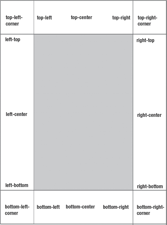
Figure 4-2. Location of margin box keywords. The white areas are margins; the gray area is content and padding. Each keyword illustrates its default orientation with the text-align and vertical-align properties.
With margin at-rules, it would be simple to add features such as author names, messages such as “draft” or “classified,” a company logo, or generated content such as automatic page numbers across all of the pages in a print job. How convenient would it be to be able to instruct your print jobs to do something like the following?
@page {

    @top-left {

        content: url(DoD_logo.png);

    }

    @top-left {

        font-weight: bold;

        font-color: red;

        content: "Classified";

    }

    @bottom-left {

        content: "2009 Report on UFO Sightings"

    }

    @bottom-right {

        content: "Page " counter(page);

    }

}
In this example, we print a DoD logo in the upper-right corner; in the upper left, we have some nice red bold text saying “Classified”; in the lower-right corner we have the document title; and in the lower-right corner, we print the page number. This would certainly simplify printing things like official government reports, corporate marketing documents, or lengthy research papers.
Future of CSS print style sheets
As of this writing, the future of CSS for print designs is extremely promising. In addition to many more page box margin areas (four across the top and bottom and three across the left- and right-hand sides), we will also see a plethora of new generated content. For example, we will be able to easily generate dotted (.), solid (_), and spaced leaders; we will be given the ability to refer to named strings; and more.
Like many other features of CSS, many print-related features that were originally present in the CSS2 specification were removed in the CSS2.1 revision for one reason or another. Some of these features, such as named pages, may make it back into an official CSS Recommendation when CSS level 3 is finalized.
Example: styling a résumé
To learn these and other techniques for creating print styles, let's work through a live example. We'll use an example of a résumé for a classical cellist. We'll start with a page that already looks great on screen, and we're going to make this one look spectacular in print as well. First, let's take a look at the full HTML representation of this page. It is a rather long example, but that is intentional since we're going to deal with various concepts that require us to fill more than a single printed page of content:
<!DOCTYPE html PUBLIC "-//W3C//DTD XHTML 1.0 Strict//EN"

    "http://www.w3.org/TR/xhtml1/DTD/xhtml1-strict.dtd">

<html lang="en-us" xmlns="http://www.w3.org/1999/xhtml"

    xml:lang="en-us">

<head>

<title>Natasha O'Reilly, Baroque Cellist</title>

<meta http-equiv="Content-type" content="text/html; charset=utf-8" />

<link rel="stylesheet" href="screen.css" type="text/css" media="all" />

</head>

<body>

<div class="hresume layout" id="natasha-oreilly-orchestra-resume">

    <div id="sitenav">

        <ul>

            <li><a href="http://natasha.example.com/">Home</a></li>

            <li><a href="http://natasha.example.com/about/">

                About</a></li>

            <li><a href="http://natasha.example.com/cv/">

                Résumé</a></li>

            <li><a href="http://natasha.example.com/cal/">

                Upcoming Events</a></li>

            <li><a href="http://natasha.example.com/av/">

                Audio and Video</a></li>

        </ul>

    </div>

<div id="natashaoreilly" class="vcard">

  <h1 id="bw-name" class="fn n"> <span class="given-name">

    Natasha</span> <span class="family-name">O'Reilly</span>

  </h1>

  <ul class="summary">

    <li>Expert in Baroque performance and period instruments.</li>

    <li>Seeking positions with major ensembles that are focused on

          historical performance.</li>

  </ul>

  <dl>

    <dt>Photo</dt>

    <dd><img src="headshot.jpg" class="photo"

        alt="Photo of Natasha O'Reilly, cellist." /></dd>

    <dt>Telephone</dt>

    <dd class="tel">(415) 555-1212</dd>

    <dt>Email</dt>

    <dd><a class="email" href="mailto:[email protected]">

        [email protected]</a></dd>

    <dt>Web</dt>

    <dd><a class="url" href="http://natasha.example.com"

        rel="me">http://natasha.example.com</a></dd>

  </dl>

</div>

<div class="vcalendar" id="experience">

  <h1>Experience</h1>
<div id="exp-farallones" class="experience vevent">

  <h2 class="summary">Principal Cello, <a class="url fn org"

      href="http://fso.example.org">Farallones Symphony

      Orchestra</a></h2>

  <p><abbr class="dtstart" title="2007-09-01">September 2007

      </abbr>-Present</p>

  <div class="description">

    <p>Principal <a rel="tag" class="skill"

    href="http://en.wikipedia.org/wiki/Violoncello">cellist</a>

    for the Farallones Symphony Orchestra, a small rocky islet

    off the coast of San Francisco, which is a very lonely spot

    considering it's just me and the seagulls out here. On the

    upside, lots of solo opportunities! Building a baroque cello

    based on 17th Century Cremonese style out of found

    driftwood and old planks from an abandoned lifeboat.</p>

  </div>

 </div>

 <div class="experience vevent" id="exp-rockcity">

   <h2 class="summary">Section Cello, <a class="url fn org"

       href="http://rockcitychamber.example.org">Rock City

       Symphony Orchestra</a></h2>

   <p><abbr class="dtstart" title="2001-01-01">2003</abbr>-present</p>

   <div class="description">

     <p> Section <a rel="tag" class="skill"

       href="http://en.wikipedia.org/wiki/Violoncello">cellist

       </a> for the Rock City Chamber Orchestra, with

       performances from Western Mt. Diablo to as far east as

       Lodi. Performances of major composers including Grieg,

       Dvorák, Beethoven, Bach, and others.</p>

   </div>

 </div>

</div>

<div class="vcalendar" id="education">

  <h1> Education </h1>

  <div class="education vevent">

    <h2 class="summary">Doctor of Musical Arts, <a class="url

location" href="http://www.newenglandconservatory.edu/">New

England Conservatory of Music</a></h2>

    <p><abbr class="dtstart"

title="2003-09-01">2003</abbr>-<abbr class="dtend"

title="2006-06-06">2006</abbr></p>

    <div class="description">

      <p>Performed research in baroque cello performance with an

emphasis on authentic reproduction of the solo violoncello

suites of J.S. Bach. Held a series of lecture-performances on

these works in Boston (NEC), New York City (NYU), and Los

Angeles (UCLA).</p>

    </div>

  </div>
  <div class="education vevent">

    <h2 class="summary">Master of Music, <a class="url location"

href="http://www.sfcm.edu/">San Francisco Conservatory of

Music</a></h2>

    <p><abbr class="dtstart"

title="2001-09-01">2001</abbr>-<abbr class="dtend"

title="2003-06-06">2003</abbr></p>

    <div class="description">

      <p>Focus in orchestral performance, baroque performance,

and chamber music.</p>

    </div>

   </div>

   <div class="education vevent">

     <h2 class="summary">Bachelor of Music, <a class="url

location" href="http://www.oberlin.edu/">Oberlin College

Conservatory of Music</a></h2>

    <p><abbr class="dtstart"

title="1997-09-01">1997</abbr>-<abbr class="dtend"

title="2001-06-06">2001</abbr></p>

    <div class="description">

      <p>Focus in orchestral performance, baroque performance,

and chamber music.</p>

    </div>

  </div>

</div>

<div id="interests">

  <h1>Interests</h1>

  <ul>

      <li><a rel="tag"

href="http://en.wikipedia.org/wiki/Chamber_music">chamber

music</a></li>

      <li><a rel="tag"

href="http://en.wikipedia.org/wiki/Wine">wine</a></li>

      <li><a rel="tag"

href="http://en.wikipedia.org/wiki/Astrophysics">astrophysics</a>

      </li>

      <li><a rel="tag"

href="http://en.wikipedia.org/wiki/Baroque">the Baroque period</a></li>

      <li><a rel="tag"

href="http://en.wikipedia.org/wiki/Viola_jokes">viola jokes</a></li>

      <li><a rel="tag" href="http://www.w3.org/Style/CSS/">CSS</a></li>

  </ul>

</div>

<p>References available upon request.</p>

</div>

</body>

</html>
An experienced HTML coder might take a look at this example and notice that there appears to be a large number of classes assigned—perhaps more classes than they were used to. This is intentional—the classes represent embedded “microformats,” and in particular this markup follows the hResume microformat design, which includes embedded instances of hCard and hCalendar. Don't worry too much about all those details now—we'll learn more about that in a later chapter when we discuss the Semantic Web in detail. For now, just appreciate that we have a rich Semantic Web structure to work from, with plenty of hooks in the form of class attributes for us to build our styles from. We've predesigned a screen layout, and the page looks like Figure 4-3 in your typical modern, standards-compliant web browser.

Figure 4-3. Our page as viewed in a browser
If you examine our source code, you'll see that the styles that rendered this page were brought in via a link tag using a media type set to all. That means that the styles we've applied here to screen will apply to print as well. As is, printing this document will give you a somewhat less-than-optimal page rendering, as shown in Figure 4-4.
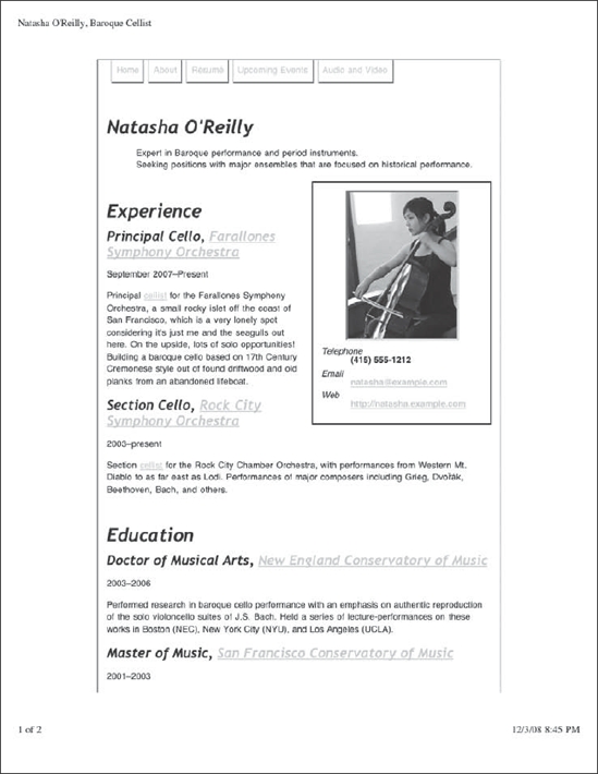
Figure 4-4. Our page, printed as is
OK, we've seen worse. But there are definitely some opportunities for improvement here. For one, the center column of content has extra-wide margins. In fact, the width of this center content is set to be 60 percent, so that means we might have an opportunity to improve the efficiency of our page real estate use by up to 40 percent. Also remember in our screen design that the font color was white, but somehow the color of the printed text here became black in our Gecko-based browser. This is good considering the fact that the vast majority of standard printer paper is white, but we certainly didn't specify that. In Safari and Internet Explorer, the font color is set to gray, giving us a readable level of contrast on the expected white background, while still paying homage to the fact that our font color was white on screen. Most modern browsers will gauge the level of darkness on a font and make an assumption as to how much darker the font needs to be to render in a readable contrast on white paper. Nevertheless, our hyperlinks are still yellow and that doesn't look so good on white.
Speaking of contrast—the background colors are not printed by default in most browsers, and the same goes for background images. Some browsers allow for the preference to turn on background printing, but it is not on by default and you should never assume it to be enabled. We've already seen that the black background colors have been largely ignored along with our font color preference, and the same level of disregard for our color specifications has been applied to the top banner background image as well.
Another annoyance is where the page breaks. In most browsers at the default setting, the break is somewhere after the heading “Section Cello, Rock City Symphony” and the heading's descriptive text. It would be better to get the break in a spot where this content isn't separated by a page. And while we're being nit-picky, those underlines on the hyperlinks are fairly useless in the print medium, as is the entire existence of the primary navigation. We'd like to see better typography overall, and we notice that IE renders our borders poorly. Is that enough complaining? Good. OK, then, let's see if we can doll this thing up a bit.
First of all, let's separate our screen styles from our print styles. This can be done easily enough—here we'll simply change the media type of our style sheet to screen:
<link rel="stylesheet" href="screen.css" type="text/css"

    media="screen" />
This means that only the devices identified by the user agent as screen devices will display styles from this style sheet. Other style sheets will render the default styles as shown in Figure 4-5.
This is already a step in the right direction. We've already gotten rid of those extra-wide margins, and the default serif font used in this browser is appropriate for printing. It already looks more like a typical printed page from a word processor, and we haven't done a thing to it really. However, we now notice that the portrait seems to be much larger than before, and we know we can do so much more with the typography and layout. To get things moving, let's embed a print style sheet into our markup and build some print-specific styles. On line 8 of the markup, insert the following code:
<style type="text/css" media="print">

    body {

        font-family: Garamond, "Times New Roman", Times, serif;

        font-size: 0.8em;

        line-height: 1.5;

        color: #191919;

    }

</style>
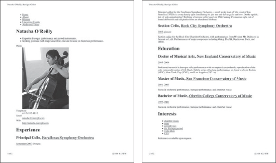
Figure 4-5. Our page as viewed in print without styles
Here we've embedded a print style sheet and established a rule to make all the text default to a nice-looking serif font family. We know that serif fonts are regarded for their superior readability in print, but we want to go with a font that was a little more attractive than the usual default Times New Roman that most browsers default to. Garamond is a popular font that is not quite as popular or as ubiquitous, but it can offer us that added element of style to our typography and it's worth offering it up to our users who have it. In the font-family declaration, fonts are listed left to right in order of preference. The leftmost item gets highest precedence, and the user agent will search this list of fonts from left to right until a match for an installed font is found on the system. So in our font-family declaration, we specify Garamond first. If that isn't available, we still like Times New Roman and Times as backups. In case none of those are available, we defer to the browser's serif font preference.
Figure 4-6 also shows that we have tightened up the font size a bit by reducing the default font size to 10 points, and added a line height value of 1.5 to make our text more readable on paper. Ten-point text is a good standard for most computer-printed documents, although you could easily justify anywhere between 9 point and 12 point for document copy. Wider line heights can help with legibility in paragraph text, and also might add a touch of style to a document layout. The value of 1.5 can be read as “one and a half lines.” The default line height is 1, so we're increasing that default by 50 percent. To finish it off, we assign an explicit color of #191919, which will be applied to all text in our document. It's a nice dark shade of gray, almost black, that will be very readable on white paper. We know ahead of time that Firefox and other Gecko-based browsers will probably render this text black anyway, but that's fine since we've chosen a fairly dark color. Now that we have our print style sheet started, let's get rid of some artifacts in our print output that we don't need, starting with the hyperlinks and site navigation:
<style type="text/css" media="print">

    .layout {

        font-family: Garamond, "Times New Roman", Times, serif;
        font-size: 10pt;

        line-height: 1.5;

        color: #191919;

    }

    a {

        text-decoration: none;

        color: #333;

        border-bottom: 1pt solid #CCC;

    }

    #sitenav {

        display: none;

    }

</style>

Figure 4-6. Our page with the site navigation removed and hyperlinks toned down
The default underlines that most browsers give to hyperlinks are fairly useless in print—they detract from the readability of our document by creating unnecessary visual cruft and distract our eyes with something that we can't really act on in paper. To remove the default underlines from our document, we use text-decoration:none. But at the same time we've decided to retain a bit of this information—after all, it may be useful for the reader to know that there is a hyperlink there for reference purposes, even if they cannot click on it on the printed page. So we are going to provide a lightening of the color of the text to #333. Since we know that Gecko browsers will fail to render the lighter gray text color, we also add back in a border at the bottom by using border-bottom:1pt solid #CCC. Why on earth would we readd the underline this way, you ask? Simple: the reason is that browsers will honor the light gray #CCC underline specification, creating a subtle and less obtrusive visual differentiation between it and the text above. If we left this up to the default text-decoration:underline property, then we'd have uniform color between the text and the underline, which again would be ignored by Gecko browsers.
Since we have preserved the idea of a hyperlink in our print-based styling, we could consider taking this one step further. Using the CSS content property and attribute accessors, we can print the URL that lies embedded within our hyperlinks and bring them out into the open. It makes most sense to have such links appear in the content area and not bother with exposing the navigation element URLs or URLs found elsewhere in the page layout, so let's use descendant selectors to target just a couple of areas where these URLs might be more informative:
#experience a:after, #education a:after {

   content: " [URL: " attr(href) "]";

   color:#555;

   }
An article by Eric Meyer that demonstrated this technique and several other similar print-specific topics appeared in A List Apart back in back in 2002. Titled “CSS Design: Going to Print” (http://www.alistapart.com/articles/goingtoprint/), the article is perhaps even more useful today now that many more user agents have implemented better support for the CSS2 specification.
Some might argue that embedding the URL in printed media detracts from the readability of the content of the document, while others will argue that having this information available makes it possible for the reader to use the URL in other contexts away from the printed page. Consider these issues and use whichever method makes the most sense for your project goals.
It's useless for your design purposes here to deliver site navigation on this page; it takes away from the intended purpose of this content, and is a waste of space and paper. You can therefore remove the site navigation from the print output by applying the display:none declaration to the #sitenav block. The <div id=“sitenav”> element and all of the contained children elements are completely removed from the page output and document flow, allowing the more useful content to filter up toward the top of the page.
It is important to note something about our border-bottom:1pt solid #CCC line specification that we used earlier. In particular, please direct your attention to the 1pt part. If you look at the line settings for many word processors, graphic design tools, and desktop publishing programs, you will notice that lines can be much thinner than 1 point. They are often set at values such as 0.75 point, 0.5 point, or even thinner. This produces a nice, crisp line that can look more attractive in print. Unfortunately in modern browsers, you really can't get any thinner than 1 point for the border property. Any value less than 1 will be rounded up to 1 point. We can hope that this function will one day become more powerful in browser implementations, but for now you should assume that 1 point or 1 pixel is going to be as thin as you can get in print for lines. You can, however, use border-bottom:thin solid #CCC; instead. The thin keyword, while not very specific, will usually display a crisp, thin line in most of the modern browsers.
Our next goal is to fix the display of the information box—the box that contains the photo, telephone number, email address, and URL for our featured cellist. In print we can see that the photo appears much larger compared to the screen version, and we've lost our floating to the right. Let's keep the float and reduce the size of the image to be more appropriate for the printed view, and apply a few more stylistic enhancements to our printed résumé, the results of which are shown in Figure 4-7:
<style type="text/css" media="print">

    a {

        text-decoration: none;

        color: #333;

        border-bottom: 1pt solid #DDD;

    }

    dl {

        width: 8cm;

        float: right;

        text-align: center;

        margin: 5em 0;

    }

    dt {

        font-style: italic;

        margin: 0;

        padding: 0;

    }

    dl > dt:first-child {

        display: none;

    }

    dd {

        font-weight: bold;

        margin: 0;

        padding: 0;

    }

    .photo {

        width: 3cm;

        height: 4cm;

    }

    .layout {

        font-family: Garamond, "Times New Roman", Times, serif;

        font-size: 10pt;

        line-height: 1.5;

        color: #191919;

    }
    #sitenav {

        display: none;

    }

</style>
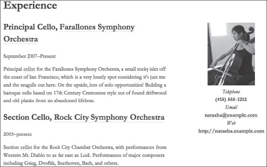
Figure 4-7. Floating the information box to the right and applying some style
The first thing to point out is that, now that our style sheet is getting longer, we've decided to slightly rearrange our CSS rules in a more logical order. We've chosen to adhere to a general order of specificity, with least specific rules toward the top and most specific rules toward the bottom. Placing more specific rules toward the bottom of our style sheet pairs well with the concept that rules appearing early in the cascade order might be overridden by later-appearing rules that have conflicts, and this is considered in many circles a best practice to follow. The only exception to this practice for this case is our dl > dt:first-child rule. This rule has a much higher specificity than the following dd rule, but since it applies a special modification to the preceding dl and dt rules, we've chosen to keep it here for readability's sake.
The image in print is too large for the printed page. In fact, we notice that this portrait has been reduced on screen as well, and that the source image weighs in at a native 300 pixels wide by 400 pixels tall. Since we know that this résumé will likely be printed on a sheet of US Letter or A4 paper, we can be reasonably sure about what image dimensions we want to have. Here we've specified width:3cm and height:4cm to our .photo class, which is a good proportional value to the native pixel dimensions of the photo.
To move our information box over to the right, we have applied a width of 3 inches to the dl element and floated it to the right. Making this element 8 centimeters wide and centering the content within using text-align:center provides plenty of white space to differentiate it from the main part of the document, and the 5 ems of margin on either side ensures that any text that might approach the edge of the dl container provides a final amount of buffer.
To give our information box some typographic style, we set our definition terms (dt) to display in italics and our definitions themselves (dd) to display in bold. Removing all of the margin and padding from these elements ensures that we won't run into any surprises with differences in the way various browsers style these by default, and it will allow our centered content in the info box to have a proper display without any unexpected indentations. We've also decided that the definition term “Photo” isn't needed since the definition for that item is fairly obvious, so we've removed it by using the first-child pseudo selector: dl > dt:first-child. This selects the first dt element that is a child element of dl, and then all we need to do is set display:none to remove it from the output.
What we have now is a fairly decent-looking printed page. This is much better than our original, and our users (in this case potential employers for Ms. O'Reilly) will appreciate having the higher-quality printed output. This would be fine as is, but there's actually much more we can do. So let's keep playing around with this résumé to see what we can come up with. We'll begin by styling those headings.
The headings currently print in the default serif font defined by our font-family rule applied earlier in the .layout rule. But this cellist wants something a little more stylish for her résumé and would like to see the headings in a more elegant typeface. But we know as CSS developers that finding a cursive font that is cross platform is difficult to do. Our customer Ms. O'Reilly has agreed that some flexibility with the headings is fine as long as it somehow looks pretty, so that frees us up to be a little creative with our font family designation. With that in mind, let's build a font family for the headings that will be almost guaranteed to look different between various browsers, but will look stylish and interesting either way. Let's explore our options.
A font that is more common on Windows but not unknown on the Mac platform is Edwardian Script ITC. This font is quite florid and full of loops and variations that make Edwardian Script ITC an excellent choice for a stylish-looking heading. Monotype Corsiva is a more popular font found frequently on Windows and occasionally on Mac, but it is not nearly as stylish as the previously mentioned selections. And if all else fails, we always have the cursive keyword in CSS. Edwardian Script ITC seems like a good choice for our primary font, so let's start there. Our backup is going to be Monotype Corsiva, and then we finish up with a cursive keyword to ensure something stylish gets picked. Edwardian Script can appear small, so we have bumped up the font sizes for h1 and h2 elements to 32 points and 18 points, respectively, and removed any underlines from <a> elements that happen to be a part of any <h2> elements—it looks terrible in print.
We'd really like to write .experience { page-break-inside:avoid; } in our style sheet to keep our experience blocks from printing on separate pages, but unfortunately this property is largely unsupported in modern browsers aside from Opera. Let's write it anyway and enjoy this behavior in at least the one browser that supports it. Perhaps soon the other browsers will catch up. Here's what we have added so far, the results of which are shown in Figure 4-8:
<style type="text/css" media="print">

a {

    text-decoration: none;

    color: #333;

    border-bottom: 1pt solid #DDD;

}

h1, h2 {
    font-family: "Edwardian Script ITC", "Monotype Corsiva", cursive;

    font-weight: normal;

    margin-bottom: 0;

    page-break-after: avoid;

}

h1 {

    font-size: 32pt;

}

h2 {

    font-size: 18pt;

}

h2 a {

    border: 0;

}

dl {

    width: 8cm;

    float: right;

    text-align: center;

    margin: 5em 0;

}

dt {

    font-style: italic;

    margin: 0;

    padding: 0;

}

dl > dt:first-child {

    display: none;

}

dd {

    font-weight: bold;

    margin: 0;

    padding: 0;

}

.photo {

    width: 3cm;

    height: 4cm;

}

.layout {

    font-family: Garamond, "Times New Roman", Times, serif;

    font-size: 10pt;

    line-height: 1.5;

    color: #191919;

}

.experience {

    page-break-inside: avoid;

}

#sitenav {

    display: none;

}

</style>

Figure 4-8. Cursive font family treatment for headings
It is too bad about page-break-inside not being as well supported as we'd like. But if we take a look at our page, we can see that there might be an opportunity to insert a more manually placed page break that should work in most settings. It looks weird to have the Education heading sitting there at the bottom of the page and then the remaining content falling onto the next page. We can apply page-break-before:always to the #education block, since we can see that in all our browsers tested this block begins toward the end of page one, and try to get a better placement of our content onto the two pages:
#education {

    page-break-before:always;

}
A word of caution on this: there is a fair amount of fudge factor here and we are giving up some control on how this will print by inserting a manual page break in this specific spot, because we don't know if our user has resized their fonts on the other end. This is something to be careful with and deserves some testing and thoughtful consideration before implementing.
We're almost done. Let's add a little style to the summary points at the top, and see if we can fill out the overall layout somehow. For the summary points we can simply italicize the font, which should give us a nice bit of emphasis for this section. The targeted content has been assigned a class of summary already, but there's a problem: the summary class is repeated elsewhere in the document, but we only want to target this one instance of the summary class. That means we're going to have to be more specific. And we're in luck: the instance of the summary class that we want is contained within the vcard class, so we can conveniently use a descendant selector to style the item we want:
.vcard .summary {

    font-style:italic;

}
After looking at that for a minute, we can see that the text appears a bit too tightly packed in an italic typeface for such a prominent part of the page. Let's space it out a bit by using the letter-spacing property:
.vcard .summary {

    font-style:italic;

    letter-spacing: 0.1em;

}
Now we have a decent-looking summary at the top; our last step is to fill out the pages a bit. It looks like there is enough room on our pages to increase the line height of our paragraph text a bit, which might help with readability while we're at it, and provide an added touch of style to the output. So let's try using the line-height property:
p {

    line-height:2;

}
You can see the results in Figure 4-9.
This might be a good place to stop. We have clean, tidy-looking print output that is free of unnecessary junk from our screen view of the page, and we've applied some neat typography to make the printed résumé look more elegant. Our client is happy and can start using her online résumé to market her cello performance skills! The last step is to extract our style sheet from the HTML and place it into an external file. Create a new file called print.css in the same directory as our HTML file, copy and paste our CSS code (everything in-between the <style> element), and then replace the <style> element block with
<link rel="stylesheet" href="print.css" type="text/css"

    media="print" />
Our final style sheet in print.css is as follows:
a {

    text-decoration:none;

    color:#333;

    border-bottom:1pt solid #DDD;

}

h1, h2 {
    font-family:"Edwardian Script ITC", "Monotype Corsiva", cursive;

    font-weight:normal;

    margin-bottom:0;

    page-break-after:avoid;

}

h1 {

    font-size:32pt;

}

h2 {

    font-size:18pt;

}

h2 a {

    border:0;

}

p {

    line-height:2;

}

dl {

    width:8cm;

    float:right;

    text-align:center;

    margin:5em 0;

}

dt {

    font-style:italic;

    margin:0; padding:0;

}

dl > dt:first-child {

    display:none;

}

dd {

    font-weight:bold;

    margin:0; padding:0;

}

.photo {

    width:3cm;

    height:4cm;

}

.layout {

    font-family: Garamond, "Times New Roman", Times, serif;

    font-size:10pt;

    line-height:1.5;

    color:#191919;

}

.experience {

    page-break-inside:avoid;

}

.vcard .summary {

    font-style:italic;
    letter-spacing: 0.1em;

}

#sitenav {

    display:none;

}

#education {

    page-break-before:always;

}
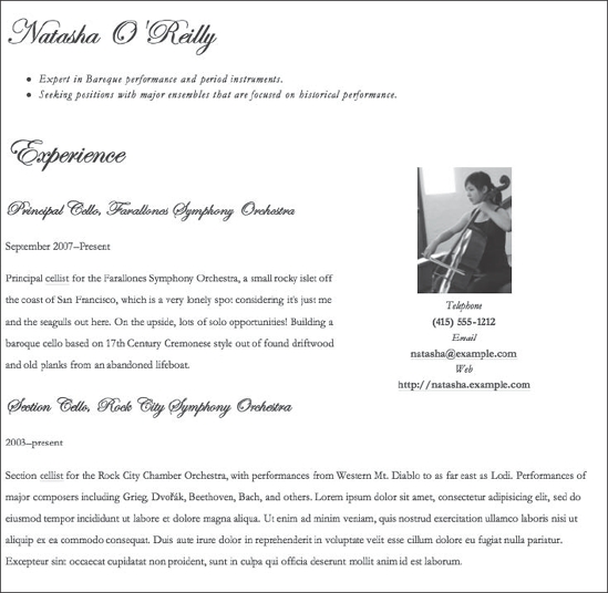
Figure 4-9. Page one of our final print design
Summary
Making print style sheets takes advantage of CSS's innate ability to provide alternative presentations of the same content, a concept whose benefits you should be familiar with from previous chapters. In this chapter, you applied this knowledge to the print media by reformatting an existing design for the screen so that it could be reproduced appropriately on paper. In addition, you learned how providing a print style sheet gives your dear website visitors a better experience when they take your content off-screen.
In composing your print style sheet, you first looked at the more common motivations and goals users have for printing physical pages from web pages. Next, you analyzed particular areas of concern to aid in your reformatting efforts, such as the content's typography, the dimensions and properties of the printing paper, and the existing content itself. By removing interactive navigation elements irrelevant to the print medium such as hyperlinks, repositioning or completely removing tangential information from sidebars, and changing the layout of the primary content area, you successfully leveraged the existing screen styles for your new print ones.
However, you can do a lot more than merely create a “printer-friendly” version of your page. From there, further optimizations can be employed, such as using a serif font for your written copy and identifying where background images, font colors, and page breaks might cause issues for your design. You can then deal with these problems so that the content they present is enhanced rather than dulled-down.
You also learned how CSS deals with different sizes of paper by defining page boxes, analogous to the browser's window (or viewport). However, since most users will probably be printing on white A4 or US Letter paper, many of CSS's intricate page sizing and selection features are still struggling to find support in modern web browsers. Further, you saw that many historical artifacts used for signaling printable pages, such as custom-built “Print this page” buttons, are still in use today for slightly different purposes.
Regardless of the content you have, it almost always makes sense to create a print style sheet for your content. Having one available makes a big difference to your users, and the effort required to provide an adequate baseline is so minimal you'd be remiss not to do so. Now, with significant experience using CSS that targets multiple media types for a single chunk of content, let's next turn our attention to yet another popular form factor for web sites: mobile, ultra-portable handheld devices.