CHAPTER 6:
Selecting & Preparing Your Surface
The surface, or support, that you choose for your drawing or painting helps determine the quality of your work—from texture, brightness, and color to longevity. Before you select a support, the following are helpful questions to ask:
• Is the support compatible with your medium?
• How will the brightness and color of your support affect the medium?
• How will the texture relate to your subject?
• How will the support help you communicate your artistic message?
• Is the support durable enough for the work’s purpose?
• Will the support help your work stand the test of time?
CHOOSING YOUR SUPPORT
Paper, canvas, and wood panels are the most common drawing and painting supports, but don’t feel pressured into a traditional approach. Artists throughout the centuries have explored (and found success with) a variety of surfaces, including animal skins and sheet metal. The more you understand why and how artists work with particular surfaces, the more likely you are to find success with your own artistic experiments and decisions.
When selecting paper for a finished drawing, note the following:
• Test your paper while working on your chosen surface. This will help you assess how the medium, paper, and surface work together.
• Beware of working on uncoated or soft wood, which scores easily beneath harder mediums such as graphite.
• To reduce the risk of creasing the sheet or damaging its edges, work on a surface that is larger than your paper.
• Don’t work on a textured or seamed surface, as it will affect the flow of your strokes.
• You may prefer to draw on a small stack of papers for a soft, cushioned feel.
• Before laying down your paper on a drawing surface, use a soft drafting brush to wipe away any dirt or old eraser crumbs. Make sure the surface is free of oil and moisture.
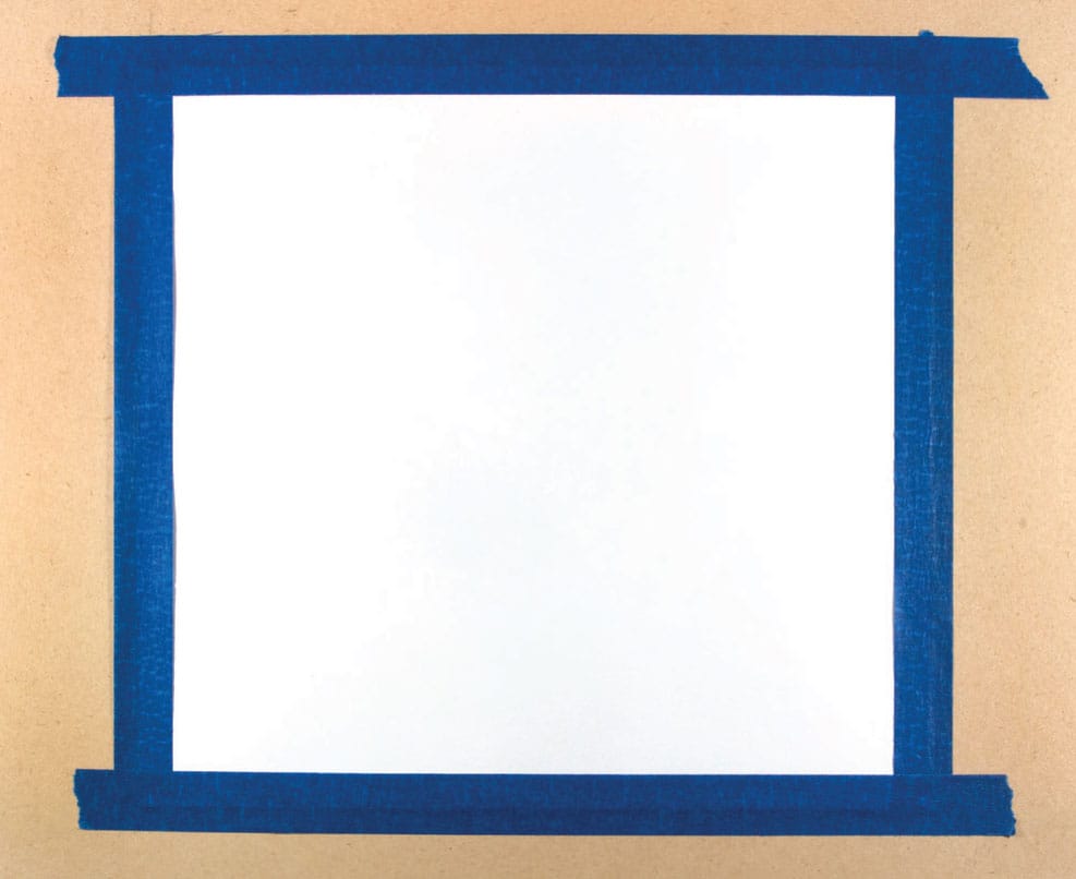
A simple wood-based composite board (such as MDF) and drawing paper secured with artist tape make a great portable drawing surface.
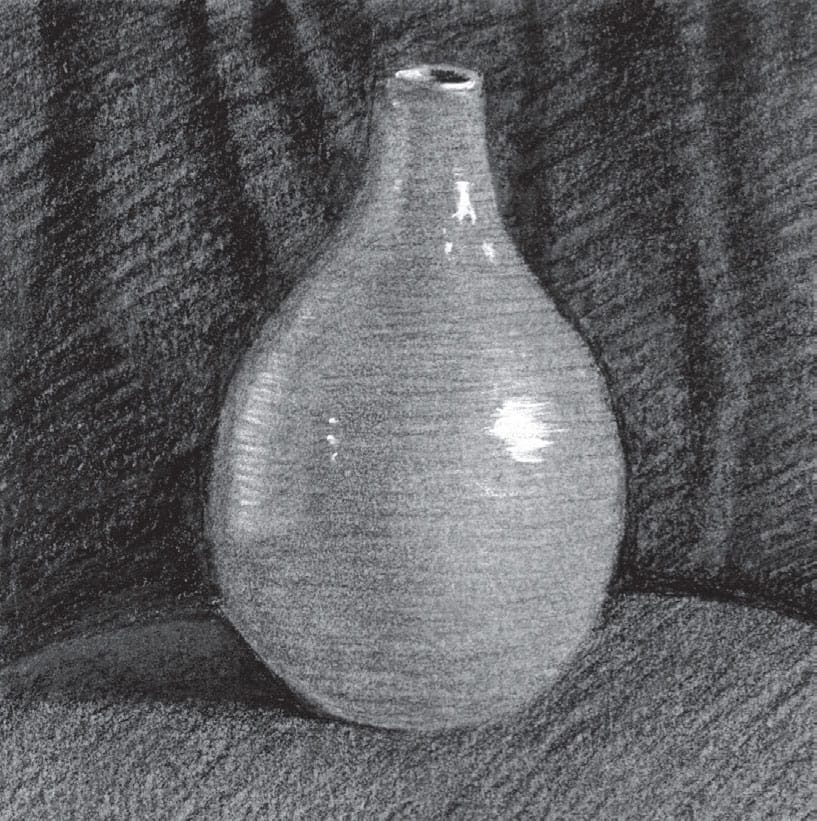
GRAPHITE
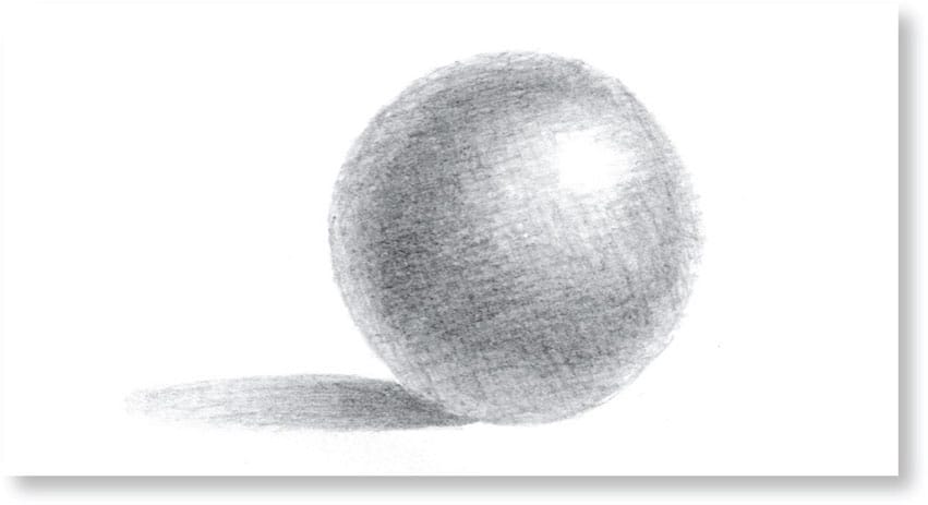
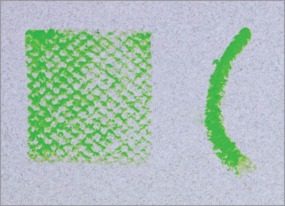
Graphite is versatile and works well on a number of paper types. Below are graphite spheres (created with HB pencil and minimal blending) on a sampling of common surfaces, including toned kraft paper, smooth drawing paper, medium drawing paper, and cold-pressed drawing paper. Note the differences in value and stroke quality.

Graphite over rough, brown kraft paper creates a dark, dramatic feel. I added extra dimension by applying white crayon over the highlight.
Smooth drawing paper offers plenty of control over graphite and allows you to build up subtle layers of crosshatching. Because the paper has little to no tooth, it is not easy to achieve dark values.

Medium drawing paper is often considered the most versatile surface for graphite. It has enough tooth to hold darker strokes, but it also allows for smooth blends.

Cold-pressed paper is a rougher, more inconsistent surface for graphite. It’s best to work on this textured paper at larger scales, as it is difficult to control the quality of smaller strokes.
PENCIL HARDNESS
Keep in mind that the hardness of the pencil affects the quality of line and tone on the paper. Pictured here are gradations of 8B, 4B, HB, and 4H on medium drawing paper, allowing you to see the differences in stroke quality and darkness.
8B
4B
HB

4H
PEN & INK
Each pen delivers ink to the paper differently; the pressure, angle, speed, and stroke direction determine the length, width, intensity, and character of your strokes. Whether you are working with traditional dip pens or markers, most pens work best on smooth drawing papers, but cold-pressed watercolor paper also works well if you’re incorporating ink washes or working with ballpoint pens.

Artwork by Jim Dowdalls
Smooth drawing surfaces are ideal for pen and ink, especially for illustrations that call for precise rendering.
Artwork by Chelsea Ward
CHARCOAL
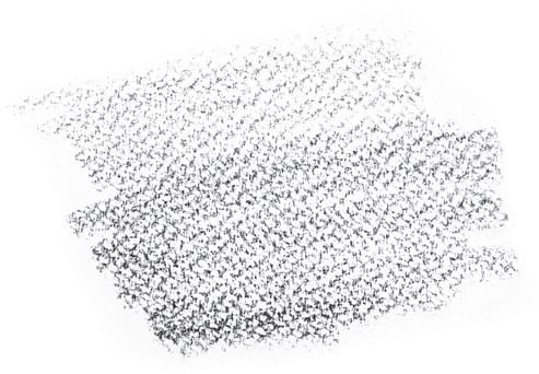
Charcoal is a dramatic alternative to graphite. It can also create subtle, velvety blends and fine detail. This medium works best on rougher paper surfaces with plenty of tooth. Because charcoal is dusty and dry by nature, it lifts easily and can sometimes be blown off the paper or canvas. Use fixative on your finished drawings to ensure that they last.

A) Charcoal produces bold, expressive strokes and is easy to blend, making it ideal for quick life-drawing sketches and gesture drawings.

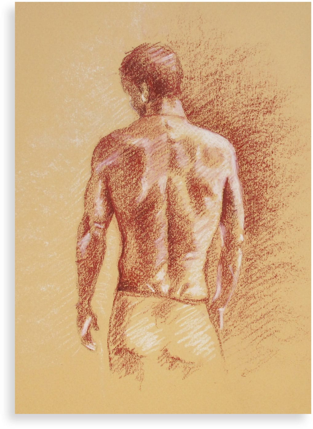
B) Many artists opt to draw on toned paper. The value of the paper acts as a middle value to which you can add shadows and highlights. Because a middle value is already in place, you can develop forms quickly and boldly. In the above piece, I used charcoal and white pencil on gray toned paper, emphasizing the dramatic portrait lighting.
CONTÉ CRAYON
Conté crayons, or Conté sticks, deliver rich, textured strokes that glide easily across the paper. You can use them to produce tight lines, broad strokes, and lightly blended areas of tone.
Artists often pair Conté crayons with toned paper, such as gray, cream, or light brown. If using a gray support, artists work with black and white Conté; if using a cream or light brown support, artists generally work with sanguine and white Conté.
COLORED PENCIL
Colored pencil works well on multiple supports, from smooth and rough to toned surfaces. Many artists find it easiest to work on a surface with at least a slight tooth.
HARD & SOFT PASTELS
Paper is an important part of pastel artwork. Whether you’re using hard or soft pastels, choose paper that has a textured surface so the raised areas catch and hold the pastel. You might also opt for toned paper, which enriches the colors with a subtle, uniting hue and prevents distracting bits of white paper from showing through.

TIP
The powdery nature of soft pastel makes your finished pieces vulnerable to smudging. Artists often use spray fixative to seal and protect their finished work.
Artwork by Jim Dowdalls
Sanded pastel paper, although costlier, is ideal for working with pastels. The more texture the paper has, the better, due to the soft nature of pastels.
OIL PASTELS
Oil pastels are compatible with almost any support. They are often used to accent or supplement other media; you can use them in conjunction with oil paint, as they respond to solvents, or even over dried acrylics or watercolor. You can also create wonderful works of art using only oil pastel.
Note: You can manipulate the consistency of oil pastel with linseed oil and solvents used in oil painting. However, be sure to work on primed canvas, board, or sized paper.
OIL PASTEL ON PAPER
Oil pastel is very responsive to the texture of its support. Shown here is oil pastel on rough paper, laid paper, vellum-finish Bristol board, and toned pastel paper.

Rough Paper

Vellum-Finish Bristol Board
Laid Paper
Toned Pastel Paper
DRAWING MEDIA COMPARISON

Graphite on medium drawing paper
Charcoal on gray toned paper

Conté crayon on textured cream paper

Colored pencil on medium drawing paper
Soft pastel on textured blue paper

Ballpoint pen on medium drawing paper
WATERCOLOR
Watercolor paper is available in myriad sizes, weights, textures, and formats. This specialty paper has been treated with sizing to reduce the absorbency of its surface. Secure the paper to a table or wooden board with artist tape or clips and work on a flat surface, which helps avoid unintentional runs and drips. If painting on the go, you can work on pads or in sketchbooks on your lap.
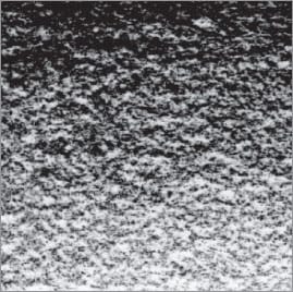
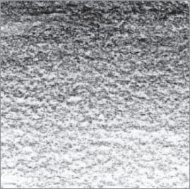
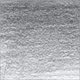
WATERCOLOR PAPER TEXTURES |
||
|
|
|
Hot-Pressed Paper |
Cold-Pressed Paper |
Rough Paper |
This paper has been pressed with heat, which creates a smooth surface. Hot-pressed paper is ideal for fine detail, even washes, and a controlled style. This paper is not especially absorbent, which results in bright colors. |
Also referred to as “not” or “medium” paper, cold-pressed sheets are not treated with heat, leaving an irregular surface. This versatile paper is ideal for granular textures and a more painterly style. |
This paper is even rougher than a cold-pressed surface. The deep tooth can leave quite a bit of the paper showing along the edges and within each stroke. It complements an expressive style and drybrush techniques. |


TIP
The most forgiving surface for a beginning watercolorist is cold-pressed, hard-sized paper.
STRETCHING WATERCOLOR PAPER
Light- and medium-weight papers can warp when you apply wet paint, but they will stay flat if stretched first. This process is economical, as lightweight paper is considerably less expensive than heavy paper. Be sure to stretch well in advance of painting; the surface will take at least two hours to dry completely.
STEP 1
Prepare a sheet of watercolor paper, a board for securing it, a large tray of water, a sponge, and masking tape. Immerse the paper in the water briefly, turning it over to wet both sides evenly.

STEP 2
Place the wet paper on your board, leaving enough room to add tape along the edges. Use a damp sponge to smooth over the paper, removing creases and air bubbles.

STEP 3
Cut four pieces of tape that are slightly longer than the paper’s edges and press them in place, smoothing them with your fingers. If using gummed tape, use the damp sponge to moisten the adhesive side before placing the strips. Allow to dry.

GOUACHE
You can paint with gouache on various papers—just remember that it’s a water-based medium, so if you use a paper that is too thin, it will warp when water is added.
Thick paper is a great choice for working with gouache, because it will hold up to several layers of paint without warping. Textured paper will give your finished work a beautiful, natural feel.

Artwork by Joy Laforme
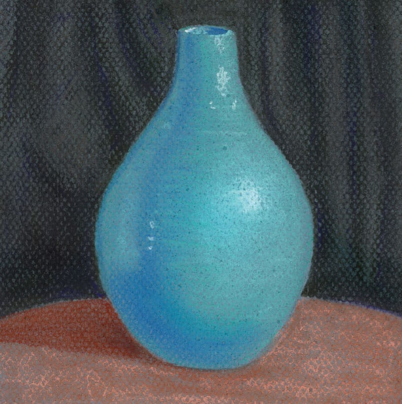
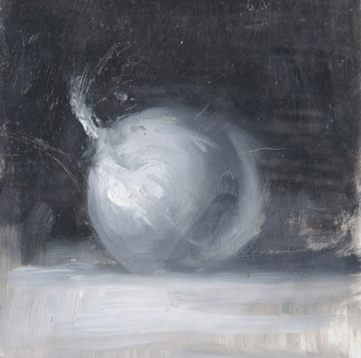
ACRYLIC
Acrylic is the most versatile paint for fine artists and can be applied to a variety of surfaces, from watercolor and canvas paper to hardboard, wood, and traditional canvas. In fact, you can apply acrylic to any surface as long as it’s not waxy or oily. This quality makes it a great choice for multimedia work and collage. When using acrylic in the style of oil, use an easel that props up your painting while you paint. If using acrylic as a fluid medium, work on a flat table to avoid unintentional drips and runs.
Many artists prefer to work with acrylic on toned surfaces. Toning refers to applying a layer of thin, transparent paint over the white of your surface. You might choose to do this for one or more of the following reasons:
• To establish a hue or hues that influence subsequent layers of paint, providing unity to the scene
• To establish a middle value that allows you to better judge the values of subsequent applications of paint
• To prevent distracting bits of white from showing through your final work
• To create interest in a background with subtle variations and textures
• To jump-start creativity and get past the blank white of your surface
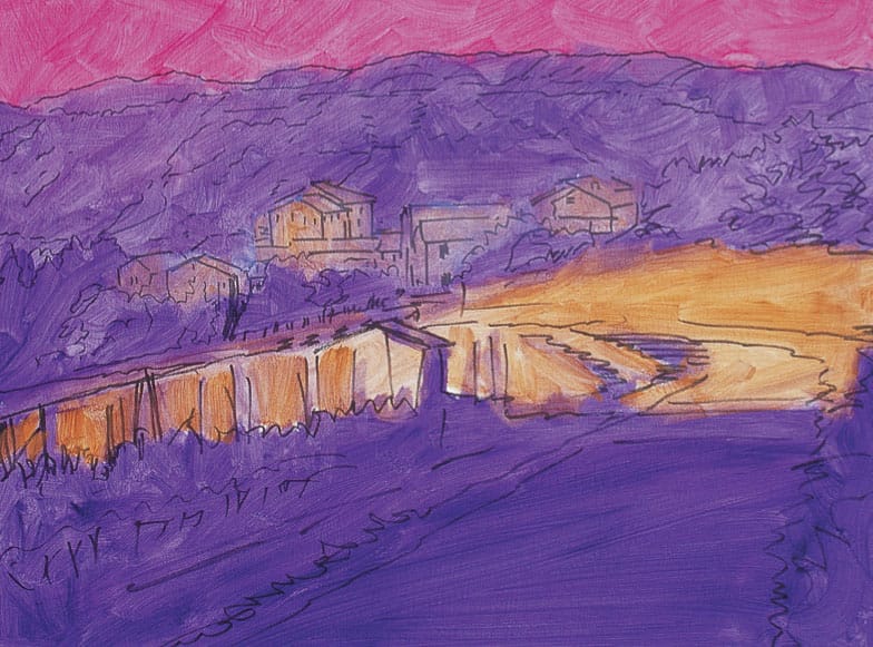
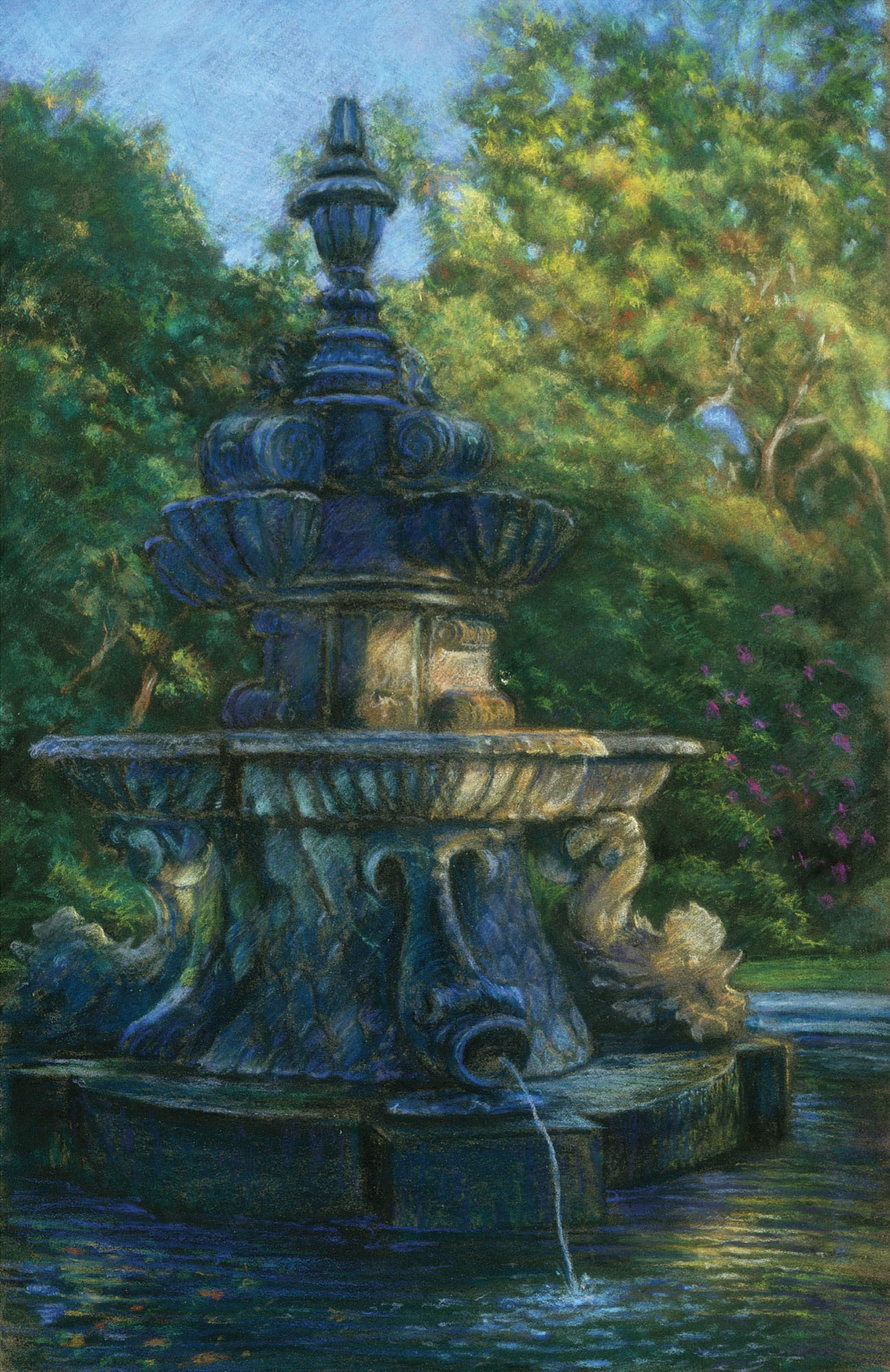
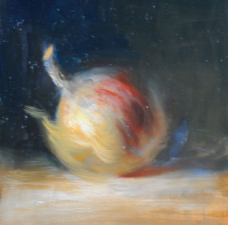
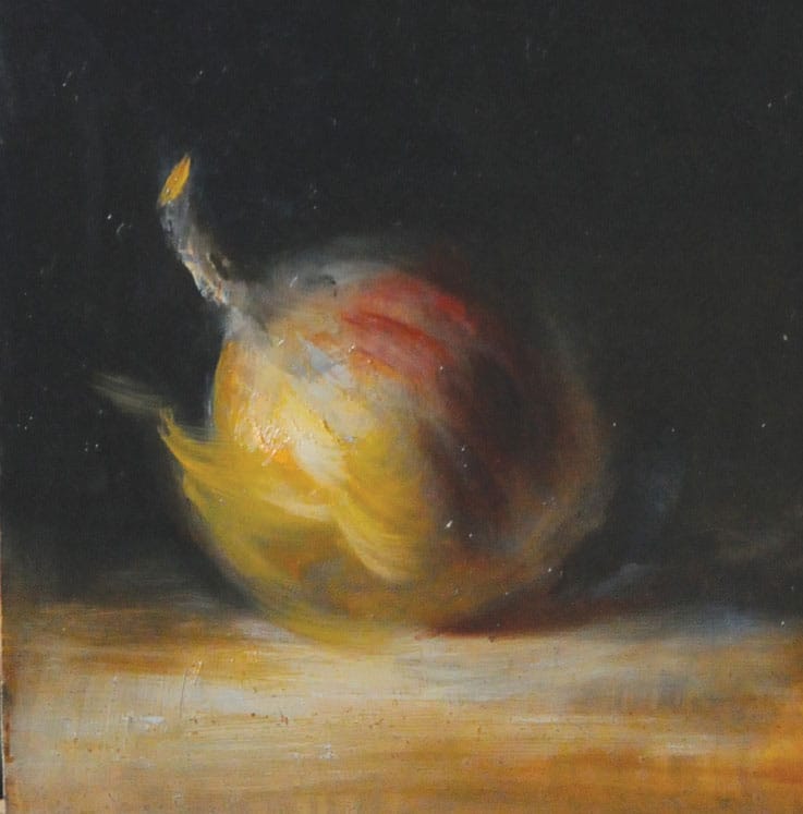
Shown above is a canvas toned with pink, purple, and gold, along with its final painting (right). Notice how the original tone influences the finished work, creating a warm pink cast in the afternoon scene.
TONING THE CANVAS It’s often best to tone the canvas with a transparent pigment. This will produce a luminous foundation that will help you create a sense of depth in the rest of the painting.
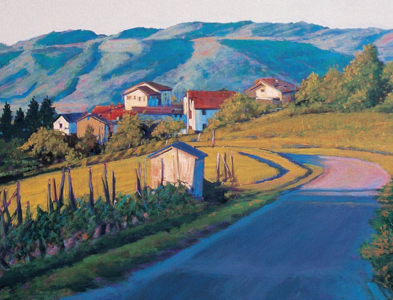
Artwork by Tom Swimm
OIL
Canvas and wood panel are the most suitable surfaces for oil painting. Remember that your surface must be sealed and primed properly to create a bright white ground, prevent impurities from leaching into the paint, and curb warping and rotting of the support. If your support is not pre-primed, you can apply sizing followed by oil or alkyd ground—or you can simply apply acrylic dispersion ground.
Artwork by James Sulkowski
The slow-drying properties of oil paints allow you to create smooth blends and rework paintings over multiple sessions, allowing for an impressive degree of realism.
ADDITIONAL PAINTS

Egg Tempera Egg tempera paint pairs best with a rigid support, such as wood panel or claybord. This lovely semi-translucent paint dries almost instantly. Egg tempera is highly susceptible to cracking with age and requires a rigid surface.

Encaustic Encaustic painting involves hot, liquid wax and is best for use on rigid surfaces that are absorbent and heat resistant. Wood panels are a good choice, and you can also purchase Encausticbord™, a ready-to-use surface specifically designed for the unique demands of encaustic painting. If you’re working with light layers or mixed-media techniques, flexible surfaces may also work. The key to working with encaustics is to test your wax on a new support type before beginning.
SURFACE PREPARATION
Most painting surfaces, such as wood, metal, and fabric, require preparation before you can paint on them. Without this step, paint may do one of the following: 1) fail to adhere, 2) peel away over time, 3) rot the underlying surface, 4) react with the surface to create discolorations, or 5) absorb into the surface too much and appear dull. A good primer can also provide a bright white base that yields true and luminous colors.
Two basic substances you might use to prepare a surface are sizing and primer (or ground). The world of surface preparation is vast, and you’ll find that product names and ingredients vary between manufacturers. The following pages offer an overview of the basics to help you better determine what category of product will work best for you.
SIZING & SEALANTS
Sizing serves as a barrier between the surface (or substrate) and the paint or primer, sealing the substrate so that oils cannot penetrate the surface. Canvas, paper, and wood panel are susceptible to rotting when exposed to oils over time, and sizing acts as their defense. Sizing also prevents oils from passing from the substrate into your paint, which causes discolorations. Note: You do not need to size a surface if you plan to prime with acrylic dispersion ground. (See “Acrylic Dispersion Grounds,” here.)
Animal Glues Rabbit-skin glue and gelatin are considered traditional sizing for panels, canvas, and paper. If you choose one of these granulated options to create sizing, dissolve the powder overnight in a ratio of 1 part powder to 15 parts water. Then heat the mixture in a double boiler, brush the mixture thinly over the surface, and allow it to dry.
Synthetic Sealants Many artists choose to seal their surfaces with newer synthetic materials, such as acrylic matte or gel mediums, which are flexible, effective, and generally nontoxic. PVA (polyvinyl acetate) dispersion also works well for panel, canvas, and paper, but be sure to use a PVA that is labeled acid-free (or neutral pH). Some artists use polyurethane to seal rigid panel surfaces.
PRIMERS & GROUNDS
Primer bonds with your support to create a new, more efficient painting surface that is porous enough to offer ideal absorbency and tooth.
Traditional Gesso The term “gesso” is often used loosely to describe any opaque white primer for painting. However, true gesso is made from gypsum, chalk, or marble dust mixed with rabbit-skin glue and white pigment. It is a luminous primer for rigid surfaces such as wood panels. Because it is not flexible when dry, don’t use it to prime canvas or paper. Traditional gesso is not as readily available as newer primers, but you can find gesso mixing kits online and at some art-supply stores.
To apply gesso to a panel, heat it according to the manufacturer’s instructions, and then follow “Applying Acrylic Dispersion Ground” (shown here). Keep these points in mind:
• Precede the gesso with a layer of sizing to seal the panel.
• Use a large bristle brush (or a house paintbrush) to apply the gesso in thin coats to reduce the risk of cracking.
• Four to as many as ten thin coats of gesso will result in a wonderful, marblelike painting surface.
Oil & Alkyd Grounds Oil ground is an oil-based primer for canvas and panel that is designed to accept oil (but not acrylic) paints. It consists of linseed oil, chalk or gypsum, and white pigment.
Alkyd ground is a resin-based primer with a faster drying time. If desired, you can thin oil and alkyd grounds with solvents such as turpentine or mineral spirits. Note: Due to the difference in drying time, do not use alkyd-based paints over an oil ground.
To use oil and alkyd grounds, precede application with a layer of sizing. Then use a palette knife or spatula to spread the ground evenly over your surface. Allow the primer to dry for a few days. (If using alkyd, the ground may dry within a few hours.) One to two coats are generally sufficient.
Acrylic Dispersion Grounds Sometimes called “acrylic gesso,” acrylic dispersion ground or primer is a popular, inexpensive, versatile, and easy way to prime a paper, canvas, or panel. Similar to traditional gesso, it is a paintlike substance that you can apply to your surface in layers. Acrylic dispersion grounds come in white (used most often), gray, black, and clear. If desired, you can tint the ground your color of choice, using acrylic paint. Note: You do not need to apply sizing to a substrate before applying acrylic dispersion ground. However, to avoid possible darkening over time, first seal the surface with a layer of acrylic matte or gel medium.
You can use oil or acrylic paints over acrylic dispersion ground, although some artists choose to use an oil or alkyd ground under oil paints instead. Oil paints and acrylic ground respond a bit differently to temperature fluctuations, which may cause problems over time. Also, oil does not chemically bond to an acrylic surface, so be sure to leave some tooth on the surface and avoid sanding down your final layer of ground before applying oil paint.
Applying Acrylic Dispersion Ground

STEP 1 If using a panel, such as this block of oak, sand the surface to remove any grooves, splinters, or textural irregularities. Wipe away the dust with a damp cloth.
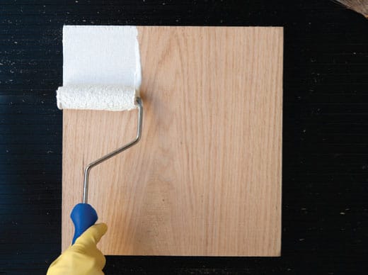
STEP 2 Use a house paintbrush or roller brush to apply a layer of acrylic dispersion ground, starting at one end of the panel and working to the other end. Use parallel strokes that overlap slightly.

STEP 3 Wait for the gesso to dry and lightly sand the surface to smooth out any clumps or brushstrokes, if desired. Remove the dust with a damp cloth.

STEP 4 At a 90-degree angle to your first layer of strokes, apply another layer of parallel strokes. When dry, lightly sand the surface and remove the dust with a damp cloth. After you have applied two to four layers, lightly sanding after each layer, your painting surface is ready!

TIP: Using a house paintbrush to apply ground can create thick strokes with striations. Some artists like working on this texture, but others prefer to remove any remaining stroke textures once dry using fine-grit sandpaper. If the acrylic dispersion ground feels too thick for your liking, simply thin it with water.