CHAPTER 7:
Demonstrations
Now that you’re equipped with the basics of various types of surfaces and the media they work well with, it’s time to try your hand at working with different supports. Here you’ll find a variety of step-by-step projects using different supports and media to create unique works of art—all presented by an accomplished selection of artists. This chapter features the following demonstrations:
• Graphite on Smooth Paper with Elizabeth T. Gilbert
• Alcohol Inks on Ceramic with Barbara Polc
• Acrylic on Panel with Blakely Little

GRAPHITE ON SMOOTH PAPER
with Elizabeth T. Gilbert
STEP 1
Begin by lightly laying in the basic shapes and outlines with an HB pencil, checking the proportions for accuracy.

STEP 2
Now stroke a layer of tone building the shadowed areas to suggest form. Use softer pencils for the darker areas.
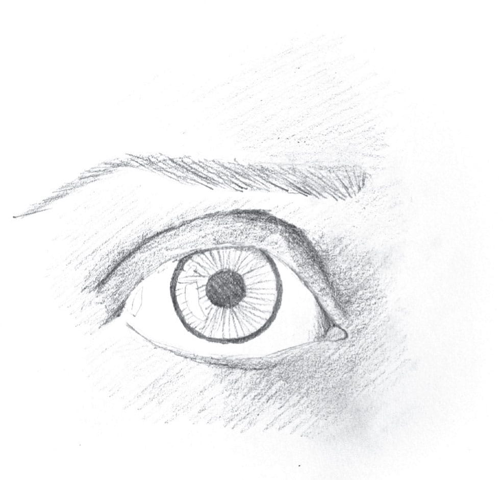
STEP 3
Blend the tone to create a smooth base that hints at the value pattern in the reference. Using chamois, blend the light skin surrounding the eye, and then switch to stumps for the darker, linear areas, including the eyebrow, crease, iris, and pupil.
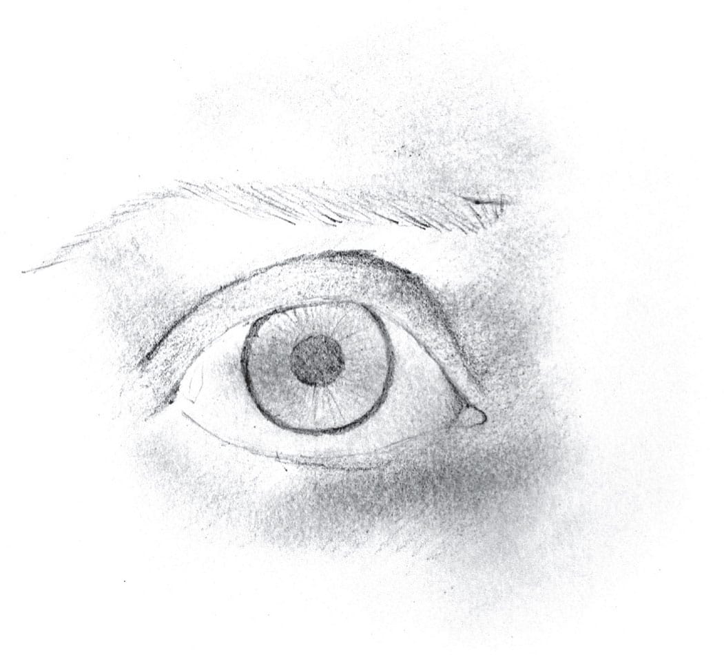
STEP 4
Because blending the tone lightens the overall value, reapply tone, blend, and repeat where needed.
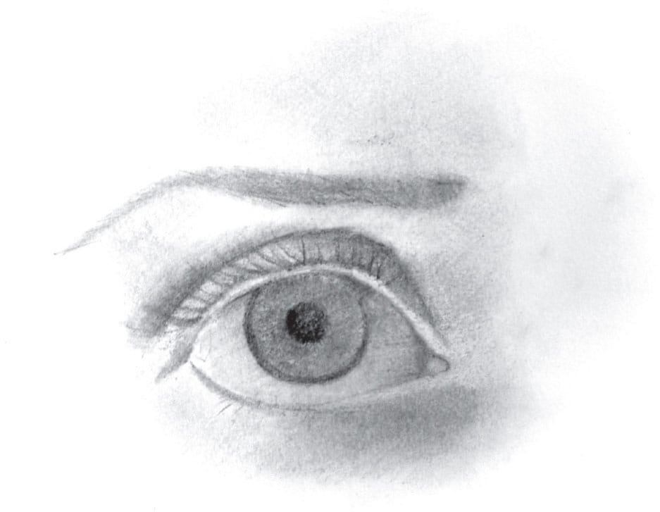
STEP 5
Add fine lines and create highlights. Fill in the eyebrow with short strokes, using a 4B pencil and stroking in the direction of hair growth. Next switch to an 8B for the darkest accents, such as the pupil and eyelashes, blending subtly with a tortillon. Use a kneaded eraser to gently dab away tone to model the forms and soften any harsh edges. Then use a stick eraser to pull out the highlights in the iris.

ALCOHOL INK ON CERAMIC TILE
with Barbara Polc
Alcohol ink is a fluid, vibrant medium that requires a nonporous surface. Ceramic tile is an excellent and economical substrate choice. The inks will mix and swirl, creating beautiful, ethereal backgrounds and images.
For this project you will need:
• Alcohol inks in various colors
• 91% isopropyl alcohol
• Smooth white ceramic tile
• Paper towels
• Small paintbrush
• Eyedropper or pipette
• Plastic paint palette
• Waterproof fine black liner pen
• Spray varnish/UV protectant sealer
• Optional: rubber gloves, cotton swabs
STEP 1: CREATE THE SKY
Clean a ceramic tile with a paper towel and 91% isopropyl alcohol. Let dry. Using an eyedropper (or pipette), apply a thin line of isopropyl alcohol to the top of your tile. Directly beneath this, apply a line of alcohol ink using the nozzle of the ink bottle. Tilt the tile from side to side, keeping the ink in the top third of the tile. When the desired effect is achieved, lay flat and let dry.

STEP 2: CREATE THE BACKGROUND
Apply alcohol ink below the sky, adding only a very small amount of isopropyl alcohol below the ink. Tilt the tile from side to side, or blow the ink gently with a straw, to create your desired background. Experiment with using multiple colors, if you wish. Applying the ink on an angle will produce interesting hills, mountains, or streams. Watch the beauty of the inks mix and swirl, creating new colors and shapes. Be sure to leave adequate room for your foreground.

STEP 3: CREATE THE FOREGROUND
For the bottom of the tile, repeat the process described in step 2, using the colors of your choice. At this point, you can tweak anything you like by rubbing away ink with a paper towel and isopropyl alcohol to rework the area.

STEP 4: CREATE A FOCAL POINT
Dip a small brush or cotton swab in isopropyl alcohol and dab it off on a paper towel. Then wipe the ink off the tile to create a tree(s), sun, or moon. This may take several swipes. Be sure to rinse your brush in alcohol and dab it off on a paper towel after each swipe. Leaving some color in the tree(s) is helpful for the next step.

STEP 5: ADD DETAILS
To create foliage, load a fine brush with alcohol ink from the palette and dab it onto the tile to paint leaves. Use a waterproof fine-tipped black liner pen to add details to tree(s).

STEP 6: PAINT THE TREES
Put a few drops of different colors of alcohol ink in the wells of a plastic palette and allow the inks to dry. Dip a paintbrush into isopropyl alcohol, dab off the excess, and dip the brush into a well of the palette, picking up the alcohol ink. Paint the tree(s) until you have reached your desired effect, and remember to rinse your brush in isopropyl alcohol in between ink colors.

STEP 7: CURE & SEAL
Allow the tile to cure for five days. Then seal it with a spray varnish/UV protectant in a well-ventilated area. Seal your tile with several light coats of varnish, allowing for drying time between layers.

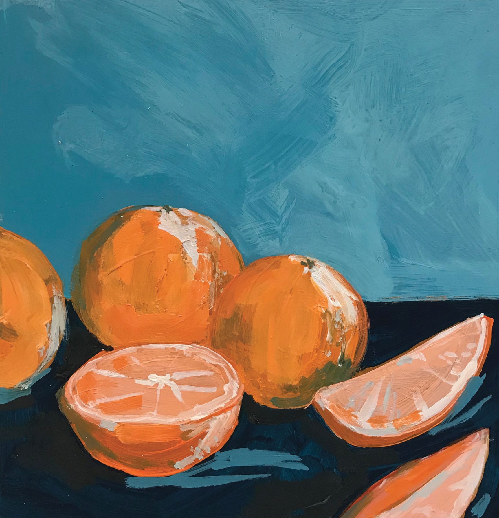
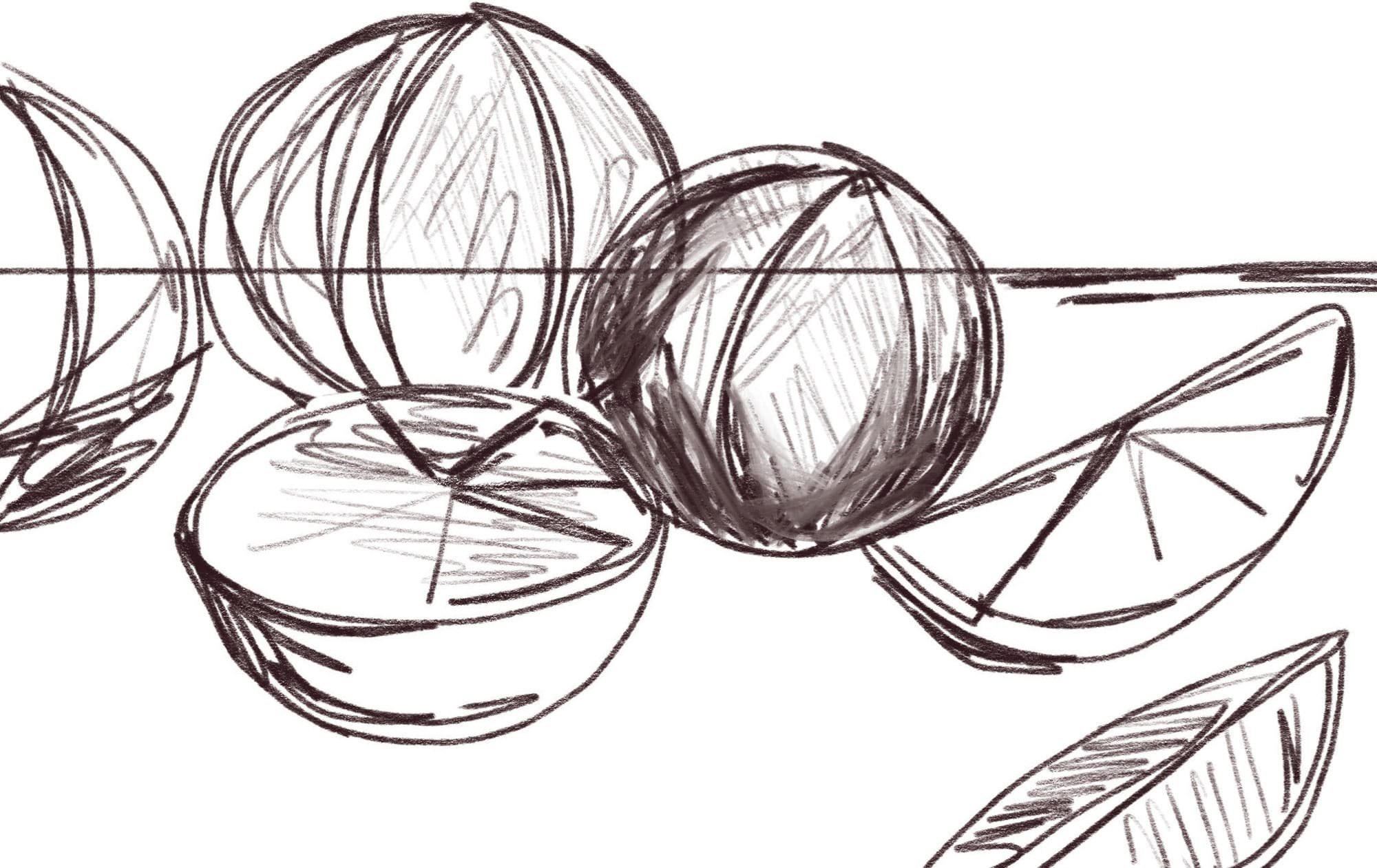
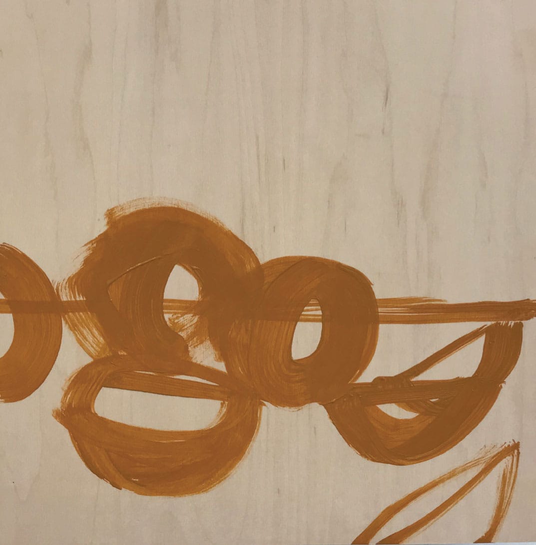
ACRYLIC ON PANEL
with Blakely Little
For this still life of oranges, let’s use a bold complementary color scheme that is vivid and full of contrast. The surface used here is a birchwood panel, but you can use canvas or canvas paper if you prefer.
STEP 1
Start with a sketch from life to build the shapes and determine the shadows and highlights.
STEP 2
On birchwood panel, use yellow ochre to create an underpainting of the oranges from the sketch.
STEP 3
Mix navy blue, using ultramarine blue and Payne’s gray, to paint the table. This color will make the orange look even brighter. Then add white to lighten the navy and fill in the back wall.

STEP 4
Use a medium orange color to work on the shapes of each orange. Using a flat paintbrush allows you to see the paint strokes, which help define the curves of the circular fruit.

STEP 5
Add white to the medium orange paint, and fill the insides of the cut oranges. Take a tiny dab of light orange and mix it with white to create the lightest shade of orange you can—almost white! Use a small filbert paintbrush for the reflections on the rinds of the whole oranges and to paint the membranes in the cut oranges.

STEP 6
Mix some navy with the orange and paint the shadows on the oranges; then dot where the stem once was. Use this color to roughly block in the cast shadows the oranges make on the table as well. With a stippling technique, use the lightest orange to create texture on the orange rinds. Finally, apply a wash of white on the background wall to show the light moving from one side to the other, making the right side brighter than the left side.