
Chapter 5
Beyond the Basics of User Interfaces
The previous chapter introduced the major concepts that you’ll need to build a BlackBerry user interface. Armed with what you learned, you can create a wide range of very functional applications. In this chapter, you’ll take a deeper dive into the BlackBerry API and learn how to really control all aspects of the look and feel of your application’s UI.
The topics in this chapter will get a bit more advanced, but you can handle it if you’ve followed through up to this point. We’ll be up front, though: you’ve already learned enough to put together a user interface that could support a lot of different applications, so if you want to skip this chapter for now and go on to learn about networking, persistence, and other services before spending time on your UI, then go ahead. Later topics don’t depend on this chapter, so skipping it for now won’t do any harm. We highly recommend that you do come back here before finally publishing your application, as the topics we’ll cover here will go a long way toward improving the appearance and overall user experience of your application.
In this chapter, you’ll take the UI Fun application you built in the last chapter as a starting point and modify a lot of the components that make up its user interface. You’ll focus a bit on some aspects of the API that we glossed over earlier (yes, we know we did) and explore fonts, colors, and more; this will give you a feel for what can be done. Of course, as with all things in this book, you should just look at this as the beginning. When you’re done here, you’ll have the tools and knowledge to implement almost any user interface that you can imagine and design.
Enhancing the UI Fun Application
You’re using the UI Fun application from Chapter 4. If you didn’t go through that entire chapter and build the application, we recommend you do so before continuing—to make sure you’ve got the solid hold on the UI fundamentals that you’ll need in this chapter. If you believe you’re comfortable enough but didn’t go all the way through, you can download the complete source code for the Chapter 4 version of UI Fun from this book’s web site.
The UI Fun application at this point should look like the one shown in Figure 5–1.

Figure 5–1. The UI Fun application from Chapter 4
When you’re done, your application will look more like the one shown in Figure 5–2.

Figure 5–2. The updated interface for the UI Fun application
Working with Fonts
The first and easiest thing to do is to change the font used in the UI components. The BlackBerry platform includes pretty good font support and makes it almost trivial to change the font used for a component or an entire screen.
Font support is provided through the net.rim.device.api.ui.Font and FontFamily classes. Through these, you can create fonts using any of the fonts installed on your device (quite a collection for all recent BlackBerry devices).
There are two ways to get a font. One is to obtain a specific font family (what might be called a typeface in different systems) and get a specific font from it. The other is to derive a font from another font you already have.
To get font from a font family, you must have an instance of that font family; this just involves the FontFamily.forName method. You can use any of the names of the families on your device; you can see these on the device by going to the device’s options screen and selecting Screen/Keyboard (see Figure 5–3). This also gives you a nice real-time preview of different font families, styles, and sizes.

Figure 5–3. A selection of the font families available on a BlackBerry device
To demonstrate BlackBerry font support, you’ll explicitly set a new font for UiFun. Starting with the code as at the end of Chapter 4, add the following imports to the top of UiFunMainScreen.java:
import net.rim.device.api.ui.Font;

import net.rim.device.api.ui.FontFamily;

import net.rim.device.api.ui.Ui;
The Ui class will be used in a minute; you’ve just added the import statement here to save time. You’ll use the BB Alpha Serif family, available on all devices, to more closely match the lettering in your logo image. Add the following to the UiFunMainScreen constructor:
try {

            FontFamily alphaSerifFamily = FontFamily.forName("BBAlpha Serif");

    } catch (ClassNotFoundException e) {

    }
This method won’t ever actually throw a ClassNotFoundException, though it’s a checked exception so the Java language requires you to add some code to handle it. If you specify a name for a font family that isn’t available, the BlackBerry will still return a default.
There are a few choices for font style (the standard bold, italic, underlined, and so on), defined as constants in the Font class. You can also specify font sizes in a few different ways; the main ones to be concerned with are points and pixels. The size unit is specified using one of the constants from the net.rim.device.api.ui.Ui class.
For your application, you’ll use a 9-point plain (not bold, italic, or underlined) version of BB Alpha Serif, like so:
Font appFont = alphaSerifFamily.getFont(Font.PLAIN, 9, Ui.UNITS_pt);
NOTE: Font sizes should generally be specified as points instead of pixels, because BlackBerry devices vary a great deal in screen resolution and physical size, or in other words, in dots per inch (DPI).A 10-pixel font may be acceptable on a BlackBerry Curve but will look tiny on the higher resolution screen of a BlackBerry Bold. Using points makes the fonts appear roughly the same physical size on these different devices.
Changing the screen’s font is straightforward.
setFont(appFont);
All the font code, added to UiFunMainScreen’s constructor, looks like this:
    public UiFunMainScreen() {

        try {

            FontFamily alphaSansFamily = FontFamily.forName("BBAlpha Serif");

            Font appFont = alphaSansFamily.getFont(Font.PLAIN, 9, Ui.UNITS_pt);

            setFont(appFont);

        } catch (ClassNotFoundException e) {

        }

        // ...

    }
Each screen, manager, and field can have a different font, but setting the font for a container (screen or manager) will generally have the effect of setting the font for everything contained within it, unless you specify a different font for some of the components using their setFont methods. All this means is that you don’t have to do anything else, and you’ve now specified a different font for all the controls in your application. Run UiFun, and you’ll see the new font in effect (see Figure 5–4).
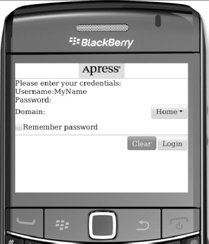
Figure 5–4. All elements, including text typed into the edit fields, are now using the new the BB Alpha Serif font.
Drawing to the Screen Using the Graphics Context
The basic interface for displaying anything to the BlackBerry device’s screen is the net.rim.device.api.ui.Graphics class. It’s used under the hood by pretty much all elements of the BlackBerry user interface, and it gives you the tools to do anything you’ve seen in any BlackBerry application’s user interface. If you’re going to be doing any kind of user interface work with BlackBerry applications, you should get very familiar with the Graphics class.
Each instance of Graphics is associated either with a Bitmap object or with a display (basically, a BlackBerry device’s physical screen). For this book, we’ll only focus on a Graphics object associated with a display.
Using the Paint Method
All fields (and managers and screens) get access to the Graphics object associated with the current display through the paint method. This method is called whenever the BlackBerry device determines that the section of the display containing the Field needs repainting. An important thing to bear in mind is that the same instance of the Graphics class is used by all managers and fields on a screen, and this instance is passed by the screen through its managers to the fields. This may seem a minor point, but it’s important to keep in mind as it’ll help in determining exactly why your application is drawing to the screen in a certain way. For example, setting the color on the Graphics object will affect the color of components drawn after it, unless they explicitly set their own colors.
Because it’s so important to understand how the UI is displayed by the BlackBerry platform, we’ll take time for a brief discussion here before getting to more concrete examples.
Understanding How the BlackBerry Screen Is Drawn
At a high level, things happen in two stages. First comes the layout stage, where layout and sublayout methods are called and all the fields are positioned and sized on the screen. Second is the paint stage, where paint methods are called and the fields actually draw to the display.
Laying Out the Screen
Layout involves positioning and sizing all the managers and controls on the screen. It starts with the screen itself and works down through all the nested managers and fields as follows:
- The screen’s
sublayout(int width, int height)method is called. Thewidthandheightparameters will be the width and height in pixels of the device’s display. - The
sublayoutmethod of the screen’s delegate manager is called. You’ll learn more about the delegate manager when you learn to build your own screen class, but briefly, it’s the component that actually contains and lays out all the fields and managers on the screen, and it’s the only component directly controlled by theScreenitself. Often, the delegate manager will take up the entire screen, but there are instances, such as in a dialog with a border, where this may not be the case. So thewidthandheightparameters passed to the delegate manager’ssublayoutmethod will be less than or equal to thewidthandheightparameters passed to the screen’ssublayoutmethod. - The delegate manager iterates through all the fields and managers it contains and lays out each of them; that is, it positions them within itself, tells them how much space is potentially available, and asks them what size they’ll be on screen. This has the effect of calling
sublayout(for a manager) orlayout(for a field). The width and height available to each of the fields and managers will vary depending on how the delegate manager lays out its fields. In many cases, they may be greater than the height and width of the delegate manager itself; this means that the delegate manager is a scrolling manager and will only draw a subset of its fields at any time. - Each manager lays out its managers, fields, and so on.
- Each field lays out itself out; a field may take up less than the space available.
Painting to the Screen
The painting stage is where pixels are actually drawn to the screen. In the same sequence as the layout stage, the screen, managers, and fields are all asked to paint themselves
- The screen’s
paintmethod is called, with a graphics context that represents the current display. - The screen may do some painting itself (drawing its background, for example) and then asks its delegate manager to paint itself, which has the effect of calling the delegate manager’s
paintmethod with the sameGraphicsobject. If the delegate manager is smaller than the screen, the screen will set a clipping region on theGraphicsobject to the size and position of the delegate. This prevents the delegate from drawing outside its size (set during layout) and frees the delegate from worrying about what its absolute position on screen is (which, in fact, it generally doesn’t know). - The delegate manager again may do some painting itself, and then asks each of its subfields and managers to paint themselves, setting appropriate clipping regions for each of its fields.
- Each manager paints itself and asks its managers and fields to paint themselves.
- Each field paints itself.
Another important thing to keep in mind is that layout happens rarely—generally when a screen is constructed or when fields are added or removed—while paint happens frequently. This means that you should be very concerned about the speed of your paint methods; slow paint methods will slow down your user interface and negatively affect your application’s user experience.
You should remember, in a nutshell, that
- Layout happens once (or rarely), and in this step fields size themselves and are positioned.
- Paint happens often, and in this step, fields draw their contents to the display.
Now that we’ve covered the framework, it’s time to fill in the details by actually implementing some custom fields, managers, and screens. Along the way, you’ll use a lot of the methods in the Graphics class and explore them as you encounter them.
Creating Custom Fields
You’ll create a couple of custom fields: first a simple, static, noninteractive one to introduce the concepts and then a more complicated one that deals with user interaction, focus, and events.
Adding a Custom Label Field
You’ll start by replacing the Please Enter Your Credentials field with one built from scratch that will use different foreground and background colors and contain a small image. It’s a simple field to make but will illustrate the basic concepts well.
Creating the Basic Field Class
Create a new class under the com.beginningblackberry.uifun package called CustomLabelField that subclasses net.rim.device.api.ui.Field. Here’s the basic outline, with placeholders for the two abstract methods that you’re required to implement for any field:
package com.beginningblackberry.uifun;


import net.rim.device.api.ui.Field;

import net.rim.device.api.ui.Graphics;

import net.rim.device.api.system.Bitmap;

import net.rim.device.api.ui.DrawStyle;


public class CustomLabelField extends Field {


    protected void layout(int width, int height) {

    }


    protected void paint(Graphics graphics) {

    }

}
Bitmap and DrawStyle will be used by the field a bit later; you just added the import statements now for convenience.
Creating a Constructor
You’ll now add a constructor and a few member variables to contain the label text and foreground and background colors (you’ll add the image shortly):
    private String label;

    private int foregroundColor;

    private int backgroundColor;


    public CustomLabelField(String label, int foregroundColor,

            int backgroundColor, long style) {

        super(style);
        this.label = label;

        this.foregroundColor = foregroundColor;

        this.backgroundColor = backgroundColor;

        }
NOTE: Colors on the BlackBerry are represented by ints. You can use one of the constants in the net.rim.device.api.ui.Color class to select a desired color, or specify a color in hexadecimal RRGGBB format (the same as in HTML), such as 0xFF0000 for red or 0x0000FF for blue.
The BlackBerry actually uses a 16-bit color model, with 5 bits for red, 6 for green, and 5 for blue. It’ll automatically select the closest color to whichever one you specify, but it may not appear exactly as on screen, and the apparent color can vary from device to device depending on screen characteristics. So be sure to test out your color choices on a range of real devices.
One final thing to notice in the constructor: there’s a style parameter so the user of this field can set styles. It’s a good idea when creating fields to provide at least one constructor where style flags can be set.
Adding the Layout Method
You’ll do something very simple for the layout method. Since you want your label field to span the width of the screen, you’ll just use the passed-in width parameter as your field width. Remember the width parameter tells how much space is available to your field. You’ll base the height on the height of the Field’s font.
    protected void layout(int width, int height) {

        setExtent(width, getFont().getHeight());

    }
Although it’s a simple method, there’s an important principle illustrated here: because there are a wide range of BlackBerry models, and default fonts and screen resolutions vary quite a bit, you should avoid specifying absolute sizes wherever possible. Instead, you should specify everything relative to the widths and heights available at runtime, including the widths and heights of the fonts being used. This will help a great deal in getting your application to run on a different model of BlackBerry. By doing things this way, you could go back and select a different font for your screen, and you wouldn’t have to change this layout method.
After calling setExtent, the getWidth and getHeight methods in your field will return the values you set; this is how the manager containing this field will now how to lay out the field in relation to all the other fields it manages and how it will know how much space to give the field to paint.
Adding the Paint Method
To draw text to the display, just use the following:
    protected void paint(Graphics graphics) {

        graphics.drawText(label, 0, 0);

    }
You don’t have to worry about setting a specific font. The Graphics object will have its font set to the field’s current font, meaning that the font that you set earlier in UiFunMainScreen is already the current font for this graphics object. Now, let’s set the foreground and background colors. Make sure to clear the field to the background color before you draw the text.
    protected void paint(Graphics graphics) {

        graphics.setBackgroundColor(backgroundColor);

        graphics.clear();

        graphics.setColor(foregroundColor);

        graphics.drawText(label, 0, 0);

    }
And that’s almost everything you need to do; in fact, at this point, you can try out the label field in the application.
Trying Out the Label Field
In The UiFunMainScreen, add an import to net.rim.device.api.ui.Color and in the constructor, replace this line
add(new LabelField("Please enter your credentials:"));
with this one
        add(new CustomLabelField

          ("Please enter your credentials:", Color.WHITE, 0x999966, 0));
And the application will have a label with a different foreground and background (0x999966 is kind of a dark tan color), as shown in Figure 5–5.

Figure 5–5. Using your custom label
Adding an Image
Now you’ll add the ability to display an image to the left of the text. You’ll create another constructor with a Bitmap parameter, and if this is specified, the Bitmap will be drawn at the left edge of the field, and the text will be shifted over to accommodate it. Let’s start with the additional member variable and the alternate constructor.
public class CustomLabelField extends Field {

    private Bitmap image;

    private String label;

    private int foregroundColor;

    private int backgroundColor;


    public CustomLabelField(String label, int foregroundColor,

            int backgroundColor, Bitmap image, long style) {

        super(style);

        this.label = label;

        this.foregroundColor = foregroundColor;

        this.backgroundColor = backgroundColor;

        this.image = image;

    }
You’ll make a small change to the layout method to handle the case where the image is taller than the font.
    protected void layout(int width, int height) {

        if (image != null) {

            setExtent(width, Math.max(image.getHeight(), getFont().getHeight()));

        }

        else {
            setExtent(width, getFont().getHeight());

        }

    }
And you’ll need to make another small change to the paint method. If you were given a bitmap, you’ll draw it and set the x parameter to drawText to the right of the bitmap. You’re also doing something else here: if the bitmap is taller than the font, you want the text centered vertically. Similarly, if the font is taller, you want the bitmap centered vertically. The algorithm in both cases is the same.
position = (Field height -- item height) / 2
This is a good one to keep at hand; you’ll end up using it often in your user interfaces (or the equivalent for horizontal centering).
The new paint method looks like this:
    protected void paint(Graphics graphics) {

        graphics.setBackgroundColor(backgroundColor);

        graphics.clear();

        graphics.setColor(foregroundColor);

        if (image != null) {

            int textY = (getHeight() - getFont().getHeight()) / 2;

            int imageY = (getHeight() - image.getHeight()) / 2;

            graphics.drawBitmap(0, imageY, image.getWidth(), image.getHeight(),

                    image, 0, 0);

            graphics.drawText(label, image.getWidth(), textY);

        }

        else {

            graphics.drawText(label, 0, 0);

        }

    }
Graphics.drawBitmap is another good method to know. Its parameters let you draw part of a bitmap or a full bitmap, and it automatically takes into account image transparency, as you’ll see when you put this new field to use with a partially transparent image.
Trying the New CustomLabelField
You’ll change UiFunMainScreen’s constructor again to use CustomLabelField’s new constructor. You’ll have to add a line to load the bitmap first, and add that bitmap to the project as before. You can get the image we’re using here from this book’s web site.
The new lines for the constructor follow:
        Bitmap loginImage = Bitmap.getBitmapResource("res/login_arrow.png");

        add(new CustomLabelField

          ("Please enter your credentials:", Color.WHITE, 0x999966, loginImage, 0));
And running the application, you’ll see the image and text together, as illustrated in Figure 5–6.
Figure 5–6. The label showing your image
Tying Up Some Loose Ends
The field works now. In the end, when you’re building a field for your application, all that matters is that it works where you want it to work. You’ll fill in a couple of details here, though, to make the CustomLabelField truly complete and to illustrate a few additional concepts.
First, there are two methods which you should override but don’t absolutely have to: getPreferredWidth and getPreferredHeight. These are used by some layout managers to help with determining field layout before a given field has had a chance to lay itself out. They let the manager know how much space the field needs ideally. There’s no guarantee the manager will give the field that much space or even call the methods, but they’re easy to implement for your field, so for completeness, you’ll implement them. Note that getPreferredHeight is just the same algorithm you used in layout.
    public int getPreferredHeight() {

        if (image != null) {

            return Math.max(getFont().getHeight(), image.getHeight());

        }

        else {

            return getFont().getHeight();

        }

    }
The getPreferredWidth method is a bit trickier. Since you don’t know the width available, you’ll have to come up with a sensible value; in this case, you’ll use the total width of the text in the field’s font, plus the width of the image (if any).
    public int getPreferredWidth() {

        int width = getFont().getAdvance(label);

        if (image != null) {

            width += image.getWidth();

        }

        return width;

    }
The Font.getAdvance method just tells you the width, in pixels, needed to render the given string in that font.
Let’s take another look at layout. Two parameters were passed in, but you ignored the height parameter. What if the available height is less than the height needed for the font or image? It turns out the BlackBerry API will let you set a height that’s bigger than the available height but will clip the field when it’s drawn. Basically the paint method would think it had more space than it actually did, which would definitely lead to some drawing bugs. Given your field and application, it’s unlikely you’ll ever actually run into problems with the available height, but it does come into play with other fields, so let’s modify the layout method to respect the height parameter. You can also take this opportunity to eliminate some code replication. Since getPreferredHeight uses exactly the same algorithm as layout, just call getPreferredHeight, and if the height passed to layout is less than that, cap the size at the smaller height.
    protected void layout(int width, int height) {

        set Extent(width, Math.min(height, getPreferredHeight()));

    }
Finally, what if the text is wider than the available width? This isn’t unlikely; with a slightly larger font, wider image, or narrower screen, you could run out of room easily. Right now, the text will just cut off wherever the screen ends, even in the middle of a letter. Without getting into anything fancy, like text wrapping, you can use another version of Graphics.drawText that allows you to specify the width available for the text and set a flag to draw an ellipsis (. . .) at the end of your text if it exceeds the given space.
    protected void paint(Graphics graphics) {

        graphics.setBackgroundColor(backgroundColor);

        graphics.clear();

        graphics.setColor(foregroundColor);

        if (image != null) {

            int textY = (getHeight() - getFont().getHeight()) / 2;

            int imageY = (getHeight() - image.getHeight()) / 2;

            graphics.drawBitmap(0, imageY, image.getWidth(), image.getHeight(),

                    image, 0, 0);

            graphics.drawText(label, image.getWidth(), textY, DrawStyle.ELLIPSIS,

                    getWidth()-image.getWidth());

        }

        else {

            graphics.drawText(label, 0, 0, DrawStyle.ELLIPSIS, getWidth());

        }

    }
Now, if the label is too long, at least it’ll look a bit better (see Figure 5–7).

Figure 5–7. The CustomLabelField demonstrating the ellipsis
Finally, let’s revisit the layout method briefly. You made the field always take up the entire width available to it. What if you didn’t want that behavior? How would the application using the field specify its behavior? Take a look at the field style flags available in the Field class. There’s one called USE_ALL_WIDTH. Let’s alter layout so that the label field only uses the full with of the screen if this flag is specified. The change is simple.
    protected void layout(int width, int height) {

        if ((getStyle() & Field.USE_ALL_WIDTH) == Field.USE_ALL_WIDTH) {

            setExtent(width, Math.min(height, getPreferredHeight()));

        }

        else {

            setExtent(getPreferredWidth(), getPreferredHeight());

        }

    }
Again, you can use getPreferredWidth, because it already provides the width of the image (if any) plus the text.
Finally, to make sure the label on the login screen still spans the entire width, you’ll make a slight change to UiFunMainScreen’s constructor, to pass in Field.USE_ALL_WIDTH as the style flag.
          add(new CustomLabelField

            ("Please enter your credentials:", Color.WHITE, 0x999966, loginImage,

Field.USE_ALL_WIDTH));
Congratulations, you’ve created your first custom field! You can take the appearance as far as you want (exploring the Graphics class may give you some ideas), but you understand the basics of building a field, except for one crucial piece: how to interact with the user. To illustrate that, you’ll replace your application’s buttons with something a bit different and learn how to create fields that a user can interact with.
Creating a Custom Button Field
To create your new buttons, you’ll again start from scratch. Because you just worked through the basics of drawing a field, let’s focus only on areas that are different when creating an interactive field.
Laying Out the Interface
Let’s start with the parts that you already know—the layout and paint methods. In this case, you want a size that’s a bit bigger than the text, because you’re going to draw a background for the button that extends beyond the text by a few pixels.
You also want to leave one pixel of blank space around the outside of the button, so the two buttons appear well spaced when they’re next to each other on the screen. Figure 5–8 illustrates the horizontal sizing of the button relative to the text; the vertical layout is similar.
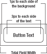
Figure 5–8. The horizontal dimensions of the custom button field
So, for the layout method, just add 8 pixels (4 on each side) to the font advance for the button’s text, and add 8 pixels to the font height to get the field’s size. Create a new class called CustomButtonField; the initial code should look like the following:
    package com.beginningblackberry.uifun;


    import net.rim.device.api.ui.Color;

    import net.rim.device.api.ui.Field;

    import net.rim.device.api.ui.Graphics;

    import net.rim.device.api.ui.Keypad;


    public class CustomButtonField extends Field {

        private String label;

        private int backgroundColor;

        private int foregroundColor;
    public CustomButtonField(String label, int foregroundColor,

            int backgroundColor, long style) {

        super(style);

        this.label = label;

        this.foregroundColor = foregroundColor;

        this.backgroundColor = backgroundColor;

    }


    public int getPreferredHeight() {

        return getFont().getHeight() + 8;

    }


    public int getPreferredWidth() {

        return getFont().getAdvance(label) + 8;

    }


    protected void layout(int width, int height) {

        setExtent

          (Math.min(width, getPreferredWidth()), Math.min(height,

getPreferredHeight()));

    }

}
Painting the Buttons
Instead of clearing the whole field to the background color, you’ll just draw a rounded rectangle of the given background color, and draw the text on top of that. You’ll have to come back to paint when you make this field focusable, but for now, to get something on screen, the paint method looks like this:
    protected void paint(Graphics graphics) {

        graphics.setColor(backgroundColor);

        graphics.fillRoundRect(1, 1, getWidth()-2, getHeight()-2, 12, 12);

        graphics.setColor(foregroundColor);

        graphics.drawText(label, 4, 4);

    }
Taking a Look
Replace the ButtonFields in UiFunMainScreen with CustomButtonFields, and you’ll see how the buttons look so far. In UiFunMainScreen’s constructor, change the class for the button declarations from ButtonField to CustomButtonField.
CustomButtonField clearButton;

CustomButtonField loginButton;
Then, in UiFunMainScreen’s constructor replace the following lines
clearButton = new ButtonField("Clear", ButtonField.CONSUME_CLICK);

clearButton.setChangeListener(this);

loginButton = new ButtonField("Login", ButtonField.CONSUME_CLICK);

loginButton.setChangeListener(this);
with these lines
clearButton = new CustomButtonField("Clear", Color.WHITE, Color.LIGHTGRAY, 0);

clearButton.setChangeListener(this);

loginButton = new CustomButtonField("Login", Color.WHITE, Color.LIGHTGRAY, 0);

loginButton.setChangeListener(this);
Running the application, you’ll see, as you should expect by now, your buttons drawn to the screen as illustrated in Figure 5–9.
Figure 5–9. Two buttons, rounded rectangles with text—no surprises
If you try to use the application now, however, you’ll notice a big difference; you can no longer select the buttons!
Making the Button Focusable
Because most BlackBerry devices use a trackball as their navigation method, the concept of focus is very important. The field with focus is the one that receives events from the user interface and has the first chance to respond to them. (Even the BlackBerry Torch preserves the notion of focus, though having focus is not as critical. When you lightly tap the screen on top of a field, it receives focus.)
To make the button focusable, you’ll just override isFocusable in CustomButtonField to return true.
public boolean isFocusable() {

    return true;

}
Now, you’ll be able to move the focus down to the buttons, but the visual representation shown in Figure 5–10 is not what you want.

Figure 5–10. Custom button fields with the default focus drawing behavior
Drawing the Focus
The default focus behavior for the BlackBerry is to invert pixels that are in the background color. This look is fine for many types of fields, but for your button field, you want to change the button to a color that the user specifies at instantiation time.
First, add a couple of member variables, so you can specify the color of the focused button’s text and background.
private int focusedForegroundColor;

private int focusedBackgroundColor;


public CustomButtonField(String label, int foregroundColor,

        int backgroundColor, int focusedForegroundColor,

        int focusedBackgroundColor, long style) {

    super(style);

    this.label = label;

    this.foregroundColor = foregroundColor;

    this.backgroundColor = backgroundColor;

    this.focusedForegroundColor = focusedForegroundColor;

    this.focusedBackgroundColor = focusedBackgroundColor;

}
Now, disable the default focus behavior so that blue rectangle isn’t drawn. To do this, just override drawFocus and have it do nothing.
protected void drawFocus(Graphics graphics, boolean on) {

}
Field has a method called isFocus that lets you determine if the field is in focus while you’re painting. You’ll make use of this in your paint method to draw the button in different colors when it’s in focus. To illustrate a little bit more about drawing using the Graphics object, you’re also going to add a shine effect to your focused button by drawing a semitransparent white rounded rectangle on top of the button background.
    protected void paint(Graphics graphics) {

        if (isFocus()) {

            graphics.setColor(focusedBackgroundColor);

            graphics.fillRoundRect(1, 1, getWidth()-2, getHeight()-2, 12, 12);

            graphics.setColor(Color.WHITE);

            graphics.setGlobalAlpha(100);

            graphics.fillRoundRect(3, 3, getWidth()-6, getHeight()/2, 12, 12);

            graphics.setGlobalAlpha(255);

            graphics.setColor(focusedForegroundColor);

            graphics.drawText(label, 4, 4);

        }

        else {

            graphics.setColor(backgroundColor);

            graphics.fillRoundRect(1, 1, getWidth()-2, getHeight()-2, 12, 12);

            graphics.setColor(foregroundColor);

            graphics.drawText(label, 4, 4);

        }

    }
Transparency is specified through the setGlobalAlpha method on the Graphics object. It takes an int that can range from 0 for fully transparent to 255 for fully opaque and affects all subsequent drawing operations with that Graphics object, so be sure to reset the alpha value to 255 before the end of your paint method, or you may see some strange effects in your application.
Finally, you need to have the button repaint when its focus state changes. This doesn’t happen automatically, so you need to override onFocus and onUnfocus to explicitly invalidate the field. Be sure to call the superclass versions of these methods to maintain the focus behavior.
    protected void onFocus(int direction) {

        super.onFocus(direction);

        invalidate();

    }


    protected void onUnfocus() {

        super.onUnfocus();

        invalidate();

    }
Changing the button initialization in UiFunMainScreen’s constructor, you’ll specify a green and yellow color scheme for your buttons if they have focus.
clearButton = new CustomButtonField
          ("Clear", Color.WHITE, Color.LIGHTGRAY, Color.YELLOW, Color.GREEN, 0);

        clearButton.setChangeListener(this);

        loginButton = new CustomButtonField

          ("Login", Color.WHITE, Color.LIGHTGRAY, Color.YELLOW, Color.GREEN, 0);

        loginButton.setChangeListener(this);
Now everything will look a lot better (see Figure 5–11).
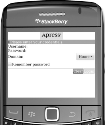
Figure 5–11. Custom focus appearance
So now you have buttons that look as you want them to when focused, but when you click them, nothing happens. The final piece to put in place is to have each trackball or touch screen click fire a field-changed event.
Handling Events
Fortunately, the API makes event handling very easy. All you have to do is override navigationClick and call fieldChangeNotify. The API takes care of handling the listener and calling its fieldChanged method.
    protected boolean navigationClick(int status, int time) {

        fieldChangeNotify(0);

        return true;

    }
The status parameter is unimportant for your purposes, but comparing it against values defined in net.rim.device.api.system.KeypadListener would let you determine if the Alt, Shift, or other keys were being pressed while the user clicked your field.
Returning true from this method lets the framework know that you handled this event, so no one else should respond to it.
Finally, the BlackBerry ButtonField also fires an event when the user presses the Enter key while the field has focus. You’ll implement that behavior by overriding keyChar.
    protected boolean keyChar(char character, int status, int time) {

        if (character == Keypad.KEY_ENTER) {

            fieldChangeNotify(0);

            return true;

        }

        return super.keyChar(character, status, time);

    }
The Enter key is the only one this field should handle, so you fire a field changed event and return true if that’s the case. Otherwise, you call the superclass’s method that will allow other interested components to handle this keypress if they want. Trying it out, you’ll get the same results as with the BlackBerry ButtonField class, as shown in Figure 5–12.

Figure 5–12. The fully functional CustomButtonField
Now you’ve got a fully customized button field that acts like a built-in ButtonField.
A Review of Custom Fields
You can extend the concepts here to make your buttons include images, have different fonts, or anything else your application requires. The same concepts will also let you create many different types of fields.
Remember, when implementing a field from scratch, you should be concerned with these methods:
paintlayout
And when creating an interactive field, you should override at least these methods as well:
isFocusableonFocusonUnfocusdrawFocusnavigationClickkeyChar
Creating Custom Managers
Now, turn your attention to the username, password, and domain fields. You want the labels to line up to the right. To do that, you’ll have to make two changes. The first is easy—you’ll stop using the built-in labels of the EditFields and ObjectChoiceField and replace them with LabelFields. You’ll use HorizontalFieldManagers as you do for the buttons to keep the labels and edit fields on the same line. The new code for the rest of UiFunMainScreen constructor, starting from the instantiation of userNameField, is as follows:
usernameField = new EditField("", "");

LabelField usernameLabel = new LabelField("Username:", Field.FIELD_RIGHT);

HorizontalFieldManager usernameManager = new HorizontalFieldManager();

usernameManager.add(usernameLabel);

usernameManager.add(usernameField);

passwordField = new PasswordEditField("", "");

LabelField passwordLabel = new LabelField("Password:", Field.FIELD_RIGHT);


HorizontalFieldManager passwordManager = new HorizontalFieldManager();

passwordManager.add(passwordLabel);

passwordManager.add(passwordField);

domainField = new ObjectChoiceField("", new String[] {"Home", "Work"});

LabelField domainLabel = new LabelField("Domain:", Field.FIELD_RIGHT);

HorizontalFieldManager domainManager = new HorizontalFieldManager();

domainManager.add(domainLabel);

domainManager.add(domainField);
add(usernameManager);

        add(passwordManager);

        add(domainManager);
You’ve given the labels the Field.FIELD_RIGHT style, which will be important later but doesn’t affect the appearance because of the way the horizontal field managers function in this configuration. The appearance of the application is the same as before, but the horizontal field managers are outlined to clarify the discussion that will follow (see Figure 5–13).

Figure 5–13. Separate labels and fields in horizontal field managers
One quick way to get the labels and fields to line up the way you want them is to create two vertical field managers, one for the labels and one for the fields. You can rely on the fact that the fields and labels are the same height to make them line up vertically. The two vertical field managers go inside one horizontal field manager, which is added to the screen. We’re not going to pursue this, but for illustrative purposes Figure 5–14 shows how the screen looks, again with the managers outlined.

Figure 5–14. Using vertical field managers to line up the components
That looks pretty good. So what’s the problem? You’re relying on the fact that the label fields are the same height as the other fields. This is not guaranteed—a fact we can illustrate by typing in a long username, as shown in Figure 5–15.

Figure 5–15. Knocking the fields out of alignment
What you really want is a grid of labels and fields. You’ll do this by creating a grid field manager.
Creating a Manager
Managers are, in many ways, simpler to implement than fields. You’re only required to implement one method, sublayout, and unless you’re doing something really complex, the basic net.rim.device.api.ui.Managerpaint method will still work and draw your fields wherever you positioned them.
Managers do have to be concerned with things like moving the focus from field to field, but if you’re clever enough about things, you won’t have to worry about handling that yourself either. The functionality that net.rim.device.api.ui.Manager provides will be enough.
Understanding GridFieldManager
GridFieldManager under the package net.rim.device.api.ui.container is a field that you can use if you need a table or grid control in your screen. This field is an extension of the Manager class. To illustrate how easy it is to create your own custom field layout using the Manager class, you’ll create your own GridFieldManager. Your GridFieldManager will let the user specify a number of grid columns when it’s instantiated. The number of rows will vary depending on the number of fields added.
For a horizontal or vertical manager, it’s clear where fields are positioned, either left to right or top to bottom in the order they’re added (ignore insert for now). For a grid manager, it’s not as clear which way you should add them. Should they be added left to right, then top to bottom, or the other way around? Let’s just choose to go left to right and then top to bottom, as shown in Figure 5–16.
Figure 5–16. This is the field layout for the grid manager; the numbers represent the order the fields are added to the manager.
Implementing the Basic Framework
You’ll subclass directly from net.rim.device.api.ui.Manager and build the Manager from scratch. The only thing you’ll need to keep track of is the number of columns. The Manager class already maintains the list of fields for you.
package com.beginningblackberry.uifun;


import net.rim.device.api.ui.Field;

import net.rim.device.api.ui.Manager;


public class GridFieldManager extends Manager {

    private int numColumns;
    public GridFieldManager(int numColumns, long style) {

        super(style);

        this.numColumns = numColumns;

    }


    protected void sublayout(int width, int height) {

    }

}
Implementing the Sublayout Method
All the magic in a manager happens in the sublayout method. It’s similar to a field’s layout method, down to the requirement that you call setExtent within the method to set the manager’s size (and in fact, behind the scenes, the manager’s layout method calls sublayout). Remember, a manager is ultimately a type of field.
The other requirement in a manager’s sublayout method is that you position and size all the fields contained by the manager. This is done through the layoutChild and setPositionChild methods. The layoutChild method will result more or less directly in a call to the child field’s layout method, meaning that before you call layoutChild the child field will return 0 from getWidth and getHeight.
Here’s where you have to think about exactly how you’ll determine how wide each column should be. In this case, you’re using the manager in a limited fashion, and you control how it’s used. Therefore, you can make some assumptions about the types of fields that will be contained; specifically, you can ensure that fields will in general all be able to fit in a row across the screen. When designing general-purpose managers, many of these design decisions can quickly become very complex; it’s usually good practice to keep in mind where you’re going to be using your manager and design to that, rather than attempting to design for the general case right away.
You’ll also assume that you don’t have to worry about having enough vertical space for the manager. In fact, if you end up in a constrained vertical space, the manager will just be cut off at the bottom, and it’s not certain that you could really do much better than that.
So your manager’s sublayout method will do the following:
- Go through the fields in the first (leftmost) column and call
layoutChildon each one to get an accurate width and height. - Determine the width of the first column from the maximum width of all the fields.
- Subtract that width from the total available, and continue to the fields in each column in turn, left to right.
- Set the position for all fields in the first row based on the column widths.
- Set the position for all fields in the second row based on the column widths and the maximum height of all the fields in the first row, and continue top to bottom for all the rows.
- Set the extent of the field based on the total width of all columns and the total height of all rows.
Clear? Here’s how all the code looks:
    protected void sublayout(int width, int height) {

        int[] columnWidths = newint[numColumns];

        int availableWidth = width;

        int availableHeight = height;


        // For each column size all the fields and get the maximum width

        for(int column = 0; column <numColumns; column++) {

            for

            (int fieldIndex = column; fieldIndex < getFieldCount(); fieldIndex +=

numColumns){

                Field field = getField(fieldIndex);

                layoutChild(field, availableWidth, availableHeight);

                if (field.getWidth() > columnWidths[column]) {

                    columnWidths[column] = field.getWidth();

                }


            }


            availableWidth -= columnWidths[column];

        }


        int currentRow = 0;

        int currentRowHeight = 0;

        int rowYOffset = 0;


        // Set the position of each field

        for(intfieldIndex = 0; fieldIndex< getFieldCount(); fieldIndex++) {

            Field field = getField(fieldIndex);

            if (fieldIndex % numColumns == 0) {

                setPositionChild(field, 0, rowYOffset);

            }

            else {

                setPositionChild

                  (field, columnWidths[(fieldIndex % numColumns) - 1], rowYOffset);

            }


            if (field.getHeight() > currentRowHeight) {

                currentRowHeight = field.getHeight();

            }


            if (fieldIndex % numColumns == numColumns - 1) {

                currentRow ++;

                rowYOffset += currentRowHeight;

                currentRowHeight = 0;

            }

        }


        int totalWidth = 0;

        for(int i = 0; i < numColumns; i++) {
            totalWidth += columnWidths[i];

        }

        setExtent(totalWidth, rowYOffset + currentRowHeight);

    }
There’s a lot to this method, so let’s walk through it. The first for loop iterates through all the fields in the manager, one column at a time, and calls layoutChild on each one to set its size.
for(int column = 0; column < numColumns; column++) {

  for(int fieldIndex = column; fieldIndex < getFieldCount(); fieldIndex += numColumns) {
If you have a two-column grid with six fields, you go through the fields in this order (starting with 0):
Column 0:

   0

   2

   4

Column 1:

   1

   3

   5
For each column, you lay out all the fields in whatever width you have available, and then take the maximum width as the column width. You subtract that width from the total remaining width to get the available width for the next columns.
Once you’ve determined the column widths, the next for loop again goes through all the fields in the manager to position them on screen using setPositionChild.
for(int fieldIndex = 0; fieldIndex < getFieldCount(); fieldIndex++) {

            Field field = getField(fieldIndex);

            if (fieldIndex % numColumns == 0) {

                setPositionChild(field, 0, rowYOffset);

            }

            else {

                setPositionChild

                  (field, columnWidths[(fieldIndex % numColumns) - 1], rowYOffset);

            }
You have the column widths already so you know where they should be positioned horizontally. As you lay out each row, keep track of the field with the largest height in that row, and use that as the row height.
if (field.getHeight() > currentRowHeight) {

    currentRowHeight = field.getHeight();

}
When you’re at the last field of a row (where the index is one less than a multiple of the number of columns), you shift the vertical position for the next row downward, and start over again.
            if (fieldIndex % numColumns == numColumns - 1) {

                currentRow ++;

                rowYOffset += currentRowHeight;

                currentRowHeight = 0;

            }
Finally, you set the size for the manager by adding up all the column widths and taking the total of all the row heights.
        int totalWidth = 0;

        for(int i = 0; i < numColumns; i++) {

            totalWidth += columnWidths[i];

        }

        setExtent(totalWidth, rowYOffset + currentRowHeight);
Seeing the Grid Field Manager in Action
OK, now let’s see how the grid looks. You’ll modify UiFunMainScreen’s constructor again to use the grid field manager to hold the separate labels and edit fields.
usernameField = new EditField("", "");

LabelField usernameLabel = new LabelField("Username:", Field.FIELD_RIGHT);

passwordField = new PasswordEditField("", "");

LabelField passwordLabel = new LabelField("Password:", Field.FIELD_RIGHT);


domainField = new ObjectChoiceField("", new String[] {"Home", "Work"});

LabelField domainLabel = new LabelField("Domain:", Field.FIELD_RIGHT);


GridFieldManager gridFieldManager = new GridFieldManager(2, 0);

gridFieldManager.add(usernameLabel);

gridFieldManager.add(usernameField);

gridFieldManager.add(passwordLabel);

gridFieldManager.add(passwordField);

gridFieldManager.add(domainLabel);

gridFieldManager.add(domainField);


add(gridFieldManager);
Remember, because you’ve instantiated a two-column grid, the labels will all appear in the left column and the edit fields on the right.
Start the simulator, and you should see something like Figure 5–17.
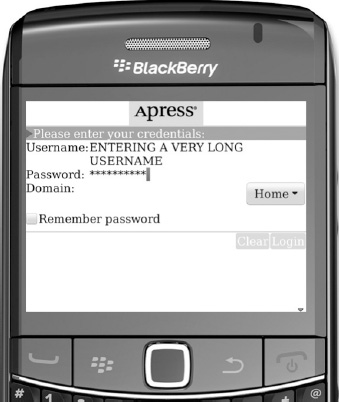
Figure 5–17. Using the first version of the grid field manager
You’re doing better already. The username can wrap, and all the labels stay aligned with the field. Incidentally, if you’re paying attention, you might realize that when the text in the username field wraps, it causes the screen’s layout method to be run again. This behavior is fine and expected: layout happens infrequently, but it does happen.
Aligning the Labels
There’s one problem, though. While the edit fields are aligned properly, the labels are still aligned to the left, rather than the right, despite the fact that you gave them the Field.FIELD_RIGHT styles. Remember earlier that we mentioned that styles were dependent on the field and the manager? The GridFieldManager has to explicitly support the FIELD_RIGHT style to get the alignment to work the way you expect it to. The change is simple. If the field has the FIELD_RIGHT style set, you just need to shift it to the right by the width of the column minus the width of the field. In sublayout, replace the following lines
            if (fieldIndex % numColumns == 0) {

                setPositionChild(field, 0, rowYOffset);

            }

            else {

                setPositionChild

                  (field, columnWidths[(fieldIndex % numColumns) - 1], rowYOffset);

            }
with these
            int fieldOffset = 0;

            if ((field.getStyle() & Field.FIELD_RIGHT) == Field.FIELD_RIGHT) {

                fieldOffset = columnWidths[fieldIndex % numColumns] - field.getWidth();

            }

            if (fieldIndex % numColumns == 0) {

                setPositionChild(field, 0 + fieldOffset, rowYOffset);

            }

            else {

                setPositionChild

                  (field, columnWidths[(fieldIndex % numColumns) - 1] + fieldOffset,

rowYOffset);

            }
Now, the manager positions all of the label fields correctly (see Figure 5–18).

Figure 5–18. The labels are aligned on the right. Notice that wrapping is supported for the password field, too.
If you wanted to support Field.FIELD_HCENTER, the change would be similar. We’ll leave that as an exercise for you.
Focus Movement
If you play with this application, you’ll notice that the focus moves as you’d expect it to: when the cursor is in the username field, scrolling down or right will move the cursor to the password field and then to the domain drop-down. This is because of the default focus movement behavior, which is to use the order the fields are added to the manager as the focus order and to move to later fields in the focus order when the trackball is moved right or down and to earlier fields when the trackball is moved left or up.
This behavior wouldn’t work if you had more than one column of focusable fields in your manager. Imagine you have two columns of focusable fields. Figures 5–19 through 5–22 illustrate the focus movement problems. The numbers represent the order in which the fields are added to the grid field manager.
Figure 5–19. The grid field manager with six fields. Fields 2, 3, 5, and 6 are focusable.
Figure 5–20. Field 2 has focus initially.
Figure 5–21. A rightward trackball movement correctly moves the focus from field 2 to field 3.
Figure 5–22. A downward trackball movement moves the focus from field 3 to field 5, which is not the behavior you expect.
This problem exists because the default focus-moving algorithm doesn’t take into account field position on the screen, only field order within the manager. So moving right and down are considered to be the same action. You can fix this by overriding navigationMovement in the manager, but the discussion about how to do so is beyond the scope of this book. The source code available on the book’s web site includes a sample implementation for moving focus in a grid field.
Tidying Up the Login Success Screen
Now that you’ve got a few components, let’s revisit LoginSuccessScreen. First, let’s add the following import statements:
import net.rim.device.api.ui.component.SeparatorField;

import net.rim.device.api.ui.Color;

import net.rim.device.api.ui.Field;

import net.rim.device.api.ui.Font;

import net.rim.device.api.ui.FontFamily;

import net.rim.device.api.ui.Ui;
With some simple modifications to the constructor to use your CustomLabelField and GridFieldManager, you can make the screen look a little better.
    public LoginSuccessScreen(String username, String domain) {

        try {

            FontFamily alphaSansFamily = FontFamily.forName("BBAlpha Serif");

            Font appFont = alphaSansFamily.getFont(Font.PLAIN, 9, Ui.UNITS_pt);

            setFont(appFont);

        } catch (ClassNotFoundException e) {

        }


        add(new CustomLabelField("Logged In!", Color.WHITE, 0x999966,

Field.USE_ALL_WIDTH));

        add(new SeparatorField());

        GridFieldManager gridFieldManager = new GridFieldManager(2, 0);

        gridFieldManager.add

          (new CustomLabelField("Username:", Color.BLACK, Color.WHITE,

Field.FIELD_RIGHT));

        gridFieldManager.add

          (new CustomLabelField(username, Color.BLACK, Color.LIGHTGRAY,

Field.USE_ALL_WIDTH));

        gridFieldManager.add

          (new CustomLabelField("Domain:", Color.BLACK, Color.WHITE,

Field.FIELD_RIGHT));

        gridFieldManager.add

          (new CustomLabelField(domain, Color.BLACK, Color.LIGHTGRAY,

Field.USE_ALL_WIDTH));

        add(gridFieldManager);

    }
Here, you’ve moved the username and domain labels and values into a grid, similar to the main screen. Notice that you’ve given the right column labels the Field.USE_ALL_WIDTH value, which, in combination with the sublayout method of the grid field manager, will make them use the entire screen width except for the space taken by the first column. Go back and see if you can figure out why, and try to figure out what would happen if you applied Field.USE_ALL_WIDTH to the labels for the first column.
One last thing before you run the app: in the UiFunMainScreen.login method, reenable LoginSuccessScreen by uncommenting the lines that instantiates loginSuccessScreen and push the loginSuccessScreen instead of new Album. This portion of the code should look like this:
LoginSuccessScreen loginSuccessScreen =

        new LoginSuccessScreen(username, selectedDomain);


            UiApplication.getUiApplication().pushScreen(loginSuccessScreen);
Now, run the app, enter the username and password, and click Login. You’ll see a screen that look something like Figure 5–23.

Figure 5–23. The redone login success screen
You should now be familiar with how to make fields and managers. That leaves one more piece of the visual BlackBerry user interface to cover: screens.
Creating a Custom Screen
You’re actually using three screens in your UI Fun application already. Two are obvious: UiFunMainScreen and the login success screen. The third is the dialog that appears when you try to log in without entering a username and password (see Figure 5–24).

Figure 5–24. The login dialog is a screen, too.
A screen on the BlackBerry doesn’t have to take up the entire display; other screens can be visible below it. All screens, however, do take over the user input. That is, any keypresses, trackball presses, or touch screen taps only go to whatever screen is currently active and on top of the display stack. The active screen is also the one that controls the menu.
All screens are derived from net.rim.device.api.ui.Screen. Let’s create a custom dialog to replace the default one, if for no other reason than you want to use your own colors and font and replace the OK button with a custom button field.
Name the new screen CustomDialog (you should be seeing a pattern in the names by now) and directly subclass Screen. There is a PopupScreen class in net.rim.device.api.ui.container, but it adds some things that you don’t want, like a border. The basic code looks like this:
package com.beginningblackberry.uifun;


import net.rim.device.api.ui.Screen;

import net.rim.device.api.ui.container.VerticalFieldManager;


public class CustomDialog extends Screen {

    public CustomDialog(String message) {

        super(new VerticalFieldManager());

    }


    protected void sublayout(int width, int height) {

    }

}
Right away, you should notice two things. First, you’re required to implement sublayout; this will actually be much easier than with a manager. Second, you’re required to pass a Manager to Screen’s constructor. This is the delegate manager.
Delegate Managers
A screen doesn’t directly lay out any of its fields. Instead, it delegates that to a manager that’s specified when the screen is instantiated. All the manager methods on the screen (add, delete, insert, etc.) actually end up invoking the same methods on the delegate manager. The only component the screen handles directly is the delegate manager. This separation of manager and screen makes it easy to change the internal layout of any screen. This also means that a screen must have a delegate manager at all times, so it must be specified at instantiation time and can never be changed. The delegate manager can be any valid Manager class, as there are no extra requirements above what a regular Manager does.
Implementing the Screen’s Sublayout Method
As discussed, the screen’s sublayout method needs to worry about only the delegate manager. This is accessible through the getDelegate method. There are a couple of special methods in Screen that allow you to lay out the delegate manager and position it. These methods work the same as the methods to set field position and size in any other manager. In addition to this, the sublayout method needs to set the extent of the screen (just as with any field) and set the position of the screen on the display. The width and height parameters passed into the sublayout method of a screen will always be the width and height of the device’s display (on a device with a rotatable display, like the BlackBerry Torch, these will represent the current orientation of the screen).
Note that setPosition sets the position of the screen relative to the device’s display; that is, setPosition(10, 10) will position the screen 10 pixels from the top-left corner of the display. setPositionDelegate sets the position of the delegate manager relative to the screen’s position.
You’re going to give the delegate manager slightly less room than is available to ensure the screen’s contents don’t take up the entire screen and to leave room to draw a border around the screen. When you’ve determined the size of the delegate, you set the actual size of the screen accordingly.
  protected void sublayout(int width, int height) {

    layoutDelegate(width - 80, height - 80);

    setPositionDelegate(10, 10);

    setExtent(width - 60, Math.min(height - 60, getDelegate().getHeight() + 20));

    setPosition(30, (height - getHeight())/2 - 30);

  }
You’re leaving 30 pixels to the left and right of the screen and a minimum of 30 to the top and bottom, though if the delegate is small, you’ll have more space. You’re also leaving a 10-pixel border on all sides between the edges of the screen and the edges of the delegate manager for space to draw the border.
Let’s add a LabelField to the constructor and make a change in UiFunMainScreen to see this in action. First, add an import statement in the CustomDialog class for net.rim.device.api.ui.component.LabelField and then edit CustomDialog’s constructor.
    public CustomDialog(String message) {

        super(new VerticalFieldManager(), Screen.DEFAULT_CLOSE);

        add(new LabelField(message));

    }
The add method here actually delegates to the VerticalFieldManager constructed on the preceding line. Also, you’ve added the Screen.DEFAULT_CLOSE style so that pressing the escape button will close this screen.
In UiFunMainScreen, modify the login method by replacing the line that shows the dialog
Dialog.alert("You must enter a username and password");
with the following line to instantiate and show the custom dialog
UiApplication.getUiApplication().pushModalScreen

  (new CustomDialog("You must enter a username and password"));
Now, run the application, and click the Login button (or menu item). You’ll see a basic screen like the one in Figure 5–25.

Figure 5–25. Basic custom dialog
Right now, there’s not much too it—just a white square with the LabelField on it, but it is a screen. Try typing, and you’ll notice that the rest of the application doesn’t respond. The custom dialog is intercepting all the keypresses. Pressing the escape key will dismiss the dialog.
Adding a Few Fields
You’ll modify the constructor to add an OK button and a separator field to fill out the dialog. You’ll also set the font while you’re at it. The following is the new constructor:
    public CustomDialog(String message) {

        super(new VerticalFieldManager(), Screen.DEFAULT_CLOSE);

        try {

            FontFamily alphaSansFamily = FontFamily.forName("BBAlpha Serif");

            Font appFont = alphaSansFamily.getFont(Font.PLAIN, 9, Ui.UNITS_pt);

            setFont(appFont);

        } catch (ClassNotFoundException e) {

        }


        add(new LabelField(message));


        add(new SeparatorField());


        okButton = new CustomButtonField

        ("OK", Color.WHITE, Color.LIGHTGRAY, Color.YELLOW, Color.GREEN,

Field.FIELD_HCENTER);

        okButton.setChangeListener(this);

        add(okButton);

    }
You’re using the same color scheme for the OK button as with the buttons on UiFunMainScreen. You’ll also have to make CustomDialog implement FieldChangeListener and provide an appropriate fieldChanged method.
public class CustomDialog extends Screen implements FieldChangeListener {

    private CustomButtonField okButton;


    //...


    public void fieldChanged(Field field, int context) {

        if (field == okButton) {

            close();

        }

    }
Painting the Background
Just to illustrate the concept, you’ll draw a simple background consisting of a rounded rectangle in the tan color outlined in black. The paintBackground method is the place to do this; you won’t interfere with painting of the fields, which is already handled just fine by the Screen class.
    protected void paintBackground(Graphics graphics) {

        graphics.setColor(0x999966);

        graphics.fillRoundRect(0, 0, getWidth(), getHeight(), 12, 12);

        graphics.setColor(Color.BLACK);

        graphics.drawRoundRect(0, 0, getWidth(), getHeight(), 12, 12);

    }
Resolve the compilation error by importing net.rim.device.api.ui.Graphics. Now, run the application again and take a look at the completed dialog (see Figure 5–26).

Figure 5–26. The completed custom dialog
The border between the outside edge of the screen and the delegate manager is now apparent by looking at the label and separator fields. Clicking OK will close the dialog, as you’d expect.
Adding the Final Touches
You’re almost there. All that’s left is to change the color of the background behind the logo image and make a couple of minor tweaks to alignment. We’ve left this section until almost the end of this chapter, because there’s not a lot new here; you’re just applying concepts that you already know.
Adding a Header Background
You want to put a black background behind the header image and align the image to the left. The second change is easy; simply change the style Field.FIELD_HCENTER to Field.FIELD_LEFT (or leave it out entirely, as FIELD_LEFT is the default).
To make the image sit on a different color background, you’ll put the BitmapField inside another manager and let that manager draw the background color. You’ll use a HorizontalFieldManager. This first part should be familiar to you by now. Change the following lines in the UiFunMainScreen constructor:
        Bitmap logoBitmap = Bitmap.getBitmapResource("res/apress_logo.png");

        bitmapField = new BitmapField(logoBitmap, Field.FIELD_LEFT);
        HorizontalFieldManager hfmLabel = new

HorizontalFieldManager(Field.USE_ALL_WIDTH);

        hfmLabel.add(bitmapField);

        add(hfmLabel);
The background is still white, but you’ve set the stage to change it. Now, there are two ways you can go about providing a black background. We’ll cover both methods briefly.
Subclassing HorizontalFieldManager
There’s a simple Java construct called an anonymous inner class that lets you define a class at the same time as you instantiate it, if you need only one instance of the new class, as you do here. Replace the new HorizontalFieldManager line with the following lines:
        HorizontalFieldManager hfmLabel = new

HorizontalFieldManager(Field.USE_ALL_WIDTH) {

            protected void paint(Graphics graphics) {

                graphics.setBackgroundColor(Color.BLACK);

                graphics.clear();

                super.paint(graphics);

            }

        };
Again, resolve the compilation error by importing Graphics. This code redefines the paint method only for this instance of HorizontalFieldManager. The new paint method is simple. It just clears the entire background of the manager to black and then calls super.paint to draw the rest of the manager as before.
Using Background and BackgroundFactory
Subclassing HorizontalFieldManager to override the paint method and draw your own background is well and good but there’s a better way. You can use borders and backgrounds classes, which can be used to modify the appearance of UI components.
The border and background classes can be found in the net.rim.device.api.ui.decor package. You’re interested in BackgroundFactory and Background, so import the two classes. The code is pretty self-explanatory—you create a solid black background, and attach it to your HorizontalFieldManager.
        HorizontalFieldManagerhfmLabel = new

HorizontalFieldManager(Field.USE_ALL_WIDTH);

        Background blackBackground =

BackgroundFactory.createSolidBackground(Color.BLACK);

        hfmLabel.setBackground(blackBackground);
Both the subclass method and the background method produce the same result, which is shown in Figure 5–27.

Figure 5–27. A black background for your image
Making Minor Tweaks
Just to complete the look you wanted, you’ll do a couple of small things. First, you want the labels to be indented from the left side a bit—you’ll accomplish that just by adding a few spaces to the beginning of the Username label—since everything is in a grid layout, the other fields will still line up with the right side of the label.
LabelField usernameLabel = new LabelField(" Username:", Field.FIELD_RIGHT);
The code above will do just fine because your needs are a bit simple. However, if you use this approach on many fields with different fonts, you will not achieve the same indentation you want on all of the fields. The best approach if you are using RIM API version 6.0 and above is to use either setMargin or setPadding methods. Implementation of these methods is relegated to the field manager.
You can use setMargin if you want a number of pixels of empty area added outside the field. Or you can use setPadding if you want a number of pixels of empty area within the field itself. In this case, setMargin is appropriate.
Going back to the code, your main screen is exactly as you wanted to see it, as illustrated in Figure 5–28.

Figure 5–28. The finished UI Fun main screen
Working with Touch Screen Models
In most of the work we’ve done so far, we’ve mentioned the trackpad many times, as most BlackBerry devices are trackpad devices after all. But what about the BlackBerry Torch with its touch screen?
The good news is that, if you construct your components the way we’ve done here, everything will work as you’d expect on a touch screen device. The BlackBerry operating system maps touch events to appropriate focus or navigation click events on your screens and fields, so as long as you’re working at the level of those methods, you don’t have to do any extra work to be compatible with the touch screen input method. Your code won’t have to change.
The other feature of the Torch is that you can use it in vertical and horizontal orientation. The good news is that, since you’ve used relative positioning everywhere, your application will look good automatically on the Torch in both vertical and horizontal orientation (see Figures 5–29 and 5–30).
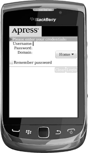
Figure 5–29. UI Fun running on the BlackBerry Torch simulator in vertical orientation
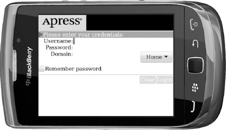
Figure 5–30. UI Fun running on the BlackBerry Torch simulator in a horizontal orientation
When the device is rotated, the sublayout and layout methods will automatically be called, and it’ll have a chance to adjust the screen layout to the new width and height.
The virtual keyboard will also automatically be displayed whenever the focus is on a text edit field.
Creating Basic Animation
We’re going to spend a little bit of time on a topic that can really make your user interface shine: animation. This topic is more advanced. Though an app looks fine without animation, having screen transitions and other effects will make it look fancy and help it stand out among the competition, plus it’s fun doing animations. And going through the exercise in this section will teach you a bit more about how the BlackBerry UI API works, so we recommend you at least read through it.
In your application, when you click the Login button, the login screen instantly appears; it doesn’t fade in, slide in, or anything like that. You’ll modify UiFun so that when the user logs in (clicks the Login button after typing a username and password), the login success screen slides up from the bottom of the display.
The basic idea for user interface animation is to pick an aspect of the user interface to animate (size, position, transparency) and a time for the animation to take place (for example, 300 milliseconds for a screen to slide onto the display). Then, in each update of the user interface, check if the animation time has elapsed: if not, update the user interface aspect according to how much time has passed, and queue up another UI update. Using time-based animation like this means that the animation will run as smoothly as possible across different device models and under different conditions and will always take the same amount of time to complete.
Setting the Vertical Offset
To get the animation started, add a new variable to LoginSuccessScreen called verticalOffset.
private int verticalOffset;
You’ll update this variable during the animation, decrementing it from the display height to zero. You’ll also add another variable and a constant final variable to keep track of how much time has passed in your animation and how long the animation should be. In this case, let’s use 300 milliseconds, as generally somewhere between 200 and 300 milliseconds gives a decent user experience.
private final static long animationTime = 300;

private long animationStart = 0;
The animation logic all occurs within sublayout. It’ll only run the animation code if verticalOffset is greater than zero; that is, only if the screen is not all the way onto the display.
If verticalOffset is greater than zero, it’ll check the current time against the animationStart time. Based on the ratio of the elapsed time to the total time for the animation, it’ll set a new value for verticalOffset.
Finally, after updating the screen’s position, it’ll queue another update layout if verticalOffset is still not zero by calling UiApplication.invokeLater.
Animating the Layout
Add import statements for Display and UiApplication. The code for sublayout follows:
   protected void sublayout(int width, int height) {

       super.sublayout(width, height);

       if (verticalOffset> 0) {

           if (animationStart == 0) {

               // start the animation

               animationStart = System.currentTimeMillis();

           }

           else {

               long timeElapsed = System.currentTimeMillis() - animationStart;

               if (timeElapsed >= animationTime) {

                   verticalOffset = 0;

               }

               else {

                   float percentDone = (float)timeElapsed / (float)animationTime;

                   verticalOffset =

                     Display.getHeight() - (int)(percentDone * Display.getHeight());

               }

           }

       }

       setPosition(0, verticalOffset);


       if (verticalOffset > 0) {

           UiApplication.getUiApplication().invokeLater(new Runnable() {

               public void run() {

                   updateLayout();

               }

           });

       }

   }
Notice that there’s an initial case where animationStart is zero. This case represents the first frame of the animation, so just leave verticalOffset where it is.
Speaking of verticalOffset, you’ll initialize it in the LoginScreen constructor to the height of the display.
verticalOffset = Display.getHeight();


new Thread(this).start();
You also need to make LoginSucessScreen implement the Runnable interface, so you can run the screen on a Thread. Your declaration should read like the following:
public class LoginSuccessScreen extends MainScreen implements Runnable {
By implementing the Runnable interface, you’re required to implement the run method. Since you don’t plan on doing extra processing, simply declare the run method inside LoginSucessScreen.
public void run() {

}
And that’s it. Now, the login success screen will smoothly scroll up from the bottom of the screen (see Figure 5–31).

Figure 5–31. The login success screen sliding in
All animation follows the same basic pattern, and it can get much more complex. With the same basic technique you can implement motion, fading, and more.
Now, if you are not doing complicated animations but simply want to implement screen-to-screen transition effects, you can revert the code to the state before you added animation. In UiFunMainScreen class, import net.rim.device.api.ui.TransitionContext and net.rim.device.api.ui.UiEngineInstance, and change the login method to this:
private void login() {

    if (usernameField.getTextLength() == 0 ||

            passwordField.getTextLength() == 0) {

            UiApplication.getUiApplication().pushModalScreen

        (new CustomDialog("You must enter a username and password"));

    }

    else {

        String username = usernameField.getText();

        String selectedDomain =

       (String)domainField.getChoice(domainField.getSelectedIndex());


        LoginSuccessScreen loginSuccessScreen =
                   new LoginSuccessScreen (username, selectedDomain);


        TransitionContext transition = new

        TransitionContext(TransitionContext.TRANSITION_SLIDE);


       transition.setIntAttribute(TransitionContext.ATTR_DURATION,

           500);

       transition.setIntAttribute(TransitionContext.ATTR_DIRECTION,

           TransitionContext.DIRECTION_UP);

       transition.setIntAttribute(TransitionContext.ATTR_STYLE,

           TransitionContext.STYLE_PUSH);


       UiEngineInstance engine = Ui.getUiEngineInstance();

       engine.setTransition(null, loginSuccessScreen,

       UiEngineInstance.TRIGGER_PUSH, transition);

       UiApplication.getUiApplication().pushScreen(

          loginSuccessScreen);


    }

}
This alternate way of using the TransitionContext class within the Login method is concise and easy to understand. It will do the same trick for the sliding screen you did earlier. And the best part is you can easily change the style of the transition and the direction with a simple selection of TransitionContext constants.
Summary
Congratulations! This chapter covered a lot of ground, and by working through it, you’ve learned enough about the BlackBerry UI to create all kinds of great-looking applications.
In this chapter, you modified your UI Fun application from last chapter by creating a new label field that allowed you to display an image alongside the label plus a different background and foreground color. You also created a replacement button field that let you specify colors for both focused and unfocused states and gave a slightly different look than the default ButtonField. Then, you created a new layout manager that let you align your labels and edit fields in the way you wanted and a new dialog to replace the default BlackBerry OK dialog. After that, you made some tweaks to the application’s color and alignment and, finally, added a simple animation effect to the login success screen.
Individually, all these changes were small, but together, they represent the starting point for creating most of the great user interfaces you see on modern BlackBerry applications.
Now, you’ve gone pretty much as far as you will with the BlackBerry user interface in this book. The next chapter will look at an entirely new topic that’ll help you produce much more capable applications: storing data on the device.