When you're ready to program your Windows Phone 7 application in Visual Studio, you'll know what general features your application will provide. Each of the major application features will need to be accessible via a shortcut or some form of a navigation menu. For Windows Phone 7 applications, Microsoft recommends that you use a standard Windows Phone 7 Application Bar to provide shortcuts for most common tasks within the application. Metro UI design concepts for Windows Phone 7 were covered in Part 1 of this book. The use of an Application Bar within the application helps ensure that these guidelines are properly observed.
An Application Bar is essentially a Windows Phone 7 menu system with clickable icons that conform to the general Metro UI guidelines provided by Microsoft. For example, take a look at the Windows Phone 7 version of the popular social networking application Foursquare (one place you can find its screenshots is http://4square.codeplex.com). At the bottom of the screen, you will see an Application Bar with shortcuts to most common features of the application. Another example is Graphic.ly (www.pcworld.com/article/191549/graphicly.html), an application that uses Deep Zoom capabilities of Silverlight to provide an immersive comic book reading experience. On its Application Bar, Graphic.ly naturally has shortcuts to zoom into and zoom out of the comic book contents, since those features are the most important ones for that application.
In this chapter, you will learn how to create an Application Bar in your programs and the specifications for various elements within the Application Bar. You will also learn about the two types of Application Bars and you will program them both. Within each Windows Phone 7 application, two types of Application Bars can be present: a global Application Bar and a local one. If a global Application Bar is defined, it can be added to any .xaml page within the application via a single XAML statement. Alternately, a local Application Bar would be local to a single application page and must be defined for each .xaml page separately. You will create both global and local Application Bars in this chapter.
The position of the Application Bar on the screen varies with the phone orientation. When the phone is in default portrait orientation, an Application Bar is displayed as a single row of icons at the bottom of the screen. Figure 7-1 shows an example of an Application Bar with three icons for Add, Save, and Delete. The ellipsis to the right of the Delete button signifies the presence of additional shortcuts in the Application Bar (called menu items) that will become visible to you when you click that ellipsis button. In this chapter, you'll learn how to create visually appealing Application Bars that conform to the best practices published by Microsoft.

Figure 7.1. An Application Bar with Add (+ icon), Save (disk icon), and Delete (trash can icon) on Windows Phone 7
The contents of an Application Bar are limited to a maximum of four elements. The elements are added and automatically centered in the Application Bar from left to right. Additional application shortcuts can be added to the Application Bar via text-based menu items and are hidden from view by default. The presence of an ellipsis to the right of the main Application Bar icons hints that, in addition to the main icons, there are text-based menu items in the Application Bar. These items serve as additional shortcuts and slide up as a list when the user clicks the ellipsis or the empty space right underneath the ellipsis. An example of what the phone screen looks like when there are menu items present in the application and the ellipsis is pressed is shown in Figure 7-2.

Figure 7.2. Application Bar with menu items shown. Note how menu items appear in lowercase, regardless of the letter casing when they were created.
There is good news and bad news when it comes to working with the Application Bar. The good news is that an Application Bar is easy to create and comes with a lot of built-in functionality. For example, when the phone changes orientation from portrait to landscape, the Application Bar automatically moves to the left side of the phone screen. In addition, there is a default animation for showing text-based menu items (shown in Figure 7-2) that didn't fit in the four main icon slots on the Application Bar. Finally, a minor but handy feature that ensures consistent user experience is the automatic addition of a circle around each Application Bar icon (i.e., you as the developer do not have to draw it) and the conversion of textual menu items to lowercase text.
The bad news is that there is little flexibility in creating icons and menus for the Application Bar. The height of the Application Bar is fixed and can't be changed. The size of the icons in the Application Bar is 48 pixels wide and 48 pixels high (generally expressed as 48x48); icons of other sizes will be scaled to fit that size, which results in distortion and thus is not recommended. The actual graphic within the icon has to be 26x26 pixels to properly fit within the circle that the Application Bar automatically draws for each icon. In addition, Microsoft recommends that you always try to use default system theme colors for the Application Bar because the use of custom colors can lead to unpredictable and potentially unfavorable effects on display quality, menu animations, and power consumption.
In the following section, you will create an Application Bar that looks like the one in Figure 7-2. Later in this chapter, you will write code to react to Application Bar events and access different features of your application.
Windows Phone 7 provides two types of Application Bars for use with phones apps: a global bar and a local bar. The only way to define a global Application Bar is inside the App.xaml; once defined, it can be added to any page within the Windows Phone 7 application with a single line of XAML code. On the other hand, there are two ways to define a local Application Bar and add it to a particular application page.
Using XAML
Using Managed Code (i.e., C#, or Visual Basic)
You'll get to try both methods in this chapter when you'll build an Application Bar that provides simple functionality and asks for a person's name, then acts like that name has been saved to the database or the cloud storage. Regardless of the approach you choose and regardless of whether you are building a local or a global Application Bar, there is a preparatory step you should take before you can properly display and use it. That step involves adding images for your Application Bar buttons to project resources.
Because the maximum size of each Application Bar icon is 48x48 pixels, the size of each image you add to the Application Bar is limited to 26x26 pixels so that a circle can be also properly drawn around it. Since Windows Phone 7 supports the concept of themes, the background of an icon has to match the rest of the theme, and therefore should be made transparent (for more information on working with different themes, please refer to Chapter 9). On this transparent background, the actual graphic should have white foreground color using an alpha channel. You will walk through creating images for the Application Bar using Microsoft Expression Design later in this chapter. Fortunately, in many cases, you won't have to create icons yourself, since Microsoft has released a set of commonly used images for Windows Phone 7 Application Bar, all properly sized and formatted in Microsoft's approved style. These icons are automatically installed for you as part of Windows Phone Developer Tools installation and their default location is in the %Program FilesMicrosoft SDKsWindows Phonev7.0Icons folder.
Start off by creating a new Visual Studio Project and naming it ApplicationBarSample.
Next, organize the project for easier readability by creating a folder for the icon images you'll use in the ApplicationBarSample project. Right-click the project name in the Solution Explorer, select Add

Next, copy the icon images to the newly created folder within your project. Using Windows Explorer, copy the image files you need from there to the
Imagesfolder of your project. In the example that follows, you will be using the images located in thedarksubfolder of the icon archive. Make sure to copy the*.pngfiles only, without any folder structure.Now the images are copied, but Visual Studio still needs to make them a part of the project. Right-click Solution Explorer, then select Add
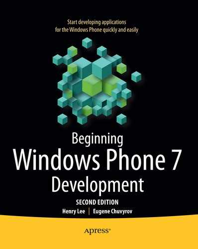
Finally, you need to instruct Visual Studio to include new images in every build of an application. For each image, right-click the image in the Solution Explorer and choose Properties (you can also press F4 to bring up the Properties dialog). In the Properties dialog box, set the Build action to Content and set the Copy to Output property to Copy Always, as shown in Figure 7-3.
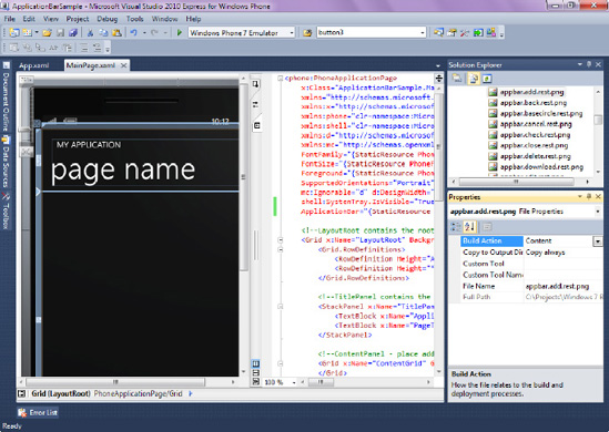
Figure 7.3. For each image, set Build Action to Content and Copy to Output Directory to Copy Always.
Now that the project knows where to find the icon images for an Application Bar, it's time to add code to showcase the Application Bar's features.
A global Application Bar is created as an application resource in the section of an App.xaml configuration file. Follow these steps to create and add a global Application Bar:
In Solution Explorer, right-click the
App.xamlfile for the ApplicationBarSample project and select Open. This action causes Visual Studio to display the XAML code for the application's resource and configuration page.Next, paste the complete XAML definition of the Application Bar with three icons and two menu items into the Application Resources section. Locate the
<Application.Resources>section of theApp.xamland paste the following code within that section. Note that setting the Text property for each control is required.<shell:ApplicationBar x:Key="GlobalAppMenuBar" Opacity="1" IsVisible="True" IsMenuEnabled="True"> <shell:ApplicationBar.Buttons> <shell:ApplicationBarIconButton IconUri="/Images/appbar.add.rest.png" Text="add"> </shell:ApplicationBarIconButton> <shell:ApplicationBarIconButton IconUri="/Images/appbar.save.rest.png" Text="save"> </shell:ApplicationBarIconButton> <shell:ApplicationBarIconButton IconUri="/Images/appbar.delete.rest.png" Text="delete"> </shell:ApplicationBarIconButton> </shell:ApplicationBar.Buttons> <shell:ApplicationBar.MenuItems> <shell:ApplicationBarMenuItem Text="Menu Item 1" IsEnabled="True"> </shell:ApplicationBarMenuItem> <shell:ApplicationBarMenuItem Text="Menu Item 2" IsEnabled="True"> </shell:ApplicationBarMenuItem> </shell:ApplicationBar.MenuItems> </shell:ApplicationBar>With the global Application Bar defined, you are ready to add it to the pages within your application. Open
MainPage.xamland add the following attribute within the<phone:PhoneApplicationPage>node:ApplicationBar="{StaticResource GlobalAppMenuBar}"Press F5 to run the application. You should see an Application Bar identical to the one shown in Figure 7-2. Note that if you see grey "x" symbols instead of expected Application Bar icons, the application can't locate the image files to use inside its Application Bar. Make sure the names and paths to those files are spelled correctly and that the Build action of the images is set to Content and the Copy to Output property is set to Copy Always, as shown in Figure 7-3.
Before moving onto the next section and taking a look at a local Application Bar, let's clean up the MainPage.xaml code by removing the ApplicationBar="{StaticResource GlobalAppMenuBar}" XAML. If you don't do that, you will get an application exception in the next section after you add a local Application Bar.
Creating a global Application Bar provides an easy way to add the same exact Application Bar to all pages or screens within your program. In cases where you want to make an Application Bar different for a given page, you would need to create a local Application Bar. One of the two ways to add a local Application Bar to a Windows Phone 7 application is to use XAML markup. Using XAML markup wherever possible is considered best practice since it allows for the separation of design (XAML) and logic (C#) of an application. The following steps show the XAML you need to add to ApplicationBarSample to construct a local Application Bar for the app:
n Solution Explorer, right-click the
MainPage.xamland select Open. This action causes Visual Studio to display the XAML code for the application's main page. Make sure you have removed the global Application Bar reference from theMainPage.xaml, as mentioned at the end of the previous section.You must define a PhoneNavigation element within XAML before adding a local Application Bar. To accomplish that, inside the phone:PhoneApplicationPage, add a phone:PhoneApplicationPage.ApplicationBar element. Notice how this element is automatically available for selection via Visual Studio IntelliSense once you start typing the first few characters—an excellent way to ensure that there are no spelling errors.
<phone:PhoneApplicationPage.ApplicationBar>
</phone:PhoneApplicationPage.ApplicationBar>
It is now time to add the Application Bar XAML to the page. Inside the phone:PhoneApplicationPage.ApplicationBar element, add a shell:ApplicationBar element. Set the IsVisible and the IsMenuEnabled properties to True, and set the Opacity property to
1, like so:<shell:ApplicationBar Opacity="1" IsVisible="True" IsMenuEnabled="True"> </shell:ApplicationBar>Now that you have defined an Application Bar in XAML, you are ready to create buttons for it. The buttons you add are a part of the shell:ApplicationBar.Buttons element, so go ahead and add that element now inside the shell:ApplicationBar element.
<shell:ApplicationBar.Buttons
</shell:ApplicationBar.Buttons>
Inside the shell:ApplicationBar element, you will create three shell:ApplicationBarIconButton XAML elements to add three button definitions: one each for Add, Save, and Delete. These buttons will show up with images you will define for them. If you had any text-based menu items to add to the Application Bar, the ellipsis in the right corner of the Application Bar would be created automatically for you by Windows Phone 7. The ellipsis is not counted as one of the buttons on the Application Bar; therefore you could have a maximum of four buttons plus an ellipsis. The XAML markup to add three buttons is shown here:
<shell:ApplicationBarIconButton IconUri="/Images/appbar.add.rest.png" Text="add">
        </shell:ApplicationBarIconButton>
        <shell:ApplicationBarIconButton IconUri="/Images/appbar.save.rest.png" Text="save">
        </shell:ApplicationBarIconButton>
        <shell:ApplicationBarIconButton IconUri="/Images/appbar.delete.rest.png"

Text="delete">
        </shell:ApplicationBarIconButton>
Note that the IconUri properties in this code snippet refer to the default names of the images that come as part of the Windows Phone 7 Tools installation. If you have changed default names of those images, make sure to properly edit the reference used in IconUri as well. Also note the Text element—it's a required element and it can't be an empty string. This text will be visible if you click the ellipsis in the right corner of the Application Bar, as shown in Figure 7-2.
At this point, you are done creating Icon buttons and should make sure that the shell:ApplicationBar.Buttons element is properly closed. Press F5 to view the results of your work—you should see the Application Bar containing three items at the bottom of the phone screen.
The full XAML for a local Application Bar is shown in Listing 7-1, together with text-based menu items for the Application Bar, which you will be adding in the next section. Since menu items are text-based, they are useful in cases where text conveys a better meaning of the shortcut than an icon in the Application Bar. Of course, if you need more than four items to be present in the Application Bar, your only choice is to resort to menu items. In the next section, you will enhance an Application Bar with menu items.
Let's add two menu items, Menu Item 1 and Menu Item 2, to the ApplicationBarSample app.
All menu items are a part of shell:ApplicationBar.MenuItems element, so add that element now inside the shell:ApplicationBar element.
<shell:ApplicationBar.MenuItems>
</shell:ApplicationBar.MenuItems>
Finally, you will define MenuItems themselves by adding shell:ApplicationBarMenuItems inside the shell:ApplicationBar.MenuItems element.
<shell:ApplicationBarMenuItem Text="Menu Item 1" IsEnabled="True">
</shell:ApplicationBarMenuItem>
<shell:ApplicationBarMenuItem Text="Menu Item 2" IsEnabled="True">
</shell:ApplicationBarMenuItem>
If you run the application now, you will now see an Application Bar displayed by the Windows Phone emulator that is identical to the one shown in Figure 7-1. If you click the ellipsis to the right of the icons, the application bar slides up, revealing the two menu items, identical to Figure 7-2. Try it by pressing F5.
Let's talk briefly about the Opacity property of an Application Bar you used in this example. Even though its values can range from 0 to 1, Microsoft recommends that developers use only three values for this property: 0, 0.5, and 1. If the Opacity is set to anything less than 1, the Application Bar will overlay the displayed page of an application. In other words, the contents of that page will extend to the area underneath the Application Bar, which is seldom desirable. If Opacity is set to 1, however, the Application Bar will have a dedicated region at the bottom of the screen and will not be overlaying any portion of an application.
The full XAML markup for creating an Application Bar with three main icons and two menu items is shown in Listing 7-1.
Example 7.1. XAML Code to Implement an Application Bar
<phone:PhoneApplicationPage.ApplicationBar>
<shell:ApplicationBar Opacity="1" IsVisible="True" IsMenuEnabled="True">
            <shell:ApplicationBar.Buttons>
<shell:ApplicationBarIconButton IconUri="/Images/appbar.add.rest.png"
Text="add">
</shell:ApplicationBarIconButton>
<shell:ApplicationBarIconButton IconUri="/Images/appbar.save.rest.png"
Text="save">
</shell:ApplicationBarIconButton>
<shell:ApplicationBarIconButton IconUri="/Images/appbar.delete.rest.png"
Text="delete">
</shell:ApplicationBarIconButton>
</shell:ApplicationBar.Buttons>
<shell:ApplicationBar.MenuItems>
<shell:ApplicationBarMenuItem Text="Menu Item 1" IsEnabled="True">
</shell:ApplicationBarMenuItem>
<shell:ApplicationBarMenuItem Text="Menu Item 2" IsEnabled="True">
</shell:ApplicationBarMenuItem>
</shell:ApplicationBar.MenuItems>
</shell:ApplicationBar>
</phone:PhoneApplicationPage.ApplicationBar>Adding an Application Bar via XAML is pretty straightforward thanks to all the powerful and easy-to-use tooling provided by Visual Studio 2010. Using XAML allows you to separate presentation from logic, which is a very good practice. We recommend you use XAML wherever possible. Sometimes, however, XAML alone is not sufficient for the task. Luckily, it is perhaps even easier to work with the Application Bar from managed code, especially if you have a little bit of programming experience. The next section will show you how to do that.
The second way to create an Application Bar for a Windows Phone 7 application is to use one of the .NET languages. Both C# and VB.NET are supported, and there are even templates available online for writing Windows Phone 7 applications with F#! It is simply astounding that we have the power of functional programming with F# available to us on a mobile platform.
The steps necessary to create an Application Bar using C# are described here. But first, be sure to remove all of the Application Bar XAML code you wrote for the previous demos.
You will be editing the MainPage code of your application. To accomplish this, locate the
MainPage.xaml.csfile by expanding theMainPage.xamlfile in the Solution Explorer. Right-clickMainPage.xaml.csand select View Code.For easier reference to an Application Bar component inside the Microsoft.Phone assembly (i.e., to avoid typing Microsoft.Phone.Shell.ApplicationBar before each component name), add the following using directive to the top of the
MainPage.xaml.csfile:using Microsoft.Phone.Shell;
Inside the constructor for the page (i.e., inside the public MainPage() code block), right after InitializeComponent(), initialize the Application Bar and set its IsVisible and IsMenuEnabled properties, as shown in the following code:
ApplicationBar = new ApplicationBar();
ApplicationBar.IsVisible = true;
ApplicationBar.IsMenuEnabled = true;
Initialize Application Bar buttons, providing the relative URI to the image that will be used for each button. Note that you must set the Text property of each button; otherwise you will cause an exception.
ApplicationBarIconButton btnAdd = new ApplicationBarIconButton(new
Uri("/Images/appbar.add.rest.png", UriKind.Relative));xs
btnAdd.Text = "add";
ApplicationBarIconButton btnSave = new ApplicationBarIconButton(new
Uri("/Images/appbar.save.rest.png", UriKind.Relative));
btnSave.Text = "save";
ApplicationBarIconButton btnDelete = new ApplicationBarIconButton(new
        Uri("/Images/appbar.delete.rest.png", UriKind.Relative));
btnDelete.Text = "delete";
Add the buttons to the Application Bar via the following code:
ApplicationBar.Buttons.Add(btnAdd);
ApplicationBar.Buttons.Add(btnSave);
ApplicationBar.Buttons.Add(btnDelete);
Next, you will create two menu items that will appear as text when the ellipsis button is clicked in the Application Bar. Very similar to adding icons, there are initialization and addition steps for each menu item. The initialization code for the menu items looks like this:
ApplicationBarMenuItem menuItem1 = new ApplicationBarMenuItem("Menu Item 1");
ApplicationBarMenuItem menuItem2 = new ApplicationBarMenuItem("Menu Item 2");
The strings "Menu Item 1" and "Menu Item 2" are the text for the two menu items; in your application, you will certainly change that text to something much more meaningful and fun.
Add menu items to the Application Bar.
ApplicationBar.MenuItems.Add(menuItem1);
ApplicationBar.MenuItems.Add(menuItem2);
Finally, you are ready to test the Application Bar. Save your work and press F5 to start debugging the application using Windows Phone 7 emulator. You should see an Application Bar identical to the one shown in Figure 7-1. If you click the ellipsis to the right of the icons, the Application Bar slides up, revealing two menu items, identical to Figure 7-2.
The full code for adding the Application Bar using managed C# code is in Listing 7-2. Note that the full MainPage() constructor is included for readability purposes.
Example 7.2. C# Code to Implement an Application Bar
public MainPage()
{
        InitializeComponent();
        SupportedOrientations = SupportedPageOrientation.Portrait |
        SupportedPageOrientation.Landscape;

        ApplicationBar = new ApplicationBar();
        ApplicationBar.IsVisible = true;
        ApplicationBar.IsMenuEnabled = true;
ApplicationBarIconButton btnAdd = new ApplicationBarIconButton(new
Uri("/Images/appbar.add.rest.png", UriKind.Relative));
btnAdd.Text = "add";
ApplicationBarIconButton btnSave = new ApplicationBarIconButton(new
Uri("/Images/appbar.save.rest.png", UriKind.Relative));
btnSave.Text = "save";
ApplicationBarIconButton btnDelete = new ApplicationBarIconButton(new
Uri("/Images/appbar.delete.rest.png", UriKind.Relative));
btnDelete.Text = "delete";
ApplicationBarMenuItem menuItem1 = new ApplicationBarMenuItem("Menu Item 1");
ApplicationBarMenuItem menuItem2 = new ApplicationBarMenuItem("Menu Item 2");
ApplicationBar.Buttons.Add(btnAdd);
ApplicationBar.Buttons.Add(btnSave);
ApplicationBar.Buttons.Add(btnDelete);
ApplicationBar.MenuItems.Add(menuItem1);
ApplicationBar.MenuItems.Add(menuItem2);
}While adding the Application Bar to Windows Phone 7 is cool in itself, you can't do much with that Application Bar right now. You can push buttons a few hundred times, but nothing changes on the phone screen or inside the application. To react to button press events, you need to write some managed (C# in this case) code, also called the event handler code. In the next section, you'll learn how to write code that processes and reacts to the button press events.
There are two steps to writing code that reacts to Application Bar events.
Writing a small snippet of glue code that links Application Bar button or menu item click to the function that does all the processing (let's call this function the worker function).
Writing a worker function that performs all the heavy lifting—i.e., rearranges UI elements on the screen, saves data, prompts the user for input, or anything else that the developer decides to do in response to the button or the menu item click event.
Let's start with the Add button, which you'll wire up in the next section.
Visual Studio has made adding both glue code and a worker function virtually a two-keystroke procedure. Let's see how easy it is to create an event handler for the Add button on your Application Bar using a couple of Visual Studio shortcuts. This demo assumes that you have already created the Application Bar via managed code (not XAML) by following the steps in the "Adding an Application Bar Using Managed Code" section earlier in the chapter.
Once again, you will be editing the code of the MainPage of your application. To accomplish this, locate the
MainPage.xaml.csfile by expanding theMainPage.xamlfile in the Solution Explorer. Right-clickMainPage.xaml.csand select View Code.At the very end of the
MainPage()constructor, type the following code:btnAdd.Click+=
Notice the appearance of a small pop-up window to the right of the = sign as you type it. You should see the following message:
new EventHandler(btnAdd_Click); (Press TAB to insert)
Press the Tab key and notice how a line of code is automatically added after the = sign. This one line of code is the glue code you need to tie together user interaction with the Add button.
btnAdd.Click+=new EventHandler(btnAdd_Click);
Now press the Tab key again, and Visual Studio automatically creates a skeleton for the worker function for you. This may not seem like a big deal at first, but it's usually a challenge to remember exactly what parameter types this worker function must have. This shortcut is just one example of how Visual Studio really enhances developer productivity.
The worker code that Visual Studio adds to your application looks like this:
void btnAdd_Click(object sender, EventArgs e)
{
                throw new NotImplementedException();
}
Now you're ready to add a bit of interactivity to your Application Bar, which you'll do in the next section.
Tip
You are certainly not required to use the shortcut just described to generate event handler code for the Application Bar or for any other event for that matter. You can write all of the previous code by hand, but be very careful to pass the proper parameter types and the proper number of parameters to the event handler.
With a worker function in place for the Add button, let's expand it to accommodate a simplified real-world scenario: when a user clicks the Add button (the button with the + icon on the Application Bar), you will show a text box on the screen that is ready and waiting for user input. You will also add functionality to the Save button (the button with a floppy disk icon) that will display the thank-you message and hide the text box. Of course, in the real world, you would want to store the values entered by the user and react on the user input in some fashion, but that is slightly beyond the scope of this chapter.
Follow these steps to add interactivity to the Application Bar events:
Locate
MainPage.xamlin the Solution Explorer and double-click that file to bring up XAML designer. Click the View menu
Tip
If you see the toolbox, Windows Phone 7 design surface, and XAML code on the screen side-by-side, as in Figure 7-4, click the Collapse Pane (>> icon) in the area between the design surface and XAML to hide the XAML code, as illustrated in Figure 7-4.
Tip
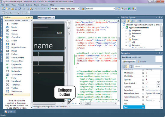
If you do not see the XAML view, click the Expand Pane (<< icon) to bring that view back, as shown in Figure 7-5.
From the Toolbox, click and drag the text box to the Windows Phone 7 design surface, as shown in Figure 7-6. Right-click the Text item, and select Properties to show the Properties window in the right corner of the screen.
Set the Text property to blank and set the Visibility property to Collapsed.
In the Toolbox, click and drag the TextBlock to the Windows Phone 7 design surface and place it right underneath the text box. Right-click the TextBlock and select Properties to show the Properties window in the right corner of the screen.
Set the Text property to "Please enter your name" and set the Visibility property to Collapsed.
Now edit the worker function that was created for you by Visual Studio 2010 in the previous section. Right-click the
MainPage.xaml.csfile and select View Code. Remove the following line from thebtnAdd_Clickfunction:throw new NotImplementedException();
Edit the
btnAdd_Clickfunction to match the following code:void btnAdd_Click (object sender, EventArgs e) { textBox1.Visibility = Visibility.Visible; textBlock1.Visibility = Visibility.Visible; }Press F5 to view the results of your work.

Now, when you click the + icon on the Application Bar, the text box is ready to accept user input.
Continuing the demo, let's now add an event handler to the Save button of the Application Bar. You'll write code so that when the user clicks the Save button, the application will hide the text box and change the text of the textblock to thank the user for entering a name.
Locate
MainPage.xamlin the Solution Explorer, right-click and select View Code. Add the following line of code to theMainPage()constructor code. Don't forget to use the Tab+Tab trick to let Visual Studio automatically generate skeleton code for you (described in the previous section).btnSave.Click += new EventHandler(btnSave_Click);
Add the following code to the
btnSave_Clickfunction:void btnSave_Click(object sender, EventArgs e) { textBlock1.Text = "Thank you, "+ textBox1.Text; textBox1.Visibility = Visibility.Collapsed; }Press F5 to see the results of your work. When you click the + icon, you will be prompted to enter your name. Once you enter your name and press the Save button on the Application Bar, the application displays a simple thank-you message. If, for some reason, the full text of the message doesn't fit within the textblock you created, you can increase both the width and the height of the textblock by setting the TextWrapping property of the textblock to Wrap.
Now you're ready to enhance the Application Bar even further by writing code for your menu items to do some meaningful work.
The code you write to react to menu click events is almost identical to the code for Application Bar button events, with the glue code attached to the menu item instead of the Application Bar button. The block of code shown next displays a simple text message when the user clicks on the first menu item in the Application Bar that you created previously. Note that only a portion of the MainPage() constructor is shown, since the rest of it remains unchanged from the prior demo.
menuItem1.Click+=new EventHandler(menuItem1_Click);
}

void menuItem1_Click(object sender, EventArgs e)
{
        textBlock1.Visibility = Visibility.Visible;
        textBlock1.Text = "You just clicked on Menu Item 1";
}
Press F5 to run the application now. You should see an Application Bar with an ellipsis in the right corner. If you press the ellipsis, two menu items become visible. Once clicked, the text on the phone screen changes to reflect the name of the menu item clicked.
In the real application, you will certainly want to do something more meaningful than what you did here. For instance, you may have Help and About menu items. If the user clicks Help, a Web Browser control (discussed in the next chapter) could be programmed to display a set of application help files. If the About menu item is clicked, you can use the Web Browser control to show your company's web page or some basic contact information.
One final thing you need to look at before leaving this chapter is how to use XAML to link event handling code to XAML elements.
It is also possible to write the necessary code that attaches (or glues) a certain event to a managed code in XAML. In other words, using this approach, you would define an Application Bar in XAML following the guidelines in the previous section, but write managed C# code to react to events when the user presses Application Bar buttons. For code readability and understandability purposes, this approach may be preferable to the purely managed code approach (where you define Application Bar from managed code) already discussed. Imagine that you are trying to maintain an application that someone else wrote—it would be easier for you to understand and trace application behavior by starting with the XAML design elements and following their glue code into the event handlers. The steps you follow to wire up events in XAML are pretty straightforward, as illustrated here:
Locate
MainPage.xamlin the Solution Explorer and double-click that file to bring up XAML designer.If only the Windows Phone 7 design surface is shown and no XAML code is visible, click the Expand Pane (<<) button in the lower right portion of the screen, as shown in Figure 7-5.
Paste the following XAML in
MainPage.xaml(it's identical to XAML from the "Adding a Local Application Bar Using XAML" section of this chapter):<phone:PhoneApplicationPage.ApplicationBar> <shell:ApplicationBar IsVisible="True" IsMenuEnabled="True"> <shell:ApplicationBar.Buttons> <shell:ApplicationBarIconButton IconUri="/Images/appbar.add.rest.png" Text="add"> </shell:ApplicationBarIconButton> <shell:ApplicationBarIconButton IconUri="/Images/appbar.save.rest.png" Text="save"> </shell:ApplicationBarIconButton> <shell:ApplicationBarIconButton IconUri="/Images/appbar.delete.rest.png" Text="delete"> </shell:ApplicationBarIconButton> </shell:ApplicationBar.Buttons> <shell:ApplicationBar.MenuItems> <shell:ApplicationBarMenuItem Text="Menu Item 1" IsEnabled="True"> </shell:ApplicationBarMenuItem> <shell:ApplicationBarMenuItem Text="Menu Item 2" IsEnabled="True"> </shell:ApplicationBarMenuItem> </shell:ApplicationBar.MenuItems> </shell:ApplicationBar> </phone:PhoneApplicationPage.ApplicationBar>Locate the
<shell:ApplicationBarIconButton IconUri="/Images/appbar.add.rest.png" Text="add">statement in XAML and addClick="to the end of that statement, so that it resembles the code here:
<shell:ApplicationBarIconButton IconUri="/Images/appbar.add.rest.png" Text="add"
Click=">
Note how Visual Studio automatically shows a choice of New Event Handler right after the double quotes. If you press the Tab key now, the skeleton code for the worker function will be automatically inserted in the MainPage.xaml.cs file and it will have a default name of ApplicationBarMenuItem_Click. To add functionality to the Application Bar button click event, open MainPage.xaml.cs (by right-clicking the MainPage.xaml file and selecting View Code) and edit that function in a way similar to what you did in the "Reacting to Button Events" and "Reacting to Menu Click Events" sections. There is also another way to glue XAML code with codebehind by using an ApplicationBar class, as you will see in the next section.
Once you create an Application Bar in XAML, you can use the ApplicationBar class and its Buttons and MenuItems properties to glue managed code to defined XAML elements within that Application Bar. The Buttons property provides access to all the buttons created for the application bar, in the order that they were added to the Application Bar. For example, the following code references the Add, Save and Delete buttons created in the previous section and then programmatically disables the Delete button. Notice how since the Add button was added first in your XAML code, it has an index of 0, and the Delete button, which was added third, has an index of 2 within the Buttons list.
ApplicationBarIconButton btnAdd = ApplicationBar.Buttons[0] as
ApplicationBarIconButton;
            ApplicationBarIconButton btnSave = ApplicationBar.Buttons[1] as
ApplicationBarIconButton;
            ApplicationBarIconButton btnDelete = ApplicationBar.Buttons[2] as
ApplicationBarIconButton;

            btnDelete.IsEnabled = false;
Obtaining programmatic references to Application Bar buttons from code may be desirable where you want to manipulate certain properties of the button, such as its Enabled/Disabled state, in response to some event triggered by the user. As you can see, you can easily obtain those references using properties of the ApplicationBar class.
In this chapter, you learned how to add an Application Bar with buttons and menu items to your Windows Phone 7 application using either XAML or managed (C#) code. You also learned basic guidelines for Application Bar development and wrote code to react to Application Bar button and menu item events. The presence of an Application Bar is certainly an expected behavior for any mobile application today, and Visual Studio has made the process of adding one easy and straightforward.
In the next chapter, you will learn about the Web Browser control on Windows Phone 7. The Web Browser control helps you provide professional-looking application Help files and aids in navigating the billions of web pages. You will also learn how to dynamically generate HTML content and show it in a web browser.