
After completing this chapter, you will be able to
Understand the historical background for PerformancePoint Server 2007 and Services (SharePoint 2010).
Know the components and other features that make up a PerformancePoint Dashboard, including KPIs, scorecards, reports, and more.
Learn what is new in PerformancePoint Services 2010 in SharePoint Server 2010.
Understand when and why you will want to use PerformancePoint Services.
Understand configuration and security setup for PerformancePoint Services.
Create a simple PerformancePoint dashboard with a KPI, scorecard, filter, and report.
In Chapter 1, you saw the basic pattern for creating key performance indicators (KPIs), which are derived from a company vision, a company strategy, and measurable objectives. PerformancePoint Services in SharePoint Server 2010 is one of the newest business intelligence (BI) tools complementing SharePoint Server 2010. It’s a monitoring and analytics service that helps organizations monitor and analyze their business by providing tools for building dashboards, scorecards, and KPIs. When set up properly and with access to trusted data (see Chapter 3) and other data sources and reports, these PerformancePoint components (and others) help you answer the following questions across an organization:
What has happened? (monitoring)
What is happening? (monitoring)
Why is it happening? (analysis)
By answering these questions, you and your employees can better predict what will happen—and make informed business decisions that align with company-wide objectives and strategy.
This chapter provides an introduction to PerformancePoint Services by helping you create many of the components that it offers, using the tools it provides.
This chapter works in concert with Chapter 8, which shows you how to publish a PerformancePoint Web Part. In some ways, the PerformancePoint Dashboard becomes a “Microsoft BI aggregator,” by providing methods to make connections to most of the other BI tools discussed in this book.
In 2005, Microsoft Office Business Scorecard Manager 2005 was released as a product to help organizations build, manage, and use scorecards and KPIs—and then enable the organization to use all these components to perform analysis.
The successor to Business Scorecard Manager, PerformancePoint Server 2007, became part of the Office 2007 system of products and is positioned to be a complete performance management application. PerformancePoint 2007 lets you monitor the progress of KPIs, which are shared as key goals or drivers of the business. The analysis capability of PerformancePoint 2007 lets you see the data behind the KPI with several options. The Planning application lets you plan, budget, and forecast with business modeling tools.
Microsoft Office PerformancePoint Server was re-engineered in April 2009. It is available as part of the non-free versions of SharePoint Server 2010 and is expected to be influential in the marketplace because of its well-engineered BI options and features.
Before discussing the improvements made in PerformancePoint Services 2010 (in comparison with PerformancePoint 2007), we want to give you a quick tour of the basic elements: data sources, dashboards, scorecards, KPIs, indicators, and reports. Later in the chapter, you’ll see more detail about each element.
PerformancePoint stores these elements as content types in SharePoint document libraries and lists. PerformancePoint elements stored in lists comprise dashboards, scorecards, reports, filters, KPIs, and indicators, while the elements stored in document libraries are data sources.
The following sections provide a more detailed look at the PerformancePoint elements.
Data sources are of paramount importance to data-driven applications, which is why we covered the topic early on in Chapter 3. In PerformancePoint, data sources are elements that store the connection information required to access the data that serves as the underlying source for KPIs, analytic charts, and grids. Data sources can also drive dashboard filters.
You should know that an Analysis Services cube is a “preferred data source,” because that data source type extends what you can do in a PerformancePoint Services dashboard. For example, you can slice and drill down to uncover the underlying data that results in a high-level value. You cannot do this with tabular data. But because this is a dashboard authoring tool, you have several data source options available.
Important
In Dashboard Designer, when you create a data source for an Excel workbook, you actually import that workbook as the data source. PerformancePoint stores an internal copy of the Excel file, so any modifications you make to it are independent of the original file.
Following are the different data sources that you can use:
Multidimensional
Analysis Services (2005, 2008, and 2008 R2)
SQL Server R2 PowerPivot for Excel Services
Tabular
Excel workbook (2007 or 2010)
Excel Services (2007 or 2010)
SharePoint list (2007 or 2010)
SQL Server (2005, 2008, and 2008 R2)
Custom data source
PerformancePoint is all about providing visualizations that help decision makers. Indicators are the images that represent the approximate value of a key performance indicator (KPI) in a scorecard. Typical indicators consist of icons. An example might be a traffic light icon that confers meaning, such as the following:
Green . On target
Amber . Needs attention
Red . Off target
You can also create custom indicators.
KPIs are actually the original reason that Microsoft sold a scorecard product (Business Scorecard Manager). Although KPIs can be displayed in stand-alone Web Parts in SharePoint, they become more meaningful in the context of a scorecard. In their simplest form, they are made up of actual, target, and threshold numbers. KPIs in PerformancePoint can be complex, driven by multiple data sources, with multiple thresholds that correspond to multiple levels of achievement or targets. You can also migrate KPIs from a SQL Server Analysis Services cube. You’ll learn more about KPIs later in this chapter in the hands-on practice.
Recall from Chapter 1 that two of the key elements that make up a KPI are a company strategy and an objective. An example might be:
Strategy . Improve satisfaction for customers that own mountain bikes.
Objective . Increase repeat business from mountain bike customers by 20 percent.
The KPI is the number of quarterly repeat sales from customers who purchase mountain bikes.
The KPI target is a numeric goal or metric, which as described in the preceding objective, aims to increase repeat business in that segment by 20 percent. The next step is to incorporate a data source to compare the desired target with the actual performance, to see where the business is in terms of achieving the objective.
A scorecard collects KPIs and objectives to provide a comprehensive view of the health of a department or organization by comparing and evaluating the strategy.
KPIs and related data sources and indicators are the foundation from which scorecards are created. As part of PerformancePoint Services, scorecards can also contain dimensional data elements that provide a hierarchical breakout of the KPIs, which are in turn based on the hierarchical data elements discussed in Chapter 3—in a cube.
The important point is that Dashboard Designer provides a feature-rich drag-and-drop interface for designing layout and for previewing scorecards, making the process quick and intuitive.
In PerformancePoint Services, a report is a reusable element that can take several forms and provide access to interactive and static data through a variety of avenues. Most of the report types offered by PerformancePoint can stand on their own and are not bound to a scorecard or KPI, so they provide something extra to a dashboard. The report types that exist in PerformancePoint are:
Analytic chart . This report type displays interactive charts from specified data.
Analytic grid . This report type displays figures as a set of rows and columns.
Excel Services . This report type enables you to reference an Excel spreadsheet, published in Excel Services, so that you can view it in a dashboard.
KPI Details . A simple report type that displays the properties of a selected KPI metric in a scorecard. The KPI Details report works as a Web Part that links to a scorecard or individual KPI to show relevant metadata to the end user in SharePoint Server. You can add this Web Part to PerformancePoint dashboards or to any SharePoint Server page.
ProClarity Analytics Server Page . This report type maintains backward compatibility with existing reports created using ProClarity Professional and published to ProClarity Server.
Reporting Services . This report type lets you publish an SSRS report in a dashboard.
Strategy map . This report type uses a Visio diagram as a template for displaying KPIs in a rich, graphical format. A strategy map report lets you display color-coded KPI indicators. You can also show numeric and textual data on a map. The underlying Visio diagram is linked to a scorecard to show at-a-glance organizational performance measures. When you put the four perspectives discussed in Chapter 1 together with a scorecard and strategy map, you get a Balanced Scorecard that captures the four main areas of BCS: Finance, Operations, Sales, and Human Resources (sometimes referred to as FOSH metrics).
Web page . This is a jack-of-all-trades report type. It’s a standard ASPX webpage, so you can display data in HTML format. Parameters selected in the connections between other components are passed to a connected component in the
Request.Paramscollection to allow an ASPX page to show arbitrary data. Use this report type to show legacy reports that cannot otherwise be integrated into a dashboard.
Each of the following features requires that you configure the KPI row to be set to Source Data.
A Decomposition Tree is a visual method to let you see how underlying data is connected to a particular value. To use it, you click to drill down in a hierarchical fashion from a parent value to its associated child nodes, broken down by dimension. To open the Decomposition Tree, simply click an individual value, such as a point in a line chart or a cell in a grid or scorecard, and then select Decomposition Tree in the context menu. The Decomposition Tree opens in a new window where users can drill down and view the derived dimensional data from the SSAS cube.
Note
A Decomposition Tree is available in a PerformancePoint dashboard only after it has been deployed to SharePoint Server 2010. Users must also have Microsoft Silverlight 2 or Silverlight 3 installed on their computers.
Show details is a feature or report view that gives you detailed row-level information for a specific KPI or report derived from Analysis Services. You access this feature by browsing an analytical chart, grid, or scorecard. Static information is displayed for the data, organized in table format. You can use this feature when you see an interesting value and want to see more data that contributes to that value.
Each report type can be configured to provide visualizations and connect to different data sources. For example, you might need to configure filters and parameters, which are interfaces to help you determine what will drive the report behavior.
A dashboard is a collection of one or more scorecard or report elements arranged in a set of webpages, hosted by SharePoint Server and displayed in a web browser. Users who want to view and work with dynamic report or scorecard data do so through the dashboard. The dashboard synchronizes PerformancePoint components so that they work together to control how business data is aggregated and displayed to users. Filters help determine what data gets displayed and the context in which report and scorecard data reach the customer.
The following diagram shows the different elements and how they come together to make a PerformancePoint dashboard.

A filter is a Web Part object that allows dashboard users to select a subset of the data rendered on a dashboard. You can apply value-based filters, such as “Top 10” or “is more than,” to analytic reports, but you do not create these value-based filters with Dashboard Designer; the filters are automatically available to users when you deploy a dashboard.
When you create a reusable dashboard filter, you must save it to SharePoint Server. Including value-based filters in a dashboard, you give dashboard users the ability to focus on more specific information.
The following illustration provides a quick overview of the major features in the Dashboard Designer authoring environment.

Use the Workspace Browser to view, open, and save dashboard items and to deploy a dashboard to SharePoint. The Workspace Browser includes two categories: Data Connections and PerformancePoint Content. When you click an item in either category, that item’s content appears in the center pane. For example, if you click Data Connections, you see data connection details in the center pane. The ribbon’s Edit and Create tabs and the Details pane change dynamically to reflect the item selected in the Workspace Browser.
You use the center pane to view and edit data connections and dashboard content. Depending on where the focus is in the Workspace Browser, different tabs are available for the center pane. For example, if you select a Pie Chart, three tabs appear: Design, Query, and Properties. You can also preview dashboard items in the center pane.
The ribbon helps simplify viewing, editing, and publishing dashboards and dashboard items.
The Home tab provides toolbar commands to view, open, and dashboard items.
The Edit tab dynamically displays only those toolbar items relevant to the dashboard items selected in the Workspace Browser. For example, the Edit tab displays no items until you create a filter via the Editor tab.
The Create tab dynamically displays toolbar items relevant to the item you want to create, such as a KPI, scorecard, dashboard, and so forth.

Not numbered in the preceding illustration, the Details pane appears when you select a dashboard item that shows information about that item. Also, the File tab lets you view change settings, Save options, and the default location for workspace files. The Workspace File is a new feature that helps you navigate and locate files saved to your desktop. You can create and save a workspace file on your computer to view and manage your own reusable dashboard objects. This saves you time because you avoid having to browse through a long list of dashboard objects that others may have saved to SharePoint lists and document libraries.
The Dashboards document library contains only live dashboards that have been deployed.
The following sections provide a brief glance at some other Dashboard Designer features.
The Data Connections content library is a container for data sources that you can reuse in dashboard objects. The data connection contains information and security details for each data source.
The PerformancePoint Content list is a SharePoint list that contains scorecards, reports, filters, unpublished dashboards, and other dashboard items that you can organize into folders.
The Dashboards library contains published dashboards that have been deployed from Dashboard Designer.
SharePoint Services is a service application integrated with SharePoint Server 2010. As such, when you purchase SharePoint Server 2010, you also get the functionality of what was once its own server product (without the cost of another server product). Additionally, the benefits of document management, back-up and restore, and other SharePoint-specific benefits apply to PerformancePoint assets. The benefits discussed in the following sections describe some enhancements over the previous version, PerformancePoint Server 2007. These include SharePoint features such as a simplified security model, workflow, and more.
You can now save dashboard items to SharePoint Server 2010 lists and document libraries, which was not possible in 2007. That means you can take advantage of SharePoint permissions to control who can view or edit your dashboard items, as well as take advantage of the ability to view a version history of dashboard items.
Following are new features for authors and viewers of PerformancePoint dashboards:
Improved sophisticated KPIs . You can now create scorecards that have multiple actuals in the KPIs. This means that you can have more than one metric for each KPI on the same row. You can also create scorecards that include advanced KPIs based on calculated metrics for your dashboard. The new KPI Details report provides additional information about scorecard KPIs. You can show types of metrics that are used for KPIs, how scores are calculated, and what thresholds drive individual scores.
Improved report types . The analytic chart and grid offer a pie chart as the view type that resembles an analytic line or bar chart. Users can click a wedge to see the next level of detail or drill into data to view a different dimension derived from an Analysis Services cube. You can now enable your dashboard users to open a Decomposition Tree report from a report or a scorecard.
Time Intelligence . In scorecards and reports, you can use Time Intelligence to show dynamic time periods, such as year-to-date, quarter-to-date, and month-to-date data, along with year-to-date results objectives or other metrics.
Improved filters . You can create reusable filters that can be shared across multiple dashboards and can link to more SharePoint Web Parts.
You can now apply value-based filters, such as “Top 10” or “is more than,” to analytic reports. These filters are automatically available when you deploy a dashboard and don’t need to be configured in advance. For example, to see the Top 10 geographical regions in a report, you would simply right-click the report and select Top 10. The report automatically updates to display those records.
The following sections describe the new PerformancePoint features for IT professionals.
Built on the SharePoint 2010 platform, PerformancePoint provides you with a more robust deployment, scalability, and performance-model story. In SharePoint Server 2010, services are no longer contained within a Shared Service Provider (SSP). Instead, the infrastructure for hosting services is integrated, with more flexible configuration of service offerings. The service application framework is a common service model that gives you a more consistent server management experience. Here’s a short list of new features:
From the SharePoint Central Administration website, you can now perform bulk security operations.
Services are now installed by default; in SharePoint 2007, you had to set up SSP separately.
You can restore a site collection, site content, or list content to a previous version or point in time.
All websites in a farm can share a single set of services.
You can now configure and dedicate only the services you need on a physical or logical server, rather than the entire list of services.
You can include and link PerformancePoint Services Web Parts with other SharePoint Server Web Parts on the same page.
You can now use SharePoint Server 2010 to manage user credentials and to secure access to dashboard content and its underlying data sources with user authentication. The SharePoint Server 2010 authentication provider handles authentication of PerformancePoint Services users.
You can use trusted locations to limit access to PerformancePoint Services content types to specific sites and data connections. Dashboards and dashboard items are stored and secured within SharePoint lists, giving you a single security and repository framework. Remember that data source connection information is stored in document libraries, while PerformancePoint content types are stored in lists. Published dashboards are stored in a separate Dashboard document library.
Each report, data source, or filter is stored as serialized XML in the list or library. You should use PerformancePoint Services APIs only to modify content types. Dashboard Designer cannot be extended. PerformancePoint Web Parts (scorecards, reports, and filters) use Microsoft SharePoint Foundation 2010 connection interfaces, which enable PerformancePoint Web Parts to send or receive values from SharePoint Web Parts that have compatible connectivity elements.
Note
For more information about extending PerformancePoint Services, see the document “What’s New: PerformancePoint Services” on MSDN at http://msdn.microsoft.com/en-us/library/ee557869(office.14).aspx .
Use PerformancePoint Services for creating dashboards, scorecards, and KPIs that help deliver a view of performance visually in the form of KPIs, scorecards, and various types of often dynamic reports. Consider the example of an IT operations scorecard in Chapter 1. The scorecard measures database space and other metrics gathered from Systems Center Operation manager. The dashboard is a point of entry for drilldown analysis to drive agility and alignment across an organization. PerformancePoint Services gives users integrated analytics for monitoring, analyzing, and reporting.
The following areas describe where you can use PerformancePoint Services and Dashboard Designer as an authoring tool when you want to:
Create rich dashboards that convey the right information, aggregating content from multiple sources and displaying it in a web browser in an understandable and collaborative environment. Scorecard and report interactivity lets you analyze up-to-the-minute information and work with the data quickly and easily to identify key opportunities and trends.
Implement a Balanced Scorecard methodology to measure finance, operations, sales, and human resources. These are sometimes called FOSH metrics.
Perform root cause analyses, using analytics to examine data while viewing only the most pertinent information by using the new Decomposition Tree.
Although this book covers which tool to use, as described in Chapter 2, we suggest you try to map your particular industry or department’s challenges and search for relevant information about how others have resolved those challenges. The TechNet “Business Intelligence Scenarios” page at http://technet.microsoft.com/en-us/bi/default.aspx highlights example scenarios that might be applicable to your own situation.
The next section provides a brief case study that shows how one company, Tenaska, a Capital Management branch of an energy company, has implemented PerformancePoint Services and describes some of the benefits the company realized. First, you should know that this is an early example. Case studies and scenario-solutions will continue to appear as companies share specific challenge-scenarios and show how they’ve initiated new and better solutions by using SharePoint 2010 and other Microsoft technologies.
Additionally, a targeted search on http://www.microsoft.com/casetudies/Case_Study_Search_Results.aspx , using the term “PerformancePoint” in the Search field, results in case studies like that of Tenaska.

Tip
You can also review industry and departmental case studies for PerformancePoint 2007. The basic functionality and purpose for creating dashboards has not changed since PerformancePoint was released as a server product in 2007. The article “PerformancePoint Server Case Studies” at http://technet.microsoft.com/en-us/library/cc811597(office.12).aspx consolidates some of these older case studies.
Tenaska, located in Omaha, Nebraska, is one of the largest independent power producers in the U.S. It builds power plants and provides energy risk-management services. Tenaska previously used manual processes for gathering data, which was stored in Microsoft Excel 2010 spreadsheet software, paper files, and various databases. These disparate sources meant that the company spent 50 percent of its time gathering data rather than analyzing it. There was also no central location for store contracts, performance reports, and other business documents.
After using SQL Server 2008 R2 Integration Services to collect raw data, validate it, clean it, and load it into analytic cubes, Tenaska integrated PerformancePoint Services so that users could view KPIs, scorecards, and charts on their desktops.
The following diagram is a physical depiction of PerformancePoint Services. It is similar to the diagram in Chapter 1 but focuses on elements specific to Dashboard Designer, the possible data sources for a dashboard, and databases. It also shows that you can export data from a dashboard to an Excel spreadsheet.
The front-end web server runs on Internet Information Services (IIS) and hosts the PerformancePoint Services Web Parts, web services, and the proxy required for communication between the client and the PerformancePoint Services service application.

This chapter doesn’t cover setup information (which is found on TechNet), and instead contains steps to apply security, as well as high-level steps that point you to relevant conceptual documentation. Additionally, these instructions are simplified because in our configuration, we first ran the Configuration Wizard to establish default service applications for our server. When you do this, the Configuration Wizard creates and starts the PerformancePoint Services service application, which is ready-to-use after you configure Secure Store Services for security. Note When you install the pre-configured VM as described in Appendix A, the PerformancePoint Services service application is already running.
It is a good idea to ensure that the service application for PerformancePoint Services has been started. You may also want to view the default settings or configure PerformancePoint Services.
In Central Administration, under Application Management, select Manage Service Applications as shown in the following illustration.
On the Service Applications tab, click Manage to view and manage the items shown in the following illustration.


The features that you can manage in a service application for PerformancePoint include the following:
PerformancePoint Applications Settings enable you to manage settings that affect performance, security, and data connection refreshes.
Trusted Data Source Locations enable you to restrict access to data sources from PerformancePoint dashboards. You’ll see how to configure these in the next section.
Trusted Content Locations enables you to restrict access to PerformancePoint objects such as KPIs, scorecards, indicators, and reports. You’ll see how to configure these in the next section as well.
The PerformancePoint Services product team blog says it best:
“Most of the customers who have been using PerformancePoint Server 2007 have accumulated several months, if not years, worth of dashboards and data. Their KPIs, grids, charts, scorecards, and custom objects have gone to good use, providing a great deal of corporate discussion about how to handle business decisions and to help plan for the future.
Understandably, most companies want to build on top of their old dashboards in 2010. And the idea of starting from scratch is unthinkable. Fortunately, Microsoft has a nice migration path so that you can migrate all of your existing objects to the new version. The migration process is straightforward, but to help ensure that things go smoothly, we’ve created a set of steps to follow.”
The steps to upgrade from PerformancePoint 2007 are located on the Blog post “Upgrading PerformancePoint Server 2007 to PPS 2010,” at http://blogs.msdn.com/b/performancepoint/archive/2010/02/25/upgrading-performancepoint-server-2007-to-pps-2010.aspx .
In addition to restricting trusted data source and content lists, you must also configure the Secure Store Service.
If you have opened up the Application Settings and see a warning that you do not have the Secure Store Service (SSS) application and Proxy running, you must “generate” a key and then configure an Unattended Service account. The Unattended Service account is an Active Directory domain account that is used for accessing PerformancePoint Services data sources.
Note
We specify “for PerformancePoint” in the following procedure because it’s important to remember that SSS configuration is performed differently for PerformancePoint than for the other services. The other services are discussed in more detail in Appendix C.
Fortunately, many of the steps are automated for PerformancePoint SSS configuration. You must be a Service Application Administrator for the SSS instance.
In Central Administration, click Manage Service Applications.
Click Secure Store Service in the list of service applications.
On the Service Applications tab, click Manage.
On the Edit tab, click Generate New Key.
In the dialog box that appears, type in a pass phrase that has at least eight characters and at least three element types (numbers, letters, and symbols) to make it more secure (example: Strong;54321).
Click Refresh The Key, and when prompted, enter the pass phrase you set in Step 5.

In Central Administration, click Manage Service Applications.
Select the PerformancePoint Service Application (or whatever you named it if you manually configured it) in the list of service applications. You should see the window shown in the following illustration.
Click PerformancePoint Service Applications Settings. Type the account that has access to the data sources you want available when you create your dashboard, and then click OK.
Tip
View the first minute of the video “Create a Target Application for SQL Server Authentication,” at http://go.microsoft.com/fwlink/?LinkId=207410 , for configuring the SSS target application to see how SQL Server Authentication is configured. The remainder of the Video is for configuring SSS for Visio.
Be sure to limit the access for the Unattended Service Account to only needed data sources in SQL Server. Also, set this account to read-only access on any data sources so that it has minimum permissions and minimizes vulnerability.


Check the SSS configuration to verify that a target application for PerformancePoint has been created for you.

The following procedures show you how to configure trusted data source and content source locations.
Note
By default, these locations are configured to trust all sites on the farm so that PerformancePoint works out-of-box. It is not necessary to configure trusted data source locations if you don’t want to limit access.
Navigate to the Central Administration page for managing the service application for PerformancePoint.
Click Trusted Data Source Locations. Notice that All SharePoint Locations is selected by default.
Select Only Specific Locations (Current Setting), and then click Apply.
Click the Add Trusted Data Source Location link, and in the Edit dialog box, enter the full web address where you want to store data source connections.
If necessary, select the type of location, and then click OK.

Navigate to the Central Administration page for managing the service application for PerformancePoint.
Click Trusted Content Locations. Notice that All SharePoint Locations is selected by default.
Select Only Specific Locations (Current Setting), and then click Apply.
Click the Add Trusted Data Source Location link, and in the Edit dialog box, enter the full web address where you want to store data source connections.
If necessary, select the type of location, and then click OK.

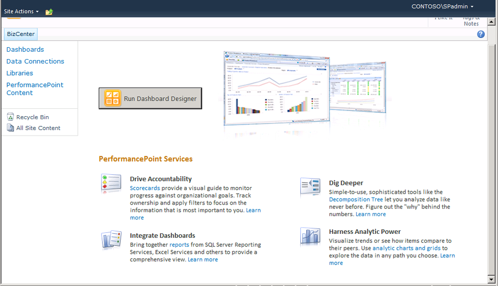
Dashboard Designer is a ClickOnce application hosted by the client without installing an .exe file. You can start it directly from the Business Intelligence Center site, available after you provision the relevant site collection template.
You can also start Dashboard Designer from a SharePoint list configured to support PerformancePoint Services content types. To edit an item, on the drop-down menu simply click Edit In Dashboard Designer. Alternatively, you can create a new item by clicking Add New Item at the bottom of the webpage. Before you install Dashboard Designer, you should make it available on a site the easy way, by creating a site collection using the BI template.
In Central Administration, select Create Site Collections, as shown in the following illustration.
Enter BizCenter in the Title field, and choose the URL name and path—or create a site at a specific path.
On the same page, click the Enterprise tab and click Business Intelligence Center. Enter user names in the Primary Site Collection Administrator and Secondary Site Collection Administrator fields, respectively, and then click OK.
A site collection is created, as shown in the following illustration.


The following are some actions you can perform to troubleshoot SQL Server data source configuration:
You might need to register the service account to the existing application pool dedicated to PerformancePoint Services. To do this, use Windows PowerShell (as Administrator) and run the following cmdlets:
PS C:> $w = Get-SPWebApplication(" <your web application> ") PS C:> $w.GrantAccessToProcessIdentity(" <insert service account> ")Refresh the SSS key.
Review the Release Notes for “SharePoint Business Intelligence SETUP/CONFIGURATION,” at http://office.microsoft.com/en-us/sharepoint-server-help/microsoft-office-servers-2010-faq-readme-HA101793217.aspx?queryid=4dd91eae39694ee586d45d31b5716b32&respos=0&CTT=1&av=OSU140#_Toc276716462 .
Review existing configuration articles, such as “Deploying PerformancePoint 2010 Soup to Nuts” at http://blogs.msdn.com/b/performancepoint/archive/2009/11/24/deploying-performancepoint-2010-soup-to-nuts.aspx and “Set up and configure PerformancePoint Services (step-by-step)” at http://technet.microsoft.com/en-us/library/ee748643.aspx .
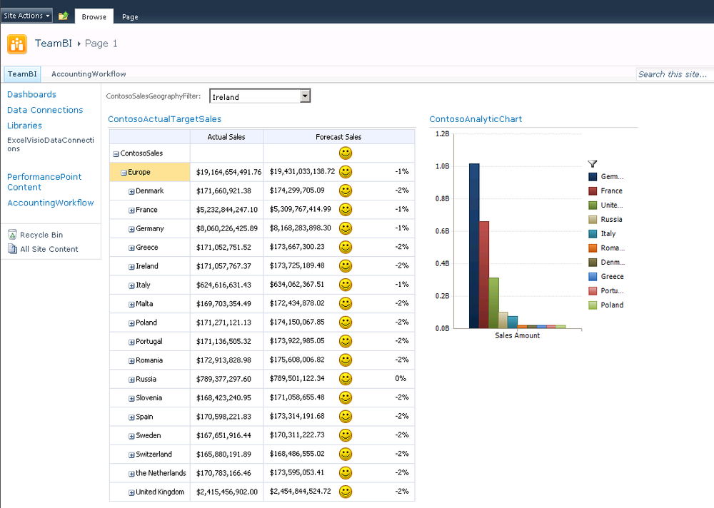
The exercise in this section centers on the sales activities of the Contoso Company. This company manufactures and sells products to various global markets via reseller and Internet channels.
The exercise shows you how to produce a dashboard to publish to users on SharePoint Server 2010. The dashboard enables users to monitor and analyze sales activities and profitability for the company reseller operations.
In the exercise, one KPI is created to support comparisons of sales, sales quotas, and profit margin to a fixed goal of 2 percent, across several fiscal periods, product categories, subcategories, and sales territory regions.
To support the monitoring requirements, two scorecards are created to produce different perspectives of a single KPI. Three reports are created to support analysis requirements.
These scorecards and reports are then embedded in a dashboard that has filters for slicing data by fiscal periods, product categories, and sales territories. The dashboard is deployed to SharePoint so that it can be viewed and explored by Contoso sales management.
Some or all the documents that this exercise draws from come into play when the Analysis Services Cube is designed and created. As discussed in Chapter 3, this should be an iterative process, and it’s the most important step to get right.
Once you know what you want to measure, you must decide what you want to accomplish with the functionality that’s available in PerformancePoint. You have many ways to create and configure KPIs and scorecards in Dashboard Designer. Consider putting your rating, actual, target, and how these may aggregate in a spreadsheet, so that you can review them in prototype fashion, adding the potential users and other stakeholders. Additionally, you can find a number of websites where you can review best practices for dashboard design, such as “Dashboard Design 101,” on the UXmatters website at http://www.uxmatters.com/mt/archives/2010/11/dashboard-design-101.php .
The reports and data sources you choose determine how much you can investigate data and incorporate meaningful visualizations. Consider how you want to filter on available data to give users the right information from which to make decisions. It is also worth reviewing other literature on dashboard design, such as the book Dashboard Design: The Effective Visual Communication of Data by Stephen Few.
Before continuing, you should be familiar with the following:
The definition of “business intelligence” (see Chapter 1)
The underlying data (see Chapter 2)
The section Overview of PerformancePoint Services Components earlier in this chapter
Dashboard Designer provides a wizard that guides you through importing Analysis Services KPIs into a scorecard. This exercise starts with the KPI because it is the driving element for monitoring and the cornerstone of any performance management initiative. Even though this exercise shows quite a bit of the best dashboard functionality, PerformancePoint provides much more functionality than we can show you in one chapter.
The following list defines the basic sequence of actions for creating a very simplified dashboard that works with the Analysis Services cube data source you created in Chapter 3, an Excel file, and a Visio file, all of which were created in this book:
Create a data source.
Create a set of KPIs.
Create dashboard items (report, scorecard).
Create filters to control what data is included.
Create reports to enable the user to perform analysis on the underlying data.
Assemble the dashboard pages.
Preview, test, and deploy the dashboard.
You can use the procedure in this section to create some data sources for use in your dashboard.
Important
External data sources must reside in the same domain as the SharePoint Server 2010 farm, or authentication will fail. For more information about planning for external data sources, see “Planning considerations for services that access external data sources” at http://technet.microsoft.com/en-us/library/cc560988.aspx#ConsiderationsForAccessingExternalData .
You must have a data source before you can create FCO (PerformancePoint content).
Although the procedure begins on the Create tab, you can also create a PerformancePoint data source from the Data Connections library on the Documents tab. Either way, Dashboard Designer and the Select A Data Source Template open so that you can create the data source.

On the Create tab, right-click Data Connections and select New Data Connection.
Analysis Services is selected by default. Click OK.
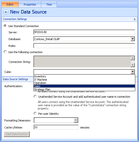
In the Workspace Browser, you are given the option to name the data source. Type the name Contoso_Retail.
In the Server field, enter SP2010-BI, In the Database field, enter ContosoRetail OLAP, and in the Cube field, select Sales. Keep the default Authentication Unattended Service Account. Your information should appear as shown in the following illustration.
Note
The Unattended Service Account And Add Authenticated User Name In Connection option, shown in the preceding illustration, applies to Analysis Services only. The Per-User Identity option requires the Kerberos protocol. For an excellent Kerberos resource, see the white paper “Configure Kerberos Authentication for SharePoint 2010 Products,” at http://go.microsoft.com/fwlink/?LinkId=196600 .
Your data source is saved to the data connections library without you having to click Save or OK in the Data Connections library in your BI Center site.
On the Time tab, under Reference Member, select a member from the dimension that represents the first day of the year, such as January 1, 2011.
The Time tab is where you configure Time Intelligence before creating a filter that can use in reports and scorecards. It is worth reviewing to see whether you want to configure your data to use Time Intelligence. For more information, see “Configure data sources to work with Time Intelligence by using Dashboard Designer,” at http://technet.microsoft.com/en-us/library/ff701697.aspx .
The Time Dimension drop-down lists the hierarchies available in the cube, such as Date.Calendar.YWD for (Year, Week, Day).
Under Reference Date, enter the same date in your regional format. This allows PerformancePoint to understand how years are structured in the date dimension.
Navigate to the Business Intelligence Center, and click Data Connections. You should see the data connections file saved to the Trusted Data Source library.


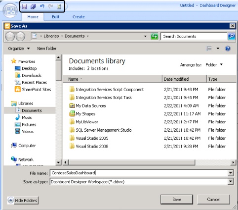
Click the diskette icon to save your dashboard.
In the File Name field, type ContosoSalesDashboard, and then click Save.
The small pencil on the data source indicates that you have not published the dashboard with that data source, although you have saved it. We added the New Data Source, shown in the following illustration, so that you can see the difference.

Now that you have data source connection information stored, you can create a KPI.
Right-click PerformancePoint Content, and then select New | KPI.
Click OK.
Note
Objective KPIs use only the calculated score of a child KPI, in case you want to compare scores of KPIs instead of values.
As shown in the following illustration, a blank KPI template opens—with no content or data mappings—that includes the actual and target metrics for the KPI. Next, you’ll customize two metrics.
In the Name column, select Actual and change it to Actual Sales.
Click the cell under Data Mappings for Actual Sales, and then click Change Source.
On the Workspace tab, select the data source that drives the value of the Actual metric.
Double-click SP2010-BI_Contoso-Sales.
In the Dimensional Data Source Mapping dialog box, select Sales Quota Amount.
In the Dimensional Data Source Mapping dialog box, select New Dimension Filter, and then select Scenario.Scenario Description.
In the Select Members dialog box, select Default Member (All Scenario) to select the filter on members of the description dimension.
Expand All Scenario, select Actual, and then click OK.
In the Dimensional Data Source Mapping dialog box, select New Dimension Filter again, and then select Sales Territory.TerritoryHierarchy.
In the Select Members dialog box, select Default Member (All) to select a filter on members of the Sales Territory.Territory.Hierarchy dimension.
Expand All, and select Europe as the dimension member.
When the Dimensional Data Source Mapping dialog box appears, as shown in the following illustration, click OK.
In the center pane, with the KPI selected, select Name, Target, and change it to “Forecast Sales.”
Repeat Steps 4 through 15 for Forecast Sales, except in Step 10, select Forecast instead of Actual.
Click Indicators to see the default. Your KPI should now look as shown in the following illustration.


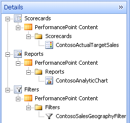
As mentioned earlier, the Workspace Browser offers a new feature from PerformancePoint Server 2007 that allows you to create folders to better organize your PerformancePoint elements.

KPIs are built on measures and presented in scorecards and dashboards. The scorecard is the vehicle for indicators and KPIs and becomes the end-user result of the complete life cycle of a BI solution. That life cycle is described in Chapter 3, where developers prepare data that can be trusted; put that data into a cube so that the cube becomes the ideal data source for the scorecard; and where KPIs display the measures in meaningful ways to assist with data-driven decision making.
Scoring uses some terms that may be unfamiliar, but they’re important as we proceed with configuring our scorecard. The following list provides only brief descriptions of an otherwise complex set of concepts:
Score . A calculated value between 0 and 1 that indicates a relative position. 0 is the worst and 1 is the best.
Scoring pattern . The language that describes what is good or bad in a score such as “increasing is better” = “a higher value is better.” Or “decreasing is better” = “a lower value is better.”
Threshold . The minimum value connected to an indicator that produces a change or specified effect to the indicator.
Banding . The input type for the threshold boundaries. Some are entered as percentages from the target, and others are numeric values with absolute values.
Normalize . In KPI hierarchies where there is a parent-child relationship, normalizing describes how scores are combined to represent the parent or rollup score.
It is worth your time to review other books that can help you understand how a score is calculated by using the band-by value, how to determine the band value, and how to normalize the score. Other material also discusses rollup scoring. The following are some good books on dashboards and scorecards:
Strategy Maps: Converting Intangible Assets into Tangible Outcomes, by Kaplan and Norton
The Strategy-Focused Organization: How Balanced Scorecard Companies Thrive in the New Business Environment, also by Kaplan and Norton
Balanced Scorecard Step-by-Step: Maximizing Performance and Maintaining Results, by Paul R. Niven
Click the default indicators in the center pane. The Thresholds window appears below the Actual Sales and Forecast Sales in Actuals and Targets.
Click Set Scoring Pattern And Indicator to start the wizard shown in the following illustration.
Click Next. The Select An Indicator page appears. Indicators dynamically appear to match the scoring pattern selected in the previous screen.
For fun, select the smiley faces and click Next. You now specify the worst value. If the score is below the threshold, the score will be zero. Keep the default in this example.
Click Next. Notice how the visualizations have changed.


You can now edit the thresholds by selecting the target metric row that should be edited. This window may be collapsed, but you can re-expand it by clicking the chevron at the bottom of the center pane.
Right-Click PerformancePoint Content in the Workspace Browser, and select New | Scorecard.
Notice the following options in the Select A Scorecard Template:
Microsoft . Analysis Services data source
Standard . Blank Scorecard without predefined content or data mappings and Fixed Values Scorecard (user-defined values)
Tabular . Includes all the options for tabular data sources such as Excel, Excel Services, SharePoint List, and SQL Server table
Select Microsoft and click OK. A Create An Analysis Services scorecard is selected.
Select the Contoso_SalesData data source, and then click Next.
Make sure Create KPIs From SQL Server Analysis Services Measures is selected, and click Next.
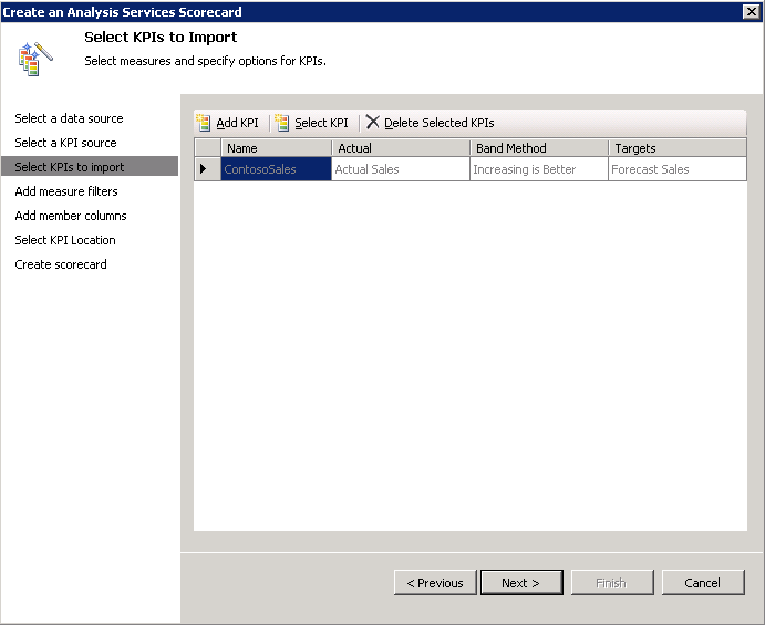
A screen appears, with two buttons on the top: Add KPI and Select KPI. Add KPI lets you choose an existing KPI from the data source, if it exists. If it does, you can make more choices such as setting Actual, Band Method, and Targets.
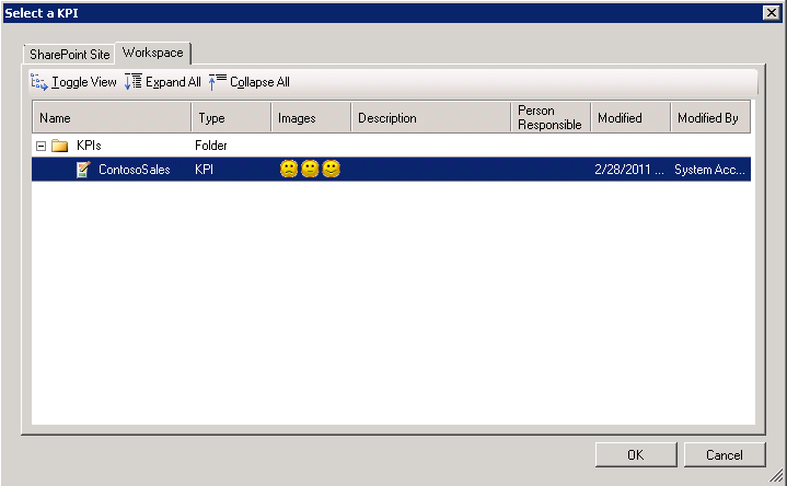
For this example, select the KPI you created in the exercise titled To create a KPI, earlier in this chapter. Click Select KPI, and then click OK.
Ensure that your KPI is selected, and then click Next.
The Add Measure Filters dialog page appears. You already filtered data from the Analysis Services cube when you created the KPIs without using this wizard, so just click Next.
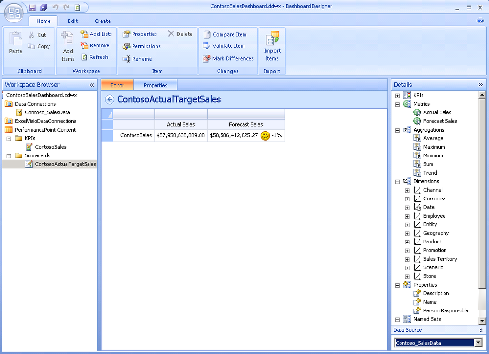
The same logic applies to the Add Measure Columns dialog. Just click Next. Your scorecard now updates to reflect the KPI you created previously. The following illustration shows the items expanded in the Details pane so that you can see the available options. If you had not included the KPI, you could drag it into the center pane.
The illustration also shows that we used the Workspace feature to create a folder for Scorecards by clicking the Properties tab. Finally, notice that the Contoso_SalesData data source is selected in the bottom-right corner.
Save the scorecard and its associated KPI to the server.


By adding a dimension, you give users the ability to slice KPIs based on different views available through the data source. Specific details may be required to drill down on operational scorecards.
Drag the Geography/Hierarchy dimension to just above the ContosoSales column of the scorecard. The member selector appears.
Select the member Europe.
If you right-click the member you selected, other options appear, as shown in the following illustration.
Choose Select All Descendants.
Note
If you accidently add an unwanted dimension and its members, you can click the Undo icon in the upper-left corner of Dashboard Designer.
Important
If you’re not familiar with multidimensional tools, we highly recommend that that you experiment with the user interface by dragging and dropping dimensions and selecting members for each value to see the multidimensional views of the Analysis Services data source. Use the Undo tool to return to your original state.
Perform the same steps listed in Steps 1 and 2, but this time drag the Forecast Sales column. Your KPI in design view (and now with a “dimension”) should look as shown in the following illustration.
On the Edit tab, click Update to update the scorecard view. Larger scorecards take time to update.


At this point you have created one KPI and one scorecard and associated one dimension with the KPI. You can build more KPIs and add more dimensions to give business users more options for slicing data they need to view, and much more. Here are a few more scorecard elements that you should explore:
The Details pane lets you navigate the elements that you can add to the Scorecard, which can dynamically change how your data is visualized.
You can add metrics on the opposite axes from all KPIs.
Aggregations on the scorecard enable you to make summations of all the metrics. You simply add the aggregation type above the metric column. Aggregations are limited to columns (no row aggregating).
Named sets (from the cube) can be placed on a scorecard.
Set Formulas allows you to add MDX or Time Intelligence expressions to the scorecard to further filter the data that is viewed by the user.
You want to include one filter on the dashboard to give users the option to select from other territories.
Right-click the PerformancePoint Content list in the Workspace Browser.
Select New | Filter, and in the resulting dialog box, click Member Selection.
Select the Contoso_SalesData data source, and in the Select Members dialog box, click Select Dimension. The Select Dimension dialog box opens.
Select Geography.Region Country Name, and then click OK.
Click Select Members, and select All Countries under Europe.
Select List For The Display Method, and then click Finish.


As mentioned earlier in the Overview of PerformancePoint Services Components section, there are 10 report types and features that you can use to analyze and investigate data that you monitor using scorecards and KPIs. The reports help you to create a reporting structure that gets the right data to the decision-makers in the right visualization. For example, an analytic bar chart is useful for comparing groups of members, or you might want to show how sales amounts are distributed across different countries or regions.
We recommend that you review the report types and determine which can best fit your needs for enhancing the scorecard experience. In the following example, it makes sense to include several reports, but we focus on the Analytic chart. The Analytic chart and grid are highly interactive, and you can place them on a webpage; however, the data source must be either PowerPivot or Analysis Services.
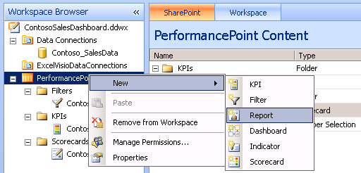
Right-click PerformancePoint Content, and select New | Report.
Select Analytic Chart, and then click OK. A wizard opens so that you can select the data source.
Select the Contoso_SalesData Analysis Services data source, and click Finish. A report authoring environment renders in Dashboard Designer where you can drag measures, dimensions, and named sets from the Details pane.
Drag the Date Calendar YQMD dimension hierarchy into the Background section, and click the drop-down arrow to select the members Year 2009, 2010, and 2011.
Drag the Sales Territory dimension hierarchy into the Background section, and then select the Europe dimension hierarchy. (This serves as a background filter for the report.)
Drag the Sales Amount measure into the Bottom Axis section.
Drag the Geography dimension hierarchy into the Series section, and then select dimension members at the country level. Deselect All and Europe.


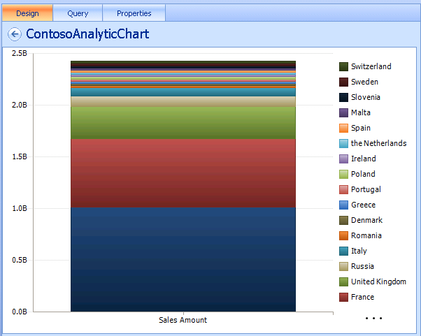
The following illustration shows the result of dragging and dropping dimensions and of narrowing by selecting members.

Tip
Notice that you have three tabs. The Query tab lets you view the MDX query as a result of dragging and dropping dimensions and selecting members. The Properties tab lets you type in the folder name, Reports, to keep things organized in Workspace Browser.
You can enter Data Elements by right-clicking anywhere on the chart. The following illustration shows the result of choosing options for adding a filter, a pivot, changing the report type, and changing the report format.

If you click Report Type, and then Stacked Chart, the chart updates to the following visualization. Again, it’s well worth your time to explore the options to determine the most meaningful visualization for your decision-makers.
If you select Filter and then Top 10, you’ll see the following Top 10 countries. Notice the filter icon, which tells you the report has a filter, and so forth.

You are now ready to create a dashboard, the vehicle you use to show PerformancePoint objects to business users. Dashboards are nothing but PerformancePoint Services Web Parts put together on a Web Part page with connections configured between the parts to create interactivity. Dashboards are ASPX pages. You must have Designer-level permissions on the SharePoint site to deploy the dashboard.
Note
SharePoint Designer also has Web Part pages but does not support creating connections between PerformancePoint Web Parts. Also remember that differences between these authoring tools can be confusing; they are different tools, and their terminology and concepts are different.
You can use the next exercise to put Web Parts together and then configure the connections. Web Part connections include:
Get Value From
Send Values To
Source Value
Connect To
Right-Click PerformancePoint Content, and then select New | Dashboard.
Select the last layout, Header, 2 Columns. (You can modify this later, after you create the dashboard.) The zones mentioned at the bottom of this screen define how you can position scorecards, reports, and filters on the dashboard.
Type a name for your dashboard as it is highlighted in the Workspace Browser. The Details pane on the right lets you drag and drop scorecards, reports, and filters.
The elements shown in the following illustration are available to create a dashboard.
Put a Header on the dashboard by choosing to add to the zone by clicking Add in the bottom-right corner of Dashboard Designer. Select the Header item. Dashboard Designer automatically adds the ContosoSalesGeographyFilter.
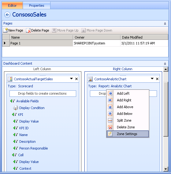
From the Details pane, open the Scorecards node and search until you find the ContosoActualTargetSales scorecard. Drag it onto the Left Column zone.
From the Details pane, open the Reports node and look for the ContosoAnalyticChart report. Drag that report onto the Right Column zone.
Notice that you cannot see the scorecard or chart you created yet. You must deploy the dashboard first.
Right-click the dashboard in the Workspace Browser, and then select Deploy To SharePoint.
Choose the document library where you want to store this dashboard.
Choose the master page you want to use.
Click OK.


The dashboard is deployed using the PerformancePointDefault master page, and it fills the entire browser window.
You can add, remove, and split zones as necessary.
Right-click a zone.
Click Zone Settings on the context menu to open the Zone Settings dialog box, and then click the Size tab.

To learn more about zone size and orientation, see the product team blog post “PerformancePoint Dashboard Sizing Explained,” at http://blogs.msdn.com/b/performancepoint/archive/2008/01/07/performancepoint-dashboard-sizing-explained.aspx .
In addition to the procedures you’ve seen in this chapter, you can also:
Add another page or existing dashboard using the Editor tab when the focus is on your dashboard in Workspace Browser. This enables you to separate and organize content by region, product, and so forth. Additionally, it is easy to help users navigate between pages on the Properties tab.
You can modify the filters you created so that users can filter on information they see.
This chapter provides a taste of the rich functionality available in Dashboard Designer. In this chapter, you explore PerformancePoint Services to understand the following:
The components and architecture of PerformancePoint, including what’s new.
How to configure security for a data source.
How to author and publish a dashboard to SharePoint 2010 by using Dashboard Designer.
Along the way, the various sources for more information should give you steppingstones to more information about the concepts presented here. Finally, it’s worth noting (again) that PerformancePoint is far too complex to cover fully in a single chapter, so you should plan to spend some time exploring the various features and options to gain a full sense of what’s possible.
|
To |
Do this |
|---|---|
|
Manage PerformancePoint Services service applications in SharePoint Central Management |
To view the default settings for PerformancePoint Services or configure the settings, use SharePoint Central Administration and click Manage Service Applications, click the PerformancePoint service application, and then click Manage. TO learn more, see the section “After Running the SharePoint Configuration Wizard.” |
|
Configure SSS for PerformancePoint Services |
Before you connect to SQL Server data sources, you must configure SSS from Central Administration. See the section Configure Security for PerformancePoint to learn more. |
|
To deploy the Business Intelligence Center from the enterprise templates and start Dashboard Designer |
Consider setting up a single repository for all of your BI assets, including your Visio and Excel files, PerformancePoint dashboards, and more. This is where you also start the PerformancePoint Dashboard Designer. Simply go to Central Administration and click Create Site Collections. When you select a template, make sure you select the Enterprise tab and then Business Intelligence Center. To learn more, see the section Start PerformancePoint Dashboard Designer. |
|
To create a basic dashboard |
See the section Providing a Performance Solution. |