13. Essential Design and Interface Techniques
There are a few critical recipes that every Web designer needs to know to begin putting their CSS skills to work. These applications of CSS have become so standard that they form the core of the vast majority of Web designs you will see.
Let’s look at these core applications of CSS to create columns, style menus, and drop-down menus; and use CSS sprites.
Getting Started
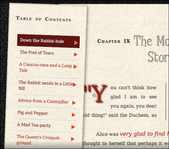
This chapter uses Chapter 9 from Alice’s Adventures in Wonderland with the styles added in Chapters 5–12. It also includes a table of contents in the nav tag and an aside to set up the columns for the layout.
Code 13.1. The HTML5 code you’ll be playing with in this chapter  .
.
<!DOCTYPE html>
<html lang="en">
<head>
<meta charset="utf-8">
<title>Alice’s Adventures In Wonderland | Chapter IX</title>
<link href="../css/font-properties.css" type="text/css" rel="stylesheet" media="all">
<link href="../css/text-properties.css" type="text/css" rel="stylesheet" media="all">
<link href="../css/color-background-properties.css" type="text/css" rel="stylesheet" media="all">
<link href="../css/list-table-properties.css" type="text/css" rel="stylesheet" media="all">
<link href="../css/ui-generatedcontent-properties.css" type="text/css" rel="stylesheet" media="all">
<link href="../css/box-properties.css" type="text/css" rel="stylesheet" media="all">
<link href="../css/visualformatting-properties.css" type="text/css" rel="stylesheet" media="all">
<link href="../css/transformation-transition-properties.css" type="text/css" rel="stylesheet" media="all">
<link href="../css/design-interface.css" type="text/css" rel="stylesheet" media="all">
</head>
<body id="chapter9" class="book aaiw chapter">
<header class="page">
<hgroup>
<h1>Alice’s Adventures in Wonderland</h1>
<h2>By <cite>Lewis Carroll</cite></h2>
</hgroup>
</header>
<section>
<nav class="toc">
<ul class="menu">
<li><h2>Table of Contents</h2></li>
<ol class="drop">
<li><a href="AAIWL-ch01.html">Down the Rabbit-hole</a></li>
<li><a href="AAIWL-ch02.html">The Pool of Tears</a></li>
<li><a href="AAIWL-ch03.html">A Caucus-race and a Long Tale</a></li>
<li><a href="AAIWL-ch04.html">The Rabbit sends in a Little Bill</a></li>
<li><a href="AAIWL-ch05.html">Advice from a Caterpillar</a></li>
<li><a href="AAIWL-ch06.html">Pig and Pepper</a></li>
<li><a href="AAIWL-ch07.html">A Mad Tea-party</a></li>
<li><a href="AAIWL-ch08.html">The Queen's Croquet-ground</a></li>
<li><a href="AAIWL-ch09.html">The Mock Turtle's Story</a></li>
<li><a href="AAIWL-ch010.html">The Lobster Quadrille</a></li>
<li><a href="AAIWL-ch011.html">Who Stole the Tarts?</a></li>
<li><a href="AAIWL-ch012.html">Alice’s Evidence</a></li>
</ol>
</ul>
</nav>
<article>
<h2>Chapter IX
<span class="chaptertitle">The Mock Turtle's Story</span>
</h2>
<p>"You can't think how glad I am to see you again, you dear old thing!" said the Duchess, as she tucked her arm affectionately into Alice’s, and they walked off together.</p>
<p>Alice was <a href="#">very glad to find her</a> in such a pleasant temper, and thought to herself that perhaps it was only the pepper that had made her so savage when they met in the kitchen.</p>
...
<p>"That's enough about lessons," the Gryphon interrupted in a very decided tone: "tell her something about the games now."</p>
</article>
<aside>
<h2>About the Author</h2>
<p><b><a href="#">Charles Lutwidge Dodgson</a></b> (7 January 1832 – 14 January 1898), better known by the pseudonym Lewis Carroll...</p>
</aside>
</section>
<footer>
Illustrator: Arthur Rackham
</footer>
</body>
</html>
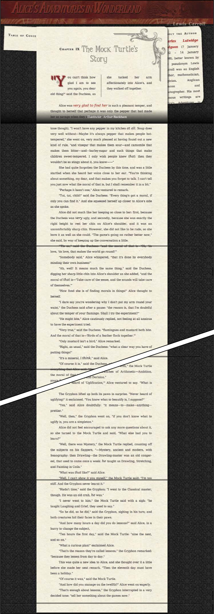
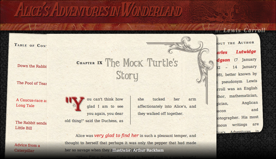
The Web page (Code 13.1) without any styles applied to it. The content is all stacked vertically.
Creating Multicolumn Layouts with Float
The most common way to lay out a page is by establishing a grid, which is generally made up of two or more columns . This allows the designer to present multiple sources of information and functionality in the same horizontal plane, making better use of the screen and reducing the need to scroll.
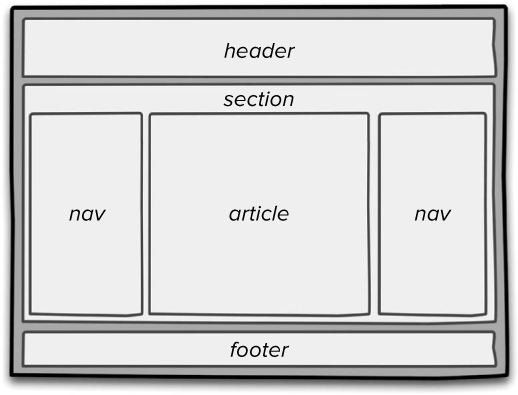
The basic wireframe for your page showing the three columns within the surrounding section element.
Although not explicitly intended to perform this duty, the float property (discussed in Chapter 10) is now the standard method for creating a grid structure of columns in most modern Web designs. This is done by taking block level elements—elements that would normally flow vertically—and “floating” them next to each other so that they flow horizontally  .
.
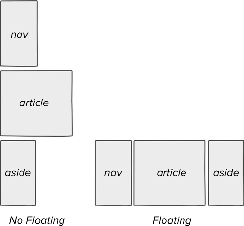
When floating is applied, the columns flow horizontally next to each other.
Code 13.2. Added to design-interface.css—Creates columns when applied to Code 13.1  . In addition to a simple CSS reset, the layout code sets the width of the total page, along with the width and padding of each column (for a fixed-width page this must equal the overall width of the page), and then floats the three columns so that they horizontally flow next to each other rather than stacking.
/*** design-interface.css ***/
/* Column Layout
-------------------------------------------------------------- */
header.page, section, footer.page {
clear: both;
margin: 0 auto;
min-width: 980px;
width: 100%; }
section {
width: 1280px; }
nav.toc, article, aside {
position: relative;
float: left; }
nav.toc:hover, aside:hover {
z-index: 99; }
nav.toc {
background: rgb(242, 237, 217) url(../images/chrome/paper-01.jpg) repeat 0 0;
box-shadow: 1px 1px 5px 1px rgba(0,0,0,.25) inset, 3px 3px 15px rgba(0,0,0,.5);
padding: 0;
top: 150px;
width: 270px;
z-index: 1;
-webkit-transform: rotate(2deg);
-moz-transform: rotate(2deg);
-o-transform: rotate(2deg);
transform: rotate(2deg); }
nav.toc ol, nav.toc ul, nav.toc li {
background: none;
list-style: none;
list-style-position: outside;
margin: 0;
margin-left: 1em;
padding: 1em 0;
width: 100%; }
nav.toc li, nav.toc li li {
background: none;
margin: 0;
padding: 1em 0;
width: 95%; }
article {
margin-left: -5%;
min-width: 480px;
max-width: 580px;
z-index: 1; }
aside {
opacity: 1;
right: 40px;
width: 200px;
z-index: 0; }
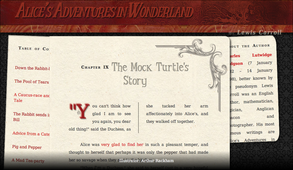
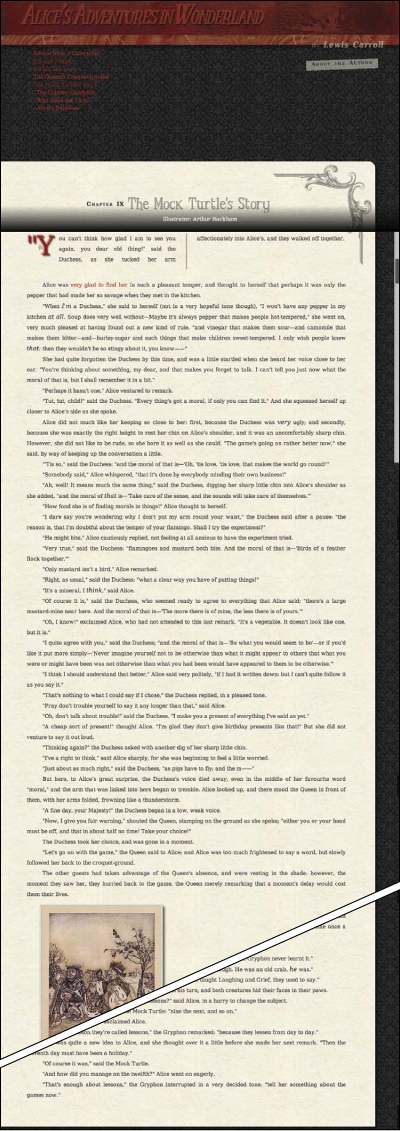
Code 13.2 applied to Code 13.1. The columns now line up horizontally and we can see all three columns at once.
To set up a multicolumn layout using CSS
1. Add rules to define the width of your content area(s). This is a container around your columns that will help hold them together regardless of the width of the browser window. I like to use the section tag to define it (Code 13.2). Generally, it involves defining a width for the site’s header and footer, as well as the section into which you will add the articles.
The widths will depend on a number of factors:
• Fluid design: If you are using a fluid grid, you will be setting your width in relative units, most likely a percentage.
With a fluid design, you need to set the minimum width (using absolute units such as pixels) to which the content can be squeezed before vertical scrolling is needed. You may also want to set the maximum width to which the content can stretch; otherwise text columns will grow so wide that they’ll become hard to read.
• Fixed design: When you want a fixed-width design, use absolute units (inches, cms, pixels, and so on). If you have a defined layout grid (highly recommended), then you should consider how wide the grid is and the number of columns it will contain.
Regardless of whether you are using a fluid or fixed design, you will want to tailor column widths to the target device, as described in Chapter 14.
header.site, section, footer.site {...}
2. Set the float property for your columns. Most columns use a float:left but float:right or a combination will work, depending on your needs.
nav, article, aside {...}
Remember to use one of the float fixes, outlined in this chapter, if you see strange things happening with your box backgrounds and borders.
3. Set the column widths. Until these widths are set, the columns will stretch the full width of the parent elements (section) and not actually float next to each other. Additionally, you will want to set margins and any padding. So you will set a separate width using conditional styles as explained in Chapter 12:
nav {...}, article {...}, aside {...}
My general rule of thumb is to leave one to five pixels or 1 to 2% (for fluid columns) as a “fudge factor” between floated elements. The difference between columns that float and rows stacked on each other can literally come down to a single pixel. However, you will need to test your design on multiple browsers at multiple window sizes to find the exact fudge factor for your design.
When you are using padding, you will run afoul of the box model problem in Internet Explorer explained in the sidebar “Fixing the Box Model for Older Versions of Internet Explorer.”
Although I used three columns here, you can add as many columns as you want. Just add more <aside> or <div> elements with the float property and adjust your column.
Fixing the Float
CSS has a nasty little bug that was apparently meant to be a feature: When you float block-level elements within a block-level element (see Chapter 10 for more information), the child elements do not take up any space in their parent . Make no mistake, the child elements are still on the Web page where you expect them to be; but if you add a background or border to their parent, the parent’s box appears to collapse as if no content were present! Believe it or not, this was done on purpose by the browser developers as a response to the CSS specification, but it can be incredibly annoying when you are trying to set up columns.
Without a fix, the parent element (article) rolls up like a cheap newspaper, leaving its child elements high and dry.
The problem is that floating elements are taken out of the normal flow of the document so, in effect, nothing anchors the bottom of the element and identifies where the bottom is. Later in this chapter I’ll show you how to float two elements next to each other to create a columnar layout. But to make them work effectively, you first need to learn the following techniques.
Several solutions have been developed to combat this little “feature” and force the parent element to acknowledge all of its prodigal children . But I find two solutions to be most reliable. The first is structural in the HTML; the other is pure and simple CSS.
With the fix in place, the parent is there to protect its children.
Code 13.3. The break tag clearfix involves adding a new structural element (the break tag) to the bottom of the parent element to clear the floating and snap the parent open. The overflow fix requires that you add the overflow property to the parent’s selector, in this case the section tag, to display everything as it should be.
/*** design-interface.css ***/
/* Float Fixes
----------------------------------------------- */
.clearfix { clear: both; }
section { overflow: auto; }
Using a break tag “clearall” fix
The float problem is caused when an element is floating and its last child in an element is floating. As a result, the parent can’t see its bottom. The most common method for fixing the float problem is to clear floating at the bottom of the element (following all of the elements that are floated within it) so the parent will open to its natural height.
To do this, we create a special “clearfix” class that we can use with any element—most commonly a break tag—to force an end to the float.
To add the clearfix
1. Create a class in your CSS called clearfix. This class will include the single declaration to clear all floating (Code 13.3):
.clearfix { clear: both; }
2. Add the clearfix class to an HTML tag at the bottom of every parent element that contains floating elements. You could also just add a break tag with the class at the bottom of every floating element. This class will clear floating, and the element will snap to its natural height:
<br class="clearfix">
Although I’ve used clearfix here for the specific purpose of fixing the floating box problem, this class can be applied anywhere you want to clear floating.
Although extremely popular, this trick tends to litter the page with a lot of breaks with clearfix class.
Using an overflow fix
The second method for preventing a parent element from collapsing is so simple that if it weren’t so important, it would hardly be worth mentioning: To restore the element’s height, just set the parent overflow. That’s it. You can even set the element overflow to auto. Apparently setting overflow reminds the element to accommodate its children.
To add the overflow fix
1. For any element that is collapsing, add the overflow property. You can set the value to anything, including the default value auto, to restore the parent to its proper height (Code 13.3):
overflow: auto;
2. Set up your parent element with floating children. As long as the parent element includes the overflow declaration, you are safe.
<section>...</section>
While you could just set the overflow property using the universal selector, I find that this can lead to some problems, as some browsers will throw in scrollbars everywhere, even when there isn’t any overflow.
You may notice a little trick I used to center the numbers in the blocks horizontally (easy) and also vertically. Horizontal is achieved by adding text-align: center. Vertical is done by setting the line-weight to be the same value as the height of the box. As long as only a single line of text is present, it will stay vertically centered in the element.
Styling Links vs. Navigation
The Web is nothing without links. Many designers are content to rely on default browser styles applied to their links; but this is not only boring, it also makes all the links on your page look exactly the same, whether they are global navigation or content links.
Styling links using pseudo-classes was covered in Chapter 4, but to bring your navigation to life, you need to style your links depending on the context.
To style navigation and links
1. Style the default link styles. In the design-interface.css file, add rules for the anchor tag and its :link, :visited, :hover, and :active states (Code 13.4).
a {...}
a:link {...}
a:visited {...}
a:hover {...}
a:active {...}
I recommend setting text decoration to “none” to eliminate the unattractive underlining. You can then add link underlining using the border-bottom property as needed.
2. Style specific hypertext link styles such as paragraphs, lists, and tables. Links in paragraphs need a little extra attention because they are surrounded by other text.
p a {...}
p a:link {...}
p a:visited {...}
p a:hover {...}
p a:active {...}
In addition to color, some options to differentiate hypertext from text include:
• Underline using border-bottom to control the style, thickness, and color of the underline.
• Italics or bold to give the linked text extra style or weight.
• A background color or image to create a highlight effect. See “Using CSS Sprites” in this chapter.
• Increase size slightly.
3. Style the navigation links. Navigation links are most commonly set up as a list to allow the links to appear in a list even if CSS is present (See “Designing with Progressive Enhancements” in Chapter 14.)
nav.toc .menu a {...}
These are the basic styles applied to the navigation links, but you are not quite done styling the menu itself. You’ll get to that in the next two sections.
Code 13.4. Added to design-interface.css—Styles the links in Code 13.1, with a default link style applied to all link (a) elements, and special styles applied for links in paragraphs and links used for navigation .
/*** design-interface.css ***/
/* Default Link Styles
-------------------------------------------------------------- */
a {
text-decoration: none; }
a:link {
color: rgb(204,0,0); }
a:visited {
color: rgb(153,0,0); }
a:hover {
color: rgb(255,0,0); }
a:active {
color: rgb(0,255,255); }
/* Contextual Link Styles
-------------------------------------------------------------- */
p a {
font-style: italic;
font-size: 1.2em;}
p a:link, p a:visited {
border-bottom: 1px dotted rgb(255,153,153); }
p a:hover, p a:active {
background-color: rgb(255,235,235);
border-bottom: 1px solid rgb(255,102,102); }
/* Menu Link Styles
-------------------------------------------------------------- */
nav.toc .menu a {
display: block;
padding: 10px;
width: 100%;
height:100%; }
nav.toc .menu a:link, nav.toc .menu a:visted {
color: rgb(153,0,0); }
nav.toc .menu a:hover {
color: rgb(255,255,255); }
nav.toc .menu a:active {
color: rgb(153,0,0); }
nav.toc .menu {
display: block;
position: relative;
height: auto;
width: 230px;
cursor: pointer; }
nav.toc .menu .drop {
display: block;
position: relative;
width: auto; }
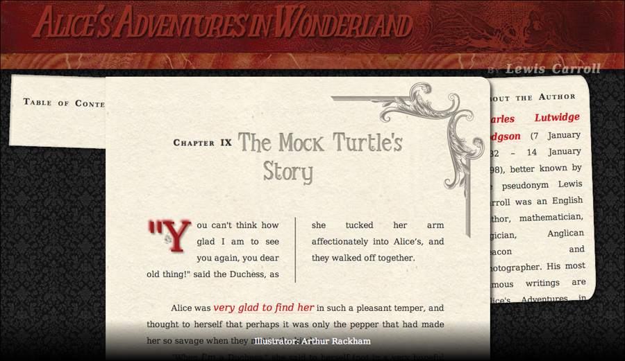
Shows the Web page (Code 13.1) when the design-interface.css (Code 13.4) styles are added. The difference between hypertext links in paragraphs and navigation links in the menu are now clear.
Using CSS Sprites
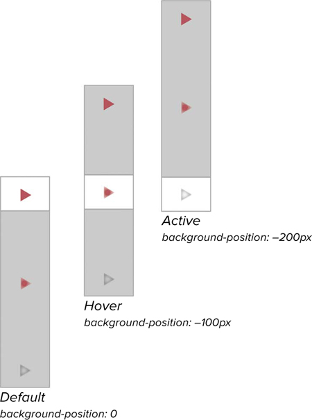
The CSS sprite technique lets you create a single image that contains the different states used for buttons, menus, or interface controls using dynamic pseudo-classes. In that file, you place all of the individual sprites that make up your button, separated by enough space so that they don’t run into each other. You then call this image as the background for an element, and set the background position property (using negative values to move the background up and/or left) to position the correct sprite. Because only one image must load, the browser needs to make only one server call, which speeds up your site.
For example, in your menu from the previous section, it might be nice to place a pointer icon to the right of the options to show that you will be loading a new page. The sprite includes all three versions of the icon for all three dynamic states.
To add CSS image rollovers to a Web page
1. Create an image with the different dynamic states for your icon. You will create icons for each of the dynamic states you need (default, hover, and active, in this example) all in the same image file, separated by a small amount of space and name it sprite-pointer.png . Generally, you will want to regularly space the states’ positions, making them easy to remember. For example, I set the top of each graphic at intervals of 100 pixels.
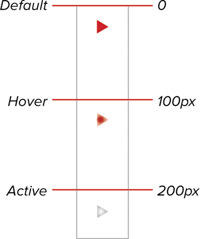
sprite-pointer.png—The image used to create the multiple states used for the arrow. They are arranged at regular intervals to help you more quickly and accurately switch them.
2. Add the sprite to the element you are using as a control (Code 13.5).
nav.toc .menu .drop li {...}
3. Set the background image to not repeat. You will need to set the horizontal position to left or right and then adjust the vertical position up (negative values) or down (positive values) as needed for appearance.
background: transparent url('../_images/sprite-pointer. png') no-repeat right 10px;
Although this is a link, you are using the list element to add your sprite because this provides better control over positioning. However, sprites work just as well on links, lists, or any other element.
Code 13.5. added to design-interface.css—When applied to your Web page (Code 13.1), this code adds a graphic arrow to the menu, providing visual interaction as the visitor uses the menu and further differentiating that link style .
/*** design-interface.css ***/
/* CSS Sprites
-------------------------------------------------------------- */
nav.toc .menu .drop li {
font-size: .875em;
border-top: 1px solid rgb(204,204,204);
background: transparent url('../images/chrome/sprite-pointer.png') no-repeat right 10px;
margin: 0;
padding: 0;
padding-right: 20px; }
nav.toc .menu .drop li:hover {
background-color: rgb(102,0,0);
background-position: right -90px; }
nav.toc .menu .drop li:active {
background-color: rgb(255,255,255);
background-position: right -190px; } }
Shows your Web page (Code 13.1) when the design-interface.css (Code 13.5) styles are included.
4. Move the background image up or down, depending on the state. Add rules for all the link states (:link, :visited, :hover, :active, and :focus), setting the background-position property with the correct vertical offset values to display the relevant rollover state.
nav.toc .menu .drop li:hover {...}, nav.toc .menu .drop li:active {...}
For example, the visited state would use:
background-position: right -100px;
So only the visited button state is shown .
With the height of the element set, only a part of the background image is revealed, hiding the rest. By changing the background position within the element, it appears as if the image has changed.
You can, of course, include any other style changes you want. In this example, I’m also changing the background color.
The concept (and the last part of the name) of CSS sprites originated in the early days of video games, when memory and speed were at a premium. To overcome system limitations, video game producers would lay out the thousands of small graphics used to create the game into a grid and then display each sprite as needed, masking out all but the needed part of the larger image.
The example here is a simple one, but it’s possible to place dozens, hundreds, or more images on a single sprite to cut down on server requests and speed up your site.
Creating a CSS Drop-Down Menu
Drop-down menus are a standard way to reduce navigation noise, allowing you to present a lot of links in a little space. Although generally thought of as the domain of JavaScript, drop-down menus can also be achieved using only a little bit of CSS.
To make a pure CSS drop-down menu
1. Hide the drop-down menu. To show the menu—“dropping” it down—you first need to hide it (Code 13.6). Give it a triple whammy by setting its height to 0, overflow to hidden, and opacity to completely transparent.
nav.toc .menu .drop {...}
Code 13.6. Added to design-interface.css—When applied to your Web page (Code 13.1), this collapses the menu, leaving only a menu label , which when the pointer hovers over it, expands the menu to full height .
/*** design-interface.css ***/
/* Drop Menu
-------------------------------------------------------------- */
nav.toc .menu .drop {
overflow: hidden;
height: 0;
opacity: 0; }
nav.toc .menu:hover>.drop {
height: auto;
opacity: 1; }
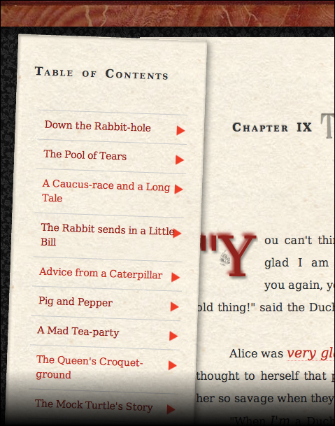
Code 13.6 applied to Code 13.1. Initially, the menu is hidden.
When the user hovers a pointer over the menu header, the menu drops down and is ready for the user to select a menu option.
2. Set the drop menu to appear when the user’s pointer hovers over it. When the pointer hovers over any part of the menu—including the title at the top—set the height to auto and opacity to opaque. You can also couple this with a transition to create a more subtle opening effect.
nav.toc .menu:hover>.drop {...}
It would be cool if the menu could use a transition to unroll from 0 to the menu’s full height. You could do this if you knew the exact height of the menu, but this is rarely the case, especially in a dynamic Web site.
Because this trick relies on the child selector, it will not work in IE6, so you will need to either show the menu (using conditional CSS to set display and opacity) or make other navigational arrangements.
Putting It All Together
Code 13.7 shows the final version of design-interface.css.
Code 13.7. Added to design-interface.css—When applied to your Web page (Code 13.1), the final results are three columns .
/*** design-interface.css ***/
/* Column Layout
---------------------------------------------- */
header.page, section, footer.page {
clear: both;
margin: 0 auto;
min-width: 980px;
width: 100%; }
section {
width: 1280px; }
nav.toc, article, aside {
position: relative;
float: left; }
nav.toc:hover, aside:hover {
z-index: 99; }
nav.toc {
background: rgb(242, 237, 217) url(../ images/chrome/paper-01.jpg) repeat 0 0;
-shadow: 1px 1px 5px 1px rgba(0,0,0,.25) inset, 3px 3px 15px rgba(0,0,0,.5);
padding: 0;
top: 150px;
left: 20px;
width: 270px;
z-index: 0;
-webkit-transform: rotate(2deg);
-moz-transform: rotate(2deg);
-o-transform: rotate(2deg);
transform: rotate(2deg); }
nav.toc ol, nav.toc ul, nav.toc li {
background: none;
list-style: none;
list-style-position: outside;
margin: 0;
margin-left: 1em;
padding: 1em 0;
width: 100%; }
nav.toc li, nav.toc li li {
background: none;
margin: 0;
padding: 1em 0;
width: 92%; }
article {
margin-left: -5%;
min-width: 480px;
max-width: 580px;
z-index: 1; }
aside {
opacity: 1;
right: 40px;
width: 200px;
z-index: 0;
}
/* Float Fixes
----------------------------------------------- */
.clearfix { clear: both; }
section { overflow: auto; }
/* Default Link Styles
----------------------------------------------- */
a {
text-decoration: none; }
a:link {
color: rgb(204,0,0); }
a:visited {
color: rgb(153,0,0); }
a:hover {
color: rgb(255,0,0); }
a:active {
color: rgb(0,255,255); }
/* Contextual Link Styles
----------------------------------------------- */
p a {
font-style: italic;
font-size: 1.2em;}
p a:link, p a:visited {
border-bottom: 1px dotted rgb(255,153,153); }
p a:hover, p a:active {
background-color: rgb(255,235,235);
border-bottom: 1px solid rgb(255,102,102); }
/* Menu Link Styles
----------------------------------------------- */
nav.toc .menu a {
display: block;
padding: 10px;
width: 100%;
height:100%; }
nav.toc .menu a:link, nav.toc .menu a:visted {
color: rgb(153,0,0); }
nav.toc .menu a:hover {
color: rgb(255,255,255); }
nav.toc .menu a:active {
color: rgb(153,0,0); }
nav.toc .menu {
display: block;
position: relative;
height: auto;
width: 230px;
cursor: pointer; }
nav.toc .menu .drop {
display: block;
position: relative;
width: auto; }
/* CSS Sprites
----------------------------------------------- */
nav.toc .menu .drop li {
font-size: .875em;
border-top: 1px solid rgb(204,204,204);
background: transparent url('../images/ chrome/sprite-pointer.png') no-repeat right 10px;
margin: 0;
padding: 0;
padding-right: 20px; }
nav.toc .menu .drop li:hover {
background-color: rgb(102,0,0);
background-position: right -90px; }
nav.toc .menu .drop li:active {
background-color: rgb(255,255,255);
background-position: right -190px; }
/* Drop Menu
----------------------------------------------- */
nav.toc .menu .drop {
overflow: hidden;
height: 0;
opacity: 0; }
nav.toc .menu:hover>.drop {
height: auto;
opacity: 1; }