
10. Box Properties
In This Chapter
Understanding an Element’s Box
Setting the Width and Height of an Element
 Controlling Overflowing Content
Floating Elements in the Window
Creating a Multi-Column Text Layout
In the physical world, atoms are the building blocks of all larger objects. Every type of atom, or element, has unique properties, but when bonded with other atoms, they create molecules—larger structures with properties different from the parts.
Likewise, HTML tags are the building blocks of your Web page. Each tag, or element, has its own capabilities. Tags can be combined to create a Web page that is greater than the sum of its parts. Whether a tag is by itself or nested deep within other tags, it can be treated as a discrete element on the screen and controlled by CSS.
Web designers use the concept of the box as a metaphor to describe the various things that you can do to an HTML element, whether it is a single tag or several nested tags. A box can have several properties—including margins, borders, padding, width, and height—that can be influenced by CSS.
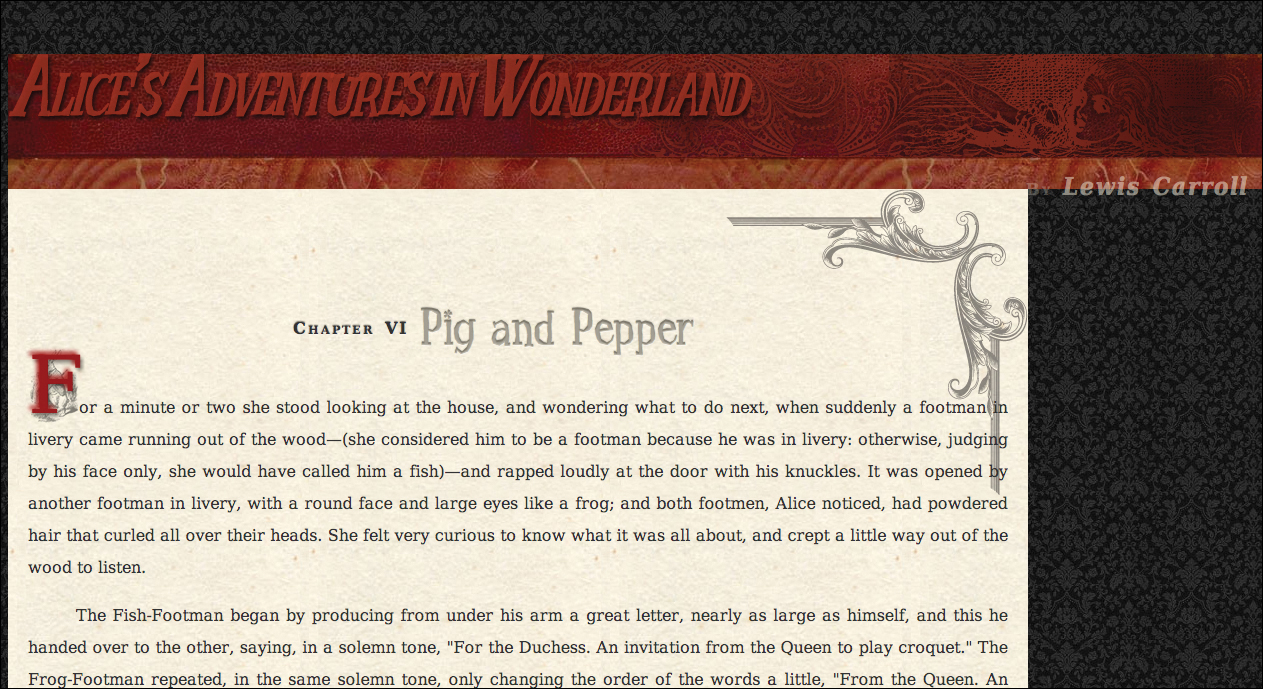
This chapter shows you how to control the box and its properties (Code 10.1).
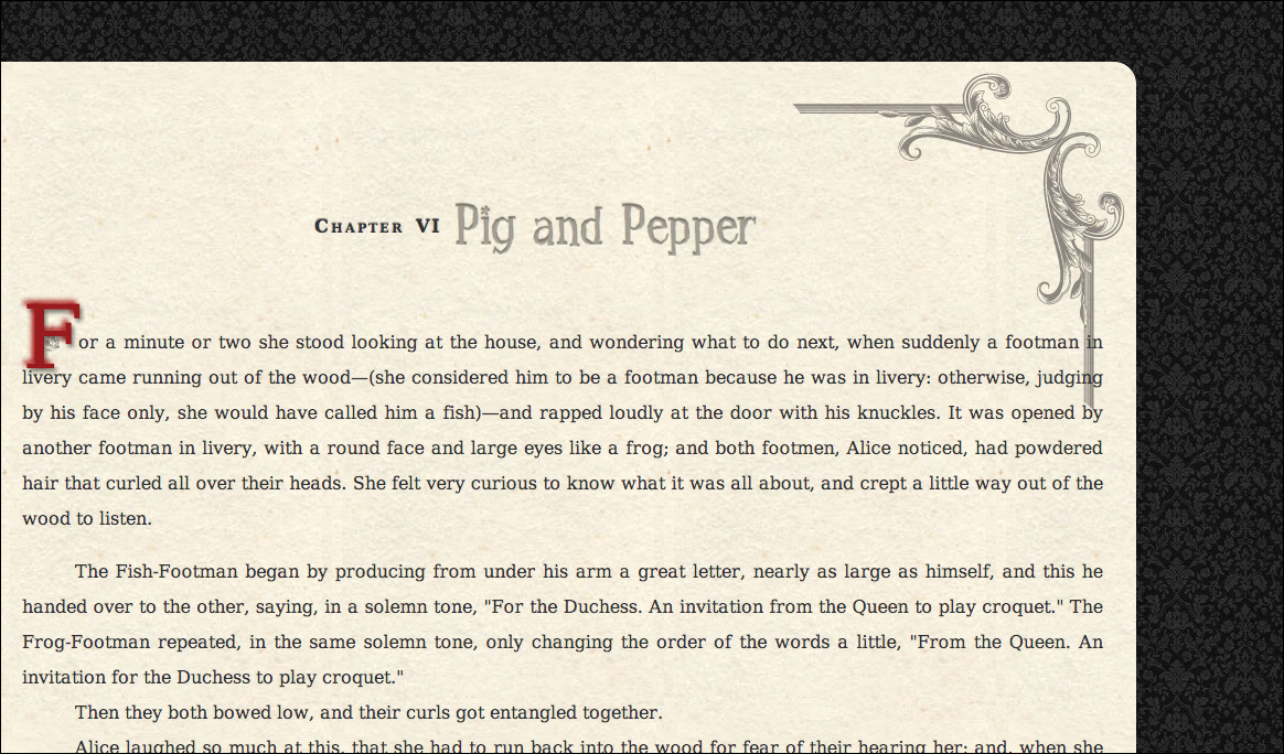
Code 10.1. The HTML5 code used for the examples in this chapter. It imports the final CSS from Chapters 5, 6, 7, 8, and 9 as well as a new file we will be building in this chapter called box-properties.css. For this section, I’ve added two figures (color with a caption and black and white) and an aside to the article  .
.
<!DOCTYPE html>
<html lang="en">
<head>
<meta charset="utf-8">
<title>Alice’s Adventures In Wonderland | Chapter VI</title>
<link href="../css/font-properties.css" type="text/css" rel="stylesheet" media="all">
<link href="../css/text-properties.css" type="text/css" rel="stylesheet" media="all">
<link href="../css/color-background-properties.css" type="text/css" rel="stylesheet" media="all">
<link href="../css/list-table-properties.css" type="text/css" rel="stylesheet" media="all">
<link href="../css/ui-generatedcontent-properties.css" type="text/css" rel="stylesheet" media="all">
<link href="../css/box-properties.css" type="text/css" rel="stylesheet" media="all">
</head>
<body id="chapter6" class="book aaiw chapter">
<header class="page">
<hgroup>
<h1>Alice’s Adventures in Wonderland</h1>
<h2>By <cite>Lewis Carrol</cite></h2>
</hgroup>
</header>
<article>
<h2>Chapter VI
<span class="chaptertitle">Pig and Pepper</span>
</h2>
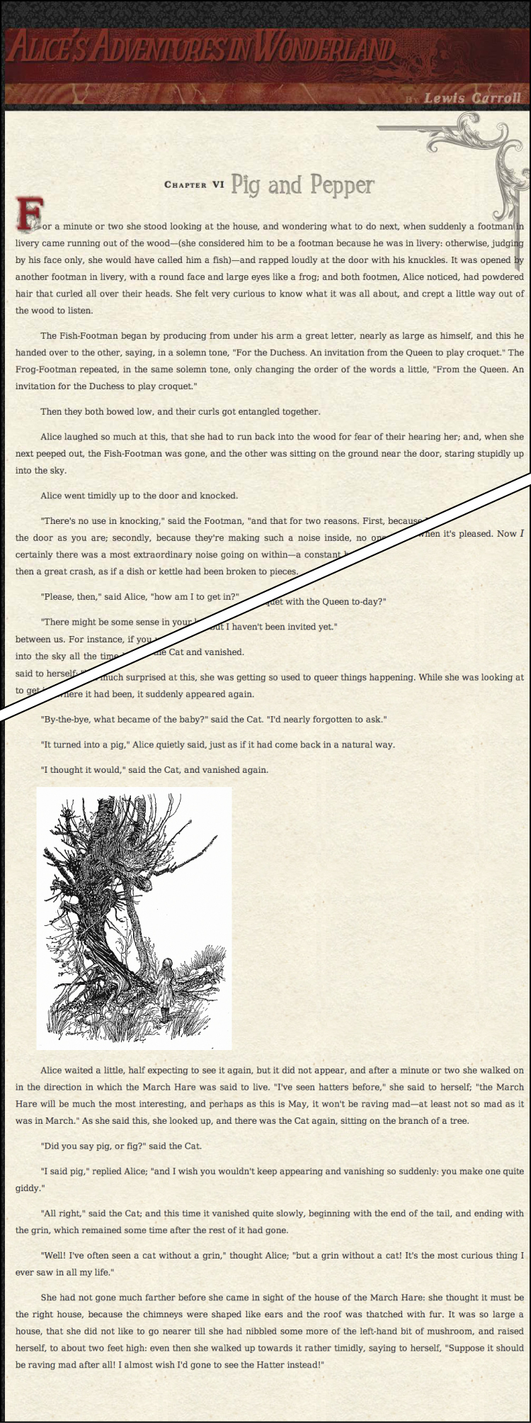
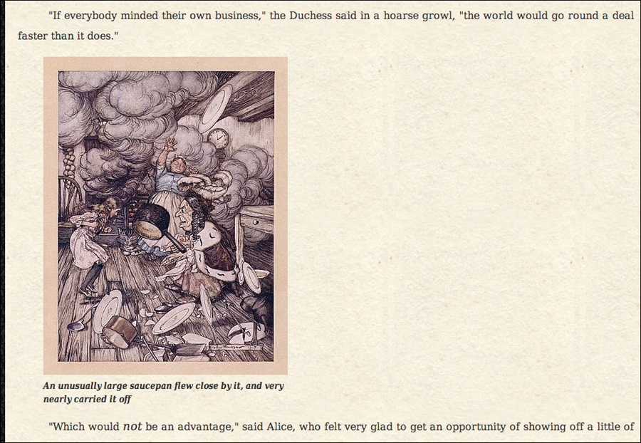
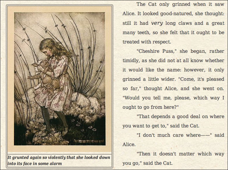
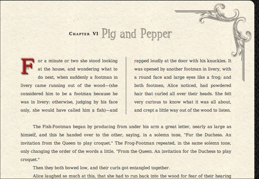
<p>For a minute or two she stood looking at the house, and wondering what to do next, when suddenly a footman in livery came running out of the wood—(she considered him to be a footman because he was in livery: otherwise, judging by his face only, she would have called him a fish)—and rapped loudly at the door with his knuckles. It was opened by another footman in livery, with a round face and large eyes like a frog; and both footmen, Alice noticed, had powdered hair that curled all over their heads. She felt very curious to know what it was all about, and crept a little way out of the wood to listen.</p>
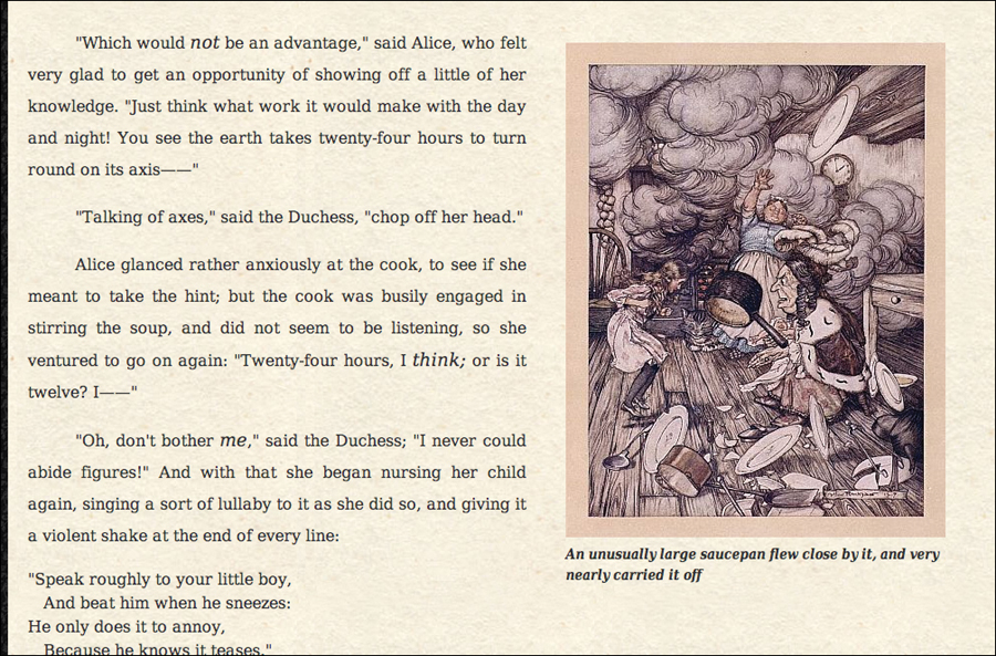
<figure class="illo cl-illo floatright" style="width: 384px;">
<img src="../images/illos/p0070-insert2.jpg" width="384" height="500" alt="An unusually large saucepan flew close by it, and very nearly carried it off" title="">
<figcaption>An unusually large saucepan flew close by it, and very nearly carried it off </figcaption>
</figure>
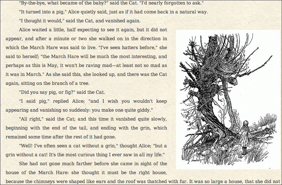
<figure class="illo bw-illo floatcenter" style="width: 400px;">
<img src="../images/illos/p0075-image.png" width="400" height="258" alt="Cheshire cat in a tree" title="">
</figure>
<p>She had not gone much farther before she came in sight of the house of the March Hare: she thought it must be the right house, because the chimneys were shaped like ears and the roof was thatched with fur. It was so large a house, that she did not like to go nearer till she had nibbled some more of the left-hand bit of mushroom, and raised herself, to about two feet high: even then she walked up towards it rather timidly, saying to herself, "Suppose it should be raving mad after all! I almost wish I'd gone to see the Hatter instead!"</p>
</article>
<aside>
<h2>About the Author</h2>
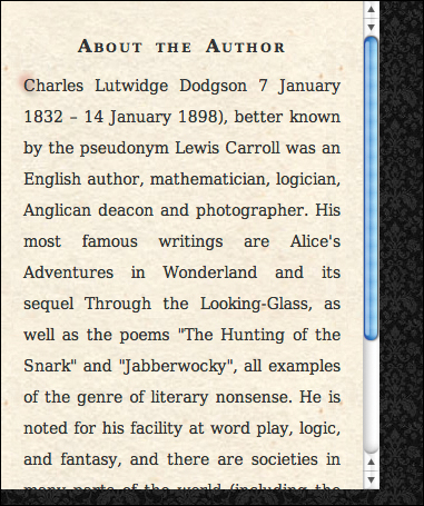
<p>Charles Lutwidge Dodgson 7 January 1832 – 14 January 1898), better known by the pseudonym Lewis Carroll was an English author, mathematician, logician, Anglican deacon and photographer. His most famous writings are Alice's Adventures in Wonderland and its sequel Through the Looking-Glass, as well as the poems "The Hunting of the Snark" and "Jabberwocky", all examples of the genre of literary nonsense. He is noted for his facility at word play, logic, and fantasy, and there are societies in many parts of the world (including the United Kingdom, Japan, the United States, and New Zealand) dedicated to the enjoyment and promotion of his works and the investigation of his life.</p>
</aside>
<footer>
<nav>
<a href="AAIWL-ch05.html" class="prev">Advice from a Caterpillar</a>
<a href="EB9780133132762_6.html">Table of Contents</a>
<a href="AAIWL-ch07.html" class="next">A Mad Tea-party</a>
</nav>
</footer>
</body>
</html>
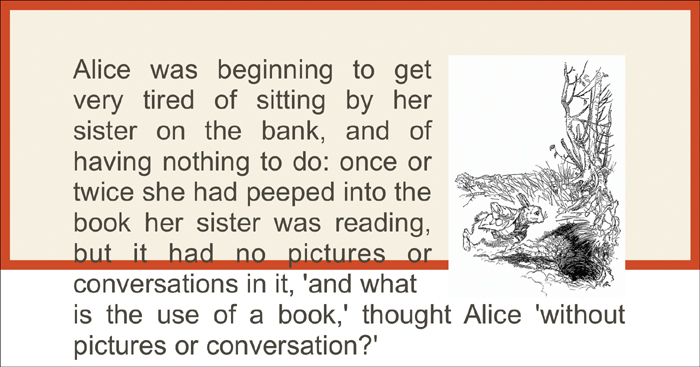
The Web page for this chapter before adding any of the box properties. It’s a scrambled mess right now, but you’ll be laying down the design grid, adding margins, and adding padding to give the design some breathing room.
Understanding an Element’s Box
As you learned in Chapter 2, an element is a part of an HTML document that is set off by HTML container tags. The following is an HTML element:
<p>Alice</p>
This is another HTML element:
<article><p><em>Alice<img src="alice11.gif"></em></p></article>
The first example is an element made of a single tag. The second example is a collection of nested tags, and each of those nested tags is an individual element. Remember that nested tags are called the children of the tags within which they are nested, which are called the parents (see “Inheriting Properties from a Parent” in Chapter 4).
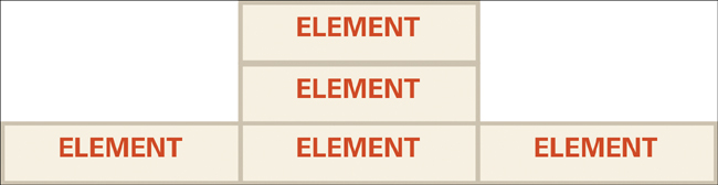
Parts of the box
All HTML elements have four sides: top, right, bottom, and left . These four sides make up the element’s box, to which CSS box properties can be applied. Each side of the box has the following properties:
• Content—At the center of the box, this is the substance of the page. The content includes all text (called copy), lists, forms, and images you use.
• Child Elements—Elements contained within the parent element that are set off by their own HTML tags. Child elements typically have their own box that can be controlled independently of the parent.
• Width and Height—The dimensions of the content area. If you leave width and height undefined, these dimensions are determined by the browser (see “Setting the Width and Height of an Element” in this chapter).
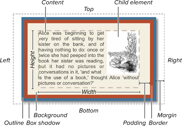
The box model in all its glory. Notice that the outline is part of the margin. If a margin is not present, the outline will appear underneath adjacent elements. Also, if two elements are stacked on each other, the margins between are not added, but collapse to the larger of the two.
• Padding—The space between the border and the content of the element (see “Setting an Element’s Padding” in this chapter). Background colors and images also fill this space. If left unset, the size of the padding is generally 0.
• Background—Space behind the content and padding of the element. This can be a solid color, one or more background images, or a background gradient. (See Chapter 7 for more information about backgrounds.)
• Border—A rule (line) that surrounds the element and can be set separately on any of the sides. The border is invisible unless you set its color, width, and style—solid, dotted, dashed, and so on. You can also set a background image. If left unset, the border size is generally 0.
• Outline—Similar to border, but does not occupy any space. It appears underneath the margin and any surrounding sibling elements in the background.
• Margin—The space between the border of the element and other elements in the window (see “Setting an Element’s Margins” in this chapter). If left unset, the browser defines the margin.
By default, setting the content width and content height does not set the width and height of the space that the element occupies on the page. The overall width includes any padding and border on a side:
element width = content width + left padding + left border width + right padding + right border width
Height is a little different. If a content height is set, but overflow is not, then the height will stretch to accommodate the content plus any padding and borders:
element height = height needed to display content + top padding + top border width + bottom padding + bottom border width
If overflow is set to hidden, scroll, or auto, then height is computed:
element height = content height + top padding + top border width + bottom padding + bottom border width
Any content that does not fit within the element will be either hidden or scrollable.
However, CSS3 introduces the new box-resize property, which simply sizes the width and height of the box including the padding and border.
Every element is rectangular in nature, even if its content is not rectangular shaped. For example, even if the image in an element is a circle, it’s bound by a rectangular box.
Every element has content area and a top, right, bottom, and left. Every element can also have background, padding, border, outline, and box-shadow values.
Displaying an Element
In Chapter 1 you learned that all elements can be classified according to the way they’re displayed—inline or block (see “Types of HTML Elements” in Chapter 2). By default, every tag has a display style that defines how it will fit with the surrounding tags.
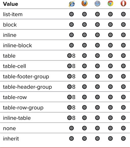
You can use the display property to define whether an element includes line breaks above and below (block), is included with other elements without hard line breaks (inline), is treated as part of a list (list), or is displayed at all (none). Table 10.1 shows the values available for the display property.
To set an element’s display type
1. Start your declaration by typing the display property name in the CSS declaration block, followed by a colon (:) (Code 10.2).
display:
2. Type one of the display types from Table 10.1.
block;
Choose a type depending on the desired result:
• inline flows the element horizontally and its siblings from left to right until the edge of the parent element is encountered, at which point a soft break is added wrapping the content to the next line. Hard line breaks immediately before and after the box are always suppressed .

Inline level elements flow horizontally.
• block places a hard line break above and below the box, flowing the elements vertically. Setting this automatically forces the width of the box to the width of the parent element’s box  .
.
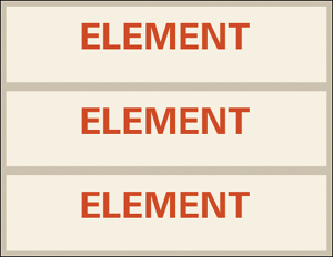
Block level elements flow vertically.
• inline-block defines this element as inline, but the content within it is treated as a block  .
.
Inline-block elements can stack vertically in the box, but the box is flowed inline.
• run-in is contextual, acting as a block element unless its next sibling is also a block element, in which case it will act as an inline element to its sibling. The sibling cannot be a run-in or have floating applied to it for this to work.
• table, or any one of the other table values shown in Table 10.1, allows you to turn any tag into part of a data table.
Code 10.2. Added to box-properties.css— When applied to Code 10.1, adding the display property allows you to redefine how different elements flow within the document  . Defining the figure, figcaption, and the first letter of the first paragraph in an article as block elements will ensure that you can control their width, height, and float.
/*** box-properties.css ***/
header, section, nav, article, aside, figure, figcaption, footer, hgroup {
display: block; }
article h2 + p:first-letter {
display: block; }
Code 10.2 applied to Code 10.1: The figure caption is now a block level element so it will appear below the image, rather than beside it.
• list-item places a list item marker on the first line of text, as well as a break above and below the text. This code allows the item to be used as part of a list even if you’re not specifically using a list element. Using list-item to create lists out of non-list elements is discussed in Chapter 8.
• inherit uses the display value set or implicit for the element’s parent.
• none causes this element not to display in CSS browsers. It will appear as though the content doesn’t exist on the page.
HTML5 structure tags (header, section, article, footer, and so on) will need to have display: block set for them.
Although you can turn any element into a list item or table, don’t. This is bad coding from a semantic and accessibility standpoint. Stick to HTML tags for creating lists and tables.
The compact property was dropped in CSS2.1 but may make a comeback in CSS3. At present, only a placeholder exists in the CSS Work Groups Box Model documentation for CSS3.
Any elements that are assigned display:none will be ignored by the browser. Be careful when using none, however. Although it is not an inherited attribute, none turns off the element display as well as the display of any child elements.
display:none is useful for creating dynamic elements—such as drop-down menus—that show and hide as the user interacts with the page. However, keep in mind that this also hides the element from screen readers, which can hinder usability.
Another great use for none is to use it to create a print-specific style sheet that hides elements not needed when the page is printed, such as navigation and form fields. Who needs navigation links, search forms, and low-resolution graphics in a printout?
The display property should not be confused with the visibility property (see “Setting the Visibility of an Element” in Chapter 11). Unlike the visibility property, which leaves a space for the element, display:none completely removes the element from the page, although the browser still loads its content.
Code 10.3. box-properties.css— When applied to Code 10.1, width and height are used to control element dimensions. Max and min values can be used to allow the design to fluidly grow or shrink to meet the user’s needs.
/*** box-properties.css ***/
header, footer {
width: 100%; }
header {
height: 135px; }
footer {
height: 60px;
box-sizing: border-box; }
h1 {
width: 95%;
max-width: 980px;
min-width: 660px; }
article h2 {
width: 95%; }
article {
max-width: 980px;
min-width: 660px; }
aside {
width: 300px;
height: 400px; }
Code 10.3 applied to Code 10.1: Shows the example with the window open to 1280px wide.
Code 10.3 applied to Code 10.1: Shows the example with the window open to 640px wide.
Setting the Width and Height of an Element
By default, the browser automatically sets the width and height of an element to 100 percent of the available width and whatever height is needed to display all the content. You can use CSS to override both the width and height of block elements. Generally, you will be setting the width of an element more often than the height unless you know the exact size of the content of a block or are willing to allow scrolling.
In addition to setting a specific width and height, you can specify a width and height range by setting a minimum and maximum width and height for an element. This can be indispensible for creating flexible designs (responsive designs as described in Chapter 14) that will never stretch to unreasonable proportions of the screen in which they are displayed.
To define the width of an element
1. Type the width property name in the CSS declaration block, followed by a colon (:) (Code 10.3).
width:
2. Type a value for the element’s width.
80%;
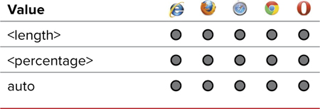
Use one of the following values (Table 10.2):
Table 10.2. Width and Height Values
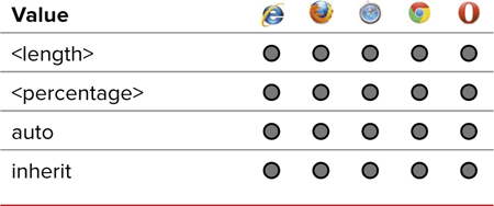
• A length value, generally in pixels
• A percentage, which sets the width proportional to the parent element’s width
• auto, which uses the width calculated by the browser for the element—usually the maximum distance that the element can stretch to the right before hitting the edge of the window or the edge of a parent element
To define the height of an element
1. Type the height property name in the CSS declaration block, followed by a colon (:).
height:
2. Type a value for the element’s height.
135px;
Use one of the following values (Table 10.2):
• A length value
• A percentage, which sets the height proportional to the parent element’s height
• auto, which uses a calculated height determined by the browser—whatever space the element needs to display all the content
If you set the width of the body tag to less than the max-width of an element, the max-width property is ignored because the body never stretches wide enough.
Generally, the max-height will act like the height attribute and the min-height is ignored because, unlike the max/min width, the element will not resize with the browser window.
To set the maximum and minimum width
1. Type the min-width and/or max-width property name, a colon (:), and an appropriate value from Table 10.3.
max-width: 980px; min-width: 660px;
Table 10.3. Max/Min-Width and Max/Min-Height Values
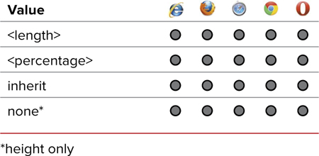
The element will never grow wider or narrower than these values regardless of the browser window width.
2. Type the min-height and/or min-height property name, a colon (:), and an appropriate value from Table 10.3.
max-height: 300px; min-height: 100px;
The max/min-height properties work very much the same as max/min-width, but depend on the content displayed rather than the dimensions of the browser window.
When you have too much content to display in the defined area, use the overflow property (see “Controlling Overflowing Content” in this chapter) to allow the viewer to scroll the additional material.
You can resize an image (GIF, PNG, or JPEG) using the width and height properties, and override the intrinsic width and height.
If you are setting the height of an element and forcing a scrollbar, be careful not to let that element get too close to the browser window’s scrollbar because it can lead to confusion and an unpleasant experience for viewers.
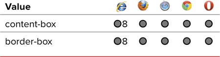
• content-box will size only the content area. The padding and border widths are added separately to the space needed to display the element. This is the default value.
• border-box will set the size of the element from the outer edges of the border to the facing border.
Controlling Overflowing Content
When an element is clipped or when the parent element’s width and height are less than the area needed to display everything, some content is not displayed . The overflow property allows you to specify how this cropped content is treated.
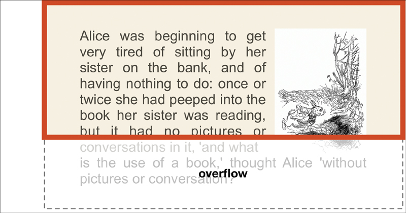
The overflow is any area (horizontally or vertically) that cannot be displayed within the given area for an element.
Overflow for the width or height can be controlled independently using overflow-x and/or overflow-y.
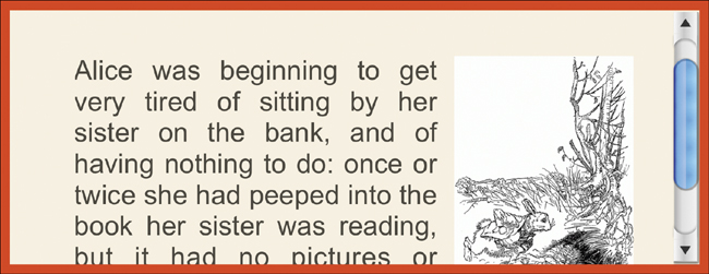
Code 10.4. Added to box-properties.css— When applied to Code 10.1, the content in the aside now has a scrollbar .
/*** box-properties.css ***/
aside {
overflow: auto }
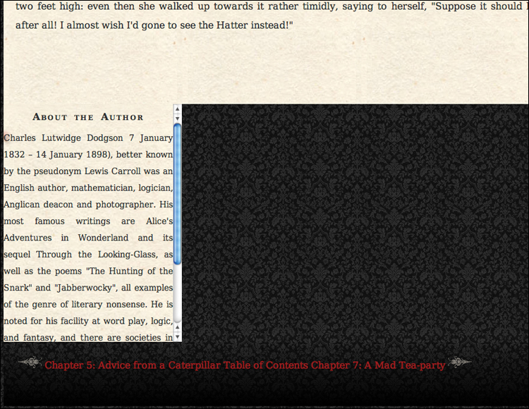
Code 10.4 applied to Code 10.1: The aside area’s height is restricted to 400px, but more content exists than can fit in that area, so a vertical scrollbar is added automatically.
To define the overflow control
1. Type the overflow, overflow-x, or overflow-y property name, followed by a colon (:) (Code 10.4).
overflow:
2. Add a keyword to tell the browser how to treat overflow from the clip.
auto;
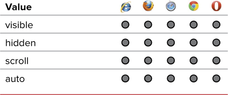
Use one of the following keywords (Table 10.5 and Table 10.6):
• visible forces the cropped part of the element to be displayed, essentially instructing the browser to ignore the cropping, pushing the content to flow outside of the box .
Visible will override the height of the element, forcing it to display all content.
• hidden hides the overflow and prevents the scrollbars from appearing .
Hidden will crop the element but provide no way to access the rest of the element’s content.
• scroll sets scrollbars around the visible area to allow the visitor to scroll through the element’s content. When you set this value, space will be reserved for the scrollbars, even if they are not needed  .
.
Scroll places both horizontal and vertical scrollbars to access additional content in the element. However, placeholder scrollbars are added even if they’re not needed.
• auto allows the browser to decide whether scrollbars need to be displayed  .
.
Auto is generally the best option because it displays scrollbars only as needed.

Table 10.6. Overflow-x and Overflow-y Values
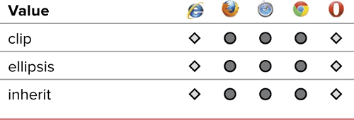
The text-overflow property controls how text is displayed where the available space cannot display all of the content, generally because the width and height have been set with overflow hidden  .
.
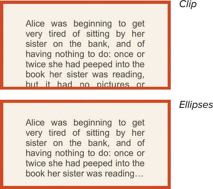
Clip or ellipsis are used to control how text is treated in overflow mode.
• clip will truncate the text wherever the space for the display area is exceeded. This can mean that text is clipped in a word or even in part of a letter.
• ellipsis will add the ellipsis as the last character, shortening the text so that it can be completely displayed. This may come at the end of a word or within a word, but will not clip a letter.
Table 10.7. Text-Overflow Values
Generally, auto is preferred for overflow because it will show the scrollbars only as needed and hide the scrollbar chrome when there is nothing to scroll.
Although not commonly used, I recommend implementing the ellipsis property for all text. This insures that if for some reason it is cut off, at least it will not look unattractive.
Floating Elements in the Window
In addition to precisely positioning elements within the document, CSS also allows you to set how an element interacts with other elements by floating it.
Using the CSS float property, you flow text around content or float block elements next to each other to create columns.
To float an element
1. Start your definition by typing the float property name, followed by a colon (:) (Code 10.5).
float:
Code 10.5. Added to box-properties.css— When applied to Code 10.1, the float properties will cause the text to wrap around the figure . Additionally, this code will cause the first letter in the first paragraph of an article to become a true drop cap .
/*** box-properties.css ***/
article {
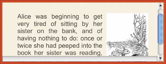
float: left; }
article h2 + p:first-letter {
float: left; }
.floatleft {
float: left; }
.floatright {
float: right; }
Code 10.5 applied to Code 10.1: The figure now floats with the text around it.

Code 10.5 applied to Code 10.1: The drop cap.
2. Type a keyword to tell the browser on which side of the screen the element should float.
right;
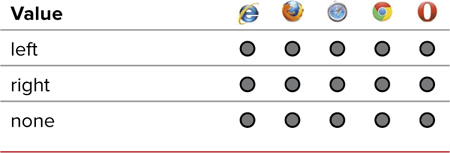
Choose one of the following keywords (Table 10.8):
• right aligns this element to the right of other elements, causing subsequent elements to wrap horizontally to the left of this element.
• left aligns this element to the left of other elements, causing subsequent elements to wrap horizontally to the right of this element.
• none overrides floating for this element.
In order to work, elements being floated have to have a specific width, so an element with no width or width: auto set will not appear to float.
Floating elements within other elements can often have odd consequences if both the child and parent are block elements. The child tends to ignore the height of the parent, which can have undesirable consequences. The child element will appear to begin in the parent element but will then extend beyond the bottom of the parent element. The fix for this is discussed in the Chapter 13 section, “Fixing the Float.”
In Chapter 13, you’ll learn how to use the float property to set up separate columns to replace a traditional table-based layout.
Clearing a floated element
Sometimes, you may find it necessary to override the float property to prevent elements that appear after a floating element from wrapping. Similar to the clear attribute of the HTML break tag, the CSS clear property allows you to specify whether you want to deny floating around the left, right, or both sides of an element (Table 10.9).
To prevent an element from floating
1. Type the clear property name in the CSS rule, followed by a colon (:) to start your declaration (Code 10.6).
clear:
2. Type the keyword for the side that you want to prevent floating.
right;
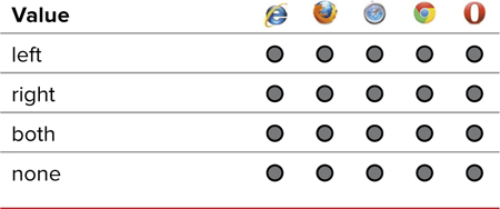
Choose one of the following keywords:
• left to prevent wrapping on the left side of the element
• right to prevent wrapping on the right side of the element
• both to prevent wrapping on both sides of the element
• none to override a previously set clear property
I like to set up float classes: .floatleft and .floatright. These can come in handy for creating versatile Web designs.
It’s usually a good idea to set headers and titles to clear:both, so that they don’t wrap around other objects.
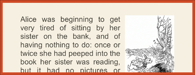
Code 10.6. Added to box-properties.css— When applied to Code 10.1, figures are prevented from floating next to each other, which might create an unattractive design
/*** box-properties.css ***/
figure {
clear: both; }
Code 10.7. Added to box-properties.css— When applied to Code 10.1, margin is set to 0 in the body, and margins are added to help space out other elements in the screen .
/*** box-properties.css ***/
body {
margin: 0; }
h1 {
margin: 0 20px 10px 5%; }
hgroup h2 {
margin: 30px; }
article h2 {
margin-bottom: 60px; }
article p {
margin: 0; }
article h2 + p {
margin-bottom: 1em; }
article h2 + p :first-letter {
margin-bottom: .35em .2em .2em 0; }
article a {
margin: 0 1em; }
figure img {
margin: 0; }
.floatleft {
margin: 1em 2em 1em 0; }
.floatright {
margin: 1em 0 1em 2em; }
.floatcenter {
margin: 1em auto; }
Code 10.7 applied to Code 10.1: Among other elements that are spaced out, all of the paragraphs now have no space between them, and instead, the text-indent from Chapter 6 now visually defines new paragraphs.
Setting an Element’s Margins
The margin (Table 10.10) of an element allows you to set the space between that element and other elements in the window by specifying one to four values that correspond to all four sides together, the top/bottom and left/right sides as pairs, or all four sides independently.
To define the margins of an element
1. Start your declaration by typing the margin shortcut property name in the declaration block, followed by a colon (:) (Code 10.7).
margin:
2. Type a value for the margin.
.35em .2em .2em 0;
Use one of the following values:
• A length value
• A percentage, which creates a margin proportional to the parent element’s width
• auto, which returns control of the margins to the browser’s discretion
You can enter one to four values, separated by spaces, to define the margins as follows:
• One value sets the margin for all four sides equally.
• Two values set the top/bottom margins and left/right margins.
• Three values set the top margin, the left/right margins (the same), and the bottom margin.
• Four values set each margin clockwise, starting from top: top, right, bottom, and left.
3. You can also set the margin for just one side of the box independently without setting the other three margins.
margin-bottom: 60px;
This is useful when used with an inline style to override margins set elsewhere. To do this, specify the margin side you want to define (margin-top, margin-bottom, margin-left, or margin-right) and enter a legitimate margin value from Table 10.10.
You can also set margins for the <body> tag; in which case the margins define the distance that elements nested in the body should appear from the top and left sides of the browser window.
In addition to the .floatleft and .floatright classes, I’ve added a .floatcenter, using an auto margin for left and right. This isn’t a true float, where text wraps around the object, since that’s not possible in CSS. What it does is simply center an element.
I’ve also added margins to .floatleft and .floatright in order to make sure those floating elements have some breathing room.
The best way to center an element within its parent element is to set the margins on the left and right to auto. This is how most Web pages with the content centered in the browser window are created.
When setting proportional margins, be aware that you might get very different results depending on the size of the user’s window. What looks good at a resolution of 800 x 600 might be a mess at larger screen sizes.
The browser has a default margin that it adds to the body of your page so the content doesn’t immediately begin at the edge of the screen. However, the default is not the same on all browsers, which can be a problem when you position elements on the page (see Chapter 11). It’s a good idea to set the margins in the body tag so that they remain consistent using a CSS reset, as explained in Chapter 13.
Setting an Element’s Outline
The outline (Table 10.11) surrounds the border and even uses the same values as the border; unlike the border, it does not increase the apparent dimensions (width or height) of the box and does not actually occupy any space on the screen. Instead, it appears under any margin and out into the page under surrounding content.
An outline can be very useful for link-rollovers, allowing you to highlight them without displacing the surrounding content.
To set a box’s outline
1. The outline property looks identical to the border property, although it behaves differently. Enter a width, style, and color separated by spaces (Code 10.8).
outline: rgba(135,127,107,.65) 10px double;
2. Alternatively, you can define each outline value, which is useful when you need to override one element value without changing the others.
outline-color: rgba(135,127,107,.65);
outline-width: 10px;
outline-style: double;
Unlike border, outline cannot be set independently for the sides.
I tend to use outline only when I am debugging element positioning on my page, and I want to see exactly how much space each block is taking up and where they extend.
Another good use of outline is using attribute selectors (Chapter 4) to highlight particular elements without disturbing their positioning.
Code 10.8. Added to box-properties.css— When applied to Code 10.1, the outline style can be used to highlight links being hovered over without disturbing the surrounding elements .
/*** box-properties.css ***/
footer a:hover {
outline: rgba(135,127,107,.65) 10px double; }

Code 10.8 applied to Code 10.1: The link “Table of Contents” in the footer navigation is highlighted using the outline.
Code 10.9. Added to box-properties.css— When applied to Code 10.1, the border property sets a line—sometimes called a rule by designers—on any side of an element’s box with a specific style, color, and thickness .
/*** box-properties.css ***/
figure {
border: 6px double rgb(142, 137, 129); }
figcaption {
border-top: 2px solid rgb(142, 137, 129); }
article {
border-top: 10px transparent solid;
border-right: 10px transparent solid;
}

Code 10.9 applied to Code 10.1: The figure is now surrounded by a double-lined border with the caption adding a border at the top to set it off from the image above. The chapter title also receives a border, as does the aside header.
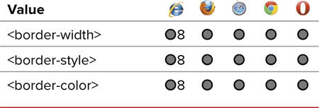
Setting an Element’s Border
The border property allows you to set a rule (line) around all four sides of your box in any color and thickness using a variety of line styles (Table 10.13). Also, using additional border properties, you can independently set the borders on any of the four sides, giving you amazing design versatility.
To set the border
1. To set the border on all four sides, type the border property name in the CSS declaration block, followed by a colon (:) (Code 10.9).
border:
2. Type a border-width value, followed by a space.
6px
This value can be one of the following (Table 10.14):
Table 10.14. Border-Width Values
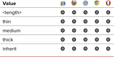
• A length value; a value of 0 prevents the border from appearing, even if the style and color are set.
• A relative-size keyword, such as thin, medium, or thick (Table 10.14).
• inherit will cause the element to use the same border styles as its parent element.
3. Type the name of the style you want to assign to your border.
double
Table 10.15 shows a complete list of available border styles.
Table 10.15. Border-Style Values
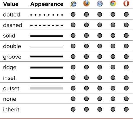
Alternatively, you can type none, which prevents the border from appearing.
4. Type a color value, which is the color you want the border to be as defined in Table 10.16.
rgb(142, 137, 129);
Table 10.16. Border-Color Values
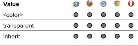
This can be the name of the color or an RGB value.
5. You aren’t stuck using the same border on all four sides. You can set each side (border-top, border-bottom, border-left, and/or border-right).
border-top: 2px solid rgb(142, 137, 129);
If those options aren’t enough, see the sidebar “Additional Ways to Set a Border.”
You do not have to include all the individual border attributes in your definition list, but if you don’t, the default value will be used.
I’ve also added a little invisible border around the article, which has the affect of pushing the background image embellishment away from the edge.
Rounding Border Corners
Rounded corners can help soften an otherwise sharp design, but they have been difficult to achieve using images. CSS3 includes a simple method for rounding off one or all of the corners of an element’s box: border-radius.
Both Mozilla and Webkit have implemented their own versions of border-radius in advance of the final W3C pronouncement, and you need to take these browser extensions into account for the widest interoperability (Table 10.17).
Table 10.17. Border-Radius Values
To set rounded corners
1. Add the Webkit, Mozilla, and standard CSS3 border-radius properties (Code 10.10).
border-radius:
Although the order doesn’t matter, it’s generally preferred to have the CSS3 version last because it’s the version that should be used.
2. Type a border-radius value, followed by a semicolon, using the same value for all three instances.
5px;
This value can be one of the following depending on browser compatibility (Table 10.17):
• A length value, which sets the radius of an imaginary circle at the corner, which is used to round it off. The larger the value, the rounder the edge.
• A percentage (0% to 50%), which uses the size of the element to set the corner radius. Higher values produce rounder corners, with 50% joining corners into a semicircle. Percentage is not supported in Webkit.
Code 10.10. Added to box-properties.css— When applied to Code 10.1, the border-radius property is used to round the corners of different elements .
/*** box-properties.css ***/
article {
border-top-right-radius: 20px; }
figure {
border-radius: 5px; }
aside {
border-radius: 20px/40px; }
Code 10.10 applied to Code 10.1: The figure area border also has slightly rounded corners but only on the outer line of the double line border.
Code 10.10 applied to Code 10.1: The main article has been rounded off, giving it the look of a notebook.
3. Each corner’s border radius can be set independently without specifying the other corner radii.
border-top-right-radius: 20px;
4. You can include up to four values.
border-radius: 20px 0 0 20px;
Separate each value by a space as a shortcut for setting the border radius:
• One value sets all four corner radii the same.
• Two values set the radius for the top-left/bottom-right and bottom-left/top-right corners.
• Three values set the corner radius for the top left, bottom left/top right (the same), and the bottom right corners.
• Four values set the radius for each corner in this order: top left, top right, bottom right, and bottom left.
With Webkit you must set corners separately because it treats a second value as the second point in the radius to create elliptical (rather than circular) corners.
Although border-radius does anti-alias the curves to make them appear smooth, the results can be hit or miss. I recommend keeping the contrast between your lines and background low to improve the curve appearance.
Curved borders will not clip the content in the box. So, an image that might normally be in the corner of the box will still be there, sticking out into the curve.
Setting a Border Image
A new feature in CSS3 is the ability to use a rectangular image that can be applied to the box’s border, overriding the line style. Mozilla and Webkit have implemented almost identical systems, and CSS3 has (thankfully) followed their lead. Although some differences exist, setting a basic image border background is identical among the three systems.
The border-image (Table 10.18) takes a rectangular image and slices it into nine parts. The eight parts around the edges are used as the side and corner images, and the center is hidden to allow the content within the element to show through. The corners are applied to the corners of the element box with a size based on the offset you set. Then the middle of the sides of the image are stretched or tiled to fill the width and height.
Table 10.18. Border-Image Values
To set the border background image
1. Create your background image and save it, preferably as a transparent PNG, although any format will work. For this example, I’ve divided the image into a grid of 27px squares, fitting the corners and edges of my background into each of these. This will make the math easier.
2. Add the Webkit, Mozilla, and standard CSS3 border-image properties.
-webkit-border-image:
-moz-border-image:
-o-border-image:
border-image:
Code 10.11. Added to box-properties.css— When applied to Code 10.1, the header in the aside column uses the file border-02.png as its source for adding a border .
/*** box-properties.css ***/
figure.bw-illo {
border: 1em double rgb(142, 137, 129);
-webkit-border-image: url(../images/chrome/border-02.png) 27 round;
-moz-border-image: url(../images/chrome/border-02.png) 27 round;
-o-border-image: url(../images/chrome/border-02.png) 27 round;
border-image: url(../images/chrome/border-02.png) 27 round;}

Code 10.11 applied to Code 10.1: The border tiles on the sides as needed to surround the element.
More properties and values for setting the border image are in the CSS3 specification, but they are not yet supported in most browsers.
Although the order doesn’t matter, it’s generally preferred to have the CSS3 version last because it’s the version that should be used (Code 10.11).
3. Add the URL that indicates the path to the image file you created in step 1.
url(../_images/border-02.png)
4. You can include up to four values that specify the border image offset—basically how far into the image the background should extend (how wide the border slices should be)—separated by a space.
27
If you set up your image as a grid, this will be the size of a square in your grid:
• One value sets all four sides.
• Two values set the offset for the top/bottom and left/right, respectively.
• Three values set the offset for the top, left/right, and bottom, respectively.
• Four values set the offset for each side in this order: top, right, bottom, and left.
5. Set one or two values to dictate how the images in the middle of a side should be tiled or stretched.
round;
Choose from the following values:
• stretch (default value) scales images to fit the width or height of the box.
• repeat tiles the images to the width and height of the element.
• round is similar to repeat. It tiles the images but scales them so they fit exactly within the width or height.
Setting an Element’s Padding
At first glance, padding (Table 10.19) seems to have an effect identical to margins: It adds space around the element’s content. The difference is that padding sets the space between the border of the element and its content rather than between the element and the other elements in the window. Padding is useful when you’re using borders and background colors and don’t want the content butting right up to the edges.
To set padding
1. Start your declaration by typing the padding property name, followed by a colon (:) (Code 10.12).
padding:
2. Type a value for the element’s padding.
10px;
Use one of the following values:
• Length values, which create padding of the exact size you specify
• A percentage, which creates padding proportional to the parent element’s width
• inherit to use the parent’s padding value
Code 10.12. Added to box-properties.css— When applied to Code 10.1, the padding property allows you to add space between the border of an element and its content .
/*** box-properties.css ***/
body {
padding: 0; }
h1 {
padding-top: 10px; }
footer {
padding: 30px 0 10px 0; }
article {
padding: 20px; }
article h2 + p {
padding-bottom: 1em; }
article h2 + p:first-letter {
padding: 0; }
figcaption {
padding: 10px; }
Code 10.12 applied to Code 10.1: With padding added, the aside no longer looks so cramped.
To set each side’s padding value separately, you can type from one to four values.
• One value sets the padding for all four sides.
• Two values set the padding for the top/bottom and left/right sides.
• Three values set the top padding, the padding for the left/right sides (the same), and the bottom padding.
• Four values set the padding for each side in this order: top, right, bottom, and left.
3. As with margins, padding can also be set independently on all four sides of the box (top, right, bottom, and left).
padding-right: 10px;
If there is no border around or background-color behind the element, setting the margin will have the same visual effect as padding, and you won’t run into the issues surrounding box model measurements. (See the Chapter 13 sidebar, “Fixing the Box Model for Older Versions of Internet Explorer.”)
Creating a Multi-Column Text Layout
Although you’ll learn how to create a column grid layout in Chapter 13, you can use the new column properties to create balanced columns of text, similar to a newspaper style. Although not useful for extremely long columns of text, text columns can be a great way to give intro blurbs some style.
To set up multi-column text
1. Start your declaration by typing the column-count property name, followed by a colon (:) along with the number of columns (Tables 10.20 and 10.23) you want as an integer (Code 10.13).
-webkit-column-count: 2;
-moz-column-count: 2;
column-count: 2;
Table 10.20. Column-Count Values

Table 10.21. Column-Rule Values
Table 10.22. Column-Width/Gap Values

2. Add the column-gap property name, followed by a colon (:) along with the width of the separation (called a gutter) you want between the columns (Table 10.22). This can be any standard length value.
-webkit-column-gap: 4em;
-moz-column-gap: 4em;
column-gap: 4em;
Code 10.13. Added to box-properties.css— When applied to Code 10.1, the first paragraph splits into two columns with a line between them .
/*** box-properties.css ***/
article h2 + p {
-webkit-column-count: 2;
-moz-column-count: 2;
column-count: 2;
-webkit-column-gap: 50px;
-moz-column-gap: 5%;
column-gap: 5%;
-webkit-column-rule: 2px groove rgba(0,0,0,.5);
-moz-column-rule: 2px groove rgba(0,0,0,.5);
column-rule: 2px groove rgba(0,0,0,.5);
}
Code 10.13 applied to Code 10.1: The first paragraph will split across two equally balanced columns.
3. Start your declaration by typing the column-rule property name, followed by a colon (:) along with a width, style (Table 10.21), and color you want for line-separating the columns. Your can also set each of these values separately using column-rule-width, column rule-style, and column-rule-color.
-webkit-column-rule: 2px groove rgba(0,0,0,.5);
-moz-column-rule: 2px groove rgba(0,0,0,.5);
column-rule: 2px groove rgba(0,0,0,.5);
Coming Soon!
Watch for a number of new properties and features that are planned for CSS in the future. These include:
Resize. Allows you to set a box as being resizable by the user. This is especially useful in text for fields where someone may have a lot to say.
New width and height values. One problem with width is that you often want the content to take up enough space to display, but no more. Several experimental values will allow you to size the box to its content.
Putting It All Together
Code 10.14 shows the final external CSS file created in this chapter. The box properties include the majority of your layout grid.
Code 10.14. Final ui-box-properties.css.
/*** box-properties.css ***/
body {
margin: 0;
padding: 0; }
header, section, nav, article, aside, figure, figcaption, footer, hgroup {
display: block; }
header, footer {
clear: both;
width: 100%; }
header {
height: 135px; }
footer {
height: 40px;
padding: 30px 0 10px 0;
text-align: center; }
h1 {
width: 95%;
max-width: 980px;
min-width: 660px;
margin: 0 20px 10px 5%;
padding-top: 10px; }
hgroup h2 {
margin: 30px; }
article h2 {
width: 95%;
margin-bottom: 60px; }article {
width: 80%;
max-width: 980px;
min-width: 660px;
margin: 150px 0 10px 0;
border-top-right-radius: 20px;
border-top: 10px transparent solid;
border-right: 10px transparent solid;
padding: 80px; }
article p {
margin: 0; }
article h2 + p {
margin-bottom: 1em;
padding-bottom: 1em;
-webkit-column-count: 2;
-moz-column-count: 2;
column-count: 2;
-webkit-column-gap: 4em;
-moz-column-gap: 4em;
column-gap: 4em;
-webkit-column-rule: 2px groove rgba(0,0,0,.5);
-moz-column-rule: 2px groove rgba(0,0,0,.5);
column-rule: 2px groove rgba(0,0,0,.5); }
article h2 + p:first-letter {
float: left;
display: block;
margin: .35em .2em .2em 0;
padding: 0; }
aside {
width: 200px;
height: 400px;
overflow: auto;
border-radius: 20px/40px;
padding: 20px; }
footer nav a {
margin: 0 1em; }
footer nav a:hover {
outline: rgba(135,127,107,.65) 10px double; }
figure {
border: 6px double rgba(142, 137, 129,.5);
clear: both; }
figure img {
margin: 0; }
figure.cl-illo {
border-radius: 10px; }
figure.bw-illo {
border: 1em double rgba(142, 137, 129,.5);
-webkit-border-image: url('../images/chrome/border-02.png') 27 round;
-moz-border-image: url('../images/chrome/border-02.png') 27 round;
-o-border-image: url('../images/chrome/border-02.png') 27 round;
border-image: url('../images/chrome/border-02.png') 27 round; }
figcaption {
border-top: 2px solid rgba(142, 137, 129,.5);
padding: 10px; }
.floatleft {
float:left;
margin: 1em 2em 1em 0; }
.floatright {
float:right;
margin: 1em 0 1em 2em; }
.floatcenter {
margin: 1em auto ; }