
11. Visual Formatting Properties
In This Chapter
Understanding the Window and Document
Setting the Visibility of an Element
Clipping an Element’s Visible Area
Whether your designs are meant to be pixel perfect or fluid, element positioning is the key to any good design. You’ve already learned how to use CSS to control margins and padding in your composition (Chapter 10). With CSS, you can also position elements in the window, either exactly (absolutely or fixed) or in relation to other elements in the document (relatively). You can also set the visibility of any element in the window, making it visible, hidden, transparent, or even clipped on its sides.
This chapter introduces you to the methods you can use to position HTML elements using CSS, including how to stack elements on top of one another and float elements next to each other.
Getting Started
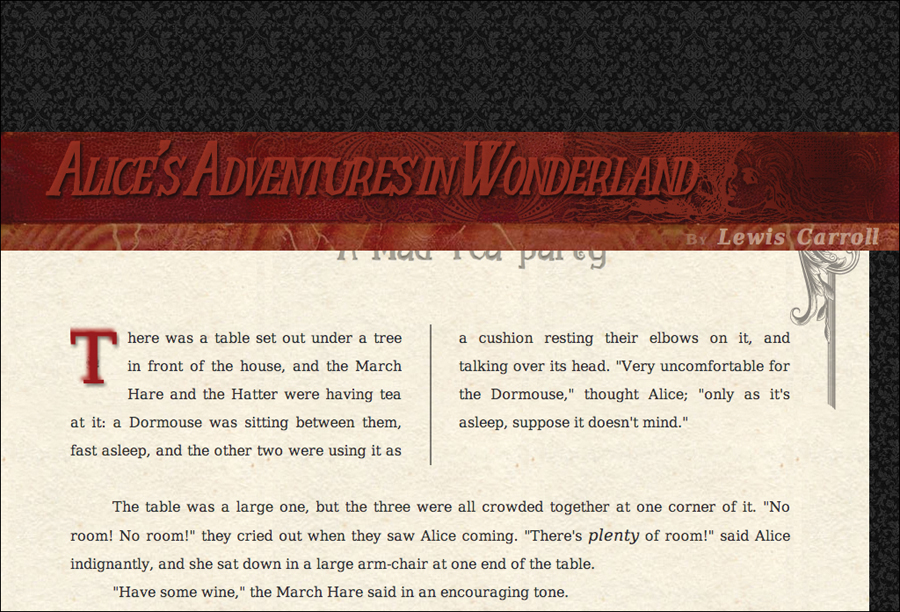
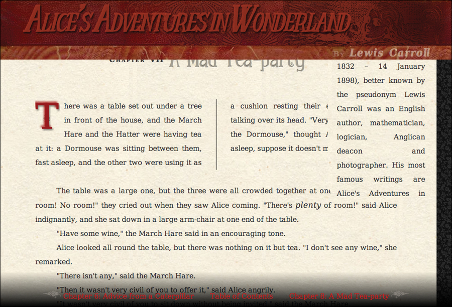
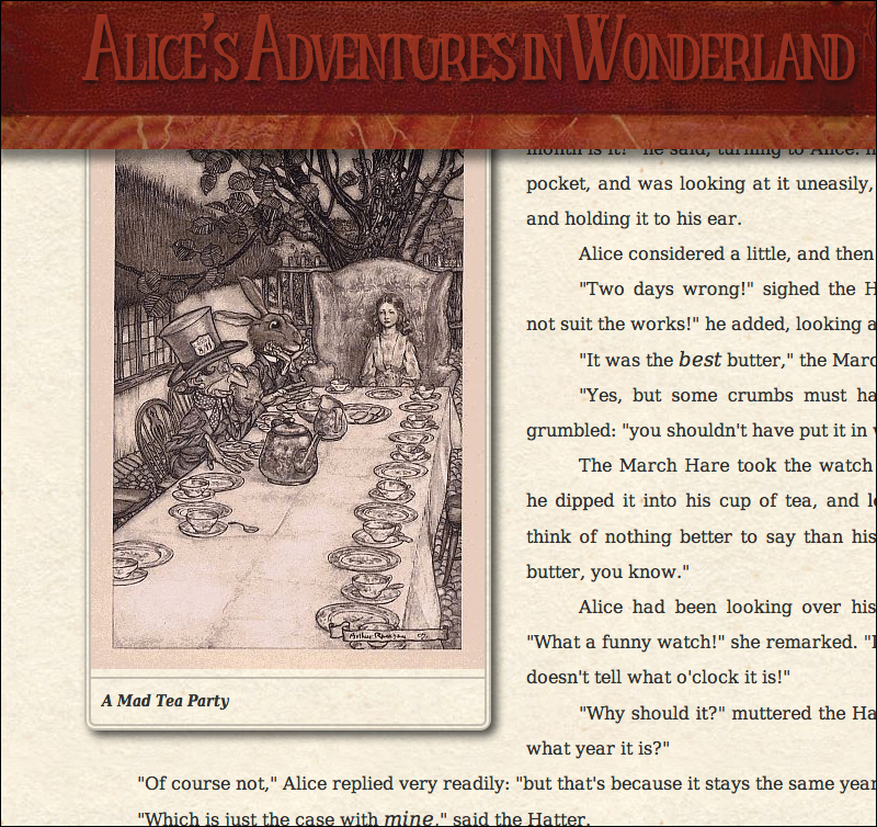
For this chapter’s example, I’ll be using the text and images from Chapter 7 of Alice’s Adventures in Wonderland (Code 11.1A). This also includes the aside “About The Author” that we’ll be styling in this chapter. We’ll be building the CSS file visualformatting-properties.css (Code 11.1B). See the final version of this file at the end of the chapter in “Putting It All Together.”
Code 11.1A. The HTML5 code for Chapter 11 is similar to the previous chapter but includes a new “gallery” element at the bottom of the article. It imports the final CSS from Chapters 5, 6, 7, 8, 9, and 10, as well as a new file you will build in this chapter, visualformatting-properties.css.
<!DOCTYPE html>
<html lang="en">
<head>
<meta charset="utf-8">
<title>Alice’s Adventures In Wonderland | Chapter VII</title>
<link href="../css/font-properties.css" type="text/css" rel="stylesheet" media="all">
<link href="../css/text-properties.css" type="text/css" rel="stylesheet" media="all">
<link href="../css/color-background-properties.css" type="text/css" rel="stylesheet" media="all">
<link href="../css/list-table-properties.css" type="text/css" rel="stylesheet" media="all">
<link href="../css/ui-generatedcontent-properties.css" type="text/css" rel="stylesheet" media="all">
<link href="../css/box-properties.css" type="text/css" rel="stylesheet" media="all">
<link href="../css/visualformatting-properties.css" type="text/css" rel="stylesheet" media="all">
</head>
<body id="chapter7" class="book aaiw chapter">
<header class="page">
<hgroup>
<h1>Alice’s Adventures in Wonderland</h1>
<h2>By <cite>Lewis Carroll</cite></h2>
</hgroup>
</header>
<article>
<h2>Chapter VII
<span class="chaptertitle">A Mad Tea-party</span>
</h2>
<p>There was a table set out under a tree in front of the house, and the March Hare and the Hatter were having tea at it: a Dormouse was sitting between them, fast asleep, and the other two were using it as a cushion resting their elbows on it, and talking over its head. "Very uncomfortable for the Dormouse," thought Alice; "only as it's asleep, suppose it doesn't mind."</p>
...
</article>
<aside>
<h2>About the Author</h2>
<p><b>Charles Lutwidge Dodgson</b> (7 January 1832 – 14 January 1898), better known by the pseudonym Lewis Carroll was an English author, mathematician, logician, Anglican deacon and photographer. His most famous writings are Alice's Adventures in Wonderland and its sequel Through the Looking-Glass, as well as the poems "The Hunting of the Snark" and "Jabberwocky", all examples of the genre of literary nonsense. He is noted for his facility at word play, logic, and fantasy, and there are societies in many parts of the world (including the United Kingdom, Japan, the United States, and New Zealand) dedicated to the enjoyment and promotion of his works and the investigation of his life.</p>
</aside>
<footer>
<nav>
<a href="AAIWL-ch06.html" class="prev">Advice from a Caterpillar</a>
<a href="EB9780133132762_6.html">Table of Contents</a>
<a href="AAIWL-ch08.html" class="next">A Mad Tea-party</a>
</nav>
</footer>
</body>
</html>
Code 11.1B. Starting visualformatting-properties.css—This file starts out empty, although I like to have a note at the top with the file name  .
.
/*** visualformatting-properties.css ***/
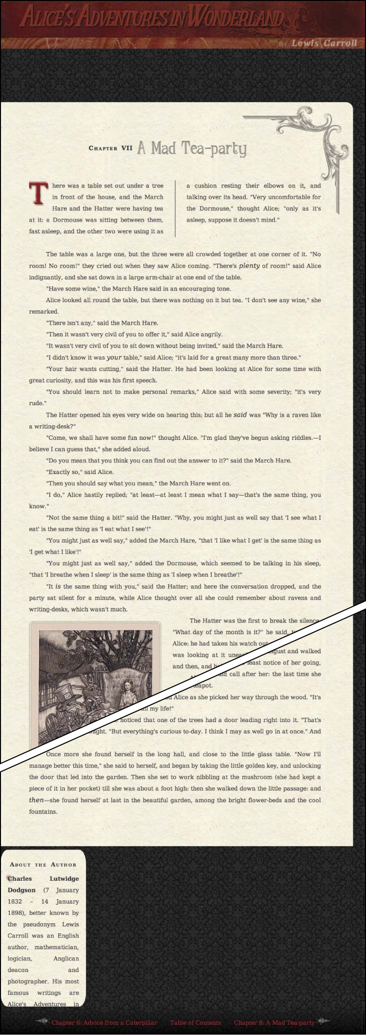
How the page looks before the CSS file visualformatting-properties.css is applied.
Understanding the Window and Document
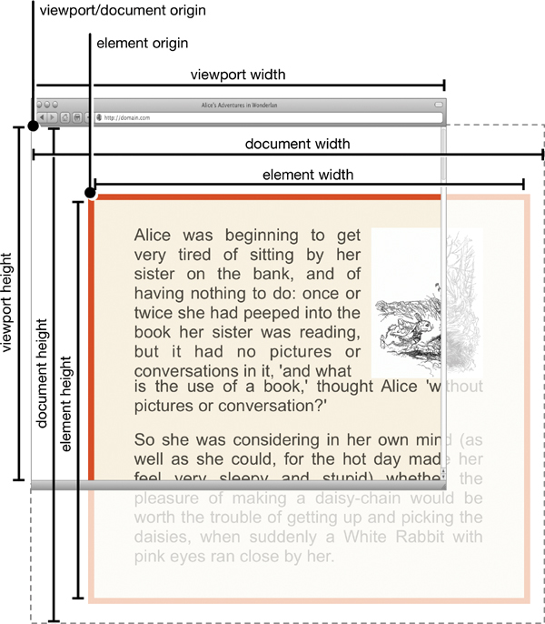
A Web page (also referred to as the document) is displayed within a browser window’s viewport. Everything that you can present to the viewer is displayed in that area, although the document will require scrolling if it is larger than the viewport.
You can open multiple windows (each displaying its own documents in its own viewport), resize and position windows on the screen, or insert smaller viewports called iframes. Everything that you present, however, is displayed within a browser window as part of a document.
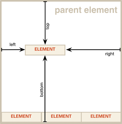
Like the elements contained within it (see “Understanding an Element’s Box” in Chapter 10), the window has a width and height, as well as a top, bottom, left, and right. In fact, you can think of the browser window as the ultimate element in your Web design—the parent of all other elements . Browser windows and the documents they contain have several distinct parts:
• Browser width and height refers to the dimensions of the entire window, including any browser controls and other interface items.
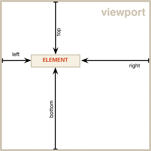
• Viewport is the area of the display area. All fixed-position elements are placed in relation to the viewport edges.
The browser window displaying a document that will require some vertical scrolling to reveal the rest of its content.
• Viewport width and height refers to the live display area of the browser window’s viewport. The live dimensions, obviously, are always less than the full window dimensions. Generally, when I refer to “the window,” I’m referring to the viewport.
• Document width and height, sometimes called the rendered width and height, refers to the overall dimensions of the Web page contained within the body tag. If the document’s width and/or height are larger than the viewport width and/or height, you’ll see scroll bars that let you view the rest of the document.
• The element edge is the edge of an element within the border. Elements are positioned relative to their parent element’s edges if the parent element has also been positioned. Otherwise, the element is positioned relative to the document edge.
• Element width and height should not be confused with content width and height (defined in Chapter 10). This is the total space occupied when border and padding are added to the content width and height.
The document width is most often the same as the viewport width since horizontal scrolling is generally not preferred.
Normal flow refers to where an element will appear in the Web page if no positioning is applied to it.
Setting the Positioning Type
CSS positioning allows you to set several properties associated with the HTML element’s position not only in 2D but also in 3D, clipping, and visibility. But first, you have to declare how the element’s positing should be treated.
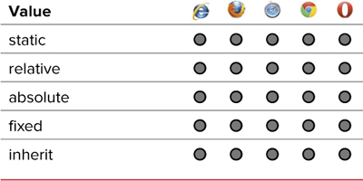
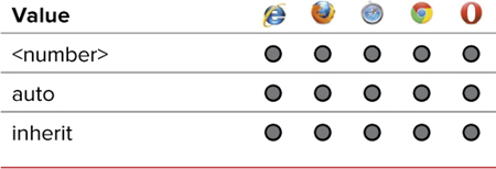
An element can have one of four position values—static, relative, absolute, or fixed (Table 11.1). The position value tells the browser how to treat the element when placing it into the document.
In addition to setting the position of an element, other position-dependent properties include:
• Stacking order, which is available for absolutely and fixed-position elements, allowing you to move elements in 3D.
• Visibility, which hides an element’s content but not the element itself, effectively setting its opacity to 0.
• Clipping, which hides parts of the content, “clipping” its sides.
Static positioning
By default, elements are positioned as static in the document unless you define them as positioned absolutely, relatively, or fixed. Static elements, like the relatively positioned elements explained in the following section, flow into a document one after the next. Static positioning differs, however, in that a static element cannot be explicitly positioned or repositioned, cannot be clipped, and cannot have its visibility changed .

A statically positioned element stays right where it is.
Relative positioning
A relative element is positioned in the context of its natural position in the document. A relatively positioned element is offset based on its position in the normal flow of the document. The space it occupied will remain in place but appear empty  .
.
A relatively positioned element is moved relative to the indicated side—top, right, bottom, and/or left—where it would have appeared if untouched. Negative values move the element in the opposite direction but still relative to the same side.
Absolute positioning
Absolute positioning takes an element out of the normal flow of the document, while leaving no space. An element that is defined in this way is placed at an exact point in the window by means of x and y coordinates relative to its most recently positioned parent element’s edges, or the body if none of its parents are positioned  .
.
An absolutely positioned element is removed from the normal flow and positioned from a positioned parent element’s sides (or the document sides if it has no positioned parents).
Fixed positioning
Fixing an element’s position in the window is similar to absolute positioning except that it is always in a locked position relative to the viewport edge (rather than its parent). When a document scrolls in the viewport, fixed elements stay in their initial positions and do not scroll with the rest of the document. This allows you to establish constant elements in the screen that do not scroll with the rest of the content  .
.
A fixed-positioned element is always positioned relative to the viewport’s edge.
To set an element’s position type
1. Add the position property to your declaration list. Type position in a rule’s declaration block or in the style attribute of an HTML tag, followed by a colon (:) (Code 11.2).
position:
2. Specify the positioning.
relative;
Type a position-type value, which can be one of the following:
• static flows the content normally; however, none of the position properties can be set for this element.
• relative also flows the element normally, but allows the position to be set relative to its normal position using the values set on the top, left, right, and bottom properties.
• absolute places the element relative to the edge of its most recently positioned parent element. This element will be the body of the document, or the element it is nested within if that element’s positioning has been set.
• fixed places the element relative to the edges of the viewport, independent of any other content on the page and ignoring its parent elements. Unlike an absolutely positioned element, when the window is scrolled, the fixed element stays where it is in the viewport as the rest of the content moves.
Code 11.2. Added to visualformatting-properties.css—Sets the position type for several elements  . Keep in mind that you won’t see any difference until you start setting the top, right, bottom, or left position.
/*** visualformatting-properties.css ***/
header, footer {
position: fixed; }
footer nav {
position: relative; }
hgroup h2 {
position: relative; }
aside {
position: absolute; }
strong {
position: relative; }
div.gallery {
position: relative; }
div.gallery figure {
position: absolute; }
Code 11.2 applied to Code 11.1. Position types have been set, but—without actually setting positions—the elements look to be a jumble. The footer, which is fixed, is now at the top of the page! Also, note how low the text marked with the strong tag is. This was caused by increasing its font size relative to the surrounding text. You will fix that in the next section.
• inherit uses the position type of the element’s immediate parent. If no position is set, this will default to static (see the sidebar “Inheriting Position Types”).
Absolutely positioned and fixed-positioned elements take up no space within the parent element. So if you have an element—such as an image—that is absolutely positioned, its width and height are not included as part of the width and height of the parent content.
You can position elements within other positioned elements. For example, you can set the relative position of a child element that is within an absolutely positioned parent or set the absolute position of an element within an absolutely positioned parent.
Remember that the browser adds a default margin to the body of your Web page, but the default value is not consistent across all browsers. To correct this, you should always set your own margin in the body tag, which allows you to position elements consistently. See Chapter 12 for details on using a browser reset.
Positioning can also vary from browser to browser due to rounding errors. It’s generally best to use “clean” numbers, rounded to the nearest even number.
When an element’s position type has been set to anything other than static, you can use JavaScript or other scripting languages to move the element, change the clip, change the stacking order, hide it, or display it.
Browsers that do not understand the fixed position type default to static for the position type.
Setting an Element’s Position
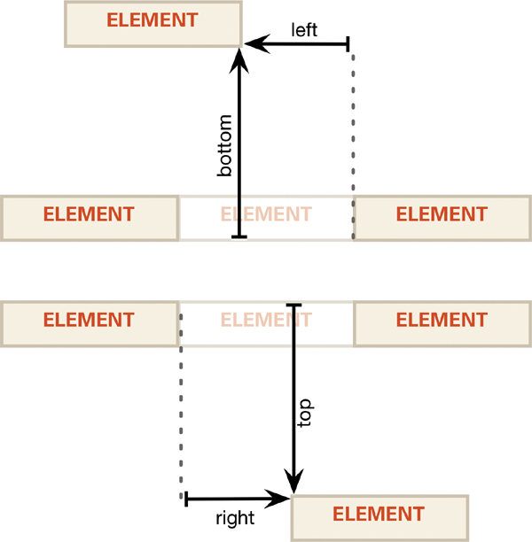
All positioned elements can have a top value, a right value, a bottom value, and a left value to position the element from those four sides (Tables 11.2 and 11.3). A relative element will be offset relative to its own edges. An absolute element will be offset relative to its parent’s edges. A fixed element will be offset relative to the viewport’s edges.
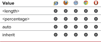
Table 11.2. Top and Left Values
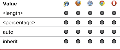
Table 11.3. Bottom and Right Values
To define an element’s position
1. Specify a position type. For details, see “Setting the Positioning Type” earlier in this chapter.
2. Add a position side property to your CSS declaration list. Type left, right, top, or bottom in the CSS rule, followed by a colon (:) (Code 11.3).
top:
3. Specify the position.
0;
Type a value for the element’s offset. You can enter any of the following:
• A length value such as 120px, 2.3em, or 1.25cm.
• A percentage value, such as 1%, which creates a fluid offset.
• auto, which allows the browser to calculate the value if the position is set to absolute; otherwise, the default value will be 0.
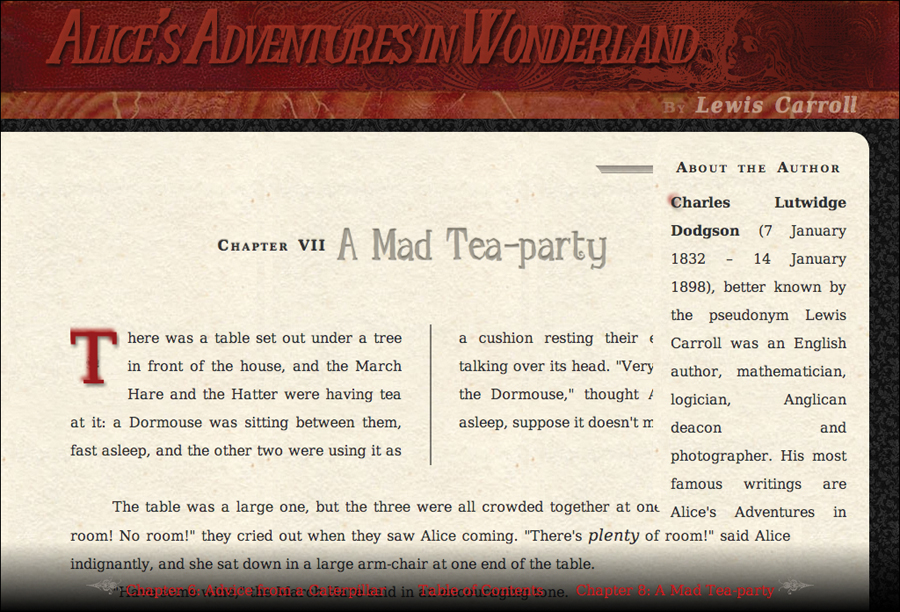
Code 11.3. Added to visualformatting-properties.css— When applied to Code 11.1, this CSS positions the footer at the bottom of the viewport (and keeps it there); positions the aside in a convenient location in the top-right corner of the screen; and offsets the gallery images slightly. It also pulls up the strong text, so that its baseline matches the surrounding text. It looks much better .
/*** visualformatting-properties.css ***/
header {
top: 0;
left: 0; }
footer {
bottom: 0;
left: 0; }
footer nav {
top: 10px; }
aside {
right: 4%;
top: 150px; }
hgroup h2 {
top: 15px;
right: 25px; }
strong {
top: -.15em; }
#f1 {
left: -10%; }
#f2 {
left: 25%; }
#f3 {
right: -10%; }
Code 11.3 applied to Code 11.1. The page is starting to come together. Notice that the strong text is now aligned with the rest of the paragraph .
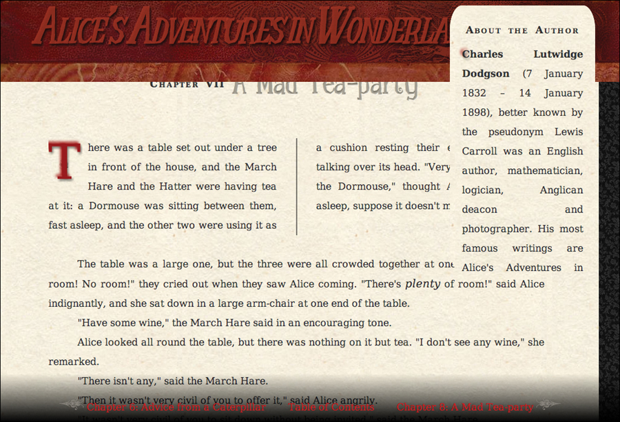
Even when scrolling, the footer still stays at the bottom of the screen. But notice that the aside is scrolling over the header. We’ll fix that in a few pages.
You don’t have to include the top, right, bottom, and left declarations, but if they are not included, they are treated as auto.
You can use negative values to move the content up and to the left instead of down and to the right.
What happens if you set the top/left and bottom/right positions for the same element? The answer depends on the browser. Internet Explorer always defaults to the top and left positions. But most others will stretch elements that do not have a definite width or height to accommodate the values that are set.
Stacking Objects in 3D
Although the screen is a two-dimensional area, positioned elements can be given a third dimension: a relative stacking order.
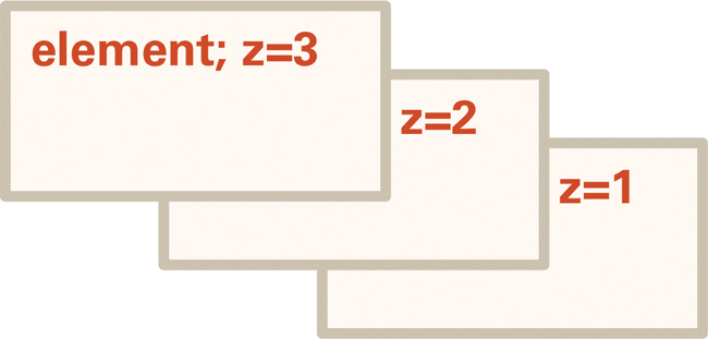
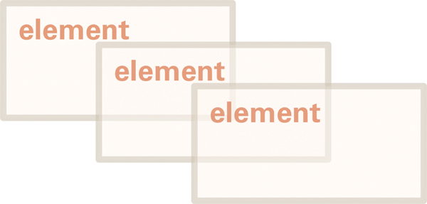
Positioned elements are assigned stacking numbers automatically, starting with 0 and continuing incrementally—1, 2, 3, and so on—in the order in which the elements appear in the HTML and relative to their parents and siblings . Elements with higher numbers appear above those with lower numbers. This system is called the z-index (Table 11.4). An element’s z-index number establishes its 3D relationship to other elements in its parent element .
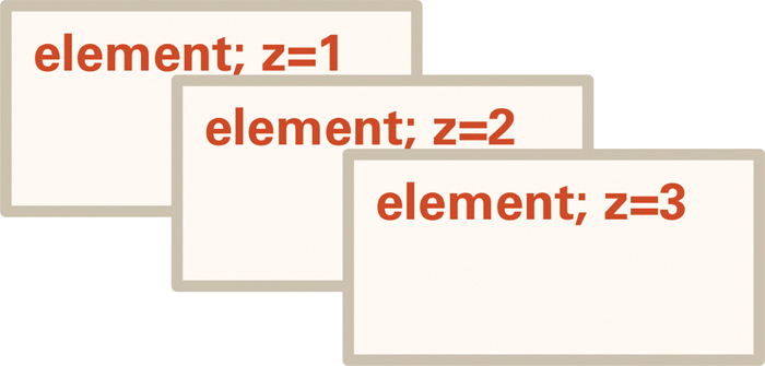
The natural z order of three elements.
The natural z order has been overridden using the z-index property.
When the content of elements overlap, the element with a higher z-index number will appear on top of the element with a lower number . The z-index is always relative to an element’s siblings, not to its parents.
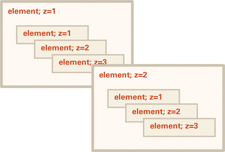
The z-index order is relative to an element’s siblings.
You can override the natural order of the z-index by setting a value for the z-index property.
Code 11.4. Added to visualformatting-properties.css— When applied to Code 11.1, this CSS will raise the header and footer above everything else . We are also setting up the z-index for the image gallery that we’ll play around with in Chapter 12, such that images will rise to the top when hovered over.
/*** visualformatting-properties.css ***/
header, footer {
z-index: 99; }
div.gallery figure {
z-index: 0; }
div.gallery figure:hover {
z-index: 999; }
Code 11.4 applied to Code 11.1. Compare the aside to the one shown in the previous section. It’s now below the header.
To define an element’s z-index
1. Specify a position type. For details, see “Setting the Positioning Type” earlier in this chapter (Code 11.4).
2. Add the z-index property to your CSS rule. Type z-index in the same declaration block, followed by a colon (:).
z-index:
3. Specify the position number. Type a positive or negative number (no decimals allowed), or 0.
99;
This step sets the element’s z-index in relation to its siblings, where 0 is on the same level.
Alternatively, you can use auto to allow the browser to determine the element’s z-index order.
Using a negative number for the z-index causes an element to be stacked that many levels below its parent.
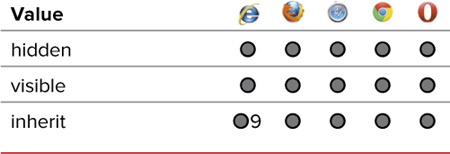
Setting the Visibility of an Element
The visibility property designates whether an element is visible in the window. If visibility is set to hidden (Table 11.5), the element is invisible but still occupies space in the document, and an empty rectangle appears where the element is located .

The hidden element no longer appears, although its location is shown as an empty space indicated by the dotted line in this figure (no, there will not actually be a dotted line).
To set an element’s visibility
1. Specify a position type. For details, see “Setting the Positioning Type” earlier in this chapter.
2. Add the visibility property to your CSS. Type visibility in the element’s CSS declaration block, followed by a colon (:).
visibility:
3. Specify how the element’s visibility should be treated.
hidden;
Type one of the following keywords to specify how you want this element to be treated:
• hidden makes the element invisible when the document is initially rendered on the screen.
• visible makes the element visible.
• inherit causes the element to inherit the visibility of its parent element.
Although the properties seem similar, visibility differs radically from display (Chapter 10). When display is set to none, the element is scrubbed from the document, and no space is reserved for it. Visibility reserves and displays the empty space like the invisible man in his bandages.
Generally, display:none is used for JavaScript effects, such as drop-down menus and pop-up text, in which elements are alternately hidden and shown. Because this property will remove the element, it prevents the element from interfering with the layout of the page when not needed.
I recommend using display:none to hide elements, such as navigation, when creating a print style sheet.
One downside to hidden elements is that Web search engines will not see them nor will screen readers used by the vision impaired. If you do hide content, make sure it’s not something that is vital for SEO.
Clipping an Element’s Visible Area
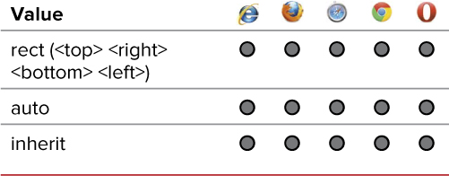
Unlike setting the width and the height of an element, which controls the element’s dimensions (see Chapter 10), clipping an absolute- or fixed-position element designates how much of that element’s content will be visible (Table 11.6). The part that is not designated as visible will still be present, but viewers won’t be able to see it, and the browser will treat it as empty space .
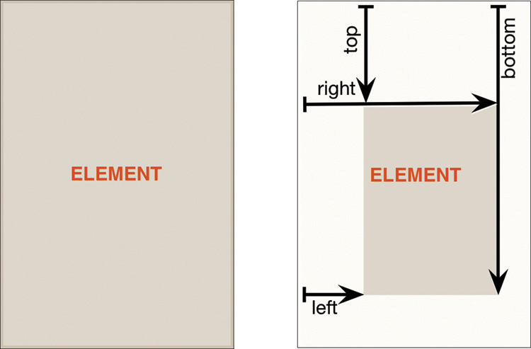
The center area is clipped based on the top, right, bottom, and left values provided to the clip property. The transparent area will not be visible.
Code 11.5. Added to visualformatting-properties.css— When applied to Code 11.1, this CSS cuts the aside down to just the headline .
/*** visualformatting-properties.css ***/
aside {
clip: rect(30px, 230px, 60px, 10px); }
aside:hover {
clip: auto; }
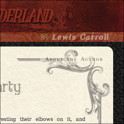
Code 11.5 applied to Code 11.1. The “About the Author” aside is now just a title, until the reader places the mouse pointer over it, in which case it expands to full size.
To define the clip area of an element
1. Specify a position type. For details, see “Setting the Positioning Type” earlier in this chapter.
2. Add the clip property to your declaration list. Type the clip property name, followed by a colon (:), as shown in Code 11.5.
clip:
3. Specify the rectangular clipping region. Type rect to define the shape of the clip as a rectangle, an opening parenthesis ((), four values separated by spaces, a closing parenthesis ()), and a semicolon (;).
clip: rect(30px, 230px, 60px, 10px);
The numbers define the top, right, bottom, and left lengths of the clip area, respectively. All these values are distances from the element’s origin (top left corner), not from the indicated side.
Each value can be a length value or auto, which allows the browser to determine the clip size (usually, 100 percent).
The element’s borders and padding, but not its margin, are clipped along with the content of the element.
Auto should restore an element to its unclipped original state. However, Safari and Chrome will only restore the clip to the outer edges of the border while still slipping the outline or box shadow.
 Setting an Element’s Opacity
One of the earliest and most widely implemented CSS3 features was the ability to set element opacity, which let you transform an element from opaque to transparent and any translucency in between . However, different browsers implement opacity in different ways.
Changing opacity allows you to see through to the element underneath.
For example, rather than implementing the W3C CSS syntax, Internet Explorer builds on its existing filter functionality, whereas other W3C-compliant browsers simply add the opacity property (Table 11.7). Because Internet Explorer ignores the other browsers’ code, you can place both declarations in the rule list for an element to control its opacity.
Code 11.6. Added to visualformatting-properties.css— When applied to Code 11.1, this CSS makes the aside transparent until the mouse pointer is over it, when it will turn fully opaque .
/*** visualformatting-properties.css ***/
aside {
opacity: 0.5; }
aside:hover {
opacity: 1.0; }
Code 11.6 applied to Code 11.1. The aside now has a neat affect where it is reduced by the clip and transparent until the user mouses over it, at which time it will pop open.
To set the opacity of an element
1. Add the opacity property to your CSS. To control the opacity of an element, type opacity followed by a colon (:) (Code 11.6).
opacity:
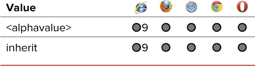
2. Specify the opacity. Enter an alpha value for the opacity of the element, which can range between 0.0 (completely transparent) and 1.0 (completely opaque).
0.5;
You could also use inherit, which will set the element’s opacity to the same value as its parent. So, if the parent has an opacity of 0.75, inherit will cause the child element to reduce its opacity 75 percent in addition to the 75 percent already set for the parent.
Opacity is applied to the entire element and to all of its children, with no way to override it in child elements. However, you can independently set the opacity of two sibling elements and then position one on top of the other.
Opacities are cumulative, so if an element with 0.5 opacity is within an element with 0.5 opacity, it will have a cumulative opacity of 0.25.
Setting an Element’s Shadows
Just as with text shadows (Chapter 6), you can add one or more drop shadows to the box of any element on the screen—positioned or not . The term “shadow” is a bit misleading, though, since you can make the color anything you like—including light colors—to create a glow effect.
Shadows provide a sense of depth and texture.
To set an element shadow
1. Add the box shadow property to your CSS rule. Type the box-shadow property names, followed by a colon (:) (Code 11.7).
box-shadow:
2. Specify the shadow offset, blur, choke, color, and inset.
1px 1px 5px 1px rgba(0,0,0,.25) inset
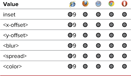
Type the following keywords or values (Table 11.8) to specify how you want this element’s shadow to be treated (from right to left):
• x and y offset length values set the position of the shadow relative to the box. Positive values offset the shadow down and to the right, whereas negative values move the shadow up and to the left. These values are required.
Code 11.7. Added to visualformatting-properties.css— When applied to Code 11.1, this CSS adds a drop shadow to the article and both a drop and interior shadow to the aside. It also adds shadows to the gallery images, but because they are clipped, they don’t show up .
/*** visualformatting-properties.css ***/
header { box-shadow: 0 10px 10px rgba(0,0,0,.5); }
article { box-shadow: 5px 5px 10px rgba(0,0,0,.7); }
aside { box-shadow: 1px 1px 5px 1px rgba(0,0,0,.25) inset, 3px 3px 15px rgba(0,0,0,.5); }
figure { box-shadow: 5px 5px 10px rgba(0,0,0,.7); }
Code 11.7 applied to Code 11.1. The shadows add to the illusion of pages in a book, giving them a sense of weight and thickness.
• A blur length value is a positive value that increases the fuzziness of the shadow and spreads it out. The higher the value, the bigger and lighter the shadow. This value is optional but defaults to 0 when left unset.
• A spread length value—sometimes called the choke—is a positive value used to specify the break point for the shadow’s fade. It has the effect of increasing the darker area of the shadow before it begins to fade. This value is optional but defaults to 0 when left unset.
• A color value is any of the standard color values outlined in Chapter 7. This value is optional but defaults to transparent when left unset, rendering the shadow invisible.
• inset causes the shadow to appear within the element’s edges, creating an inner shadow. This is optional.
3. Add more shadows as desired.
, 3px 3px 15px rgba(0,0,0,.5);
You can repeat the shadow code as many times as desired to create multiple shadows under or within the element, separating each value list by a comma (,) and always remembering to end your CSS rule with a semicolon (;).
If only one length value is included after the x/y offset length values, it will be assumed to be the blur, not the spread.
Box “Shadow” Effects
The box shadow can do some great effects that might all but replace the border and outline properties. Here are just a few examples that I created classes for:
Frame
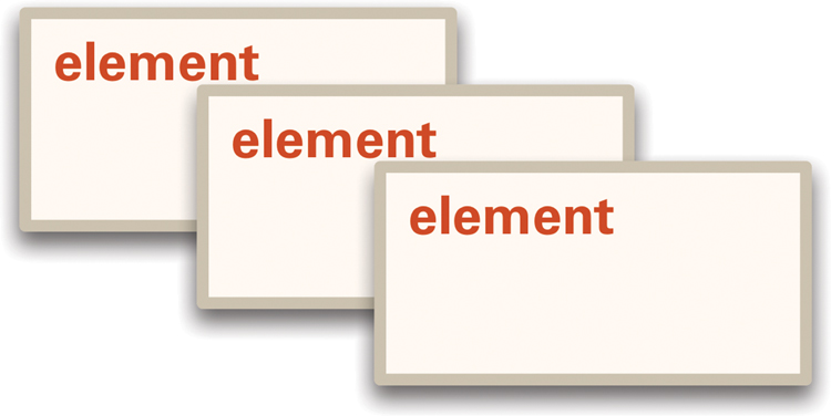
The frame effect uses drop shadows with the spread set to 0 to create a frame around the box. This has an advantage over border because you can have multiple borders, and has the advantage of the outline property in that it will not take up any space in the design .

Using multiple Box-shadows to create a multiple border effect.
.frame {
box-shadow: 0 0 0 5px hsl(0,100%,0%),
0 0 0 10px hsl(90,100%,20%),
0 0 0 15px hsl(180,100%,40%),
0 0 0 20px hsl(270,100%,80%),
0 0 0 25px hsl(0,100%,80%),
0 0 0 30px hsl(90,100%,100%); }
Inset Frame
Like the frame effect, only the border is inside the element . You cannot do this with the border property.
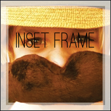
Using Box-shadows to create a transparent border inside the image.
.insetframe {
background: rgb(53,53,53);
box-shadow: 0 0 0 15px hsla(0,0%,100%,.5) inset,
0 0 0 10px hsla(0,0%,100%,.5) inset; }
Code 11.8. Final visualformatting-properties.css
/*** visualformatting-properties.css ***/
header, footer {
position: fixed;
z-index: 999; }
header {
top: 0;
left: 0;
box-shadow: 0 10px 10px rgba(0,0,0,.5); }
footer {
bottom: 0;
left: 0; }
hgroup h2 {
position: relative;
top: 15px;
right: 25px; }
article {
box-shadow: 5px 5px 10px rgba(0,0,0,.7); }
aside {
position: absolute;
right: 4%;
top: 150px;
opacity: .5;
clip: rect(30px 230px 60px 10px);
box-shadow: 1px 1px 5px 1px rgba(0,0,0,.25) inset, 3px 3px 15px rgba(0,0,0,.5); }
aside:hover {
clip: auto;
opacity: 1.0; }
figure {
box-shadow: 5px 5px 10px rgba(0,0,0,.7); }
footer nav {
position: relative;
top: 20px; }
strong {
position: relative;
top: -.15em; }
Putting It All Together
The completed code for visualformatting-properties.css should look something like Code 11.8.