
4. Selective Styling
In This Chapter
Defining Styles Based on Context
Defining Styles Based on Tag Attributes
Inheriting Properties from a Parent
Making a Declaration !important
It’s not enough to style a Web page element. The art of CSS—and thus the art of Web design—is the ability to style elements based on their context. You must consider where an element is in the document; which elements surround it; its attributes, content, and dynamic state; and even the platform displaying the element (screen, handheld device, TV, and so on).
Selective styling is the closest that CSS gets to traditional computer programming, allowing you to style elements if they meet certain criteria. This level of styling can get increasingly complex, so it’s important, at least in this chapter, to start out as simply as possible and build a firm foundation of understanding.
The Element Family Tree
When a tag is surrounded by another tag—one inside another—the tags are nested.
<h2><strong>Chapter 2</strong> The Pool of Tears<h2>
In a nested set, the outer element in this example (<h2>) is called the parent, and the inner element (<strong>) is the child. The child tag and any children of that child tag are the parents’ descendents. Two tags in the same parent are called siblings, and two tags immediately next to each other are adjacent siblings  .
.
• Parent elements contain other elements (children). Child elements will often inherit styles from a parent element.
• Descendent elements are any elements within another element.
• Child elements are first-generation descendent elements in relation to the parent. Second generation and higher elements are sometimes referred to as grandchildren.
• Adjacent or preceding sibling elements are child elements of the same generation that are immediately next to each other in the HTML code.
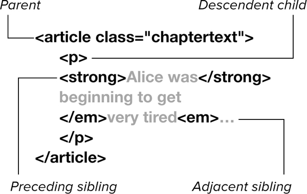
The article element is the parent to the elements created by the paragraph, strong, and emphasis tags, which are its descendents. Only the paragraph tag is a direct child. The elements created by the emphasis and strong tags are the children of the paragraph tag, and each other’s siblings.
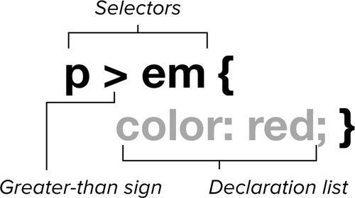
In Chapter 3, you learned ways to specify the styles of an individual element regardless of where it is placed in the HTML code. However, CSS also lets you specify the element’s style depending on its context. Using contextual selectors, you can specify styles based on a tag’s relationship to other tags, classes, or IDs on the page.
Defining Styles Based on Context
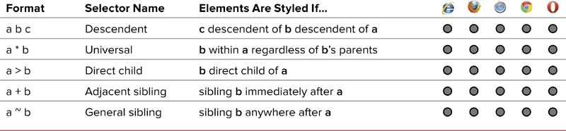
Contextual styles allow you to specify how a particular element should appear based on its parents and siblings. For example, you may want an emphasis tag to appear one way when it’s in the main header of the page and differently when it appears in the sub-header. You may want still another appearance in a paragraph of text. These combinatory selectors (Table 4.1) are among the most used and useful in CSS.
Table 4.1. Combinatory Selectors
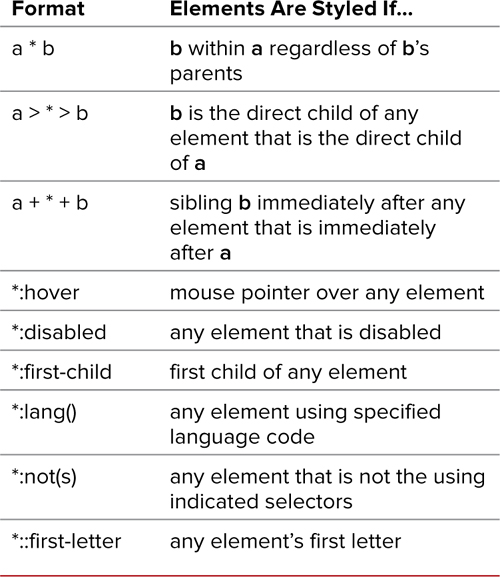
Styling descendents
You can style individual descendent elements depending on their parent selector or selectors in a space-separated list. The last selector will receive the style if and only if it is the descendent of the preceding selectors .
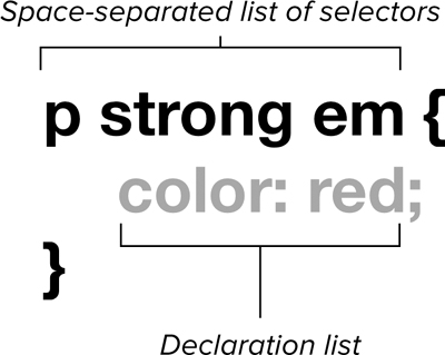
The general syntax for the descendent selector.
When you want to indicate that the exact selector does not matter at any given level, you can use the universal selector (*) described in Chapter 3  .
.
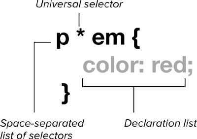
The general syntax for the descendent selector using the universal selector.
To style descendent elements
1. Set up a list of descendent selectors. Type the HTML selector of the parent tag, followed by a space, and then the final child or another parent (Code 4.1).
article.chaptertext p strong em {...}
You can type as many HTML selectors as you want for as many parents as the nested tag will have, but the last selector in the list is the one that receives all the styles in the rule.
2. Styles will be used only if the pattern is matched.
<article class="chaptertext"><p><strong><em>...</em></strong></p></article>
The style will be applied if and only if the final selector occurs as a descendent nested within the previous selectors. So, in this example, the emphasis tag (em) is styled only if it is in a paragraph (strong) that is within a paragraph tag (p), that is in an article tag using the class chaptertext (article.chaptertext).
The emphasis tag would not be styled by the code in Step 1 in the following case, because it is not in a strong tag:
<article class="chaptertext"><p><em>...</em></p></article>
And emphasis will not be styled by the code in Step 1 in the following case because the article tag does not have the chaptertext class:
<article><p><strong><em>...</em></strong></p></article>
It is important to note, though, that although the selectors do not style the emphasis tag in these last two cases, it does not mean that styles from other declarations will not do so.
Code 4.1. The style is set for the emphasis tag if its parents are the h1 tag and the article tag using the copy class  .
.
<!DOCTYPE html>
<html lang="en">
<head>
<meta charset="UTF-8">
<title>Alice’s Adventures in Wonderland</title>
<style type="text/css" media="all">
article.chaptertext p strong em {
color: red;
font-weight: normal;
font-size: 2em;
font-style: normal; }
</style>
</head>
<body>
<article class="chaptertext">
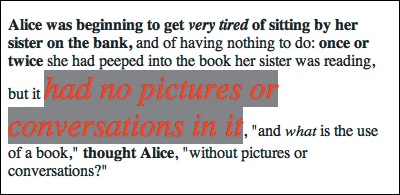
<p><strong>Alice was beginning to get <em>very tired</em> of sitting by her sister on the bank,</strong> and of having nothing to do: <strong>once or twice</strong> she had peeped into the book her sister was reading, but it <em>had no pictures or conversations in it</em>, <q>and <em>what</em> is the use of a book,</q> <strong>thought Alice</strong>, <q>without pictures or conversations?</q></p>
</article>
</body>
</html>
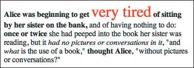
The results of Code 4.1. The only text that meets the selective criteria is in red, which is only the emphasis tag in the h1, in this example.
To style descendents universally
1. Set up a list of descendent selectors including a universal selector. Type the HTML selector of the parent tag, followed by a space, and then an asterisk (*) or other selectors (Code 4.2).
article.chaptertext p * em {...}
2. Styles will be used only if the pattern is matched. Generally, the universal selector is used at the end of a list of selectors so that the style is applied explicitly to all of a parent’s direct descendents (children). However, the styles will not be directly applied to those children’s descendents.
In this example, the style is applied to the emphasis tag inside any parent tag (such as strong) in a paragraph, such as:
<article class="chaptertext"><p><strong><em>...</em></strong></p></article>
Or:
<article class="chaptertext"><p><q><em>...</em></q></p></article>
However, an emphasis tag that is not in another tag in the paragraph will not be styled.
<article class="chaptertext"><p><em>...</em></p></article>
Like grouped selectors, contextual selectors can include class selectors (dependent or independent), ID selectors in the list, and HTML selectors.
Code 4.2. The style is set for the emphasis tag with any parent that’s in an article tag using the copy class  .
.
<!DOCTYPE html>
<html lang="en">
<head>
<meta charset="UTF-8">
<title>Alice’s Adventures in Wonderland</title>
<style type="text/css" media="all">
article.chaptertext p * em {
border: 1px double red;
font-size: 2em;
font-weight: normal; }
</style>
</head>
<body>
<article class="chaptertext">
<p><strong>Alice was beginning to get <em>very tired</em> of sitting by her sister on the bank,</strong> and of having nothing to do: <strong>once or twice</strong> she had peeped into the book her sister was reading, but it <em>had no pictures or conversations in it</em>, <q>and <em>what</em> is the use of a book,</q> <strong>thought Alice</strong>, <q>without pictures or conversations?</q></p>
</article>
</body>
</html>
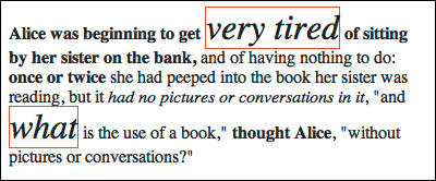
The results of Code 4.2. The text in red matches the selective criteria with the universal selector. In this case, all emphasis tags match.
Styling only the children
If you want to style only a parent’s child elements (not a grandchild descendent), you must specify the parent selector and child selector, separated by a right angle bracket (>)  .
.
The general syntax of the direct child selector.
To define child selectors
1. Set up a list of direct child selectors. Type the selector for the parent element (HTML, class, or ID), followed by a right angle bracket (>) and the child selector (HTML, class, or ID).
article.chaptertext > p > em {...}
You can repeat this as many times as you want with the final selector being the target to which you apply the styles (Code 4.3). You can have one space between the selector and the greater-than sign or no spaces.
2. Styles are used only if the pattern is matched.
<article class="chaptertext"><p><em>...</em></p></article>
The styles from Step 1 are applied if and only if the final selector is an immediate child element nested in the preceding element. Placing the tag within any other HTML tags will disrupt the pattern. In this example, the emphasis tag (em) is styled only if it is in a paragraph (p) within an article (article).
However, any emphasis tag that is in another tag will not be styled:
<article class="chaptertext"><p><q><em>...</em></q><p></article>
Code 4.3. The style is applied to the emphasis tag only if it is a child of a paragraph that is in turn the child of an article tag using the copy class  .
.
<!DOCTYPE html>
<html lang="en">
<head>
<meta charset="UTF-8">
<title>Alice’s Adventures in Wonderland</title>
<style type="text/css" media="all">
article.chaptertext > p > em {
color: silver;
background: red;
font-size: 2em;
font-weight: normal; }
</style>
</head>
<body>
<article class="chaptertext">
<p><strong>Alice was beginning to get <em>very tired</em> of sitting by her sister on the bank,</strong> and of having nothing to do: <strong>once or twice</strong> she had peeped into the book her sister was reading, but it <em>had no pictures or conversations in it</em>, <q>and <em>what</em> is the use of a book,</q> <strong>thought Alice</strong>, <q>without pictures or conversations?</q></p>
</article>
</body>
</html>
The results of Code 4.3. The text in red matches the direct child criteria. In this case the emphasis tags match within the paragraphs but not within the headers.
Styling siblings
Siblings are elements that have the same parent. You can style a sibling that is immediately adjacent to another  or occurs anywhere after that sibling
  .
.
The general syntax for the adjacent sibling selector.
The general syntax for the general sibling selector.
To define adjacent sibling selectors
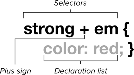
1. Set up a list of adjacent sibling selectors. Type the selector for the first element (HTML, class, or ID), a plus sign (+), and then the selector (HTML, class, or ID) for the adjacent element to which you want the style applied (Code 4.4).
strong + em {...}
2. Styles will be used only if the pattern is matched.
<strong>...</strong>...<em>...</em>
The styles will be applied to any sibling that occurs immediately after the preceding selector with no other selectors in the way. Placing any element between them (even a break tag) will disrupt the pattern. The following pattern will not work:
<strong>...</strong>...<q>...</q>...<em>...</em>
Code 4.4. The style is applied to the emphasis tag only if it is in a paragraph that is immediately after another paragraph  .
.
<!DOCTYPE html>
<html lang="en">
<head>
<meta charset="UTF-8">
<title>Alice’s Adventures in Wonderland</title>
<style type="text/css" media="all">
strong + em {
color: red;
background: silver;
font-size: 2em; }
</style>
</head>
<body>
<article class="chaptertext">
<p><strong>Alice was beginning to get <em>very tired</em> of sitting by her sister on the bank,</strong> and of having nothing to do: <strong>once or twice</strong> she had peeped into the book her sister was reading, but it <em>had no pictures or conversations in it</em>, <q>and <em>what</em> is the use of a book,</q> <strong>thought Alice</strong>, <q>without pictures or conversations?</q></p>
</article>
</body>
</html>
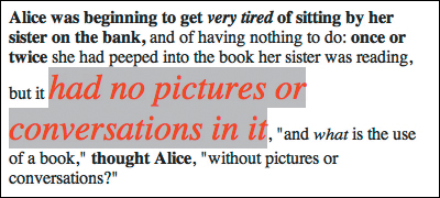
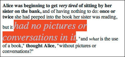
The results of Code 4.4. The text in red matches the adjacent sibling criteria—the emphasis tags within the second and third paragraphs in this case—but does not match the fourth paragraph because a block quote is in the way.
To define general sibling selectors
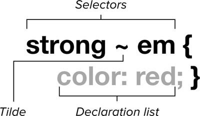
1. Set up a list of general sibling selectors. Type the selector for the first sibling element (HTML, class, or ID), a tilde sign (~), and then another selector (HTML, class, or ID) (Code 4.5).
strong ~ em {...}
You can repeat this as many times as necessary, but the last selector in the list is the one you are targeting to be styled.
2. Styles are used only if the pattern is matched.
<strong>...</strong>...<em>...</em>...<q>...</q>...<em>...</em>
The styles are applied to any siblings that occur after the first sibling selector, not just the first one. Unlike the adjacent sibling, this is true even when other types of tags are located in between. In the case above, this includes both the second and third strong tags
Although the universal selector shown in this section is used with the combinatory selectors, it can be used with any selector type. Table 4.2 shows how you can apply it.
Table 4.2. Universal Selector Examples
Code 4.5. The style is applied to the emphasis tag if it is in a paragraph with any preceding sibling that is a paragraph  .
.
<!DOCTYPE html>
<html lang="en">
<head>
<meta charset="UTF-8">
<title>Alice’s Adventures in Wonderland</title>
<style type="text/css" media="all">
strong ~ em {
color: red;
background: gray;
font-size: 2em; }
</style>
</head>
<body>
<article class="chaptertext">
<p><strong>Alice was beginning to get <em>very tired</em> of sitting by her sister on the bank,</strong> and of having nothing to do: <strong>once or twice</strong> she had peeped into the book her sister was reading, but it <em>had no pictures or conversations in it</em>, <q>and <em>what</em> is the use of a book,</q> <strong>thought Alice</strong>, <q>without pictures or conversations?</q></p>
</article>
</body>
</html>
The results of Code 4.5. The text in red matches the general sibling criteria—in this case the emphasis tags within the second, third, and fourth paragraphs.
 Working with Pseudo-Classes
Many HTML elements have special states or uses associated with them that can be styled independently. One prime example of this is the link tag, <a>, which has link (its normal state), a visited state (when the visitor has already been to the page represented by the link), hover (when the visitor has the mouse over the link), and active (when the visitor clicks the link). All four of these states can be styled separately.
A pseudo-class is a predefined state or use of an element that can be styled independently of the default state of the element .
• Links (Table 4.3)—Pseudo-classes are used to style not only the initial appearance of the anchor tag, but also how it appears after it has been visited, while the visitor hovers the mouse over it, and when visitors are clicking it.
Table 4.3. Link and Dynamic Pseudo-Classes

• Dynamic (Table 4.3)—Pseudo-classes can be applied to any element to define how it is styled when the user hovers over it, clicks it, or selects it.
• Structural (Table 4.4)—Pseudo-classes are similar to the sibling combinatory selectors but allow you to specifically style elements based on an exact or computed numeric position.
Table 4.4. Structural/Other Pseudo-Classes
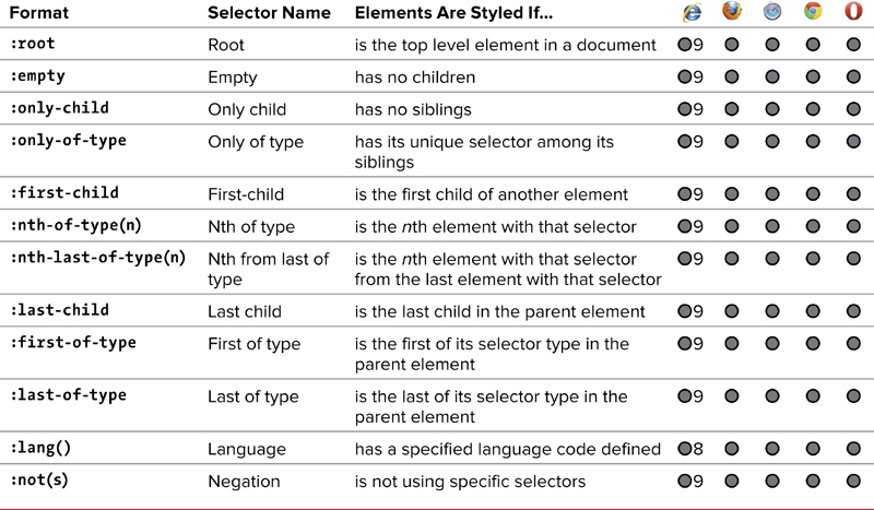
• Other (Table 4.4)—Pseudo-classes are available to style elements based on language or based on what tag they are not.
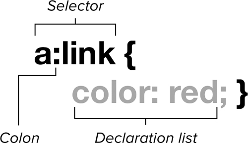
General syntax of a pseudo-class.
Styling links
Although a link is a tag, its individual states are not. To set properties for these states, you must use the pseudo-classes associated with each state that a link can have (in this order):
• :link lets you declare the appearance of hypertext links that have not yet been selected.
• :visited lets you set the appearance of links that the visitor selected previously—that is, the URL of the href attribute in the tag that is part of the browser’s history.
• :hover lets you set the appearance of the element when the visitor’s pointer is over it.
• :active sets the style of the element when it is clicked or selected by the visitor.
For ideas on which styles to use with links, see the sidebar “Picking Link Styles.”
To set contrasting link appearances
1. Style the anchor tag.
a {...}
Although not required, it’s best to first define the general anchor style (Code 4.6). This differs from setting the :link pseudo-class in that these styles are applied to all the link pseudo-classes. So, you want to declare any styles that will remain constant or are changed in only one of the states.
Code 4.6. The link styles are set for the default and then all four link states, creating color differentiation . Notice also that I’ve turned off underlining with text decoration but added an underline effect using border bottom.
<!DOCTYPE html>
<html lang="en">
<head>
<meta charset="UTF-8">
<title>Alice’s Adventures in Wonderland</title>
<style type="text/css" media="all">
a {
text-decoration: none;
font-size: 2em; }
a:link {
color: darkred;
border-bottom: 1px solid red; }
a:visited {
color: darkred;
border-bottom: 1px dashed red; }
a:hover {
color: red;
border-bottom: 1px solid pink; }
a:active {
color: pink;
border-bottom: 1px solid pink; }
</style>
</head>
<body>
<nav>
<h2>TOC:</h2>
<ol>
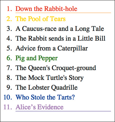
<li><a href="AAIWL-ch01.html">Down the Rabbit-hole</a></li>
<li><a href="AAIWL-ch02.html">The Pool of Tears</a></li>
<li><a href="AAIWL-ch03.html">A Caucus-race and a Long Tale</a></li>
<li><a href="AAIWL-ch04.html">The Rabbit sends in a Little Bill</a></li>
<li><a href="AAIWL-ch05.html">Advice from a Caterpillar</a></li>
<li><a href="AAIWL-ch06.html">Pig and Pepper</a></li>
<li><a href="AAIWL-ch07.html">A Mad Tea-party</a></li>
<li><a href="AAIWL-ch08.html">The Queen's Croquet-ground</a></li>
<li><a href="AAIWL-ch09.html">The Mock Turtle's Story</a></li>
<li><a href="AAIWL-ch010.html">The Lobster Quadrille</a></li>
<li><a href="AAIWL-ch011.html">Who Stole the Tarts?</a></li>
<li><a href="AAIWL-ch012.html">Alice’s Evidence</a></li>
</ol>
</nav>
</body>
</html>
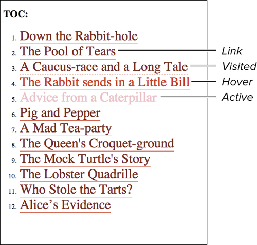
The results of Code 4.6 show the links styled for each state to help the user understand what’s going on.
2. Style the default link state. Type the selector (anchor tag, class, or ID) of the element you want to style, followed by a colon (:), and then link.
a:link {...}
You can override styles set for the anchor tag, but this rule should always come before the :visited pseudo-class.
3. Style the visited link style. Type the selector (anchor, class, or ID) of the element you want to style, followed by a colon (:), and then visited.
a:visited {...}
4. Style the hover link state. Type the selector (anchor, class, or ID) of the element you want to style, followed by a colon (:), and then hover.
a:hover {...}
5. Style the active link state. Type the selector (anchor, class, or ID) of the element you want to style, followed by a colon (:), and then active.
a:active {...}
6. Style is applied to the link state as needed.
<a href="AAIWL-ch01.html">...</a>
All links on the page will obey the rules you lay down here when styling the various link states. You can—and should—use selective styling to differentiate link types.
In this example, the pseudo-classes are applied directly to the anchor tag, but any class or ID could have been used as long as it was then applied to an anchor tag.
The general anchor link styles will be inherited by the different states and between states. The font you set for the :link appearance, for example, will be inherited by the :active, :visited, and :hover states.
The Web is a hypertext medium, so it is important that users be able to distinguish among text, links, and visited links. Because users don’t always have their Underline Links option turned on, it’s a good idea to set the link appearance for every document.
If you use too many colors, your visitors may not be able to tell which words are links and which are not.
The link styles are set for the entire page in this example, but links can be used for a variety of purposes. For example, links might be used for global navigation, in a list of article titles, or even as a dynamic control. To that end, it’s a good idea to style links depending on their usage:
nav a {...}
nav a:link {...}
nav a:visited {...}
Styling for interaction
Once loaded, Web pages are far from static. Users will start interacting with the page right away, moving their pointers across the screen and clicking hither and yon. The dynamic pseudo-classes allow you to style elements as the user interacts with them, providing visual feedback:
• :hover—Same as for links, but sets the appearance of the element when the pointer is hovering over it.
• :focus—Applied to elements that can receive focus, such as form text fields.
• :active—Same as for links, but sets the style of the element when it is clicked or selected.
To define a dynamic pseudo-class
1. Style the default element.
input {...}
Although optional, it’s generally a good idea to set the default, non-dynamic style for the elements receiving dynamic styles (Code 4.7).
2. Style the hover state of the element. Type the selector (HTML, class, or ID), a colon (:), and then hover.
input:hover {...}
As soon as the pointer enters the element’s box (see Chapter 10 for details about the box model), the style change will occur.
Code 4.7. The input elements, with a special style for the button type, are set to change style when the user interacts with them by hovering, selecting (focus), or clicking (active) .
<!DOCTYPE html>
<html lang="en">
<head>
<meta charset="UTF-8">
<title>Alice’s Adventures in Wonderland</title>
<style type="text/css" media="all">
input {
border: 3px solid gray;
background-color: silver;
color: gray;
padding: 0 5px;
font-size: 1.5em; }
input[type="button"] {
border-radius: 1em;
color: silver;
background-color: gray; }
input:hover {
background-color: white;
border-color: pink;
color: silver; }
input:focus {
border-color: red;
background-color: white;
color: black;
outline: none; }
input:active {
color: red;
border-color: pink;
background-color: silver; }
</style>
</head>
<body>
<footer>
<label>Mailing List:</label>
<input type="text" value="email" placeholder="enter your eMail">
<input type="button" class="active" value="submit">
</footer>
</body>
</html>
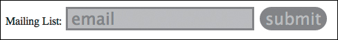
Default
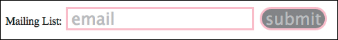
Hover
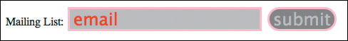
Active
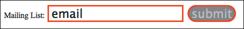
Focus
The results of Code 4.7. This shows a simple form field in the four dynamic states. Providing this visual feedback can help users know which form field is ready for use or that they have clicked a button.
I recommend caution when changing some attributes for :hover. Changing typeface, font size, weight, and other properties may make the text grow larger or smaller than the space reserved for it in the layout and force the whole page to reflow its content, which can really annoy visitors.
In this example, input is used to show the dynamic states. The input has one styling drawback in that all input types use the same tag. Later in this chapter, you will see how to use tag attributes to set styles, which will allow you to set different styles for text fields and buttons.
3. Style the focus state of the element. Type the selector (HTML, class, or ID), a colon (:), and then focus.
input:focus {...}
As soon as the element receives focus (is clicked or tabbed to), the style change occurs and then reverts to the hover or default style when the element loses focus (called blur).
4. Style the active state of the element. Type the selector (HTML, class, or ID), a colon (:), and then active.
input:active {...}
As soon as the user clicks within the element’s box (explained in Chapter 10), the style change will occur and then revert to either the hover or default style when released.
5. The styles are applied to the elements’ states as necessary in reaction to the user.
<input type="button" value="Submit">
All the tags using the specific selector will have their states styled.
The order in which you define your link and dynamic pseudo-classes makes a difference. For example, placing the :hover pseudo-class before the :visited pseudo-class keeps :hover from working after a link has been visited. For best results, define your styles in this order: link, visited, hover, focus, and active.
You will want to always set :focus if you’re setting :hover. Why? Hover is applied only to non-keyboard (mouse) interactions with the element. For keyboard-only Web users, :focus will apply.
Styling specific children with pseudo-classes
Designers often want to apply a style to an element that is the first element to appear within another element, such as a parent’s first child.
The first-child pseudo-element has been available since CSS2; however, CSS3 offers an assortment of new structural pseudo-elements for styling an element’s child element exactly (Table 4.4):
• :first-child—Sets the appearance of the first instance of a selector type if it is the first child of its parent.
• :first-of-type—Sets the appearance of an element the first time its selector type appears within the parent.
• :nth-child(#)—Sets the appearance of the specific occurrence of the specified child element. For example, the third child element of a paragraph would be p:nth-child(3).
• :nth-of-type(#)—Sets the appearance of the specific occurrence of a selector type within the parent. For example, the seventh paragraph would be p:nth-of-type(7).
• :nth-last-of-type(#)—Sets the appearance of the specific occurrence of a selector type within the parent, but from the bottom. For example, the third paragraph from the bottom would be p:nth-last-of-type(3).
• :last-child—Sets the appearance of the element of the indicated selector type if it is the last child of the parent.
• :last-of-type—Sets the appearance of the last instance of a particular selector type within its parent.
To style the children of an element
1. Style the children based on their positions in the parent. Type the selector (HTML, class, or ID) of the element you want to style, a colon (:), and one of the structural pseudo-elements from Table 4.4 (Code 4.8).
li:first-child {...}
li:first-of-type {...}
li:nth-of-type(3) {...}
li:nth-last-of-type(2) {...}
li:last-child {...}
li:last-of-type {...}
Code 4.8. The list has styles set based on the location within the list .
<!DOCTYPE html>
<html lang="en">
<head>
<meta charset="UTF-8">
<title>Alice’s Adventures in Wonderland</title>
<style type="text/css" media="all">
li {
font-size: 1.5em;
margin: .25em; }
li:first-child { color: red; }
li:first-of-type { border-bottom: 1px solid orange; }
li:nth-child(2) { color: yellow; }
li:nth-of-type(6) { color: green; }
li:nth-last-of-type(2) { color: blue; }
li:last-of-type { border-bottom: 1px solid indigo; }
li:last-child { color: violet; }
</style>
</head>
<body>
<nav>
<ol>
<li>Down the Rabbit-hole</li>
<li>The Pool of Tears</li>
<li>A Caucus-race and a Long Tale</li>
<li>The Rabbit sends in a Little Bill</li>
<li>Advice from a Caterpillar</li>
<li>Pig and Pepper</li>
<li>The Queen's Croquet-ground</li>
<li>The Mock Turtle's Story</li>
<li>The Lobster Quadrille</li>
<li>Who Stole the Tarts?</li>
<li>Alice’s Evidence</li>
</ol>
</nav>
</body>
</html>
The results of Code 4.8 show the items in the list styled separately. In this case, the first child and first of type are the same element as the last element and last of type.
2. Elements will be styled if they match the pattern.
<li>...</li>
Set up your HTML with the selectors from Step 1 in mind.
Styling for a particular language
The World Wide Web is just that—all around the world—which means that anyone, anywhere can see your pages. It also means that Web pages are created in many languages.
The :lang() pseudo-class lets you specify styles that depend on the language specified by the language property.
To set a style for a specific language
1. Style an element based on its language code. Type the selector (HTML, class, or ID) of the element you want to style, a colon (:), lang, and enter the letter code for the language you are defining within parentheses (Code 4.9).
p:lang(fr) {...}
2. The element is styled if it has a matching language code. Set up your tag in the HTML with the language attributes as necessary.
<p lang="fr">...</p>
If the indicated selector has its language attribute equal to the same value that you indicated in parentheses in Step 1, the style is applied.
You can use any string as the language letter code, as long as it matches the value in the HTML. However, the W3C recommends using the codes from RFC 3066 or its successor. For more on language tags, visit www.w3.org/International/articles/language-tags.
Language styles can go far beyond simple colors and fonts. Many languages have specific symbols for quotes and punctuation, which CSS can add. In Chapter 9, you will find information on how to style quotes for a particular language.
Code 4.9. Styles are set to turn paragraphs red if they are in French (fr) .
<!DOCTYPE html>
<html lang="en">
<head>
<meta charset="UTF-8">
<title>Alice’s Adventures in Wonderland</title>
<style type="text/css" media="all">
q:lang(fr) {
quotes: '«''»';
color: red; }
</style>
</head>
<body>
<article class="chaptertext">
<p>Alice was beginning to get very tired of sitting by her sister on the bank, and of having nothing to do: once or twice she had peeped into the book her sister was reading, but it had no pictures or conversations in it, <q>and what is the use of a book,</q> thought Alice, <q>without pictures or conversations?</q></p>
<p class="translation" lang="fr">Alice commençait à être très fatigué d'être assis par sa sœur sur la rive, et de n'avoir rien à faire: une fois ou deux, elle avait regarda dans le livre de sa sœur lisait, mais il n'avait pas d'images ni dialogues en elle, <q>et ce qui est l'utilisation d'un livre,</q> pensait Alice, <q>sans images ni dialogues?</q></p>
</article>
</body>
</html>
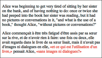
The results of Code 4.9 show the paragraph in French rendered in red (with my apologies to French speakers).
Not styling an element
So far you’ve looked at ways to style a tag if it is something. The negation selector, :not, allows you to not style something for a particular selector.
To not set a style for a particular element
1. Style elements to exclude certain selectors. Type the selector (HTML, class, or ID) of the element you want to style, a colon (:), not, and enter the selectors you want excluded from this rule in parentheses (Code 4.10).
p:not(.dialog) {...}
2. The element is not styled if it contains the indicated selector.
<p class='dialog'>...</p> <p>...</p>
The styles are applied to elements that match the initial selector but not the selector in parentheses.
Code 4.10. When the element is a paragraph that does not use the dialog class, it will be displayed in red and italics .
<! DOCTYPE html>
<html lang="en">
<head>
<meta charset="UTF-8">
<title>Alice’s Adventures in Wonderland</title>
<style type="text/css" media="all">
q:lang(fr) {
quotes: '«''»'; }
p:not(.translation) {
color: red; }
</style>
</head>
<body>
<article class="chaptertext">
<p>Alice was beginning to get very tired of sitting by her sister on the bank, and of having nothing to do: once or twice she had peeped into the book her sister was reading, but it had no pictures or conversations in it, <q>and what is the use of a book,</q> thought Alice, <q>without pictures or conversations?</q></p>
<p class="translation" lang="fr">Alice commençait à être très fatigué d'être assis par sa sœur sur la rive, et de n'avoir rien à faire: une fois ou deux, elle avait regarda dans le livre de sa sœur lisait, mais il n'avait pas d'images ni dialogues en elle, <q>et ce qui est l'utilisation d'un livre,</q> pensait Alice, <q>sans images ni dialogues?</q></p>
</article>
</body>
</html>
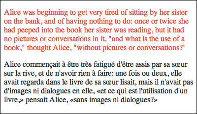
The results of Code 4.10. This shows that the paragraph that does use the dialog class does not receive the style.
Working with Pseudo-Elements
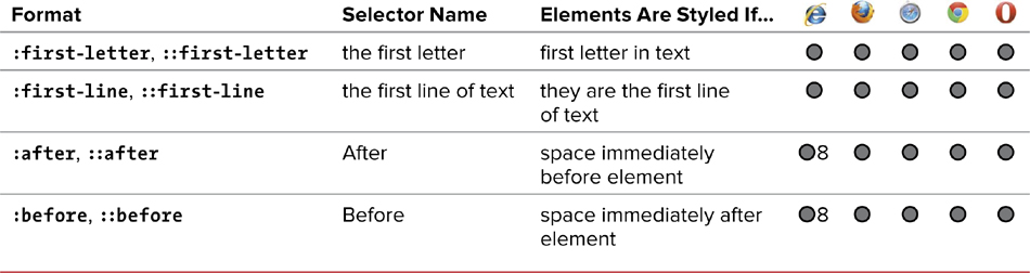
A pseudo-element is a specific, unique part of an element—such as the first letter or first line of a paragraph—that can be styled independently of the rest of the element. (For a list of other pseudo-elements, see Table 4.5.)
Working with first letters and lines
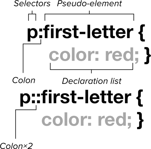
You can access the first letter of any block of text directly using the :first-letter pseudo-element. The first line of any block of text can be isolated for style treatment using the :first-line pseudo-element .
The general syntax for pseudo-elements. Pseudo-elements can have either a single or double colon, but use a single colon at present for increased browser compatibility.
To highlight the beginning of an article
1. Style the default version of the element.
article p {...}
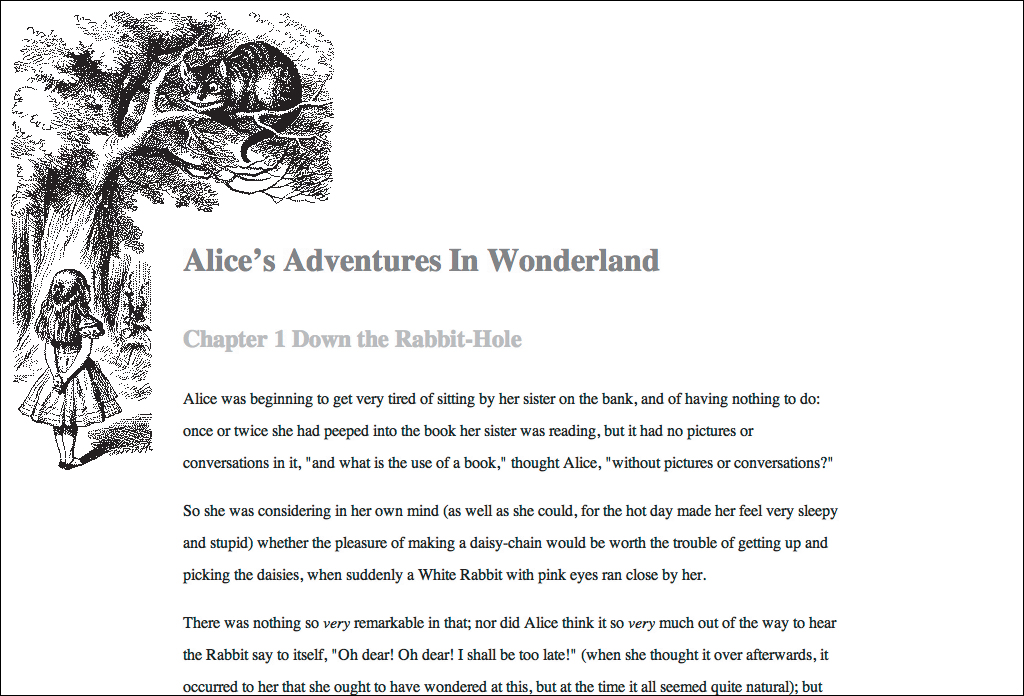
Although not required, it’s generally a good idea to set the default style of the selector for which you will be styling the :first-letter pseudo-element (Code 4.11).
Code 4.11. Styles are set for the first letter and first line of the first paragraph in an article .
<!DOCTYPE html>
<html lang="en">
<head>
<meta charset="UTF-8">
<title>Alice’s Adventures in Wonderland</title>
<style type="text/css" media="all">
article p {
color: gray;
font-size: 1em;
line-height: 1.5;
margin: .875em 2em;
}
article p:first-of-type::first-letter {
color: red;
font-size: 3em;
float: left;
margin: -.25em .05em 0 0; }
article p:first-of-type::first-line {
color: black;
font-size: 1.25em;
font-weight: bold; }
</style>
</head>
<body>
<article class="chaptertext">
<h2>Chapter I
<span class="chaptertitle">Down the Rabbit-Hole</span>
</h2>
<p>Alice was beginning to get very tired of sitting by her sister on the bank, and of having nothing to do: once or twice she had peeped into the book her sister was reading, but it had no pictures or conversations in it, <q>and what is the use of a book,</q> thought Alice, <q>without pictures or conversations?</q></p>
</article>
</body>
</html>
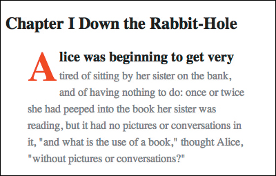
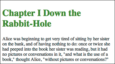
The results of Code 4.11. A common typographic trick to draw the reader’s eye to the beginning of a paragraph is to use a drop cap and to bold the first line of text, as shown here.
2. Style the first letter of the element if it is the first of its type. Type the selector you want to style the first letter of (article p), a colon (:), and then first-letter.
article p:first-of-type::first-letter {...}
To affect only the first paragraph in an article, you can add the :first-of-type pseudo-class, as in this example.
3. Style the first line of the element’s text if it is the first of its type. Type the selector (article p) for which you want to style the first letter, a colon (:), and then first-line.
article p:first-of-type::first-line {...}
In this example, the first-of-type pseudo-class is added so that only the first paragraph in an article is styled.
4. The element’s first letter and first line of text is styled if it is the first of its type in the parent element. Add the class attribute to the relevant HTML tag.
<p>...</p>
Although you do not have to use a class, you generally will want to selectively style the first letter of elements rather than style them all universally.
Drop-cap styled letters are a time-honored way to start a new section or chapter by making the first letter of a paragraph larger than subsequent letters and moving several lines of text to accommodate the larger letter. Medieval monks used drop caps with illuminated manuscripts. Now you can use them on the Web.
Setting content before and after an element
The :before and :after pseudo-elements can be used to generate content that appears above or below a selector. Generally, these pseudo-classes are used with the content property. (See “Adding Content Using CSS” in Chapter 9.) The pseudo-elements let you add and style repetitive content to the page in a consistent way.
To set content before and after an element
1. Style the element.
h2 {...}
Although not required, it’s generally a good idea to set the default style of the selector for which you will be styling the :before and:after pseudo-elements. (See Code 4.12.)
2. Add content before the element. Type the selector (HTML, class, or ID) you want to add content before, a colon (:), and then the keyword before.
h2:before { content:... }
Next, declare the content property and define what generated content goes before the element and how it should be styled.
Code 4.12. Before and after pseudo-elements are used to add content—images in this case—to the page header .
<!DOCTYPE html>
<html lang="en">
<head>
<meta charset="UTF-8">
<title>Alice’s Adventures in Wonderland</title>
<style type="text/css" media="all">
h2 {
font-size: 2em;
color: red; }
h2::before {
content: url('bullet-01.png'), }
h2::after {
content: url('bullet-02.png'), }
</style>
</head>
<body>
<article class="chaptertext">
<h2> Chapter I
<span class="chaptertitle">Down the Rabbit-Hole</span>
</h2>
<p>Alice was beginning to get very tired of sitting by her sister on the bank, and of having nothing to do: once or twice she had peeped into the book her sister was reading, but it had no pictures or conversations in it, <q>and what is the use of a book,</q> thought Alice, <q>without pictures or conversations?</q></p>
</article>
</body>
</html>
bullet-01.png & bullet-02.png will be used as flourishes around titles.
The header now has a bit of flourish added before and after by the CSS. These images take up space as if they were in an image tag, but do not show up in the HTML code.
3. Add content after the element. Type the selector (HTML, class, or ID) you want to add content after, a colon (:), and then the keyword after.
h2:after { content:... }
Next, declare the content property and define what generated content goes after the element and how it should be styled.
The pseudo-element syntax in CSS3 has undergone a slight change from the CSS2 syntax (which is rare). Pseudo-elements now have a double colon to distinguish them from pseudo-classes. Existing pseudo-elements can use either single or double colons. New and future pseudo-elements should use double colons, but will work with a single colon.
Since IE8 does not support double colon syntax for CSS2 pseudo-elements, it’s a good idea to use single colon syntax for older pseudo-elements until all browsers have adopted the syntax. Double colon will not work in IE8 anyway.
Be careful when using before and after to add content to your page. This content will not appear to search engines or screen readers, so do not rely on it for anything vital.
Defining Styles Based on Tag Attributes
Although style attributes should all be handled by CSS, many HTML tags still have attributes that define how they behave. For example, the image tag, img, always includes the src attribute to define the source for the image file to be loaded.
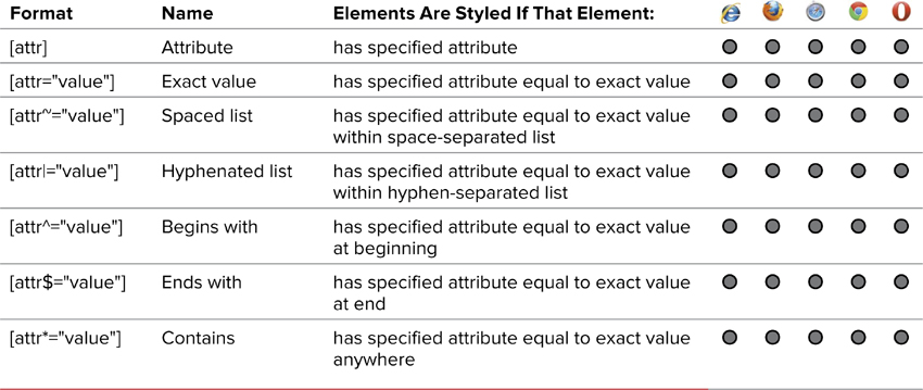
Styles can be assigned to an HTML element based on an attribute or an attribute value, allowing you to set styles if the attribute has been set, is or is not a specific value, or contains a specific value (Table 4.6).
Table 4.6. Attribute Selectors
To set styles based on an element’s attributes
1. Set styles if the element has a specific property. To set styles based on the existence of an attribute, type the selector you want to style (HTML, class, or ID), a left bracket ([), the name of the attribute you want to check for, and a right bracket (]) (Code 4.13) .
a[title] {...}
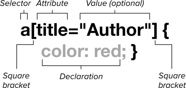
The general syntax of an attribute selector.
Code 4.13. HTML tags can have different attributes, and you can add styles to an element based on its attributes .
<!DOCTYPE html>
<html lang="en">
<head>
<meta charset="UTF-8">
<title>Alice’s Adventures in Wonderland</title>
<style type="text/css" media="all">
a { display: block; font-size: 2em;}
a[title] { color: red; }
a[title="Author"] {color: orange; }
a[title~="white"] { color: yellow; }
a[title|="illustrations"] { color: green; }
a[href^="http://"] {color: blue; }
a[href*="order"] {color: indigo; }
a[href$="css3-vqs"] {color: violet; }
</style>
</head>
<body>
<article class="chaptertext">
<h1>About The Book:</h1>
<ul>
<li><a href="EB9780133132762_26.html" title="Alice's Adventures in Wonderland">Alice’s Adventures in Wonderland</a></li>
<li><a href="EB9780133132762_26.html" title="Author">Lewis Carroll</a></li>
<li><a href="EB9780133132762_26.html" title="illustrations black white">John Tenniel</a></li>
<li><a href="EB9780133132762_26.html" title="illustrations-full-color">Arthur Rackham</a></li>
<li><a href="http://www.jasonspeaking.com">Download Examples</a></li>
<li><a href="http://www.jasonspeaking.com/css3-vqs/order">More Info</a></li>
<li><a href="http://www.jasonspeaking.com/css3-vqs">Order The Book</a></li>
</article>
</body>
</html>
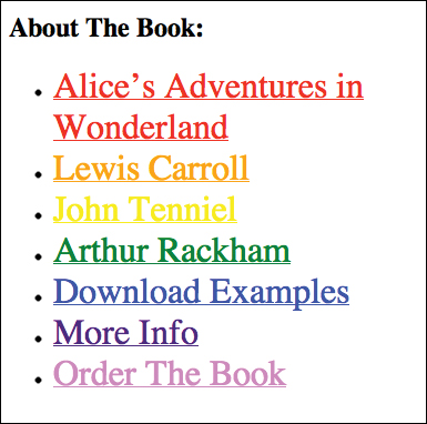
The results of Code 4.13. This shows how styles are applied to elements based on their properties.
This will assign the styles you declare only if the tag has this attribute assigned to it regardless of the value.
2. Set styles if a string exactly matches the property’s value. To set styles based on an attribute’s exact value, type the selector you want to style (HTML, class, or ID), a left bracket ([), the name of the attribute you want to check for, an equals sign (=), the value you are testing for in quotes ('...'), and a right bracket (]). The value is case sensitive.
a[title='home'] {...}
This will assign the styles you declare only if the tag has this attribute assigned to it with the exact assigned value.
3. Set styles if a string is in a space-separated list of values. To set styles based on an attribute’s value that is within a list of space-separated values (for example, a particular word in a sentence), type the selector you want to style (HTML, class, or ID), a left bracket ([), the name of the attribute you want to check for, a tilde (~), an equals sign (=), the value you are testing for in quotes ('...'), and a right bracket (]).
a[title~="email"] {...}
This will assign the styles you declare only if the tag has the attribute assigned to it with a value that contains the string as part of a space-separated list. Generally, this means that it is a word in a sentence. Partial words do not count. So in this example, testing for 'mail' would not work.
4. Sets the style if the string is in a hyphenated list of values assigned to the property. To set styles based on an attribute’s value being the first in a list separated by hyphens, type the selector you want to style (HTML, class, or ID), a left bracket ([), the name of the attribute you want to check for, a bar (|), an equals sign (=), the value you are testing for in quotes ('...'), and a right bracket (]).
a[title|="resume"]
This will assign the styles you declare only if the tag has this attribute assigned to it with a value that contains the string at the beginning of a hyphen-separated list. Generally, this is used for styling languages as an alternative to using the language pseudo-class.
5. Set styles if a string is the value’s prefix. To set styles based on the value at the beginning of an attribute, type the selector you want to style (HTML, class, or ID), a left bracket ([), the name of the attribute you want to check for, a carat (^), an equals sign (=), the value you are testing for in quotes ('...'), and a right bracket (]).
a[href^="http://"]
This will assign the styles you declare only if the value string occurs exactly as it is in the quotes at the beginning of the attribute value.
6. Set styles if a string is the property value’s suffix. To set styles based on an attribute’s value being the first in a hyphen-separated list, type the selector you want to style (HTML, class, or ID), a left bracket ([), the name of the attribute you want to check for, a dollar sign ($), an equals sign (=), the value you are testing for in quotes ('...'), and a right bracket (]).
a[href$=".info"]
This will assign the styles you declare only if the value occurs at the end of the attribute’s value.
7. Set styles if a string is anywhere in the property value. To set styles based on an attribute’s value being the first in a hyphen-separated list, type the selector you want to style (HTML, class, or ID), a left bracket ([), the name of the attribute you want to check for, an asterisk (*), an equals sign (=), the value you are testing for in quotes ('...'), and a right bracket (]).
a[href*="speakinginstyles"]
This will assign the styles you declare if the value occurs anywhere in the attribute’s value.
Values are case sensitive. In other words, “Alice” and “alice” are two different values.
Querying the Media
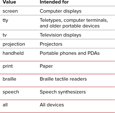
In Chapter 3 you learned how to specify style sheets for a particular media type, allowing you to set styles depending on whether the HTML is output to a screen, print, TV, or a handheld or other device (Table 4.7). CSS3 adds an important new capability that allows you to set styles based on common interface properties such as width, height, aspect ratio, and number of available colors.
Media queries and the @media rule can be used to tailor your page, not just to a general device type but to the specific device your site visitor is using. This includes sizing for print, for mobile devices, or to best fit the size of the open browser window.
Media queries
If you want to know the current size of the browser window, why not just ask the browser? JavaScript gives you the ability to do this, but it’s a cumbersome way to get some basic facts about the Webbed environment your design is trying to fit into.
Media queries provide you with several common media properties that you can test and then deliver the style sheet that best suits the environment.
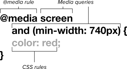
The general syntax for media queries.
Although media queries have many properties (Table 4.8), they come in five basic flavors:
• Aspect-ratio looks for the relative dimensions of the device expressed as a ratio: 16:9, for example.
• Width and height looks for the dimensions of the display area. These can also be expressed as maximum and minimum values.
Table 4.8. Media Query Properties
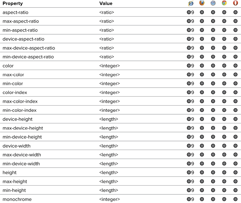
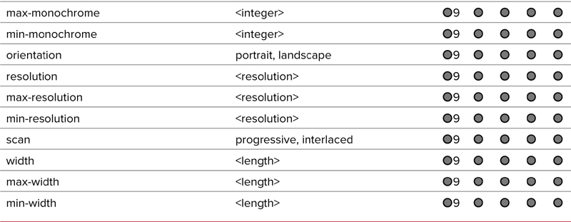
• Orientation looks for landscape (height greater than width) or portrait (width greater than height) layout. This allows you to tailor designs for devices that can flip.
• Color, color-index, and monochrome finds the number of colors or bits per color. These allow you to tailor your design for black-and-white mobile devices.
• Resolution looks at the density of pixels in the output. This is especially useful when you want to take advantage of display devices that have a higher resolution than 72 dpi.
By default, media queries are for the viewport (see Chapter 11 for details on the viewport) with the exception of those that specify device, in which case they are for the entire screen or output area. For example, width is the width of the visible browser viewport within the screen, whereas device-width is the width of the entire screen.
Using media queries to specify styles
1. Create your style sheets. Create a default media style sheet that captures all the general styles for your design and save it. I like to call mine default.css (Code 4.14).
Create style sheets for the various media or specific devices for which you will be designing. Print is generally good to include (Code 4.17). You can call the sheet print.css, but you might also want to create style sheets specifically for tablets (Code 4.15) and for desktop computers (Code 4.16).
Code 4.14. default.css—These styles are applied regardless of the screen size; but we are tailoring the styles for small devices, most likely mobile devices such as smart phones. We start with the small sizes first, and then tailor for larger sizes in the next two CSS files.
/*** Default Screen Styles ***/
body {
color: charcoal;
font: normal 1.5em/1 helvetica, arial, sans-serif;
background: silver url('alice23c.gif') no-repeat center 0;
padding: 120px 20px; }
h1 { color: purple; font-size: 1.5em; }
h2 { color: black; font-size: 1.25em; }
p { line-height: 2; font-size: 1em; }
Code 4.15. medium.css—A custom view for medium-size screens. Generally, these styles will be used by tablet devices.
/*** Medium Device Styles ***/
body {
color: dimgray;
background-color: gray;
font-size: 1.25em;
padding: 200px 2em; }
h1 { color: gold; }
h2 { color: silver; }
Code 4.16. large.css—The final style sheet will be used to serve a page tailored to larger computer screens.
/*** Large Device Styles ***/
body {
color: silver;
font: normal 1.1em/2 georgia,times,serif;
background: black url('alice23b.gif') no-repeat 0 0;
padding: 200px 175px; }
h1 {
color: red;
font-style: italic; }
h2 { color: gray; }
Code 4.17. print.css—These styles are tailored for the printed page, changing the background to white (assuming white paper), serif fonts, black text, and a different background image.
/*** For Print ***/
body {
color: rgb(0,0,0);
background: white url('alice23a.gif') no-repeat 0 0;
padding: 200px 0 0 175px;
}
h1 { color: gray; }
p { font: normal 12pt/2 Constantia, palatino, times, "times new roman", serif; }
2. Add the viewport meta tag. In the head of your HTML document (Code 4.18), add a meta tag with a name equal to viewport and content, as shown.
<meta name="viewport" content="width=device-width, initial-scale=1, maximum-scale=1, minimum-scale=1, user-scalable=no" />
This will prevent devices with smaller screens, most notably the iPhone, from resizing the page, overriding your styles to be set in Step 5.
3. Link to your default style sheet. In the head of your HTML document (Code 4.18), type a <link> tag that references the default version of the CSS and define media as all.
<link rel="stylesheet" media="all" href="default.css" >
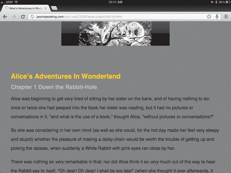
Code 4.18. The HTML code links to all three of the style sheets, which are displayed in default , tablet , smart phone , and print . The iPhone style sheet uses media queries to set a device’s width range in keeping with the iPhone. Notice that I used screen for the media type because the iPhone identifies itself as a screen, not a handheld device.
<!DOCTYPE html>
<html lang="en">
<head>
<meta charset="UTF-8">
<meta name="viewport" content="width=device-width, initial-scale=1, maximum-scale=1, minimum-scale=1, user-scalable=no" />
<title>Alice’s Adventures in Wonderland</title>
<link rel="stylesheet" media="screen" href="14.css">
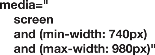
<link rel="stylesheet" media="screen and (min-width: 740px) and (min-device-width: 740px), (max-device-width: 800px) and (min-width: 740px) and (orientation:landscape)" href="15.css">
<link rel="stylesheet" media="screen and (min-width: 980px) and (min-device-width: 980px)" href="16.css">
<link rel="stylesheet" media="print" href="17.css">
</head>
<body>
<hgroup>
<h1>Alice’s Adventures In Wonderland</h1>
<h2 id="ch01">Chapter 1 <span class="chaptertitle">Down the Rabbit-Hole</span></h2>
</hgroup>
<article>
<p>Alice was beginning to get very tired of sitting by her sister on the bank, and of having nothing to do: once or twice she had peeped into the book her sister was reading, but it had no pictures or conversations in it, <q>and what is the use of a book,</q> thought Alice, <q>without pictures or conversations?</q></p>
</article>
<footer><nav> Next:
<a class="chaptertitle" href="AAIWL-ch02.html">The Pool of Tears</a>
</nav></footer>
</body>
</html>
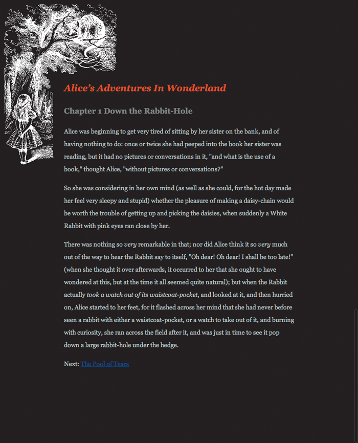
Code 4.18 output to a computer screen. This version uses a dark background and an inverted version of the Alice’s Adventures in Wonderland illustration. On an LCD screen, the lightly colored text will look fine.
Code 4.18 on a tablet device, in this case an iPad.
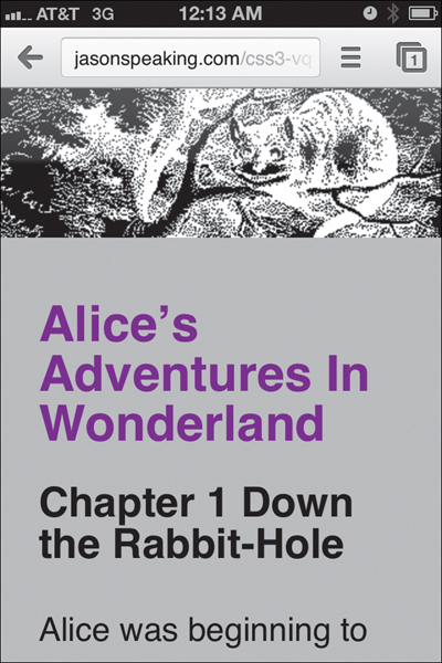
Code 4.18 on a mobile device, in this case an iPhone. A specially tailored version to fit the width of smaller devices uses a custom header of the Cheshire cat.
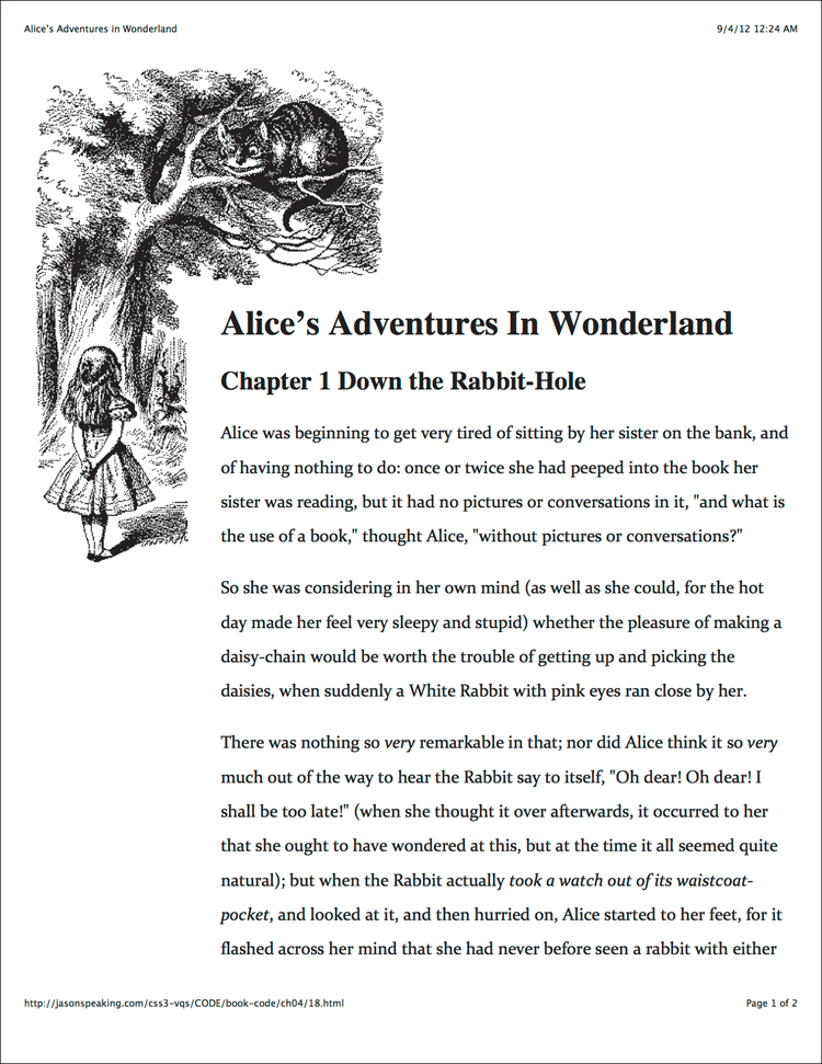
Code 4.18 output to a printer. The background is white, and the background image is no longer inverted. This works better in print.
4. Use a media query to link to a style sheet. Immediately after the previous <link> tag, add more <link> tags that reference the style sheets for a specific media type and then add media queries (Table 4.8) in parentheses connecting multiple queries with and.
<style type="text/css" media="screen and (min-width: 740px) and (min-device-width: 740px), (max-device-width: 800px) and (min-width: 740px) and (orientation:landscape)">@import url("css/medium.css");</style>
<style type="text/css" media="screen and (min-width: 980px) and (min-device-width: 980px)">@import url("css/medium.css"); @import url("css/large.css");</style>
5. Link to your print style sheet. Immediately after the <link> tag, add another <link> tag that references the print version of the CSS and define media as print.
<link rel="stylesheet" media="print" href="print.css">
Before media queries were introduced, Web developers used JavaScript to detect browser dimensions and colors. Media queries render those techniques obsolete, at least for styling purposes.
In this example, media queries are applied to the media property value of the <link> tag, but you can just as easily apply them to the media property of the <style> tag.
Using the @media rule
Media queries allow you specify styles in the media property of <link> and <style> tags, but the @media rule allows you to embed media queries directly into a style sheet.
The general syntax of the @media rule.
Using @media to specify styles
1. Create your style sheets. Create an external style sheet or embed a style sheet in the body of your document (Code 4.19).
2. Use the @media rule to specify styles with media queries. In the head of your HTML document, type @ and media. Then specify the media type (Table 4.7) and any media queries (Table 4.8) for the styles.
@media screen and (max-device-width: 480px) {...}
For example, you might specify that these styles are for screens with a width up to 480px wide. Finish with curly brackets. Add any media-specific styles between the curly brackets.
3. Add other styles as necessary.
body {...}
You can add more @media rules or other nonmedia-specific rules. However, all CSS rules that are not in @rules (@media, @font-face, @import, and so on) must come after the @rules.
Code 4.19. The HTML code links to the various style sheets for different media types and .
<!DOCTYPE html>
<html lang="en">
<head>
<meta charset="UTF-8">
<meta name="viewport" content="width=device-width, initial-scale=1, maximum-scale=1, minimum-scale=1, user-scalable=no" />
<title>Alice’s Adventures in Wonderland</title>
<style type="text/css">
body {
font: normal 12pt/2 times, "times new roman", serif;
background: white url('alice23a.gif') no-repeat 0 0;
padding: 200px 175px; }
h1 { color: gray; }
h2 { color: silver; }
p { color: black; }
@media screen and (max-width: 480px) {
/*** Small screen Styles ***/
body {
-webkit-text-size-adjust:none;
color: red;
background: gray url('alice23c.gif') no-repeat center 0;
padding: 120px 20px 20px 20px; }
h1 {
color: red;
text-shadow: 0 0 5px black; }
h2 { color: silver; }
p {
font-size: 1.5em;
color: white; }
}
</style>
</head>
<body>
<hgroup>
<h1>Alice’s Adventures In Wonderland</h1>
<h2 id="ch01">Chapter 1 <span class="chaptertitle">Down the Rabbit-Hole</span></h2>
</hgroup>
<article>
<p>Alice was beginning to get very tired of sitting by her sister on the bank, and of having nothing to do: once or twice she had peeped into the book her sister was reading, but it had no pictures or conversations in it, <q>and what is the use of a book,</q> thought Alice, <q>without pictures or conversations?</q></p>
</article>
<footer><nav> Next:
<a class="chaptertitle" href="AAIWL-ch02.html">The Pool of Tears</a>
</nav></footer>
</body>
</html>
Code 4.19 on a computer screen.
Code 4.19 on a mobile device screen. The styles and background have been modified based on the device width.
Inheriting Properties from a Parent
No, this book hasn’t suddenly become the Visual QuickStart Guide to Real Estate. Child and descendent HTML tags generally assume the styles of their parents—inherit them—whether the style is set using CSS or is inherited from a browser style. This is called inheritance of styles.
For example, if you set an ID called copy and give it a font-family value of Times, all of its descendents would inherit the Times font style. If you set a bold tag to red with CSS, all of its descendents will inherit both the applied red and the inherent bold style .
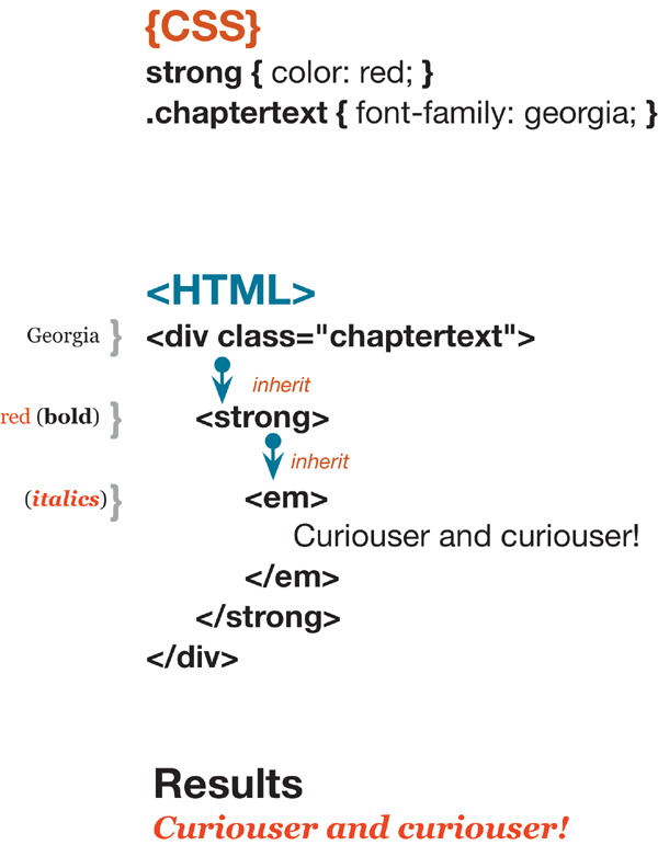
The final result of the styles applied and inherited is bold, red, and italicized text in Times font. Styles in parentheses are inherent styles applied by the browser for the particular HTML tag.
In some cases, a style property is not inherited from its parent—obvious properties such as margins, width, and borders. You will probably have no trouble figuring out which properties are inherited and which are not. For example, if you set a padding of four pixels for the paragraph tag, you would not expect bold tags within the paragraph to also add a padding of four pixels. If you have any doubts, see Appendix A, which lists all the CSS properties and how they are inherited.
If you did want to force an element to inherit a property of its parent, many CSS properties include the inherit value. So, in the previous example, to force all the bold tags in a paragraph to take on the 4px padding, you could set their padding value to inherit.
Managing existing or inherited property values
When defining the styles for a selector, you do not cause it to lose any of its inherited or inherent attributes unless you specifically override those styles. All those properties are displayed unless you change the specific existing properties that make up its appearance.
In addition to overriding the relevant property with another value, many CSS properties have values that allow you to override inheritance:
• inherit—Forces a property to be inherited that would normally not be inherited, or overrides other applied style values and inherits the parent’s value.
• none—Hides a border, image, or other visual element.
• normal—Forces the default style to be applied.
• auto—Allows the browser to determine how the element should be displayed based on context.
Making a Declaration !important
You can add the !important declaration to a property-value declaration to give it the maximum weight when determining the cascade order . Doing so ensures that a declaration is applied regardless of the other rules in play. (See “Determining the Cascade Order” in this chapter.)
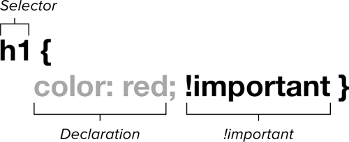
The general syntax for !important.
To force use of a declaration
1. Add your CSS rule (Code 4.20).
h2 {...}
Code 4.20. The !important value has been added to the color property in the first h2, but not in the second . Typically, the second h2 would override the first, but not in this case.
<!DOCTYPE html>
<html lang="en">
<head>
<meta charset="UTF-8">
<title>Alice’s Adventures in Wonderland</title>
<style type="text/css" media="all">
h2 {
color: green !important;
font-size: 3em; }
h2 {
color: red;
font-size: 2em; }
</style>
</head>
<body>
<article class="chaptertext">
<h2> Chapter I
<span class="chaptertitle">Down the Rabbit-Hole</span>
</h2>
<p>Alice was beginning to get very tired of sitting by her sister on the bank, and of having nothing to do: once or twice she had peeped into the book her sister was reading, but it had no pictures or conversations in it, <q>and what is the use of a book,</q> thought Alice, <q>without pictures or conversations?</q></p>
</article>
</body>
</html>
The result of Code 4.20. The style that is most important wins the day, so the text is green rather than red, despite the fact that the red declaration comes later in the cascade.
You can use an HTML, class, or ID selector. CSS rules can be defined within the <style> tags in the head of your document (see “Embedded: Adding Styles to a Web Page” in Chapter 3) or in an external CSS file that is then imported or linked to the HTML document (see “External: Adding Styles to a Web Site” in Chapter 3).
2. Make it important. Type a style declaration, a space, !important, and a semicolon (;) to close the declaration.
color: green !important;
font-size: 3em;
Add any other declarations you wish for this rule, making them !important or not, as you desire.
!important is a powerful tool, second only to inline styles for determining style cascade. !important is great for debugging your CSS; but, because it can interfere with making changes later, it should never be used in the final Web site code.
Setting a shorthand property to !important (background, for example) is the same as setting each sub-property (such as background-color) to be !important.
A common mistake is to locate !important after the semicolon in the declaration. This causes the browser to ignore the declaration and, possibly, the entire rule.
If you are debugging your style sheet and can’t get a particular style to work, try adding !important to it. If it still doesn’t work, the problem is most likely a typo rather than another overriding style.
Many browsers allow users to define their own style sheets for use by the browser. Most browsers follow the CSS 2.1 specification in which a user-defined style sheet overrides an author-defined style sheet.
Determining the Cascade Order
Within a single Web page, style sheets may be linked, imported, or embedded. Styles may also be declared inline in the HTML.
In addition, many browsers allow visitors to have their own style sheets that can override yours. It’s guaranteed, of course, that simultaneous style sheets from two or more sources will have conflicting declarations. Who comes out on top?
The cascade order refers to the way styles begin at the top of the page and, as they cascade down, collect and replace each other as they are inherited. The general rule of thumb is that the last style defined is the one that is used.
However, at times, two or more styles will conflict. Use the following procedure to determine which style will come out on top and be applied to a given element.
To determine the cascade-order value for an element
Collect all styles that will be applied to the element. Find all the inherent, applied, and inherited styles that will be applied to the element, and then use the following criteria to determine which styles are applied in the cascade order, with the criteria at the top being most important .
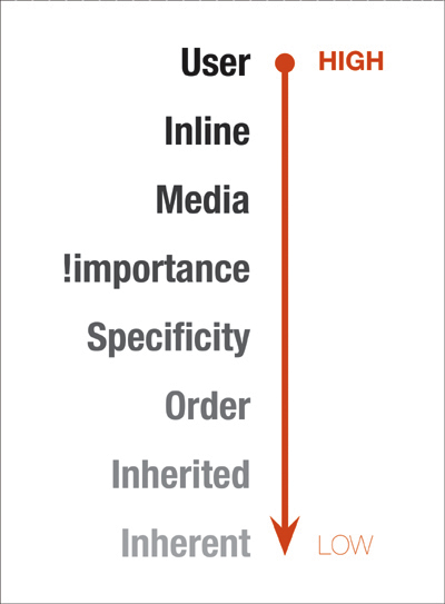
The cascade order from most important to least important.
1. User styles
Most Web browsers allow users to specify their own default style sheets. In principle, these always have precedence over other styles.
2. Inline styles
If the style is inline (see Chapter 3), it is always applied regardless of all other factors. That’s why you should never use them in your final HTML code.
3. Media type
Obviously, if the media type is set for a style and element that is not being displayed in that media type, the style will not be used.
4. Importance
Including !important with a declaration gives it top billing when displayed. (See “Making a Declaration !important” in this chapter.)
Many browsers let users define their own style sheets for use by the browser. If both the page author and the visitor have included !important in their declarations, the user’s declaration wins.
In theory, an author’s style sheets override a visitor’s style sheets unless the visitor uses the !important value. In practice, however, most browsers favor a user’s style sheet when determining which declarations are used for a tag.
The more contextually specific a rule is, the higher its cascade priority. So the more HTML, class, and ID selectors a particular rule has, the more important it is. In determining this priority, ID selectors count as 100, classes count as 10, and HTML selectors are worth only 1. Thus,
#copy p b { color: red; }
is worth 102, whereas
b { color : lime; }
is worth only 1. So, the first rule would have higher specificity and the color would be red.
This priority setting may seem a bit silly at first, but it allows context-sensitive and ID rules to carry more weight, ensuring that they will be used.
6. Order
If the conflicting declarations applied to an element are equal at this point, CSS gives priority to the last rule listed, in order. Remember that inline styles always win.
7. Inherited
These styles are inherited from the parent.
8. Inherent
These styles are applied by the browser to HTML tags and are the least important.