Chapter 6. Data Visualization Color Tips
Blending colors together in the form of data visualization is a dance, something subtle, not the equivalent of a new age painter hurtling a gallon of paint on a blank canvas and calling it art. You are looking to influence the overall feel of the creation and give it depth. Think about the definition of the colors you are using. Bright, airy colors like yellow and orange can promote a cheerful sense in someone, bringing happiness, light, and joy into their mood. If you need calm and confidence, blue comes to mind. If you’re trying to deliver the excitement of a new product, you can’t go wrong with bright red.
Use Contrasting Color
Don’t keep using the same color over and over again, regardless of if it’s the one most often associated with your brand. If all plotted points are light blue, what’s to make one stand out from all the rest? The key here is contrast, as we’ll discuss at length a bit later in this chapter.
Contrast between two colors can make a world of difference in the look and significance of your data. If some elements are less important than others, don’t waste a color on them; mark them with gray to ensure your important points are accented and everything else does not stand out.
Let’s say we are looking at the popularity of specific vegetables in our fictitious supermarket. The head of the sales department wants to know specifically how “lettuce” popularity trends look over the past few years (Figure 6-1). We can use gray and green to allow for enough contrast so that the reader can easily distinguish between the trends of various vegetables and the specific one in question—lettuce.

Figure 6-1. Line graph demonstrating popularity of various vegetables, highlighting lettuce
Avoid Bright Backgrounds
A big part of standing out is making sure the audience is focused on the right thing. Having a bright background color might be unique, but it’s going to distract the eyes of the person who’s looking at your data for guidance. Don’t make it hard on them! Look at the two images in Figure 6-2—we have one chart with a bright background and one with a plain white background. Which of these are you able to read and understand more efficiently and effectively?

Figure 6-2. Two donut charts illustrating how a white background is superior to a bright background for ease of reading a graph
Know Your Devices
Make sure you know what context your data visualization will be used in. Looking brilliant on the monitor does not mean it will look as glorious on a tablet, phone, or a digital projector that 500 people are going to be staring at. You should also consider the fact that some might end up printing your visualization in black and white!
When discussing color best practices with Maureen Stone, retired research scientist at Tableau, she told me it’s important to “get it right in black and white.” This is a phrase she has picked from designers and is a fundamental principle in designing with color. As an example, when cartographers design maps, they first design it to be readable in black and white. They will add color at times to make interpretation just a little easier. This is what we must do as data visualization designers: create in black and white and add color to help our readers understand the message more efficiently and effectively.
Use Gradients
If you are having trouble figuring out how to compare and contrast data without having to use too many different colors, consider using a gradient. Use lower gradients on lighter colors and higher gradients on darker colors to show the difference between the two, a comparison that should be intuitive to the audience you are designing for. Figure 6-3 provides an example of how a gradient color scheme can be used to represent the median age across a region. The darker colors are reserved for higher median age and the lighter colors are used for the lower median age.
We should avoid using gradients for categorical data as it will lead to audience confusion.
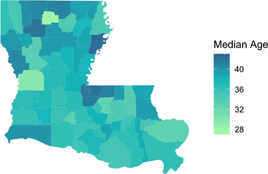
Figure 6-3. Gradient color map view demonstrating median ages, geographically1
Summary
In this section, we shared some tips on using color for data visualization and storytelling. It’s important to use contrasting colors, avoid bright backgrounds, and design visualizations that can be viewed effectively across various devices (laptop, mobile, print, etc.).
1 Image credit: Amanda West, “Pretty (Simple) Geospatial Data Visualization in R,” Towards Data Science, June 26, 2020, https://oreil.ly/z52ib.