Chapter 3. Types of Colors Used in Data Visualization
When it comes to data visualization and data storytelling, the types of colors you use are going to make or break your presentation—it’s really just that simple. Colors direct our eye movements and thus command our attention and our brain power. Your color usage can either help or hinder the understanding your intended audience gets from the data you are presenting.
Three Types of Colors
There are three types of colors to understand and utilize in your data visualization process. The type of color palette that you use will depend on several things, including the nature of the data you are preparing to bring to life visually. The three types of colors we will be looking at are sequential, diverging, categorical.
Figure 3-1 provides a glimpse into the various types of colors.

Figure 3-1. Demonstration of three types of colors: sequential, diverging, and categorical1
Let’s break down these three color types and see what circumstances make the most sense for each.
Sequential
Sequential colors have numeric meaning and move from light to dark using a graduation of colors. These ordered values use colors assigned to data values, often based on hue, lightness, or a combination of the two.
Typically, the lower values are associated with lighter colors and the higher values with darker colors. However, this depends on the type of background the chart is depicted on. On a white or light background, the lower values are the lighter colors. On a darker background, the reverse is often true. While it works to have a single hue for a sequential color palette, spanning the distance between two colors can also have its benefits and make for a visually stimulating experience. Assuming a white or light background, you can start with a warmer color such as red, yellow, or orange, and trend toward a cooler color (green, blue, or purple) on the darker end of things to give a distinct pattern between the two.
Let’s look at an example of how sequential colors can be used for displaying total sales by state using a green sequential color scheme to show the lower sales (light green) and higher sales (darker green) within each state (Figure 3-2).
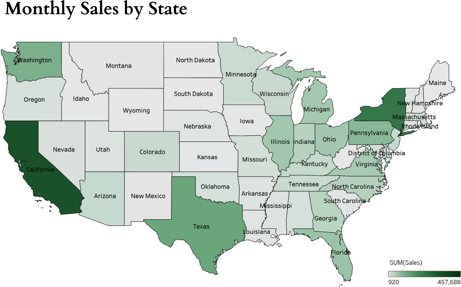
Figure 3-2. Map view of sales: demonstration of sequential color usage
Diverging
When the numeric variables have a meaningful, central value, such as zero, a diverging palette can be used. It combines two sequential palettes with a shared endpoint that rests on the central value. Those values to the right of center are assigned colors on one side and are typically larger, and the smaller ones sit left of center.
There are usually distinctive hues on each side of center to stagger and separate the positive from the negative values. The central value should have a typically light color so that darker colors can indicate more and more of a larger distance from the center of the range. Such colors to use in this format are red-yellow-blue, red-blue, and orange-yellow-blue.
No matter what kind of colors you are using, the first and most important rule should be to keep it simple. Just like too many witches spoil the brew, too many colors will dilute the meaning and make things confusing for your intended audience. You have to remember that your audience—whether they are potential customers, potential investors, the company’s board of directors, or people on the street—are all going into this visualization without much context.
Even if they have read the agenda and presumably know what’s coming, they still should be able to take that first 10- to 15-second glance and know what the subject is, what the data represents, and what the story is without having to raise their hands, ask questions, and talk to each other about who sees what. If you pick your colors properly, you’re likely to record a slam dunk in this capacity. If you’ve gone too far off target or you’re loading up the entire rainbow into your infographic, an airball is a lot more likely to be in your future.
As an example for diverging colors, observe Figure 3-3, where we display the profitability for each state, with the deep orange colors displaying low profitability and deep blue representing high profitability.
No matter what type of presentation you are making, the use of color plays a vital role in capturing the user’s attention and creating specific emotional reactions. Colors can reduce the cognitive load that a person has to commit to understanding the information presented by putting it in a simpler format that emphasizes colors, shapes, and patterns, which are much easier to understand for most people than a complex series of numbers.

Figure 3-3. Map view of profitability: demonstration of diverging color usage
Categorical
Categorical colors, sometimes referred to as “qualitative,” help their users map nonnumeric meanings for objects in a visualization. They are designed to be easily and visually distinctive from one another. They are optimized so that readers with color vision deficiencies can still read them with minimum difficulty. Typical examples are nominal variables in charts like zip code, blood type, and race.
Emphasizing patterns is the name of the game here, and using darker actionable colors will draw attention to those findings. The colors assigned to each group need to be very distinctive, and as a rule of thumb, the maximum palette size should be seven colors or fewer. Once you get past that number of colors, you can really start having a tough time distinguishing between different groups. If there are more possible values than colors, you should try to bundle some of the values together to make it easier on yourself and not get into a situation where there are such slight differences between colors that it would take the most high-tech monitor in the world to be able to accurately portray the differences. You can also explore breaking the visual into multiple graphs.
For example, if you were breaking down sales for your company by location, and you had sales in 40+ different states, you couldn’t possibly conjure up over 40 different distinctive colors (Figure 3-4) to successfully chart out everything.
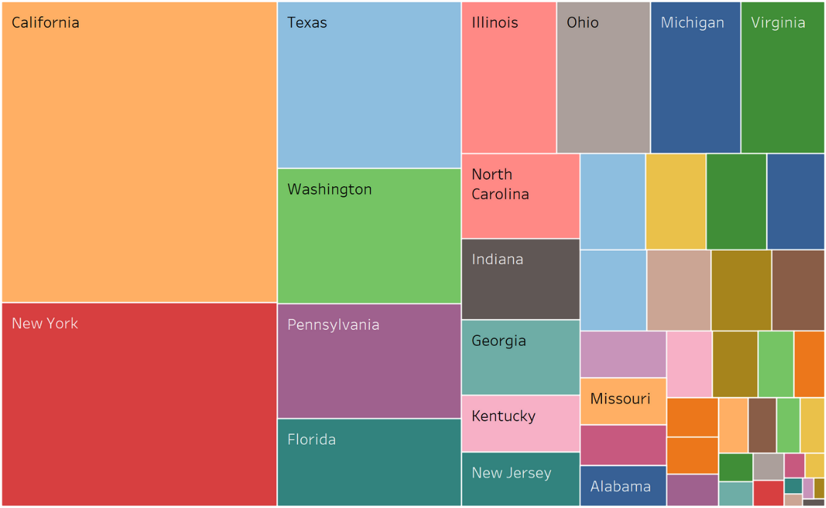
Figure 3-4. Treemap of sales values by location: demonstration of categorical color usage
Instead, you could break down the sales by region—say North, East, Central, and South—and use four distinctive colors from all over the color wheel to really differentiate the values for the reader (Figure 3-5).
The best way to generate distinctive colors is through their hues, specifically by adjusting the saturation and lightness to make them crisp and make them “pop.” There should not be any colors that have big differences or where additional lightness or saturation are used because the difference might suggest that some colors are more important than others, unless that is your intention. Additionally, don’t use two colors that share the same hue but have different lightness and/or saturation readings on them unless those values are related, as this can cause a lot of confusion.

Figure 3-5. Improved usage of categorical colors to demonstrate sales by location
Let’s become more familiar with some of these terms. Saturation represents how pure the color is—for example, a vibrant orange versus a duller brown with more gray. Colors with high saturation look brighter and more vivid. Lightness reflects the intensity of the light in the color—for example, light and dark blue. It’s also important for us to define luminance, which describes the the perceived brightness of a color.2
Background Colors
The background isn’t something we think about a lot in most of our creative compositions because, well, it’s in the background. A friend of mine has a great photo framed on his desk of himself and four friends from right after their college graduation ceremony, arms linked and big smiles on their faces as they head out into the future. In the background, there’s a woman who has dropped her camera a split-second before and is doing the most awkward lunge/knee bend of all time in an attempt to catch it before it shatters on the ground. Once you’ve seen her hilarious antics in the back of the photo, it’s impossible to see anything else. People tend to get itchy in their data visualization when they’re putting out figure after figure that are all produced with white backgrounds. They start worrying that it’s coming across as too dull, too stark, too stale. That sort of mental condition is similar to writers and journalists who fear that audiences will get bored when every quote or piece of dialogue ends with the word said.
Only through analytics and research do we find that this is usually only a worry of the creator. In a captivating book, the word “said” is barely noticed by the human mind; it’s just a placeholder to make us understand that this is dialogue we are reading, not the author’s words, but some real person or fictional character.
Likewise, a predominant amount of the time, the person looking at your data visualization piece has not just looked at 50 others and is bored by the white background; they have a specific purpose in seeing the data you’ve compiled and represented with numbers, colors, etc. That white background is very unlikely to cause them any level of distress.
Note
Remember that the perceived color of an object is not just dependent on the color of the object itself, but also on its background. Different objects grouped by the same color should have the same background. That means that generally speaking, variations in background colors should be minimized.
I love sharing the example of the gray squares (Figure 3-6). There are two squares here of the exact same color; however, because they are placed on a diverging background, you perceive the two squares to be different shades.

Figure 3-6. Two same-colored squares placed on a gray-white diverging background
Our smartphones are a great example of why standard, “boring” white is so well accepted in data visualization. You can turn your phone’s background to any color you want, but how many times do you see someone typing away on a phone with a bright red or forest green background? The answer is that you don’t because the background is supposed to support what is in front of it, not steal the show. Some folks flip their background to a darker color for night-time use, as those bright screens can wreak havoc in your brain when it’s time to wind down and head to sleep. But even that flip job can be distracting because your eye is drawn to what is new and what stands out, and a dramatic change in background color can accidentally cause that to happen.
With so many companies now creating dashboards as part of their offerings, you are seeing more and more colors being used in bad backgrounds that distract from the important information. If you don’t use white, a cool gray is a good second choice that doesn’t distract from any color and can actually sharpen several of them so that they really stand out.
One of the biggest mistakes people make is using a dark background or a highly saturated color for their resumes. It’s not hard to understand why it happens so often; people are looking for any advantage to make their work stand out, to make it “pop.” If you’ve ever been a hiring manager and come across a resume that is printed on bright red paper (back in the days when we had resumes on paper), you know that this is the mark of someone wanting to stand out in the crowd by being what they perceive as unique, but often it is just really, really distracting instead.
Simply put, the reason it’s called the background is because it’s behind what’s really important. The beautiful Hawaiian beach is an amazing piece of scenery, but the newlywed couple smiling in front of it is what all their friends want to see when they post pictures to Facebook from their honeymoon. The grandparents think it is great that you’re getting your photo taken in front of Cinderella’s Castle at Disney World, but the grandkids’ smiling faces in the front are what they’re really opening the email for.
Darker backgrounds don’t necessarily look bad all the time, but they are still not serving their intended purpose. For starters, a heavy background draws attention away from the data visualization itself, which is the exact opposite of the intended effect.
See Figure 3-7 for an example of how a color-rich background can confuse the audience and how a white background can help the main components of a data visualization stand out.

Figure 3-7. Two bar charts: one showing how a color-rich background makes it difficult for readers, and another showing how a white background is more effective3
Notice the drastic changes in the visual once the color is reduced to only blue, the weight of the graph lines is slimmed down, and the background is updated to the color white.
We only have one brain and one set of eyes. When they are drinking in the wrong information, they’re not getting the value of the data you’ve trying to put in front of them.
This reminds me of an experiment that a local government office once tried that didn’t have the intended results. A local county courthouse was trying to get people entering the building to focus on its new security rules—namely no firearms, no food or drink, and no children allowed in the building. The rules were all posted on a digital sign, but next to the sign was a curious site, a “holographic” police officer who was so life-like that most people did a double-take or a triple-take before they figured out that he wasn’t real and that he was just a really cool piece of technology. People would walk up and gawk at the hologram that was mounted on a video board in the exact same shape and size as a regular person, poke and prod it, take photos and videos on their smartphones, and talk to other people in line. Of course, what they did not do is read any of the rules on the sign next to the officer; in fact, most of them were hardly aware the sign even existed! By accidentally shifting the focus, they diminished the message they wanted to send, which is what a really strong, bright, bold background can do as well.
A less well-known but just as legitimate reason to stay away from background colors other than white is that they are distracting and it takes the human brain longer to process it. Black (or other color) words on a white background is our default setting. Switching it up to try and read white text on a black background can be almost as difficult to do for most people as reading the text upside down!
Take a look for yourself at the difference in how quickly you process information.
The lazy sleeping dog was quickly jumped over by the brown, quick fox.
Quick, right? Now, slightly different wording and reversing the basic colors (Figure 3-8).

Figure 3-8. White-colored text placed on a black background
It’s nothing you would notice in a short phrase or two, but your mind will keep focusing on that black box and trying to make rhyme or reason of why it’s there at all instead of noticing the words inside of it.
The Power of Dividers in a Data Visualization
Sometimes, adding a divider to a visualization can help transform it from something that’s difficult to understand into a more effective visual.
For example, if we take a look at these two pie charts, you’ll notice that by adding a white divider in between the slices of the pie, we can help make each slice a bit more distinct (Figure 3-9).
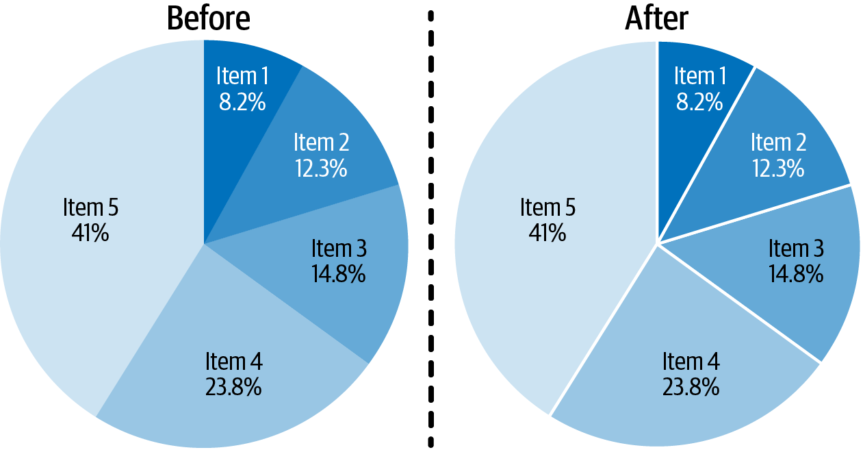
Figure 3-9. Two pie charts demonstrating how a white divider can separate the slices and create a more visually appealing image
Additionally, you can improve the look of other charts, such as treemaps (Figure 3-10) and geographic maps.

Figure 3-10. Two treemaps demonstrating how a white divider can separate the rectangles and create a more visually appealing image
In the geographic map example, you’ll notice that we used black-colored dividers to help make the distinction between each state (Figure 3-11).
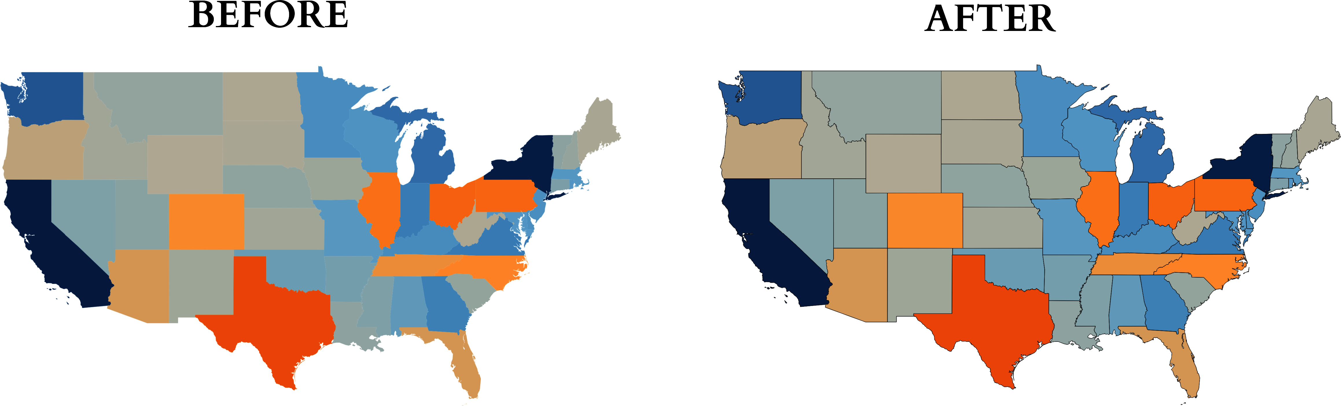
Figure 3-11. Two map views demonstrating how a black divider can separate geographic locations and create a more visually appealing image
Summary
In this chapter we discussed the various types of colors that can be used for data visualization. It’s important to understand when to utilize sequential, diverging, and categorical color schemes when designing visuals. Additionally, the proper selection of background colors can either make or break your data visualization. When in doubt of which background color to choose, go with the simple white that is commonly accepted and easily interpreted.
1 Image credit: Steve Wexler, Jeffrey Shaffer, and Andy Cotgreave, The Big Book of Dashboards: Visualizing Your Data Using Real-World Business Scenarios, Wiley, 2017.
2 Tyler Wu and Lucy Cui, “Choosing the Right Color Scale for Data Visualization,” Psychology in Action, May 19, 2022, https://oreil.ly/AWQH8.
3 Image credit: Courtney Jordan, “Make Your Data Speak for Itself! Less Is More (And People Don’t Read),” Towards Data Science, July 7, 2017, https://oreil.ly/yyZaV.