One of the questions that we commonly ask about data is, how has performance changed over time? This helps us understand how events of decisions affect outcomes. While understanding the relationship between discrete numbers is helpful, it's even more useful to understand the rate of change, or the percentage change over time. The reason why it's important to understand the rate of change is that, while discrete numbers may appear to be increasing, the actual percentage change from year to year may be declining.
In the following example, we will discuss how to graph the amount of remittances over time and we will create a quick table calculation that shows the percent difference:
- On a new worksheet, using the World Development Indicators data source, drag Year from the Dimensions pane to the Columns shelf.
- Drag Remittances (USD) from the Measures pane to the Rows shelf.
- Exclude years before 1980 by using your preferred method. We selected them on the x axis, hovered over pill, and selected Exclude.
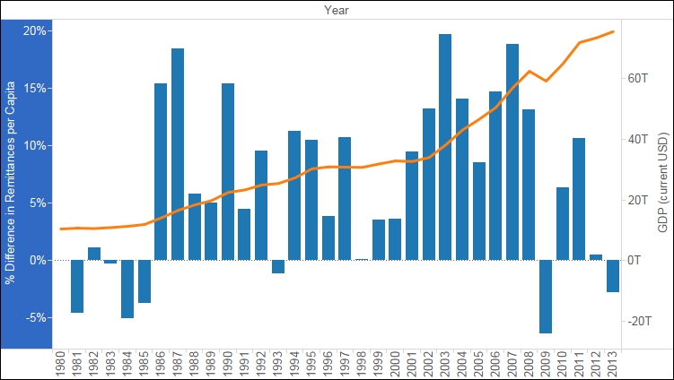
- We now have a basic line graph that shows change over time, but we're missing context. While we can see that Remittances have gone up and down, we know nothing about how they relate to the economy of the region or its population.
- We can edit the measure to produce a rate per capita. We will do this by editing it in the shelf, which is a new feature in Tableau 9.x, and adding the total population to the denominator (editing in the shelf is a good option for simpler aggregations).
- On the Rows shelf, click on the pill for the measure to see the Context menu and select Edit in Shelf.
- Enter a division sign after the closing parenthesis, and from the Measures pane, drag Total Population to the right of the division sign so that it is in the denominator, as shown in the following screenshot:

Note
Since the Remittances (USD) is summed, we need to sum Total Population. In a calculated field, both fields must be aggregated or disaggregated. We could disaggregate, but that would give us the average per country within each region, and when those numbers are added up, they will not represent the data accurately.
- In order to give the new field a name, drag it from the Rows shelf to the Measures pane, which does not seem intuitive. When prompted, name it Remittances per Capita.
- We can create a quick table calculation that shows change over time by right-clicking on the Remittances per Capita field on the Label shelf, selecting Quick Table Calculation from the context menu, and then selecting Percent Difference.
- Change the mark type for Remittances per Capita to a bar.
- You can create more context by adding another reference point, namely the GDP. Drag GDP (current USD) to the secondary y axis, as shown in following screenshot, and then drop it when the secondary y axis has a dashed, horizontal line:

- Right-click on the y axis for GDP (current USD), click on the Mary type, and select Line.
- The following screenshot shows the fluctuation in remittances, as it relates to the global GDP. In 2009, when the global economy was reset, the GDP dropped, and so did the remittances: