7. Actions
IN CHAPTER 6 WE looked at how to include data in an application and visualize it in interesting ways. Up to now we have focused on the output side of the platform, looking at how an application is built up from controls that use visuals to display and layout to position everything. Now we can start to look at the input side of the platform.
Often we want an application to respond in some way when a user moves the mouse, clicks a button, presses a key, or draws with a pen. Windows Presentation Foundation has three common ways of dealing with actions: events, commands, and triggers. We will look at the principles that apply to all three of these mechanisms, and then dig into the details about each one.
Action Principles
For actions, WPF operates on three principles, which are actually continuations of principles we have seen already: element composition, loose coupling, and declarative actions. To allow actions to work with the way that WPF builds the display tree, with many elements that may be further composed of other elements, requires the use of element composition. The fact that controls can completely change their display introduces a problem if the source of an event and the code that handles it are tightly coupled, so the ability for loose coupling is necessary. And finally, because declarative programming should extend to all aspects of the system, WPF must support handling actions in a declarative fashion also.
Element Composition
As we saw in Chapter 3, a button is actually made up of several elements. This composition introduces an interesting problem for handling events. Remember the three principles of the control model: element composition, rich content everywhere, and simple programming model.
To start, from the simple programming model we know that we want the code for listening to a click event to be simple and familiar to developers. We should have to do nothing more than attach a handler to the Click event:

This appears to work great, but let’s look at what is actually happening. It’s not the button itself that’s being clicked, but rather the elements that make up the display of the button. To make all this work seamlessly, WPF introduces the concept of a routed event that lets events traverse the elements. We can see this by changing the preceding example to include a second button as content; clicking on either the inner or the outer button will cause the event to be raised:

The resulting display tree is pictured in Figure 7.1, which also shows that we must concern ourselves with more than just the two buttons. Even in the simple scenario of a single button, event composition is necessary for routing the mouse events to the button.
Figure 7.1. Display tree (left) of a button containing another button (right)

Element composition affects all aspects of action handling, not just events.
Loose Coupling
The events published by Button show that it supports both direct mouse events (MouseUp, MouseDown, etc.) as well as the Click event. Click is an abstraction at a much higher level than mouse events. In fact, Click will be raised if the user presses the space bar (when the button has keyboard focus) or Enter (when the button is the default button in a window). Click is a semantic event, and mouse events are physical events.
Writing code against the Click event has two advantages: (1) We don’t tie ourselves to a specific input gesture (mouse versus keyboard), and (2) we don’t tie ourselves to a button. CheckBox, RadioButton, Button, and Hyperlink all support clicking. Code written against the Click event depends only on a component that can be clicked. This decoupling of code to the action produced allows for more flexibility in the implementation of handlers.
Events themselves, though, suffer from a form of coupling that requires the method implementation to be of a specific signature. For example, the delegate for Button.Click is defined as follows:
One of the goals in WPF is to allow a spectrum of actions (Figure 7.2), ranging from tightly coupled physical events (like MouseUp) all the way to completely semantic notifications (like the ApplicationCommands.Close command that signals that a window should be closed).
Figure 7.2. Examples illustrating the spectrum of coupling actions

By allowing for loose coupling, we are able to write templates that dramatically change a control. For example, by adding a button wired to the Close command, we can write a template for a window that adds chrome for closing the window:

We can then make the window close when any component issues the Close command by adding a command binding to the window:

Commands represent the most loosely coupled action model in WPF. Loose coupling provides a complete abstraction from the action source (in this case, the button) and the action handler (in this case, the window). Leveraging this loose coupling, we could change the window style to use a totally different control and not break anything.
Declarative Actions
With the introduction of commands and loose coupling, we can start to see that WPF is moving toward a model in which software declares its intent (e.g., “I want the window to close when you issue this command”) instead of its implementation (e.g., “Call Window.Close() when you click this button”).
A major foundation of WPF is the notion of declarative programming. In addition to visuals and UI layout, much of application logic can be specified in markup. Declarative logic is extremely useful in that, around a declarative format, we can often provide a better experience in providing tools for the user, and potentially provide more advanced services in the system.
The various ways of handling actions have different levels of support for declarative programming. Events allow us to declare the target function in markup, but the handler must be implemented in code. Commands are specifically designed for declarative use, providing the best abstraction between the action source and consumer. Triggers provide probably the richest declarative support, but their lack of extensibility makes them difficult to use for complex tasks.
All of the mechanisms for dealing with actions support some amount of all of these principles. Let’s start by digging into the one that’s probably the most familiar: events.
Events
In WPF, events behave exactly as they do in any other .NET class library. Each object exposes a set of events to which we can attach a listener using a delegate. As discussed earlier, WPF has an additional set of features around routed events that allow events to propagate through the tree of elements.
There are three types of routed events: direct, bubbling, and tunneling events. Direct events are simple events that fire on a single source; these are nearly identical to standard .NET events, with the exception that they are registered with the WPF routed-event system.[1] Certain features in the platform (triggers, for example) require an event to be registered to be used.
Bubbling and tunneling events are really two sides of the same coin: Tunneling events travel from the root of the element tree to a target element, and bubbling events do the opposite. Typically, these two types of events are paired, and the tunneling version is prefixed with Preview. Most input events (keyboard, mouse, and pen) have bubbling and tunneling versions of each event—for example, MouseRightButtonDown and PreviewMouseRightButtonDown, respectively.
If we write a small sample that creates a hierarchy of elements and listens to some events, we can see how bubbling and tunneling versions relate. Here we will create a window with a group box and some buttons:

In the event handler for each, we can dump the name of the event:

Running this code reveals the order of events:
Window PreviewMouseRightButtonDownGroupBox PreviewMouseRightButtonDownButton PreviewMouseRightButtonDownButton MouseRightButtonDownGroupBox MouseRightButtonDownWindow MouseRightButtonDown
As further illustration, Figure 7.3 shows the two phases of event routing.
Figure 7.3. Event tunneling and bubbling in an element tree

Any default behavior for a control should always be implemented in the bubbling version of a given event. For example, Button creates the Click event in the MouseLeftButtonUp event. This pattern of never using the preview events allows application developers to use preview events to hook in logic or cancel the default behavior of a control. At any point during an event route we can set the Handled property on the event arguments to block any more event handlers from being invoked.
To see this in action, we can listen to the PreviewMouseLeftButtonDown event on Window. By setting Handled to true, we can prevent any elements from being clicked:

The Handled property is one of several interesting properties that all routed events share. All event arguments for routed events derive from the common type RoutedEventArgs:

OriginalSource and Source are very useful in dealing with routed events. Source maps to the sender of the event; that is, it represents the object on which we are listening to the events. OriginalSource represents the originator of the event. In the preceding examples, the originator of the event is actually ButtonChrome, the display element that is used in the button’s template. Because mouse events are physical events, their original source will always be the actual element over which the mouse was hovering when the event was created. The original source for more abstract events, like Click, will be the element that created the event.
To see this directly, we can write some code that listens to the left-button up and down events, as well as click events. Building a structure similar to what we already have, we get output like this:

Notice that the MouseLeftButtonDown events are not visible. The reason is that the button handles the Button events to generate the Click event.
Tunneling and bubbling work great for events that are built into every control, like mouse events; however, any event can tunnel or bubble (as the preceding Click example illustrates). To allow for both tunneling and bubbling, WPF supports attached events. In much the same way that the property system allows for properties to be attached to any element, we can attach an event handler to any element.
If we want to be notified when any button in a window is clicked, we can simply call AddHandler. Every event that uses the event system in WPF has a RoutedEvent field on the defining object, just like the DependencyProperty field that is used for the property system. To attach a handler, we call AddHandler and pass to it the RoutedEvent object and the delegate to be invoked:
WPF extends the basic .NET event model to include the notion of routing to events, which enables element composition. The other action-processing features are all built on top of this base event-routing model.
Commands
Most events in WPF are tied to implementation details about each control—selection changed, element clicked, mouse moved down, and so on. Events are great when we’re wiring up a specific section of code to a notification from a control, but often we want to deal with things more abstractly.
Suppose we want to add the ability to quit a program (something most programs should support!). For starters, we know that we want to have a menu for exiting the program. We will first define the menu in the markup file:
In the code behind, we can implement the event handler:

This works fine, but now let’s also add a text section that includes a hyperlink to exit the application:
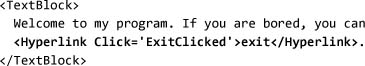
Here’s where it starts to get a little weird. We’re making a lot of assumptions about the implementation of ExitClicked—for example, that the signature is compatible with the Hyperlink.Click event, and that the implementation is, in fact, just exiting the application. In addition, we now have arbitrary methods in the code behind baked into the markup file, so a graphic designer trying to build the UI for this application would have no idea what event handlers to bind to.
Commands exist to help solve this problem. They allow us to provide a single name to signify the action that we want. To start using commands, we must do three things: (1) define a command, (2) define the implementation of that command, and (3) create a trigger for the command.
The basis for the command system in WPF is the relatively simple ICommand interface:

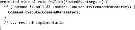
CanExecute is used to determine whether the command is in a state that it can execute. Typically, UI controls use CanExecute to enable or disable themselves; that is, a button will become disabled when the associated command returns False from CanExecute. This shared notion of “enabled” allows multiple controls being wired to the same command to have a consistent enabled state.
Execute is the key thing for a command; when called, it triggers execution of the command. The implementation for Button (or any other command-enabled control), would include a section that looked roughly like this:
To define a new command, we can implement the ICommand interface. Because we want ICommand to close after being invoked, we can call the Shutdown method on the current application:

To bind a menu item or hyperlink to the shutdown of the application, we can wire the Command property to the Exit command:

Because it is common to use a command from more than one location, it is also common to create a static field with a command instance:

This has the added benefit of allowing us to make the implementation of Exit completely private by making ICommand the type of the field. We can now mark Exit as a private class and switch our markup to bind to the static field:

Now our window can publish a set of functionality by exposing commands. There is an interesting problem here, though. Right now Exit is implemented in global terms: We can call it anywhere, and it will shut down the application. Suppose, instead, that we wanted “exit” to be equivalent to closing the current window. In this case, similar to what we do with events, we would want to separate the implementation of exit from its definition.
The simplest way to achieve this separation is to leverage the event system. We can define a new event on the command and use the event-routing system to notify components:

Because this event is defined with the Bubble strategy, it will bubble from the source of the event. To raise the event, we can update our implementation of Execute to find the current element (we will use Keyboard.FocusedElement in this example, but we could use any mechanism to track “current”) and then raise the appropriate event:

This introduces the concept of command binding, the ability to separate the implementation of a command from the identity of that command. We need to go back to our Window1 implementation and add the implementation of the command:

You may be a little confused at this point. Remember, the command’s purpose is to provide an abstract notion of what should happen. What is happening is that a control (like MenuItem) is triggering the command in response to an event (like Click). In this case, the Exit command will raise an Execute event on the element tree so that Window can listen to that event and act (Figure 7.4 on page 378):
- A menu item is clicked.
MenuItemcallsExecuteon the command.- The
Exitimplementation raises theExit.Executeevent on the focused element (theMenuItemobject, in this case) - That event bubbles up the tree.
Windowreceives theExit.Executeevent.Windowruns the implementation of the event (closing the window).
Figure 7.4. Execution flow of a command using an event to route notifications

We could continue down this path, enhancing the base ICommand model to support input bindings (to handle keyboard, mouse, and stylus input), parameters, and other features.[2] However, the framework has a built-in utility class—RoutedCommand—that handles most of this already.
Routed commands completely separate the implementation of the command from the identity of the command. The pattern for defining a new command is similar to RoutedEvent and DependencyProperty. The definition of the command is static; it is really just a unique token to provide an identity for the command:

To make something happen when a command is executed, we need to bind handling code to the command (similar to when we used an event in the previous example). Routed commands bubble (just like events), so we can add a command binding on the root window and see all commands. Command bindings take two pieces of data—the command to listen to, and the code to run when the command is triggered:

Command bindings allow us to specify the logic for determining whether the command should be enabled, and they also map input gestures[3] using the InputBindings property:

The other main feature is the notion of “secure” commands. Certain commands, like cut, copy, and paste, have security ramifications. To ensure that the system performs these operations only when requested by a user (or when digital rights management permits), the RoutedCommand class can track whether a command was initiated by a user.
Using a command cleanly separates the display from the behavior. By having a single name that signifies the semantic action we want, we avoid many of the tight coupling problems that can occur when we’re trying to wire up multiple controls to a single event handler. Generally, application logic should always be implemented in terms of commands, not event handlers. Many of the common cases of needing to wire directly to event handlers are better handled with triggers, which we will cover shortly.
Commands and Data Binding
One of the most compelling and powerful features of using commands is the integration to data binding. Because both Command and CommandParameter are properties on elements, they can have data bound to them. Therefore, we can use the shape of the data that we’re binding to determine the action that should happen. In Chapter 6 we talked about data-driven UIs; now with commands we can also have data-driven logic.
To see how this comes together, we will start with an application that displays all the files in the c: drive. We’ll start by defining a simple dialog with a list box, and a data template to display the name of each file:

In the code behind, we can then populate the ItemsSource property to contain the list of files:

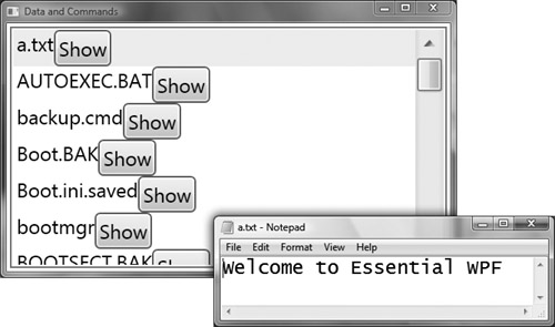
Running this program will produce something like Figure 7.5.
Figure 7.5. Displaying the list of files

Great! Now we want to add a button to display the file. However, we don’t want to allow arbitrary applications to run, so we want to provide some type of filter on the files that we load. We will have two commands, Open and Blocked:

Also we need to provide some type of handler for these commands:

With our two commands defined, we can update the data template for our files to include a button. We can use data binding for the command parameter (the file name). For the command itself, because we want some items to use OpenCommand and others to use BlockedCommand, we will use IValueConverter to go from the file name to ICommand:

The converter can perform any logic based on the data to determine what command to execute. For this example, we will check the file extension:

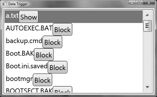
When we run the program (Figure 7.6), we can see that only .txt files will show their contents.[4] This example is a bit trivial; we could easily accomplish a similar behavior by using the CanExecute method and disable the command for “bad” files. However, the important point here is that we could have returned any command. We can use any logic based on the data to determine the behavior of any element displayed.
Figure 7.6. Running the program with data-bound commands
Commands allow for a loose coupling between the UI and the behavior. Commands also enable a much more data-driven approach to defining the behavior of an application. There is a set of behavior that is not really application logic, but rather just manipulation of the display state. For example, when a user moves the mouse over a button, we want that button to be highlighted. This display logic can be implemented with command or event handlers, but once that behavior is moved into code it is very difficult to provide good tools for it, and we have reintroduced a tight coupling of the display to the behavior. Triggers are designed to solve this exact problem.
Triggers
In Chapter 5 we had our first taste of triggers, using them to declaratively start an animation in conjunction with a control template. Triggers are signaled by three things: (1) the state of a display property (Trigger), (2) the state of a data property (DataTrigger), or (3) an event (EventTrigger).
All three trigger types cause a set of actions when they are signaled. There are also two collection trigger types: MultiTrigger and MultiDataTrigger.
Triggers can be used only inside of a template or style.[5] Trigger and EventTrigger can be used inside of a control template or style; DataTrigger can be used only within a data template.
Adding Triggers to Data
In building a data template, there are two options for binding a display element to part of a data model. We’ve already seen how to use a binding to accomplish this, and we can optionally use a value converter to translate the data model value into something that the display elements can consume.
DataTrigger provides a declarative way to specify a set of actions that should be performed for specific data model values. In this way, DataTrigger is effectively a simple value converter in markup. DataTrigger uses a binding to get a value from the data model, and a series of Setter and EventSetter objects that should be used when the value matches a specified value.
To illustrate, let’s take the last example from the section on commands (see Figure 7.6) and switch from using a value converter to using DataTrigger. Instead of using a value converter on the binding for the button’s Command property, we specifically bind it to the default value for the property (in this case, BlockedCommand):

Next we want to set up a data trigger that will be implemented when the file extension is “.txt”:

When the extension matches “.txt”, we want to set the Command property to OpenCommand. To accomplish this, we need to add a setter to the trigger. A setter sets a property to a certain value. In this case we must also specify a target for the property, because we don’t want to set the property on the data model:

Because DataTrigger supports a set of Setter objects, we can easily perform multiple actions in response to the data value. Here we will add a second setter that displays the command to be executed (Figure 7.7). The order in which setters are applied is not guaranteed, although currently they are applied in the order that they’re declared:

Figure 7.7. Using DataTrigger to replace a value converter, and setting multiple properties
When using DataTrigger, we are limited to simple value equality: The data value must exactly match the value we specify. The preceding example differs from the value converter version in one small but important way:
The original value converter always called ToLowerInvariant to handle different cases in the file name. To deal with file name variations, we can create a simple value converter that does the conversion:

It’s then trivial to attach the converter to the trigger:

By using DataTrigger, we could move all the UI-dependent logic (binding of the correct command) into the markup and leave the minimal amount of code (the string conversion) in the code. This approach allows for the majority of the logic to be in the markup, improving our ability to create tools for the display, and providing a cleaner separation between the UI and application logic.
Adding Triggers to Controls
Although data triggers provide the ability to move more logic out of value converters, the design for Trigger and EventTrigger was inspired by the desire to have all view-dependent logic of a control declared in the markup. The goal of ControlTemplate was to allow the display of a control to be completely replaceable, with no change to the control logic:

DataTrigger takes us partway there: We can perform data transformation and binding declaratively. For the display of a control, however, we often need more flexibility. Trigger builds on the functionality of DataTrigger by adding EnterActions and ExitActions. Consequently, we can have animations start and stop in response to the transition of a property from one state to another (as we saw in Chapter 5).
EventTrigger, on the other hand, is signaled from an event (like MouseEnter or Loaded) and lets us control a set of animations.
Two interesting observations can be made about triggers at this point. First, two classes of “actions” can happen in response to a trigger: storyboard control actions, and setters. Setters support property and event wire-up; storyboard control actions allow us to play, stop, pause, and perform other actions on a storyboard. EventTrigger and the enter and exit actions of Trigger all work only with the storyboard control actions.
The second interesting observation is that the list of triggers and actions that triggers can wire up to cannot be extended in version 1.0 of WPF. However, it is possible to stretch triggers pretty far using complex triggers and combining them in interesting ways.
Triggers as the New “if”
Triggers are a simple form of rules engine. They let us express a condition (through the value) and an action (the list of setters or enter and exit actions). If we think about this in C# terms, triggers let us write code like

Because we can have multiple conditions, using either MultiTrigger or MultiDataTrigger, we can write a trigger like this:

This would actually be written with MultiTrigger (assuming the control template example we just saw):

If no trigger applies, then the value specified on the element will be used. Effectively this means that the else clause of the if statement is found on the element. Here we’ll make the background blue if no trigger applies:

Where Are We?
In this chapter we have looked at how to add behavior in response to an event, from either the user or the system, using the various action models: events, commands, or triggers.