3. Controls
CHAPTER 2 DESCRIBED how an application is built, the main UI components, application services, and options for hosting the application. Although the UI of an application is built from windows, user controls, and pages, the top-level parts of the UI are built out of smaller components, controls.
For as long as there have been UI toolkits, there have been controls. Whether they were called widgets, gadgets, VBXs, OCXs, components, CWnds, elements, or another name, there has always been some notion of a component that encapsulates a particular behavior, object model, and display. Windows Presentation Foundation is no exception.
In this chapter we can begin to dig into controls, which are the real meat of WPF. To start, we will walk through the key new concepts for controls in WPF: content model and templates. These two concepts are the core of the entire control model and, once understood, provide a context for understanding the WPF control library. In addition, we explore a few of the deeper building-block controls that we can use to create new controls of our own.
Control Principles
The team assembled to begin working on the control library for WPF had worked on many frameworks before. We had a list of mistakes and limitations that we had encountered in the past and did not want to repeat. In addition, we knew that WPF needed to provide an integrated platform for UI, documents, and media.
One of the key issues with the previous frameworks was a lack of consistent flexibility. To create a customized list in Win32 requires a programming model that is totally different from using a control. In today’s Windows, every place that needs a button has a different implementation: The scrollbar buttons behave differently from the close button on a window, which behaves differently from a standard button in a dialog. The WPF team wanted to build a system in which one button could be used everywhere. For this reason, element composition is a key principle in WPF.
To integrate the worlds of UI, documents, and media, we felt we needed a design principle around rich content everywhere. Early versions of HTML allowed rich text with multiple fonts, sizes, colors, and weight to be included almost anywhere—except inside a button. Even just making a button a different color required creating an image for people to click. Win32 was much the same way; the RichEdit control was the only control that could contain richly formatted text. The principle of rich content says that any place where text is allowed should support rich text, media, and other controls.
A pervasive characteristic of .NET is a simple programming model, so we adopted this principle for the WPF controls. A model that is easy to program is a critical component of a set of controls that developers can actually use.
One of the early issues in the building of WPF was (we thought) a simple problem: What is the object model for Button? A clickable button control is one of the most basic controls; it has been part of the Windows UI since Windows 1.0, and part of the Macintosh UI since Mac OS 1.0. It’s a pretty basic thing! But the WPF team hit a snag.
Figure 3.1 shows a button containing two other buttons, a button containing rich content, and the simple programming model that we want. Initially, we looked at element composition and rich content and decided that if our rich content in fact consisted of elements, then we just needed element composition. The programming model we developed looked something like this:

Figure 3.1. The three principles of controls: element composition, rich content, and simple programming model

This doesn’t look too bad, but we’re missing one thing: What if we want the word World in “Hello World” to be bold?

If we wanted something very simple, on the other hand—for example, a button that said just “OK”—here’s what the code would look like:
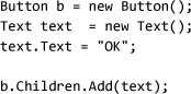
At this point you should be wondering what happened to the tenet of a simple programming model. The kind of code we really wanted to write should look like this:
Here we’re adding content to the button using a single property, but the content can be only a string. Instead, we wanted all the richness to support the more complex content in a button.
Enter the content model.
Content Model
In Win32 programming, controls (e.g., ListBox, Button, and Label) traditionally defined their data model as a simple string. The WPF design team wanted to allow for both rich content everywhere and the separation of data from visualization. Many systems incorporate complex ways of separating models, views, and controllers, requiring developers to understand a data model for each control. WPF instead uses a model already familiar to many developers: the CLR type system.
Let’s start by setting the content of a button:
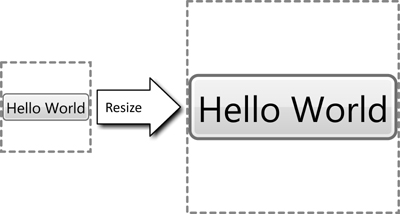
This code will create a simple button with the text “Hello World” inside of it, just as we would expect (Figure 3.2). Note that the property type of Content for Button is System.Object, not a string.
Figure 3.2. “Hello World” in a button
To understand what happened here, let’s investigate the display that was created. We know there’s a button at the root, but somewhere there has to be something that displays the text. Because we believe in element composition, we use other elements to render the button. Figure 3.3 shows the hierarchy of elements, also known as the display tree, created to display the button.
Figure 3.3. A button, with the elements generated to display it

Dissecting the display elements in Figure 3.3 reveals a ButtonChrome element, which displays the nice background of the button, and two other interesting elements: ContentPresenter and TextBlock. We’ve seen TextBlock before; it is the type that displays basic text. But what about this ContentPresenter thing?
ContentPresenter
ContentPresenter is the workhorse of the content model. It will happily take whatever data we stuff into the Content property and create a corresponding visual tree to display it. For example, ContentPresenter can be used to display a number, a date and time, or a button:

Running this code shows that all the various types of data display something (Figure 3.4).
Figure 3.4. Using several ContentPresenter objects to display different bits of data, and the corresponding display tree

Now the big question: How? The object model for ContentPresenter provides some hints:

The first thing that the presenter looks at is the data type of the content. If the content is already of type System.Windows.UIElement (the base type of controls), then no more work is needed and the content can be added directly to the display tree. ContentPresenter then tries to find alternative ways to convert the content to a display, using the following logic:
- If
Contentis of typeUIElement, then add it to the display tree. - If
ContentTemplateis set, use that to create aUIElementinstance and add it to the display tree. - If
ContentTemplateSelectoris set, use that to find a template, use the template to create aUIElementinstance, and add it to the display tree. - If the data type of
Contenthas a data template[1] associated with it, use that to create aUIElementinstance.
- If the data type of
Contenthas aTypeConverterinstance associated with it that can convert to typeUIElement, convertContentand add it to the display tree. - If the data type of
Contenthas aTypeConverterinstance associated with it that can convert to a string, wrapContentinTextBlockand add it to the display tree. - Finally, call
ToStringonCotent, wrap it inTextBlock, and add it to the display tree.
Obviously the presenter tries very hard to create something that can be displayed. The only value that is guaranteed not to display is null; everything else will, at worst, display the value returned by the content’s ToString method. By encapsulating the logic for presenting content into a simple, composable element, we established a high degree of reusability.
So far we’ve seen how a control, such as Button, uses a content presenter to enable a simple programming model, while still allowing rich content and element composition. There are four general patterns for the content model, based on what the control does (e.g., can it consume any data, or just elements?) and whether the model is single or multiple. Each pattern is encapsulated as a property, as Table 3.1 shows.
Table 3.1. Content Property Naming Pattern

We’ve already seen how the Content property is used to display content, so let’s look at the Items, Child, and Children properties.
Items
If ContentPresenter is good for a single item, we should be able to use it as the basis for a list of items. The multiple-content pattern is very similar to the single-content pattern, but instead of the object-valued Content property, we have a list-valued Items property:

The resulting display tree (Figure 3.5) inspires a simple “Wow!”
Figure 3.5. ListBox containing several strings, and its display tree

There’s a lot of stuff here. The visual tree for ListBox contains several presenters. Starting from the bottom (the items in the larger font), we see the familiar Button pattern: a ContentPresenter object containing a TextBlock element. ListBoxItem fits the single-content pattern: a control with the Content property, just like Button.
Working up the stack, we come to ItemsPresenter. Where ContentPresenter is the workhorse for displaying items composed of single pieces of content, ItemsPresenter is the workhorse for displaying items composed of multiple pieces of content. This presenter works in concert with several other classes to dynamically generate the necessary items, each of which uses an instance of ContentPresenter.
The final element that carries the presenter name is ScrollContentPresenter, which enables scrolling within the list box. ScrollContentPresenter is not part of the core content model, but rather an implementation of the ScrollViewer primitive control, which is used to implement scrolling.
Children and Child
Instead of supporting arbitrary objects as content (as Button and ListBox do), some controls support only UIElement children—which brings us to the final two patterns for content: Child and Children.
Before we dive into the element content models, it is interesting to quickly talk about the types of controls. Jeff Bogdan, another WPF architect, is often quoted as saying, “The key to factoring is knowing when to stop.” Element composition is a great feature, but eventually someone needs to do some real work. WPF divides most controls into three categories: content controls, layout controls, and render controls.
Content controls like ListBox and Button don’t do much work; they are composed of other elements that do work. For example, the display tree for Button (see Figure 3.3) shows that ButtonChrome and ContentPresenter do most of the work for Button.
On the other hand, layout controls are responsible for positioning other controls; StackPanel is the primary example that we’ve seen so far in this book. Generally, layout controls aren’t visible themselves; rather we see their effects on other controls. Layout controls comprise the majority of the controls that support the multiple-element content pattern. All of the layout panels other than FlowDocumentViewer[2] implement the multiple-element content model by deriving from Panel:

Render controls are the controls that actually put pixels on the screen. Rectangle and Ellipse are examples of render controls. Some render controls also support containing a control; probably the best example is the Border class. This type takes a single element and adds a border around it:
The content model helps solve the problem of rich content for controls with a simple programming model. Another big problem for writing controls is figuring out how to render everything that’s not content: How did that ButtonChrome appear inside of the button?
Templates
Customizing the appearance of controls can be fairly problematic. With Windows Forms or User32 today, changing the look of a button requires overriding OnPaint or handling WM_PAINT and writing code to draw some pixels. Using HTML requires either creating a control using several images to look like a button, or writing customized HTML. A problem with all of these models is that their programming model for creating and modifying the look of a control is substantially different from the programming model for using a control.
Instead of requiring a new display to be written, another common solution is to enable customization of the display using properties. In HTML, Cascading Style Sheets (CSS) can be used to adjust the look of an element in HTML. A problem with this model is that it requires the author of the control to expose every possible customization point of the display as a property that CSS can style. Today’s CSS provides a rich library of properties for adjusting the borders, fill, and text formatting of components, but it doesn’t allow the person customizing the display to inject arbitrary content.
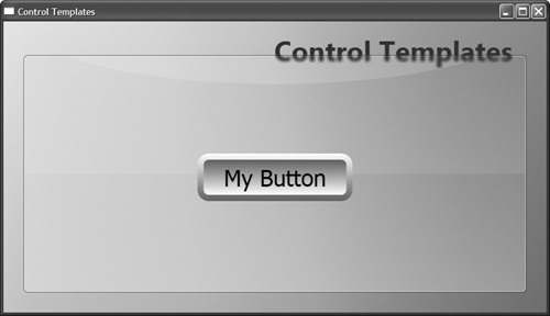
WPF controls offer a great deal of control over the visual display through the use of properties, but it is also possible to completely customize the look of any control. In WPF we wanted the entire spectrum of customization to be declarative and provide a consistent programming model experience. Our solution was the templating system. The display tree for Button (Figure 3.6) shows the ButtonChrome control that is not the button, the content presenter, or the content. This control was created by the template for the button.
Figure 3.6. Button’s display tree (notice ButtonChrome)

The preceding discussion of the content model introduced the three types of controls: render, layout, and content controls. Besides implementing the content pattern, all content controls also support templates. A template allows the creation of a particular set of elements (such as ButtonChrome) to implement their display. Content controls derive from Control and inherit a common property named Template.
To start, we can look at the code for a simple button, which will display the same button that we’ve already seen several times:
If we wanted to change the look of the button without affecting the content, we could define a new template. Templates are a factory for creating a new display tree. Templates come in two varieties: ControlTemplate (which creates a display tree for a control) and DataTemplate (which creates a display tree for a piece of data, as will be described in Chapter 6).
To define a new control template, we must provide a target type and a display tree. We must also always set the target type for the template, which provides the template with information about the type to which it will be applied:

The display tree in this example is a single red rectangle, and the code generates the element and display tree shown in Figure 3.7.
Figure 3.7. A button templated with a rectangle, and its display tree

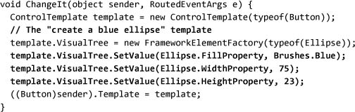
Notably, the ButtonChrome, ContentPresenter, and the TextBlock objects that we saw earlier are all missing. Yet the button is still functional. To demonstrate, let’s use code to change the template when the button is clicked. To start, we will define an event handler that creates a new template and assigns it to the button:
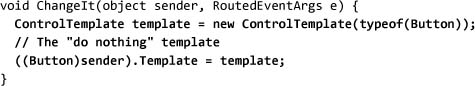
Now that we have our template, we need to fill in the display tree. The VisualTree property on ControlTemplate defines the display tree, but notice that the type of the property is FrameworkElementFactory. Templates can be applied to more than one control, but controls can appear in the display tree only once. To address this problem, FrameworkElementFactory constructs a new instance of the display tree for every control that uses the template. Here we will set the button to be displayed as an ellipse:

Next we want to set some of the ellipse’s properties. We must use the SetValue syntax for setting properties because we are effectively creating a list of properties to set when the ellipse is created:
At this point you may notice that, by not tying markup to the object model, we are going against one of the tenets of the XAML language design. In this case the code equivalent of defining a template is very different from the markup. We decided here to go against the tenet of making the markup more usable. We effectively rerun the markup every time the template is used.
The final step in our example is to wire the event handler to the button:
The result after the click is shown in Figure 3.8.
Figure 3.8. The button after the new template is applied, and its display tree

With a little more artistic work, and including a content presenter, we can make a button that looks like a button:

Notably, a content presenter is introduced into the template and, by default, looks for a property called Content on the templated control, whose value it then displays. For the surrounding visuals, we have replaced the default ButtonChrome element from the button with a generic Border control. Running this code will produce something much more buttonlike (Figure 3.9).
Figure 3.9. A button with a more artistic template, and its display tree

With the richer template in place, what happens if we change the background property of the button?
Template Binding
Think back to the three principles of controls: element composition, rich content everywhere, and simple programming model. Templates provide great support for element composition and rich content; however, requiring a a template to be defined just to change the color of a button may not always be the simplest programming model.
Ideally, we want to be able to add parameters to templates, or further customize them, by using properties from the template control. With this capability, a template author could bind to properties on the template control, letting the control user adjust properties on the control and customize the template:

This markup binds the BorderThickness, BorderBrush, and Background properties from Border to those same properties on the templated Button. Once this is done, we can create a button like that shown in Figure 3.10 simply by setting properties on Button:

Figure 3.10. A button with a template that uses template binding

In this case the property names all match, but we could just as easily go back and use template binding on our original Rectangle-based style:
Both of these markup examples accomplish the same thing: allowing a developer to customize the look of the control by using only properties. Incremental customization is another important part of the philosophy of WPF. We start by customizing an application using basic elements and their properties (setting Button’s Background property). Then we move to composing elements within each other (putting an image inside of a button). Then we can create a custom template for a control, or go so far as to write a custom control if needed.
Thinking about Templates
WPF uses templates all over the place. Our goal is to make every piece of user interface customizable, allowing the creation of completely new models for interaction. Perhaps unexpectedly, Window is a control that supports the content model. We can make a template for Window:

Here we use multiple visuals and several controls as the template for Window, so instead of the standard white background, the default window can look much more interesting (Figure 3.11) without our having to create a new base class or change the content of Window.
Figure 3.11. Making a window template can create a common style for an application’s entire user interface.
Using this technique, we can create a unique appearance for every aspect of an application!
Control Library
With two critical concepts—content model and templates—under our belts, we can start the tour of the control library that WPF provides. WPF offers the majority of the standard controls that we would expect in any UI package (with a few exceptions, such as DataGrid). Because the content model and templates make visualization so customizable, the important description of a control is the data model and interaction model that it offers.
Buttons
For our tour of controls, it seems appropriate to start with Button. Fundamentally, buttons are “clickable” things.[3] Beyond the Click event from ButtonBase, Button doesn’t add anything significant except the default look and feel of a standard button.
CheckBox and RadioButton both represent toggle buttons that support IsChecked (data model) and IsThreeState (interaction model) properties. IsThreeState is interesting, in that it controls only the user interaction model. When IsThreeState is True, the user can click the check box to toggle from Checked to Unchecked to Indeterminate. When IsThreeState is False, no matter what the user does the Indeterminate state will not appear; however, the state can be programmatically set to be indeterminate.
Figure 3.12 shows the Button class hierarchy. Both ButtonBase and ToggleButton are building-block types that aren’t typically directly used. Button, CheckBox, and RadioButton customize these building-block classes by providing user interaction policy (like RadioButton enforcing a model that only one button is checked) and visuals (making radio buttons look like radio buttons).
Figure 3.12. The Button class hierarchy

The example that follows shows the default look for all three button controls:

As Figure 3.13 reveals, these controls look just like the built-in Windows controls,[4] and running this code shows that all the interaction logic is identical. For base-level controls, the goal of WPF was to be a pixel-perfect copy of the built-in controls.[5]
Figure 3.13. Several button controls

Lists
One of the most common tasks in an application is to display a list of data. The list controls in WPF provide two main pieces of functionality: displaying lists of data, and allowing the selection of one or more list items. During the development of WPF, the number of list controls to ship was a question of considerable debate. Because of WPF’s rich template support, ListBox, ComboBox, DomainUpDown, and even something like a radio button list are differentiated only by different templates on top of a base control. In the end, the WPF team decided to ship with the expected controls but generally favor templates instead of new controls (this is why the RadioButtonList control that was in the initial beta release was cut). WPF has four standard list controls: ListBox, ComboBox, ListView, and TreeView.
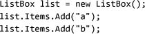
All list controls can be filled with items from one of two sources: the ItemsSource property or the Items property. The Items property adds data to the list’s internal list of data items:
The ItemsSource property provides the list control with a collection of data items, which the list displays:
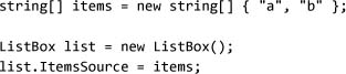
The difference between the two is subtle but important: using ItemsSource lets us maintain the data external to the list control.
ListBox and ComboBox
Figure 3.14 (on page 132) shows the two basic list types: ListBox and ComboBox. ComboBox is really a different view on ListBox, but from an object model view the two controls are nearly identical. Initially we implemented the drop-down part of ComboBox with ListBox.
Figure 3.14. The two basic list types: ListBox and ComboBox

It is preferable to use the ItemsSource property. Although we can use any type that implements IEnumerable as the source for a list, .NET 3.0 provides a new collection designed specifically for use in these scenarios: ObservableCollection<T>. ObservableCollection<T> implements several interfaces for tracking changes that make it work much better as a source for data in list scenarios (this is covered in detail in Chapter 6).
As you might have guessed from looking back at the two core control concepts—content model and templates—we can put any type of data into the list controls and change the entire look of the control using a template. In addition, ListBox and ComboBox offer a set of properties to adjust the look of the control without having to write an entirely new template.
The most commonly used property for customizing a list is probably ItemsPanel. ItemsPanel can provide a template for creating the layout panel that will be used to display the items in the list. We will cover layout in detail in Chapter 4.
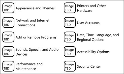
To understand how to use this property, think about the Windows XP control panel (Figure 3.15). It’s a ListBox object (well, selection isn’t necessarily required, so we could also use the base ItemsControl), with a grid layout.
Figure 3.15. Windows XP control panel in category mode: an example of a list box with custom layout

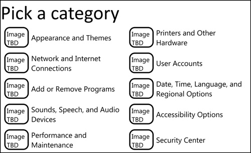
ItemsPanel takes ItemsPanelTemplate (not the normal ControlTemplate), which requires that the template build a panel. We can use UniformGrid for the layout of a list, which will produce something very close to the control panel shown in Figure 3.16:
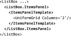
Figure 3.16. ListBox with a grid item layout
Customizing the list using the ItemsPanel property can take us only so far; eventually we may want to build a custom template for the list. Building a template for a list control is just like building a template for any other control, with one notable exception: The list control needs a place to put the displayed items. When we use ItemsPanel to customize the list, the list control knows where to put the items. When we use the Template property, the list control has to search the display tree to find the panel where the displayed items should be put. We identify the correct panel by setting the IsItemsHost property on one or more panels:[6]

By adding more to the template, we can get even closer to the control panel (Figure 3.17).
Figure 3.17. Using ControlTemplate to customize more than just the layout of a list box
Building templates is a great way to customize a list display. As you build more and more complex list templates, you may want to package these templates for reuse in other applications. Templates work great, until we need to define some properties to associate with them. For example, if we wanted to create a template for a list that shows multiple columns of data, we would need somewhere to store the column information. We can easily define a new control that derives from ListBox and adds the additional data.
Another way to accomplish this is to use the ListView control, which has built-in features to enable this type of separation.
ListView
ListView derives from ListBox and adds one feature: the ability to separate view properties (such as column information for a grid display) from control properties (such as the selected item). For example, we can build a display like the one shown in Figure 3.18. To create this display, first we need to define some custom objects with the needed data:
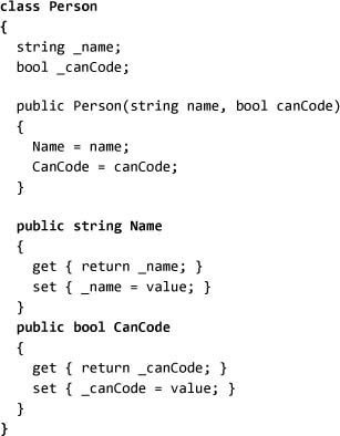
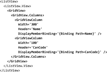
Figure 3.18. ListView displaying items with the built-in GridView

There are no properties to set on ListView to control the number of columns, what the headers are, or anything else about the view. Instead, we must set the ListView.View property to GridView, and set properties on that object. GridView requires the use of binding (which will be covered in more detail in Chapter 6) to get data from the items in the list:
This separation between control properties and display properties makes ListView probably the most powerful list control.
Creating a new view for the ListView control (something to replace GridView), involves deriving from the deceptively simple ViewBase type. The essence of a custom view is actually simple: We override PrepareItem and adjust any properties needed:

This is just the beginning, though. The real power of building a custom view comes from coupling it with the styling system. Overriding the ItemContainerDefaultStyleKey property allows a custom view to define all aspects of the resulting display, as GridView indicates.
All the list controls that we’ve seen so far present a flat list of data; often, however, the data that we want to display is hierarchical.
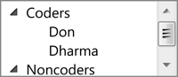
TreeView
TreeView adds the ability to display a hierarchy like that shown in Figure 3.19. One way to think about a tree is that it is just a list box in which each item is another list box; this is basically how TreeView works. TreeView is probably the best example of element composition; each TreeViewItem object is a control. To create the display in Figure 3.19, we can define the hierarchy of items:

Figure 3.19. TreeView displaying a hierarchy of lists
Like the other list controls, TreeView supports getting items either by directly adding them to the Items property (which we did in the previous example) or by using the ItemsSource property. There are some very interesting aspects about exposing a hierarchy of data to TreeView, but we will leave that discussion to Chapter 6.
Creating New Lists Using Templates
At the beginning of the lists discussion, the ill-fated RadioButtonList was mentioned as one of the specialty lists that was cut from WPF, in favor of using templates. A radio button list is a list box that uses radio buttons to show the items and selection (Figure 3.20 on page 138).
Figure 3.20. Making a list box into a radio button list
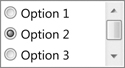
Implementing the style for a radio button list doesn’t require a lot of markup, although it does use some complex data-binding syntax. The binding syntax will be covered in detail later; for now, all we need to know is that we’re binding the IsChecked property from RadioButton to the IsSelected property from ListBoxItem:

This example just begins to show the power of the templating system coupled with the right selection of base controls.
Menus and Toolbars
Up to this point I’ve carefully omitted two very interesting list controls: MenuItem and ToolBar. It may seem strange at first, but a menu is logically nothing more than a TreeView control with a very special template. Digging into the object model reveals that TreeViewItem and MenuItem derive from the same base type: HeaderedItemsControl. The reasons for using these controls are very different from the reasons we use standard list boxes, but it’s important to remember that all the features of the content model and templates are available for menus and toolbars.
Menus and toolbars go hand in hand. Both provide effectively the same functionality: the ability to execute one or more commands. The primary differences between the two are visual space and interaction model. Toolbars consume a lot more visual space to represent the same commands, but they allow easy user access. Generally, toolbars are shortcuts to commands already present in the menu structure. Menus provide a rich hierarchy and occupy minimal screen real estate, but users have more difficulty finding commands within them. Menus and toolbars are typically paired with commands, which we will discuss in Chapter 7.
Menus
Menus consist of a series of MenuItem controls hosted within either Menu or ContextMenu. Menus are always displayed and, in any Windows application, are typically located at the top of the window. Context menus are displayed only when the user requests them, typically by right-clicking, pressing Shift+F10, or, on newer keyboards, pressing the context menu key.
In User32, menus were relegated to the top of the window; in WPF that restriction has been removed. We can put menus anywhere we want. Figure 3.21 shows an alternative menu display—something that we can accomplish with a set of templates. Keep in mind, though, the amount of training that users will need to use a new interaction model. For most applications, keeping menus where users expect them is a good thing.
Figure 3.21. An alternative presentation for a menu

To create a menu, we add a hierarchy of MenuItem controls to a Menu object, which we typically host within DockPanel to make it easy to display the menu at the top of the window:

Users interact with a menu by clicking an item contained within it, causing an associated functionality to be executed. We detect the clicking of a menu item by handling its Click event:

Running this application yields the display in Figure 3.22, which shows exactly what we would expect: a drop-down menu containing options that the user can select with the mouse. Choosing File and then Exit will cause the application to terminate.
Figure 3.22. A window with a simple menu

The notion that MenuItem is derived from HeaderedItemsControl should make some sense. The caption “Edit” is the header, and the three child menu items are the items. ToolBar, however, is a slightly bigger leap.
Toolbars
Like menus, toolbars have a host type (ToolBarTray) and an item type (ToolBar). The big difference between menus and toolbars is that menus support arbitrary hierarchies (through submenus), while toolbars provide only one level of nesting.
Each toolbar has a set of items and a header. In most examples of toolbars today, the header is blank and the items are buttons. The content model, however, allows us to add anything as an item in the toolbar:
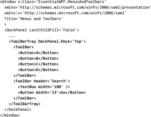
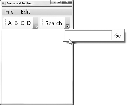
Running this application yields the window shown in Figure 3.23 (on the next page). The toolbars can be moved within the toolbar tray (but not pulled out to be a floating toolbar). In addition, if we resize the window smaller, the items move to an overflow menu (Figure 3.24). We can control how items are moved to the overflow menu by using the ToolBar.OverflowMode property.
Figure 3.23. Two toolbars—one with buttons, the other with a text box and a button

Figure 3.24. Toolbar with items in the overflow menu
Toolbars are frequently used as general control containers—for example, text boxes (such as a search box) or combo boxes (such as the address bar in most Web browsers). WPF has a number of general-purpose control containers as well.
Containers
For grouping and hiding parts of a user interface, WPF has three main built-in controls: TabControl, Expander, and GroupBox. TabControl provides the traditional tab-style UI, Expander offers the Windows XP–style expansion functionality that we see in the file explorer, and GroupBox provides a simple visual containment for separating parts of the UI. All of these are shown here and illustrated in Figure 3.25:

Figure 3.25. Various containers nested

There are some interesting things to note about the derivation hierarchy of these controls. First, TabItem, Expander, and GroupBox all derive from HeaderedContentControl. Effectively, HeaderedContentControl is a generic base type for any control that has a data model with a single header and single content model. At first this might seem wrong, since Expander, TabItem, and GroupBox most often contain multiple items. These controls are able to hold multiple items because a single layout container, like StackPanel or Grid, can be the root of that content.
The second interesting observation about the derivation hierarchy is that TabControl derives from Selector (and therefore ItemsControl). This means that TabControl is really a type of list. All the data model, templating, and selection events associated with lists are available to TabControl.
The last group of container controls consists of the layout controls, such as WrapPanel. These will be covered in detail in Chapter 4.
Ranges
Range controls allow the selection of a value between upper and lower bounds (a valid range of values, which is where the name comes from). WPF provides three range controls: Slider, ScrollBar, and ProgressBar. ScrollBar is considered a building-block control because using a scrollbar for anything other than scrolling is generally thought to be bad UI design.
All the range controls work in the same way: We specify a range by assigning minimum and maximum values using the Minimum and Maximum properties, and we specify or determine the current value within the range through the Value property. Or we can specify SmallChange and LargeChange to control how quickly the value changes when the user clicks on different parts of the control.
To see how a slider works, we can handle the ValueChanged event on the slider and update the text of a text block:
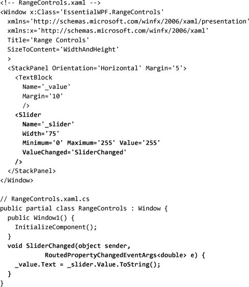
Running this code produces the window shown in Figure 3.26, which allows users to adjust the value displayed in the text area by moving the sliders. Another really common use for a slider is to implement the zoom control for a piece of user interface. By listening to the change notification (or better yet, using data binding, which we’ll learn about in Chapter 6), we can easily add a user-configurable zoom option to any application.

Editors
WPF offers several editors: PasswordBox, TextBox, RichTextBox, and InkCanvas.
PasswordBox is the outlier here, so let’s talk about it first. PasswordBox provides the all-too-familiar function of a text box, except that it replaces what the user types with a series of dots or asterisks. The implementation of this control is interesting, in that it doesn’t actually support the text object model. PasswordBox provides an island of functionality, with the password stored opaquely inside of it. Security is improved because walking the text tree will not accidentally disclose the password.
TextBox and RichTextBox are very similar to each other, except that TextBox turns off the ability to host rich text and offers many “simple” text-editing services (maximum length, character casing, etc.). Because TextBox supports only plain text, the API is much simpler, so we don’t need to understand the text object model for simple scenarios. The globalization, text editing, IME (input method editor) support, spell checking (yes, built-in spell checking for all text editors!), and other features of the platform are otherwise identical between the two controls.
RichTextBox is the granddaddy text editor. Out of the box, it supports about 84 commands that are accessible via keyboard shortcut keys (did you know that Ctrl+[ and Ctrl+] modify the font size of a selection?), and dozens more are available programmatically. RichTextBox is really a FlowDocument editor, which we will talk about in Chapter 5.
InkCanvas is to ink what RichTextBox is to text. The default behavior will support writing, erasing ink, selecting ink, and gestures[7] with no additional code.
Both ink editing and text editing have a corresponding object model for inspecting and modifying the native data types.
Text Data
There are two ways to deal with text data in WPF: streaming and collections. For most scenarios of building text dynamically and inspecting text, the collection model is simpler. Dealing with rich text editing (and selection) requires understanding some of the core parts of the streaming text model.
The collection model for text manipulation works just like any of the control properties we’ve seen so far: We construct text elements and add them to collections on other text elements:
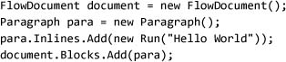
Note that FlowDocument has a Blocks property, while Paragraph has an Inlines property. The universe of text elements is divided into two main concepts: block elements and inline elements. Block elements occupy a rectangle of space; they start on a new line and are contiguous. Effectively, block elements are just like WPF controls, except they can break across page boundaries. Examples of block elements are Paragraph or Table. Inline elements can span lines. Examples of inline elements are Span, Run, and Bold.
The text object model enforces a strict set of rules about text containment, in order to allow for a very predictable model for text, that enables the building of editors and object models that behave regularly. The rules for text are fairly simple:
Runis the only element that contains strings of text (the real content).Paragraphis the only block element that contains inline elements (and it can contain only inline elements).Tablecontains one or moreTableRowGroupobjects, each of which contains one or moreTableRowobjects, which each contains one or moreTableCellobjects.TableCellis the only table element that contains block elements.Listcontains one or moreListItemobjects, which in turn can contain block elements.Blockcontainers (Section, etc.) contain only other block elements (this is really a repeat of rule 2).- Inline containers (
Span,Bold, etc.) contain only other inline elements (this is really a repeat of rule 1).
Figure 3.27 illustrates this set of rules.
Figure 3.27. An abstract text model

The collection-based text object model directly reflects these rules. Some objects have helper methods (e.g., a Paragraph object of type string has a Text property) that create the appropriate elements under the covers.
The final two interesting text elements are BlockUIContainer and InlineUIContainer. These two types take an arbitrary UIElement-derived type and host it in the text flow in much the same way that TextFlow and RichTextBox host text flow content in the UIElement tree.
In Chapter 5 we will dive into the details of what all these text elements do.
So far we have looked at the collection-based text object model. The streaming model is used for manipulating text as a stream of elements. It is important to understand that text is sequential. That may sound obvious, but in the design of WPF it was a pretty difficult issue. Typically, UI libraries (User32, Windows Forms, Abstract Window Toolkit [AWT], Swing, etc.) represent their objects as a tree of elements. Each element has a parent and some children. It’s a pretty simple model to grasp.
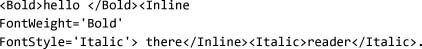
Typical text or document libraries (Internet Explorer, for example) represent their objects as a stream of text. Because the building block of the library is a stream of characters, everything can be equated back to that stream of text. For a moment, consider the object model required to represent the following completely valid HTML: <b>hello <i>there</b> reader</i>.
The WPF development team was faced with the dilemma of how to represent objects. We knew that rich typography and documents were a core part of the platform, but dealing with everything as a stream of text means some cost in performance and complexity. In addition, the platform was intended to have a rich control framework, but concepts like partial selection cannot be easily represented in a simple tree model. Our solution was to do both. When rich text is added into the tree, a streaming model is used (hence the text object model), and a simple hierarchy is used for controls (which we’ve already seen).
TextPointer objects are the main building blocks in the streaming text object model. A text pointer can be thought of as a finger pointing right between two characters. A text pointer can represent the caret position, or the start and end of a selection, or the beginning of a word.
TextRange is used to represent the entire selection (or any range of text); it consists of simply two text pointers.[8] Formatting and visual effects can be applied to arbitrary ranges. This is a critical point, so let me repeat it: formatting can be applied to arbitrary ranges. We can re-create that nasty overlapping bold and italic HTML example by using ranges. However, if we attempt to save the generated markup, we’ll find that the overlapping tags have been removed and something more reasonable has been created:
The Xml property on TextRange returns a very verbose XAML string. The Xml property captures all information (including defaults) about the text range, and it is therefore useful for Clipboard operations or other cases of extracting part of a document.
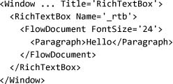
Using RichTextBox
To use RichTextBox, we must start with the Document property. RichTextBox allows the editing of a single FlowDocument object. Using the text object model, we can initialize the document for RichTextBox with some formatted text:
At runtime the editor is fully functional (Figure 3.28) and supports all the common editing commands.
Figure 3.28. RichTextBox with some text selected

The next big concepts to understand for RichTextBox are the notions of a caret and selection. The caret is the blinking line that represents the current insertion point, and it is generally the start or end of the selection. Three TextPointer objects are used to track caret positions and selections: CaretPosition, Selection.Start, and Selection.End.
Dealing with TextPointer objects isn’t always the most intuitive thing, primarily because they expose the details of the underlying text storage. When dealing with programmatic manipulation of a selection, it is necessary to understand some of these details also. In the text store, start and end elements are represented by tokens in the stream, which means that GetPositionAtOffset will be able to see those start and end tokens:
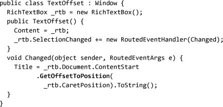
When we run this code (Figure 3.29), we can type the characters and use Ctrl+B to make the center two characters boldface. (See Figure 3.30, which shows the offsets for each element.) Putting the caret before the letter a shows that the offset is actually 2. This is because Section and Run elements start before the a. As we move to the right, the title changes: 2, 3, 4, 7, 8, 11, 12.[9] The jumps (from 4 to 7, and from 8 to 11) occur right after b and d. Again, this is because there are end and corresponding start elements.
Figure 3.29. TextOffset example, showing how the start and end tokens of an element occupy space in the text object model

Figure 3.30. Simplified markup for text, with the corresponding offsets of each item
Offsets are important when we’re dealing with RichTextBox because they must be taken into account when the caret or selection is being moved. My first attempt at writing a simple find method for RichTextBox missed this crucial point (Figure 3.31):

Figure 3.31. Incorrectly implemented find functionality

In this example the selection will always be off because of the start element tokens for Section and Run. The fix is to move a text pointer through the document searching for the match:

The final big concept with RichTextBox is undo. All operations performed on RichTextBox can be undone (and redone) on command. Undo units are hierarchical also, which means that we can create groups of operations that will be treated as a single change. We can use either BeginChange/EndChange or DeclareChangeBlock; however, using DeclareChangeBlock is generally preferred because it returns an IDisposable object that can be used in a using statement.
Consider the code to add two paragraphs to a rich text box. If we run this code, the user will have to run undo twice to remove both paragraphs:
Instead, we can surround the programmatic changes to the document with a change block, making them both into a single undo unit:

When making programmatic changes to the content of RichTextBox, we are expected to wrap them in a call to DeclareChangeBlock so that the end user can easily undo all the operations.
Using TextBox
TextBox is a simplification of most of the features of RichTextBox. Because TextBox supports only a single format, it is easy to expose selection as two integers that represent the offset into the text (no need to deal with the start/end token issues), and text is exposed as a simple string value. On top of this simplification, TextBox offers some additional functionality, such as the ability to easily limit the length of text or modify the casing of the text.
Ink Data
The base data type of ink is Stroke, defined in the System.Windows.Ink namespace. In some ways ink data is much simpler than rich text; it is effectively a series of packets received from the digitizer.
Ink was introduced in the Tablet PC version of Windows XP (if you ignore the fabled Pen Windows releases), with a binary persistence format (called ink serialized format, or ISF), COM programming model, and .NET programming model. The WPF development team wanted to have ink completely integrated into the platform. The binary format of ink is largely unchanged, but the programming model has undergone some changes to integrate it with the rest of the platform.
We can safely ignore the binary format, other than to know that the Stroke object model is implemented on top of this very efficient binary stream. This detail explains some of the oddity in the object model that Stroke exposes. In most cases we can get all needed data using the simple StylusPoint API, but when we really need access to all the data we can dive down into the StylusPointDescription API to gain access to everything.[10] To see how to work with ink, we can use InkCanvas and handle the InkCollected event (Figure 3.32):
Figure 3.32. Working with the ink object model


Three sets of data are associated with a stroke: digitizer packets (called stylus packets), drawing attributes, and application-defined data. The application-defined data allows ink-optimized applications to annotate the ink data with special information. Drawing attributes control how the ink will be rendered. We can control drawing attributes on each stroke using the DrawingAttributes property, or on InkCanvas with the DefaultDrawingAttributes property.
As we have started to see, stylus packets are somewhat complex beasts. A key reason for this complexity is that the ink stream can be extended by hardware manufacturers. Multiple buttons are very common extensions that digitizer manufacturers use. Other examples include pen tilt data, or even the rotation of the pen. The long-term goal of ink is to be able to capture all the information about someone’s writing or drawings in order to accurately create a digital experience that matches or exceeds pen on paper.
To query this additional data, we need to tell the ink object model which data we want transferred from the packets into the object model. We can request the data either globally (by specifying the DefaultStylusPointDescription value on InkCanvas) or per stroke (by using the Reformat method on StylusPointCollection).
Many newer tablets support XTilt and YTilt, which open up possibilities for very interesting visualizations. For this example, however, I’ll stick with BarrelButton, which most tablets have. X, Y, and NormalPressure must be the first three properties in the query. When the barrel button is pressed, we will display an alternate circle (Figure 3.33):

Figure 3.33. Adjusting the display using additional properties from the ink object model

Using InkCanvas
We’ve already seen the basics of using the InkCanvas control, but there is a lot more there. With RichTextBox we have all the functionality needed to implement the WordPad application included in Windows; with InkCanvas we can implement Journal. All the basics are there: ink selection, erasing, highlighting, tip specification, and so on. Probably the most interesting feature is the new gesture support.
The gesture recognizer analyzes the ink data and determines whether the user tried to input one of 41 gestures (everything from Check to DoubleCurlicue is included). Enabling gestures requires two critical steps: First, we must set EditingMode on InkCanvas to InkAndGesture. Second, we must call SetEnabledGestures on InkCanvas to tell the recognizer which gestures to look for:

When we run the application, we can try several different gestures (Figure 3.34) to see how close our writing is to what the recognizer expects. Using gestures is a great way to ink-enable an application.
Figure 3.34. InkCanvas recognizing gestures

Document Viewers
For displaying a document, WPF offers several options. The simplest is to use the basic FlowDocumentScrollViewer (read-only scrolling view) and RichTextBox (editable scrolling view) controls to display the document. To present a reading experience to the end customer, however, the platform offers several options.
Effectively there are two building blocks: FlowDocumentScrollViewer and FlowDocumentPageViewer. FlowDocumentScrollViewer provides a scrollable viewer with standard end user chrome (zoom controls, etc.). FlowDocumentPageViewer provides a paginated view, one page at a time, with standard end user chrome.
The optimal control, though, is FlowDocumentReader, which offers a single control that users can select if they want a single-page view, multiple-page view, or scrolling view. The reader is the recommended control for viewing a document. Figure 3.35 shows all three.
Figure 3.35. All the views of a document. Notice that FlowDocumentReader has a view control to let us see the document in either page mode or scrolling mode, and it provides search functionality.

Document viewers are one type of host for content—in this case, documents. The other common host is a frame.
Frame
Using Frame in an application allows an island of navigation to be placed anywhere. There are two interesting models for hosting navigable content: isolated hosting and integrated hosting.
With isolated hosting the content is not trusted and is run in a completely isolated (sandboxed) environment. This is how WPF content is hosted when running in the system Web browser as a XAML Browser Application. For navigation to another application or HTML content, this isolated hosting model is supported with a Frame object.
Integrated hosting, in which we want the content to behave as part of our application, is not supported at all in the system. When Frame navigates to content within the application, we get an odd hybrid of isolated and integrated behavior. Frame isolates its content from its style (and its parent’s style), but not from the application’s style. Events don’t bubble from the content in Frame; however, the objects are accessible from the Content property (meaning that they aren’t isolated in a security sense).
For all these reasons, Frame is most useful when we’re working with external content, but it can be carefully used for application content.
Building Blocks
WPF’s control model is built around the idea of element composition. We build up larger controls (such as ListBox) by using smaller controls (StackPanel, ScrollViewer, etc.). Although in most scenarios we don’t need to dig into these building-block controls, it’s good to know what services can be leveraged to build custom controls. The System.Windows.Controls. Primitives namespace contains many of the smaller components from which larger controls are built.
ToolTip
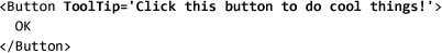
Generally we access tool tip functionality using the ToolTip property on elements:
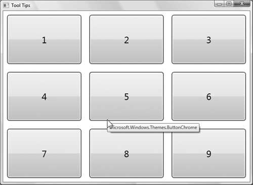
There are two common ways to adjust the behavior of tool tips. First, we can use ToolTipService to adjust more tool tip properties. An advantage of using the service is that only a single ToolTip control is created (this is useful when we have lots of tips on lots of controls). For more advanced scenarios we can create an instance of ToolTip directly on a control:

If we run this example (Figure 3.36), we never see a window appear as one of the visuals to mouse over. Because the default template for Window includes a border around the content presenter that hosts the content, the system will never detect a mouse hit on the window itself.[11] The same is true for Button: The button chrome and text block will appear, but not the button. This is another reason we often talk about controls not having a visual display of their own.
Figure 3.36. ToolTip in action
Of course, we can provide a custom template for the ToolTip control and give it any appearance and shape that we want (Figure 3.37 on page 164).
Figure 3.37. Templated ToolTip, with transparency

Thumb
Thumb provides a region that can be moved. More specifically, it provides the ability to get events when a user drags this region, the thumb, around. Using this control, we can easily create resize handles or splitter controls.
In this example we will simply have the thumb move when it is dragged. The DragStarted event lets us capture the start location, and then in DragDelta we can move the thumb by the appropriate amount:

Border
Border is an amazing simple yet useful control for creating visual effects. Effectively, Border is a rectangle that can contain a child. This is handy because most render elements (Rectangle, Ellipse, etc.) don’t support children. The typical workaround is to put the render elements into a layout container (like Grid or Canvas). Because enclosing an element in a rectangle is so common, Border is there to do just that.
Border actually does one better than a rectangle, though, allowing for variable thickness and corner radius around the border, which enables some unusual borders (Figure 3.38):
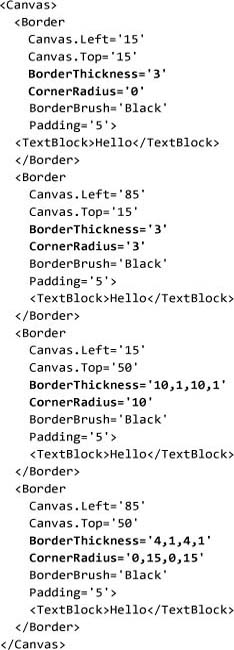
Figure 3.38. Various borders created by adjusting the radius and thickness of the edges

Popup
One of the difficulties that faced UI developers in the past was creating floating windows. A big problem was how to manage the top-level window to host their content. In WPF, we ran into this problem while trying to implement tool tips, menus, and the combo box drop-down. In the spirit of creating reusable controls, the WPF team created a class called Popup that encapsulates all of the necessary behavior:

Running this example will display a window like the one in Figure 3.39.
Figure 3.39. A window with a pop-up over it

ScrollViewer
Wherever scrolling is needed, the building-block control ScrollViewer can do it. You may have noticed that scrollbars are actually listed in the Primitives namespace; that’s because scrollbars should be used only for scrolling, and the only component that needs to implement scrolling is ScrollViewer.
ScrollViewer must be used with caution because combining it with layout controls can have very unexpected results. One of the biggest confusions is that, in order for ScrollViewer to calculate the size of the scrollbar, it needs to know how big its children are. But ScrollViewer creates layout child elements that have an infinite size (in the directions that are scrollable), thereby wreaking havoc on various controls—for example, FlowDocumentScrollViewer and, oddly enough, other ScrollViewer controls.
ScrollViewer can be found in the visual style of most lists and editors—any control that by default will display a larger area than may be visible. It is probably most common to want to place a scroll viewer on the window, as the root element. You might think such placement would nicely enable a dialog that, once sized to small, would automatically scroll. This does work, provided that the size is set to Auto for any child content controls. Consider, for example, the dialog in Figure 3.40.
Figure 3.40. A dialog with the scrollbar appearing in the list box

This dialog has a simple grid with three rows (Grid will be covered in depth in Chapter 4). When we make the dialog too small, we want scrollbars to appear (not just for the list box). The simple solution is to surround the grid with a scroll viewer:

Because the list box itself uses a scroll viewer, we end up with unexpected results. Notice in Figure 3.41 (on page 170) that the scrollbar appears in the window, not in the list box as expected. There is no workaround for this problem. ScrollViewer is very powerful, but we must understand its impact on layout to fully utilize it.
Figure 3.41. A dialog with a scroll viewer at the root. Notice that the list box no longer has a scrollbar.

ScrollViewer allows us to “fit” any content into a space by adding scrolling when the content is too large. The other control that helps with this problem is Viewbox.
Viewbox
Viewbox takes a single child and stretches it to fit by applying rendering transforms (stretching the content), as shown in Figure 3.42 (on page 170). Using the Stretch and StretchDirection properties, we can control how the content is sized.
Figure 3.42. Viewbox scales the content inside of it to fit a space
Where Are We?
Three main principles underlie all the controls of WPF: element composition, rich content everywhere, and a simple programming model. This chapter has delved into the core concepts of WPF’s controls that enable these three principles: the content model and templates. With these two concepts in mind, we have walked through a brief overview of the controls that ship with WPF.