4. Layout
CHAPTER 3 GAVE an overview of the control library in Windows Presentation Foundation that can be used to build UIs for applications. A real application needs more than one control, which means we have to figure out how to position all of those controls.
Although controls have been part of every major UI framework for the past 15 years, the notion of layout being a core part of a UI framework has lagged behind. For Win32 developers, layout is built on a simple 2D coordinate system that starts in the upper left corner of each window. On the other hand, HTML authors have been able to use a combination of flowing text, tables, and absolute positioning to create displays.
In WPF, layout is a pervasive concept that is deeply integrated into all WPF controls. WPF’s layout engine is divided into two parts: a contract for specifying how components participate in layout, and a set of implementations of that contract.[1] There is no built-in layout; rather, all layouts are built using the platform extensibility mechanisms.
Layout Principles
The developers of WPF knew that layout was going to be an intrinsic part of the system. The goal was to define a single layout system that could span from paginated documents to traditional application UIs. Eventually we realized that a single, monolithic system for this wide span of scenarios was impossible[2] (or at least very difficult) and moved to a model of layout composition. We ended up solving the bulk of the layout problems in the same way that we tackled the control library: by allowing layouts to be nested inside of other layouts.
Given this approach, it seemed that the most critical thing to determine was how a child control would communicate with the parent layout. This “contract” between the parent and child would, we hoped, enable any control to be hosted in any layout.
Layout Contract
The layout contract defines the way that a layout and child controls communicate. The goal in defining the layout contract was to keep it as simple as possible while still enabling various layout implementations to interoperate. Although some layouts have complex semantics that need deep knowledge of their child controls, the WPF team felt that the parts common to all layout implementations were fairly basic. A layout needs to be able to determine the size of the child controls, and then needs to tell its parent layout how big it wants to be. This concept boils down to two simple ideas: size to content, and two-phase layout.
Size to Content
Size to content, as the name implies, is the idea that each control is expected to determine its size on the basis of its content. This concept applies to all levels of the UI: Windows can resize to fit the controls inside them, buttons can resize to fit the text inside them, and text boxes can resize to fit the characters inside them. To enable size to content, each element must be asked what size it would prefer to be.
Two-Phase Layout
We determine a control’s preferred size in two distinct phases: measure and arrange. This two-phase layout model enables both the parent and the child elements a chance to attempt to reach an agreement about the eventual size of an element.
The measure phase consists of walking the entire display and asking each element to determine its desired size, given a constraint. Elements must return a valid desired size, even if the constraint provided is infinite in size (e.g., when placed in a scrolling container). After all the elements have been asked to measure themselves, we move on to the arrange phase, during which each element is told by its parent to size itself to a specific size and location.
This two-phase model enables the parent and child to coordinate and negotiate about how much space is needed. Three interesting sizes are negotiated: available size, desired size, and actual size. Available size is the initial constraint used in the measure phase, typically the maximum amount of space that a parent is willing to give the child element. Desired size is the size that the child control wants to be. Actual size is the final size that the parent allocates to the child. In a perfect world, the three conform to this equation:
desiredSize ≤ actualSize ≤ availableSize
Layout is introduced in the WPF class hierarchy in the UIElement type. The layout-related object model on UIElement is fairly simple. Measure, MeasureCore, Arrange, and ArrangeCore implement the two phases of layout; and Visibility is the one layout-affecting property that controls whether an element will be displayed or included in layout:[3]

Visibility provides three ways of controlling how a child participates in layout. By default, elements are tagged as Visible; they will be displayed and will occupy space in layout. Controls may also be designated as Hidden (not displayed, but occupying space in layout) or Collapsed (neither displayed nor occupying space in layout). Figure 4.1 shows three buttons representing each type of visibility. The dotted border was added to illustrate where each control is occupying space in the layout.
Figure 4.1. Visible, collapsed, and hidden buttons. Notice that the collapsed button is completely missing.
The base layout contract is designed to be as flexible as possible, avoiding putting undue restrictions on implementations. Using this basic contract, the WPF team found it possible to implement rich typographic layout and a variety of 2D layout[4] implementations. This basic model is a great building block; in fact, many common patterns appeared in the 2D layout domain.
Consistent Layout
To make it simple to create layouts that implement these patterns consistently, WPF has a layer on top of the layout contract. The properties to control these common layout patterns are defined on System.Windows.FrameworkElement.
Probably the most common pattern that we found was the notion of layout constraints. When building a UI, it is very common to want to set minimums and maximums on control sizing, or even to set a specific size (effectively preventing size to content).
Layout Constraints
To control layout constraints, FrameworkElement introduces six properties: MinWidth, MinHeight, MaxWidth, MaxHeight, Width, and Height:

Usually Width and Height are not set directly, because if they were, size to content would be disabled. MinWidth, MaxWidth, MinHeight, and MaxHeight, on the other hand, allow us to put constraints on layout without disabling size to content. For example, instead of setting a button to be a specific width, we can set MinWidth to be the desired width. If someone then entered a very long string, the button would grow to display the entire string, but it would normally be the desired size.
The properties ActualHeight and ActualWidth are the only output properties; they report the final size of the element. Note that they are not valid until a layout pass (measure and arrange) is complete.
The data type of Width and Height was one of the most hotly contested layout questions in WPF. The big debate centered on how to deal with percentages and automatic sizing.[5] Specifying automatic width or height signals the layout system to size the element to its content. Given that size to content is the default, the WPF developers chose to make the absence of a specified width or height mean automatic sizing.[6] Percentage sizing wasn’t so easy to solve. Some controls (e.g., Grid or Table) natively have a notion of percentage size. Others (e.g., Canvas) can’t really support percentage sizing (we’ll see why later).
Slot Model
If percentage sizing is fairly control-specific, what we really need is a way for a control to determine its behavior when used in a parent. Interestingly enough, the solution helped the WPF development team deal with another common pattern: margins.
Although the various size properties can control the dimensions of the area that a parent allocates for an element, the design often introduces spacing around elements. If you’ve used CSS, you may be familiar with the box model, which allows for a margin, padding, and a border for each element. In WPF we moved to a simpler model, embracing the composition nature of the layout system.
Conceptually, the model for framework layout is that a parent allocates a slot of space for a child element. That child is free to occupy any portion of the space in the slot. This flexibility enables a compromise between the child and parent when conflicts arise. The parent sets boundaries, and the child can choose to use those boundaries as it sees fit. In the programming model, this functionality is exposed through three properties: Margin, HorizontalAlignment, and VerticalAlignment.
Margin lets a child put a buffer of space around itself inside of the slot, but outside of the content of the control. HorizontalAlignment and VerticalAlignment determine how the child occupies the remaining space in the slot (alignment is determined with respect to the area inside of the margins):

Figure 4.2 shows two different StackPanel objects. The top panel has a vertical orientation (buttons are stacked on top of each other from top to bottom), the bottom panel has a horizontal orientation (buttons are stacked from left to right). The dotted borders represent the slots that the panel allocated for each element. Using HorizontalAlignment and VerticalAlignment, we can control how much of the slot each button occupies:

Figure 4.2. Aligning buttons in a panel

Using Margin, we can offset the slot for each edge. Margin supports different insets for top, left, right, and bottom. As Figure 4.3 shows, it is also possible to have negative margins (again, dotted lines represent the slots allocated by the parent):
Figure 4.3. Setting margins around buttons in a panel

Figure 4.3 shows something else that is subtle but important: Clipping is not the default. What does that mean? Notice that the last button in the figure extends outside the boundaries of the parent panel. In Win32 the default was to clip, or trim, the parts of controls that extended beyond their parent containers; only rarely could a child control paint outside the bounds of its parent. And if a child did paint outside of its parent, even more rarely would it produce the correct results.
As mentioned in Chapter 1, WPF uses a composition engine that employs the painter’s algorithm (painting from back to front). Clipping is an expensive operation: Whenever we paint a pixel, we have to check its boundaries with the clip region to determine if we should actually light the pixel. Clipping has the benefit of being able to repaint a single control. In a world without clipping, we never know if a control has decided to draw outside the lines and affect us.
WPF takes the performance hit of always compositing, but that enables much richer visualizations. In addition, with today’s video cards and CPUs, compositing is not so taxing. In a fully composited world, however, clipping is expensive.
In WPF, most controls use layout to ensure that they will fit within the bounds of their parent, so we can avoid clipping. You will notice that some controls (like Button) do turn on clipping, to ensure that its content will not leak outside of the control.
This discussion brings us to another interesting layout pattern: transforms. Negative margins allow us to move an element outside of the bounds that the parent intended for it. Transforms allow us to make these kinds of changes in a much more flexible fashion.
Transforms
When all else fails, there’s always the sledgehammer. To adjust the final position of a control, two properties are available for making an arbitrary transformation: RenderTransform and LayoutTransform:

Both properties are of type System.Windows.Media.Transform, which we will cover in depth in Chapter 5. For now, think about Transform from the view of the most common subclasses: ScaleTransform, RotateTransform, TranslateTransform, and TransformGroup. ScaleTransform allows us to perform an x/y zoom, RotateTransform allows us to rotate around a point, and TranslateTransform allows us to reposition something by a specified offset. Finally, TransformGroup allows us to group and combine these three primitives in any way.
The only difference between RenderTransform and LayoutTransform is the point at which the transform is applied. RenderTransform is applied immediately before rendering[7] (therefore affecting only rendering), and LayoutTransform is applied before layout (therefore affecting the layout of the component). To understand how these two properties interact, let’s start with a simple stack panel containing three buttons (Figure 4.4):


Figure 4.4. Three buttons with no transforms applied
If we want to rotate each of these buttons by a particular angle, we can use layout, render, or both types of transforms. Adding RotateTransform to the RenderTransform property for each button illustrates the effect (Figure 4.5):

Figure 4.5. Applying RenderTransform to each button

Notice in Figure 4.5 that the buttons overlap and extend outside the bounds of the panel. Because the transform is being applied after layout, the layout system has no knowledge that the display of each button is being manipulated; effectively the controls lie to the parent layout, saying that they occupy their untransformed locations. Switching to LayoutTransform yields a much different effect (Figure 4.6):

Figure 4.6. Applying LayoutTransform to each button

As Figure 4.6 shows, now the buttons don’t overlap and the panel has resized to fit the contained buttons completely. Because LayoutTransform is applied before layout, the system has complete knowledge of the effect. Generally it’s a good idea to use the render transform for effects (such as an entrance animation). Because render transforms do not affect layout, they can run on the video card and avoid layout calculation while the effect is being created.
Z-Index
Controls that overlap (as we can see, just barely, in Figure 4.5) carry with them the notion of a specific ordering, or z-index. By default, all controls have a z-index of 0. The order of the children in the Panel.Children collection defines how they overlap. Using the Panel.ZIndex property, we can define “layers” for children. Within a layer, the order of children determines their rendering order; however, we can define multiple layers to control how children overlap.
To demonstrate, we can create several buttons, each with a negative margin to ensure that they all overlap:
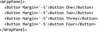
Running this code produces something like the top picture shown in Figure 4.7. The first control is at the bottom of the visual stack. By setting the z-index for several controls, we can alter the display:
Figure 4.7. Effects of the z-index on the layout of controls
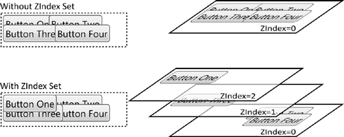
Notice that we can have several controls at any given z-index (in this case Button Two and Button Four are both at z-index 0). The result is a display like the bottom picture shown in Figure 4.7.
Implementing Consistent Layout
We’ve seen many of the layout properties that FrameworkElement introduces. Using these properties, we can greatly affect layout without needing to author a new panel. But if we do need to implement a new panel, it may seem a daunting task, given all of the behaviors we’ve seen up to now. Luckily, all of this behavior is hidden behind the scenes:

FrameworkElement overrides ArrangeCore and MeasureCore, replacing them with new versions: ArrangeOverride and MeasureOverride. To implement a custom layout that supports all the layout patterns that we’ve seen, we only have to override ArrangeOverride and MeasureOverride.[8] We can ignore all the rest of the layout properties.
No Built-In Layout
At this point you might be thinking that every layout property is baked into the base types of the system. With all the sizing properties, alignment, margins, and transforms, it’s easy to see why you might get that impression. Remember, though, most of these properties were introduced on FrameworkElement, not on the base type UIElement. The goal was to clearly separate the contract of layout—measure and arrange—from the implementation of layout in the rest of the framework.
Early in the development of WPF, a topic of raging debate was how to implement layout. We felt it was critical to have a rich layout system.
We wanted a composition-based layout system that was extensible. For these reasons we didn’t want to bake in knowledge about every layout into every element.
The best example of a rich, composition-based, extensible layout system is probably Windows Forms. Windows Forms 1.0 had a simple layout model using the Layout event. Each control in the system had two properties—Dock and Anchor—that were used for the default layout implementation. To implement a custom layout, however, we would have to figure out a new mechanism (maybe using IExtenderProvider?) to get the new layout properties to appear on elements. Windows Forms 2.0 has a more extensible layout system with better support for adding properties to other controls; however, the old Dock and Anchor properties are still around.
To avoid having so many properties on controls, all the properties specific to layout implementation are implemented as attached properties (like Canvas.Left, which we’ll discuss next). Attached properties allow one object to offer a property for another object. Support for attached properties is implemented by DependencyObject, from which almost all types in WPF derive.
With this basic understanding of the principles of layout, we can walk through the library of layouts provided by WPF.
Layout Library
On top of the basic layout control and the more complete framework layout model, WPF provides a suite of layout panels. These panels implement a set of basic layouts that tries to represent the most common needs for layout. We will cover some of the more common layout panels: Canvas, StackPanel, DockPanel, and UniformGrid. The most complex layout, Grid, will be covered next, in a section all to itself.
Canvas
Canvas is the simplest layout included in WPF. Canvas offers four properties: Top, Left, Right, and Bottom. Canvas lets us position its child elements at any offset from one corner of the panel. Notice that I said “position”; Canvas does not introduce any sizing constraints on child elements. Canvas simply takes the desired size from an element and positions it relative to one of the four corners. Only two properties can be used: one horizontal coordinate and one vertical coordinate. If more are specified, the extra properties will be ignored.
To demonstrate, we can add several buttons to a Canvas with various offsets. Figure 4.8 shows that the offset is applied to the appropriate corner of the child control; for example, if we use Canvas.Right and Canvas.Top, the offset is applied from the top right corner of the child:

Figure 4.8. Canvas using different origins for buttons

Canvas doesn’t place any interesting constraints on the width or height of the layout slot, so the HorizontalAlignment and VerticalAlignment properties are irrelevant. Margins are still honored, but they are behaviorally identical to setting the Canvas layout properties. For this reason, Canvas is sometimes referred to as the “slotless” layout panel.
There is one other interesting aspect to the Canvas control. Recall from the discussion of RenderTransform that, by default, we do not clip children. Because child controls can be oriented to any of the four corners of the canvas, it is impossible for Canvas to determine a desired width and height. This means that we can easily create the situation of a canvas with no width and height but all its child controls visible. Although this may seem an odd behavior, it is a pretty useful way to inject controls that float above the layout of the rest of the UI.
To see this, we can put Canvas inside of StackPanel and remove the Width and Height properties (setting the horizontal and vertical alignments will ensure that our canvas is sized to content in both directions):

When we run this code (Figure 4.9), the canvas is nowhere to be seen, and the buttons seem to have scattered.
Figure 4.9. The magical missing canvas

What has happened is that the canvas is actually zero height and is being stretched by StackPanel to the full width of the display. To see a bit more how this feature may be used practically, we can add some buttons to the stack panel:
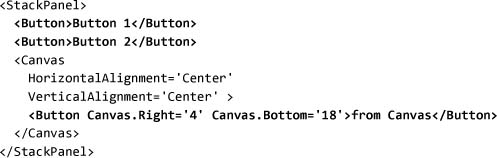
As Figure 4.10 shows, the from Canvas button is floating above the other controls. The dotted lines represent the slots for the stack panel; the canvas has a zero height slot. Using this trick, we can inject controls into a panel and not affect the layout of the other components.
Figure 4.10. Using Canvas to “float” controls out of the layout

StackPanel
Up to this point in the book, StackPanel is the only layout panel that we’ve seen, so you’ve probably figured out how it works by now, but it’s still useful to talk about it. As the name implies, StackPanel stacks things up in a row. Through the Orientation property we can control whether the stack is horizontal or vertical.
The slot for each child in StackPanel is given the entire width or height of the control (depending on its orientation), and StackPanel determines its preferred size according to the maximum size of its children. To show this, we can nest a couple of StackPanel controls and see how they behave. The outermost instance has a border around it (so that it’s visible), and each inner panel has a background:

Figure 4.11 shows that the horizontal panel puts each button end to end. The buttons are stretched so that they’re all the same height. The vertical panel stacks each button on top of the other, and all of the buttons have the same width (because we aren’t setting their alignment). The reason that the buttons are so wide is that the outer panel forces the two inner panels to be the same width. As far as the complexities (and power) of layout composition go, this just touches the surface.
Figure 4.11. Three stack panels nested together

StackPanel must be used carefully because it measures children using an infinite width or height based on the orientation. This lack of a control on size can break other child layout panels, specifically causing problems for TextBlock with wrapping (Figure 4.12) and ScrollViewer:
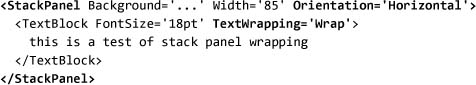
Figure 4.12. Horizontal StackPanel clipping text instead of wrapping
There is no way to avoid this problem with StackPanel. The most common workaround is to use DockPanel instead.
DockPanel
DockPanel is fairly similar to StackPanel, except that it allows mixing of stacking from different edges within the same layout container. In addition, the LastChildFill property allows the last child to consume all the remaining space (like DockStyle.Fill in Windows Forms).
DockPanel is probably one of the most common UI layouts today. Windows Forms natively supported docking, and Java supports docking with its BorderLayout class. Docking allows elements to be stacked at any edge of a container, with the final element filling the remaining space. Windows Explorer (Figure 4.13) is a familiar application that benefits from dock layout.
Figure 4.13. Windows Explorer, a classic example of dock layout

We can break down Windows Explorer into its major structural elements: menu, toolbar, folder list, and details pane (Figure 4.14 on page 192).
Figure 4.14. Windows Explorer, with the four major parts highlighted

Implementing this layout in WPF is relatively simple: The DockPanel offers a single property, Dock, which allows us to specify the edge to which a control is docked. The declaration order of the elements determines the order in which they’re placed, and by default the last child fills the remaining space.
We can use a dock panel to recreate the basic structure of Windows Explorer (Figure 4.15), using buttons to show the major elements:
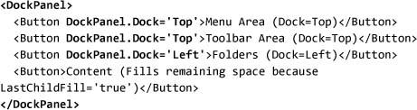
Figure 4.15. Using DockPanel to build the classic dock layout

We can change the relationships of the parts (e.g., suppose we want the folders section to extend the entire length of the left edge except for the menu area) by reordering the elements:

As each slot is allocated by DockPanel, the remaining space is used to calculate the next slot, so no two slots will overlap. Moving the folders section immediately after the menu area will mean that its slot will be allocated immediately after the menu area (Figure 4.16).
Figure 4.16. Adjusting the order of children affects the layout

Note that DockPanel has no default support for user modification of the layout (e.g., using a splitter between the folders section and the content to allow the user to resize the folder list). The only splitter that is part of WPF is GridSplitter, which relies on the Grid control, which we will learn about shortly.
WrapPanel
If DockPanel is a stack panel with multiple edges, then WrapPanel is a stack panel with wrapping support. Remember that StackPanel positions elements with infinite width or height (depending on the orientation), allowing any number of elements, stacked one after the other. WrapPanel, on the other hand, uses the available space and fits elements to it; and when it runs out of room, it wraps to the next line. The classic example of a wrap panel is toolbar layouts.
By default, WrapPanel simply sizes all the children to fit their content (see Figure 4.17), although we can fix the width and height of the children by using the ItemWidth and ItemHeight properties:

Figure 4.17. WrapPanel in action

UniformGrid
The final basic layout, which is really nothing like StackPanel, is UniformGrid. UniformGrid hides in the System.Windows.Controls.Primitives namespace and provides a very basic grid layout: Each cell is the same size (hence uniform), and the locations of the items are determined simply by their order in the children collection.
To use UniformGrid, we specify the number of columns and rows we want. If we specify only columns, then rows will be calculated as the number of children divided by the number of columns, and vice versa:

Running this code yields the grid illustrated in Figure 4.18.
Figure 4.18. UniformGrid with a 2×3 layout

The width of each cell is calculated as the maximum of all child widths, and the height of each cell is the maximum of all child heights. If we provide more children than can be displayed (e.g., adding a seventh button to the preceding example), it will be positioned as if the grid had infinite height (the Seven button will be directly below the Five button):

Running this code produces something like Figure 4.19. The dark black border represents the bounds of the grid. It is important, but odd, that UniformGrid has positioned the last child outside the bounds of the control.
Figure 4.19. UniformGrid with too many children

UniformGrid completes our tour of the basic layouts in WPF. Next we will dive into the most complex, but powerful, layout control: Grid.
Grid
UniformGrid offers a basic grid, but for most scenarios it doesn’t go far enough. People want grids with items that span cells, nonuniform row and column spacing, and so on. Grid is by far the most power, flexible, and complex of the UI layouts. On the surface, Grid is simple: Elements are positioned within grid cells defined by a series of rows and columns. Easy, right?
The simplest use of Grid is to set the RowDefinitions and ColumnDefinitions properties, add some children, and use the Grid.Row and Grid.Column attached properties to specify which child goes in which slot (Figure 4.20):

Figure 4.20. A simple use of the Grid layout

Grid Concepts
Figure 4.20 shows the basic grid layout, but it doesn’t adequately show three big concepts associated with Grid: (1) separation of layout from structure, (2) flexible sizing models, and (3) shared size information.
Separation of Layout from Structure
In all of the layout panels that we’ve covered up to now, we must change the structure of the element tree to change the layout. First we have to inject the layout panel into the display tree to plug in the layout algorithm, and then often we must change the order of controls to affect the layout (which we saw in the DockPanel example).
Injecting the layout panel as the parent of an element is a requirement with Grid too, but Grid’s flexibility generally requires many fewer nested layout panels to accomplish a complex result.
Because the row and column information for Grid is based on property values, we can greatly modify the layout without changing the order of the elements. Therefore, not only is it much easier to change the layout, but the order of the elements does not depend on the layout order, so it is also much easier to control overlapping and predict what overlapping will do.
Both of these benefits serve a greater good: the ability to define layout without affecting the programming model. Using DockPanel and StackPanel, a graphic designer who wanted to change the layout of a window or page would be required to change the element hierarchy, and in so doing, could break the code. With Grid, it is much easier to adjust the layout without affecting code.
Finally, because the structure is separate, we can create the control structure (e.g., I want three buttons and a text box) and then apply layout (e.g., I want them positioned next to each other).
Flexible Sizing Models
Most layout panels partition the space using either the content size of the child, or the absolute value of the size of the child. In addition to these common modes, Grid introduces the notion of percentage sizing, in which the width or height of a column or row can be specified with a star (*) unit. Stars allow columns and rows to occupy a percentage of the space in the grid, after any size to content or absolute sizing of columns and rows is done.
The simplest way to understand stars is to see them in action. By adjusting the Width and Height properties on the definitions, we can adjust how the slots resize:

As Figure 4.21 shows, the star-size row and column use all the remaining space after the fixed-size row and column.
Figure 4.21. Star sizing allows for percentages

To see the real flexibility offered by star sizing, let’s change all of the slots to use stars. We’ll make both the first row and the first column “2*”. Since there are no fixed-size rows or columns, the two rows and columns will effectively be the same as items sized at 66.66 … percent and 33.33 … percent:

This example demonstrates something interesting about stars: They represent weighted percentages (Figure 4.22). By adding up all the star units, we can determine what percentage each represents. In the preceding example, using “20*” and “10*” would achieve exactly the same results for the layout.
Figure 4.22. Percentages in star sizing are weighted

In addition to star sizing, column and row sizes can be expressed in absolute units (pixels) or left as Auto. The Auto option allows for controls to size to content and affect the size of the column or row.
Automatically sized rows and columns introduce an interesting problem: Once we have a column or row in which the size is calculated (from the size of the children), we may often want another column or row to be the same size.
Shared Size Information
Shared sizing is the last major capability that is built into Grid. A grid shares sizing information among all the controls that are positioned in the same column. In the simplest form, this allows a set of controls to all have the same size, but be wide enough for the largest control. To demonstrate, we will adjust our example to have a longer string for one of the buttons, and put all the buttons in a single column (Figure 4.23):

Figure 4.23. Grid sharing size information within a single column

If we set the column width to Auto, the column will size to content. Because each button has the default behavior, which is to stretch to fill the total space of the column (HorizontalAlignment.Stretch), the buttons will fill the total space of the column—which is determined by the maximum width of the buttons. This type of shared sizing is very powerful for laying out dialogs, where we might have multiple buttons or labels that we want to line up.
The other type of shared sizing is to size groups explicitly. Shared sizing allows two different columns or rows (even in different grids) to share the same size. The two-row, two-column layout that we saw earlier illustrates what shared sizing does for us (see Figure 4.24).
Figure 4.24. Grid with and without shared sizing

To enable shared sizing we need to do two things: first, set the SharedSizeGroup property on more than one column or row; and second, set the IsSharedSizeScope property on a control. In this first example we will share the sizing information between two columns in the same grid:

Finally, to see the real power of shared sizing, we can have sizing information span multiple Grid controls. IsSharedSizeScope can be set locally on Grid or used as an attached property on any element. To share the sizing information, we will set the parent StackPanel in the example to be the scope, and then have two Grid controls that use the same name for a size group:

When we run this code (Figure 4.25), we can see that the second grid (with buttons a through d and a thick black border) has the same width for the first column as the first grid has. This powerful concept is used in controls like ListView to enable the column header to have the same size as the rows in the data section.
Figure 4.25. Two Grid controls sharing sizing information

Grid Layout
Grid layout consists of two distinct phases: (1) defining the rows and columns, and (2) assigning the children to slots.
To define rows and columns we use the RowDefinition and ColumnDefinition objects, which support a subset of the standard framework layout properties:

These properties generally behave exactly like their counterparts on FrameworkElement, with the exception that GridLength allows the Width and Height properties to contain the additional sizing types that Grid supports. By using the MinWidth, MaxWidth, MinHeight, and MaxHeight properties, we can constrain the size of a column without having to set properties on every child element in the grid.
Before defining columns and rows, it’s often best to start with a sketch of what we want to create. Suppose we want to clone a bit of the UI from MSN Messenger (Figure 4.26 on page 204). To start, we can create a mockup of what we want to create. We’ll begin by drawing some boxes and using a dashed line to indicate where we want row and column boundaries (Figure 4.27 on page 205).
Figure 4.26. The grid layout of MSN Messenger

Figure 4.27. A mockup of the columns and rows that we want

We need two rows and two columns. The first row should take up the majority of the space, but we know that the text entry area might grow to give people more space to type. To support this flexibility, we’ll make the second row size to fit but put constraints on it to ensure that it doesn’t consume all available space:

The first column should take up the bulk of the space, leaving just enough room for the second column to show the Send button:

Now that we’ve defined the rows and columns, we need to position the controls. The first thing to notice is that the conversation area spans multiple columns. Grid defines four attached properties for child elements: Row, RowSpan, Column, and ColumnSpan. Using RowSpan and ColumnSpan, we can specify that any element be able to span multiple rows or columns:
This combination of setting layout constraints on the definitions and the elements within the layout allows us to get the desired behavior. Not only is the initial state correct, but as we resize the display, the rows and columns size intelligently (Figure 4.28).
Figure 4.28. Grid resizing the final layout

GridSplitter
If you’ve used MSN Messenger before, you may have noticed that the text entry area is resizable; a little splitter there allows the user to make more space for typing (Figure 4.29). When we set up the rows and columns in our example, we specified a maximum and a minimum for the size of the second row, but we didn’t provide the end user with any way of changing the size.
Figure 4.29. Resizing MSN Messenger using the splitter above the text area

GridSplitter is a normal control (supporting templates, etc.) that allows the user to edit the layout of a row or column at runtime. In our example we can easily add it to the layout with no changes other than adding the control and setting some properties:

ResizeDirection controls whether the splitter is editing rows or columns, and ResizeBehavior determines which rows or columns are being edited. There are two types of resize behavior: implicit and explicit. Using GridResizeBehavior.BasedOnAlignment will provide the implicit behavior; the splitter will use the vertical and horizontal alignment to “guess” which columns or rows should be edited. The other three values (CurrentAndNext, PreviousAndCurrent, and PreviousAndNext) allow us to specify explicitly which columns or rows should be edited.
Because we didn’t create a new row for the splitter, it is occupying one of the rows that we want to edit (the first row), so we need to edit the “current” column. The splitter is at the bottom of the slot, and we want to edit the next row (the second row), so we need to use the CurrentAndNext value for ResizeBehavior (Figure 4.30). Of course, since the splitter’s alignments are all set correctly, this example would work equally well with the BasedOnAlignment behavior.
Figure 4.30. GridSplitter in action

Grid is a very powerful, but complex, layout. With effective use of Grid, we can build a complex UI without having to nest a lot of controls or create a custom layout logic. Sometimes, however, we really do need to write a custom layout.
Writing a Custom Layout
To write a custom layout, generally we build a new class deriving from Panel. Before we dive into implementing a layout, though, let’s digress for a moment and talk about why we would build a custom layout.
The two most common reasons are “algorithmic layout” (the desire to position controls along a curve, for example) and performance. Be careful with the performance argument; remember the first rule of performance: test. People often jump to the conclusion that something is slow (or fast) without adequately testing it. Performance was one of the reasons that UniformGrid was created; for a uniform distribution of elements, the overhead of Grid was not needed.
Algorithmic layout is more interesting. Suppose we want to lay out a set of controls along a circular path (something like what’s shown in Figure 4.31 on page 208). Obviously none of the existing layouts would handle this case.
Figure 4.31. An example of algorithmic layout: a circle

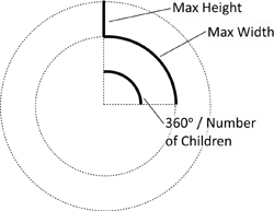
With the two-phase model for layout in WPF, we should start by calculating the desired layout size. There are some complexities in calculating the desired size of this layout, mostly because of the math involved. We will simplify the algorithm a bit and use the model shown in Figure 4.32.
Figure 4.32. A model for calculating the desired size of the circle layout
To calculate the desired size, we will check the size of each child and determine the maximum height and width. It is critical to call Measure on each child,[9] or else that child will not be rendered:

Knowing the maximum width and height, we can calculate the ideal size of the panel by computing the radius of a circle required to produce a circumference long enough for all the controls. We are cheating here a little, because we are evenly spacing the controls instead:

The final step is to attempt to “fit” into the available size. Because we are willing to overlap the controls as needed, we can fit in any size. However, in some cases (e.g., when contained in a stack panel), either width or height (or both) is infinite. It is important to take this possibility into account, because it is an error to return infinity as the desired size:

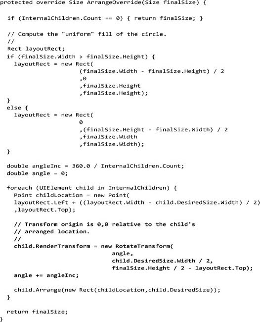
Our arrange implementation will be a little more tricky. Because we want the layout to be circular (not elliptical), we need to calculate the largest square that can fit in the available size. We can use RotateTransform to do the heavy lifting of rotating the control, but we do have to calculate the center point. All of this together gives us the model shown in Figure 4.33.
Figure 4.33. A model for arranging children in the circle layout

The first step is to calculate the bounds of our uniform circle:

Computing the angle increment is trivial; just divide the total number of degrees by the number of children:

We’ll do two interesting things to each child. First we must call Arrange on the child. If we omit this call, the child will not render. Arrange takes a rectangle, which defines the final size and position of the child. In this case we’ll center the control in the middle of the layout rectangle:

With our child positioned, we can now apply RotateTransform to spin it around the center of the layout rectangle:
Although writing a circular layout is not the most common thing, this example has illustrated many of the interesting aspects of writing a custom layout.[10]
Where Are We?
In this chapter we’ve covered the basic principles of layout and the library of layout controls. We’ve seen how applications are built out of controls, and how layout plays a critical role in positioning and sizing those controls. Having a rich layout system enables a UI that can dynamically resize on the basis of user input, screen size, or changes to content.