Chapter 5 Other Techniques and Tools
Great things are not done by impulse, but by a
series of small things brought together.
– Vincent van Gogh
Introduction
Information quality work uses many of the standard tools and techniques employed for years in product quality improvement. This chapter provides additional detail and examples related to data quality for a few of them. These techniques and tools are included in a separate chapter (not in just one of the Ten Steps) because they can be applied throughout The Ten Steps process.
The techniques can be used to understand and improve a current life cycle or to create a new one. Consider the various approaches to documenting your Information Life Cycle described in the following section, Information Life Cycle Approaches, and apply the ones most useful for your project. The ideas presented in this chapter’s Capture Data section can be used any time you need to extract or access data. Because it is strongly recommended that you document results from the project’s very beginning, the ideas in the Analyze and Document Results section and particularly Template 5.2, Assessment Results, provide an easy way to track key lessons learned, issues, and initial recommendations.
The Data Quality Tools section is an introduction to the various tools on the market to support data quality efforts. Finally, the The Ten Steps and Six Sigma section presents a high-level mapping of The Ten Steps to Six Sigma’s DMAIC (Define-Measure-Analyze-Improve-Control).
Information Life Cycle Approaches
This section outlines various approaches for representing an Information Life Cycle. See
Step 2.6—Define the Information Life Cycle for specific steps. Also see the sections Framework for Information Quality and Information Life Cycle in Chapter 2 for more background.
The Swim Lane Approach
The swim lane approach is one method for visually representing the Information Life Cycle. A swim lane is a type of process flow diagram made popular in Geary Rummler and Alan Brache’s book.1 It can be used to indicate the key components (data, processes, people and organizations, and technology) that impact information throughout the life cycle phases. You decide the level of detail needed for your project.
1. Create the swim lanes.
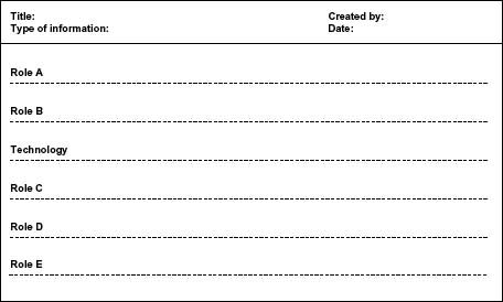
A useful application of this technique is to show the people aspect (organizations, teams, or roles) as the individual swim lanes. Technology can be presented in its own swim lane or as part of the process flow. The lanes can be horizontal or vertical. Figure 5.1 is a swim lane template with a horizontal orientation as a starting point.
2. Add the process flow using standard flowchart symbols.
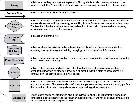
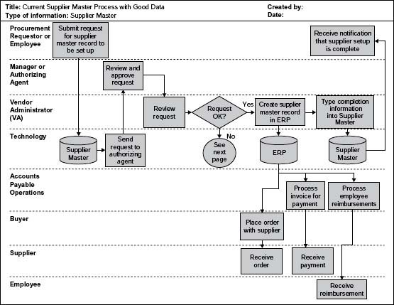
Figure 5.2 contains a list of easy reference symbols to use as you get started with your swim lanes. Figure 5.3 shows the highlevel life cycle for a supplier master record from initial request to use of the master record data for ordering supplies, paying vendors, and reimbursing employees for expenses.
The Table Approach
The table approach is particularly useful if you need detailed documentation of your Information Life Cycle, because it easily shows gaps or conflicts in tasks, roles, timing, and dependencies. You can also use this approach to develop new processes for your life cycle.
1. Create the table.
Use Template 5.1 as a starting point. The following list explains the template columns:
Activity—Describe the task or activity in a verb–noun format.
Manual or automatic—Whether the task is completed by a person or automatically by a program.
Timing—When the activity takes place (e.g., daily, monthly, quarterly). If important, be more specific and list time of day, when in the month, and any high-level dependencies on other processes (e.g., daily—8:00 a.m. PST; monthly—tenth working day or workday 10; quarterly—at completion of quarter-end financial close).
Template 5.1 • Table Approach
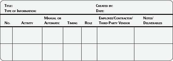
Role—Title of the person who performs the task.
Employee/contractor/third party—Is the person performing the task a company employee, a contractor, or a third-party vendor? This information is useful in case of escalation and for communication—different methods may be used depending on the answer to the question.
Note/deliverables—Any additional information such as the output of this step, reference documents, and the like.
Associated technology—The associated technology might apply to all of the tasks and is therefore listed as a template column heading. If the activities in the Information Life Cycle use various technologies, you may want to add a column for technology.
2. Document the processes at the level of detail most useful for your needs.
Table 5.1 illustrates the Dispose phase of the life cycle for financial information, including tracking the security of the information to be disposed of and verification of proper disposal.
3. Look for gaps in the process and in the information.
Note the many blank spaces in Table 5.1, which indicate gaps in the understanding of the life cycle. The associated technology (tape backup and servers in Computer Center XYZ) is indicated at the header level, which may or may not be enough detail to meet your needs. Use the gaps as an opportunity to ask questions and fill in the missing pieces.
Other Approaches
You may be familiar with or actually be using other approaches that capture information pertinent to the Information Life Cycle, such as data flow diagrams, business process flows, an IP Map, or SIPOC.
SIPOC, a technique from manufacturing, stands for Supplier-Input-Process-Output-Customer. As it applies to information, the Supplier is Input to a Process; the Process has an Output, which goes to the Customer, who applies it. And so the chain continues.
Table 5.1 • Example of the Table Approach

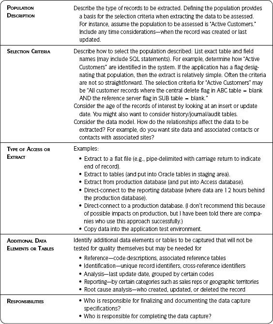
An Information Product Map (IP Map), according to a book coedited by Elizabeth Pierce (2005), is
[A] graphical model designed to help people to comprehend, evaluate, and describe how an information product such as an invoice, customer order, or prescription is assembled. The IP Map is aimed at creating a systematic representation for capturing the details associated with the manufacture of an information product that is routinely produced within an organization.2
No matter which approach you use, your goal is to understand the interaction between data, process, people, and technology throughout the life cycle of your information. Use available documentation and knowledge as you define the life cycle. Supplement what is already on hand with additional research and documentation as needed.
Capture Data
Data capture (see Table 5.2) refers to extracting or accessing data—a key activity for any data assessment. It often turns out to be more problematic than expected. Therefore, adequate preparation will save time, prevent errors, and ensure that the data extracted/accessed are the data you need. Do not underestimate the effort required to extract the right data for your assessments.
Develop your initial plan for data capture during Step 2.7—Design Data Capture and Assessment Plan. Further refine and finalize it prior to each data quality assessment in Step 3—Assess Data Quality.
Use Table 5.2 as a template when developing your data capture plan. In summary, prepare and document your plan so that you will extract or access
- The right data (records and fields).
- Within the right timeframe.
- For the right process steps.
- From the right systems.
- In the right output.
Verify that the extract specifications were met after the extract and before conducting assessments.
Analyze and Document Results
The objective of this technique is to better analyze and track what is learned throughout your project using the Approach steps (pages 265–267). Scrutinize and interpret results and make initial recommendations. Start tracking results at the beginning of the project and continue with each step. Add to your results documentation as important observations are made and assessments are completed. If multiple assessments are conducted, be sure to synthesize results by evaluating and interpreting them together.
Table 5.2 • Data to Be Captured

Approach
1. Prepare for the analysis.
Be able to answer the following questions. This places the results to be analyzed in the appropriate context.
- What did we measure?
- How did we measure it? (Include who measured it and when.)
- Why did we measure it?
- What assumptions were used?
2. Format your results in a way that enhances understanding and is conducive to analysis.
Books that focus on the most effective way to visually communicate data are readily available. Edward R. Tufte and Stephen Few are two authors whose work is worth investigating.
- It is often easier to analyze results visually and graphically in charts rather than numerically in a large table spreadsheet.
- Be clear about what you are graphing—is it a fact (e.g., a city field has a fill rate of 99 percent) or an observation (e.g., by glancing through the records, you see what seems to be a high number of universities in the customer file).
- Keep visible any assumptions made while conducting the tests.
At their best, graphics are instruments for reasoning about quantitative information. Often the most effective way to describe, explore, and summarize a set of numbers—even a very large set—is to look at pictures of those numbers. Furthermore, of all methods for analyzing and communicating statistical information, well-designed data graphics are usually the simplest and at the same time the most powerful.
– Edward R. Tufte (1983)
3. Conduct the analysis.
Carefully review and discuss the assessment results. You may be analyzing broadly across many data or deep within a focused data set. Consider the following ideas3:
Identify patterns or trends—This is one of the most basic forms of analysis.
Check for misinformation—This is information that is incorrect because of factors such as misinterpretation, improper recording, purposeful misrepresentation, and errors. Look for the following clues:
- Does the information deviate significantly from what was expected or from other data that should be comparable?
- Are there conflicting data from multiple sources (e.g., information collected on the same subject by different members of the team)? Major discrepancies should be investigated.
Identify omissions or displacement—What is not present can often be as significant as what is. Omissions are missing data that should be available. Displacement involves significant changes in data trends without an explanation.
Check out-of-place information—Some information won’t seem to “fit” with respect to other information, or it may deviate noticeably from the information you thought you would find.
Compare actual results to targets or requirements:
- Are there differences (either higher or lower)?
- Is there an explanation for the differences (e.g., targets were off due to unknowns at the time targets were set)?
- Are the differences in key or less critical data?
Ask questions—Such as the following:
- Are there any immediately visible red flags or issues?
- Are there any possible causes and effects?
- What impact could these findings have on the business? It is always important to answer this question in as much detail as possible—even if the answers are qualitative, not quantitative.
- Is there a need for more information on business impact? If yes, see Step 4—Assess Business Impact.
- Does additional information need to be gathered or do additional tests need to be conducted?
- Is this step considered complete for now?
Capture reactions—To the results:
- What is the team’s reaction to the results?
- What results were expected?
- What results were surprises?
4. Complete any follow-up, if needed.
5. Draw conclusions and make recommendations.
Consider the following:
- Recommendations resulting from the individual data quality and business impact assessments should be considered preliminary. Once all tests have been completed, they will be finalized.
- It can be a challenge to make logical comparisons and draw reasonable conclusions.
- Give yourself time to rest from the detail and then review again before finalizing the recommendations.
6. Document the results of the analysis.
Use Template 5.2, Tracking Results, for documenting results—starting with Step 2—Analyze Information Environment and continuing throughout the project. Much will be learned during the assessments. Conscientious tracking will prevent extra work when the time comes to look for root causes, make final recommendations, and develop improvement plans. Capture what you know as you discover it, and document
- Important results from any analysis.
- What was learned.
- Likely impacts to the business.
- Possible root causes.
- Preliminary recommendations.
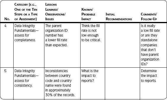
Table 5.3 on the next page lists examples of analysis and results captured using Template 5.2.
![]() Best Practice
Best Practice
Tracking Results: Create a spreadsheet for tracking assessment results with the summary level on the first sheet. If additional details are needed, created a separate worksheet for each line item.
Template 5.2 • Tracking Results
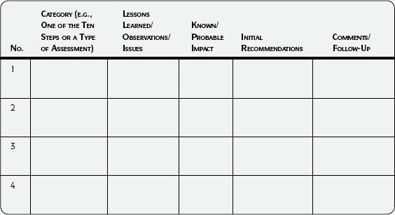
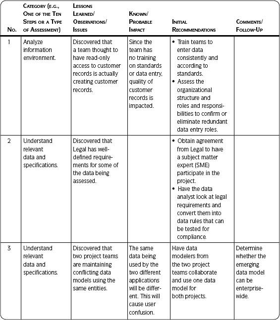
Table 5.3 • Examples of Tracking Data Quality Assessment Results
Metrics
Metrics are an important part of data quality control and are often a high business priority. However, do not lose sight of the fact that metrics are a means to an end—bringing visibility to data quality issues to prevent data quality problems. They are not the end in themselves.
Purpose
Metrics are useful for
- Replacing opinions with facts.
- Determining where to focus resources and efforts.
- Identifying sources of problems.
- Confirming the effectiveness of solutions.
- Encouraging behavior that supports business objectives through information quality.
![]() Best Practice
Best Practice
Metrics and Business Impact: Include a brief statement about the value of metrics and/or their impact to the business if data quality is poor. This gives context and importance to what the reader sees when reviewing the metrics.
When planning your metrics, be clear on the goal for using them and on their impact to the business. Here is the way one data quality metrics project expressed impact:
The product master metrics focus on key attributes within the product master. The product master comprises the foundational data for all manufacturing processes within the company. For example, problems with the data quality of revisions create bill of material errors and production issues because engineering change orders cannot be released. The metrics website provides a central location for product data that allows sites to pull information and proactively drive their data quality.
Levels of Detail
Consider three levels of detail for your metrics (as shown in Figure 5.4), with different audiences for each. For example, the summary/dashboard level might show “Synchronization of key product master attributes across the four product systems of record”4 or “Compliance of key attributes to enterprise data standards.” The drilldown might contain the data quality status of the key attributes by system of record. If reporting metrics on a website, the drilldown section might contain links to detailed reports that include the actual exception records, the data quality issue, who is working on the report, and the status of the root cause investigation and clean-up efforts.
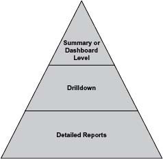
Summary or dashboard level—Summary-level metrics provide an easy visual glance at and interpretation of metrics such as targets, actual data quality, and status. Status indicates the condition of the metric in easy-to-understand terms. For example, you may use green to equal “results meet or exceed target”; yellow to equal “results fail target or unfavorable trend”; and red to equal “results well outside of tolerance limits or drastic unfavorable change.” Some summaries will show a single point in time; others will also include trends and history.
Management is the primary audience for dashboards, so integrate your data quality metrics into other business dashboards for best results. Take advantage of books available to help you design an effective dashboard for your information metrics.5
Drilldown—The drilldown is a mid-level view that provides additional information about the dashboard metrics. This is useful to show more about the dashboard numbers—but not in excruciating detail.
Detailed reports—Metrics are based on detailed measurements, which are contained in detailed reports. Detailed reports are not normally viewed by management, but should be available if questions arise about the accuracy of the metrics. They should be used by the project team to monitor and fix data identified as exceptions to the quality assessment and as input to continuous improvement.
Key Points
Following are important points to keep in mind as you get started with metrics:
- Make sure your metrics track and act as a clear indicator of what needs to be improved. They should relate to goals and organization strategy.
- Define the desired behavior first.
- Then determine the metrics needed to understand and encourage the desired behavior. If you don’t do this, you may get what you ask for but not what you want.
- Focusing on any single piece of data can result in its improvement at the expense of other data. You may want to track some general metrics so that they can act as a check and balance.
- Metrics can change behavior. Make sure they change the behavior you want.
- Measure those things that make a difference.
See Step 9—Implement Controls for Template 3.12, Metrics and RACI, to help you get started with your metrics.
Data Quality Tools
The focus of The Ten Steps process is not on tools. The data quality approach in this book is not specific to, nor does it require, any particular data quality software. It is important to understand that any tool used should serve legitimate business needs. In and of themselves tools have no merit unless they are useful and effective, and they can only be useful and effective if you understand what you need first.
Purchasing a data quality tool without knowing why and how you will use it will not give you data quality any more than buying a power saw will give you custom-made cabinets. Still, while The Ten Steps process is tool neutral, it is good to know there are tools available to help with many data quality tasks.
Michael Scofield, Manager of Data Asset Development at ESRI in Redlands, California, emphasizes the importance of understanding data quality needs first and then finding the tool to match. He lists three general data quality needs:
- Data understanding—Being aware of and comprehending the meaning and behavior of data.
- Data fixing or improving—Correcting or updating data, such as name and address updates and specialized find-and-replace functions.
- Data monitoring—Checking data as they flow or while at rest by applying tests that draw attention to new anomalies or highlight continuing problems you thought were solved.
Any of the tools soon to be discussed can be used in various ways to meet these needs.
The market for data quality tools is constantly changing, so I have avoided mentioning specific tools or vendors. Be aware that the functionality described next can be found in stand-alone versions or as modules of other tools—for example, tools focused on data integration. Expect new functionality, as well as vendors, to appear over time.
Once again, as helpful as tools can be, they produce no miracles. Meaningful results will only be obtained if people with the appropriate knowledge of business needs, processes, and data work with those who have the skills to implement and use the technology. If you already have data quality tools but are not sure how to use them effectively, The Ten Steps process can help.
Data Profiling/Analysis Tools
Tools used for understanding your data are often referred to as data profiling or analysis tools. I will refer to them as profiling tools since that term has become fairly well known and accepted.
Data Integrity Fundamentals is a dimension of quality that measures the existence, validity, structure, content, and other basic characteristics of data. Profiling tools are very helpful in understanding this dimension because they discover the data’s structure, content, and quality. They are used for analysis, but do not change the data. (See more on data profiling in Step 3.2—Data Integrity Fundamentals.)
As mentioned in Step 3.2, profiling can be carried out with a commercial tool or via other means such as the use of SQL to write queries, a report writer to create ad hoc reports, or a statistical analysis tool. Even if you are not using a purchased data profiling product, use its functionality and output to guide the queries or reports you write so you can examine your data from the perspective of data integrity fundamentals.
The specific capabilities and results you derive from data profiling will vary depending on the particular tool you are using, but could include all or some of the following:
Column or content profiling or analysis—Analyzes each column in a record, surveying all of the records in the data set. Column profiling will provide results such as completeness/fill rates, data type, size/length, list of unique values and frequency distribution, patterns, and maximum and minimum ranges. (This may also be referred to as domain analysis.)
Intra-table or intra-file or dependency profiling or analysis—Discovers relationships between attributes (data elements/columns/fields) within a table or file. This enables you to discover the table’s or file’s actual data structures, functional dependencies, primary keys, and data structure quality problems.
Cross-table or cross-file or redundancy profiling or analysis—Compares data between tables or files, determines overlapping or identical sets of values, identifies duplicate values, or indicates foreign keys. Profiling results can help a data modeler build a third normal form data model, where unwanted redundancies are eliminated. The model can be used to design a staging area that will facilitate the movement and transformation of data from one source to a target database such as an operational data store or data warehouse. Cross-table or cross-file analysis can be extremely powerful when used properly.
Most profiling tools provide the option of profiling against a flat file or connecting directly to a database. They complement t he Extract-Transform-Load (ETL) processes and tools because the profiling results help create better source-to-target mappings in a shorter time than the traditional method of producing mappings, which is based only on column headings without knowledge of actual content. Creating correct source-to-target mappings is a good reason for using a data profiling tool.
Data Cleansing Tools
Data cleansing tools are often referred to simply as data quality tools. So even though I use the term “data quality” to refer to any tool that improves data quality, often that term is used to mean just data cleansing. A more descriptive phrase for such tools might be “data improvement,” but that usage is uncommon.
Historically, data cleansing tools performed name and address cleansing, such as for customer and vendor records. However, the same functionality can also be used for product or item records and the like. A frequent trigger for data cleansing is the need to link related records (e.g., all people living in a particular household) or to identify duplicates (e.g., multiple records that represent the same company).
The various uses of data cleansing tools include preparing data for record matching and de-duplication, for consolidation, or before moving data from a source to a target. They can be used in batch mode (useful for initial assessments) or online in real time (useful for preventing data quality problems when built into an application). The development of master data efforts has brought with it the increased popularity of data cleansing tools since the tools are used to create valid, clean elements of master data.
Typical functionalities provided by data cleansing tools are described next. (The descriptive terms listed for the various functionalities are not consistent from tool to tool, so synonyms for many are included.)
Investigation or analysis—Data cleansing tools perform similar functions to those offered in data profiling tools, but they are not as thorough.
Standardization—Changes data into standard formats (e.g., Avenue in all addresses to Ave., Corporation in business names to Corp., or variations of a particular company name to the same version). Standardizing facilitates better parsing. In many tools, both standardization and parsing are used to facilitate better matching, linking, and de-duplication.
Parsing—Separates character strings or free-form text fields into their component parts, meaningful patterns, or attributes, and moves the parts into clearly labeled and distinct fields (e.g., the separation of a product description into height, weight, etc.; or a name into first, middle, and last fields; or an address into house number and street name).
Transformation—A general term that can mean any changes to the data such as during parsing and standardization.
Validation or verification or augmentation or enhancing—Updates or corrects data or adds new information to existing data (e.g., compares a U.S. address against the Postal Service file and adds the zip+4 data to zip code fields where that information is missing; adds longitude and latitude to a record of physical location).
Matching or linking—Links associated records through a user-defined or common algorithm. For instance, householding links all records associated with a particular household so that, for example, a young adult with a new checking account is linked to his or her parents, who may have a number of accounts with the bank.
Matching or de-duplication—Identifies multiple records that represent the same real-world object. This is often used to find duplicate name and address records (for customers, vendors, and employees) or non-name and address records such as product or item masters. Note that “matching” is sometimes used to mean linking and/or de-duplication.
Survivorship or merge or consolidation—Combines duplicate records, determining which records, or which fields from duplicate records, should be included in the final record. This often includes the ability to build “best-of-breed” records from multiple sources and/or instances of the same entity. The merge process can be carried out automatically by the tool, or manually by a person reviewing a list of possible duplicates and completing the consolidation.
Match-merge—A commonly used phrase that can mean de-duplication and/or consolidation.
Cleansing or scrubbing—A general term for any updates to the data (e.g., by validation, augmentation, or de-duplication).
Note that data profiling and data cleansing functionalities as described do not address the data quality dimension of Accuracy (see Step 3.4—Accuracy), which compares the data to the real-world object they represent (the authoritative source of reference). Sometimes it is not possible to access that real-world object and in those cases a carefully chosen substitute may be used as the authoritative source of reference.
The assessment of accuracy is often a manual and time-consuming process. For example, a data profiling tool can show if an item number record contains a valid code indicating a make or buy part, but there is no tool that can answer whether item 123 is a make part or a buy part—only someone familiar with it can make that determination.
Likewise, a data cleansing tool can tell you whether a particular U.S. state-city-zip code combination is valid by comparing it to a Postal Service file, but only your contact can tell you whether that is his or her address. Finally, a data profiling tool can give you the completeness or fill rate of a field containing inventory levels, but only someone counting the inventory on the shelf and comparing it to what is in the record can determine whether the inventory count is accurate.
Other Data Quality Tools
Look for other tools that, although not labeled as data quality, if used properly can enhance the quality of your data, create an environment and system design that enables higher quality data, or address some other quality issue.
Data modeling tools—Provide the ability to create diagrams with text and symbols that represent the data and their definitions, structure, and relationships. Data models define how a business works so that they can be turned into applications and systems that process information. They allow you to understand an existing application (through “reverse engineering”) in order to perform impact analysis (the impact of adding or modifying structures for an application already in production), understand a business area, and facilitate training (to understand requirements).6
All of these are useful for understanding and better managing data quality. Since these tools provide a place to capture definitions, the data models they construct are a good way to find and capture metadata.
Application development tools—May contain developer tool kits or components that contribute to good data quality that are already part of or available for the application being used, such as a development component for easily verifying and standardizing addresses.
Metadata management tools—Any tools that capture and document metadata (e.g., ETL, spreadsheets, metadata repositories). Use the metadata as input to your assessment process.
ETL tools—The Extract-Transform-Load process extracts data from a source system, transforms and aggregates them to meet target system requirements, and loads them into a target database. ETL tools can be used during development and implementation of a project and throughout production for data that need to be moved periodically, such as when being loaded to a warehouse on a regular schedule. Some ETL tools include a module that performs basic data profiling. The careful use of ETL tools can have a positive impact on data quality.
Data relationship discovery or business rule discovery—This is software that looks at multiple data sets, identifies the data available, finds relationships and transformations based on the business rules hidden in the data, and automates the mapping process. Data profiling tools can be used after the discovery tools to look in-depth at the data quality.
Screen emulator—Used for updating data by automating use of the standard interface in an application through replication of keystrokes as if done manually. This is sometimes referred to as screen scraping. A screen emulator tool can be helpful if there are too many records to be updated manually but the updates do not require the functionality of a data cleansing tool.
Tools and the Ten Steps
It has already been mentioned that The Ten Steps process is tool independent. However, it does support effective use of tools to enhance your data quality work.7
It is not unusual to find that a company has already purchased a data quality tool, but is not sure how to use it effectively. The Ten Steps process will help you make better use of the data quality tools you may already have. By first understanding your business needs (Step 1—Define Business Need and Approach) and analyzing the associated data, processes, people/organizations, and technology (Step 2—Analyze Information Environment), you will be able to better apply the tool to solve your data quality issues.
Table 5.4 shows various data quality tool functionality and where they may be used in The Ten Steps process.
Table 5.4 • Data Quality Tools and The Ten Steps Process
| TOOL FUNCTIONALITY | THE TEN STEPS PROCESS |
| Data Profiling and/or Cleansing | Use for applicable data quality dimensions: |
Step 3—Assess Data Quality, for example:
|
|
| Use results as input to: Step 5—Identify Root Causes Step 6—Develop Improvement Plans |
|
| Use to prevent and/or correct errors and as part of ongoing controls: Step 7—Prevent Future Data Errors Step 8—Correct Current Data Errors Step 9—Implement Controls |
|
| Screen Emulator | Step 8—Correct Current Data Errors |
| Data Modeling | Use as input to: |
| Metadata Management | Step 2—Analyze Information Environment |
| Business Rule Discovery or Data Relationship Discovery | Step 3—Assess Data Quality Step 7—Prevent Future Data Errors |
| Any good use of data modeling and metadata management tools provides the foundation for avoiding data quality issues. They also provide documentation of data specifications. | |
| Application Development Tools | Step 7—Prevent Future Data Errors |
| Use to prevent data quality issues right from initial development. |
The Ten Steps and Six Sigma
For those who are familiar with Six Sigma, the Ten Steps can also be easily understood using DMAIC. The DMAIC process comprises five steps that begin with stating the problem and work through to implementing a solution:
- Define—Define the problem.
- Measure—Gather data to validate and quantify the problem or opportunity.
- Analyze—Analyze details, enhance understanding of the problem, and find root cause.
- Improve—Implement solutions.
- Control—Measure and monitor results.
Figure 5.5 maps the Information and Data Quality Improvement Cycle (Assessment-Awareness–Action) to DMAIC and then to The Ten Steps process.
The Ten Steps process is a way of dealing specifically with information and data quality improvement. The information found in this book can supplement a Six Sigma project if you want more help with its data and information aspects. As with any improvements, it is important to consciously manage information in the same way as business processes are addressed.

1Rummler and Brache, Improving Performance: How to Manage the White Space on the Organization Chart (Jossey-Bass, 1990).
2Richard Y. Wang, Elizabeth M. Pierce, Stuart E. Madnick, and Craig W. Fisher (Eds.), “Introduction,” Information Quality (M. E. Sharpe, 2005), p. 10.
3Adapted from and used with permission of AMACOM Books, from Michael J. Spendolini, The Benchmarking Book (AMACOM, 1992), pp. 172–174; permission conveyed through Copyright Clearance Center, Inc.
4In an ideal world, there would only be one product master. In reality multiple masters are not uncommon. You may need to use your metrics and associated business impact for a time in order to gather evidence to show that investing in one master will be of benefit to the company
5For example, see Stephen Few, Information Dashboard Design: The Effective Visual Communication of Data (O’Reilly, 2006) and Wayne W. Eckerson, Performance Dashboards: Measuring, Monitoring, and Managing Your Business (Wiley, 2006).
6See Steve Hoberman, Data Modeling Made Simple (Technics Publications, 2005), p. 11.
7If you determine the need for a tool, remember to account for the software selection process in your project activities, timeline, and budget (identify tools with funtionality that meet your needs; compare the tools and vendors through documentation and demonstrations; choose, purchase, and implement the tools and obtain training).