
Chapter 29. WPF Common Controls
In This Chapter
• Introducing WPF Controls Features
• Understanding the ContentControl
• Understanding Common Controls
Being a technology for Windows desktop applications, Windows Presentation Foundation offers built-in controls that you can immediately use in your applications to build rich user interfaces. You can also build your own custom controls. WPF 4.5 offers a good standard toolbox, provided by the System.Windows.Controls namespace. If you are new to WPF and you come from the Windows Forms experience, you can certainly find differences in controls implementation between the two technologies, but, fortunately, you will feel at home because of the names. Look for WPF controls that are counterparts to Windows Forms interface elements. In this chapter you first learn some important features in WPF controls; next, you take a tour through the most common user controls so you can start building your user interface.
Introducing WPF Controls Features
Before using WPF controls, you need to understand some behaviors. In Chapter 28, “Creating WPF Applications,” you learned that UI elements, including controls, are declared in XAML code. You also saw how to assign a name to controls to interact with them in Visual Basic code. XAML allows you to declare and implement controls even if you do not assign a name. For example, the following Button declaration is legal:
<Button Width="100" Height="50" Click="OnClick"/>
The control declared in this way works normally as you would expect, also raising click events that you can handle in managed code. This is possible because of the particular WPF architecture part that implements routed events discussed in Chapter 28. When an unnamed control raises an event, the event passes through the entire Visual Tree, and the WPF runtime can intercept the event independently from the control name. Providing a name therefore is useful when you need to assign properties in managed code or when you want to assign an event handler to a specific visual element. Another interesting feature is that WPF controls are defined as lookless. This means that WPF controls are classes that expose a series of properties defining the behavior of controls while the look is assigned via a template. When you drag a WPF control from the toolbox to the designer, the control takes advantage of a standard template that defines its layout, but templates can be completely customized or overridden with the so-called control templates. Chapter 30, “Brushes, Styles, Templates, and Animations in WPF,” provides more examples and explanations, but you need to understand the concept before examining common controls. Basing controls’ layout on templates enables roles separation between developers and designers and is the reason Microsoft created a tool such as Expression Blend. Another fundamental feature in WPF control is that it can contain almost any visual elements. This is possible with the ContentControl item, which is the subject of the next section.
WPF Controls and Silverlight Controls
Understanding WPF controls is useful for Silverlight development, too. In most cases, controls described here have a counterpart in Silverlight, and this is why a similar discussion is not provided for Silverlight.
Understanding the ContentControl
One of the biggest presentation benefits in WPF is the capability for controls to show more than simple text. Particularly, all controls exposing a Content property can nest complex visual elements to offer special effects with or without text. For example, consider the following button whose content is just text:
<Button Name="Button1" Width="100" Height="100" Content="Click me!"/>
The Content property can be declared in a hierarchical fashion so that you can take advantage of the XAML logic for nesting complex elements. The following example shows how you can replace the button text with a movie:
<Button Name="Button1" Width="100" Height="100">
<Button.Content>
<MediaElement Source="MyVideo.wmv" LoadedBehavior="Play"/>
</Button.Content>
</Button>
At this point your button plays a video instead of showing the Click me! text. This is possible because of a special element named ContentControl that provides the capability to embed complex visual elements within controls offering the Content property. It is an invisible element, but its presence is noticeable when you can get these results. Another example is nesting multiple elements within a panel as the child element of the ContentControl. The following example shows how you can embed text and video together:
<Button Name="Button1" Width="100" Height="100">
<Button.Content>
<StackPanel>
<MediaElement LoadedBehavior="Play"
Source="MyVideo.wmv"/>
<TextBlock Text="Click me!"/>
</StackPanel>
</Button.Content>
</Button>
It is fundamental to understand the existence of the ContentControl because even the most classic controls can be enriched with complex visual elements with a couple lines of code.
Understanding Common Controls
In this section you learn about the most common controls in Windows Presentation Foundation. In most cases, we provide XAML implementation because this is the place where you define your user interface; remember that everything you do in XAML is reproducible in Visual Basic code for runtime handling (refer to Chapter 28).
The Border Control
Consider the Border control as a special container that draws a border around the child control, with the specified color, thickness, and corner radius. The following XAML code draws a red border with a depth of 3 around a rectangle:
<Border BorderBrush="Red" BorderThickness="3"
CornerRadius="8">
<Rectangle Height="100"/>
</Border>
Changes are immediately visible in the Visual Studio designer. Notice that the Border can nest just one child element, so if you want to add multiple visual elements, you need to encapsulate them within a container such as the Grid or StackPanel. Figure 29.1 shows the result of the preceding code.
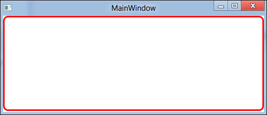
Figure 29.1. Drawing a border.
Specifying Different Brushes
In the preceding code the BorderBrush is assigned with a SolidColorBrush (Red), but according to the hierarchical logic of XAML, you could set it with a different brush, such as LinearGradientBrush.
The Button Control
In Chapter 28 you saw some Button examples in action, so we do not cover this again here.
Showing Dates with the Calendar Control
The Calendar control shows a calendar where you can select a particular day in the specified month and year. The following XAML code defines a calendar with a custom border and a TextBox that contains the selected date to be assigned programmatically:
<StackPanel Orientation="Horizontal">
<Calendar Name="Calendar1" Margin="5"
BorderBrush="Blue" BorderThickness="3"
SelectedDatesChanged="Calendar1_SelectedDatesChanged">
</Calendar>
<TextBox Name="TextBox1" Margin="5" Height="30" Width="200"/>
</StackPanel>
The SelectedDatesChanged event is raised when the user clicks a different date. The following is instead the event handler that gets the instance of the calendar and sends the selected date to the text box:
Private Sub Calendar1_SelectedDatesChanged(ByVal sender As Object,
ByVal e As Windows.Controls.
SelectionChangedEventArgs)
Dim currentCalendar = CType(sender, Calendar)
Me.TextBox1.Text = currentCalendar.SelectedDate.Value.ToString
End Sub
Figure 29.2 shows the result of our work.
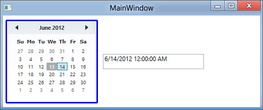
Figure 29.2. Implementing a Calendar control.
You can also programmatically assign the SelectedDate property with an object of type Date to change the date shown in the Calendar control with a different one.
Items Selection with the CheckBox Control
The WPF CheckBox control works like any other same-named controls in other technologies. Take a look at the following XAML code:
<CheckBox Name="Check1" Content="I will do this"
Margin="5" Checked="Check1_Checked"
Unchecked="Check1_Unchecked"/>
The CheckBox’s text is set via the Content property. Setting Content also means that you can fill the control with visual elements other than text. It exposes two events, Checked and Unchecked, that are raised when you place or remove the flag from the control and that can be handled as follows:
Private Sub Check1_Checked(ByVal sender As System.Object,
ByVal e As System.Windows.RoutedEventArgs)
MessageBox.Show("Checked")
End Sub
Private Sub Check1_Unchecked(ByVal sender As Object,
ByVal e As System.Windows.RoutedEventArgs)
MessageBox.Show("Unchecked")
End Sub
Finally, you invoke the IsChecked Boolean property for verifying whether the control is checked. Figure 29.3 shows the control.
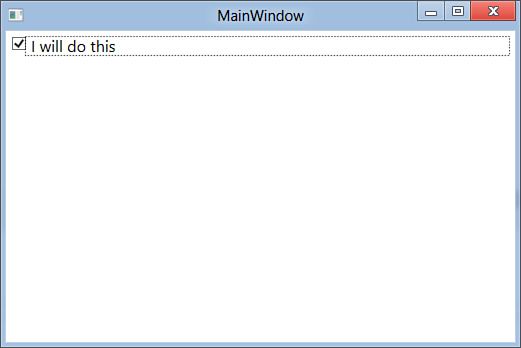
Figure 29.3. Implementing a CheckBox.
Selecting Values from a List with the ComboBox Control
The WPF ComboBox also works the same as in other technologies. The following XAML snippet shows how you implement a sample ComboBox showing a list of hypothetical customers:
<ComboBox Name="CustomerNamesCombo"
Width="200" Height="30"
SelectionChanged="CustomerNamesCombo_SelectionChanged">
<ComboBox.Items>
<ComboBoxItem Content="Alessandro"/>
<ComboBoxItem Content="Brook"/>
</ComboBox.Items>
</ComboBox>
Each item in the control is represented by a ComboBoxItem object whose Content property sets the item’s content that can be also something different from text. (For example, you might embed a video through a MediaElement control.) The SelectionChanged event is raised when the user selects an item.
Designer Tools for Adding Items
You can add items to a ComboBox by clicking the button on the Items property in the Properties window. This displays a dialog box where you can take advantage of the Visual Studio designer tools.
This control is powerful because it also supports data-binding. The next example renames the ComboBox into ProcessNamesCombo, setting the ItemsSource property as follows:
<ComboBox Name="ProcessNamesCombo"
Width="200" Height="30" ItemsSource="{Binding}"
SelectionChanged="CustomerNamesCombo_SelectionChanged">
This ensures that items will be populated at runtime via data-binding. The following Visual Basic code shows how you populate the ComboBox via a LINQ query with the list of running processes’ names:
Private Sub MainWindow_Loaded(ByVal sender As Object,
ByVal e As RoutedEventArgs) _
Handles Me.Loaded
Dim procList = From proc In Process.GetProcesses
Select proc.ProcessName
'Assuming the Combo's name is now ProcessNamesCombo
Me.ProcessNamesCombo.ItemsSource = procList
End Sub
If you want to handle items selection, you write an event handler such as the following:
Private Sub CustomerNamesCombo_SelectionChanged(ByVal sender As Object,
ByVal e As SelectionChangedEventArgs)
Dim selectedProcess = CType(CType(sender, ComboBox).SelectedItem,
String)
MessageBox.Show("You selected " & selectedProcess)
End Sub
You need to get the instance of the selected item (ComboBox.SelectedItem) and then convert it into the appropriate type, which in this case is String. If you bounded a list of Process objects, instead of their names, conversion would return Process. You would need to add a DisplayMemberPath attribute on the XAML side pointing to the property you wanted to show (for example, ProcessName). Figure 29.4 shows the result of the data-bound ComboBox.
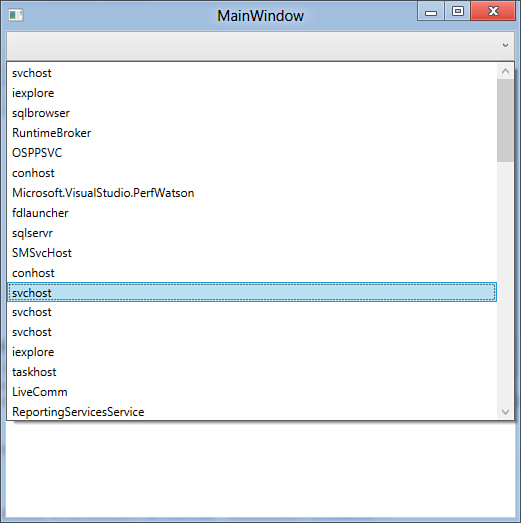
Figure 29.4. Binding a ComboBox to a list of objects.
Presenting Tabular Data with the DataGrid Control
The DataGrid control enables you to present and edit tabular data. A complete example is available in Chapter 32, “Introducing Data-Binding.”
Selecting Dates with the DatePicker Control
The DatePicker control shows a pop-up calendar where you can pick a date; the date is then bound to a text box placed near the control. The DatePicker is used in data-binding techniques (see Chapter 32). The following XAML code shows how you can implement a DatePicker; the selection, which is mapped by the SelectedDate property of type Date, is then bound to a second, external text box to demonstrate how the value can be consumed by other user controls:
<StackPanel Orientation="Horizontal">
<DatePicker Name="DatePicker1" Margin="5"
SelectedDateChanged="DatePicker1_SelectedDateChanged" />
<TextBox Name="TextBox2" Margin="5"
Text="{Binding ElementName=DatePicker1,
Path=SelectedDate}"
Height="30" Width="200"/>
</StackPanel>
Figure 29.5 shows how the DatePicker appears.
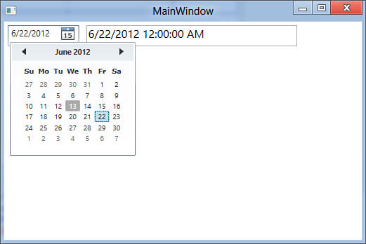
Figure 29.5. Implementing a DatePicker.
The DatePicker exposes an event called SelectedDateChanged that is raised when the user selects another date. The following event handler shows an example of handling the event:
Private Sub DatePicker1_SelectedDateChanged(ByVal sender As Object,
ByVal e As _
SelectionChangedEventArgs)
'Use the "e" object to access the DatePicker control
'(Source represents
'the instance)
MessageBox.Show("The new date is " & CType(e.Source,
DatePicker).SelectedDate.
Value.ToLongDateString)
End Sub
Viewing XPS Documents with the DocumentViewer Control
The DocumentViewer control enables viewing flow documents. A complete example is available in Chapter 31, “Manipulating Media and Documents.”
Drawing Shapes: The Ellipse
The Ellipse element is not properly a user control because it is actually a geometric shape. It is useful to understand how the element works because you can use it when creating your custom control templates. The following XAML code declares an Ellipse:
<Ellipse Width="150" Height="80" Stroke="Red"
StrokeThickness="3" Fill="Orange"/>
The most important properties are Width and Height that define dimensions. Stroke defines the color that surrounds the ellipse, and StrokeThickness is a value indicating the stroke depth. As with other geometric shapes, Ellipse background can be assigned via the Fill property. Figure 29.6 shows the drawn ellipse.
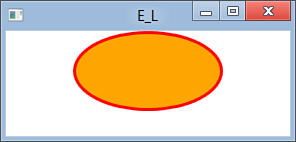
Figure 29.6. Drawing and filling an ellipse.
Organizing Controls with the Expander
The Expander control is a special kind of control container that can be expanded or collapsed and that is useful for organizing your controls. The following is an example of Expander with nested controls:
<Expander Name="Expander1" Header="Expand to view controls"
Background="LightBlue">
<StackPanel>
<ComboBox Name="Combo1" Margin="10">
<!— Add your items here...—>
</ComboBox>
<ListBox Name="List1" Margin="10">
<!— Add your items here...—>
</ListBox>
</StackPanel>
</Expander>
You must use a panel, as in the preceding example, if you want to add multiple visual elements because the Expander’s Content property supports just one element. You access members by invoking their names as if they were not nested inside the Expander. Figure 29.7 shows the Expander in action.
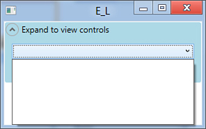
Figure 29.7. Implementing the Expander and nesting controls.
Frame
The Frame control enables showing Html contents, including web pages. The most basic usage is assigning its Source property with an Uri, as in the following example:
<Frame Source="http://msdn.com/vbasic" />
Figure 29.8 shows how the website appears in the Frame control.
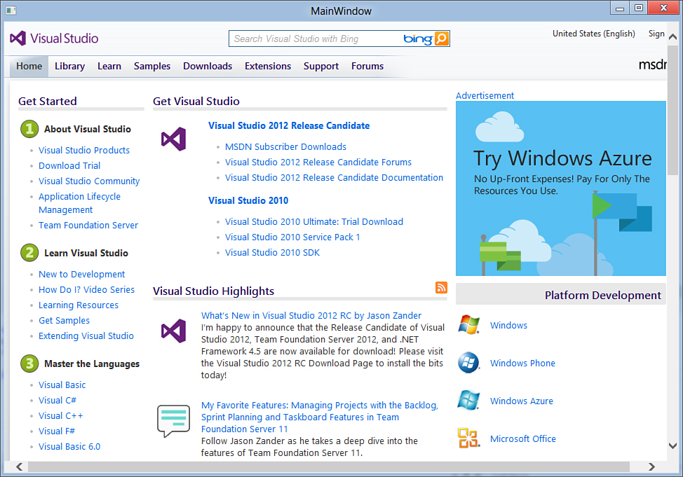
Figure 29.8. Opening a website with a Frame control.
This control exposes a Navigate method that enables programmatically browsing HTML contents and/or web pages as in the following snippet:
Frame1.Navigate(New Uri("Http://msdn.com/vbasic"))
You can also point to an html file on disk; just remember that each content name must be converted into Uri.
Using Webbrowser
Later this chapter discusses the WebBrowser control that provides better functionalities for browsing web pages. Frame should be considered as an HTML document viewer more than a real browsing control.
Organizing Controls with the GroupBox Control
The WPF GroupBox control has the same purpose for same named controls in other technologies, offering a container with a header and a border for grouping nested controls. The following code shows how you can implement a GroupBox, assigning its headers and nesting controls:
<GroupBox Name="Group1" Margin="5">
<GroupBox.Header>
<TextBlock Text="Set your options"/>
</GroupBox.Header>
<StackPanel Margin="10">
<CheckBox Name="Check3" Content="Set a single option"/>
<RadioButton Name="Radio3" Content="Use this"/>
<RadioButton Name="Radio4" Content="Use that"/>
</StackPanel>
</GroupBox>
Figure 29.9 shows the output of this code.
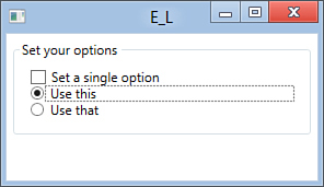
Figure 29.9. Grouping controls with a GroupBox.
Notice that in this example the Header property is defined in the hierarchical fashion, meaning that you can add to the header complex visual elements other than simple text. For example, you can add a StackPanel nesting an image with text.
Displaying Images with the Image Control
The Image control enables presenting images. A complete example is available in Chapter 31.
Displaying Text Messages with the Label Control
The Label control shows a text message, as in the following code example:
<Label Name="Label1" Content="A sample value"/>
WPF offers the TextBlock control that provides deeper customizations features for text, so you should use the one covered in more detail later in this chapter.
Presenting Data with the ListBox Control
The ListBox control enables listing a series of items. The good news is that you are not limited to text items but can also add complex items. Each item is represented by a ListBoxItem object, nested in the ListBox. The following example shows how you can declare a ListBox in XAML code:
<ListBox Name="ListBox1">
<ListBoxItem Content="Item 1"/>
<ListBoxItem Content="Item 2"/>
<!— Creating a complex item,
with text and picture —>
<ListBoxItem>
<ListBoxItem.Content>
<StackPanel>
<TextBlock Text="Item 3 with image"/>
<Image Source="MyImage.jpg" />
</StackPanel>
</ListBoxItem.Content>
</ListBoxItem>
</ListBox>
A ListBox is populated at runtime via data-binding. These concepts are the same as illustrated for the ComboBox control, so take a look there for a recap. To accomplish data-binding, specify the ItemsSource markup extension as follows:
<ListBox Name="ListBox1" ItemsSource="{Binding}"/>
Then in Visual Basic code, you assign the ItemsSource property with a data-source as demonstrated in the following LINQ query that returns a list of names about running processes:
Dim procList = From proc In Process.GetProcesses
Select proc.ProcessName
Me.ListBox1.ItemsSource = procList
You access items in the ListBox via some properties such as the following:
• SelectedItem, of type Object, which returns the instance of the selected item in the ListBox. The returned object must be converted into the appropriate type.
• Items, which returns a read-only collection of items in the control.
In Chapter 32 you see a more extensive example of data-binding using the ListBox. Figure 29.10 shows the result for the data-bound implementation.
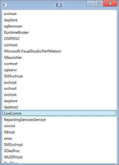
Figure 29.10. A data-bound ListBox.
Data-Binding
The ListBox control is intended for presenting data, even if you can customize items’ template with TextBox controls. For two-way data-binding, use the DataGrid control described in Chapter 32.
Presenting Data with the ListView Control
The ListView control offers a higher customization level if compared to the ListBox and can also be used for receiving user input other than just presenting data. Same as for the ListBox, you might want to consider the DataGrid control for advanced data-binding techniques. To present a series of items, the ListView can be declared the same way as the ListBox. Things are better when you instead use this control with columns, such as in a grid. Consider the following XAML code that declares a ListView data-bound to the list of running processes:
<ListView Name="ListView1" ItemsSource="{Binding}">
<ListView.View>
<GridView>
<GridViewColumn Header="Process ID">
<GridViewColumn.CellTemplate>
<DataTemplate>
<TextBlock Text="{Binding Path=Id}"/>
</DataTemplate>
</GridViewColumn.CellTemplate>
</GridViewColumn>
<GridViewColumn Header="Process name">
<GridViewColumn.CellTemplate>
<DataTemplate>
<TextBlock
Text="{Binding Path=ProcessName}"/>
</DataTemplate>
</GridViewColumn.CellTemplate>
</GridViewColumn>
</GridView>
</ListView.View>
</ListView>
The View property establishes how the control will look. The GridView creates a nested grid with column definitions. Each GridViewColumn represents a single column where you can customize cells by defining the CellTemplate item. A DataTemplate item is nested that actually stores one or more visual elements that show how each object in the ListView appears. See Chapter 32 for more details on data-binding; at the moment consider that the Binding Path extension points to the specified property of the associated data source. Then you assign the ItemsSource property, as in the following Visual Basic code that retrieves the list of running processes:
Me.ListView1.ItemsSource = Process.GetProcesses.AsEnumerable
This populates the ListView that just shows two properties from the data source. Figure 29.11 shows the result of the code.
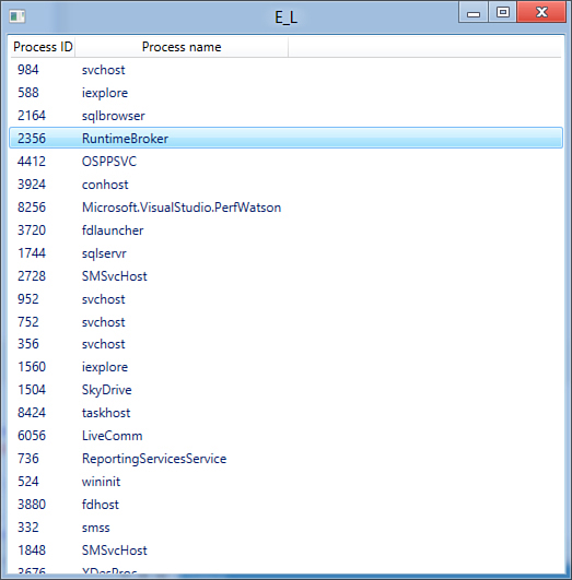
Figure 29.11. The result for the data-bound ListView.
Playing Audio and Video with the MediaElement Control
The MediaElement control enables playing multimedia files. A complete example is available in Chapter 31.
Building Effective User Interfaces with the Menu Control
WPF still enables creating user interfaces based on menus via the Menu control. You nest inside the Menu control many MenuItem objects and as many commands as you need; you can also nest MenuItem objects into other MenuItems to create submenus. Menus in WPF are highly customizable because you can specify background and foreground colors, add images and other visual elements, and set different fonts for specific menu items. The following example shows how to accomplish this:
<DockPanel LastChildFill="True" VerticalAlignment="Top">
<Menu DockPanel.Dock="Top">
<MenuItem Header="First menu" IsEnabled="True"
DockPanel.Dock="Top">
<MenuItem Header="_TestMenu"/>
<Separator/>
<MenuItem IsEnabled="True" Name="Copy"
Click="Copy_Click">
<MenuItem.Header>_Copy</MenuItem.Header>
</MenuItem>
<MenuItem IsEnabled="True" Name="Paste"
Click="Paste_Click"
ToolTip="Paste your text">
<MenuItem.Header>_Paste</MenuItem.Header>
</MenuItem>
<Separator />
<MenuItem Name="FontMenuItem" Header="Item with another font"
FontFamily="Tahoma" FontSize="16" FontStyle="Italic"
FontWeight="Bold"
/>
</MenuItem>
<MenuItem Header="Second menu" DockPanel.Dock="Top"
Background="Blue" Foreground="White">
<!—<MenuItem Header="Item with bitmap image">
<MenuItem.Icon>
<Image Source="Immages/MyImage.png" />
</MenuItem.Icon>
</MenuItem>—>
<MenuItem Header="Checkable item" IsCheckable="True"
IsChecked="True" />
<MenuItem Header="Disabled item" IsEnabled="False"
Name="DisabledMenuItem"/>
</MenuItem>
</Menu>
</DockPanel>
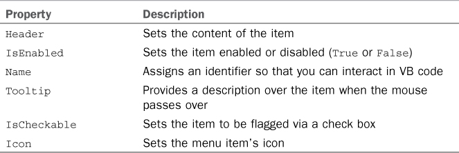
You can set a lot of properties within menus. Table 29.1 summarizes the most important ones that were used in the preceding code.
Table 29.1. Most Common Properties in Menu and MenuItems
By assigning the Click property for each MenuItem, you can handle the click event, as in the following code snippet:
Private Sub Copy_Click(ByVal sender As System.Object,
ByVal e As System.Windows.RoutedEventArgs)
MessageBox.Show("You clicked Copy")
End Sub
Private Sub Paste_Click(ByVal sender As System.Object,
ByVal e As System.Windows.RoutedEventArgs)
MessageBox.Show("You clicked Paste")
End Sub
Notice that the main Menu item is placed inside a DockPanel container that provides better arrangement for this kind of control. Figure 29.12 shows the result of the menu implementation.
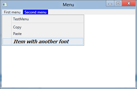
Figure 29.12. Implementing menus and submenus.
Entering Passwords with the PasswordBox Control
The PasswordBox control is a special text box intended for entering passwords and that automatically hides characters. The following code snippet shows an example:
<StackPanel Orientation="Horizontal">
<PasswordBox Name="PasswordBox1" Margin="5"
Width="150" MaxLength="20"
PasswordChar="*"/>
<Button Name="PasswordButton" Width="100" Height="30"
Margin="5" Content="Check password"
Click="PasswordButton_Click"/>
</StackPanel>
By default, characters are hidden with a dot, but you can replace it via the PasswordChar property (optional). The MaxLength property limits the password length (optional). Such control exposes the Password property of type String that is the entered password, as demonstrated by the following code:
Private Sub PasswordButton_Click(ByVal sender As Object,
ByVal e As RoutedEventArgs)
Dim myPassword = "TestPassword"
If PasswordBox1.Password = myPassword Then
MessageBox.Show("Password matches")
Else
MessageBox.Show("Password does not match")
End If
End Sub
Figure 29.13 shows the result of the code.
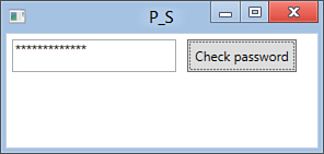
Figure 29.13. Implementing a PasswordBox.
The main event in the PasswordBox is PasswordChanged that is raised when the control’s content changes.
Showing the Progress of an Operation with the ProgressBar Control
The ProgressBar control requires you to set some start properties, such as Minimum, Maximum, and Value. Then you can increase the value at runtime. The following XAML code declares a ProgressBar:
<ProgressBar Name="ProgressBar1" Height="30"
Value="0"
Minimum="0" Maximum="10000"/>
To update the progress value, a good approach is making this asynchronously. This can be accomplished by invoking the Dispatcher, which is the WPF object responsible for managing threads. This points to the ProgressBar.SetValue to update the progress value. So the first step is to create a custom delegate that matches SetValue’s signature:
Private Delegate Sub updateDelegate(ByVal depProperty As _
System.Windows.DependencyProperty, _
ByVal value As Object)
The next step is to provide code that updates the progress value. This is just a demonstration loop that invokes the dispatcher while increasing the progress value:
Private Sub HandleProgressBar()
Dim value As Double = ProgressBar1.Value
Dim updateProgressBar As New _
updateDelegate(AddressOf _
ProgressBar1.SetValue)
Do Until ProgressBar1.Value = ProgressBar1.Maximum
value += 1
Dispatcher.Invoke(updateProgressBar, _
System.Windows.Threading.DispatcherPriority.Background, _
New Object() {ProgressBar.ValueProperty, value})
Loop
End Sub
The Dispatcher.Invoke method invokes the delegate, which does nothing but invoke ProgressBar.SetValue. The other interesting argument is an array of Object storing the dependency property to be updated (ProgressBar.ValueProperty), which will be reflected onto Value, and its value. Figure 29.14 shows the result of the code.
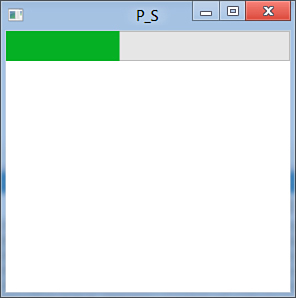
Figure 29.14. The ProgressBar value increasing.
Using Dispatcher.InvokeAsync
WPF 4.5 introduces some new methods for the Dispatcher class. It is worth mentioning InvokeAsync. Different from Invoke, which you saw in the previous example and which works synchronously, InvokeAsync executes the specified thread asynchronously on the thread the Dispatcher is associated with.
Accepting User Choices with the RadioButton Control
The RadioButton control works similarly to the CheckBox, differing in that this enables one choice among several alternatives, but it exposes the same properties. The following XAML code declares two RadioButton controls:
<StackPanel>
<RadioButton Name="Radio1" Content="First option"/>
<RadioButton Name="Radio2" Content="Second option"/>
</StackPanel>
Each instance exposes the IsChecked property and the Checked and Unchecked events. For this, take a look back at the CheckBox discussion. Figure 29.15 shows how the controls look.
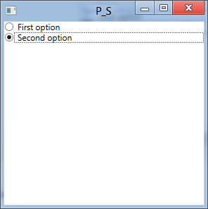
Figure 29.15. Adding RadioButton selection.
Drawing Shapes: The Rectangle
The Rectangle element is another common geometric shape that you can utilize in custom control templates. Drawing a rectangle is easy, as demonstrated in the following code example:
<Rectangle Width="150" Height="50"
Fill="Orange" Stroke="Red"
StrokeThickness="3"/>
You define its dimensions, specifying Stroke and StrokeThickness as for the ellipse (optional). Figure 29.16 shows how the object is drawn.
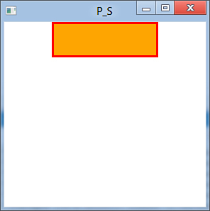
Figure 29.16. Drawing a rectangle.
Rectangle also has the RadiusX and RadiusY properties that you can assign to round corners.
Editing Text with the RichTextBox Control
WPF 4.5 offers a RichTextBox control that works differently from Windows Forms and requires you to understand flow documents. This topic will be discussed in Chapter 31.
Extended View with the ScrollBar Control
You can implement scrollbars with the ScrollBar control. The following code provides an example:
<ScrollBar Name="Scroll1" Maximum="100" Minimum="0"
Value="50" Scroll="Scroll1_Scroll"/>
The implementation is simple because you just have to provide the Minimum, Maximum, and current Value. The Scroll event is instead raised when the selector position changes. The event handler is then implemented as follows:
Private Sub Scroll1_Scroll(ByVal sender As System.Object,
ByVal e As Primitives.
ScrollEventArgs)
End Sub
WPF offers a more versatile control, named ScrollViewer, as described in the next section.
Scrolling the Visual Tree with the ScrollViewer Control
The ScrollViewer element enables scrolling its entire content with both horizontal and vertical scrollbars. This can be easily understood directly at design time. Type the following XAML code:
<ScrollViewer VerticalScrollBarVisibility="Auto"
HorizontalScrollBarVisibility="Auto">
<StackPanel>
<TextBlock Width="1000"/>
<TextBlock Height="2000"/>
</StackPanel>
</ScrollViewer>
You notice that, because of the big width and height values, the ScrollViewer provides both scrollbars, as demonstrated in Figure 29.17.
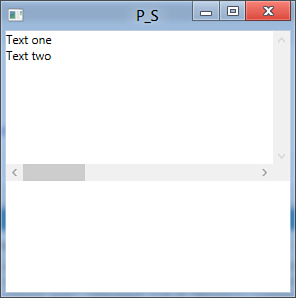
Figure 29.17. Implementing a ScrollViewer.
This control is useful when you need to arrange multiple elements in a fixed fashion and still want to provide the ability of scrolling them within the window.
Separating Visual Elements with the Separator Control
The Separator control is used for drawing a separation line between visual elements. I provided an example previously when discussing the Menu control.
Value Selection with the Slider Control
The Slider control provides a selector you can use to set a particular value that is bound to another control. Chapter 31 provides an example binding a Slider to a MediaElement for controlling the volume; however, at the moment consider the following code:
<Slider Name="Slider1"
Maximum="10" Minimum="0" Value="5"
AutoToolTipPlacement="BottomRight"
TickPlacement="TopLeft" TickFrequency="1"
/>
<TextBlock Text="{Binding ElementName=Slider1,
Path=Value}"/>
A Slider requires a Minimum and Maximum value, whereas Value is the current selected value. You can place tool tips reporting the value (AutoToolTipPlacement) that specify the position (TopLeft or BottomRight). Moreover, you can place ticks so that visualization is clearer and decide how many ticks to place (TickFrequency). For example, the preceding code can produce 10 ticks (1 per possible value). The TextBlock shows the value of the slider via data-binding, which is the preferred way of binding a Slider value to another control. This object raises a ValueChanged event when the user moves the selector to another value. Figure 29.18 shows the result of the preceding code.
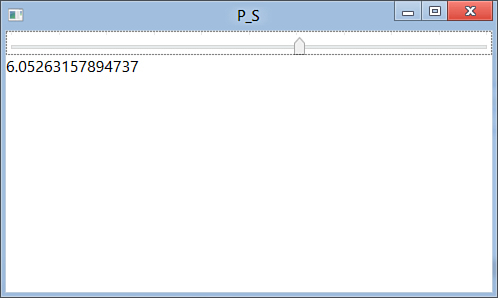
Figure 29.18. Setting values with a Slider.
Displaying Information with the StatusBar Control
WPF enables you to place status bars at the bottom of a Window. This is accomplished by declaring a StatusBar object that nests StatusBarItems elements. The good news is that you are not limited to adding text to a StatusBar because you can add several kinds of visual elements. The following example shows adding text and a ProgressBar into a StatusBar:
<StatusBar>
<StatusBarItem Name="Item1" Content="Ready"/>
<StatusBarItem Name="Item2">
<ProgressBar Name="Progress1"
Minimum="0" Maximum="200" Value="50"
Width="50" Height="15" />
</StatusBarItem>
</StatusBar>
Figure 29.19 shows the result of the preceding code. You access members in the bar at the Visual Basic level via their identifiers.
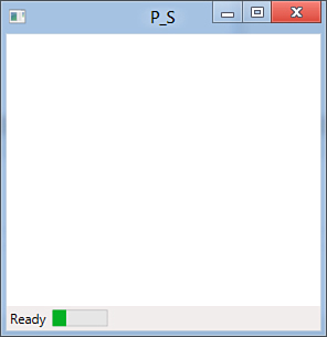
Figure 29.19. A StatusBar with nested controls.
Organizing User Interfaces with the TabControl Control
The TabControl enables you to split an area into tabs. Each tab is represented by a TabItem object, and tabs are enclosed within a TabControl.TabItems collection. The following code demonstrates how you can implement a TabControl with both standard and customized tabs:
<TabControl>
<TabControl.Items>
<TabItem Header="Tab1">
<!— Nest your controls here.. —>
</TabItem>
<TabItem Foreground="Blue"
Background="Orange">
<TabItem.Header>
<StackPanel Orientation="Horizontal">
<TextBlock Text="Tab2"/>
<!— Replace with a valid image
<Image Source="MyImage.jpg"/>—>
</StackPanel>
</TabItem.Header>
</TabItem>
</TabControl.Items>
</TabControl>
You set the tab header content assigning the Header property for each TabItem and then nest controls within the element. Notice how you can customize tabs by setting Foreground and Background and declaring the Header in a hierarchical fashion to place multiple elements. Figure 29.20 shows the TabControl implementation.
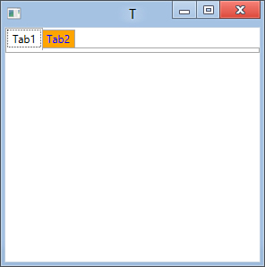
Figure 29.20. Implementing a TabControl.
You can also customize the header with text and an image, as you can check in the comment placed in the code. Then you access nested controls via their names as you would do in any other situation.
Presenting Text with the TextBlock Control
The TextBlock control enables showing text messages. Its purpose is similar to the Label’s purpose, but it differs in that TextBlock offers deeper control over text customization. The following example demonstrates how you can present customized text using the TextBlock:
<TextBlock Name="TextBlock1" FontFamily="Tahoma"
FontSize="20" FontStyle="Italic"
FontWeight="Bold"
Text="Sample text with TextBlock">
<TextBlock.Foreground>
<LinearGradientBrush>
<GradientStop Offset="0" Color="Blue"/>
<GradientStop Offset="0.5" Color="Violet"/>
<GradientStop Offset="1" Color="Green"/>
</LinearGradientBrush>
</TextBlock.Foreground>
</TextBlock>
Font properties are of particular interest. FontFamily indicates the font name, FontStyle indicates whether the font is normal or oblique, and FontWeight sets the font depth. IntelliSense enables easy selections for available members on each of the previously mentioned properties. Figure 29.21 shows the result of the preceding code.
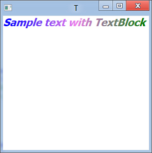
Figure 29.21. Drawing a TextBlock.
Because of its flexibility, the TextBlock control is often used in custom control templates that require customizing text. You can also set the TextBlock text at runtime by assigning the Text property.
Entering Text with the TextBox Control
Another typical control that is also provided by WPF is the TextBox. You declare one as follows:
<TextBox Name="TextBox1"
TextChanged="TextBox1_TextChanged"/>
The most common event is TextChanged that is raised when the text is modified and that can be handled as follows:
Private Sub TextBox1_TextChanged(ByVal sender As System.Object,
ByVal e As System.Windows.Controls.
TextChangedEventArgs)
End Sub
The e object of type TextChangedEventArgs offers a Changes collection property that can be iterated to get a list of changes that affect the control’s content. The TextBox control provides support for undo actions (that is, Ctrl+Z) and a SelectedText property that enables you to easily retrieve in VB code the currently selected text in the control.
Offering Commands with the ToolBar Control
The ToolBar control enables you to create toolbars for your WPF applications. You can add multiple ToolBar objects within a ToolBarTray object. The following XAML code shows how you can define a simple toolbar; you have to replace image files with valid ones:
<ToolBarTray>
<ToolBar>
<Button Name="NewButton"
Click="NewButton_Click">
<Image Source=NewDocument.png" />
</Button>
<Button Name="OpenButton"
Click="OpenButton_Click">
<Image Source="OpenFolder.png" />
</Button>
<Button Name="SaveButton"
Click="SaveButton_Click">
<Image Source="Save.png" />
</Button>
</ToolBar>
</ToolBarTray>
Notice how the code implements primitive Button controls that you can manage in Visual Basic code with classic event handlers for the Click event. Following this logic, you can place additional ToolBar objects inside the ToolBarTray. Figure 29.22 shows the ToolBar.
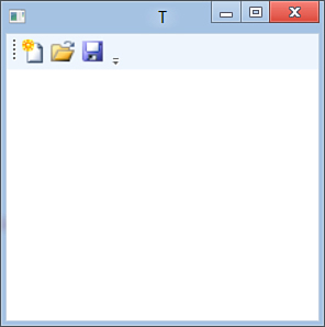
Figure 29.22. Implementing a ToolBar.
Presenting Hierarchical Data with the TreeView Control
The TreeView is another important control, and WPF provides its own implementation that exposes a TreeView.Items collection where you nest nodes. Each node is represented by a TreeViewItem object. You can build complex items as in the following example:
<TreeView Name="TreeView1">
<TreeView.Items>
<TreeViewItem Header="Root Node" Name="RootNode"
Tag="Information for this node">
<TreeViewItem Header="Node0" Name="Node0"/>
<TreeViewItem Header="Node1" Name="Node1">
<TreeViewItem Header="SubNode"
Name="SubNode"/>
</TreeViewItem>
</TreeViewItem>
</TreeView.Items>
</TreeView>
The text in the node is specified with the Header property, while you can assign additional information with the Tag property. Assigning the Name property is also useful because you can interact with nodes in managed code. To add nodes at runtime, you create an instance of the TreeViewItem class and then add it to the specified node as demonstrated here:
Dim nt As New TreeViewItem
With nt
.Header = "New sub node"
.Tag = "Runtime added"
End With
Node0.Items.Add(nt)
Figure 29.23 shows the result for all the preceding code.
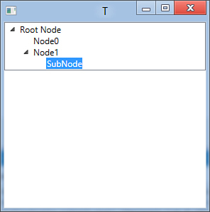
Figure 29.23. Implementing and populating a TreeView.
The TreeView can also be populated via data-binding with the ItemsSource property; it exposes the SelectedItem property, exactly as it happens for the ComboBox and ListBox controls. Thus, you can apply the same techniques.
Accessing the Web with the WebBrowser Control
The WebBrowser control provides specific functionalities for browsing websites. You add it to the user interface by declaring a WebBrowser element as follows:
<WebBrowser Name="Browser1"/>
Then you can control the WebBrowser behavior from Visual Basic code; the following are methods exposed by the WebBrowser allowing navigation:
'Open the specified website
Browser1.Navigate(New Uri("Http://msdn.com/vbasic"))
'Back to the previous page
Browser1.GoBack()
'Forward to the next page
Browser1.GoForward()
'Refresh the page
Browser1.Refresh()
The WebBrowser also exposes some events; the most important is LoadCompleted, which is raised when the control completes loading a web page. This can be handled to get useful information on the visited website, as in the following code snippet:
Private Sub Browser1_LoadCompleted(ByVal sender As Object,
ByVal e As NavigationEventArgs) _
Handles Browser1.Navigated
MessageBox.Show(e.Uri.ToString)
End Sub
The object of type NavigationEventArgs provides properties that retrieve information such as the website URL or the WebResponse instance.
Windows Forms Interoperability with the WindowsFormsHost Control
The WindowsFormsHost control enables interoperability with the Windows Forms technology and provides a way for hosting Win Forms user controls within a WPF application.
Interoperability Tips
I often answer questions in online forums about WPF, and one of the most common questions is about interoperability between Windows Forms and WPF, especially for developers who are moving their applications to WPF. So many architectural differences exist between the two technologies that interoperability is not a task that I suggest. You should use interoperability only when there is no other way of rewriting a WPF version of a Windows Form control, which is improbable.
To host a Windows Forms control, you drag the WindowsFormsHost element from the Toolbox onto the Window surface. The next step is adding a reference to the System.Windows.Forms.dll assembly. If you want to host Windows Forms controls built in the .NET Framework, you need to add an XML namespace declaration at the Window level; the following line of XAML code demonstrates this:
xmlns:wf="clr-namespace:System.Windows.Forms;assembly=System.Windows.Forms"
At this point, you can nest the desired control inside the WindowsFormsHost declaration, as in the following example that adds a System.Windows.Forms.PictureBox:
<WindowsFormsHost Height="100"
Name="WindowsFormsHost1"
Width="200">
<wf:PictureBox x:Name="Picture1"/>
</WindowsFormsHost>
Notice that you need to provide the x:Name attribute to make the control reachable from the Visual Basic code. Now you can interact with the PictureBox like you would in any other Windows Forms application by invoking its identifier—as demonstrated in the following code snippets where the code loads an image file and assigns it to the PictureBox. This particular example also requires a reference to the System.Drawing.dll assembly:
'This is Windows Forms code inside a WPF application
Me.Picture1.Image = System.Drawing.Image.
FromFile("C:Picture.jpg")
This technique works with custom user controls as well; you just need to add an XML namespace reference pointing to the appropriate assembly exposing the custom user control (including the current project). Then you can use the control itself.
Using Common Dialogs
In WPF 4.5, as well as its predecessors, common dialogs are wrappers of Win32 dialogs. They are exposed by the Microsoft.Win32 namespace and are OpenFileDialog and SaveFileDialog. (WPF also provides a PrintDialog control exposed by the System.Windows.Controls namespace.) The following code demonstrates how you instantiate both dialogs:
'Instantiating an OpenFileDialog
Dim od As New Microsoft.Win29.OpenFileDialog
With od
.Title = "Your title here..."
.Filter = "All files|*.*"
.ShowReadOnly = True
If .ShowDialog = True Then
Dim fileName As String = .FileName
End If
End With
'Instantiating a SaveFileDialog
Dim sd As New Microsoft.Win29.SaveFileDialog
With sd
.Title = "Your title here..."
.InitialDirectory = "."
.Filter = "All files|*.*"
If .ShowDialog = True Then
Dim fileName As String = .FileName
End If
End With
Notice that the ShowDialog method returns a Nullable(Of Boolean), in which True means that the user clicks OK, False when she clicks Cancel, and Nothing when she closes the dialog.
Summary
In this chapter you got an overview of WPF’s most commonly used controls, which you can use in your client applications, understanding how they can be both implemented in XAML or VB code. Also we covered some particular aspects about them, such as their so-called lookless implementation, understanding why they can also be nameless because of routed events.