
Chapter 11. 32 Bit HDR Compositing and Color Management

True realism consists in revealing the surprising things which habit keeps covered and prevents us from seeing.
–Jean Cocteau (French director, painter, playwright, and poet)
You may already be aware that although After Effects by default matches the 8 bit per channel color limitation of your monitor, this is hardly the way to create the optimal image. Thus other modes and methods for color are available, including high bit depths, alternate color spaces and color management. Few topics in After Effects generate as much curiosity or confusion as these. Each of the features detailed here improves upon the standard digital color model you know best, but at the cost of requiring better understanding on your part.
In After Effects CS3 the process centers around Color Management, which is no longer a feature that can safely be ignored; operations essential to input and output now rely on it. The name “Color Management” would seem to imply that it is an automated process to manage colors for you, when in fact it is a complex set of tools allowing (even requiring) you to effectively manage color.
On the other hand, 32 bit High Dynamic Range (HDR) compositing is routinely ignored by artists who could benefit from it, despite that it remains uncommon for source files to contain over-range color data, which are pixel values too bright for your monitor to display.
Film can and typically does contain these over-range color values. These are typically brought into After Effects as 10 bit log Cineon or DPX files, and importing, converting, and writing this format requires a bit of special knowledge. It’s an elegant and highly standardized system that has relevance even when working with the most up-to-date high-end digital cameras.
CS3 Color Management: Why Bother?
It’s normal to wish Color Management would simply go away. So many of us have produced footage with After Effects for years and devised our own systems to manage color through each stage of production. We’ve assumed, naively perhaps, that a pixel is a pixel and as long as we control the RGB value of that pixel, we maintain control over the appearance of the image.
The problem with this way of thinking is that it’s tied to the monitor. The way a given RGB pixel looks on your monitor is somewhat arbitrary—I’m typing this on a laptop, and I know that its monitor has higher contrast than my desktop monitors, one of which has a bluer cast than the other if I don’t adjust them to match. Not only that, the way that color operates on your monitor is nothing like the way it works in the real world, or even in a camera. Not only is the dynamic range far more limited, but also an arbitrary gamma adjustment is required to make images look right.
Color itself is not arbitrary. Although color is a completely human system, it is the result of measurable natural phenomena. Because the qualities of a given color are measurable to a large degree, a system is evolving to measure them, and Adobe is attempting to spearhead the progress of that system with its Color Management features.
Completely Optional
The Color Management feature set in After Effects is completely optional and disabled by default. Its features become necessary in cases including, but not necessarily limited to, the following:
• A project relies on a color managed file (with an embedded ICC Profile). For example, a client provides an image or clip with specific managed color settings and requires that the output match.
• A project will benefit from a linearized 1.0 gamma working space. If that means nothing to you, read on; this is the chapter that explains it.
• Output will be displayed in some manner that’s not directly available on your system.
• A project is shared and color adjusted on a variety of workstations, each with a calibrated monitor. The goal is for color corrections made on a given workstation to match once the shot moves on from that workstation.
To achieve these goals requires that some old rules be broken and new ones established.
Related and Mandatory
Other changes introduced in After Effects CS3 seem tied to Color Management but come into play even if you never enable it:
• A video file in a DV or other Y’CrCb (YUV) format requires (and receives) automatic color interpretation upon import into After Effects, applying settings that would previously have been up to you to add. This is done by MediaCore, a little known Adobe application that runs invisibly behind the scenes of Adobe video applications (see “Input Profile and MediaCore,” below).
• QuickTime gamma settings in general have become something of a moving target as Apple adds its own form of color management, whose effects vary from codec to codec. As a result, there are situations in which imported and rendered QuickTimes won’t look right. This is not the fault of Color Management, although you can use the feature set to correct the problems that come up (see “QuickTime,” below).
• Linear blending (using a 1.0 gamma only for pixel-blending operations without converting all images to linear gamma) is possible without setting a linearized Project Working Space, and thus without enabling Color Management whatsoever (see the last section of this chapter).
Because these issues also affect how color is managed, they tend to get lumped in with the Color Management system when in fact they can be unique from it.
A Pixel’s Journey through After Effects
Join me now as we follow color through After Effects, noting the various features that can affect its appearance or even its very identity—its RGB value. Although it’s not mandatory, it’s best to increase that pixel’s color flexibility and accuracy, warming it up to get it ready for the trip, by raising project bit depth above 8 bpc. Here’s why.
16 Bit per Channel Composites
A 16 bit per channel color was added to After Effects 5.0 for one basic reason: to eliminate color quantization, most commonly seen in the form of banding where subtle gradients and other threshold regions appear in an image. In 16 bpc mode there are 128 extra gradations between each R, G, B, and A value contained in the familiar 8 bpc mode.
Those increments are typically too fine for your eye to distinguish (or your monitor to display), but your eye easily notices banding, and when you start to make multiple adjustments to 8 bpc images, as may be required by color management features, banding is bound to appear in edge thresholds and shadows, making the image look bad.
You can raise color depth in your project by either Alt/Option-clicking on the color depth setting at the bottom of the Project panel, or via the Depth pull-down menu in File > Project Settings. The resulting performance hit typically isn’t as bad as you might think.
Many but not all effects and plug-ins support 16 bpc color. To discern which ones do, with your project set to the target bit depth (16 bpc in this case), choose Show 16 bpc-Capable Effects Only from the Effects & Presets panel menu. Effects that are only 8 bpc aren’t off-limits; you should just be careful about where you apply them—best is typically either at the beginning or the end of the image pipeline, and watch for banding.
Most digital artists prefer 8 bpc colors because we’re so used to them, but switching to 16 bpc mode doesn’t mean you’re stuck with incomprehensible pixel values of 32768, 0, 0 for pure red or 16384, 16384, 16384 middle gray. In the panel menu of the Info panel, choose whichever numerical color representation works for you; this setting is used everywhere in the application, including the Adobe color picker (Figure 11.1). The following section refers to 8 bpc values in 16 bpc projects.

Figure 11.1. If you hesitate to work in 16 bpc simply because you don’t like the unwieldy color numbers, consider setting the Info panel to display 8 bpc while you work in 16 bpc; this change will be rippled throughout the application, including the Adobe color picker.
Monitor Calibration
Sometimes it becomes obvious that RGB values alone cannot describe pure colors; if you don’t know what I’m talking about, find a still-working decade old CRT monitor and plug it in.
Assuming your monitor isn’t that far out of whack, third-party color calibration hardware and software can be used to generate a profile which is then stored and set as a system preference. This monitor profile accomplishes two things:
• Defines a color space for compositing unique from what is properly called monitor color space
• Offers control over the color appearance of the composition. Each pixel has not only an RGB value but an actual precise and absolute color.
In other words, the color values and how they interrelate change, as does the method used to display them.
Is there an external broadcast monitor attached to your system (set as an Output Device in Preferences > Video Preview)? Color Management settings do not apply to that device.
Color Management: Disabled by Default
Import a file edited in another Adobe application such as Photoshop or Lightroom and it likely contains an embedded ICC color profile. This profile can tell After Effects how the colors should be interpreted.
A file called sanityCheck.tif can be found on the book’s disc; it contains data and color gradients that will be helpful later in the chapter to help understand linear color. Import this file into After Effects and choose File > Interpret Footage > Main (Ctrl+F/Cmd+F, or context-click instead). The familiar Interpret Footage dialog opens, with something new to CS3, a Color Management tab.
Figure 11.2 shows how this tab appears with the default settings. Assign Profile is grayed out because, as the Description text explains, color management is off and color values are not converted. You enable Color Management by assigning a Working Space.

Figure 11.2. Until Color Management is enabled for the entire project, the Embedded Profile of a source image is recognized but not used to convert colors.
Project Working Space
The proper choice of a working space is the one that typically matches the “output intent,” the color space corresponding to the target device. The Working Space pull-down menu containing all possible choices is located in File > Project Settings (Ctrl+Alt+K/Cmd+Opt+K). Those above the line are considered by Adobe to be the most likely candidates. Those below might include profiles used by such unlikely output devices as a color printer (Figure 11.3).
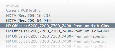
Figure 11.3. For better or worse, all of the color profiles active on the local system are listed as Working Space candidates, even such unlikely targets as the office color printer. To do a local housecleaning search for the Profiles folders on either platform—but you may need some of those to print documents!
By default, Working Space is set to None (and thus Color Management is off). Choose a Working Space from the pull-down menu and Color Management is enabled, triggering the following:
• Assigned profiles in imported files are activated and displayed atop the Project panel when it’s selected.
• Imported files with no assigned profile are assumed to have a profile of sRGB IEC61966-2.1, hereafter referred to as simply sRGB.
• Actual RGB values can and will change to maintain consistent color values.
Choose wisely; it’s a bad idea to change working space mid-project, once you’ve begun adjusting color, because it will change the fundamental look of source footage and comps.
Okay, so it’s a cop-out to say “choose wisely” and not give actual advice. There’s a rather large document, included on the disc and also available at www.adobe.com/designcenter/aftereffects/articles/aftereffectscs3_color_mgmt.pdf, that includes a table itemizing each and every profile included in After Effects.
We can just forego that for the moment in favor of a concise summary:
• For HD display, HDTV (Rec. 709) is Adobe-sanctioned, but sRGB is similar and more of a reliable standard.
• For monitor playback, sRGB is generally most suitable.
• SDTV NTSC or SDTV PAL theoretically let you forego a preview broadcast monitor, although it’s also possible to simulate these formats without working in them (“Display Management and Output Simulation,” below).
• Film output is an exception, discussed later in this chapter.
To say that a profile is “reliable” is like saying that a particular brand of car is reliable: It has been taken through a series of situations and not caused problems for the user. I realize that with color management allegedly being so scientific and all, this sounds squirrelly, but it’s just the reality of an infinite variety of images heading for an infinite variety of viewing environments. There’s the scientifically tested reliability of the car and then there are real-world driving conditions.
A small yellow + sign appears in the middle of the Show Channel icon to indicate that Display Color Management is active (Figure 11.4).
Figure 11.4. When Use Display Color Management is active in the View menu (and after you set a Working Space) this icon changes in any viewer panel being color managed.
Gamut describes the range of possible saturation, keeping in mind that any pixel can be described by its hue, saturation and brightness as accurately as its red, green, and blue. The range of hues accessible to human vision is rather fixed, but the amount of brightness and saturation possible is not—32 bpc HDR addresses both. The idea is to match, not outdo (and definitely not to undershoot) the gamut of the target.
Working spaces change RGB values. Open sanityCheck.tif in a viewer and move your cursor over the little bright red square; its values are 255, 0, 0. Now change the working space to ProPhoto RGB. Nothing looks different, but the values are now 179, 20, 26, meaning that with this wider gamut, color values do not need to be nearly as large in order to appear just as saturated, and there is headroom for far more saturation. You just need a medium capable of displaying the more saturated red in order to see it properly with this gamut. Most film stocks are capable of this, but your monitor is not.
Input Profile and MediaCore
If an 8 bpc image file has no embedded profile, sRGB is assigned (Figure 11.5), which is close to monitor color space. This allows the file to be color managed, to preserve its appearance even in a different color space. Toggle Preserve RGB in the Color Management tab and the appearance of that image can change with the working space—not, generally, what you want, which is why After Effects goes ahead and assigns its best guess.
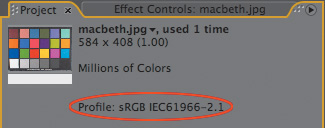
Figure 11.5. If an imported image has no color profile, After Effects assigns sRGB by default so that the file doesn’t change appearance according to the working space. You are free to override this choice in the Interpret Footage dialog.
Video formats, (QuickTime being by far the most common) don’t accept color profiles, but they do require color interpretation based on embedded data. After Effects CS3 uses an Adobe application called MediaCore to interpret these files automatically; it runs completely behind the scenes, invisible to you.
In many ways, MediaCore’s automation is a good thing. After Effects 7.0 had a little checkbox at the bottom of Interpret Footage labeled “Expand ITU-R 601 Luma Levels” that obligated you to manage incoming luminance range. With MediaCore, however, you lose the ability to override the setting. Expanded values above 235 and below 16 are pushed out of range, recoverable only in 32 bpc mode.
You know that MediaCore is handling a file when that file has Y’CbCr in the Embedded Profile info, including DV and YUV format files. In such a case the Color Management tab is completely grayed out, so there is no option to override the embedded settings.
Display Management and Output Simulation
Are we having fun yet? Output Simulation is about the most fun you can have with color management; it simulates how your comp will look on a particular device. This “device” can include film projection, which actually works better than you might expect.
![]() Close-Up: Interpretation Rules
Close-Up: Interpretation Rules
A file on your system named interpretation rules.txt defines how files are automatically interpreted as they are imported into After Effects. To change anything in this file, you should be something of a hacker, able to look at a line like
# *, *, *, "sDPX", * ~ *, *, *,
*, "ginp", *
and, by examining surrounding lines and comments, figure out that this line is commented out (with the # sign at the beginning) and that the next to last argument, "ginp" in quotes, assigns the Kodak 5218 film profile if the file type corresponds with the fourth argument, "sDPX"—if this makes you squirm, don’t touch it, call a nerd. In this case, removing the # sign at the beginning would enable this rule so that DPX files would be assigned a Kodak 5218 profile (without it, they are assigned to the working space).
Figure 11.6 shows HDTV footage displayed with the sRGB working space (or, if you prefer doing it the Adobe-sanctioned way, an HDTV Rec. 709 working space). This clip is also going to be broadcast on NTSC and PAL standard definition television, and you don’t have a standard def broadcast monitor to preview it.
Figure 11.6. The source image is set with a working space for HDTV output (not that you can evaluate the true color in a printed figure in a book).
No problem. With the viewer selected choose View > Simulate Output > SDTV NTSC. Here’s what happens:
• The appearance of the footage changes to match the output simulation. The viewer displays After Effects’ simulation of an NTSC monitor.
• Unlike when you change the working space, color values do not change with output simulation.
• The image is actually assigned two separate color profiles in sequence: a scene-referred profile to simulate the output profile you would use for NTSC (SDTV NTSC) and a second profile that actually simulates the television monitor that would then display that rendered output (SMPTE-C). To see what these settings are, and customize them, choose View > Simulate Output > Custom to open the Custom Output Simulation dialog (Figure 11.7a).

Figure 11.7a and b. The two-stage conversion in Custom Output Simulation does not change the actual RGB values but, in the case of a film projection simulation, dramatically changes the look of the footage, taking much of the guesswork out of creating a file destined for a different viewing environment.
Having trouble with View > Simulate Output appearing grayed-out? Make sure a viewer window is active when you set it; it operates on a per-viewer basis.
This gets really fun with simulations of projected film (Figure 11.7b)—not only the print stock but the appearance of projection is simulated, allowing an artist to work directly on the projected look of a shot instead of waiting until it is filmed out and projected.
Here’s a summary of what is happening to the source image in the example project:
1. The source image is interpreted on import (on the Footage Settings > Color Management tab).
2. The image is transformed to the working space; its color values will change to preserve its appearance.
3. With View > Simulate Output and any profile selected
a. Color values are transformed to the specified Output Profile.
b. Color appearance (but not actual values) is transformed to a specified Simulation Profile.
4. With View > Display Color Management enabled (which is required for step 3) color appearance (but not actual values) is transformed to the monitor profile (the one that lives in system settings, that you created when you calibrated your monitor, remember?)
And that’s all just for simulation. Let’s look now at what happens when you actually try to preserve those colors in rendered output (which is, after all, the whole point, right?).
Suppose you wish to render an output simulation (to show the filmed-out look on a video display in dailies, for example). To replicate the two-stage color conversion of output simulation, apply the Color Profile Converter effect, and match the Output Profile setting to the one listed under View > Simulate Output > Custom. Change the Intent setting to Absolute Colorimetric. Now set a second Color Profile Converter effect, and match the Input Profile to the Simulation Profile under View > Simulate Output > Custom (leaving Intent as the default Relative Colorimetric). The Output Profile in the Render Queue then should match the intended display device.
Output Profile
By default, After Effects uses Working Space as the Output Profile, and that’s most often correct. Place the comp in the Render Queue and open the Output Module; on the Color Management tab you can select a different profile to apply on output. The pipeline from the last section now looks like this:
1. The source image is interpreted on import (on the Footage Settings > Color Management tab).
2. The image is transformed to the working space; its color values will change to preserve its appearance.
3. The image is transformed to the output profile specified in Output Module Settings > Color Management.
If the profile in step 3 is different from that of step 2, color values will change to preserve color appearance. If the output format supports embedded ICC profiles (presumably a still image format such as TIFF or PSD), then a profile will be embedded so that any other application with color management (presumably an Adobe application such as Photoshop or Illustrator) will continue to preserve those colors.
In the real world, of course, rendered output is probably destined to a device or format that doesn’t support color management and embedded profiles. That’s okay, except in the case of QuickTime, which may further change the appearance of the file, almost guaranteeing that the output won’t match your composition without special handling.
QuickTime
At this writing, QuickTime has special issues of its own separate from, but related to Adobe’s color management. Because Apple constantly revises QuickTime and the spec has been in some flux, the issues particular to version 7.2 of QuickTime and version 8.01 of After Effects may change with newer versions of either software.
The current problem is that Apple has begun implementing its own form of color management, one that manages only the gamma of QuickTime files by allowing it to be specifically tagged. This tag is then interpreted uniquely by each codec, so files with Photo-JPEG compression has a different gamma than files with H.264 compression. Even files with the default Animation setting, which are effectively uncompressed, display an altered gamma.
If color management is enabled, an RGB working space and output profile is a close match to the 2.2 gamma that is written to QuickTime files, so there should be little or no mismatch.
Otherwise, for QuickTime to behave as in previous versions of After Effects, toggle Match Legacy After Effects QuickTime Gamma Adjustments in Project Settings. This prevents any gamma tag from being added to a QuickTime file.
Why was the tag added in the first place? Untagged QuickTime files don’t look or behave the same on Mac and Windows; the gamma changes to match the typical gamma of each platform (1.8 for Mac, 2.2 for Windows), causing problems when you render from one platform to the other using common compression formats such as Photo-JPEG or DV.
However, tagged QuickTime files rendered by After Effects 8.0.1 exhibit inconsistencies even between After Effects, QuickTime Player, and Final Cut Pro, so until the issue is solved—possibly by an update to QuickTime 7.2, or possibly by an After Effects revision—untagged QuickTimes will behave more reliably when displayed in various applications.
![]() Close-Up: QuickTime Is Only a Container
Close-Up: QuickTime Is Only a Container
The funny thing about QuickTime is that it isn’t a format like TIFF or JPEG; instead, it’s more like a container for such formats as TIFF and JPEG (specifically, the Animation and Photo-JPEG codecs, respectively). To create a QuickTime file you must choose a Compression Type, which is more like what we are used to calling a format. QuickTime stores this as a track in the movie (Figure 11.8).
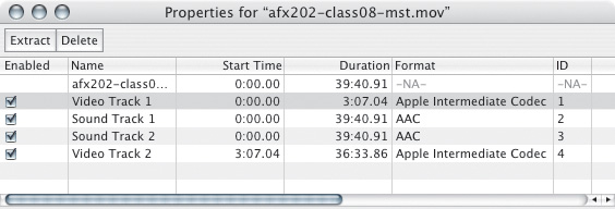
Figure 11.8. Open a QuickTime .mov file in QuickTime Player and its Properties show that it’s not an image file format but is instead a container for various tracks, each with its own potentially unique format.
These files contain tags to specify characteristics, such as frame rate and pixel aspect ratio, so that when they are imported into After Effects, even though you can adjust these settings manually, it knows how to handle them automatically. For the most part that is a good thing, but different applications interpret these settings differently and the gamma tag seems to yield results that are inconsistent with After Effects in some of the more popular applications that heavily use QuickTime, including Apple’s own Final Cut Pro.
To Bypass Color Management
Headaches like that make many artists long for the simpler days of After Effects 7.0 and opt to avoid Color Management altogether, or to use it only selectively. To completely disable the feature and return to 7.0 behavior:
• In Project Settings, set Working Space to None (as it is by default).
• Enable Match Legacy After Effects QuickTime Gamma Adjustments.
Being more selective about how color management is applied—to take advantage of some features while leaving others disabled for clarity—is really tricky and tends to stump some pretty smart users. Here are a couple of final tips that may nonetheless help:
• To disable a profile for incoming footage, check Preserve RGB in Interpret Footage (Color Management tab). No attempt will be made to preserve the appearance of that clip.
• To change the behavior causing untagged footage to be tagged with an sRGB profile, in interpretation rules.txt find this line
# soft rule: tag all untagged footage with an sRGB
profile
*, *, *, *, * ~ *, *, *, *, "sRGB", *
and add a # at the beginning of the second line to assign no profile, or change “sRGB” to a different format (options listed in the comments at the top of the file).
• To prevent your display profile from being factored in, disable View > Use Display Color Management and the pixels are sent straight to the display.
• To prevent any file from being color managed, check Preserve RGB in Output Module Settings (Color Management tab).
Note that any of the above steps is bound to lead to unintended consequences. Leaving a working space enabled and disabling specific features is tricky and potentially dangerous to your health and sanity.
Film and Dynamic Range
The previous section showed how color benefits from precision and flexibility. The precision is derived with the steps just discussed; flexibility is the result of having a wide dynamic range, because there is a far wider range of color and light levels in the physical world than can be represented on your 8 bit per channel display.
However, there is more to color flexibility than toggling 16 bpc in order to avoid banding, or even color management, and there is an analog image medium that is capable of going far beyond 16 bpc color, and even a file format capable of representing it.
Film and Cineon
Reports of film’s death have been greatly exaggerated, and the latest and greatest digital capture media, such as the Red camera, can make use of much of what works with film. Here’s a look at the film process and the digital files on which it relies.
After film has been shot, the negative is developed, and shots destined for digital effects work are scanned frame by frame, usually at a rate of about 1 frame per second. During this, the Telecine process, some initial color decisions are made before the frames are output as a numbered sequence of Cineon files, named after Kodak’s now-defunct film compositing system. Both Cineon files and the related format, DPX, store pixels uncompressed at 10 bits per channel. Scanners are usually capable of scanning 4 K plates, and these have become more popular for visual effects usage, although many still elect to scan at half resolution, creating 2 K frames around 2048 by 1536 pixels and weighing in at almost 13 MB.
Included on the book’s disc is a Cineon sequence taken with the RED Camera, showing off that digital camera’s high dynamic range and overall image quality, and provided courtesy fxphd.com. A 32 bpc project with this footage set properly to display over-range pixels is also included.
Working with Cineon Files
Because the process of shooting and scanning film is pretty expensive, almost all Cineon files ever created are the property of some Hollywood studio and unavailable to the general public. The best known free Cineon file is Kodak’s original test image, affectionately referred to as Marcie (Figure 11.9) and available from Kodak’s Web site (www.kodak.com/US/en/motion/-support/dlad/) or the book’s disc. To get a feel for working with film, drop the file called dlad_2048X1556.cin into After Effects, which imports Cineon files just fine.
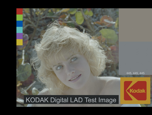
Figure 11.9. For a sample of working with film source, use this image, found on the book’s disc.
The first thing you’ll notice about Marcie is that she looks funny, and not just because this photo dates back to the ’80s. Cineon files are encoded in something called log color space. To make Marcie look more natural, open the Interpret Footage dialog, select the Color Management tab, click Cineon Settings and choose the Over Range preset (instead of the default Full Range). The log image has been converted to the monitor’s color space.
It would seem natural to convert Cineon files to the monitor’s color space, work normally, and then convert the end result back to log; you can reverse the Interpret Footage setting on the Color Management tab of the Output Module, but you can even preview the operation right in After Effects by applying the Cineon Converter effect and switching the Conversion Type to Linear to Log. But upon further examination of this conversion, you see a problem: With an 8 bpc (or even 16 bpc) project, the bright details in Marcie’s hair don’t survive the trip (Figures 11.10a, b, and c).

Figure 11.10a, b, and c. When you convert an image from log space (a) to linear (b) and then back to log (c), the bright details are lost.
What’s going on with this mystical Cineon file and its log color space that makes it so hard to deal with? And more importantly, why? Well, it turns out that the engineers at Kodak know a thing or two about film and have made no decisions lightly. But to properly answer the question, it’s necessary to discuss some basic principles of photography and light.
As becomes evident later in the chapter, the choice of the term “linear” as an alternative to “log” space for Cineon Converter is unfortunate, because “linear” specifically means neutral 1.0 gamma; what Cineon Converter calls “linear” is in fact gamma encoded.
Dynamic Range
The pictures shown in Figure 11.11 were taken within a minute of each other from a roof on a winter morning. Anyone who has ever tried to photograph a sunrise or sunset with a digital camera should immediately recognize the problem at hand. With a standard exposure, the sky comes in beautifully, but foreground houses are nearly black. Using longer exposures you can bring the houses up, but by the time they are looking good the sky is completely blown out.

Figure 11.11. Different exposures of the same camera view produce widely varying results.
The limiting factor here is the digital camera’s small dynamic range, which is the difference between the brightest and darkest things that can be captured in the same image. An outdoor scene has a wide array of brightnesses, but any device will be able to read only a slice of them. You can change exposure to capture different ranges, but the size of the slice is fixed.
Our eyes have a much larger dynamic range and our brains have a wide array of perceptual tricks, so in real life the houses and sky are both seen easily. But even eyes have limits, such as when you try to see someone behind a bright spotlight or use a laptop computer in the sun. The spotlight has not made the person behind any darker, but when eyes adjust to bright lights (as they must to avoid injury), dark things fall out of range and simply appear black.
White on a monitor just isn’t very bright, which is why our studios are in dim rooms with the blinds pulled down. When you try to represent the bright sky on a dim monitor, everything else in the image has to scale down in proportion. Even when a digital camera can capture extra dynamic range, your monitor must compress it in order to display it.
A standard 8-bit computer image uses values 0 to 255 to represent RGB pixels. If you record a value above 255—say 285 or 310—that represents a pixel beyond the monitor’s dynamic range, brighter than white or overbright. Because 8-bit pixels can’t actually go above 255, overbright information is stored as floating point decimals where 0.0 is black and 1.0 is white. Because floating point numbers are virtually unbounded, 0.75, 7.5, or 750.0 are all acceptable values, even though everything above 1.0 will clip to white on the monitor (Figure 11.12).
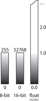
Figure 11.12. Monitor white represents the upper limit for 8-bit and 16-bit pixels, while floating point can go beyond. Floating point also extends below absolute black, 0.0, values that are theoretical and not part of the world you see (unless you find yourself near a black hole in space).
In recent years, techniques have emerged to create high dynamic range (HDR) images from a series of exposures—floating point files that contain all light information from a scene (Figure 11.13). The best-known paper on the subject was published by Malik and Debevec at SIGGRAPH ’97 (www.debevec.org has details). In successive exposures, values that remain within range can be compared to describe how the camera is responding to different levels of light. That information allows a computer to connect bright areas in the scene to the darker ones and calculate accurate floating point pixel values that combine detail from each exposure.
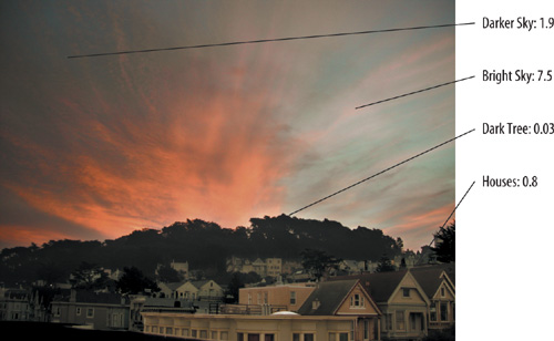
Figure 11.13. Consider the floating point pixel values for this HDR image.
But with all the excitement surrounding HDR imaging and improvements in the dynamic range of video cameras, many forget that for decades there has been another medium available for capturing dynamic range far beyond what a computer monitor can display or a digital camera can capture.
That medium is film.
Photoshop’s Merge to HDR feature allows you to create your own HDR images from a series of locked-off photos at varied exposures.
Cineon Log Space
A film negative gets its name because areas exposed to light ultimately become dark and opaque, and areas unexposed are made transparent during developing. Light makes dark. Hence, negative.
Dark is a relative term here. A white piece of paper makes a nice dark splotch on the negative, but a lightbulb darkens the film even more, and a photograph of the sun causes the negative to turn out darker still. By not completely exposing to even bright lights, the negative is able to capture the differences between bright highlights and really bright highlights. Film, the original image capture medium, has always been high dynamic range.
If you were to graph the increase in film “density” as increasing amounts of light expose it, you’d get something like Figure 11.14. In math, this is referred to as a logarithmic curve. I’ll get back to this in a moment.
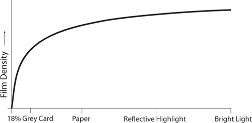
Figure 11.14. Graphing the darkening of film as increasing amounts of light expose it results in a logarithmic curve.
Digital Film
If a monitor’s maximum brightness is considered to be 1.0, the brightest value film can represent is officially considered by Kodak to be 13.53 (although using the more efficient ICC color conversion, outlined later in the chapter, reveals brightness values above 70). Note this only applies to a film negative that is exposed by light in the world as opposed to a film positive, which is limited by the brightness of a projector bulb and is therefore not really considered high dynamic range. A Telecine captures the entire range of each frame and stores the frames as a sequence of 10-bit Cineon files. Those extra two bits mean that Cineon pixel values can range from 0 to 1023 instead of the 0 to 255 in 8-bit files.
Having four times as many values to work with in a Cineon file helps, but considering you have 13.53 times the range to record, care must be taken in encoding those values. The most obvious way to store all that light would simply be to evenly squeeze 0.0 to 13.53 into the 0 to 1023 range. The problem with this solution is that it would only leave 75 code values for the all-important 0.0 to 1.0 range, the same as allocated to the range 10.0 to 11.0, which you are far less interested in representing with much accuracy. Your eye can barely tell the difference between two highlights that bright—it certainly doesn’t need 75 brightness variations between them.
A proper way to encode light on film would quickly fill up the usable values with the most important 0.0 to 1.0 light and then leave space left over for the rest of the negative’s range. Fortunately, the film negative itself with its logarithmic response behaves just this way.
Cineon files are often said to be stored in log color space. Actually it is the negative that uses a log response curve and the file is simply storing the negative’s density at each pixel. In any case, the graph in Figure 11.15 describes how light exposes a negative and is encoded into Cineon color values according to Kodak, creators of the format.

Figure 11.15. Kodak’s Cineon log encoding is expressed as a logarithmic curve, with labels for the visible black and white points that correspond to 0 and 255 in normal 8-bit pixel values.
One strange feature in this graph is that black is mapped to code value 95 instead of 0. Not only does the Cineon file store whiter-than-white (overbright) values, it also has some blacker-than-black information. This is mirrored in the film lab when a negative is printed brighter than usual and the blacker-than-black information can reveal itself. Likewise, negatives can be printed darker and take advantage of overbright detail. The standard value mapped to monitor white is 685, and everything above is considered overbright.
You may first have heard of logarithmic curves in high school physics class, if you ever learned about the decay of radioactive isotopes.
If a radioactive material has a half-life of one year, half of it will have decayed after that time. The next year, half of what remains will decay, leaving a quarter, and so on. To calculate how much time has elapsed based on how much material remains, a logarithmic function is used.
Light, another type of radiation, has a similar effect on film. At the molecular level, light causes silver halide crystals to react. If film exposed for some short period of time causes half the crystals to react, repeating the exposure will cause half of the remaining to react, and so on. This is how film gets its response curve and the ability to capture even very bright light sources. No amount of exposure can be expected to affect every single crystal.
Although the Kodak formulas are commonly used to transform log images for compositing, other methods have emerged. The idea of having light values below 0.0 is dubious at best, and many take issue with the idea that a single curve can describe all film stocks, cameras, and shooting environments. As a different approach, some visual effects facilities take care to photograph well-defined photographic charts and use the resultant film to build custom curves that differ subtly from the standard Kodak one.
As much as Cineon log is a great way to encode light captured by film, it should not be used for compositing or other image transformations. This point is so important that it just has to be emphasized again:
Encoding color spaces are not compositing color spaces.
To illustrate this point, imagine you had a black pixel with Cineon value 95 next to an extremely bright pixel with Cineon’s highest code value, 1023. If these two pixels were blended together (say, if the image was being blurred), the result would be 559, which is somewhere around middle gray (0.37 to be precise). But when you consider that the extremely bright pixel has a relative brightness of 13.5, that black pixel should only have been able to bring it down to 6.75, which is still overbright white! Log space’s extra emphasis on darker values causes standard image processing operations to give them extra weight, leading to an overall unpleasant and inaccurate darkening of the image. So, final warning: If you’re working with a log source, don’t do image processing in log space!
Video Gamma Space
Because log space certainly doesn’t look natural, it probably comes as no surprise that it is a bad color space to work in. But there is another encoding color space that you have been intimately familiar with for your entire computer-using life and no doubt have worked in directly: the video space of your monitor.
You may have always assumed that 8-bit monitor code value 128, halfway between black and white, makes a gray that is half as bright as white. If so, you may be shocked to hear that this is not the case. In fact, 128 is much darker—not even a quarter of white’s brightness on most monitors.
The description of gamma in video is oversimplified here somewhat because the subject is complex enough for a book of its own. An excellent one is Charles Poynton’s Digital Video and HDTV Algorithms and Interfaces (Morgan Kaufmann).
A system where half the input gives you half the output is described as linear, but monitors (like many things in the real world) are nonlinear. When a system is nonlinear, you can usually describe its behavior using the gamma function, shown in Figure 11.16 and the equation
Output = inputgamma 0 <= input <= 1
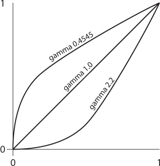
Figure 11.16. Graph of monitor gamma (2.2) with file gamma (0.4545) and linear (1.0). These are the color curves in question, with 0.4545 and 2.2 each acting as the direct inverse of the other.
In this function, the darkest and brightest values (0.0 and 1.0) are always fixed, and the gamma value determines how the transition between them behaves. Successive applications of gamma can be concatenated by multiplying them together. Applying gamma and then 1/gamma has the net result of doing nothing. Gamma 1.0 is linear.
In case all this gamma talk hasn’t already blown your mind, allow me to mention two other related points.
First, you may be familiar with the standard photographic gray card, known as the 18% gray card. But why not the 50% gray card?
Second, although I’ve mentioned that a monitor darkens everything on it using a 2.2 gamma, you may wonder why a grayscale ramp doesn’t look skewed toward darkness—50% gray on a monitor looks like 50% gray.
The answer is that your eyes are nonlinear too! They have a gamma that is just about the inverse of a monitor’s, in fact. Eyes are very sensitive to small amounts of light and get less sensitive as brightness increases. The lightening in our eyeballs offsets the darkening of 50% gray by the monitor. If you were to paint a true gradient on a wall, it would look bright. Objects in the world are darker than they appear.
Getting back to the 18% card, try applying that formula to our gamma 0.4 eyes:
0.180.4 = 0.504
Yep, middle gray.
Mac monitors have traditionally had a gamma of 1.8, while the gamma value for PCs is 2.2. Because the electronics in your screen are slow to react from lower levels of input voltage, a 1.0 gamma is simply too dark in either case; boosting this value compensates correctly.
The reason digital images do not appear dark, however, is that they have all been created with the inverse gamma function baked in to pre-brighten pixels before they are displayed (Figure 11.17). Yes, all of them.

Figure 11.17. Offsetting gammas in the file and monitor result in faithful image reproduction.
Because encoding spaces are not compositing spaces, working directly with images that appear on your monitor can pose problems. Similar to log encoding, video gamma encoding allocates more values to dark pixels, so they have extra weight. Video images need converting just as log Cineon files do.
Linear Floating-Point HDR
In the real world, light behaves linearly. Turn on two lightbulbs of equivalent wattage where you previously had one and the entire scene becomes exactly twice as bright. A linear color space lets you simulate this effect simply by doubling pixel values. Because this re-creates the color space of the original scene, linear pixels are often referred to as scene-referred values, and doubling them in this manner can easily send values beyond monitor range.
The Exposure effect in After Effects converts the image to which it is applied to linear color before doing its work unless you specifically tell it not to do so by checking Bypass Linear Light Conversion. It internally applies a .4545 gamma correction to the image (1 divided by 2.2, inverting standard monitor gamma) before adjusting.
To follow this discussion, choose Decimal in the Info panel menu. 0.0 to 1.0 values are those falling in Low Dynamic Range, or LDR—those values typically described in 8 bit as 0 to 255. Any values outside this range are HDR, 32 bpc only.
A common misconception is that if you work solely in the domain of video you have no need for floating point. But just because your input and output are restricted to the 0.0 to 1.0 range doesn’t mean that overbright values above 1.0 won’t figure into the images you create. The 11_sunrise.aep project included on your disc shows how they can add to your scene even when created on the fly.
The examples in Table 11.1 show the difference between making adjustments to digital camera photos in their native video space and performing those same operations in linear space. In all cases, an unaltered photograph featuring the equivalent in-camera effect is shown for comparison.
Table 11.1. Comparison of Adjustments in Native Video Space and in Linear Space
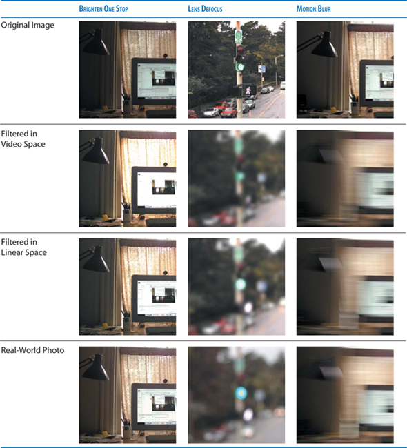
The table’s first column contains the images brightened by one stop, an increment on a camera’s aperture, which controls how much light is allowed through the lens. Widening the aperture by one stop allows twice as much light to enter. An increase of three stops brightens the image by a factor of eight (2 × 2 × 2, or 23).
To double pixel values in video space is to quickly blow out bright areas in the image. Video pixels are already encoded with extra brightness and can’t take much more. The curtain and computer screen lose detail in video space that is retained in linear space. The linear image is nearly indistinguishable from the actual photo for which camera exposure time was doubled (another practical way to brighten by one stop).
The second column simulates an out-of-focus scene using Fast Blur. You may be surprised to see an overall darkening with bright highlights fading into the background—at least in video space. In linear, the highlights pop much better. See how the little man in the Walk sign stays bright in linear but almost fades away in video because of the extra emphasis given to dark pixels in video space. Squint your eyes and you notice that only the video image darkens overall. Because a defocused lens doesn’t cause any less light to enter it, regular 8 bpc blur does not behave like a true defocus.
The table’s third column uses After Effects’ built-in motion blur to simulate the streaking caused by quick panning as the photo was taken. Pay particular attention to the highlight on the lamp; notice how it leaves a long, bright streak in the linear and in-camera examples. Artificial dulling of highlights is the most obvious giveaway of nonlinear image processing.
Artists have dealt with the problems of working directly in video space for years without even knowing. A perfect example is the Screen transfer mode, which is additive in nature but whose calculations are clearly convoluted when compared with the pure Add transfer mode. Screen uses a multiply-toward-white function with the advantage of avoiding the clipping associated with Add. But Add’s reputation comes from its application in bright video-space images. Screen was invented only to help people be productive when working in video space, without overbrights; Screen darkens overbrights (Figures 11.18a, b, and c). Real light doesn’t Screen, it Adds. Add is the new Screen, Multiply is the new Hard Light, and many other blending modes fall away completely in linear floating point.
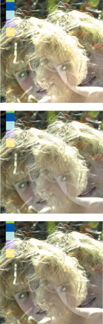
Figure 11.18a, b, and c. Adding in video space blows out (a), but Screen in video looks better (b). Adding in linear is best (c).
HDR Source and Linearized Working Space
Should you in fact be fortunate enough to have 32 bit source images containing over-range values for use in your scene, there are indisputable benefits to working in 32 bit linear, even if your final output uses a plain old video format that cannot accommodate these values.
In the Figures 11.19a, b, and c, each of the bright Christmas tree lights is severely clipped when shown in video space, which is not a problem so long as the image is only displayed, not adjusted. Figure 11.19b is the result of following the rules by converting the image to linear before applying a synthetic motion blur. Indeed, the lights create pleasant streaks, but their brightness has disappeared. In Figure 11.19c the HDR image is blurred in 32 bit per channel mode, and the lights have a realistic impact on the image as they streak across. Even stretched out across the image, the streaks are still brighter than 1.0. Considering this printed page is not high dynamic range, this example shows that HDR floating point pixels are a crucial part of making images that simulate the real world through a camera, no matter the output medium.

Figure 11.19a, b, and c. An HDR image is blurred without floating point (a) and with floating point (b), before being shown as low dynamic range (c). (HDR image courtesy Stu Maschwitz.)
The benefits of floating point aren’t restricted to blurs, however; they just happen to be an easy place to see the difference most starkly. Every operation in a compositing pipeline gains extra realism from the presence of floating point pixels and linear blending.
Figures 11.20a, b, and c feature an HDR image on which a simple composite is performed, once in video space and once using linear floating point. In the floating point version, the dark translucent layer acts like sunglasses on the bright window, revealing extra detail exactly as a filter on a camera lens would. The soft edges of a motion-blurred object also behave realistically as bright highlights push through. Without floating point there is no extra information to reveal, so the window looks clipped and dull and motion blur doesn’t interact with the scene properly.

Figure 11.20a, b, and c. A source image (a) is composited without floating point (b) and with floating point (c). (HDR image courtesy Stu Maschwitz.)
Linear floating-point HDR compositing uses radiometrically linear, or scene-referred, color data. For the purposes of this discussion, this is perhaps best called “linear light compositing,” or “linear floating point,” or just simply, “linear.” The alternative mode to which you are accustomed is “gamma-encoded,” or “monitor color space,” or simply, “video.”
32 Bits per Channel
Although it is not necessary to use HDR source to take advantage of an HDR pipeline, it offers a clear glimpse of this brave new world. Open 11_treeHDR_lin.aep; it contains a comp made up of a single image in 32 bit EXR format (used to create Figures 11.19a, b, and c). With the Info panel clearly visible, move your cursor around the frame.
Included on the disc are two similar images, sanityCheck.exr and sanityCheck.tif. The 32 bpc EXR file is linearized, but the 8 bpc TIFF file is not. Two corresponding projects are also included, one using no color profile, the other employing a linear profile. These should help illustrate the different appearances of a linear and a gamma-encoded image.
As your cursor crosses highlights—the lights on the tree, specular highlights on the wall and chair, and most especially, in the window—the values are seen to be well above 1.0, the maximum value you will ever see doing the same in 8 bpc or 16 bpc mode. Remember that you can quickly toggle between color spaces by Alt/Option-clicking the project color depth identifier at the bottom of the Project panel.
Any experienced digital artist would assume that there is no detail in that window—it is blown out to solid white forevermore in LDR. However, you may have noticed an extra icon and accompanying numerical value that appears at the bottom of the composition panel in a 32 bpc project (Figure 11.21). This is the Exposure control; its icon looks like a camera aperture and it performs an analogous function—controlling the exposure (total amount of light) of a scene the way you would stop a camera up or down (by adjusting its aperture).
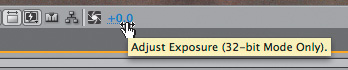
Figure 11.21. Exposure is an HDR preview control that appears in the Composition panel in 32 bpc mode.
Drag to the left on the numerical text and something amazing happens. Not only does the lighting in the scene decrease naturally, as if the light itself were being brought down, but at somewhere around -10.0, a gentle blue gradient appears in the window (Figure 11.22a).

Figure 11.22a and b. At -10 Exposure (a), the room is dark other than the tree lights and detail becomes visible out the window. At +3, the effect is exactly that of a camera that was open 3 stops brighter than the unadjusted image (b).
Drag the other direction, into positive Exposure range, and the scene begins to look like an overexposed photo; the light proportions remain and the highlights bloom outward (Figure 11.22b).
The Exposure control in the Composition panel is a preview-only control (there is an effect by the same name that renders); scan with your cursor and Info panel values do not vary according to its setting. This control offers a quick way to check what is happening in the out-of-range areas of a composition. With a linear light image, each integer increment represents the equivalent of one photographic stop, or a doubling (or halving) of linear light value.
Keep in mind that for each 1.0 adjustment upward or downward of Exposure you double (or halve) the light levels in the scene. Echoing the earlier discussion, a +3.0 Exposure setting sets the light levels 8 × (or 23) brighter.
Incompatible Effects and Compander
Most effects don’t, alas, support 32 bpc, although there are dozens that do. Apply a 16 bpc or (shudder) 8 bpc effect, however, and the overbrights in your 32 bpc project disappear—all clipped to 1.0. Any effect will reduce the image being piped through it to its own color space limitations. A small warning sign appears next to the effect to remind you that it does not support the current bit depth. You may even see a warning explaining the dangers of applying this effect.
![]() Close-Up: Floating Point Files
Close-Up: Floating Point Files
As you’ve already seen, there is one class of files that does not need to be converted to linear space: floating point files. These files are already storing scene-referred values, complete with overbright information. Common formats supported by After Effects are Radiance (.hdr) and floating point TIFF, but the newest and best is Industrial Light + Magic’s OpenEXR format. OpenEXR uses efficient 16-bit floating point pixels, can store any number of image channels, supports lossless compression, and is already supported by most 3D programs thanks to being an open source format.
If the knowledge that Industrial Light + Magic created a format to base its entire workflow around linear doesn’t give it credence, it’s hard to say what will.
Of course, this doesn’t mean you need to avoid these effects to work in 32 bpc. It means you have to cheat, and After Effects includes a preset allowing you to do just that: Compress-Expand Dynamic Range (contained in Effects & Presets > Animation Presets > Image – Utilities; make certain Show Animation Presets is checked in the panel menu).
This preset actually consists of two instances of the HDR Compander effect, which was specifically designed to bring floating point values back into LDR range. The first instance is automatically renamed Compress, and the second, Expand, which is how the corresponding Modes are set. You set the Gain of Compress to whatever is the brightest overbright value you wish to preserve, up to 100. The values are then compressed into LDR range, allowing you to apply your LDR effect. The Gain (as well as Gamma) of Expand is linked via an expression to Compress, so that the values round-trip back to HDR. (Figure 11.23).

Figure 11.23. The Compress-Expand Dynamic Range preset round-trips HDR values in and out of LDR range; the Gain and Gamma settings of Compress are automatically passed to Expand via preset expressions. Turn off Expand and an image full of overbright values will appear much darker, the result of pushing all values downward starting at the Gain value.
If banding appears as a result of Compress-Expand, Gamma can be adjusted to weight the compressed image more toward the region of the image (probably the shadows) where the banding occurs. You are sacrificing image fidelity in order to preserve a compressed version of the HDR pipeline.
Additionally, there are smart ways to set up a project to ensure that Compander plays the minimal possible role. As much as possible, group all of your LDR effects together, and keep them away from the layers that use blending modes, where float values are most essential. For example, apply an LDR effect via a separate adjustment layer instead of directly on a layer with a blending mode. Also, if possible, apply the LDR effects first, then boost the result into HDR range to apply any additional 32 bpc effects and blending modes.
Blend Colors Using 1.0 Gamma
After Effects CS3 adds a fantastic new option to linearize image data only when performing blending operations: the Blend Colors Using 1.0 Gamma toggle in Project Settings. This allows you to take advantage of linear blending, which makes Add and Multiply blending modes actually work properly, even in 8 bpc or 16 bpc modes.
The difference is quite simple. A linearized working space does all image processing in gamma 1.0, as follows:
footage --> to linear PWS ->
Layer ->
Mask -> Effects -> Transform ->
Blend With Comp ->
Comp -> from linear PWS to OM space ->
output
whereas linearized blending performs only the blending step, where the image is combined with the composition, in gamma 1.0:
footage --> to PWS ->
Layer ->
Mask -> Effects -> Transform -> to linear PWS ->
Blend With Comp -> to PWS ->
Comp -> from PWS to OM space ->
output
Special thanks to Dan Wilk at Adobe for detailing this out.
Because effects aren’t added in linear color, blurs no longer interact correctly with overbrights (although they do composite more nicely), and you don’t get the subtle benefits to Transform operations; After Effects’ much maligned scaling operations are much improved in linear floating point. Also, 3D lights behave more like actual lights in a fully linearized working space.
I prefer the linear blending option when in lower bit depths and there is no need to manage over-range values; it gives me the huge benefit of more elegant composites and blending modes without forcing me to think about managing effects in linear color. Certain key effects, in particular Exposure, helpfully operate in linear gamma mode.
Output
Finally, what good is it working in linear floating point if the output bears no resemblance to what you see in the composition viewer? Just because you work in 32 bit floating point color does not mean you have to render your images that way.
Keeping in mind that each working space can be linear or not, if you work in a linearized color space and then render to a format that is typically gamma encoded (as most are), the gamma-encoded version of the working space will also be used. After Effects spells this out for you explicitly in the Description section of the Color Management tab.
To this day, the standard method to pass around footage with over-range values, particularly if it is being sent for film-out, is to use 10 bit log-encoded Cineon/DPX. This is also converted for you from 32 bpc linear, but be sure to choose the Working Space as the output profile and that in Cineon Settings, you use the Standard preset.
The great thing about Cineon/DPX with a Standard 10-bit profile is that it is a universal standard. Facilities around the world know what to do with it even if they’ve never encountered a file with an embedded color profile. As was detailed earlier in the chapter, it is capable of taking full advantage of the dynamic range of film, which is to this day the most dynamic display medium widely available.
Conclusion
This chapter concludes Section II, which focused on the most fundamental techniques of effects compositing. In the next and final section, you’ll apply those techniques. You’ll also learn about the importance of observation, as well as some specialized tips and tricks for specific effects compositing situations that re-create particular environments, settings, conditions, and natural phenomena.