Hypertext links allow you to jump around a Web page, a Web site, or the entire Web. All links, whether internal or external, are created using the anchor tag (<a>) to link an image or text to another location. However, different types of links should be styled differently.
Hypertext links in a block of text generally have a different emphasis than site navigation, while buttons are used to highlight specific functionality. CSS provides us with an easy way to take a single HTML tag and give it a multitude of looks based on its context.
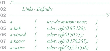
All navigation in a Web browser, whether a hypertext link or a menu option, relies on the anchor tag (a). This tag has four distinct states accessed through the link pseudo-classes: a:link, a:visited, a:hover, and a:active. An effective way of showing the change in states is swapping the background image. However, image swapping has two important shortcomings:
01 | Download time |
02 | Image flashing |
To overcome these problems, developers use a technique called CSS sprites, placing all four link state images into a single image file and then using background positioning to move the background around within the text box boundaries. The unneeded images are waiting and ready but cropped from view by the elements text box.

Remember to style links not only for how they will appear when the page first loads, but also for the different states they have as the user interacts with them. You should style each of the four link states separately. In addition, since all links are controlled through the same HTML tag, it’s important to differentiate their styles based on context.
For voxLibris, a default style has been set up to turn underlining off in all four states and then to set a color for all four of the states (01–08). You can set other styles, of course, but color is the most common way to differentiate link states.
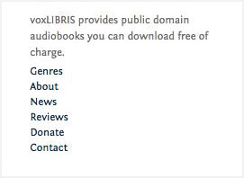
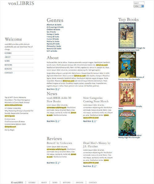
If the link is in a paragraph, styles are also included to add a background image—one that mimics a highlight marker—that differentiates these links from others, such as those in the navigation menu and genre list (12–15).
Links can also be given the class readmore within a paragraph to be given special treatment using CSS sprites as described in the previous section (16–28).


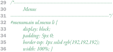
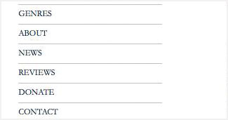
Menus are a list of links that allow the user to navigate sections and sub-sections within a Web site. Although the links could simply be grouped together, it’s better to use the list tag (<li>) to show their relationship. Navigation links also use the anchor tag, but some different styles should be added to differentiate them. Whether the top level (sometimes called “global”) navigation menus run horizontally or vertically, it’s imperative that they are clear and easy to identify.
| Horizontal menus generally run down the left column of the page, providing top level navigation for the Web site (29–36). |
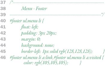
| Vertical menus built from a list of links are floated next to each other, generally somewhere at the top of the page above or below the header. Vertical menus also tend to be placed on the footer ostensibly as backup navigation, but actually because it improves search engine optimization (37–46). |


Buttons are used to highlight important content on a site that may not fit into a global menu.
voxLibris has buttons for each of the genres it covers (50–68 and 95–118). Rather than simply placing an image tag in the HTML—which limits future design possibilities—each button has an ID associated with it to load a specific background image, which is placed into the list tag with some design enhancements using border-radius and box-shadow. The final trick is to move the caption text underneath the button image by setting the top margin in the list tag to 50px.
On top of this (literally), in the anchor tag, a transparent PNG background is used to create a gel effect, so that the button looks like it has a glossy top (69–91). To avoid trouble, I’m turning this off in IE6 with _background: none;.


Using Design Enhancements
Just because a browser does not support a particular property does not mean you shouldn’t use it—as long as it does not interfere with the other browsers.
For example, in the three cases here, the buttons are displayed and easily accessible. FF3, which supports border-radius, has rounded corners, Sa4, which supports both box-shadow and border-radius has rounded corners and a drop shadow. Compare these two versions to IE8, which does not support either of the properties. The buttons are still just as usable, but not quite as slick looking.

You could use images to create the same look and feel in all three browsers, but CSS design enhancements provide several advantages:
Easy to change—. Design changes can be made directly in the CSS without having to recut images.
Design flexibility—. Design elements like drop shadows and rounded corners are difficult to achieve with images.

Smaller files sizes—. CSS code will generally download faster than an image file.
Future compatibility—. All of these styles will be standard on all browsers in the future, but the kludge you used to get an image solution to work now may not work later.