
Chapter 17. Actions
There is much more to the notion of actions than we’ve covered in our examples so far. Chapter 6, “Adding Actions,” ended with an explanation of why Hyperbola does not use declarative actions, a standard technique in Eclipse. To recap, the actions in Hyperbola are defined and placed programmatically by the ActionBarAdvisor. This technique is simple and ideal for small, closed applications. In Chapter 14, “Adding Software Management,” we talked about updating deployed applications and adding new plug-ins. How do these new plug-ins add their actions? The answer lies in the Workbench’s support for declarative actions.
This chapter is split into two parts. The first explains when and how to use declarative actions, and the second gives useful tips and tricks for writing product-quality actions. Specifically in this chapter we show you how to
• Decide between using declarative and programmatic actions
• Add declarative actions to Hyperbola
• Use retargetable actions to define pluggable behavior
• Write actions that correctly track selection
• Show progress for long-running actions
• Use actions in alternate ways, such as showing text, creating multirow toolbars, and adding controls to toolbars
• Add contributions to the status line
17.1 Overview
Before introducing declarative actions, let’s take a step back and look at what an action is all about. The primary role of actions is to expose application behavior to the user. When you click on a menu item or toolbar item or invoke a key sequence, an action is run. Furthermore, you can set up a system so that the same action is placed in a menu and a toolbar and bound to a key sequence—actions allow you to separate behavior from placement. Actions also determine if they are enabled, figure out what elements to work on, run the work, and display the results.
Below is a list of the basic responsibilities of actions. As you explore the various ways of defining and using actions, remember that these responsibilities apply regardless of how or where they are defined and used—only the syntax is different.
Placement—Actions can be placed in many areas of the Workbench: in views, editors, context menus, and top-level menus and toolbars. When they are created, they are given a reference to the container in which they are placed, allowing them to query for selection or access other information.
Rendering—There are several types of actions, for example, menus, toolbar buttons, radio buttons, drop-down menu buttons, and so on. When you create an action, you have to decide what type of action it is and how it will be rendered in the UI. Actions also contain basic information, such as a label, an icon, and a tool tip, which display and describe the action to the user.
Input and enablement—Actions usually perform work on a set of objects. The input to an action is defined by the selection in the related UI part. For example, if an action is in a view, the related selection is that of the widgets in the view. An action in the Workbench window uses the selection that comes from the active view or editor. As an action’s context changes (e.g., its input changes or its container state changes), the action must update its enablement state.
Behavior—When an action is eventually run, it performs some operation on its input. If the action is long-running, it should show progress to the user.
Binding—An action can be controlled by the keyboard instead of by its explicit UI element. Actions can also be bound to other mechanisms that control when they are run.
When you add an action, you have to implement each of these responsibilities. Figure 17-1 shows how the Build action from the IDE product implements these responsibilities.
Figure 17-1 Action responsibilities
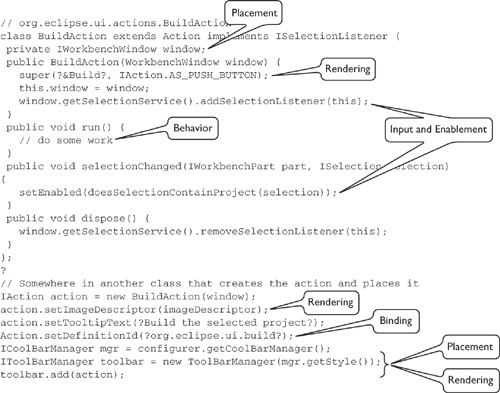
The Build action is placed in the top-level toolbar and menu, it is rendered as a push button with a name and image, it’s enabled when at least one project is selected, and its input is the selected project. Its behavior is to build the selected project.
17.2 Declarative Actions in Hyperbola
Imagine a scenario where Hyperbola is extended by the Debug and MUC (multiuser chat) plug-ins. Ideally, the actions defined by these plug-ins are placed side by side in some top-level menu, and the fact that they originate from different sources is hidden. This promotes the added behavior as an integral part of Hyperbola rather than as something tacked onto the side.
Here we focus on this scenario and talk about
• The different kinds of declarative actions
• Extending the ActionBarAdvisor to support action contributions into the top-level menu and toolbar
• Using an action set to add two declarative actions, Export Contacts and Import Contacts, to Hyperbola’s top-level menu and toolbar in several locations to demonstrate placement control
• Adding a context menu with Export and Import actions to the Contacts view
17.2.1 Declarative Actions
One of the Workbench’s main roles is as an integration point. Plug-ins contribute actions, views, and the like to the Workbench, and the Workbench structures, places, and manages them. Diverse sets of plug-ins are thus integrated and the user experience is improved. To participate in the integration, however, plug-ins must supply their contributions declaratively rather than programmatically.
The Workbench supports the following extension points into which plug-ins make action contributions, describing the action’s implementation, placement, icon, and label. Armed with a set of extensions to these extension points, the Workbench inserts the actions into existing menus and toolbars.
org.eclipse.ui.actionSets—This extension describes a set of menus and actions that is added to the top-level menu and toolbar. Action sets are enabled and disabled as a group.
org.eclipse.ui.popupMenus—This extension point is used to contribute actions to context menus that have been registered with the Workbench.
org.eclipse.ui.editorActions—This extension point is used to add actions to the top-level menu and toolbar when a particular editor is enabled.
org.eclipse.ui.viewActions—This extension point is used to add actions to the local menu and toolbar for views.
Within the context of a small application, such as Hyperbola, there is usually no need to use declarative actions. However, there are benefits of using declarative actions that should be considered:
• Declarative actions are shown in the UI without loading their associated plug-in. In large applications with many plug-ins, this is crucial to scalability.
• Dynamic reconfiguration of top-level menus and toolbars based on the active perspective is enabled by associating action sets with perspectives.
• Users can configure top-level menus and toolbars via the perspective customization dialog (see the ActionFactory.EDIT_ACTION_SETS action).
The downside of declarative actions is that they cannot build on one another, and their ordering within a menu is controlled by the Workbench. In other words, you cannot deterministically order two actions sets within the same menu. The other issue is that toolbar and menu paths are error-prone. It’s hard to find the right paths, and when you get it wrong, menus just do not show up.
17.2.2 Allowing Contributions
To take advantage of the benefits of declarative actions, RCP applications should define a top-level menu and toolbar skeleton in the ActionBarAdvisor and use declarative actions for everything else.
Even if you choose not to use declarative actions for your part of the application, you should design your application so that other plug-ins can extend its menus and toolbars. This way, third parties can add functions and you can ship additional functions after the main product ships.
The first step is to add placeholders into the top-level menus and toolbars. This is where the declarative actions will plug in. Placeholders are added to IContributionManager instances, such as ToolbarManager or MenuManager. They are named entities that are referenced from declarative action definitions.
Hyperbola already has a named top-level menu. In the ActionBarAdvisor method fillMenu(), the Hyperbola menu is created as a MenuManager using the snippet below. The first parameter to the constructor is the menu name, as shown in the UI, and the second, hyperbola, is the ID of the menu.
org.eclipsercp.hyperbola/ApplicationActionBarAdvisor
MenuManager hyperbolaMenu = new MenuManager("&Hyperbola", "hyperbola");
You can define placeholders using the hyperbola menu as part of the path (e.g., hyperbola/placeholder). Once the placeholders are defined, the Workbench takes care of the rest—it decides which contributed actions are applicable and automatically inserts them when the toolbar or menu is shown.
The Workbench supplies a standard placeholder ID that is used to mark the location in a contribution manager where contributions are added. The constant IWorkbenchActionConstants.MB_ADDITIONS is used in the code snippets below to identify placeholders. It is then used in plugin.xml files of plug-ins contributing action sets to link actions into menus and toolbars.

Let’s change Hyperbola’s ActionBarAdvisor to allow contributed actions in the following areas:
• On the menu bar, between the Hyperbola and Help menus
• In the Hyperbola menu, between the first two groups
• At the end of the toolbar
• In the Contacts view’s context menu
We cover the first three actions next and the context menu action in Section 17.2.4, “Context Menus.”
There’s no magic when adding placeholders; you simply add them the same way that actions are added. The following code snippet from Hyperbola’s ActionBarAdvisor adds a placeholder to the Hyperbola menu as well as to the menu bar and the end of the toolbar:
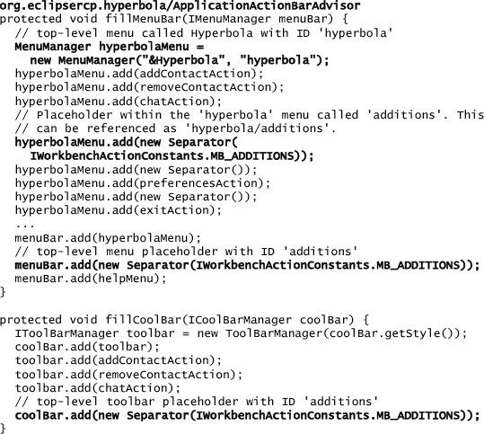
Placeholders are added as either Separators or GroupMarkers. Separators surround all contributions by the appropriate separators, whereas contributions to a GroupMarker are added as is, without any additional separators.
Tip
To support action contributions to menus anywhere in your application, not just at the top level of menus, you must document the menu and group IDs defined by your application. The Workbench provides a list of commonly used menu IDs in IWorkbenchActionConstants. The IDE product uses these, but you are free to use your own identifiers instead. These IDs effectively become API and so should be documented and maintained.
17.2.3 Declaring Actions
Now that the placeholders are in place, let’s declaratively add some action sets to Hyperbola. In this example the two actions called Export Contacts and Import Contacts are added to the three placeholders we just defined. In practice, placing an action in one or two spots is enough, but here we want to demonstrate all the cases.
The following action set adds a menu called Tools to the top-level menu bar and adds the Import and Export actions to that menu:
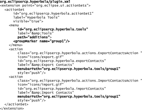
The first thing in an action set is its ID. An ID must be globally unique relative to all other action set IDs. The easiest way to ensure uniqueness is to prefix the ID with the ID of the contributing plug-in.
Action sets are not normally shown to the user. The actionSet element’s label attribute is used to represent the action set in the perspective configuration dialog (see ActionFactory.EDIT_ACTION_SETS). The actionSet element’s visible attribute determines if the action set should be visible in all perspectives. If this is set to false, perspectives determine which action sets to show using IPageLayout.addActionSet(String). When true, the action set can be hidden by the user only if the perspective customization dialog is shown, or by calling the IWorkbenchPage method hideActionSet(String).
The menu element defines a top-level menu into which actions can be placed. The menu element’s path attribute causes the menu to be placed in the menu bar in the additions placeholder that we defined in the code earlier. The menu element’s label attribute defines the text that is shown in the UI to represent the menu. This menu element also defines a groupMarker element that defines a placeholder for actions. The menu element’s menu ID is important because it is used to place the actions defined in the containing actionSet element. Again, the menu element’s ID should be unique among menus.
The action elements carry enough information to support displaying an action without running any code. That information includes the label, icon, and action style (e.g., push button, toggle, radio). The location of the action is determined by the action element’s menubarPath attribute. The path consists of multiple menu IDs with a terminating group ID. In this example the menu and group happen to be defined by the action set’s menu, and the menu itself is placed in the menu bar.
The implementation of an action is defined by its class attribute. The supplied class must implement an interface that is particular to the extension point to which the action is being added. For example, here the class must implement IWorkbenchWindowActionDelegate. This gives the action a Workbench window as context for its operation. If the action was added to a view or editor, it would have to implement a different interface. All these interfaces extend IActionDelegate. Let’s take a look at the ImportContactsAction:

Action classes for declarative actions are very similar to a regular IAction, but they have additional methods such as init() and selectionChanged(). An IAction is not used directly because the Workbench is lazy. It places proxy IAction instances into menus and toolbars instead of instantiating declared actions. The proxy actions keep a reference to the action delegate for which they are serving as a proxy.
Notice that run(IAction) and selectionChange(IAction) take an action argument—this is the proxy. Under the covers, the proxy is the action that is part of the menu. As such, changing how the action appears (e.g., its enablement or label) requires changing the proxy action. The proxy action uses the information from the declarative action’s description to display, perform basic enablement, and then ultimately run the action.
Adding these actions to the Hyperbola menu and the toolbar follows the same pattern. The only difference is that the menubarPath attribute has a different value. For example, adding the following action to the action set places the Import and Export actions, as shown in Figure 17-2.
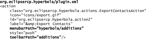
Figure 17-2 Import and Export declarative actions in the menu and toolbar

Here the hyperbola/additions menu path and additions toolbar path refer directly to the names of the menus and placeholders we added to the Hyperbola ActionBarAdvisor earlier.
17.2.4 Context Menus
It is often convenient for users to act directly on a UI element using a context menu or by double-clicking, for example, initiating a chat in Hyperbola by double-clicking on a contact in the Contacts view. So far Hyperbola does not have any context actions, let alone any extensible structure for adding them. In this section we add a context menu and then add some declarative actions to it.
The snippet below shows the ContactsView method makeActions(). This method is called from the ContactsView method createControlPart() and does the following:
• Adds a context menu.
• Adds the chat action to the menu.
• Adds the MB_ADDITIONS placeholder to the menu.
• Registers the menu with the Workbench.
• Initializes double-click behavior on the tree viewer.

The ChatAction used here is the same one that was added to Hyperbola’s top-level menu in Chapter 7, “Adding a Chat Editor.” The context menu is defined using the MenuManager in the same way as the top-level menus defined previously.
The registerContextMenu() method is used to hook the menu into the Workbench and its declarative action mechanisms. When a registered menu is shown, the Workbench adds any related declarative contributions. In the case of a context menu, contributions to the org.eclipse.ui.popupMenus extension point that apply to the current selection are added.
The last step is to define the declarative actions for Export and Import that place them in the context menu. The snippet below adds an org.eclipse.ui.popupMenus extension that applies to any instance of RosterEntry. Notice that here the action is not placed in a particular menu. Rather, it is scoped so that when a RosterEntry (e.g., a contact) is selected, the action is available and is added to any open context menu.

Apart from the objectContribution element, the actions in this example are described in the same manner as action sets. The existing ExportContactsAction implementation is even reused after one small change—the action class must implement IObjectActionDelegate in addition to IWorkbenchWindowActionDelegate. The new interface is needed so the action can track its context. In the case of a context menu action, the context is the UI part that is showing the context menu.
17.3 Standard Workbench Actions
In Chapter 6 you saw that the Workbench defines a set of reusable actions. These actions are defined as inner classes of org.eclipse.ui.actions.ActionFactory and are instantiated and used as regular actions.
exitAction = ActionFactory.QUIT.create(window);
The reusable actions have preconfigured names, icons, IDs, and action definition IDs, but any of these attributes can be overridden after the action is created.
exitAction.setText("&Quit"); // Change from Exit to Quit.
All actions created from the ActionFactory are instances of IWorkbenchAction. IWorkbenchAction extends IAction and adds the dispose() method since instances must be deleted when their associated window is closed.
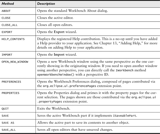
Before implementing an action in your application, check to see if the ActionFactory defines a related action. Reusing these standard actions gives your application a more consistent look and feel. A partial list of reusable actions is given in Table 17-1.
Table 17-1 Partial List of Actions Available from ActionFactory
Reusable Preference Pages and Views
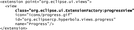
The Workbench also provides a set of reusable preference pages and views. The complete list can be found on the org.eclipse.ui.ExtensionFactory class. It includes common things such as the Keys, Colors and Fonts, and Decorators preference pages, as well as the Progress view.
The extension factory provides access to these pages and views via a set of identifiers. The identifiers are used in view extensions as shown below. Notice that the markup is the same as for a regular view extension, but instead of specifying the view’s implementation class directly, the ExtensionFactory is used and the view identifier is provided after the “:”.
See IExecutableExtensionFactory for how to define your own factories.
17.4 Retargetable Actions
The Workbench defines yet another special type of actions called retargetable actions. Retargetable actions are similar to regular actions except they do not have behavior. Instead, their behavior is supplied by another action. Hyperbola does not have a particularly compelling use case for retargetable actions, so to illustrate the concept we look at implementing Back and Forward buttons in an RCP-based Web browser application.
Note
The source code for an RCP Web browser that uses retargetable actions is available in the Eclipse Platform CVS repository, in the org.eclipse.ui.examples.rcp.browser project.
The Web browser application uses several views, each with its own browser widget. The main toolbar has Back and Forward actions that control the active browser. If there is only one set of actions in the toolbar, how do they control the view that happens to be active?
One way to implement this is to create two regular actions that can be accessed statically from the views and implement the views to hook themselves to the actions when they become active. When the actions run, the current view gets called and performs the required behavior. The views also have to unregister themselves when they are deactivated.
This is essentially what retargetable actions do, with the benefit that the Workbench provides the management of binding actions to retargetable actions as Workbench parts are activated and deactivated.
Note
Some of the reusable actions defined on ActionFactory are retargetable actions (e.g., COPY, PASTE, CUT, NEXT, PREVIOUS, RENAME, and DELETE). By using these actions, your application exposes standard icons, labels, and key bindings that are familiar to users.
The following snippet shows how the Forward retargetable action is added to the toolbar in the ActionBarAdvisor. Notice that retargetable actions are added in exactly the same way as regular actions.

When creating a retargetable action, you have to specify the ID for the action and the default label. The ID is used to match the action that implements the behavior to the retargetable action that places it.
Now that the Forward action is in the toolbar, the Browser view needs to register its implementation of the Forward action with the Workbench. To do this, it implements an IAction and registers it as a global action handler with the Browser view’s action bars. This is usually done when the part creates its actions and controls, as shown in the next snippet. The ID of the retargetable action specified earlier is used to link in the new action.

The Workbench handles the details of ensuring that the retargetable action is associated with the active view or editor. When retargetable actions are not linked with an action, they are automatically disabled.
17.5 Consolidating Declarative Actions
The Workbench offers some facilities for aggregating and presenting similar actions. For example, the New wizard dialog presents a set of wizards and allows users to choose the one they want. Plug-ins hook into this facility by contributing extensions to the relevant Workbench extension points. The Workbench exposes chooser dialogs or menus for preference pages, property pages, new wizards, import wizards, and export wizards. See Section 15.5.3, “Scalability,” for the complete extension point reference.
This approach is powerful for applications as they can expose common access points for exporting, importing, and creating new things without having to know or determine what kinds of new things or exports and imports are supported. The mechanism is useful for plug-in writers as their actions are integrated into the host application, alongside other related functions.
The actions that show dialogs or menus are available on ActionFactory as ActionFactory.EXPORT, ActionFactory.IMPORT, ActionFactory.NEW, ActionFactory.PREFERENCES, and ActionFactory.PROPERTIES. The following snippet from Chapter 11, “Adding a Login Dialog,” shows how these actions are added to toolbars or menus:

If the standard dialogs and menus are not suitable, you can access the contributions directly and build your own UI. The extension registries for the contributions to the Import, Export, and New wizards are accessed by calling the appropriate IWorkbench method, get[New|Import|Export]WizardRegistry().
The Workbench also exposes a handy New menu that is similar to the Perspectives and Views menus shown in Chapter 16, “Perspectives, Views, and Editors.” This is a cascading menu with quick access to the list of contributed new wizards. You can add this menu using the ContributionItemFactory.NEW_WIZARD_SHORTLIST helper, as shown here:

To keep menus short, the quick access list of wizards shown is the set of new wizards explicitly defined by the active perspective. Perspectives configure the list using the IPageLayout method addNewWizardShortcut(String).
17.6 Toolbar Action Tricks
Desktop applications often need to show more than buttons in the toolbar. This adds a bit of polish and usability to the look and feel of the application. In this section we show you how to tweak your toolbar actions and have them show text, wrap on multiple lines, and host various controls.
17.6.1 Showing Images and Text
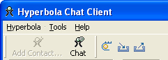
Showing both images and text for certain toolbar items is a common requirement. The text is generally placed either to the right of or below the image for the action, as shown in Figure 17-3. This improves usability for new users who do not know the meanings of the images. The Workbench supports mixing images and text, but only with programmatic actions.
Figure 17-3 Toolbar actions with text
Let’s walk through how this is done. When an application contributes actions to the top-level toolbar, it adds them to an ICoolBarManager. The ICoolBarManager interface extends IContributionManager and can manage both IActions and IContributionItems. Contributed items wrap the SWT controls that are shown in the contribution manager and are ultimately responsible for rendering the items in a menu, a composite, or a coolbar.
JFace provides a helper class called ActionContributionItem for directly adding actions to a contribution manager. Contributed action items effectively transfer the properties of an action down to an SWT control. As such, they can be used to configure whether or not text is shown on the toolbar.
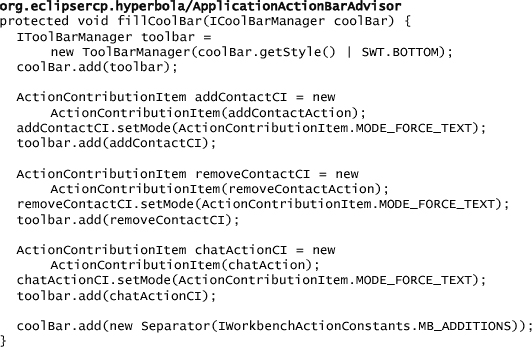
To control the ActionContributionItem for an action, first create the toolbar with a style flag that includes SWT.BOTTOM or SWT.RIGHT to indicate where to show the text. Then, for each action, create an ActionConfigurationItem and set its mode to ActionContributionItem.MODE_FORCE_TEXT. Next, call ToolBarManager.add(IContributionItem) to add the contribution item to the toolbar. The following code shows how to do this in Hyperbola’s ActionBarAdvisor:
17.6.2 Adding Controls to the Toolbar
Another common feature is to place SWT controls in the toolbar instead of in buttons. Again, the key here is to put an IContributionItem into the toolbar instead of an IAction. This works because both ToolItems and CoolItems allow controls to be set as their contents. JFace includes a helper class, ControlContribution, that supports adding controls to toolbars and coolbars. The code for ControlContribution is shown here:
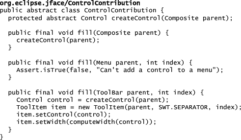
To add your own control, subclass ControlContribution and implement createControl(Composite) to return the desired control. The returned control is added to the toolbar by placing it in a dedicated tool item. The following snippet from Hyperbola’s ActionBarAdvisor shows how to place a combo box into the Hyperbola main toolbar:

17.7 Adding Contributions to the Status Line
In Chapter 6 you added a presence indicator to Hyperbola’s status line. You may have noticed that as parts are activated—for example, activating the Contacts view, then a chat editor—this status line indicator disappears. This happens because the indicator was added to the shared message area of the status line (refer to Chapter 6 for an overview of the areas in the status line). A better approach is to add the indicator to the contribution area so that it remains visible across part switches.
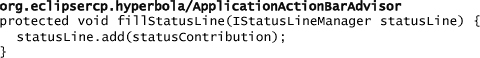
Actions or contribution items can be added to the status line in the ActionBarAdvisor method fillStatusLine(). To maintain some stability in the status line, you should add contributions to predefined named groups that are defined on StatusLineManager as BEGIN_GROUP, MIDDLE_GROUP, and END_GROUP. This enables aligning global contributions to the right or left of the contribution area.
Status line contributions are very similar to the ControlContribution classes used in the last section. Instead of adding a control to a toolbar, they add controls to a composite—the status line is really just a fancy composite.
The sample code for this chapter includes a custom contribution item called StatusLineContribution, which uses a CLabel control to show its contents. A CLabel is a custom SWT control that displays both an image and a label together. The fill(Composite) method in StatusLineContribution is called to add the contribution to the status line. You can add just about anything you like at this point. Here we use two CLabels, the first to show a separator and the other to show an icon followed by text:

The StatusLineLayoutData is a special layout used to tell the status line how much room is needed for the contribution area. These areas cannot be resized dynamically, so you must commit to a size when they are created.
To add the contribution to the status line, create the contribution in the ActionBarAdvisor method makeActions() and add it as follows:
17.8 Reporting Progress
In a perfect world, actions run at the speed of light and the user never has to wait. However, in reality, many actions may take a noticeable amount of time to complete. Without feedback to the user, these actions make your application look unresponsive. Adding progress reporting to actions is therefore critical.
The simplest feedback option is to show a busy cursor, as shown here:
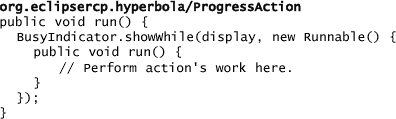
This is great for operations that are not instant but are likely to take less than about two seconds. If the action takes longer than two seconds, the busy cursor does not provide enough feedback—it appears that the UI is blocked and there is no possibility of canceling the action.
The Runtime’s IProgressMonitor interface is useful for reporting progress and allowing cancellation. The following is an example of running a long operation while showing a progress dialog:

The progress dialog runs the given runnable and displays the main task name, optional subtask names, and a progress bar. A Cancel button allows the user to cancel the action. The ability to cancel an action depends on how often the action checks the IProgressMonitor for cancellation.
This example forks the operation. Forking a long-running action is highly desirable because it allows the UI to repaint and process events while the action is running—the application looks more responsive. It does mean, however, that the action’s code must use Display.syncExec(Runnable) or Display.asyncExec(Runnable) to do any drawing since the action is run outside the main UI thread.
The problem with progress dialogs is that they flicker and flash when the operation runs quickly. A better solution is to show a busy cursor and show the progress dialog only if the action has been running for more than a specified amount of time. The IProgressService provides this functionality and unifies progress reporting in the Workbench.
The progress service tries to achieve a balance between a busy cursor and a dialog. The coding pattern is very similar to that of the progress dialog except that the IRunnableWithProgress.run() method is always forked. The progress service displays a busy cursor first, then pops up a progress dialog when the operation runs for more than a specified threshold. The threshold for switching between a busy cursor and the progress dialog is hard-coded into the Workbench; it’s currently 800ms. The following snippet shows how the service is accessed via the IWorkbench:

The progress service also handles the case when a foreground action is blocked by a background action. In this case the service displays a list of the actions that may be blocking the foreground action and allows them to be canceled by the user.
17.8.1 Nonmodal Progress
The Runtime provides a jobs mechanism that is useful for managing background tasks. The Job class is a cross between a java.lang.Runnable and a java.lang.Thread. Jobs require less overhead than threads because they are pooled. They also support progress and cancellation and can be configured with varying priorities and scheduling rules that describe how they interact with other jobs. Here is a simple job that does some fake work:

As with actions, the user probably wants to know about running jobs, but not in a way that interrupts or blocks the UI. Not all jobs are alike, and the progress presentation depends on how the job is created. There are three categories of jobs:
• User-initiated jobs—These are jobs that the user has triggered. The Workbench automatically shows user jobs in a modal progress dialog with a button to allow the user to run the job in the background and continue working. Jobs are marked as user jobs using the Job method setUser(boolean).
• Automatically triggered jobs—These jobs have meaning for the user but are not initiated directly by the user. They are shown in the progress view and in the status line, but the modal progress dialog is not shown.
• System operations—These are jobs that are not triggered by the user and can be considered as platform implementation detail. They are created by setting the system flag using the Job method setSystem(boolean).
The Workbench shows progress for user jobs using an area in the status line, as shown in Figure 17-4, and supplies a modal dialog that contains a Run in background button. The background job progress area has to be explicitly enabled in WorkbenchWindowAdvisor.preWindowOpen() as follows:
configurer.setShowProgressIndicator(true);
Figure 17-4 Showing job progress in the status line

When this is enabled and a background job is run, the user is presented with a progress dialog. If the user selects Run in background, the dialog is dismissed and progress is shown in the progress area in the status line.
Note
The sample code for this chapter includes an example action that runs several long-running actions using the different progress feedback mechanisms. The last action is run as a job. The action can be found in the main menu as Tools > Long running action example.
17.8.2 Progress View
The Workbench also provides a view that displays progress for multiple jobs simultaneously. It complements the status line progress by providing more detailed status information about running jobs as well as the ability to cancel jobs.
In everyday usage, users are not expected to use the Progress view since background jobs should complete reasonably quickly and users can keep working while background jobs run. Nevertheless, if you want to include the Progress view in your application, add the following view extension to your plugin.xml file:
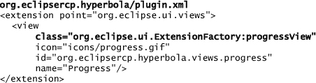
You can give the view any name and still use the implementation provided by the Workbench’s ExtensionFactory. Don’t forget to update your perspective to show the Progress view, as shown here:

You can control a job’s icon and various other job properties using the constants in IProgressConstants and the Job method setProperty(QualifiedName, Object).
17.8.3 Customizing Progress
Job progress support in Eclipse is tailored for large-scale IDE applications, in which the type of background jobs is not known at design time. A quick survey of existing non-Eclipse-based products confirms that there are no standard ways of showing background progress—the chosen solution is often domain-specific and highly integrated.
Here is a list of different ways applications can show background progress:
Web browser—Web browsers load pages in the background and show an animated icon but do not lock the UI. In many applications this image is branded. Status text is often shown in the status line.
Nonblocking progress dialogs—Some applications allow concurrent operations and display their progress by showing a nonmodal progress dialog for each separate operation. The advantage of this approach is that the user can easily cancel individual background tasks without hunting for a Progress view.
Specific task progress—Progress reporting for specific types of operations is also common. For example, a word processor may use one animated image when saving a file, another for checking spelling and grammar, and yet another when loading large files.
Context progress—Applications using a tabbed browsing paradigm often show progress on each tab to indicate the status of the background tasks initiated from a certain tab. In other words, progress is shown in multiple locations in the application.
If you decide that you don’t like the background progress support in Eclipse, it’s possible to implement a custom solution. To demonstrate, let’s work through an example of replacing the existing support with an implementation that shows progress for background jobs in separate nonmodal dialogs. When the background job is finished, the dialog is automatically closed.
Jobs are created by the user and run by the Platform. The IProgressMonitor passed to the job’s run() method is used to report the job’s progress. Here is an example of a job reporting progress:

To write your own progress reporting, first implement a subclass of org.eclipse.core.runtime.jobs.ProgressProvider and then register the provider with the Workbench. The provider is responsible for creating IProgressMonitor instances for use by the job framework when running jobs. This, combined with notifications about the lifecycle of jobs, allows you to implement background progress reporting. The Workbench registers its progress provider only if progress support is enabled; otherwise, you can register your own in the WorkbenchAdvisor method preStartup().
Platform.getJobManager().setProgressProvider(new DialogProgressProvider());
17.8.4 Writing a ProgressProvider
The most interesting method on the ProgressProvider is createMonitor(Job). This method returns the progress monitor that is passed to the running job. In the following example, a nonmodal progress monitor dialog is created every time a new job is run:
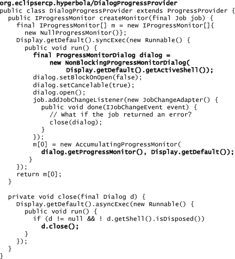
The essential part of this snippet is the subclass of ProgressMonitorDialog that makes the progress dialog nonmodal. The new dialog is used to create an IProgressMonitor that shows progress using an indicator with status messages and task names. When a job completes, the dialog is closed.
To keep this example simple, the error status of the job is not checked—it is possible to check the return status and prompt the user or provide an indication that an error has occurred. The dialog’s progress monitor is wrapped with another progress monitor, AccumulatingProgressMonitor, that ensures all calls to the IProgressMonitor methods by the background job are run in the UI thread. This is important because the dialog assumes that it is being called from the UI thread, whereas jobs are always run in a non-UI thread.
Warning
The progress view relies on the Workbench’s progress provider. If you add your own provider, the progress view stops working as only one progress provider can be registered at a time.
17.9 Summary
The main difference between RCP development and regular plug-in development is the level of control and responsibility you have when writing an RCP application. RCP application writers have full control over the structure of the menus and toolbars, and whether to allow contributions and where they are added. Plug-in writers have it easy—they plug into an existing application in well-defined ways. RCP application writers, in essence, define the ways in which others can plug in.
In this chapter you learned when and how to use declarative actions and how to open up your application to accept them. This, in combination with the general tips and tricks, gives you a solid base for adding well-behaved, well-integrated, and responsive actions to your application.