
5
COLOR PRECEPTS, COLOR PARADOXES
There is no area within the landscape painter’s study that is as complex and theory-rich as color. It presents the painter with many questions, not the least of which is, How do I convert the light and color of the natural world into a painting that can impart a parallel experience to the viewer?
The following chapters explore color from the perspective of the color strategy—the overarching plan that guides our color choices and helps achieve harmony. Before we begin, there are several broad truths about color that must first be acknowledged. These truths are not listed under the heading of color theory, but they do profoundly affect our efforts to translate light into paint.
The first precept is that pigments and painting surfaces are limited in their ability to express the brilliance of natural light. Second, a color strategy is not based solely on the colors we observe in nature; it is also the result of informed modification, the necessary changes we make to colors to suit the demands of the painting. And finally, color in painting is not duty bound to reality, but rather to the internal truth of the painting itself.
Brent Cotton, Winter’s Calm Pigments on canvas or paper cannot compete with the brilliance of natural light, but manipulating value and color in clever ways can create a parallel experience in the eyes of the beholder. Here, Cotton uses analogous harmony to achieve a deeply colored light and then adds a spark of color contrast with a warm pink accent.
Oil on linen, 10" × 8" | 25.5 × 20.5 cm
RECONCILING THE DIFFERENCES BETWEEN PIGMENTS AND NATURAL LIGHT
If achieving harmony or capturing a mood or the color of the light was simply a matter of matching colors, then landscape painters would only need to cultivate one skill: mixing and matching colors exactly as they see them. Yet any painter who has ever attempted to translate the effects of light into paint has had to come to terms with the fact that this is not entirely possible. Why? Pigments are incapable of expressing the range of value and luminosity of natural light.
No matter how brilliant we make our colors or how strongly we render our value contrasts, a painting can never compete with the brilliance of sunlight.
To compensate for this disparity, painters manipulate value and color in exceedingly clever ways. So clever, in fact, they can produce color relationships that, although never matching the luminosity of natural light, can evoke the same sensations. If any of the great painters of light—J.M.W. Turner, the Impressionists, or the Hudson River painters, to name a few—were able to convince us that their light was “true,” then that is a testament to how clever and skillful their use of color was.
As we will see in the next chapter, the primary vehicle for this “cleverness” is the color strategy. What particular colors, interacting in what particular ways, can produce the effects we are after?

REACHING FOR THE SUN
Colored pigments on canvas or paper, as rich and saturated as they may be, can never compete with the brilliance of natural light—dappled light upon the water, a snowfield struck by direct sunlight, or the sun itself. To simulate such effects in their work, painters bend color to their will by manipulating values, color contrasts, temperature, and saturation levels.

Oliver Akers Douglas, Old Harry Rocks
Oil on board, 18" × 24" | 46 × 61 cm
A painter’s goal is not to replicate the subject, but to interpret it. He borrows from what he observes, but also alters the colors in service to the painting. To look at Old Harry Rocks is to experience the brilliance of the sunlight on the chalk cliffs and the richness of the azure blue sea. Yet these colors are not exactly what Akers Douglas observed. “Painted literally, the values would have been too polarized,” he explains. “The whiteness of the cliffs would have looked rather bland and pale in comparison to the sea around it, so I emphasized the reflected blues, yellows, and pinks in the shadows in order to model the shapes more fully.”
DIRECT OBSERVATION VS. “INFORMED MODIFICATION”
When I was in art school, one of my first landscape assignments was to paint the view out the studio window. I recall my struggle to match the color of the afternoon light that slanted across the grounds. No matter how many mixtures I tried, the color didn’t seem right. When my instructor came over, he looked out the window, looked at my painting, and said, “Try adding some orange to the light areas . . . and make them a little darker.” The color I saw outside didn’t appear very orange or very dark to me. But I applied this new color anyway and much to my surprise, it worked better than any of my previous attempts. Even more surprising was that this better color was not the color I saw when I looked out the window.
Here was a paradox: a particular color, in the context of my painting, could make a more effective statement about the color of the light than when I tried to paint it exactly as I saw it.
That experience awakened me to a fundamental precept that would forever surround my efforts to paint the effects of natural light. A successful color strategy is not based solely on direct observation; that is, the colors we see in nature. It is also based on informed modification, the necessary changes we make to values and colors to achieve the desired results. The “right” color is a fluid blend between observation and interpretation.
How much does one rely on direct observation? On informed modification? It varies depending on whether we are painting outdoors or in the studio.

Carolyn Lord, Opalescent Morning
Watercolor on paper, 11" × 15" | 28 × 38 cm
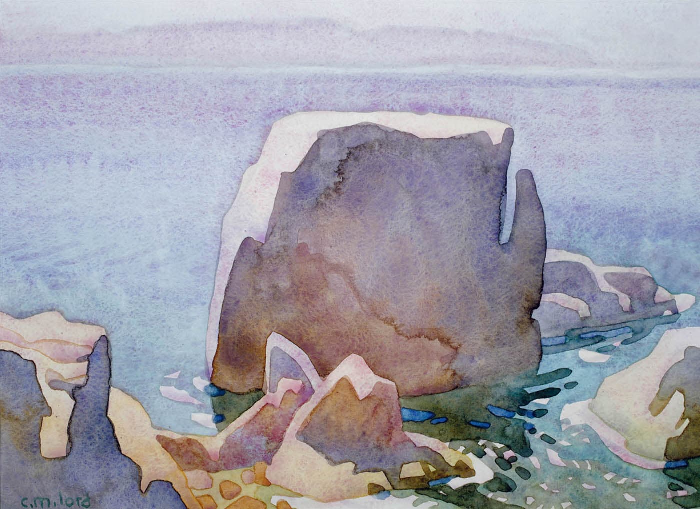
Carolyn Lord, Shell Beach Opalescence
Watercolor on paper, 22" × 30" | 56 × 76 cm
When working on location, landscape painters typically lead with direct observation. They work closely with the colors they see. But even within the observational mode of plein air, a painter will need to modify the colors they see. For example, in the smaller plein air version, Opalescent Morning (left), Lord heightened the intensity of the bluish-purple shadows in order to bring out the difference between the light and shadow.
When working in the studio, painters rely more on informed modification: “I can take the time to consider all the elements of art, and how much of each I want to incorporate,” says Lord. In her larger studio version, Shell Beach Opalescence (above), she brings out the temperature differences more and heightens the effects of atmosphere. She also creates greater texture. She plays into the granulating qualities of watercolor pigments, knowing they will settle into the texture of the cold press paper. This contributes to a specular effect, which in turn contributes to a sense of diffused light.
PLEIN AIR: DIRECT OBSERVATION
When we paint outdoors, nothing stands between us and the subject but the air. We can see nuances of color and value that a photo could never record. We are engaged in an intense conversation with nature, observing what is before us and trying to translate those colors as closely as we can. When surrounded by living color—the colors we observe when standing in nature—it is difficult to do otherwise. Plein air painters still modify colors as needed, but they primarily work from direct observation.
Monet famously described direct observation in this way: “Try to forget what objects you have before you—a tree, a house, a field, or whatever. Merely think, ‘Here is a little square of blue, here an oblong of pink, here a streak of yellow,’ and paint it just as it looks to you, the exact color and shape, until it gives you your own impression of the scene before you.”
We know that pigments and canvas cannot compete with the brilliance of actual sunlight—but we try. Such is the dance of living color.

Mitchell Albala, The Cottonwood Tree
Oil on paper, 10½" × 8" | 27 × 20.5 cm
The joy of working outdoors comes through our response to living color. We know that skies are blue and trees are green, but when outdoors, perceived color is our goal—the color of an object as it appears under a particular color of light. In Cottonwood, the light on the horizon in the late afternoon appeared more yellow than blue, so that is the color I painted it. The shadows in the tree appeared more blue than green, so that is the color I mixed.
IN THE STUDIO: “INFORMED MODIFICATION”
In the studio, our relationship to color changes—direct observation is no longer possible. We are once removed from the actual subject. If we are not face to face with living color then every color choice becomes a form of informed modification. We may still “borrow” from what we have seen by means of memory, studies, and reference photos, but the color strategy is now entirely our own.
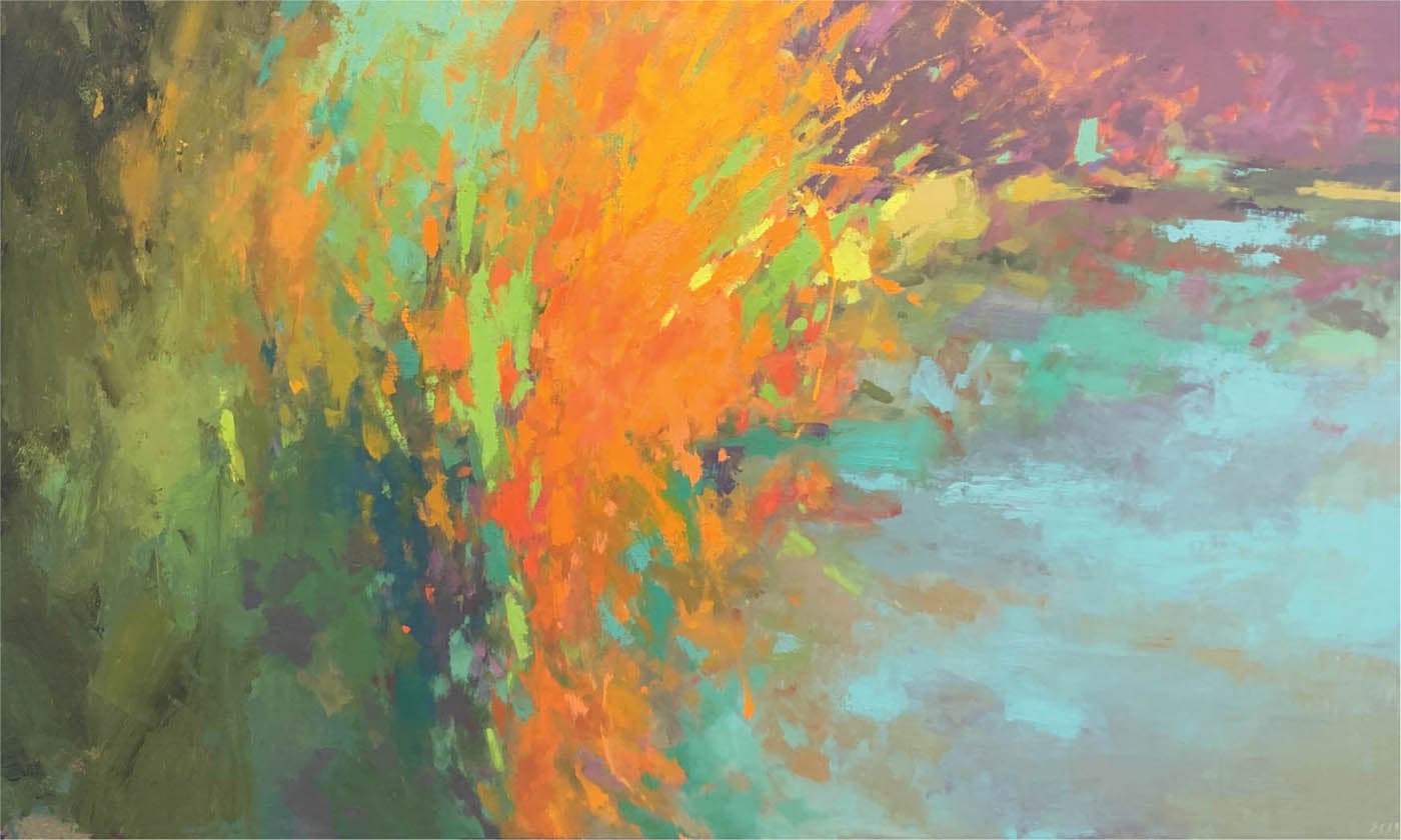
Scott Gellatly, Waterside
Oil on panel, 27" × 45" | 68.5 × 114.5 cm
Gellatly’s Waterside is a significant departure from his field study, Wetland in Autumn (below), on which the painting is based. In the studio, Gellatly works with informed modification: he modifies colors based on knowledge and his own subjective interpretation. He creates a bold color tension by juxtaposing the saturated orange and greens in the center foliage against the less saturated color areas on either side.

WATERSIDE FIELD STUDY
Scott Gellatly, Wetland in Autumn
Gouache on paper, 4" × 6½" | 10 × 16.5 cm
Gellatly’s color choices in the field study are based more on direct observation. He is responding to colors he observed in the moment, taking fewer liberties with color than he does in the studio with Waterside (above). Gellatly says, “These studies serve as a catalog of imagery where I can find visual sparks to use as a basis for larger studio paintings.”
CONVINCING COLOR, BELIEVABLE COLOR
Color grants us a wide latitude of expression. Whether we rely more on direct observation or informed modification, what matters is that the colors that end up in the final painting are believable in the context of that painting.
“Believable” color does not mean how accurately the colors match reality. It means that the viewer can accept the painter’s reality on their own terms.
In dramatic writing, there is something called the “willing suspension of disbelief.” A screenwriter can spin a fantastical tale of wizards with magical powers, but if we walk out of the theater saying, “That just wasn’t believable,” then the film would be considered a failure. The skilled writer knows how to weave a story in such a way that, for the brief time we spend in front of the movie screen, we accept it on its own terms.
The landscape painter’s goal is much the same. Whether spinning a tale of color as seemingly naturalistic as a Marc Hanson’s Eclipse Day (below) or as expressive as Mark Gould’s Glen, Canyon, Stream: Arcadian (here), it must be done in a way that is believable in the context of the painting. A painting is not reality, so its colors don’t necessarily have to conform to reality. But they do need to form an impression that is consistent with the internal color logic of the painting.
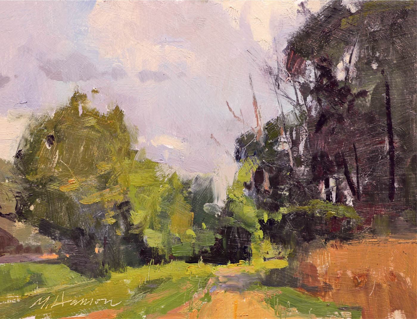
Marc Hanson, Eclipse Day #1
Oil on board, 9" × 12" | 23 × 30.5 cm
As much as a painter may rely on direct observation when working outdoors, some informed modification is always involved. Hanson explains, “Although the colors in Eclipse Day may look naturalistic (because of my own preferences and style), it is still several steps away from how it actually looked in the subject . . . I want to make color choices that are interesting as a painting, rather than only being descriptive.”

Mark Gould, Glen, Canyon, Stream: Arcadian
Acrylic on panel, 20" × 16" | 51 × 40.5 cm
All paintings present us with an alternate reality, but some paintings do so more than others. In comparison to Hanson’s Eclipse Day (previous page), Gould’s interpretation of color is much more expressive. His intense colors are not what we would call realistic, but in the context of painting they remind us of nature and they make sense. “One saturated color tends to lead to other saturated colors,” says Gould. “Saturated colors make more sense in the context of other saturated colors.”