
6
THE COMPLETE COLOR STRATEGY
When we observe the myriad colors of the natural world, we never think, Those colors just don’t look harmonious! Natural light and color never fails to be convincing. But how do painters, in the synthetic world of their two-dimensional paintings, maintain that same sense of harmony and color cohesion? How can they convey a mood, an atmospheric effect, or a particular color of light?
We begin by drawing from nature’s palette. We borrow her hues and value relationships, her temperatures and chromaticity. Yet, that is only a starting point. Inevitably, we discover that to achieve the effects we are after, we also have to modify colors in an informed way. We need to apply some kind of overarching plan to our color—a color strategy.
In this chapter, you will learn how a complete color strategy is made up of three types of color relationships: hue interactions, value contrasts, and relative saturation. We’ll analyze several paintings to see how each of these work to produce different harmonies, colors of light, and moods.
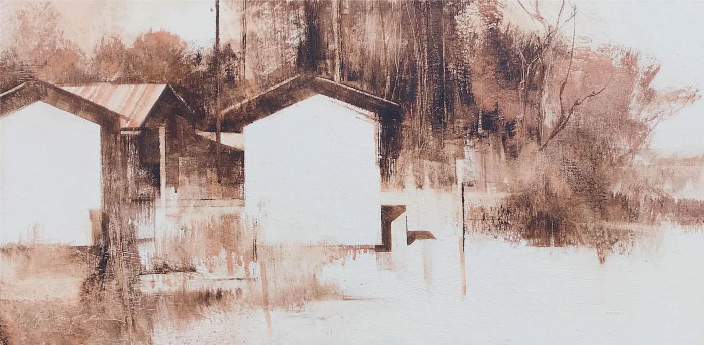
Brent Watkinson, Evening Trees HUE INTERACTION: SIMILARITY, analogous with contrasting accents The illusion of light in painting is not achieved by mimicking nature. It is based on a color plan or strategy, which involves three types of contrast: hue interactions, values, and relative saturation. Evening Trees is predominantly yellow-green, but has accents of orange and blue-violet. The strong sense of sunset light is the result of strong value contrasts combined with saturated color.
Oil on canvas, 30" × 24" | 76 × 61 cm
VALUE CONTRAST: LOW / MEDIUM / HIGH
SATURATION: LOW / MEDIUM–HIGH
All landscape painters strive for harmony, that unmistakable sense that all the colors in the painting cohere and work well together. Harmony is typically defined as a “pleasing arrangement of colors forming a consistent whole.” The color strategy is the organizing principle through which we actually achieve “pleasing” and "harmonious."
A color strategy is a formula for color interactions, a collection of colors that relate in specific ways to produce a desired effect. Landscape painters rely on a strategy to help guide their color choices and ensure that they form landscape-like harmonies.
A color strategy seeks to answer the landscape painter’s eternal question: what particular colors, interacting in what specific ways, will be able to convey a mood, a time of day, or a particular color of light?

Jill Carver, New Day
Oil on canvas, 36" × 36" | 91.5 × 91.5 cm
HUE INTERACTION: SIMILARITY, analogous harmony with contrasting accent
VALUE CONTRAST: LOW / MEDIUM / HIGH
SATURATION: LOW / MEDIUM / HIGH
New Day beautifully captures a winter day, touched by a glimmer of warmth at sunrise. Every strategy involves hue interactions, value contrasts, and relative saturation. Here, the dominant blue-violet establishes a unifying harmony. Yet, it is the contrasting pink accent in the sky that gives the subject its special meaning.
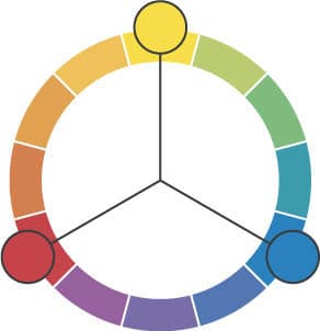
Ray Balkwill, Venetian Reflections
Oil on board, 10" × 14" | 25.5 × 35.5 cm
HUE INTERACTION: DISSIMILAR, complementary
VALUE CONTRAST: LOW / MEDIUM / HIGH
SATURATION: LOW / MEDIUM / HIGH
Venetian Reflections uses a complementary hue interaction based on yellow and violet, which corresponds to the light and shadow patterns. Complements need not be fully saturated to provide effective contrast. The values range from light to dark, but most are in the midrange, which allows the shadows to be more luminous.
CONTRAST: THE ANIMATING FORCE OF THE COLOR STRATEGY
Contrast of color—or the differences between colors—is the animating force of the color strategy. Whether those differences are subtle or great, they give life to our color relationships and to our paintings. Are hues similar and related or do they contrast? Are the values closely related or is the contrast strong? Are the colors saturated and intense, or are they neutral and gray-like? Or a combination of both?
In the artificial world of our paintings, contrast of color is the means at our disposal for making our colors interact in ways that simulate the effects of natural light.
DEFINING STRATEGY IN TERMS OF HUE, VALUE, AND SATURATION
When painters talk about “color strategies,” they are usually referring to the color relationships found on the standard 12-step color wheel: monochromatic, analogous, complementary, split-complementary, and triadic. More precisely, these relationships refer to hue interactions. They define the ways different hue families interact with one another.
As vital as hue interactions are, they do not form a complete strategy on their own. A complete strategy also involves two other essential aspects of color—value contrasts and relative saturation.
These aspects of contrast act as the levers that control the overall strategy. When delicately balanced, they are responsible for every moment of color magic ever produced on paper or canvas. Controlling these relationships allows us to bend color to our will and produce the effects we are after.
ASPECT OF COLOR CONTRAST: HUE INTERACTIONS
WHY HUE INTERACTIONS MATTER
The first aspect of color contrast is the hue interaction. These are the standard relationships we are familiar with from the color wheel. They define how different hue families interact with one another and are largely responsible for the forces of attraction and opposition we find among colors. Are the colors closely related, with tight bonds, as they are in analogous harmony? Or do the colors differ from each other as in complementary relationships?
HUE INTERACTIONS IN THE CONTEXT OF SIMILARITY OR DIFFERENCES
Painters often think of hue interactions as all there is to a color strategy, without considering any other aspects of color. They will say, This is analogous harmony or This is a complementary relationship. In fact, a painting is often a complex blend of different types of hue interactions. We see this in Brent Cotton’s When Days Are Short (here). There is a strong analogous harmony at work. Yet, there is also a small complementary accent. Does this make it a complementary painting? Or is it analogous? In fact, it is both. For this reason, it is also helpful to think about hue interactions in terms of similarity or differences.
Identifying a hue interaction by name (analogous, complementary, etc.) is helpful, but not as important as recognizing whether that interaction is based on similarity or differences.
HUE INTERACTIONS | |
|
|
MONOCHROMATIC | ANALOGOUS |
Monochromatic and analogous are hue interactions based on similarity. Both form very cohesive and unified harmonies because their colors are so related. | |

HUE INTERACTIONS | ||
|
|
|
SPLIT- | COMPLEMENTARY | TRIADIC |
Split-complementary, complementary, and triadic are interactions that rely on the differences between hues. They also create harmonies, but do so through contrast and opposition. | ||

THE POWER OF ONE: MONOCHROMATIC

Mitchell Albala, Cascade Dusk
Oil on canvas, 20" × 38" | 51 × 96.5 cm
HUE INTERACTION: SIMILARITY, monochromatic
VALUE CONTRAST: LOW / MEDIUM / HIGH
SATURATION: LOW / MEDIUM / HIGH
Cascade Dusk uses the simplest of all hue interactions, monochromatic. Every color in the painting is drawn from the blue family, but the blues vary in value, temperature, and saturation. Even the subtle green hints in the middle ground trees are heavily tinged with blue. The value range is compressed. On a 10-step value scale, the snowfield is about a 4 and the darkest trees about a 7. This compressed range, in combination with the monochromatic scheme, creates a sense of deep atmosphere and unified light. The snow appears especially luminous because its saturation is played against the much grayer stand of trees.
THE POWER OF LIGHT AND DARK
Charlie Hunter, Five Five Eighteen
Oil on panel, 12" × 24" | 30.5 × 61 cm
HUE INTERACTION: SIMILARITY, monochromatic
VALUE CONTRAST: LOW / MEDIUM / HIGH
SATURATION: LOW / MEDIUM / HIGH
In Five Five Eighteen, Hunter works monochromatically with just a single pigment, Van Dyke brown. With all the color contrast a full palette can offer, why would a painter choose this kind of strategy? The purity of light and dark alone has an inherent beauty all its own. What a painting like this may lack in color contrast, it more than makes up for with the drama of value contrasts. To achieve a range of values with the one dark pigment, Hunter uses no white. Instead, he uses the Van Dyke brown in varying degrees of opacity and transparency.
THE POWER OF KINSHIP: ANALOGOUS HARMONY
Mitchell Albala, Snowy Ridge, Early Light
Oil on board, 12" × 12" | 30.5 × 30.5 cm
HUE INTERACTION: SIMILARITY, analogous
VALUE CONTRAST: LOW / MEDIUM / HIGH
SATURATION: LOW / MEDIUM / HIGH
Analogous colors are adjacent to each other on the color wheel and therefore as closely related as any two or three colors can be. The deeply colored atmosphere in Early Light is achieved with a three-hue analogy, ranging from yellow to yellow-green to green. Yellow is the common hue shared by all three colors in the analogy. A compressed value range also contributes to the atmospheric quality.
ATMOSPHERE AND ANALOGY
One of the magical qualities of landscape light is its ability to hold color within the atmosphere. Depending on the time of day and the amount of moisture and dust in the air, the atmosphere can reflect certain colors (as we readily see at sunset) and bathe everything it touches under a unifying veil of colored light. Analogous harmony is particularly effective at rendering this effect. The innate ability of analogous colors to create deeply harmonious relationships makes them an ideal means of simulating the illusion of colored light and atmosphere.
Photo: Obadinah Heavner
ANALOGOUS HARMONY WITH CONTRASTING ACCENT

Brent Cotton, When Days Are Short
Oil on linen, 10" × 8" | 25.5 × 20.5 cm
HUE INTERACTION: SIMILARITY, analogous harmony with contrasting accent
VALUE CONTRAST: LOW / MEDIUM / HIGH
SATURATION: LOW / MEDIUM / HIGH
If analogous harmony is so effective at suggesting unified light, why don’t more painters work with it? Because it doesn’t always give them the color contrast they need. In Cotton’s piece, we experience all the benefits of deeply colored light through a blue-violet/red-violet analogy. Yet, he enlivens the color field with a complementary accent of yellow-orange. Cotton’s use of a compressed value range also supports the illusion of a deeply colored light.
THE POWER OF OPPOSITES: COMPLEMENTS
If harmony implies an agreeable relationship among colors, then how can a pair of complements, with innate opposition and vibration, be considered harmonious? Because colors that vibrate aren’t necessarily disharmonious. In fact, most painters find this type of hue interaction desirable. It creates a type of contrast that can simulate the brilliance of light through color. Complementary colors are the most potent type of hue interaction.
Rodger Bechtold, Tall Timber
Oil on linen, 36" × 42" | 91.5 × 107 cm
HUE INTERACTION: DISSIMILAR, complementary
VALUE CONTRAST: LOW / MEDIUM / HIGH
SATURATION: LOW / MEDIUM–HIGH
Tall Timber is clearly based on a complementary pairing of yellow and violet. Bechtold’s handling of this radiant complementary relationship demonstrates restraint. With the exception of a few small areas, he doesn’t use the yellow and violet at full saturation. That would heighten the radiant effect but look very unnatural. In most areas, the yellow and the violet are partially desaturated.

“RADIANT” AND “NEUTRALIZING” COMPLEMENTS
Complements have a dual nature. When placed side by side, they each heighten the visual intensity of the other. These are radiant complements. When those same colors are blended together, they have the opposite effect. They begin to cancel each other out and produce neutrals, as seen in the center of the blended swatch. These are neutralizing complements. Johannes Itten described it this way: “Two such colors make a strange pair. They are opposite, yet they require each other. They incite each other to maximum vividness when together and annihilate each other when mixed—like fire and water.”
ASPECT OF COLOR CONTRAST: VALUE
WHY CONTRAST OF VALUE MATTERS
Value is the second form of contrast involved in the color strategy. As we saw in chapter 1, value is the relative lightness or darkness of a color. Its importance cannot be overstated. It is largely responsible for conveying a sense of light, depth, and volume. Painters often think of value as working independently of color. In fact, color and value are dynamically interrelated.
The value of a color has a direct effect on the expression of that color’s chromatic identity. How light or dark a color is will affect how much we can perceive the color as actual color.
By adjusting the relative value of colors, painters are able to suggest light in different ways. Some painters rely on strong value contrasts, so much so that the hue itself plays a secondary role. This is called value-priority. Other painters flip the balance between color and value with a color-priority approach. By keeping values more in the midrange and increasing their saturation, color contrasts can do more of the work in suggesting light. Painters can also cleverly combine both approaches.
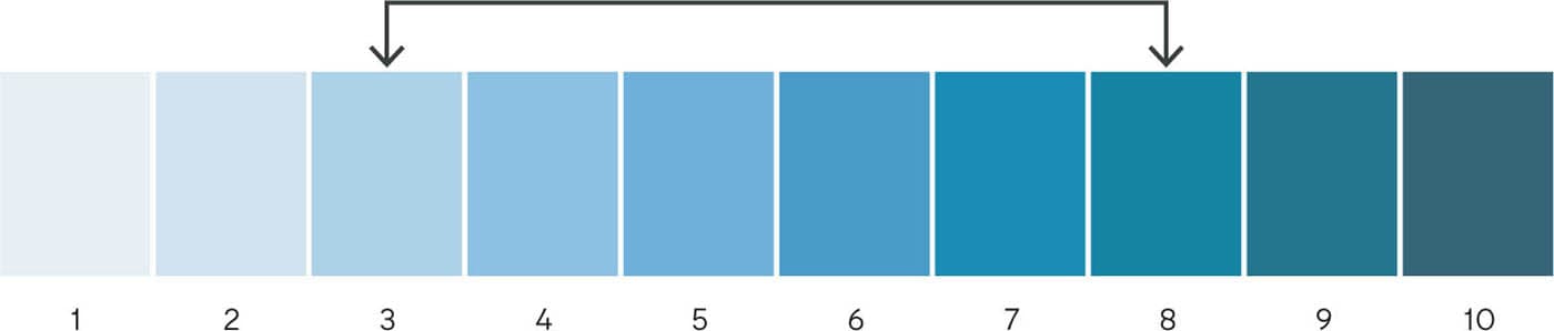
HOW VALUE AFFECTS COLOR IDENTITY
In this 10-step value scale for blue, some of the blues are bluer than others. In the midrange (3 to 8), the blues exhibit more of their characteristic “blueness.” Their chromatic identity is more obvious, especially when colors are more saturated as they are in these swatches. In the values on the ends of the scale (1 to 2 and 9 to 10), the blue identity is less apparent. Extremely light- and extremely dark-valued colors hold less hue identity than colors in the midvalue range. This has important implications for painters who wish to use more saturated colors to simulate the effects of natural light.
VALUE-PRIORITY
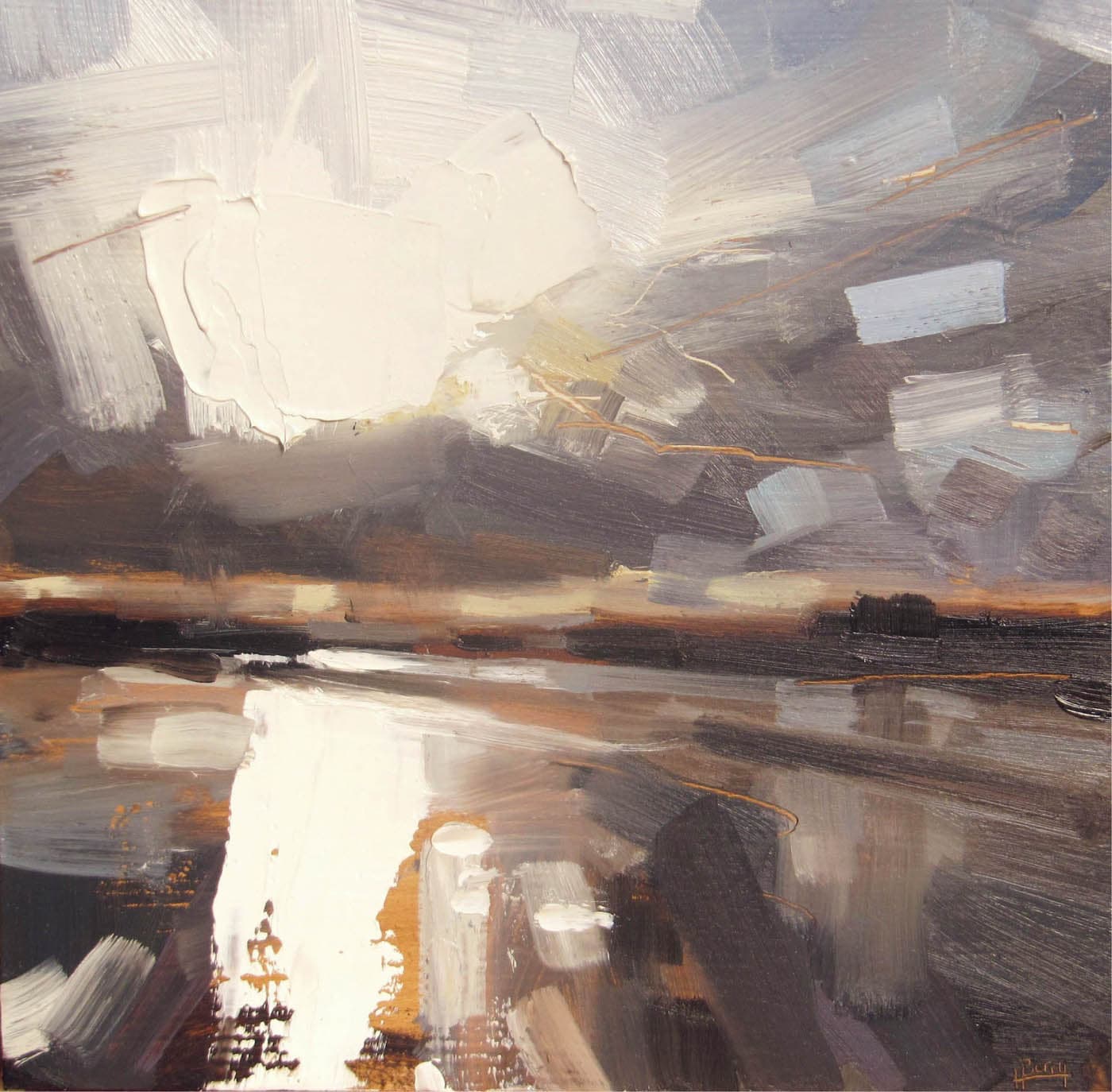
Hester Berry, Instow
Oil on panel, 8" × 8" | 20.5 × 20.5 cm
HUE INTERACTION: DISSIMILAR, subtle temperature differences
VALUE CONTRAST: LOW / MEDIUM / HIGH
SATURATION: LOW / MEDIUM / HIGH
The dramatic light in Instow is achieved almost entirely through strong value contrasts. In a value-priority approach, hue tends to play a lesser role. Here, there are some very subtle temperature differences between the cool gray-blues in the sky and the warmer earth tones below. But they only have a small supporting role as compared to the strong contrast between light and dark.
COLOR-PRIORITY
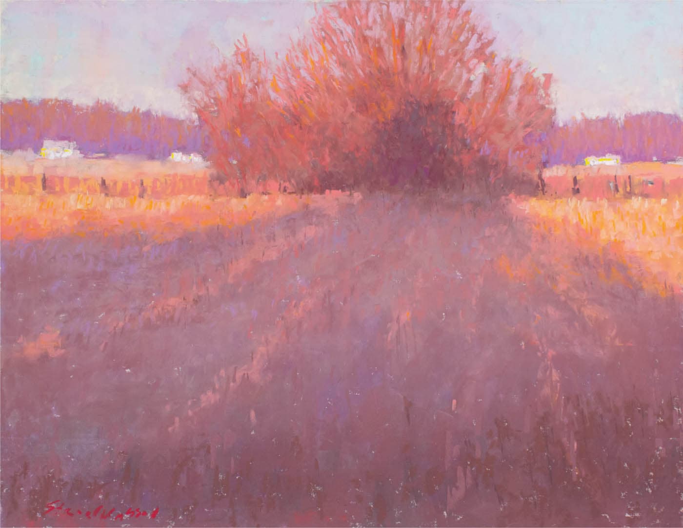
Carol Strock Wasson, Last Light
Pastel on paper, 16" × 20" | 40.5 × 51 cm
HUE INTERACTION: DISSIMILAR, complementary
VALUE CONTRAST: LOW / MEDIUM / HIGH
SATURATION: LOW / MEDIUM–HIGH
It is easy to forget that at one time a color-priority approach like this was considered scandalous. For the landscape colorist, the great legacy of nineteenth century Impressionism is this: purer color, when used in the midvalue range, can be as, if not more, effective at suggesting the qualities of light than strong value contrasts. In terms of color and value, Last Light is almost the opposite of what we saw in Berry’s Instow on the previous page. Of course, there are value contrasts in Last Light, but they are not strong. Values are kept within the midrange where colors reveal more of their intrinsic hue identity.
ASPECT OF COLOR CONTRAST: SATURATION
WHY COLOR SATURATION MATTERS
Color saturation is the third aspect of contrast at work within the color strategy. When discussing saturation, painters are typically referring to the overall color saturation of the painting. For example, the colors in an Impressionist painting will have greater overall saturation than, say, a Tonalist painting, which works with less saturated colors. This is one reason why saturation plays such an important role in setting the emotional tone of a painting. An Impressionist painting, with its lighter-valued and more saturated colors, can fill us with joy; a Tonalist painting, with its darker tonalities and neutral harmonies, can invoke a contemplative mood.
Of course, individual colors within a painting may also vary in saturation. Without varying saturation levels, our color relationships would be one-dimensional. Every color would be the same pitch.
Because color has such emotional resonance with us, there is often a preference toward saturated colors. Yet, these bright colors are just one aspect of a fully balanced palette. Less saturated colors are another dimension and serve as a necessary counterpoint to saturated colors.
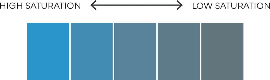
COLOR SATURATION
Like value contrast, color saturation is a relative measure. In the range of blues shown here, the values are all the same, but the saturation levels vary. The blue on the left is fully saturated (intense and colorful). As we transition right, the blues become progressively less saturated until the swatch on the right is so desaturated that it appears gray.
SEMANTICS: Saturation is also referred to as “chroma” or “intensity.” Each of these words have subtle differences in meaning. Unfortunately, artists use the words interchangeably. Low saturation colors may also be called “low intensity,” “neutrals,” or “grays.” For consistency, I refer to this aspect of color contrast as saturation and use the word neutrals to describe colors that are less than fully saturated.
BALANCING SATURATED COLOR WITH NEUTRALS

Loriann Signori, Subtle Grandeur
Pastel, 9½" × 11" | 24 × 28 cm
HUE INTERACTION: DISSIMILAR, subtle complementary
VALUE CONTRAST: LOW / MEDIUM / HIGH
SATURATION: LOW / MEDIUM / HIGH
Saturated colors are more striking when placed alongside neutral colors, and neutral colors are more meaningful when combined with saturated colors. “I rely on the beauty of neutral colors to make the more saturated colors sing,” says Signori. In Subtle Grandeur, we see a subtle complementary hue interaction between the orange island and the blue of the water and sky.
SATURATED COLOR AND RICH DARKS

David Mensing, Excessive Moderation
Oil on canvas, 16" × 12" | 40.5 × 30.5 cm
HUE INTERACTION: DISSIMILAR
VALUE CONTRAST: LOW / MEDIUM / HIGH
SATURATION: LOW / MEDIUM / HIGH
Another approach to working with saturated color is to combine the saturated colors with rich darks. This may be seen as a combination of value-priority and color-priority approaches. In Mensing’s painting, saturated reds and oranges are surrounded by rich dark values which further accentuate the brilliance of those colors. This approach gives us strong lights and darks that foster an illusion of brilliant light and saturated colors to make that light sing.
THE HARMONY OF NEUTRALS
If the goal of a color strategy is to help build color unity, then low saturation or neutral palettes may be considered one of the most effective means of achieving that harmony. Neutral colors have a special power—they naturally agree with other neutral colors.
An absolute neutral would be a perfect gray, with no color bias at all. As painters make the colors in their paintings increasingly neutral, the colors begin to harmonize through a common association to neutral gray. This is beautifully implemented in David Curtis’ painting on this page.
Neutral colors cast a spell of binding. Hues that might otherwise clash in a saturated color field are calmed down when neutralized and better able to agree with each other.
CONSIDER: A neutral harmony does not mean the absence of color. Although neutrals don’t shout as loudly as saturated colors do—they prefer to whisper—they are more than capable of forming harmonious relationships. As the paintings by Renato Muccillo and David Curtis in the following pages show, neutral colors are also beautiful colors.
FROM DISCORD TO ACCORD
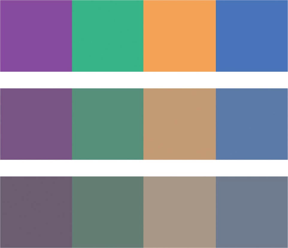
Neutral colors have an innate ability to bring disparate colors into harmony. This allows a painter to include a wider range of hues, from multiple points on the spectrum, without risking discord. In these swatches, each row has the same four hues. In the top row, the colors are fully saturated. They have little in common and are even discordant. In the middle row, the colors are partially desaturated and seem less discordant. In the bottom row, the colors are extremely desaturated, retaining only a hint of their original hue, and are considerably more harmonious and unified than in the two upper rows.
DISPARATE COLORS BROUGHT INTO HARMONY THROUGH NEUTRALS
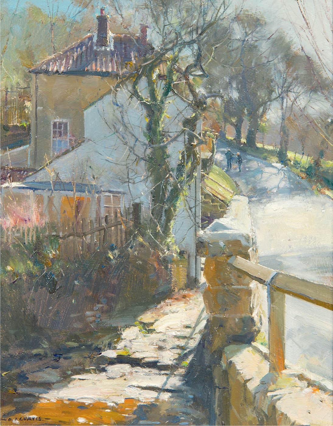
David Curtis, Spring Light - Beck Hole, North Yorkshire
Oil on panel, 12" × 10" | 30.5 × 25.5 cm
HUE INTERACTION: MULTIPLE
VALUE CONTRAST: LOW / MEDIUM / HIGH
SATURATION: LOW / MEDIUM / HIGH
In Spring Light, Curtis achieves one of the most inspired feats of color harmony: he uses colors from every part of the spectrum—reds, yellows, blues, greens, oranges, and violets—yet avoids the discord we might expect with such a diversity of hues. Curtis attains this through the harmony of neutrals. Neutral colors naturally agree with other neutral colors. With the exception of the small patch of orange at the very bottom, all the hues in the painting are partially desaturated and harmonize through a common association to the neutral gray.
THE NEUTRAL HARMONIES OF TONALISM

Renato Muccillo, Valley Fires II
Oil on panel, 8" × 6" | 20.5 × 15 cm
HUE INTERACTION: SIMILARITY
VALUE CONTRAST: LOW / MEDIUM / HIGH
SATURATION: LOW / MEDIUM / HIGH
Renato Muccillo works in the contemporary Tonalist tradition. Tonalist painters rarely dip into saturated colors; instead, their palettes are laden with earth tones and neutral colors. When the harmony produced by neutral colors is used in combination with strong value contrasts, it’s a prescription for both dramatic and unified light. Muccillo’s tonalist palette includes just four colors plus white: NAPLES YELLOW, SAP GREEN, TRANSPARENT RED OXIDE, and ULTRAMARINE BLUE. The use of so few colors (a limited palette) also supports the formation of unified harmonies.
REVIEW QUESTIONS: THE COMPLETE COLOR STRATEGY
When developing a strategy, are you remembering that the strategy isn’t only about hue interactions (e.g., complementary, analogous, etc.)?
A complete strategy also involves value contrasts and relative color saturation. How do these affect the overall color composition?
What hue interactions are at work in the subject?
Hue interactions are responsible for the forces of attraction and opposition among colors. Are the hue interactions based primarily on colors that are very related or colors that that differ widely? Or a combination of both? Is there more than one type of hue interaction at play?
Are you taking advantage of temperature differences or building all-warm or all-cool strategies?
Cool versus warm is an important aspect of color contrast. Temperature differences add variety to the color tapestry.
How do the value contrasts affect the overall color impression?
Are the value contrasts very strong? Or are the values very close? How does a color’s value affect the expression of that color’s chromatic identity? How light or dark a color is will affect how much we can perceive the color as actual color.
What are the saturation levels of the colors?
Are there lots of bright and saturated colors? Is the overall strategy based on neutral harmonies? Or a combination of both? How does the saturation level of the colors affect the illusion of unified light? Where might you need to increase or decrease the saturation?
Are you following the colors you see in the subject too closely?
The success of a color strategy is not measured by how well it matches the original scene, but by how well the painting works as a painting. The color you see in the subject is only a starting point. You can depart from what you see in nature (or the photo) in service to the painting.
Mitchell Albala, Ballard Bridge to Shilshole, Winter
Pastel on paper, 5¾" × 9" | 14.5 × 23 cm
HUE INTERACTION: DISSIMILAR, temperature
VALUE CONTRAST: LOW / MEDIUM / HIGH
SATURATION: LOW / MEDIUM / HIGH
EXERCISE: ONE SUBJECT, DIFFERENT STRATEGIES
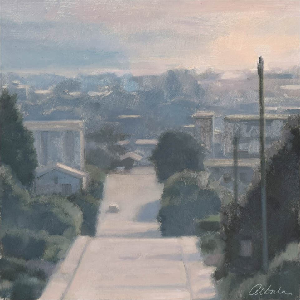
OVERVIEW: There is no better way to experience the potential range of the color strategy than to paint the same subject using different strategies. You may not have a set of photos of the same subject with distinct color harmonies, which means you might have to be inventive with your color choices or even borrow strategies from other paintings. A color strategy is mutable and flexible; you can make almost any color scheme work as long as the color is convincing in the context of the painting. (See “Convincing Color, Believable Color”.)
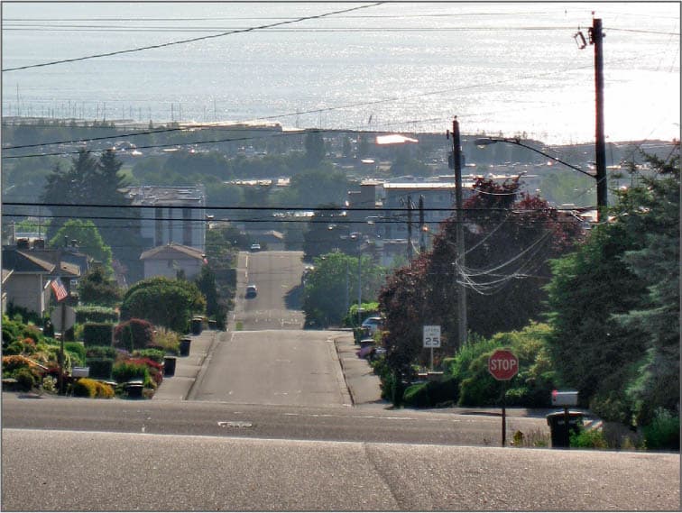
SOURCE PHOTO
The source photo has a potentially interesting composition, but it doesn’t capture sunset-like colors. It will be used only as a starting point. Only one of the paintings in the series borrows the neutral harmonies found in the source photo. The strategies in all the others are largely invented. The water at the top will also be converted to a sky. In this series, each painting holds to the sunset theme, but interprets it with an entirely different palette. Each piece makes a unique statement about a particular color of light.

Mitchell Albala, The Way Home, Study in Yellow and Phthalo
Oil on paper, 8" × 8" | 20.5 × 20.5 cm
The deeply atmospheric quality in this study is achieved largely with analogous harmony—yellow/yellow-green—with hints toward blue-green. The hints of blue in the sky and the small house on the left offer gentle notes of temperature contrast. The values are in midrange, allowing the relatively saturated colors to reveal more of their chromatic identity, adding to the luminosity of the painting.

Mitchell Albala, The Way Home, Study in Azure and Orange
Oil on paper, 8" × 8" | 20.5 × 20.5 cm
The hue interaction here is analogous harmony with a contrasting hue. The pale yellow-orange in the sky and the road is the counterpoint to the dominant blue. Value contrasts are in the midrange, allowing the illusion of light to be suggested with saturated colors, as opposed to strong value contrasts, as we see in Study in Grays (right).
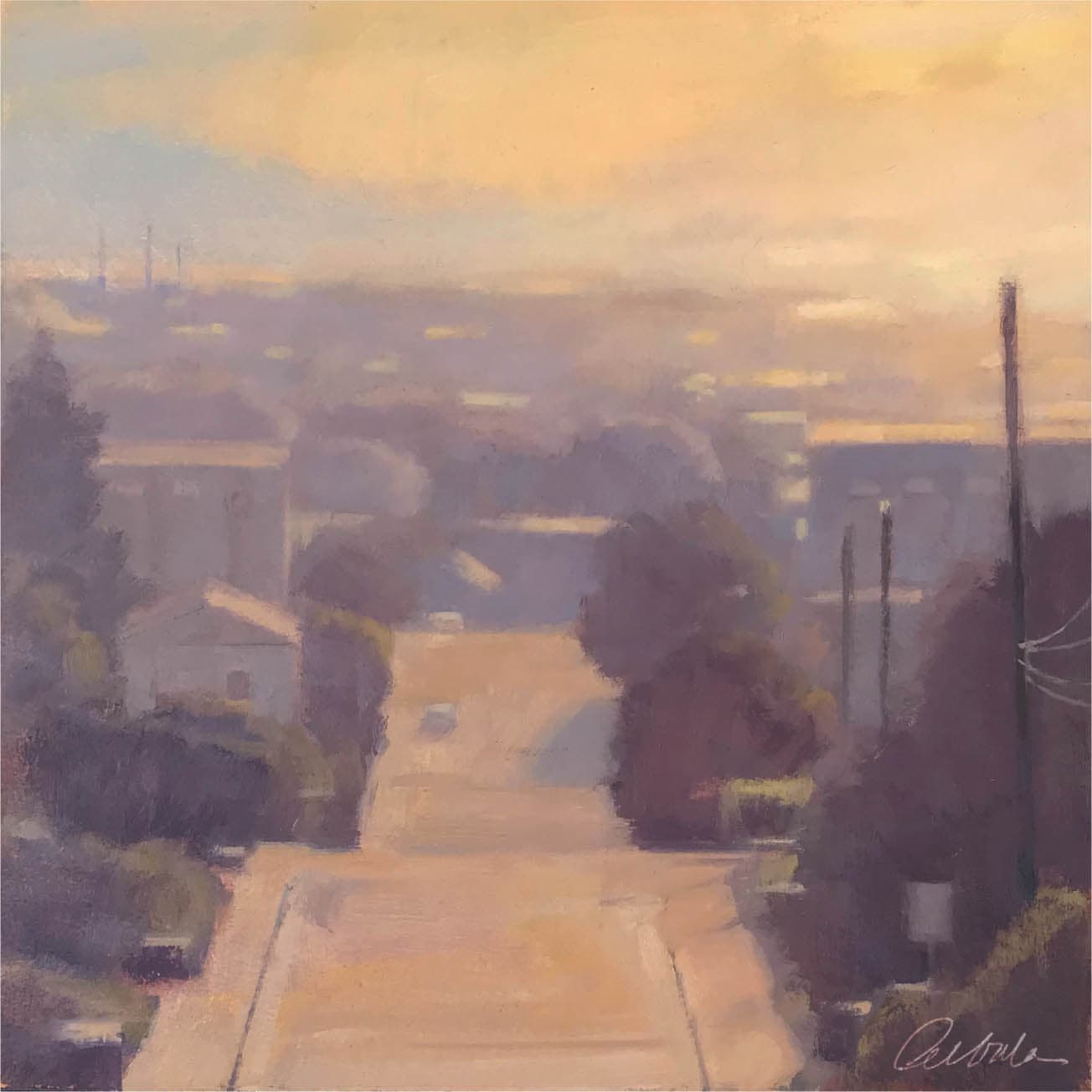
Mitchell Albala, The Way Home, Study in Grays
Oil on paper, 8" × 8" | 20.5 × 20.5 cm
This study comes closest to the gray harmonies found in the source photo. With a value-priority approach, the effects of light are achieved primarily through strong value contrasts. The soft pinks in the sky and in the road serve as a subtle color accent amid the predominantly cool gray harmony.
Mitchell Albala, The Way Home, Study in Orange and Violet
Oil on paper, 8" × 8" | 20.5 × 20.5 cm
The hue interaction in this painting is complementary: yellow-orange/violet-blue. Colors within a complementary pairing need not be fully saturated to be effective. Here, the colors throughout are partially desaturated. Value contrasts are leaning toward strong, which contribute to the sense of a sunset light.
TEMPERATURE, AN ASPECT OF HUE INTERACTION
Temperature describes the “warm” or “cool” attributes of colors and is considered a form of color contrast. Temperature differences may be subtle, as they are in the yellow/green pairing, or they can be strong, as in the yellow-orange/blue-violet pairing. Temperature differences are an important way painters add variation to the color tapestry. Each of the hue interactions also reflect temperature differences.
CONSIDER: Temperature is a relative measure. A color is never cool or warm on its own. A “cool” color is only cool when placed alongside a warmer color. And a “warm” color is only warm when placed alongside a cooler color.
EXERCISE: COLOR- AND VALUE-PRIORITY, SIDE BY SIDE
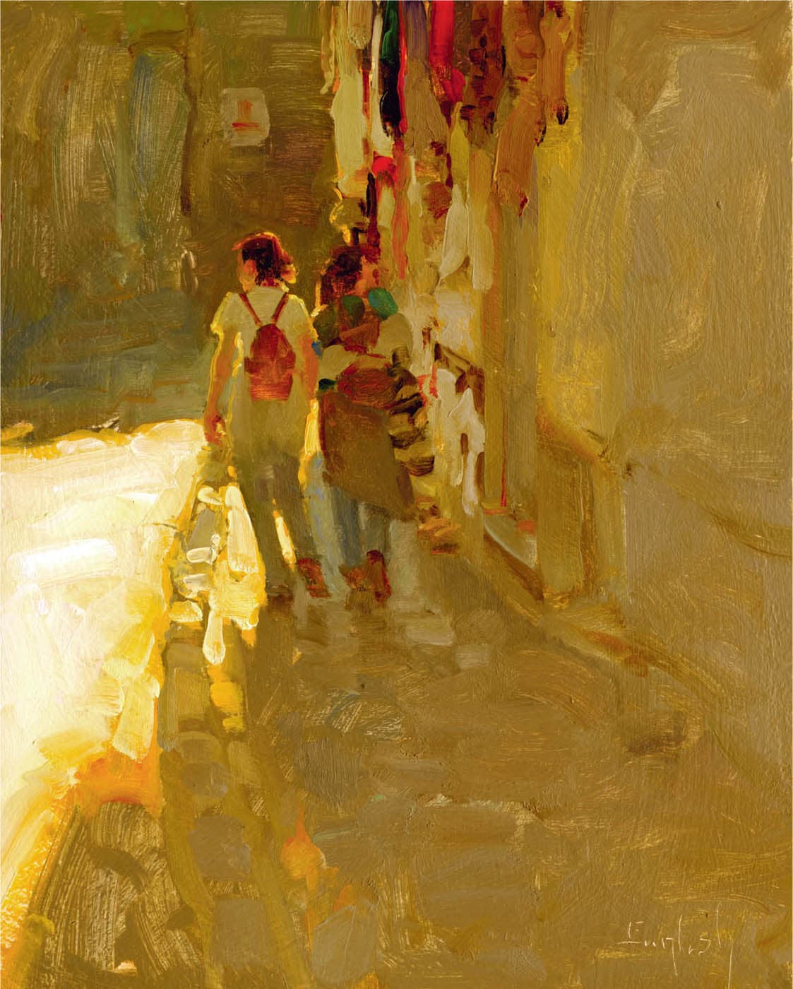
OVERVIEW: One of the most essential lessons every colorist needs to learn is this: how does the value of a color affect how much we can perceive the color as actual color? (See “Why Contrast of Value Matters”). In this exercise, you will do two paintings of the same or a similar subject. In one, you will use a value-priority approach; in the other, a color-priority approach. This is a demanding exercise. You have to be willing to make changes to the colors you see, whether you are working from life or a photo. Kim English, a master at conveying light in the urban setting, demonstrates.
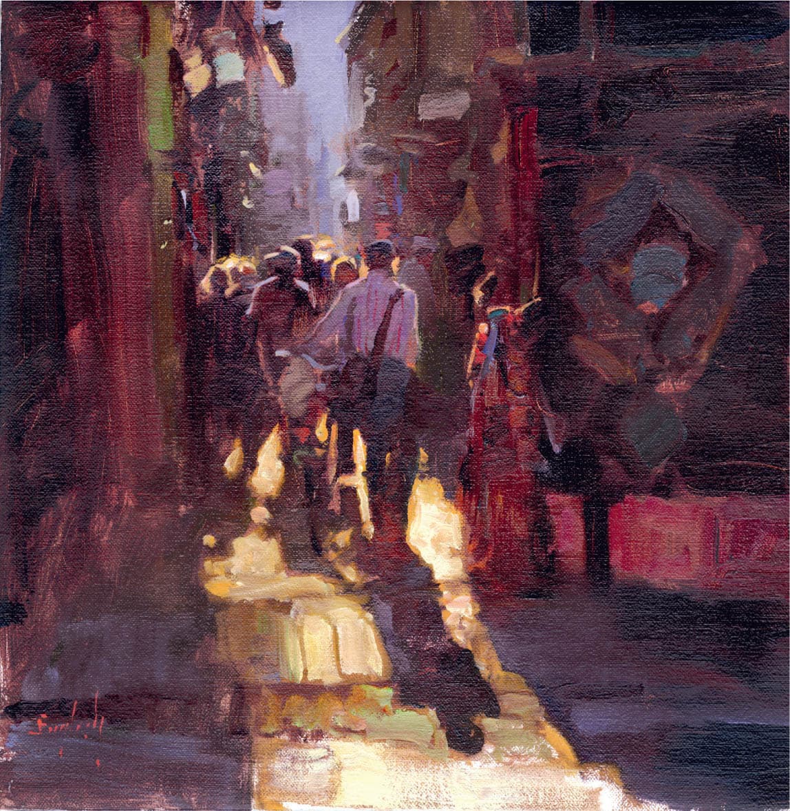
Kim English, Entering the Narrows
Oil on linen, 12" × 12" | 30.5 × 30.5 cm
The sense of light in Entering the Narrows is achieved primarily through strong value contrasts. The yellow light on the street appears more vibrant when played against the near-black colors that surround it, but value contrasts still do most of the work. In the dark shadows, colors are still visible, but they hold much less of their hue identity.
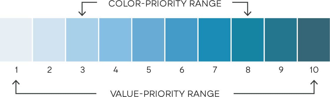
In a value-priority approach, the painter uses the full range of values available to them, from very light (1) to very dark (10). Strong value contrasts are a tried-and-true means of creating an illusion of light. In a color-priority approach, the painter forgoes extremes of value and instead keeps the values in the midrange (approximately 3 to 8). By holding values to this range and making those colors more saturated, the innate hue identity of those colors is more apparent and color can do more of the work of suggesting light.
Kim English, Walk Through Granada
Oil on panel, 14" × 11" | 35.5 × 28 cm
In Walk Through Granada, light is suggested in an entirely different way. There are still distinct value differences between light and shadow, but because the shadows are much lighter, color takes on a greater role in suggesting light. When values are kept in the midrange, the hue identity of the color is more apparent; the colors sing and the shadows become luminous.