CHAPTER 12
Improving the Model
The test of all knowledge is experiment. Experiment is the sole judge of scientific truth.
—RICHARD FEYNMAN, FEYNMAN LECTURES ON PHYSICS
When I conduct our webinar and seminar training, I like to divide the content into takeaway and aspirational. The former are methods the attendees should be able to immediately apply by the end of the training without further assistance. The basic one-for-one substitution described in chapters 4 and 11 is the takeaway method. This is the one of the simplest quantitative risk analysis methods possible. It involves just eliciting quantitatively explicit estimates of the likelihood and impact of events, the appetite for risk, and the effects of controls. Only the simplest empirical methods have been introduced and most estimates will rely on calibrated experts. This is the starting point from which we will improve incrementally as you see fit.
This chapter will provide a high-level introduction of just some of the aspirational issues of quantitative risk management. Depending on your needs and your comfort level with these techniques, you may want to introduce these ideas soon. The objective here is to teach you at least enough that you know these methods exist so you can aspire to add them and more in the future. The ideas we will introduce now are as follows:
- Additional empirical inputs
- More realistic detail in the model
- Further improvements to expert estimates
- More tools for Monte Carlo simulation
- Empirical tests of the model itself
EMPIRICAL INPUTS
The survey of Monte Carlo modelers (see chapter 10) found that of the seventy-two models I reviewed, only three (4 percent) actually conducted some original empirical measurement to reduce uncertainty about a particular variable in a model. This is far short of what it should be.
Should more measurements have been attempted? Would such efforts have been justified? Which specific measurements are justified? Those questions can be answered. As previously discussed, there is a method for computing the value of additional measurements and we have been applying that routinely on many models.
Of the well-over 150 models I've completed up to this point, only three have shown that further measurement was not needed. In other words, I'm finding that additional empirical measurement is easily justified at least 97 percent of the time, not 4 percent of the time. Clearly, the lack of empirical methods is a key weakness of many quantitative models. Here, we will quickly discuss the concept behind computing the value of information and some key ideas for conducting further measurements for risk analysis.
The Value of Information
As discussed in chapter 10, the expected value of perfect information (EVPI) for some uncertain decisions is equal to the expected opportunity loss (EOL) of the decision. This means that the most you should be willing to pay for uncertainty reduction about a decision is the cost of being wrong times the chance of being wrong.
The EVPI is handy to know, but we don't usually get perfect information. So we could estimate the expected value of information (EVI). This is the EVPI without the perfect. This is equal to how much the EOL will be reduced by a measurement. I won't go into further detail here other than to direct the curious reader to the www.howtomeasureanything.com/riskmanagement site for an example.
The systematic application of this is why I refer to the method I developed as applied information economics. The process is fairly simple to summarize. Just get your Monte Carlo tool ready, calibrate your estimators, and follow these five steps:
- Define the problem and the alternatives.
- Model what you know now (based on calibrated estimates and/or available historical data).
- Compute the value of additional information on each uncertainty in the model.
- If further measurement is justified, conduct empirical measurements for high-information-value uncertainties and repeat step 3. Otherwise, go to step 5.
- Optimize the decision.
This is very different from what I see many modelers do. In step 2, they almost never calibrate, so that is one big difference. Then they hardly ever execute steps 3 and 4. And the results of these steps are what guides so much of my analysis that I don't know what I would do without them. It is for lack of conducting these steps that I find that analysts, managers, and SMEs of all stripes will consistently underestimate both the extent of their current uncertainty and the value of reducing that uncertainty. They would also likely be unaware of the consequences of the measurement inversion described in chapter 10. This means that because they don't have the value of information to guide what should be measured, if they did measure something, it is likely to be the wrong thing.
The reasons for underestimating uncertainty and its effects on decisions are found in the research we discussed previously. JDM researchers observed the extent of our overconfidence in estimates of our uncertainty. And Daniel Kahneman observes of decision-makers that when they get new information, they forget how much they learned. They forget the extent of their prior uncertainty and think that the new information was no big surprise (i.e., “I knew it all along”). Researchers have also found that decision-makers will usually underestimate how much can be inferred from a given amount of information.
I once had a related conversation with a very experienced operations research expert, who had said he had extensive experience with both Monte Carlo models and large law enforcement agencies. We were discussing how to measure the percentage of traffic stops that inadvertently released someone with a warrant for his or her arrest under some other jurisdiction. They needed to quantify a way to justify investments in building information technology that would enable easier communication among all participating law enforcement agencies.
After I explained my approach, he said, “But we don't have enough data to measure that.” I responded, “But you don't know what data you need or how much.” I went on to explain that his assumption that there isn't enough data should really be the result of a specific calculation. Furthermore, he would probably be surprised at how little additional data would be needed to reduce uncertainty about this highly uncertain variable.
I've heard this argument often from a variety of people and then subsequently disproved it by measuring the very item they thought could not be measured. It happened so often I had to write How to Measure Anything: Finding the Value of Intangibles in Business, just to explain all the fallacies I ran into and what the solutions were. Here are a couple of key concepts from that book that risk managers should keep in mind:
- The definition of measurement is uncertainty reduction based on observation.
- It is a fallacy that when a variable is highly uncertain, we need a lot of data to reduce the uncertainty. The fact is that when there is a lot of uncertainty, less data are needed to yield a large reduction in uncertainty.
- When information value is high, the existing amount of data is irrelevant because gathering more observations is justified.
- As mentioned, the often-observed measurement inversion means you probably need completely different data than you think, anyway.
Updating Uncertainty with Bayes' Theorem
In risk analysis, it is often important to assess the likelihood of relatively uncommon but extremely costly events. The rarity of such events—called catastrophes or disasters—is part of the problem in determining their likelihood. The fact that they are rare might make it seem problematic for statistical analysis. But there are solutions even in these cases. For example, the previously mentioned Bayes' theorem is a simple but powerful mathematical tool and should be a basic tool for risk analysts to evaluate such situations. From what I can tell it is used much less frequently by quantitative modelers than it should be.
Bayes' theorem is a way to update prior knowledge with new information. We know from calibration training that we can always express our prior state of uncertainty for just about anything. What seems to surprise many people is how little additional data we need to update prior knowledge to an extent that would be of value.
One area of risk analysis in which we don't get many data points is in the failure rates of new vehicles in aerospace. If we are developing a new rocket, we don't know what the rate of failure might be—that is, the percentage of times the rocket blows up or otherwise fails to get a payload into orbit. If we could launch it a million times, we would have a very precise and accurate value for the failure rate. Obviously, we can't do that because, as with many problems in business, the cost per sample is just too high.
Suppose your existing risk analysis (calibrated experts) determined that a new rocket design had an 80 percent chance of working properly and a 20 percent chance of failure. But you have another battery of tests on components that could reduce your uncertainty. These tests have their own imperfections, of course, so passing them is still no guarantee of success. We know that in the past, other systems that failed in the maiden test flight had also failed this component testing method 95 percent of the time. Systems that succeeded on the launch pad had passed the component testing 90 percent of the time. If you get a good test result on the new rocket, what is the chance of success on the first flight? Follow this using the notation introduced in the previous chapter:

In other words, a good test means we can go from 80 percent certainty of launch success to 98.6 percent certainty. We started out with the probability of a good test result given a good rocket and we get the probability of a good rocket given a good test. That is why this is called an inversion using Bayes' theorem, or a Bayesian inversion.
Now, suppose we don't even get this test. (How did we get all the data for past failures with the test, anyway?) All we get is each actual launch as a test for the next one. And suppose we were extremely uncertain about this underlying failure rate. In fact, let's say that all we know is that the underlying failure rate (what we could measure very accurately if we launched it a million times) is somewhere between 0 percent and 100 percent. Given this extremely high uncertainty, each launch starting with the first launch tells us something about this failure rate.
Our starting uncertainty gives every percentile increment in our range equal likelihood. An 8–9 percent base failure rate is a 1 percent chance, a 98–99 percent failure rate is a 1 percent chance, and so on for every other value between 0 and 100 percent. Of course, we can easily work out the chance of a failure on a given launch if the base failure rate is 77 percent—it's just 77 percent. What we need now is a Bayesian inversion so we can compute the chance of a given base rate given some actual observations. I show a spreadsheet at www.howtomeasureanything.com that does this Bayesian inversion for ranges. In exhibit 12.1, you can see what the distribution of possible base failure rates looks like after just a few launches.
Exhibit 12.1 shows our estimate of the baseline failure rates as a probability density function (pdf). The area under each of these curves has to add up to 1, and the higher probabilities are where the curve is highest. Even though our distribution started out uniform (the flat dashed line), where every baseline failure rate was equally likely, even the first launch told us something. After the first launch, the pdf shifted to the left.

EXHIBIT 12.1 Application of Robust Bayesian Method to Launch Failure Rates
Here's why. If the failure rate were really 99 percent, it would have been unlikely, but not impossible, for the first launch to be a success. If the rate were 95 percent, it would have still been unlikely to have a successful launch on the first try, but a little more likely than if it were 99 percent. At the other end of the range, an actual failure rate of 2 percent would have made a success on the first launch very likely.
We know the chance of launch failure given a particular failure rate. We just applied a Bayesian inversion to get the failure rate given the actual launches and failures. It involves simply dividing up the ranges into increments and computing a Bayesian inversion for each small increment in the range. Then we can see how the distribution changes for each observed launch.
Even after just a few launches, we can compute the chance of seeing that result given a particular failure probability. There are two ways to compute this. One is to compute the probability of seeing a given number of failures given an assumed failure rate and then use a Bayesian inversion to compute the probability of that failure rate given the observed failures.
We compute the first part of this with a calculation in statistics called the binomial distribution. In Excel the binomial distribution is written simply as =binomdist(S,T,P,C), where S = number of successes, T = number of trials (launches), P = probability of a success, and C is an indicator telling Excel whether you want it to tell you the cumulative probability (the chance of every number of successes up to that one) or just the individual probability of that result (we set it to the latter). After five launches we had one failure. If the baseline probability were 50 percent, I would find that one failure after five launches would have a 15.6 percent chance of occurrence. If the baseline failure were 70 percent, this result would have only a 3 percent chance of occurrence. As with the first launch, the Bayesian inversion is applied here to each possible percentile increment in our original range.
Because this starts out with the assumption of maximum possible uncertainty (a failure rate anywhere between 0 and 100 percent), this is called a robust Bayesian method. So, when we have a lot of uncertainty, it doesn't really take many data points to improve it—sometimes just one.
A Probability of Probabilities: The Beta Distribution
There is an even simpler way to do this using a method we briefly mentioned already: the beta distribution. In the previous chapter we showed how using just the mean of the beta distribution can estimate the chance that the next marble drawn from an urn would be red given the previously observed draws. Recall from chapter 11 that this is what Laplace called the rule of succession. It works even if there are very few draws or if you have many draws but no observed red marbles yet. This approach could serve as a baseline for a widely variety of events where data is scarce.
Now, suppose that instead of estimating the chance that the next draw is a red marble, we want to estimate a population proportion of red marbles given a few draws. The beta distribution uses two parameters with rather opaque names: alpha and beta. But you could think of them as hits and misses. We can also use alpha or beta to represent our prior uncertainty. For example, if we set alpha and beta to 1 and 1, respectively, the beta distribution would have a shape equal to the uniform distribution from 0 percent to 100 percent, where all values in between are equally likely. Again, this is the robust prior or uninformative prior in which we pretend we know absolutely nothing about the true population proportion. That is, all we know is that a population proportion has to be somewhere between 0 percent and 100 percent but other than that we have no idea what it could be. Then if we start sampling from some population, we add hits to alpha and misses to beta.
Suppose we are sampling marbles from an urn and we think of a red marble as a hit and green marbles as a miss. Also, let's say we start with the robust prior for the proportion of marbles that are red—it could be anything between 0 percent and 100 percent with equal probability. As we sample, each red marble adds one to our alpha and each green adds one to our beta. If we wanted to show a 90 percent confidence interval of a population proportion using a beta distribution, we would write the following in Excel:

If we sampled just four marbles and only one of those were red, the 90 percent confidence interval for the proportion of red marbles in the urn is 7.6 percent to 65.7 percent. If after sampling twelve marbles only two were red, our 90 percent confidence interval narrows to just 6 percent to 41 percent.
It can be shown that the beta distribution will produce the same answer as the method using the binomial with the Bayesian inversion. You can see this example in chapter 12 spreadsheet on the website.
Using Near Misses to Assess Bigger Impacts
For the truly disastrous events, we might need to find a way to use even more data than the disasters themselves. We might want to use near misses, similar to what Robin Dillon-Merrill researched (see chapter 8). Near misses tend to be much more plentiful than actual disasters and, because at least some disasters are caused by the same events that caused the near miss, we can learn something from them. Near misses could be defined in a number of ways, but I will use the term very broadly. A near miss is an event in which the conditional probability of a disaster given the near miss is higher than the conditional probability of a disaster without a near miss. In other words, P(disaster|with near miss) > P(disaster|without near miss).
For example, the failure of a safety inspection of an airplane could have bearing on the odds that a disaster would happen if corrective actions were not taken. Other indicator events could be an alarm that sounds at a nuclear power plant, a middle-aged person experiencing chest pains, a driver getting reckless-driving tickets, or component failures during the launch of the Space Shuttle (e.g., O-rings burning through or foam striking the Orbiter during launch). Each of these could be a necessary, but usually not sufficient, factor in the occurrence of a catastrophe of some kind. An increase in the occurrence of near misses would indicate an increased risk of catastrophe, even though there are insufficient samples of catastrophes to detect an increase based on the number of catastrophes alone.
As in the case of the overall failure of a system, each observation of a near miss or lack thereof tells us something about the rate of near misses. Also, each time a disaster does or does not occur when near misses do or do not occur tells us something about the conditional probability of the disaster given the near miss. To analyze this, I applied a fairly simple robust Bayesian inversion to both the failure rate of the system and the probability of the near miss. When I applied this to the Space Shuttle, I confirmed Dillon-Merrill's findings that it was not rational for NASA managers to perceive a near miss to be evidence of resilience. Remember, when they saw a near miss followed by the safe return of the crew, they concluded that the system must be more robust than they thought.
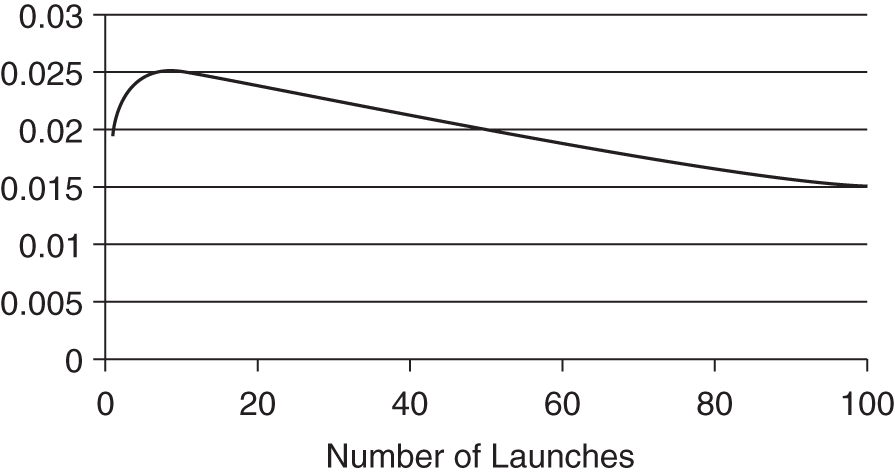
EXHIBIT 12.2 Conditional Robust Bayesian Method: Chance of Shuttle Disaster after Each Observed Near Miss (e.g., Falling Foam, O-Rings Burning Through) with an Otherwise Successful Launch
Exhibit 12.2 shows the probability of a failure on each launch given that every previous launch was a success but a near miss occurred on every launch (as was the case with the foam falling off the external tank). I started with the prior knowledge stated by some engineers that they should expect one launch failure in fifty launches. (This is more pessimistic than what Feynman found in his interviews.) I took this 2 percent failure rate as merely the expected value in a range of possible baseline failure rates. I also started out with maximum initial uncertainty about the rate of the near misses. Finally, I limited the disaster result to those situations when the event that allowed the near miss to occur was a necessary precondition for the disaster. In other words, the examined near miss was the only cause of catastrophe. These assumptions are actually more forgiving to NASA management.
The chart shows the probability of a failure on the first launch (starting out at 2 percent) and then updates it on each observed near miss with an otherwise successful flight. As I stated previously, I started with the realization that the real failure rate could be much higher or lower. For the first ten flights, the adjusted probability of a failure increases, even under these extremely forgiving assumptions. Although the flight was a success, the frequency of the observed near misses makes low-baseline near-miss rates less and less likely (i.e., it would be unlikely to see so many near misses if the chance of a near miss per launch were only 3 percent, for example). In fact, it takes about fifty flights for the number of observed successful flights to bring the adjusted probability of failure back to what it was.
But, again, this is too forgiving. The fact is that until they observed these near misses they acted as if they had no idea they could occur. Their assumed rate of these near misses was effectively 0 percent—and that was conclusively disproved on the first observation.
The use of Bayesian methods is not reserved for special situations. I consider them a tool of first resort for most measurement problems. The fact is that almost all real-world measurement problems are Bayesian. That is, you knew something about the quantity before (a calibrated estimate, if nothing else), and new information updates that prior knowledge. It is used in clinical testing for life-saving drugs for the same reason it applies to most catastrophic risks—it is a way to get the most uncertainty reduction out of just a few observations.
The development of methods for dealing with near misses will greatly expand the data we have available for evaluating various disasters. For many disasters, Bayesian analysis of near misses is going to be the only realistic source of measurement.
ADDING DETAIL TO THE MODEL
In chapter 11 we discussed how decomposition and a little bit of Monte Carlo simulation helps estimates. Bear in mind that we could always add more decomposition detail to a model. Models will never be a perfectly accurate representation of what is being modeled. If they were, we wouldn't call them models; we would call them reality. So the objective of improving a model is not infinite detail but only to find marginal improvements that make the model incrementally more realistic and less wrong. As long as the value of being less wrong (the information value) exceeds the cost of the additional complexity, then it is justified. Otherwise, it is not.
In the one-for-one substitution model, we can think of decompositions in three dimensions: vertical, horizontal, and Z. This classification of decompositions is convenient given the structure of a spreadsheet, and they naturally allow for different levels of effort and complexity.
Vertical Decomposition
This is the simplest decomposition. It involves only replacing a single row with more rows. For example, if we have a risk that a data breach is 90 percent likely per year and that the impact is $1,000 to $100 million, we may be putting too much under the umbrella of a single row in the model. Such a wide range probably includes frequent but very small events versus infrequent but serious events. In this case, we may want to represent this risk with more than a single row. Perhaps we differentiate the events by those that involve a legal penalty in one row and those that do not in another. We might say that data breaches resulting in a legal penalty have a likelihood of 5 percent per year with a range of $2 million to $100 million. Smaller events happen almost every year but their impact is, say, $1,000 to $500,000. All we did for this decomposition was add new data. No new calculations are required.
Horizontal Decomposition
If you were starting with the one-for-one substitution model, a horizontal decomposition involves adding new columns and new calculations. For example, you might compute the impact as a function of several other factors. One type of impact might be related to disruption of operations. For that impact, you might decompose the calculation as follows:

Furthermore, cost per hour could be further decomposed as revenue per hour, profit margin, and unrecoverable revenue. In a similar way, you could decompose the cost of a data breach as being a function of the number of records compromised and a cost per record including legal liabilities.
When adding new variables such as these, you will need to add the following:
- Input columns. For continuous values you need to add an upper and lower bound. Examples of this would be to capture estimates of hours of duration, cost per hour, and so on. If you are adding probabilities of discrete events (remember, we already have one discrete probability regarding whether the event occurs at all) you just need a single column. Examples of this include the probability that, if an event occurs, legal liabilities might be experienced.
- Additional PRNG columns. For each new variable you add, you need to add another PRNG column. That column needs its own variable ID.
- Simulated loss column modification. Your simulated loss calculation needs to be updated to include the calculation from the decomposed values (e.g., the disruption example shown above).
- Expected loss column. This is the quick way to compute your ROI. But, remember, you can't just compute this based on the averages of all the inputs. You have to take the average of the values in the simulation.
Z Decompositions
Some decompositions will involve turning one row in the original risk register into an entirely separate model, perhaps another tab on the same spreadsheet. The estimates usually directly input into the risk register are now pulled from another model. For example, we may create a detailed model of a data breach due to third-party/vendor errors. This may include a number of inputs and calculations that would be unique to that set of risks. The new worksheet could list all vendors in a table. The table could include columns with information for each vendor, such as what type of services they provide, how long they have been an approved vendor, what systems and data they have access to, their internal staff vetting procedures and so on. That information could then be used to compute a risk of the breach event for each vendor individually. The output of this model is supplied to the original risk register. The simulated losses that would usually be computed on the risk register page are just the total losses from this new model.
The Z decomposition is essentially a new model for a very specific type of risk. This is a more advanced solution, but my staff and I frequently find the need to do just this.
Just a Few More Distributions
In the simple one-for-one substitution model, we only worried about two kinds of distributions: binary and lognormal. What we are calling the binary distribution (what mathematicians and statisticians may also call the Boolean or Bernoulli distribution) only produces a 0 or 1. Recall from chapter 4 that this is to determine whether or not the event occurred. If the event occurred then we use a lognormal distribution to determine the size of the impact, expressed as a monetary loss. We use the lognormal because it naturally fits fairly well to various losses. Similar to a lognormal, losses can't be negative or zero (if the loss was zero we say the loss event didn't happen). It also has a long upper tail that can go far beyond the upper bound of a 90 percent confidence interval.
But we may have information that indicates that the lognormal isn't the best fit. When that is the case, then we might consider adding one of the following. Note that the random generators for these distributions are on the book website. (See exhibit 12.3 for illustrations of these distribution types.)
- Normal: A normal (or Gaussian) distribution is a bell-shaped curve that is symmetrically distributed about the mean. Many natural phenomenon follow this distribution, but in some applications it will underestimate the probability of extreme events. This is useful when we have reason to believe that the distribution is symmetrical. That is, a value is just as likely to be above the middle of the stated confidence interval as below. Also, in this distribution values are more likely to be in the middle. But, unlike the lognormal, nothing keeps this distribution from producing zero or negative values. If you use a normal distribution with a 90 percent confidence interval of 1 to 10, it is possible to produce a negative value (in this case 2.2 percent). If that is intended, then perhaps this distribution is the answer. It is also the distribution you would usually use if you are estimating the mean of a population based on a sample greater than thirty.
- Triangular: For a triangular distribution, the UB and LB represent absolute limits. There is no chance that a value could be generated outside of these bounds. In addition to the UB and LB, this distribution also has a mode that can vary to any value between the UB and LB. This is sometimes useful as a substitute for a lognormal, when you want to set absolute limits on what the values can be but you want to skew the output in a way similar to the lognormal. It is useful in any situation when you know of absolute limits but the most likely value might not be in the middle, such as the normal distribution.

EXHIBIT 12.3 Examples of Various Distribution Types
- Beta: As we already saw in this chapter, Beta distributions are very useful in a measurement problem that is fairly common in risk assessment. It is also extremely versatile for generating a whole class of useful values. They can be used to generate values between 0 and 1 but some values are more likely than others. This result can also be used in other formulas to generate any range of values you like. They are particularly useful when modeling the frequency of an event, especially when the frequency is estimated based on random samples of a population or historical observations. In this distribution it is not quite as easy as in other distributions to determine the parameters based only on upper and lower bounds. The only solution is iteratively trying different alpha and beta values until you get the 90 percent CI you want. If alpha and beta are each greater than 1 and equal to each other, then it will be symmetrical, where values near .5 are the most likely and less likely further away from .5. The larger you make both alpha and beta, the narrower the distribution. If you make alpha larger than beta, the distribution will skew to the left, and if you make beta larger, it skews to the right.
- Power law: The power law is a useful distribution for describing phenomena with extreme, catastrophic possibilities—even more than lognormal. The fat tail of the power law distribution enables us to acknowledge the common small event, while still accounting for more extreme possibilities. In fact, sometimes this type of distribution may not always have a defined mean because the tail goes out so far. Be careful of producing unintended extreme results. To keep this from producing unrealistic results, you might prefer to use the truncated power law below. We show this distribution in a simple form that requires that you enter alpha and beta iteratively until you get the 90 percent CI you want.
- Poisson: A Poisson distribution tells you how likely a number of occurrences in a period would be, given the average number of occurrences per period. Imagine you have one hundred marbles and each marble is randomly distributed to one of eighty urns, which start out empty. After the marbles are distributed, some urns—28.6 percent—will still have no marbles, 35.8 percent will have one marble, 22.4 percent will have two, 9.3 percent will have three, and so on. This distribution is useful because an event that could happen in a year could happen more than once, too. When the annual likelihood exceeds 50 percent, the chance of happening twice or more exceeds 9 percent.
- Student t-distribution and log t distribution: The t-distribution, also known as the student-t distribution, after the inventor of the distribution, William Sealy Gossett, used student as a pseudonym when he published papers on it. The t-distribution is often used when we are estimating the mean of a population based on very small samples. A t-distribution has much fatter tails than a normal distribution. If a sample is somewhere less than thirty and as small as two, a t-distribution is a better representation of the error of the estimate of the mean than a normal distribution. The t-distribution can also be used to generate random variables with the same properties. If you want a symmetrical distribution similar to the normal but want more the extreme outcomes to be more extreme, the t-distribution may be a good fit.
- Hybrid and truncated distributions: Sometimes you have specific knowledge about a situation that gives you a reason to modify or combine the distributions previously mentioned. For example, a catastrophic impact of an event in a corporation can't have financial losses to the corporation itself greater than the total market value of the firm. Losses may usually follow a lognormal or power law distribution but they may need to be limited to some maximum possible loss. Also, when distributions are created from historical data, more than one distribution may be patched together to create a distribution that fits the observed data better. This is sometimes done in the financial world to more accurately describe market behavior where there are fat tails. I call these Frankendistributions.
Correlations and Dependencies Between Events
In addition to further decomposition and the use of better-fitting distributions, there are a few slightly more advanced concepts you may want to eventually employ. For example, if some events make other events more likely or exacerbate their impact, you may want to model that explicitly. One way this is done is to build correlations between events. This can be done using a correlation coefficient between two variables. For example, your sales are probably correlated to your stock prices. An example at www.howtomeasureanything.com/riskmanagement shows how this can be done.
But unless you have lots of historical data, you probably will have a hard time estimating a correlation. Correlations are not entirely intuitive metrics that calibrated estimators can approximate. You may be better off building these relationships explicitly as we first described in chapter 10. For example, in a major data breach, the legal liabilities and the cost of fraud detection for customers will be correlated, but that is because they are both partly functions of the number of records breached. If you decompose those costs, and they each use the same estimate for number of records breached, they will be correlated.
Furthermore, some events may actually cause other events, leading to cascade failures. These, too, can be explicitly modeled in the logic of a simulation. We can simply make it so that the probability of event A increases if event B occurred. Wildfires caused by downed power lines in California in 2018, for example, involved simultaneous problems exacerbated the impact of having to fight fires as well as dealing with a large population without power. Including correlations and dependencies between events will cause more extreme losses to be much more likely.
ADVANCED METHODS FOR IMPROVING EXPERT'S SUBJECTIVE ESTIMATES
In chapter 11 we discussed how calibration training can improve the subjective estimates of subject matter experts. Most experts will start out extremely overconfident, but with training they can learn to overcome that. Observations will confirm that the experts will be right 90 percent of the time they say they are 90 percent confident.
There is more we can add to the expert's estimates. First, experts are not just overconfident, but highly inconsistent. Second, we may need to consider how to aggregate experts because not all experts are equally good.
Reducing Expert Inconsistency
In chapter 7, we described the work of a researcher in the 1950s, Egon Brunswik, who showed that experts are highly inconsistent in their estimates. For example, if they are estimating the chance of project failures based on descriptive data for each project (duration, project type, project manager experience, etc.) they will give different estimates for duplicates of the same project. If the duplicates are shown far apart enough in the list—say one is the eleventh project and the other is the ninety-second, experts who forget they already answered will usually give at least a slightly different answer the second time. We also explained that Brunswik showed how we can remove this inconsistency by building a model that predicts what the expert's judgment will be and that, by using this model, the estimates improve.
A simple way to reduce inconsistency is to average together multiple experts. JDM researchers Bob Clemen and Robert Winkler found that a simple average of forecasts can be better calibrated than any individual.1 This reduces the effect of a single inconsistent individual, but it doesn't eliminate inconsistency for the group, especially if there are only a few experts.
Another solution is to build a model to try to predict the subjective estimates of the experts. It may seem nonintuitive, but Brunswik showed how such a model of expert judgment is better than the expert from whom the data came, simply by making the estimates more consistent. You might recall from chapter 7 that Brunswik referred to this as his lens method.
Similar to most other methods discussed in this chapter, we will treat the lens method as an aspirational goal and skim over the details. But if you feel comfortable with statistical regressions, you can apply the lens method just by following these steps. We've modified it somewhat from Brunswik's original approach to account for some other methods we've learned about since Brunswik first developed this approach (e.g., calibration of probabilities).
- Identify the experts who will participate and calibrate them.
- Ask them to identify a list of factors relevant to the particular item they will be estimating, but keep it down to ten or fewer factors.
- Generate a set of scenarios using a combination of values for each of the factors just identified—they can be based on real examples or purely hypothetical. Use at least thirty scenarios for each of the judges you survey. If the experts are willing to sit for it, one hundred or more scenarios will be better.
- Ask the experts to provide the relevant estimate for each scenario described.
- Average the estimates of the experts together.
- Perform a logistic regression analysis using the average of expert estimates as the dependent variable and the inputs provided to the experts as the independent variable.
- The best fit formula for the logistic regression becomes the lens model.
Performance Weights
In chapter 4 and in the lens model, we assume we are simply averaging the estimates of multiple experts. This approach alone (even without the lens method) usually does reduce some inconsistency. There are benefits to this approach but there is a better way.
A mathematician focusing on decision analysis who has researched this in detail is Roger Cooke.2 He conducted multiple studies, replicated by others, that showed that performance-weighted expert estimates were better than equally weighted expert estimates.3 and applied these methods to several types of assessments including risk assessments of critical infrastructures.4
Cooke and his colleagues would develop topic-specific calibration questions. Unlike the generic trivia calibration question examples we showed previously, this enabled Cooke to simultaneously measure not only the calibration for confidence of the expert but also to assess the general knowledge of the expert in that field. Consider, for example, two equally well calibrated experts but one provides ranges half as wide as the other. Because both experts were calibrated, both experts provided ranges that contained the answer 90 percent of the time. But because the latter expert provides narrower 90 percent confidence interval, she is assessed to have more knowledge than the other expert and, therefore, less uncertainty.
Cooke uses both calibration performance and the assessment of knowledge to compute a weight for each expert. My staff and I have the opportunity to use the performance-weighted methods with clients. What I find most interesting is how most experts end up with a performance weight of at or near zero with just a few—or maybe one—getting the majority weighting for the group.
I find this astonishing. Can it really be true that we can ignore half or more of experts' opinions in fields as diverse as operational risks, engineering estimates, terrorism risks, and more? Apparently so. This is consistent with the research of Philip Tetlock (see chapter 9). Even though Tetlock uses different scoring methods he still finds that a few “superforecasters” outperform the others by large margins.5 You might improve risk models a lot by finding the superforecasters in your team.
OTHER MONTE CARLO TOOLS
There are plenty of good Monte Carlo tools to pick from (see exhibit 12.4). The total number of users for all of the various Monte Carlo software tools is in the tens of thousands and chances are that somebody is already applying one of these tools to problems very similar to yours.
You probably already have a license for Excel and that will be good enough for starting out. But as you start developing more elaborate decompositions and using more advanced methods, you may find some other tools more suitable. Some of the tools listed in exhibit 12.4 are actually add-ins for Excel that add a lot more functionality. Others are entirely separate software packages, and some may be more suited to enterprise solutions. There are players in this field coming and going on a regular basis so treat this as a tentative list for starting your research.
EXHIBIT 12.4 Some Available Monte Carlo Tools
| Tool | Made by | Description |
| Excel | Microsoft (Free supporting templates by HDR) | Sufficient for the vast majority of users; HDR has developed free downloadable templates that use the HDR pseudo random number generator (PRNG) www.howtomeasureanything.com/riskmanagement |
| SIPMath | Sam Savage, Probabilitymanagement.org | An intuitive and free set of Excel add-ins from the Savage's nonprofit that promotes standards in simulation tools; these tools use the Hubbard PRNG |
| RiskLens | RiskLens | Developed primarily for cybersecurity with a decomposition already developed for that use |
| Risk Solver Engine | Frontline Systems Incline Village, NV | Unique Excel-based development platform to perform interactive Monte Carlo simulation at unprecedented speed; support SIP and SLURP formats for probability management |
| Analytica | Lumina Decision Systems, Los Gatos, CA | Uses an extremely intuitive graphical interface that enables complex systems to be modeled as a kind of flowchart of interactions; has a significant presence in government and environmental policy analysis |
| R and RStudio | Open source, supported by R Foundation for Statistical Computing | Not just Monte Carlo; R is a popular open source stats programming language with a large user group; most users of R will use RStudio as a more intuitive interface; requires a bit more technical knowledge |
| Crystal Ball | Oracle (Previously Decisioneering, Inc.) Denver, CO | Excel-based; a wide variety of distributions; a fairly sophisticated tool; broad user base and technical support |
| @Risk | Palisade Corporation, Ithaca, NY | Excel-based tool; main competitor to Crystal Ball; many users and much technical support |
| SAS | SAS Corporation, Raleigh, NC | Goes well beyond the Monte Carlo; extremely sophisticated package used by many professional statisticians |
| SPSS | SPSS Inc., Chicago, IL | Goes far beyond the Monte Carlo; tends to be more popular among academics |
| Mathematica | Wolfram Research, Champaign, IL | Extremely powerful tool that does much more than Monte Carlo; used primarily by scientists and mathematicians, but has applications in many fields |
| Pelican | Vose Software, Ghent, Belgium | A Monte Carlo-based Enterprise Risk Management and risk governance tool |
SELF-EXAMINATIONS FOR MODELERS
Too often, a model of reality takes on a reality of its own. The users of the model are likely eventually to adopt it as the truth. The philosophers Plato (an idealist) and Benedict de Spinoza (a rationalist) were similar in that respect. That is, they believed that all knowledge had to come from their models (reason) alone—that everything we know could have been deduced without observation. In a way, they believed, the need to resort to observation merely shows the weaknesses and flaws in our ability to reason.
The philosopher David Hume, by contrast, was an empiricist. Empiricists doubt even the most rigorous, rational models and prefer to get their hands dirty with observation and real-world facts. They insist that reason alone would be insufficient for the basis of our knowledge even if our ability to reason were perfect. In fact, empiricists say that much of what we call reason could not have been known without observation first. But the best combination appears to be skill in theory and in observation. The Nobel Prize–winning physicists Enrico Fermi and Richard Feynman were competent theorists as well as consummate observers. They had a knack for checking just about any claim with observations much simpler than one might expect were necessary.
However, I would say that most modelers, whether they really thought about this or not, are closer to Plato and Spinoza than Hume. They believe that because they are using a sophisticated sounding method such as Monte Carlo that the model should work. They and their clients may feel more confident in their decisions having gone through this process. But because we know about the analysis placebo effect (described in previous chapters) we also know that their confidence in the method is an unreliable indicator of effectiveness.
Constantly testing your model by seeing how well it matches history is absolutely essential. This requires tracking and/or backtesting of models. Tracking is simply recording forecasts and comparing them with eventual outcomes. Look at a set of project cost estimates produced by a model. How well did they match reality? Backtesting is similar to tracking except that with backtesting the real-world events used to test the model may have predated when the model was built. In other words, you test the model against data you already had. For the same model which estimates project costs, you don't have to wait until current projects are done. You can look at past models. These tests are necessary to have any confidence in modeling at all. However, even though this testing is not difficult to implement, the survey of models in chapter 10 showed it is rarely done. There is simply very little incentive for analysts or management to go back and check models against reality.
We know from the research mentioned in the previous chapters that there is evidence that statistical models, decomposition, and the use of Monte Carlos improve estimates. But we know this not because the users merely felt better about their estimates. We know it because estimates were compared to actual outcomes in a large number of trials.
In that spirit, I try to routinely go back and check forecasts against reality. Of all the variables in all the models I've forecasted, I can easily get real data to compare to forecasts for only a small percentage, but it still adds up to more than two hundred variables in which we had initially estimated outcomes and confirmed outcomes to compare them to.
We can validate forecasts of binary probabilities in the same way we validated the results of true/false calibration tests in the previous chapter. That is, of all the times we said some event was about 10 percent likely, it should have occurred about 10 percent of the time. To validate ranges, we can apply a test that is just a bit more detailed than the test we used to validate 90 percent confidence intervals. To get a little bit more data out of the actual observations, I separated all the original range forecasts into multiple buckets:
- 50 percent should be in the interquartile range (the middle half of a distribution).
- 5 percent should be above the upper bound of a 90 percent CI.
- 5 percent should be below the lower bound of a 90 percent CI.
- 20 percent should be above the interquartile but below the upper bound of a 90 percent CI.
- 20 percent should be below the interquartile but above the lower bound of a 90 percent CI.
The buckets are arbitrary and I could have defined a very different set. But, as with the true/false tests, things should be about as frequent as we estimate. In this case, the actual data should fall in these sections of a range about as often as would be implied by the forecasts. And ranges don't have to be all the same type. Some separation of buckets can always be done for any distribution of a range, no matter what its shape. No matter how I define a distribution, only 5 percent of the data should be above the 95 percentile of the forecast.
When I go back and look, I find that, within a statistically allowable error, the forecasts of most types of data were distributed as we expected. For those, the forecasting methods were working. However, in 2001, just as I was reaching thirty projects in my database, I was also finding that there were certain variables the calibrated estimators still didn't forecast well, even though they had shown their ability to assess probabilities in the calibration tests. The two areas where I found that even calibrated persons failed to perform well were the estimation of catastrophic project failures and business volumes.
In the case of project cancellations (stopping a project after beginning it), the assessed probabilities were far too low to account for the observed rate of cancellations. Calibrated estimators never gave a chance of cancellation to be above 10 percent and the average estimate is 5 percent. But observation of those same projects after they got started showed that the cancellation rate was six out of thirty, or 20 percent. According to the binomial distribution we discussed previously, it would be extremely unlikely, if there were only a 5 percent chance of cancellation per project, to see six cancellations out of thirty (less than one in one thousand). One of the cancellations was a project that was thought to have no chance of cancellation, which, of course, should be impossible.
I saw a similar inability for people not directly involved with tracking business volumes to forecast them well. For many of the operational investments I was assessing for companies, the return on investment had to be partly a function of sales. For example, if an insurance company was trying to increase the efficiency of new policy processing, the value had to be, in part, related to how many new policies were sold. At first, we would ask IT managers to estimate this and, if the information value justified it, we would do more research. Again, I found that too many of the actual observations of business volumes were ending up in the extremes of the original forecast.
The good news is that because of this tracking and testing, I found that the historical data for project cancellations and changes in business volumes was more reliable than the calibrated estimators—even if the data came from the industry and not that particular firm. And now we know better than to ask managers to estimate business volumes if tracking them is not in their own area of expertise. Furthermore, for every other kind of forecast I was asking estimators to make (e.g., project duration, productivity improvements, technology adoption rates, etc.), the calibrated estimator did as well as expected—about 90 percent of the observations fell within the originally stated 90 percent CI.
Using historical data to validate models and track forecasts to compare them to actual outcomes is fairly simple. Don't worry that you can't get all the data. Get what you can. Even though I had limited data, I still learned something useful from tracking results. Here are four things to keep in mind (if these items sound a little like what we saw previously, it is because the same principles apply):
- Don't assume that because each model was unique, you can't assess outcomes in some aggregate fashion. All forecasts of any type can still be assessed by comparing the chance you gave the event to the outcomes. For example, you can look at the 5 percent lower tails of all your forecasts of any kind and see whether about 5 percent landed there. Also, don't commit the Mount St. Helens fallacy (from chapter 10). Just because there are unique aspects of two different systems doesn't mean that we can't learn something from one about the other. No matter how specialized your problem may be, your reference class is larger than that problem.
- Don't worry about not having enough data to track because you only have a few models. Almost every variable in your model is a forecast that can be checked against observation, whether that forecast was based on other historical data or calibrated estimates. Even a single, typical model will have several forecasts you can attempt to track. Ten models use and produce just ten forecasts—there may be hundreds of individual variables.
- Don't worry about the fact that there are some data you can't easily get—because there are data you can easily get. If you don't know whether the forecast of some productivity improvement was accurate without doing a big study of operations, don't worry. You can easily check the actual project duration or widgets produced.
- Don't presume that the few data points will tell you nothing. Laplace's rule of succession is just one example in which you can still make valid inferences from a small amount of data. At least get the data, then determine how much can be learned from it. In the case of the IT project that had a 0 percent chance of cancellation, I proved the original estimators wrong with one data point of a failure. If you find that events that were estimated to have less than a 1 percent chance of occurrence happened three times out of just ten forecasts, then you have all the data you need to indicate that the event is probably more likely than 1 percent.
- Change your time scales. There is a habit among some analysts to look at five years of data as if that were a magic number. But, as 2008 proved, events that happen only once every several decades can be much more impactful. Consider an event that has only a 5 percent chance of occurrence in one year. In a five-year period, it still only has a 23 percent chance of occurrence but will have an 87 percent chance sometime during the typical forty-year working career. Even showing management the chance of an event occurring in a decade as opposed to a year puts impactful events in a better perspective.
- If you use history, use meta-history. Meta-history is simply the larger reference class than the history of the immediate topic of consideration, that is, the set of similar histories of events. For example, if you are looking at the history of the price volatility of a stock, ask yourself, “Historically, how often has this history predicted an outcome within a given range?” It is common for financial analysts to use the volatility of the previous five years of a stock to estimate the volatility for the next quarter. If we look at each day in the history of Dow Jones, how well do the previous five years match the volatility of the following quarter? We would find that it varies by a factor of about two—the volatility of the next quarter could be anywhere between half as much and twice as much as the previous five years. Likewise, as we found in chapter 10, don't just accept a historical correlation between two variables as immutable fact without asking how often previously correlated variables change their correlation.
The first thing you have to know is yourself. A man who knows himself can step outside himself and watch his own reactions like an observer.
—ADAM SMITH [pseudonym], The Money Game
NOTES
- 1. R.T. Clemen and R. L. Winkler, “Combining Economic Forecasts,” Journal of Business & Economic Statistics 4, no. 1 (January 1986): 39–46.
- 2. Roger Cooke, Max Mendel, Wim Thijs, “Calibration and Information in Expert Resolution: A Classical Approach,” Automatica 24, no. 1 (1988): 87–94.
- 3. M. P. Wiper, S. French, and R. Cooke, “Hypothesis-Based Calibration Scores Author(s),” Journal of the Royal Statistical Society, Series D (The Statistician) 43, no. 2 (2011): 231–36, https://www.jstor.org/stable/2348340; Roger M. Cooke, Experts in Uncertainty: Opinion and Subjective Probability in Science (New York: Oxford University Press, 1991).
- 4. R. M. Cooke and L.H.J. Goossens, “Expert Judgement Elicitation for Risk Assessments of Critical Infrastructures,” Journal of Risk Research 7 (2004): 643–56.
- 5. Philip E. Tetlock and Dan Gardner, Superforecasting: The Art and Science of Prediction (New York: Crown Publishers, 2015).