Chapter . Designing the 10-Foot User Interface
In this chapter, we’ll cover some of the common challenges that developers face when they go about designing a 10-foot user interface for web apps. Our goal is for you to gain a better understanding of the nuances between an application viewed from a distance versus one viewed nearby on your laptop or desktop computer.
Focus on Design First, Implementation Second
When developing your web app, it’s always a good idea to break down the project into separate phases. As you may already know, the design phase is often the most critical and time consuming step in a project. Though you may want to quickly dive in and start implementing right away, you should fight this urge and focus on the design phase.
Jumping to the implementation phase before design mocks are created can often result in hours forfeited to developing an imperfect prototype. This can often limit your development in the following ways:
Constricts and limits design freedom based on your implementation
Potentially forces you to reject what you currently have, leading you to start from scratch
As you start to develop a 10-foot user interface, focus on design first. Set a goal to mock up anywhere from three to six interfaces, each posing a different perspective, then evaluate the pros and cons of each. Subsequently, evaluate, combine, and reiterate until you have a user interface with which you are happy.
Learn from Other 10-Foot User Experiences
There are already various 10-foot interfaces being used today on TV. The Google TV UI is one vision of a 10-foot user experience, but there are other UIs worth comparing as well. Figure 16 shows the home screen for XBMC, a media center operating system branched from Xbox.
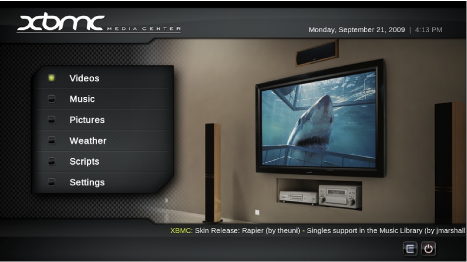
Notice that the UI displays both static and dynamic information. The navigation to browse different categories of content is positioned on the left, with a visual icon indicating where the current selection cursor exists. This interface requires the user to interact with it before presenting any data to the user. Figure 17 shows how the UI changes when a user elects to see her video library.

Notice the carousel viewing mechanism to browse videos based on a visual image. The item with a focused selection and highlighted border is the item currently selected. Its icon is also larger than the rest and centered, providing additional visual queues to the user about which item is currently selected. As you can see in Figure 18, the UI changes again when a user switches to a music library.

This music library is presented to the user in grid list format with vertical scrolling, and the current selection is identified this time only by a highlighted border.
While the scope of this book doesn’t allow us to comprehensively cover all of the 10-foot UIs out there, some other UIs targeted for TV that may be worth a look before you embark on your own design include UIs used in multipurpose gaming consoles, such as XBOX 360 and PlayStation 3, as well as UIs from other TV devices, such as Boxee and Apple TV. Our goal is not to draw comparisons here, but rather for you to get a sense of and draw inspiration from the various approaches that exist.
Tip
You can also read about 10-foot user interfaces on Wikipedia at http://goo.gl/pp5pc.
Fundamentals of the 10-Foot User Interface
Reference: User Interface Elements
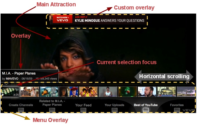
We’ll be referencing common phrases and objects throughout the chapter to denote a specific element or section of the interface. In order to reference these elements, they need to be clearly defined to the reader. Take a look at Figure 19, which displays various UI elements referenced throughout the chapter.
Understand Your Users
As we discussed in Chapter 2, environment, mind-set, and interaction factor into a user’s 10-foot experience. Although there is some variability around these factors, there are certain usability patterns which hold true for most, if not all, users.
Google TV is an open platform that connects a variety of users to web apps. To optimize this experience for users, it’s important to understand that there is a spectrum of users that will use your web app.
On one end of the spectrum, there are “passive” users. These users relax on the sofa in a comfortable position, leaning back while casually surfing the web. They will perform basic web browsing actions, such as searching for videos, using a single hand and finger on the remote. Unnecessary movement is avoided and minimized in this case. The less energy spent swapping fingers and searching for the right buttons to push on the remote, the better. They generally don’t care so much about what other capabilities or features an application has to offer.
Passive users typically exhibit the following characteristics:
D-Pad navigation is vital
Multimedia transport controls are a plus
May quickly feel overwhelmed and confused by complex interfaces
Rarely prefers to use mouse track pad and clicker
Unlikely to discover or use shortcut keys
Simple interface, interactions, and input devices are preferred
On the opposite end of the spectrum are “power” users. These users enjoy the challenge of learning how to do what they want, even if the user experience is less than optimal. Power users find the qwerty keyboard input device favorable, similar to their interactions with a personal computer. They are fully engaged and hardly inconvenienced by placing two hands on the input device in order to type more efficiently.
Power users may exhibit the following characteristics:
D-Pad navigation is a plus, but not vital
Prefers to use mouse trackpad and clicker
Multimedia transport controls are rarely used
Impressed by feature-rich applications and interfaces
Appreciate complex input devices to provide more control
Willing to discover, learn, and use shortcut keys
You may find that your application is geared more to one end of the spectrum than the other. Ultimately, how well your web app is used depends on the audience (as discussed in the previous chapter), so if you know that your audience is comprised of nontechnical users, your best bet is to design an app for passive users. Despite the versatility of power users, you should note that the D-Pad is relevant and relatively important for all users. In other words: D-Pad should be the primary means for interaction with your web apps.
Common Interface Elements
Within any user interface, there are a common set of interface elements, to which users respond differently depending on the context of their environment. Since we’re designing 10-foot interfaces, common interface elements such as horizontal/vertical scrolling, layout, and overlays must behave differently in order to achieve the optimal user experience. There are important characteristics to remember for each element, including how each one may vary from traditional web browser designs.
Layout
The interface is comprised of many different elements, resulting in an almost infinite number of ways to choose a specific layout to present your content.
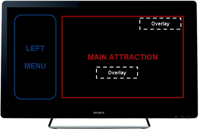
Figures 20 and 21 illustrate two common screen layouts which developers typically implement for Google TV. Figure 20 illustrates the “main attraction” approach, while Figure 21 illustrates the “embedded main attraction” approach. Both approaches have advantages and disadvantages, as we’ll discuss.
Main Attraction
The main attraction layout is often used to display dynamic content, such as videos. Transparent menus are typically placed along one of the neighboring margins of the interface. Bottom or left margins are typically the most common. Note that additional overlays such as video playback controls and notification dialogs are generally placed in the middle where it’s most visible and apparent to the user.

Advantages:
Familiar interface from existing set-top box channel guide menus
Main attraction is always visible and occupies the entire screen real estate
Users can always hit “Esc” or “Exit” buttons to easily return to the main attraction
Good for displaying video, sideshows, and live content
Simple and user-friendly
Disadvantages:
Not intuitive for content requiring more user input
Menus and overlays may obstruct the view of the main attraction
Generally limited to one-dimensional menus and submenus
Embedded Main Attraction
The main attraction layout typically displays a list of items in grid format or the live multimedia content itself in an embedded frame. This layout gives menus designated space on any side of the main attraction area, typically positioned to the left of it. Additional transparent overlays can sometimes be positioned over the main attraction area, but is not typically done if displaying static content such as a grid list of items.
Advantages:
Good for presenting categories for users to browse through
Persistent menus for presenting content via categories
Good for static content and information like books and news
Disadvantages:
Requires extra step to toggle main attraction to fullscreen mode
Requires user interaction before loading content into main attraction area
Interface is more complex with potentially lots of ways to navigate
Transparent Overlays
The following questions can help in determining whether to make any overlay transparent when displaying it over existing content:
Is the content behind the overlay displaying dynamic content such as streaming video?
Is there information behind the overlay which is important to remain visible to the user?
Is the overlay something which should display only temporarily and can be dismissed either by the user or via timer?
Note that not all overlays need to be transparent. Transparency generally indicates to the user that an overlay is merely a temporary layer placed above a more important piece of content. For example, when displaying video, it’s best to make playback control overlays transparent so the user can see what’s behind it, and also to indicate that it can be dismissed.
Similarly, when an overlay is opaque, it indicates to the user that a more important piece of data is contained within. For example, if the left menu column was displayed in opaque fashion, it would indicate the menu is persistent and cannot be dismissed, which may or may not always be true.
Tip
Use transparency wisely. Overlays that are less important and configured to be dismissed either by a user or timer should be made transparent. The overlays for containers that are persistent and contain important data for the user to interact with should be made opaque.
Navigation
When you begin to design the navigation scheme for your interface, it may seem overwhelming at first, given all of the design considerations. The rule of thumb and preferred mode of navigating 10-foot interfaces is via keyboard navigation. All Google TV devices come equipped with an input device, including a D-Pad (Figure 22). Though a qwerty keyboard and trackpad are also available, all existing TV menus and interfaces today are generally designed to be interfaced with using a simple remote with a D-Pad. So we can’t reiterate enough how important it is that your app use the D-Pad as the primary mechanism for navigation.

We’ll touch more on this topic in the next two chapters, particularly Chapter 5, which dives deep into how to actually make a web app D-Pad navigable.
Scrolling
Traditional scrolling models which work well on desktop browsers do not translate well over to the 10-foot interface. Scrolling through traditional scroll bars with a D-Pad is not an optimal experience for users.
In almost all cases, design your own scrolling mechanism using animations to transition between items or pages smoothly. It’s best to let the user’s current selection initiate the scrolls as it moves across each item instead of supplying “next” or “previous” page links.
Figure 23 displays an example of a web application implementing horizontal scrolling. Notice that there are no page links for users to click on. Instead, the user simply navigates left or right using the directional pad to browse across the pages of the video gallery.
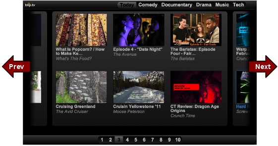
The same scrolling mechanism can apply vertically. However, since TV screens are landscape with a wider width than height, there is considerably more screen real estate in the horizontal plane than there is in the vertical. If you need to implement scrolling in your interface, default to horizontal scrolling mechanisms whenever possible.
Typefaces and Graphics
Font sizes and graphics need to be large enough to be viewed comfortably from at least 10 feet away.
One tricky “gotcha” to setting typefaces and graphics is to take into account the two different resolutions in most HD displays. Depending on whether the viewer’s display is rendering 1280 × 720 (720P) or 1920 × 1080 (1080P) resolutions, you may need to adjust your font and graphic sizes accordingly.
Tip
Different fonts can add to the look and feel of your interface. Be sure to scroll through the list of fonts in the Google Font Directory at http://code.google.com/webfonts to get an idea of how custom fonts can be used in your web app.
Text
When designing a 10-foot interface, displaying less information is really key to driving a positive user experience. TV viewers will easily feel overwhelmed by text-heavy interfaces with complicated navigation schemes, menus, and buttons. If you’re displaying text, consider trimming the text to only show a small snippet of it. A good rule of thumb is to use text the same way that you would in an art museum: you wouldn’t expect visitors to read through more than a small description for a visual piece of art.
Visual and Audio Cues
Visual graphics and cues are a valuable way to keep users informed about navigation or state in a given application. Well-placed and well-timed visuals can dramatically improve the user experience and make the user feel more connected to the application. Text is often times cumbersome, takes up precious screen real estate, and does a poor job of communicating status to users. On the other hand, a well-done visual graphic, logo, or effect will not only improve the visual quality and polish of your application, but will also better convey what the application is doing behind the scenes.
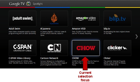
One visual cue which you’ll indefinitely need to design is the user’s current selection focus (Figure 24). Users will rely on the selection focus to navigate and interact with your application, and thus you should aim to include the following logic:
Only one selection focus exists
Selection focus must be persistent and remain visible at all times
Selection focus is driven by the D-pad
Audio cues can help liven up your app to give a much more polished feel. Playing a subtle sound effect each time the selection focus moves or behind toggling of a menu confirms to the user that her action was received. If you do decide to add audio effects and cues to your application, remember to include a way for users to toggle this functionality on or off. Google TV users may be watching another program or listening to music in the background as they explore and interact with your application, so the capability to disable sound is a requirement if you plan on including audio cues.