
Chapter 6. Bayes Classifier on Cloud Dataproc
Having become accustomed to running queries in BigQuery where there were no clusters to manage, I’m dreading going back to configuring and managing Hadoop clusters. But I did promise you a tour of data science on the cloud, and in many companies, Hadoop plays an important role in that. Fortunately, Google Cloud Dataproc makes it convenient to spin up a Hadoop cluster that is capable of running MapReduce, Pig, Hive, and Spark. Although there is no getting away from cluster management and diminished resources,1 I can at least avoid the programming drudgery of writing low-level MapReduce jobs by using Apache Spark and Apache Pig.
In this chapter, we tackle the next stage of our data science problem, by creating a Bayesian model to predict the likely arrival delay of a flight. We will do this through an integrated workflow that involves BigQuery, Spark SQL, and Apache Pig. Along the way, we will also learn how to create, resize, and delete job-specific Hadoop clusters using Cloud Dataproc.
MapReduce and the Hadoop Ecosystem
MapReduce was described in a paper by Jeff Dean and Sanjay Ghemawat as a way to process large datasets on a cluster of machines. They showed that many real-world tasks can be decomposed into a sequence of two types of functions: map functions that process key-value pairs to generate intermediate key-value pairs, and reduce functions that merge all the intermediate values associated with the same key. A flexible and general-purpose framework can run programs that are written following this MapReduce model on a cluster of commodity machines. Such a MapReduce framework will take care of many of the details that make writing distributed system applications so difficult—the framework, for example, will partition the input data appropriately, schedule running the program across a set of machines, and handle job or machine failures.
How MapReduce Works
Imagine that you have a large set of documents and you want to compute word frequencies on that dataset. Before MapReduce, this was an extremely difficult problem. One approach you might take would be to scale up—that is, to get an extremely large, powerful machine.2 The machine will hold the current word frequency table in memory, and every time a word is encountered in the document, this word frequency table will be updated. Here it is in pseudocode:
wordcount(Document[] docs):
   wordfrequency = {}
   for each document d in docs:
      for each word w in d:
           wordfrequency[w] += 1
   return wordfrequency
We can make this a multithreaded solution by having each thread work on a separate document, sharing the word frequency table between the threads, and updating this in a thread-safe manner. You will at some point, though, run into a dataset that is beyond the capabilities of a single machine. At that point, you will want to scale out, by dividing the documents among a cluster of machines. Each machine on the cluster then processes a fraction of the complete document collection. The programmer implements two methods, map and reduce:
map(String docname, String content):
   for each word w in content:
      emitIntermediate(w, 1)

reduce(String word, Iterator<int> intermediate_values):
    int result = 0;
    for each v in intermediate_values:
      result += v;
    emit(result);
The framework manages the orchestration of the maps and reduces and interposes a group-by-key in between; that is; the framework makes these calls (not the programmer):
wordcount(Document[] docs):
   for each doc in docs:
        map(doc.name, doc.content)
   group-by-key(key-value-pairs)
   for each key in key-values:
        reduce(key, intermediate_values)
To improve speed in an environment in which network bisection bandwidth is low,3 the documents are stored on local drives attached to the compute instance. The map operations are then scheduled by the MapReduce infrastructure in such a way that each map operation runs on a compute instance that already has the data it needs (this assumes that the data has been presharded on the cluster), as shown in Figure 6-1.

Figure 6-1. MapReduce is an algorithm for distributed processing of datasets in which the data are presharded onto compute instances such that each map operation can access the data it needs using a local filesystem call
As the diagram indicates, there can be multiple map and reduce jobs assigned to a single machine. The key capability that the MapReduce framework provides is the orchestration and massive group-by-key after the map tasks complete and before the reduce jobs can begin.
Apache Hadoop
When Dean and Ghemawat published the MapReduce paper, they did not make Google’s MapReduce implementation open source.4 Hadoop is open source software that was created from parts of Apache Nutch, an open source web crawler created by Doug Cutting based on a couple of Google papers. Cutting modeled the distributed filesystem in his crawler on Google’s descriptions of the Google File System (a predecessor of the Colossus filesystem that is in use within Google Cloud Platform today) and the data processing framework on the MapReduce paper. These two parts were then factored out into Hadoop in 2006 as the Hadoop Distributed File System (HDFS) and the MapReduce engine.
Hadoop today is managed by the Apache Software Foundation. It is a framework that runs applications using the MapReduce algorithm, enabling these applications to process data in parallel on a cluster of commodity machines. Apache Hadoop provides Java libraries necessary to write MapReduce applications (i.e., the map and reduce methods) that will be run by the framework. In addition, it provides a scheduler, called YARN, and a distributed filesystem (HDFS). To run a job on Hadoop, the programmer submits a job by specifying the location of the input and output files (typically, these will be in HDFS) and uploading a set of Java classes that provide the implementation of the map and reduce methods.
Google Cloud Dataproc
Normally, the first step in writing Hadoop jobs is to get a Hadoop installation going. This involves setting up a cluster, installing Hadoop on it, and configuring the cluster so that the machines all know about one another and can communicate with one another in a secure manner. Then, you’d start the YARN and MapReduce processes and finally be ready to write some Hadoop programs. On Google Cloud Platform, we can create a fully configured Hadoop cluster by using the following single gcloud command:5
gcloud dataproc clusters create
     --num-workers=2
     --scopes=cloud-platform
     --worker-machine-type=n1-standard-4
     --master-machine-type=n1-standard-4
     --image-version=1.4
     --enable-component-gateway
     --optional-components=ANACONDA,JUPYTER
     --zone=us-central1-a
     ch6cluster
A minute or so later, the Cloud Dataproc cluster is created, all ready to go. The --num-workers, --worker-machine-type, and --master-machine-type parameters specify the hardware configuration of the cluster. The scopes parameter indicates what Cloud Identity Access Management (IAM) roles this cluster’s service account should have. For example, to create a cluster that will run programs that will need to administer Cloud Bigtable and invoke BigQuery queries, you could specify the scope as follows:
--scopes=https://www.googleapis.com/auth/bigtable.admin,bigquery
Here, I’m allowing the cluster to work with all Google Cloud Platform products. Cloud Dataproc allows you to specify an image version, so that any work you carry out is repeatable. Leave out --image-version to use the latest stable version. The --enable-component-gateway creates readily accessible, but secure, https proxy endpoints for various services running on the cluster. Besides the standard Hadoop services, we also want Jupyter, and so we specify it as an optional component. If your data (that will be processed by the cluster) is in a single-region bucket on Google Cloud Storage, you should create your cluster in that same zone to take advantage of the high bisection bandwidth within a Google datacenter; that’s what the --zone specification does.
Although the cluster creation command supports a --bucket option to specify the location of a staging bucket to store such things as configuration and control files, best practice is to allow Cloud Dataproc to determine its own staging bucket. This allows you to keep your data separate from the staging information needed for the cluster to carry out its tasks. Cloud Dataproc will create a separate bucket in each geographic region, choose an appropriate bucket based on the zone in which your cluster resides, and reuse such Cloud Dataproc–created staging buckets between cluster create requests if possible.6
We can verify that Hadoop exists by connecting to the cluster using Secure Shell (SSH). You can do this by visiting the Cloud Dataproc section of the Google Cloud Platform web console, and then, on the newly created cluster, navigate to the part of the cluster details that contains the list of VM instances. Click the SSH button next to the master node. In the SSH window, type the following:
hdfs dfsadmin -report
You should get a report about all the nodes that are running. Because we specified --enable-component-gateway, we could have verified this by accessing the HDFS NameNode web interface through the GCP web console (from the Web Interfaces section of the cluster details).
Need for Higher-Level Tools
We can improve the efficiency of the basic MapReduce algorithm by taking advantage of local aggregation. For example, we can lower network traffic and the number of intermediate value pairs by carrying out the reduce operation partially on the map nodes (i.e., the word frequency for each document can be computed and then emitted to the reduce nodes). This is called a combine operation. This is particularly useful if we have reduce stragglers—reduce nodes that need to process a lot more data than other nodes. For example, the reduce node that needs to keep track of frequently occurring words like the will be swamped in a MapReduce architecture consisting of just map and reduce processes. Using a combiner helps equalize this because the most number of values any reduce node will have to process is limited by the number of map nodes. The combine and reduce operations cannot always be identical—if, for example, we are computing the mean, it is necessary for the combine operator to not compute the intermediate mean,7 but instead emit the intermediate sum and intermediate count. Therefore, the use of combine operators cannot be automatic—you can employ it only for specific types of aggregations, and for other types, you might need to use special tricks. The combine operation, therefore, is best thought of as a local optimization that is best carried out by higher-level abstractions in the framework.
The word count example is embarrassingly parallel, and therefore trivial to implement in terms of a single map and a single reduce operation. However, it is nontrivial to cast more complex data processing algorithms into sequences of map and reduce operations. For example, if we need to compute word co-occurrence in a corpus of documents,8 it is necessary to begin keeping joint track of events. This is usually done using pairs or stripes. In the pairs technique, the mapper emits a key consisting of every possible pair of words and the number 1. In the stripes technique, the mapper emits a key, which is the first word, and the value is the second word and the number 1, so that the reducer for word1 aggregates all the co-occurrences (termed stripes) involving word1. The pairs algorithm generates far more key-value pairs than the stripes approach, but the stripes approach involves a lot more serialization and deserialization because the values (being lists) are more complex. Problems involving sorting pose another form of complexity—the MapReduce framework distributes keys, but what about values? One solution is to move part of the value into the key, thus using the framework itself for sorting. All these design patterns need to be put together carefully in any reasonably real-world solution. For example, the first step of the Bayes classifier that we are about to develop in this chapter involves computing quantiles—this involves partial sorting and counting. Doing this with low-level MapReduce operations can become quite a chore.
For these reasons and others, decomposing a task into sequences of MapReduce programs is not trivial. Higher-level solutions are called for, and as different organizations implemented add-ons to the basic Hadoop framework and made these additions available as open source, the Hadoop ecosystem was born.
Apache Pig provided one of the first ways to simplify the writing of MapReduce programs to run on Hadoop. Apache Pig requires you to write code in a language called Pig Latin; these programs are then converted to sequences of MapReduce programs, and these MapReduce programs are executed on Apache Hadoop. Because Pig Latin comes with a command-line interpreter, it is very conducive to interactive creation of programs meant for large datasets. At the same time, it is possible to save the interactive commands and execute the script on demand. This provides a way to achieve both embarrassingly parallel data analysis and data flow sequences consisting of multiple interrelated data transformations. Pig can optimize the execution of MapReduce sequences, thus allowing the programmer to express tasks naturally without worrying about efficiency.
Apache Hive provides a mechanism to project structure onto data that is already in distributed storage. With the structure (essentially a table schema) projected onto the data, it is possible to query, update, and manage the dataset using SQL. Typical interactions with Hive use a command-line tool or a Java Database Connectivity (JDBC) driver.
Pig and Hive both rely on the distributed storage system to store intermediate results. Apache Spark, on the other hand, takes advantage of in-memory processing and a variety of other optimizations. Because many data pipelines start with large, out-of-memory data, but quickly aggregate to it to something that can be fit into memory, Spark can provide dramatic speedups when compared to Pig and Spark SQL when compared to Hive.9 In addition, because Spark (like Pig and BigQuery) optimizes the directed acyclic graph (DAG) of successive processing stages, it can provide gains over handwritten Hadoop operations. With the growing popularity of Spark, a variety of machine learning, data mining, and streaming packages have been written for it. Hence, in this chapter, we focus on Spark and Pig solutions. Cloud Dataproc, though, provides an execution environment for Hadoop jobs regardless of the abstraction level (i.e., whether you submit jobs in Hadoop, Pig, Hive, or Spark).
All these software packages are installed by default on Cloud Dataproc. For example, you can verify that Spark exists on your cluster by connecting to the master node via SSH and then, on the command line, typing pyspark.
Jobs, Not Clusters
We will look at how to submit jobs to the Cloud Dataproc clusters shortly, but after you are done with the cluster, delete it by using the following:10
gcloud dataproc clusters delete ch6cluster
This is not the typical Hadoop workflow—if you are used to an on-premises Hadoop installation, you might have set up the cluster a few months ago and it has remained up since then. The better practice on Google Cloud Platform, however, is to delete the cluster after you are done. The reasons are two-fold. First, it typically takes less than two minutes to start a cluster. Because cluster creation is fast and can be automated, it is wasteful to keep unused clusters around—you are paying for a cluster of machines if the machines are up, regardless of whether you are running anything useful on them. Second, one reason that on-premises Hadoop clusters are kept always on is because the data is stored on HDFS. Although you can use HDFS in Cloud Dataproc (recall that we used an hdfs command to get the status of the Hadoop cluster), it is not recommended. Instead, it is better to keep your data on Google Cloud Storage and directly read from Cloud Storage in your MapReduce jobs—the original MapReduce practice of assigning map processes to nodes that already have the necessary data came about in an environment in which network bisection speeds were low. On the Google Cloud Platform, for which network bisection speeds are on the order of a petabit per second, best practice changes. Instead of sharding your data onto HDFS, keep your data on Cloud Storage and read the data from an ephemeral cluster, as demonstrated in Figure 6-2.
Because of the high network speed that prevails within the Google datacenter, reading from Cloud Storage is competitive with HDFS in terms of speed for sustained reads of large files (the typical Hadoop use case). If your use case involves frequently reading small files, reading from Cloud Storage could be slower than reading from HDFS. However, even in this scenario, you can counteract this lower speed by simply creating more compute nodes—because storage and compute are separate, you are not limited to the number of nodes that happen to have the data. Because Hadoop clusters tend to be underutilized, you will often save money by creating an ephemeral cluster many times the size of an always-on cluster with a HDFS filesystem. Getting the job done quickly with a lot more machines and deleting the cluster when you are done is often the more frugal option (you should measure this on your particular workflow, of course, and estimate the cost11 of different scenarios). This method of operating with short-lived clusters is also quite conducive to the use of preemptible instances—you can create a cluster with a given number of standard instances and many more preemptible instances, thus getting a lower cost for the full workload.

Figure 6-2. Because network bisection speeds on Google Cloud are on the order of a petabit per second, best practice is to keep your data on Cloud Storage and simply spin up short-lived compute nodes to perform the map operations. These nodes will read the data across the network. In other words, there is no need to preshard the data.
Initialization Actions
Creating and deleting clusters on demand is fine if you want a plain, vanilla Hadoop cluster, but what if you need to install specific software on the individual nodes? If you need the master and slave nodes of the Cloud Dataproc cluster set up in a specific way, you can use initialization actions. These are simply startup executables, stored on Cloud Storage, that will be run on the nodes of the cluster. For example, suppose that we want the GitHub repository for this course installed on the cluster’s master node, you would do three things:
-
Create a script to carry out whatever software we want preinstalled:12
#!/bin/bash USER=vlakshmanan # change this ... ROLE=$(/usr/share/google/get_metadata_value attributes/dataproc-role) if [[ "${ROLE}" == 'Master' ]]; then cd home/$USER git clone https://github.com/GoogleCloudPlatform/data-science-on-gcp fi -
Save the script on Cloud Storage:
#!/bin/bash
BUCKET=cloud-training-demos-ml
ZONE=us-central1-a
INSTALL=gs://$BUCKET/flights/dataproc/install_on_cluster.sh

# upload install file
gsutil cp install_on_cluster.sh $INSTALL
-
Supply the script to the cluster creation command:13
gcloud dataproc clusters create
   --num-workers=2
   ...
   --initialization-actions=$INSTALL
   ch6cluster
Now, when the cluster is created, the GitHub repository will exist on the master node. Some components, like Jupyter, are already known. For Jupyter, we could get away with just specifying it as one of the --optional-components to be installed.
Quantization Using Spark SQL
So far, we have used only one variable in our dataset—the departure delay—to make our predictions of the arrival delay of a flight. However, we know that the distance the aircraft needs to fly must have some effect on the ability of the pilot to make up delays en route. The longer the flight, the more likely it is that small delays in departure can be made up in the air. So, let’s build a statistical model that uses two variables—the departure delay and the distance to be traveled.
One way to do this is to put each flight into one of several bins, as shown in Table 6-1.
| <10 min | 10–12 minutes | 12–15 minutes | >15 minutes | |
|---|---|---|---|---|
| <100 miles | For example: Arrival Delay ≥ 15 min: 150 flights. Arrival Delay < 15min: 850 flights. 85% of flights have arrival delay < 15 minutes |
|||
| 100–500 miles | ||||
| >500 miles |
For each bin, I can look at the number of flights within the bin that have an arrival delay of more than 15 minutes, and the number of flights with an arrival delay of less than 15 minutes and determine which category is higher. The majority vote then becomes our prediction for that entire bin. Because our threshold for decisions is 70% (recall that we want to cancel the meeting if there is a 30% likelihood that the flight will be late), we’ll recommend canceling flights that fall into a bin if the fraction of arrival delays of less than 15 minutes is less than 0.7. This method is called Bayes classification and the statistical model is simple enough that we can build it from scratch with a few lines of code.
Within each bin, we are calculating the conditional probability P(Contime | x0, x1) and P(Clate | x0, x1) where (x0, x1) is the pair of predictor variables (mileage and departure delay) and Ck is one of two classes depending on the value of the arrival delay of the flight. P(Ck | xi) is called the conditional probability—for example, the probability that the flight will be late given that (x0, x1) is (120 miles, 8 minutes). As we discussed in Chapter 1, the probability of a specific value of a continuous variable is zero—we need to estimate the probability over an interval, and, in this case, the intervals are given by the bins. Thus, to estimate P(Contime | x0, x1), we find the bin that (x0, x1) falls into and use that as the estimate of P(Contime). If this is less than 70%, our decision will be to cancel the meeting.
Of all the ways of estimating a conditional probability, the way we are doing it—by divvying up the dataset based on the values of the variables—is the easiest, but it will work only if we have large enough populations in each of the bins. This method of directly computing the probability tables works with two variables, but will it work with 20 variables? How likely is it that there will be enough flights for which the departure airport is TUL, the distance is about 350 miles, the departure delay is about 10 minutes, the taxi-out time is about 4 minutes, and the hour of day that the flight departs is around 7 AM?
As the number of variables increases, we will need more sophisticated methods in order to estimate the conditional probability. A scalable approach that we can employ if the predictor variables are independent is a method called Naive Bayes. In the Naive Bayes approach, we compute the probability tables by taking each variable in isolation (i.e., computing P(Contime | x0) and P(Contime | x1) separately) and then multiplying them to come up with P(Ck | xi). However, for just two variables, for a dataset this big, we can get away with binning the data and directly estimating the conditional probability.
JupyterLab on Cloud Dataproc
Developing the Bayesian classification from scratch requires being able to interactively carry out development. Although we could spin up a Cloud Dataproc cluster, connect to it via SSH, and do development on the Spark Read–Eval–Print Loop (REPL), it would be better to use JupyterLab and get a notebook experience similar to how we worked with BigQuery in Chapter 5.
Among the web interfaces that we enabled with --enable-component-gateway was that for JupyterLab. Hence, we can connect to it similar to the way we connected to the HDFS Name Node, from the Google Cloud web console, in the Web Interfaces part of the cluster details section. In Jupyter, open a new Python3 notebook to try out the code in this chapter.14
Independence Check Using BigQuery
Before we can get to computing the proportion of delayed flights in each bin, we need to decide how to quantize the delay and distance. What we do not want are bins with very few flights—in such cases, statistical estimates will be problematic. In fact, if we could somehow spread the data somewhat evenly between bins, it would be ideal.
For simplicity, we would like to choose the quantization thresholds for distance and for departure delay separately, but we can do this only if they are relatively independent. Let’s verify that this is the case. Cloud Dataproc is integrated with the managed services on Google Cloud Platform, so even though we have our own Hadoop cluster, we can still call out to BigQuery from the notebook that is running on Cloud Dataproc. Using BigQuery, Pandas, and seaborn as we did in Chapter 5, here’s what the query looks like:
sql = """
SELECT DISTANCE, DEP_DELAY
FROM `flights.tzcorr`
WHERE RAND() < 0.001 AND dep_delay > -20
    AND dep_delay < 30 AND distance < 2000
"""
df = bq.query(sql).to_dataframe()
sns.set_style("whitegrid")
g = sns.jointplot(df['DISTANCE'], df['DEP_DELAY'], kind="hex",
                  size=10, joint_kws={'gridsize':20})
The query samples the full dataset, pulling in 1/1,000 of the flights’ distance and departure delay fields (that lie within reasonable ranges) into a Pandas dataframe. This sampled dataset is sent to the seaborn plotting package and a hexbin plot is created. The resulting graph is shown in Figure 6-3.
Each hexagon of a hexagonal bin plot is colored based on the number of flights in that bin, with darker hexagons indicating more flights. It is clear that at any distance, a wide variety of departure delays is possible and for any departure delay, a wide variety of distances is possible. The distribution of distances and departure delays in turn is similar across the board. There is no obvious trend between the two variables, indicating that we can treat them as independent.
The distribution plots at the top and right of the center panel of the graph show how the distance and departure delay values are distributed. This will affect the technique that we can use to carry out quantization. Note that the distance is distributed relatively uniformly until about 1,000 miles, beyond which the number of flights begins to taper off. The departure delay, on the other hand, has a long tail and is clustered around –5 minutes. We might be able to use equispaced bins for the distance variable (at least in the 0- to 1,000-mile range), but for the departure delay variable, our bin size must be adaptive to the distribution of flights. In particular, our bin size must be wide in the tail areas and relatively narrow where there are lots of points.

Figure 6-3. The hexbin plot shows the joint distribution of departure delay and the distance flown. You can use such a plot to verify whether the fields in question are independent.
There is one issue with the hexbin plot in Figure 6-3: we have used data that we are not allowed to use. Recall that our model must be developed using only the training data. While we used it only for some light exploration, it is better to be systematic about excluding days that will be part of our evaluation dataset from all model development. To do that, we need to join with the traindays table and retain only days for which is_train_day is True. We could do that in BigQuery, but even though Cloud Dataproc is integrated with other Google Cloud Platform services, invoking BigQuery from a Hadoop cluster feels like a cop-out. So, let’s try to re-create the same plot as before, but this time using Spark SQL, and this time using only the training data.
Spark SQL in JupyterLab
A Spark session can be created by typing the following into a code cell:
from pyspark.sql import SparkSession
spark = SparkSession
    .builder
    .appName("Bayes classification using Spark")
    .getOrCreate()
With the spark variable in hand, we can read in the comma-separated value (CSV) files on Google Cloud Storage:
inputs = 'gs://{}/flights/tzcorr/all_flights-*'.format(BUCKET))
flights = spark.read
            .schema(schema)
            .csv(inputs)
The schema to be specified is the schema of the CSV files. By default, Spark will assume that all columns are strings, so we’ll correct the types for the three columns we are interested in—arr_delay, dep_delay, and distance:
from pyspark.sql.types import *

def get_structfield(colname):
   if colname in ['ARR_DELAY', 'DEP_DELAY', 'DISTANCE']:
      return StructField(colname, FloatType(), True)
   else:
      return StructField(colname, StringType(), True)

schema = StructType([get_structfield(colname)
                     for colname in header.split(',')])
Even though we do want to ultimately read all the flights and create our model from all of the data, we will find that development goes faster if we read a fraction of the dataset. So, let’s change the input from all_flights-* to all_flights-00000-*.
inputs = 'gs://{}/flights/tzcorr/all_flights-00000-*'.format(BUCKET))
Because I had 31 CSV files, doing this change means that I will be processing just the first file, and we will notice an increase in speed of 30 times during development. Of course, we should not draw any conclusions from processing such a small sample15 other than that the code works as intended. After the code has been developed on 3% of the data, we’ll change the string so as to process all the data and increase the cluster size so that this is also done in a timely manner. Doing development on a small sample on a small cluster ensures that we are not underutilizing a huge cluster of machines while we are developing the code.
With the flights dataframe created as shown previously, we can employ SQL on the dataframe by creating a temporary view (it is available only within this Spark session):
flights.createOrReplaceTempView('flights')
Now, we can employ SQL to query the flights view, for example by doing this:
results = spark.sql('SELECT COUNT(*) FROM flights WHERE dep_delay >
-20 AND distance < 2000')
results.show()
On my development subset, this yields the following result:
+--------+
|count(1)|
+--------+
|  384687|
+--------+
Even this is too large to comfortably fit in memory,16 but I dare not go any smaller than 3% of the data, even in development.
To create the traindays dataframe, we can follow the same steps, but because trainday.csv still has its header, we can take a shortcut, instructing Spark to name the columns based on that header in the data file. Also, because trainday.csv is quite small (only 365 lines of data), we can also ask Spark to infer the column types. Inferring the schema requires a second pass through the dataset, and, therefore, you should not do it on very large datasets.
traindays = spark.read
    .option("header", "true")
    .option("inferSchema", "true")
    .csv('gs://{}/flights/trainday.csv'.format(BUCKET))
traindays.createOrReplaceTempView('traindays')
A quick check illustrates that traindays has been read, and the column names and types are correct:
results = spark.sql('SELECT * FROM traindays')
results.head(5)
This yields the following:
[Row(FL_DATE=datetime.datetime(2015, 1, 1, 0, 0), is_train_day=True),
 Row(FL_DATE=datetime.datetime(2015, 1, 2, 0, 0), is_train_day=False),
 Row(FL_DATE=datetime.datetime(2015, 1, 3, 0, 0), is_train_day=False),
 Row(FL_DATE=datetime.datetime(2015, 1, 4, 0, 0), is_train_day=True),
 Row(FL_DATE=datetime.datetime(2015, 1, 5, 0, 0), is_train_day=True)]
To restrict the flights dataframe to contain only training days, we can do a SQL join:
statement = """
SELECT
  f.FL_DATE AS date,
  distance,
  dep_delay
FROM flights f
JOIN traindays t
ON f.FL_DATE == t.FL_DATE
WHERE
  t.is_train_day AND
  f.dep_delay IS NOT NULL
ORDER BY
  f.dep_delay DESC
"""
flights = spark.sql(statement)
Now, we can use the flights dataframe for the hexbin plots after clipping the x-axis and y-axis to reasonable limits:
df = flights[(flights['distance'] < 2000) &
    (flights['dep_delay'] > -20) &
    (flights['dep_delay'] < 30)]
df.describe().show()
On the development dataset, this yields the following:
+-------+-----------------+-----------------+
|summary|         distance|        dep_delay|
+-------+-----------------+-----------------+
|  count|           207245|           207245|
|   mean|703.3590581196169|0.853024198412507|
| stddev| 438.365126616063|8.859942819934993|
|    min|             31.0|            -19.0|
|    max|           1999.0|             29.0|
+-------+-----------------+-----------------+
When we drew the hexbin plot in the previous section, we sampled the data to 1/1,000, but that was because we were passing in a Pandas dataframe to seaborn. This sampling was done so that the Pandas dataframe would fit into memory. However, whereas a Pandas dataframe must fit into memory, a Spark dataframe does not. As of this writing, though, there is no way to directly plot a Spark dataframe either—you must convert it to a Pandas dataframe and therefore, we will still need to sample it, at least when we are processing the full dataset.
Because there are about 200,000 rows on 1/30 of the data, we expect the full dataset to have about 6 million rows. Let’s sample this down to about 100,000 records, which would be about 0.02 of the dataset:
pdf = df.sample(False, 0.02, 20).toPandas()
g = sns.jointplot(pdf['distance'], pdf['dep_delay'], kind="hex",
                  size=10, joint_kws={'gridsize':20})
This yields a hexbin plot that is not very different from the one we ended up with in the previous section. The conclusion—that we need to create adaptive-width bins for quantization—still applies. Just to be sure, though, this is the point at which I’d repeat the analysis on the entire dataset to ensure our deductions are correct had I done only the Spark analysis. However, we did do it on the entire dataset in BigQuery, so let’s move on to creating adaptive bins.
Histogram Equalization
To choose the quantization thresholds for the departure delay and the distance in an adaptive way (wider thresholds in the tails and narrower thresholds where there are a lot of flights), we will adopt a technique from image processing called histogram equalization.17
Low-contrast digital images have histograms of their pixel values distributed such that most of the pixels lie in a narrow range. Take, for example, the photograph in Figure 6-4.18

Figure 6-4. Original photograph of the pyramids of Giza used to demonstrate histogram equalization
As depicted in Figure 6-5, the histogram of pixel values in the image is clustered around two points: the dark pixels in the shade, and the bright pixels in the sun.

Figure 6-5. Histogram of pixel values in photograph of the pyramids
Let’s remap the pixel values such that the full spectrum of values is present in the image, so that the new histogram looks like that shown in Figure 6-6.

Figure 6-6. Histogram of pixels after remapping the pixels to occupy the full range
The remapping is of pixel values and has no spatial component. For example, all pixel values of 125 in the old image might be changed to a pixel value of 5 in the new image. Figure 6-7 presents the remapped image.

Figure 6-7. Note that after the histogram equalization, the contrast in the image is enhanced
Histogram equalization has helped to enhance the contrast in the image and bring out finer details. Look, for example, at the difference in the rendering of the sand in front of the pyramid or of the detail of the mid-section of Khafre’s pyramid (the tall one in the middle19).
How is this relevant to what we want to do? We are also looking to remap values when we seek to find quantization intervals. For example, we’d like to remap a distance value of 422 miles to a quantized value of perhaps 3. As in histogram equalization, we want these values to be uniformly distributed between the bins. We can, therefore, apply the same technique as is employed in the image processing filter to achieve this.
What we want to do is to divide the spectrum of distance values into, say, 10 bins. The first bin will contain all values in [0, d0), the second will contain values in [d0, d1], and so on, until the last bin contains values in [d9, ∞). Histogram equalization requires that d0, d1, and so on be such that the number of flights in each bin is approximately equal—that is, for the data to be uniformly distributed after quantization. As in the example photograph of the pyramids, it won’t be perfectly uniform because the input values are also discrete. However, the goal is to get as close to an equalized histogram as possible.
Assuming independence and 6 million total flights, if we divvy up the data into 100 bins (10 bins per variable), we will still have about 60,000 flights in each bin. Therefore, with histogram equalization, at any specific departure delay, the number of flights at each distance and delay bin should remain large enough that our conclusions are statistically valid. Divvying up the data into 10 bins implies a probability range of 0, 0.1, 0.2, …, 0.9 or 10 probabilistic thresholds:
np.arange(0, 1.0, 0.1)
Finding thresholds that make the two quantized variables uniformly distributed is quite straightforward using the approximate quantiles method discussed in Chapter 5. There is an approxQuantile() method available on the Spark dataframe also:
distthresh = flights.approxQuantile('distance',
                   list(np.arange(0, 1.0, 0.1)), 0.02)
delaythresh = flights.approxQuantile('dep_delay',
                   list(np.arange(0, 1.0, 0.1)), 0.02)
On the development dataset, here’s what the distance thresholds turn out to be:
[31.0, 228.0, 333.0, 447.0, 557.0, 666.0, 812.0, 994.0, 1184.0, 1744.0]
Here are the delay thresholds:
[-61.0, -7.0, -5.0, -4.0, -2.0, -1.0, 3.0, 8.0, 26.0, 42.0]
The zeroth percentile is essentially the minimum, so we can ignore the first threshold. All departure delays of less than 7 minutes are lumped together, as are departure delays of greater than 42 minutes. About 1/10 of all flights have departure delays between three and eight minutes. We can check that about 1/100 of the flights do have a distance between 447 and 557 miles and departure delay of between three and eight minutes:
results = spark.sql('SELECT COUNT(*) FROM flights' +
     ' WHERE dep_delay >= 3 AND dep_delay < 8 AND' +
     ' distance >= 447 AND distance < 557')
results.show()
The result on my development dataset, which had about 200,000-plus rows, is as follows:
+--------+
|count(1)|
+--------+
|    2750|
+--------+
Note that the intervals are wide at the tails of the distribution and quite narrow near the peak—these intervals have been learned from the data. Other than setting the policy (“histogram equalization”), we don’t need to be in the business of choosing thresholds. This automation is important because it allows us to dynamically update thresholds if necessary20 on the most recent data, taking care to use the same set of thresholds in prediction as was used in training.
Dynamically Resizing Clusters
Remember, however, that these thresholds have been computed on about 1/30 of the data (recall that our input was all-flights-00000-of-*). So, we should find the actual thresholds that we will want to use by repeating the processing on all of the training data at hand. To do this in a timely manner, we will also want to increase our cluster size. Fortunately, we don’t need to bring down our Cloud Dataproc cluster in order to add more nodes.
Let’s add machines to the cluster so that it has 20 workers, 15 of which are preemptible and so are heavily discounted in price:21
gcloud dataproc clusters update ch6cluster
   --num-preemptible-workers=15 --num-workers=5
Preemptible machines are machines that are provided by Google Cloud Platform at a heavy (fixed) discount to standard Google Compute Engine instances in return for users’ flexibility in allowing the machines to be taken away at very short notice.22 They are particularly helpful on Hadoop workloads because Hadoop is fault-tolerant and can deal with machine failure—it will simply reschedule those jobs on the machines that remain available. Using preemptible machines on your jobs is a frugal choice—here, the five standard workers are sufficient to finish the task in a reasonable time. However, the availability of 15 more machines means that our task could be completed four times faster and much more inexpensively23 than if we have only standard machines in our cluster.
We can navigate to the Google Cloud Platform console in a web browser and check that our cluster now has 20 workers, as illustrated in Figure 6-8.

Figure 6-8. The cluster now has 20 workers
Now, go to the JupyterLab notebook and change the input variable to process the full dataset, as shown in Figure 6-9.
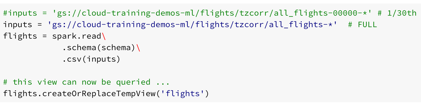
Figure 6-9. Changing the wildcard in inputs to process the entire dataset
Next, in the JupyterLab notebook, click Kernel > “Restart Kernel and Clear All Outputs” to avoid mistakenly using a value corresponding to the development dataset. Then, click on Run > “Run all Cells”.
All the graphs and charts are updated. The key results, though, are the quantization thresholds that we will need to compute the conditional probability table:
[30.0, 251.0, 368.0, 448.0, 575.0, 669.0, 838.0, 1012.0, 1218.0, 1849.0]
[-82.0, -6.0, -5.0, -4.0, -3.0, 0.0, 3.0, 5.0, 11.0, 39.0]
Recall that the first threshold is the minimum and can be ignored. The actual thresholds start with 251 miles and –6 minutes.
After we have the results, let’s resize the cluster back to something smaller so that we are not wasting cluster resources while we go about developing the program to compute the conditional probabilities:
gcloud dataproc clusters update ch6cluster
   --num-preemptible-workers=0 --num-workers=2
I have been recommending that you create ephemeral clusters, run jobs on them, and then delete them when you are done. Your considerations might change, however, if your company owns a Hadoop cluster. In that case, you will submit Spark and Pig jobs to that long-lived cluster and will typically be concerned with ensuring that the cluster is not overloaded. For the scenario in which you own an on-premises cluster, you might want to consider using a public cloud as spillover in those situations for which there are more jobs than your cluster can handle. You can achieve this by monitoring YARN jobs and sending such spillover jobs to Cloud Dataproc. Cloud Composer provides the necessary plug-ins to able to do this, but discussing how to set up such a hybrid system is beyond the scope of this book.
Bayes Classification Using Pig
Now that we have the quantization thresholds, what we need to do is find out the recommendation (whether to cancel the meeting) for each bin based on whether 70% of flights in that bin are on time or not.
We could do this in Spark SQL, but just to show you another tool that we could use, let’s use Pig. First, we will log into the master node via SSH and write Pig jobs using the command-line interpreter. After we have the code working, we’ll increase the size of the cluster and submit a Pig script to the Cloud Dataproc cluster (you can submit Spark jobs to the Cloud Dataproc cluster in the same way) from CloudShell or any machine on which you have the gcloud SDK installed.
Log in to the master node of your cluster and start a Pig interactive session by typing pig.
Let’s begin by loading up a single CSV file into Pig to make sure things work:
REGISTER /usr/lib/pig/piggybank.jar;

FLIGHTS =
   LOAD 'gs://cloud-training-demos-ml/flights/tzcorr/all_flights-00000-*'
   using org.apache.pig.piggybank.storage.CSVExcelStorage(
      ',', 'NO_MULTILINE', 'NOCHANGE')
   AS
(FL_DATE:chararray,UNIQUE_CARRIER:chararray,AIRLINE_ID:chararray,
CARRIER:chararray,FL_NUM:chararray,ORIGIN_AIRPORT_ID:chararray,
ORIGIN_AIRPORT_SEQ_ID:int,ORIGIN_CITY_MARKET_ID:chararray,
ORIGIN:chararray,DEST_AIRPORT_ID:chararray,DEST_AIRPORT_SEQ_ID:int,
DEST_CITY_MARKET_ID:chararray,DEST:chararray,CRS_DEP_TIME:datetime,
DEP_TIME:datetime,DEP_DELAY:float,TAXI_OUT:float,WHEELS_OFF:datetime,
WHEELS_ON:datetime,TAXI_IN:float,CRS_ARR_TIME:datetime,ARR_TIME:datetime,
ARR_DELAY:float,CANCELLED:chararray,CANCELLATION_CODE:chararray,
DIVERTED:chararray,DISTANCE:float,DEP_AIRPORT_LAT:float,
DEP_AIRPORT_LON:float,DEP_AIRPORT_TZOFFSET:float,ARR_AIRPORT_LAT:float,
ARR_AIRPORT_LON:float,ARR_AIRPORT_TZOFFSET:float,EVENT:chararray,
NOTIFY_TIME:datetime);
The schema itself is the same as the schema for the CSV files that we supplied to BigQuery. The difference is that Pig calls strings charrarray, integers simply as int, and the timestamp in BigQuery is a datetime in Pig.
After we have the FLIGHTS, we can use Spark to bin each flight based on the thresholds we found:24
FLIGHTS2 = FOREACH FLIGHTS GENERATE
     (DISTANCE < 251? 0:
     (DISTANCE < 368? 1:
     (DISTANCE < 448? 2:
     (DISTANCE < 575? 3:
     (DISTANCE < 669? 4:
     (DISTANCE < 838? 5:
     (DISTANCE < 1012? 6:
     (DISTANCE < 1218? 7:
     (DISTANCE < 1849? 8:
          9))))))))) AS distbin:int,
     (DEP_DELAY < -6? 0:
     (DEP_DELAY < -5? 1:
     (DEP_DELAY < -4? 2:
     (DEP_DELAY < -3? 3:
     (DEP_DELAY < 0? 4:
     (DEP_DELAY < 3? 5:
     (DEP_DELAY < 5? 6:
     (DEP_DELAY < 11? 7:
     (DEP_DELAY < 39? 8:
          9))))))))) AS depdelaybin:int,
     (ARR_DELAY < 15? 1:0) AS ontime:int;
Having binned each flight and found the category (on time or not) of the flight, we can group the data based on the bins and compute the on-time fraction within each bin:
grouped = GROUP FLIGHTS2 BY (distbin, depdelaybin);
result = FOREACH grouped GENERATE
     FLATTEN(group) AS (dist, delay),
       ((double)SUM(FLIGHTS2.ontime))/COUNT(FLIGHTS2.ontime)
                    AS ontime:double;
At this point, we now have a three-column table: the distance bin, the delay bin, and the fraction of flights that are on time in that bin. Let’s write this out to Cloud Storage with a STORE so that we can run this script noninteractively:
STORE result into 'gs://cloud-training-demos-ml/flights/pigoutput/'
         using PigStorage(',','-schema');
Running a Pig Job on Cloud Dataproc
After increasing the size of the cluster, I can submit this Pig job to Cloud Dataproc using the gcloud command from CloudShell:
gcloud dataproc jobs submit pig
     --cluster ch6cluster --file bayes.pig
The name of my Dataproc cluster is ch6cluster, and the name of my Pig script is bayes.pig.
I get a bunch of seemingly correct output, and when the job finishes, I can look at the output directory on Google Cloud Storage:
gsutil ls gs://cloud-training-demos-ml/flights/pigoutput/
The actual output file is part-r-00000, which we can print out using the following:
gsutil cat gs://cloud-training-demos-ml/flights/pigoutput/part-*
The result for one of the distance bins
5,0,0.9726378794356563
5,1,0.9572953736654805
5,2,0.9693486590038314
5,3,0.9595657057281917
5,4,0.9486424180327869
5,5,0.9228643216080402
5,6,0.9067321178120618
5,7,0.8531653960888299
5,8,0.47339027595269384
5,9,0.0053655264922870555
seems quite reasonable. The on-time arrival percentage is more than 70% for delay bins 0 to 7, but bins 8 and 9 require the flight to be canceled.
Automating Cloud Dataproc with Workflow Templates
Can we script this whole process, of creating a cluster, running a job, and then deleting it? This way, we will have a truly ephemeral cluster. Yes, you can use a workflow template with the steps you want:
TEMPLATE=ch6eph
MACHINE_TYPE=n1-standard-4
CLUSTER=ch6eph
BUCKET=cloud-training-demos-ml

gsutil cp bayes_final.pig gs://$BUCKET/

gcloud dataproc --quiet workflow-templates create $TEMPLATE

# the things we need pip-installed on the cluster
STARTUP_SCRIPT=gs://${BUCKET}/${CLUSTER}/startup_script.sh
echo "pip install --upgrade --quiet google-api-python-client" >
    /tmp/startup_script.sh
gsutil cp /tmp/startup_script.sh $STARTUP_SCRIPT

# create new cluster for job
gcloud dataproc workflow-templates set-managed-cluster $TEMPLATE
    --master-machine-type $MACHINE_TYPE
    --worker-machine-type $MACHINE_TYPE
    --initialization-actions $STARTUP_SCRIPT
    --num-preemptible-workers 20 --num-workers 5
    --image-version 1.4
    --cluster-name $CLUSTER

# steps in job
gcloud dataproc workflow-templates add-job
  pig gs://$BUCKET/bayes.pig
  --step-id create-report
  --workflow-template $TEMPLATE
  -- --bucket=$BUCKET
Submit the template whenever you wish to run the job:
gcloud beta dataproc workflow-templates instantiate $TEMPLATE
Because the cluster was setup with set-managed-cluster, this cluster will be created when the template is instantiated and torn down when all the steps in the template are complete. Schedule this instantiation command using Cloud Scheduler, and we have a fully automated (dare we say, “serverless”?) job!
However, before we go off automating the Pig job, there are three issues with this script that I need to fix:
-
It is being run on all the data. It should be run only on training days.
-
The output is quite verbose because I am printing out all the bins and probabilities. It is probably enough if we know the bins for which the recommendation is that you need to cancel your meeting.
-
I need to run it on all the data, not just the first flights CSV file.
Let’s do these things and do the development on the cluster we already have running.
Limiting to Training Days
Because the training days are stored as a CSV file on Cloud Storage, I can read it from our Pig script (the only difference in the read here is that we are skipping the input header) and filter by the Boolean variable to get a relation that corresponds only to training days:
alldays = LOAD 'gs://cloud-training-demos-ml/flights/trainday.csv'
   using org.apache.pig.piggybank.storage.CSVExcelStorage(
       ',', 'NO_MULTILINE', 'NOCHANGE', 'SKIP_INPUT_HEADER')
   AS (FL_DATE:chararray, is_train_day:boolean);
traindays = FILTER alldays BY is_train_day == True;
Then, after renaming the full dataset ALLFLIGHTS, I can do a join to get just the flights on training days:
FLIGHTS = JOIN ALLFLIGHTS BY FL_DATE, traindays BY FL_DATE;
The rest of the Pig script25 remains the same because it operates on FLIGHTS.
Running it, though, I realize that Pig will not overwrite its output directory, so I remove the output directory on Cloud Storage:
gsutil -m rm -r gs://cloud-training-demos-ml/flights/pigoutput
gcloud dataproc jobs submit pig
       --cluster ch6cluster --file bayes2.pig
The resulting output file looks quite similar to what we got when we ran on all the days, not just the training ones. The first issue—of limiting the training to just the training days—has been fixed. Let’s fix the second issue.
The Decision Criteria
Instead of writing out all the results, let’s filter the result to keep only the distance and departure delay identifiers for the bins for which we are going to suggest canceling the meeting. Doing this will make it easier for a downstream programmer to program this into an automatic alerting functionality.
To do this, let’s add a few extra lines to the original Pig script before STORE, renaming the original result at probs and filtering it based on number of flights and likelihood of arriving less than 15 minutes late:26
grouped = GROUP FLIGHTS2 BY (distbin, depdelaybin);

probs = FOREACH grouped GENERATE
           FLATTEN(group) AS (dist, delay),
           ((double)SUM(FLIGHTS2.ontime))/COUNT(FLIGHTS2.ontime) AS ontime:double,
           COUNT(FLIGHTS2.ontime) AS numflights;

result = FILTER probs BY (numflights > 10) AND (ontime < 0.7);
The result, as before, is sent to Cloud Storage and looks like this:
0,8,0.3416842105263158,4750
0,9,7.351139426611125E-4,4081
1,8,0.3881127160786171,4223
1,9,3.0003000300030005E-4,3333
2,8,0.4296875,3328
2,9,8.087343307723412E-4,2473
3,8,0.4080819578827547,3514
3,9,0.001340033500837521,2985
4,8,0.43937644341801385,3464
4,9,0.002002402883460152,2497
5,8,0.47252208047105004,4076
5,9,0.004490057729313663,3118
6,8,0.48624950179354326,5018
6,9,0.00720192051213657,3749
7,8,0.48627167630057805,4152
7,9,0.010150722854506305,3251
8,8,0.533605720122574,4895
8,9,0.021889055472263868,3335
9,8,0.6035689293212037,2858
9,9,0.03819444444444445,2016
In other words, it is always delay bins 8 and 9 that require cancellation. It appears that we made a mistake in choosing the quantization thresholds. Our choice of quantization threshold was predicated on the overall distribution of departure delays, but our decision boundary is clustered in the range 10 to 20 minutes. Therefore, although we were correct in using histogram equalization for the distance, we should probably just try out every departure delay threshold in the range of interest. Increasing the resolution of the departure delay quantization means that we will have to keep an eagle eye on the number of flights to ensure that our results will be statistically valid.
Let’s make the change to be finer-grained in departure delay around the decision boundary:27
(DEP_DELAY < 11? 0:
 (DEP_DELAY < 12? 1:
 (DEP_DELAY < 13? 2:
 (DEP_DELAY < 14? 3:
 (DEP_DELAY < 15? 4:
 (DEP_DELAY < 16? 5:
 (DEP_DELAY < 17? 6:
 (DEP_DELAY < 18? 7:
 (DEP_DELAY < 19? 8:
      9))))))))) AS depdelaybin:int,
Taking two of the distance bins as an example, we notice that the delay bins corresponding to canceled flights vary:
3,2,0.6893203883495146,206
3,3,0.6847290640394089,203
3,5,0.6294416243654822,197
3,6,0.5863874345549738,191
3,7,0.5521472392638037,163
3,8,0.6012658227848101,158
3,9,0.0858412441930923,4951
4,4,0.6785714285714286,196
4,5,0.68125,160
4,6,0.6162162162162163,185
4,7,0.5605095541401274,157
4,8,0.5571428571428572,140
4,9,0.11853832442067737,4488
As expected, the probability of arriving on time drops as the departure delay increases for any given distance. Although this drop is not quite monotonic, we expect that it will become increasingly monotonic as the number of flights increases (recall that we are processing only 1/30 of the full dataset). However, let’s also compensate for the finer resolution in the delay bins by making the distance bins more coarse grained. Fortunately, we don’t need to recompute the quantization thresholds—we already know the 20th, 40th, 60th, and so on percentiles because they are a subset of the 10th, 20th, 30th, and so forth percentiles.
If the departure delay is well behaved, we need only to know the threshold at which we must cancel the meeting depending on the distance to be traveled. For example, we might end up with a matrix like that shown in Table 6-2.
| Distance bin | Departure delay (minutes) |
|---|---|
| <300 miles | 13 |
| 300–500 miles | 14 |
| 500–800 miles | 15 |
| 800–1200 miles | 14 |
| >1200 miles | 17 |
Of course, we don’t want to hand-examine the resulting output and figure out the departure delay threshold. So, let’s ask Pig to compute that departure delay threshold for us:
cancel = FILTER probs BY (numflights > 10) AND (ontime < 0.7);
bydist = GROUP cancel BY dist;
result = FOREACH bydist GENERATE group AS dist,
                                 MIN(cancel.delay) AS depdelay;
We are finding the delay beyond which we need to cancel flights for each distance and saving just that threshold. Because it is the threshold that we care about, let’s also change the bin number to reflect the actual threshold. With these changes, the FLIGHTS2 relation becomes as follows:
FLIGHTS2 = FOREACH FLIGHTS GENERATE
     (DISTANCE < 368? 368:
     (DISTANCE < 575? 575:
     (DISTANCE < 838? 838:
     (DISTANCE < 1218? 1218:
          9999)))) AS distbin:int,
     (DEP_DELAY < 11? 11:
     (DEP_DELAY < 12? 12:
     (DEP_DELAY < 13? 13:
     (DEP_DELAY < 14? 14:
     (DEP_DELAY < 15? 15:
     (DEP_DELAY < 16? 16:
     (DEP_DELAY < 17? 17:
     (DEP_DELAY < 18? 18:
     (DEP_DELAY < 19? 19:
          9999))))))))) AS depdelaybin:int,
     (ARR_DELAY < 15? 1:0) AS ontime:int;
Let’s now run this on all the training days by changing the input to all-flights-*.28 It takes a few minutes for me to get the following output:
368,15
575,17
838,18
1218,18
9999,19
As the distance increases, the departure delay threshold also increases and a table like this is quite easy to base a production model on. The production service could simply read the table from the Pig output bucket on Cloud Storage and carry out the appropriate thresholding.
For example, what is the appropriate decision for a flight with a distance of 1,000 miles that departs 15 minutes late? The flight falls into the 1218 bin, which holds flights with distances between 838 and 1,218 miles. For such flights, we need to cancel the meeting only if the flight departs 18 or more minutes late. The 15-minute departure delay is something that can be made up en route.
Evaluating the Bayesian Model
How well does this new two-variable model perform? We can modify the evaluation query from Chapter 5 to add in a distance criterion and supply the appropriate threshold for that distance:
#standardsql
SELECT
  SUM(IF(DEP_DELAY = 15
      AND arr_delay < 15,
      1,
      0)) AS wrong_cancel,
  SUM(IF(DEP_DELAY = 15
      AND arr_delay >= 15,
      1,
      0)) AS correct_cancel
  FROM (
    SELECT
      DEP_DELAY,
      ARR_DELAY
    FROM
      flights.tzcorr f
    JOIN
      flights.trainday t
    ON
      f.FL_DATE = t.FL_DATE
    WHERE
      t.is_train_day = 'False'
      AND f.DISTANCE < 368)
In this query, 15 is the newly determined threshold for distances under 368 miles and the WHERE clause is now limited to flights over distances of less than 368 miles. Figure 6-10 shows the result.

Figure 6-10. Result when WHERE clause is limited to distances of less than 368 miles
This indicates that we cancel meetings when it is correct to do so 2,593 / (2,593 + 5,049) or 34% of the time—remember that our goal was 30%. Similarly, we can do the other four distance categories. Both with this model, and with a model that took into account only the departure delay (as in Chapter 5), we are able to get reliable predictions—canceling meetings when the flight has more than a 30% chance of being delayed.
So, why go with the more complex model? The more complex model is worthwhile if we end up canceling fewer meetings or if we can be more fine-grained in our decisions (i.e., change which meetings we cancel). What we care about, then, is the sum of correct_cancel and wrong_cancel over all flights. In the case of using only departure delay, this number was about 962,000. How about now? Let’s look at the total number of flights in the test set that would cause us to cancel our meetings:
SELECT
  SUM(IF(DEP_DELAY >= 15 AND DISTANCE < 368, 1, 0)) +
  SUM(IF(DEP_DELAY >= 17 AND DISTANCE >= 368 AND DISTANCE < 575, 1, 0)) +
  SUM(IF(DEP_DELAY >= 18 AND DISTANCE >= 575 AND DISTANCE < 838, 1, 0)) +
  SUM(IF(DEP_DELAY >= 18 AND DISTANCE >= 838 AND DISTANCE < 1218, 1, 0)) +
  SUM(IF(DEP_DELAY >= 19 AND DISTANCE >= 1218, 1, 0))
  AS cancel
FROM (
  SELECT
    DEP_DELAY,
    ARR_DELAY,
    DISTANCE
  FROM
    flights.tzcorr f
  JOIN
    flights.trainday t
  ON
    f.FL_DATE = t.FL_DATE
  WHERE
    t.is_train_day = 'False')
This turns out to be 920,355. This is about 5% fewer canceled meetings as when we use a threshold of 16 minutes across the board. How many of these cancellations are correct? We can find out by adding ARR_DELAY >= 15 to the WHERE clause, and we get 760,117, indicating that our decision to cancel a meeting is correct 83% of the time.
It appears, then, that our simpler univariate model got us pretty much the same results as this more complex model using two variables. However, the decision surfaces are different—in the single-variable threshold, we cancel meetings whenever the flight is delayed by 16 minutes or more. However, when we take into account distance, we cancel more meetings corresponding to shorter flights (threshold is now 15 minutes) and cancel fewer meetings corresponding to longer flights (threshold is now 18 or 19 minutes). One reason to use this two-variable Bayes model over the one-variable threshold determined empirically is to make such finer-grained decisions. This might or might not be important.
Why did we get only a 5% improvement? Perhaps the round-off in the delay variables (they are rounded off to the nearest minute) has hurt our ability to locate more precise thresholds. Also, maybe the extra variable would have helped if I’d used a more sophisticated model—direct evaluation of conditional probability on relatively coarse-grained quantization bins is a very simple method. In Chapter 7, we explore a more complex approach.
Summary
In this chapter, we explored how to create a two-variable Bayesian model to provide insight as to whether to cancel a meeting based on the likely arrival delay of a flight. We quantized the two variables (distance and departure delay), created a conditional probability lookup table, and examined the on-time arrival percentage in each bin. We carried out the quantization using histogram equalization in Spark, and carried out the on-time arrival percentage computation in Pig.
Upon discovering that equalizing the full distribution of departure delays resulted in a very coarse sampling of the decision surface, we chose to go with the highest possible resolution in the crucial range of departure delay. However, to ensure that we would have statistically valid groupings, we also made our quantization thresholds coarser in distance. On doing this, we discovered that the probability of the arrival delay being less than 15 minutes varied rather smoothly. Because of this, our conditional probability lookup reduced to a table of thresholds that could be applied rather simply using IF-THEN rules.
On evaluating the two-variable model, we found that we would be canceling about 5% fewer meetings than with the single-variable model while retaining the same overall accuracy. We hypothesize that the improvement isn’t higher because the departure delay variable has already been rounded off to the nearest minute, limiting the scope of any improvement we can make.
In terms of tooling, we created a three-node Cloud Dataproc cluster for development and resized it on the fly to 20 workers when our code was ready to be run on the full dataset. Although there is no getting away from cluster management when using Hadoop, Cloud Dataproc goes a long way toward making this a low-touch endeavor. In fact, with workflow templates, it is possible to create and schedule ephemeral jobs. The reason that we can create, resize, and delete Cloud Dataproc clusters is that our data is held not in HDFS, but on Google Cloud Storage. We carried out development both on the Pig interpreter and in JupyterLab, which gives us an interactive notebook experience. We also found that we were able to integrate BigQuery, Spark SQL, and Apache Pig into our workflow on the Hadoop cluster.
1 I suppose that I could create a 1,000-node cluster to run my Spark job so that I have as much compute resources at my disposal as I did when using BigQuery, but it would be sitting idle most of the time. The practical thing to do would be to create a three-node cluster for development, and then resize it to 20 workers when I’m about to run it on the full dataset.
2 In Chapter 2, we discussed scaling up, scaling out, and data in situ from the perspective of datacenter technologies. This is useful background to have here.
3 See slide 6 of Dean and Ghemawat’s original presentation here: https://research.google.com/archive/mapreduce-osdi04-slides/index-auto-0006.html—the MapReduce architecture they proposed assumes that the cluster has limited bisection bandwidth and local, rather slow drives.
4 Now, research papers from Google are often accompanied by open source implementations—Kubernetes, Apache Beam, TensorFlow, and Inception are examples.
5 As discussed in Chapter 3, the gcloud command makes a REST API call and so this can be done programmatically. You could also use the Google Cloud Platform web console.
6 To find the name of the staging bucket created by Cloud Dataproc, run gcloud dataproc clusters describe.
7 Because the average of partial averages is not necessarily the average of the whole (it will be equal to the whole only if the partials are all the same size).
8 This discussion applies to any joint distribution such as “people who buy item1 also buy item2.”
9 Hive has been sped up in recent years through the use of a new application framework (Tez) and a variety of optimizations for long-lived queries. See https://cwiki.apache.org/confluence/display/Hive/Hive+on+Tez and https://cwiki.apache.org/confluence/display/Hive/LLAP.
10 As this book was heading to print, the Dataproc team announced a new feature—you can now automatically schedule a cluster for deletion after, say, 10 minutes of idle time.
11 For a tool to estimate costs quickly, go to https://cloud.google.com/products/calculator/.
12 One efficient use of installation actions is to preinstall all the third-party libraries you might need, so that they don’t have to be submitted with the job.
13 This script is in the GitHub repository of this book as 06_dataproc/create_cluster.sh.
14 Look in the GitHub repository for this book at 06_dataproc/quantization.ipynb.
15 Just as an example, the Google Cloud Dataflow job that wrote out this code could have ordered the CSV file by date, and in that case, this file will contain only the first 12 days of the year.
16 Around 50,000 would have been just right.
17 For examples of histogram equalization applied to improve the contrast of images, go to http://docs.opencv.org/3.1.0/d5/daf/tutorial_py_histogram_equalization.html.
18 Photograph by the author.
19 Not the tallest, though. Khufu’s pyramid (the tall pyramid in the forefront) is taller and larger, but has been completely stripped of its alabaster topping and is situated on slightly lower ground.
20 If, for example, there is a newfangled technological development that enables pilots to make up time in the air better or, more realistically, if new regulations prompt airline schedulers to start padding their flight-time estimates.
21 Trying to increase the number of workers might have you hitting against (soft) quotas on the maximum number of CPUs, drives, or addresses. If you hit any of these soft quotas, request an increase from the Google Cloud Platform console’s section on Compute Engine quotas: https://console.cloud.google.com/compute/quotas. I already had the necessary CPU quota, but I needed to ask for an increase in DISKS_TOTAL_GB and IN_USE_ADDRESSES. Because a Cloud Dataproc cluster is in a single region, these are regional quotas. See https://cloud.google.com/compute/quotas for details.
22 Less than a minute’s notice as of this writing.
23 If the preemptible instances cost 20% of a standard machine (as they do as of this writing), the 15 extra machines cost us only as much as three standard machines.
24 Yes, if we had been using Python, we could have used the numpy library to find the bin more elegantly.
25 See 06_dataproc/bayes2.pig in the GitHub repository for this book.
26 See 06_dataproc/bayes3.pig in the GitHub repository for this book.
27 See 06_dataproc/bayes4.pig in the GitHub repository for this book.
28 See 06_dataproc/bayes_final.pig in the GitHub repository for this book.