Chapter 5. Interactive Data Exploration
In every major field of study, there is usually a towering figure who did much of the seminal work and blazed the trail for what that particular discipline would evolve into. Classical physics has Newton, relativity has Einstein, game theory has John Nash, and so on. When it comes to computational statistics (the field of study that develops computationally efficient methods for carrying out statistical operations), the towering figure is John W. Tukey. At Bell Labs, he collaborated with John von Neumann on early computer designs soon after World War II—famously, Tukey was responsible for coining the word bit. Later, at Princeton (where he founded its statistics department), Tukey collaborated with James Cooley to develop the Fast-Fourier Transform, one of the first examples of using divide-and-conquer to address a formidable computational challenge.
While Tukey was responsible for many “hard science” mathematical and engineering innovations, some of his most enduring work is about the distinctly softer side of science. Unsatisfied that most of statistics overemphasized confirmatory data analysis (i.e., statistical hypothesis testing such as paired t-tests1), Tukey developed a variety of approaches to do what he termed exploratory data analysis2 (EDA) and many practical statistical approximations. It was Tukey who developed the box plot, jack-knifing, range test, median-median regression, and so on and gave these eminently practical methods a solid mathematical grounding by motivating them in the context of simple conceptual models that are applicable to a wide variety of datasets. In this chapter, we follow Tukey’s approach of carrying out exploratory data analysis to identify important variables, discover underlying structure, develop parsimonious models, and use that model to identify unusual patterns and values.
Exploratory Data Analysis
Ever since Tukey introduced the world to the value of EDA in 1977, the traditional first step for any data scientist has been to analyze raw data by using a variety of graphical techniques. This is not a fixed set of methods or plots; rather, it’s an approach meant to develop insight into a dataset and enable the development of robust statistical models. Specifically, as a data scientist, you should create graphics that enable you to do the following:
-
Test any underlying assumptions, such as that a particular value will always be present, or will always lie within a certain range. For example, as discussed in Chapter 2, the distribution of the distance between any pair of airports might help verify whether the distance is the same across the dataset or whether it reflects the actual flight distance.
-
Use intuition and logic to identify important variables. Verify that these variables are, indeed, important as expected. For example, plotting the relationship between departure delay and arrival delay might validate assumptions about the recording of these variables.
-
Discover underlying structure in the data (i.e., relationships between important variables and situations such as the data falling into specific statistical regimes). It might be useful to examine whether the season (summer versus winter) has an impact on how often flight delays can be made up.
-
Develop a parsimonious model—a simple model with explanatory power, that you can use to hypothesize about what reasonable values in the data look like. If there is a simple relationship between departure delay and arrival delay, values of either delay that are far off the trendline might warrant further examination.
-
Detect outliers, anomalies, and other inexplicable data values. This depends on having that parsimonious model. Thus, further examination of outliers from the simple trend between departure and arrival delays might lead to the discovery that such values off the trendline correspond to rerouted flights.
To carry out exploratory data analysis, it is necessary to load the data in a form that makes interactive analysis possible. In this chapter, we load data into Google BigQuery, explore the data in AI Platform Notebooks, carry out quality control based on what we discover about the dataset, build a new model, and evaluate the model to ensure that it is better than the model we built in Chapter 4. As we go about loading the data and exploring it and move on to building models and evaluating them, we’ll discuss a variety of considerations that come up, from security to pricing.
Both exploratory data analysis and the dashboard creation discussed in Chapter 3 involve the creation of graphics. However, the steps differ in two ways—in terms of the purpose and in terms of the audience. The aim of dashboard creation is to crowd-source insight into the working of models from end users and is, therefore, primarily about presenting an explanation of the models to end users. In Chapter 3, I recommended doing it very early in your development cycle, but that advice was more about Agile development3 and getting feedback early than about statistical rigor. The aim of EDA is for you, the data engineer, to develop insights about the data before you delve into developing sophisticated models. The audience for EDA is typically other members of your team, not end users. In some cases, especially if you uncover strange artifacts in the data, the audience could be the data engineering team that produces the dataset you are working with. For example, when we discovered the problem that the times were being reported in local time, with no UTC offsets, we could have relayed that information back to the US Bureau of Transportation Statistics (BTS).4 In any case, the assumption is that the audience for an EDA graphic is statistically sophisticated. Although you probably would not include a violin plot5 in a dashboard meant for end users, you would have no compunctions about using a violin plot in an EDA chart that is meant for data scientists.
Doing exploratory data analysis on large datasets poses a few challenges. To test that a particular value will always be present, for example, you would need to check every row of a tabular dataset, and if that dataset is many millions of rows, these tests can take hours. An interactive ability to quickly explore large datasets is indispensable. On Google Cloud Platform, BigQuery provides the ability to run Cloud SQL queries on unindexed datasets (i.e., your raw data) in a matter of seconds even if the datasets are in the petabyte scale. Therefore, in this chapter, we load the flights data into BigQuery.
Identifying outliers and underlying structure typically involves using univariate and bivariate plots. The graphs themselves can be created using Python plotting libraries—I use a mixture of matplotlib and seaborn to do this. However, the networking overhead of moving data between storage and the graphics engine can become prohibitive if I carry out data exploration on my laptop—for exploration of large datasets to be interactive, we need to bring the analytics closer to the data. Therefore, we will want to use a cloud computer (not my laptop) to carry out graph generation. Generating graphics on a cloud computer poses a display challenge because the graphs are being generated on a Compute Engine instance that is headless—that is, it has no input or output devices. A Compute Engine instance has no keyboard, mouse, or monitor, and frequently has no graphics card.6 Such a machine is accessed purely through a network connection. Fortunately, desktop programs and interactive Read–Eval–Print Loops (REPLs) are no longer necessary to create visualizations. Instead, notebook servers such as Jupyter (formerly IPython) have become the standard way that data scientists create graphs and disseminate executable reports. On Google Cloud Platform, Cloud AI Platform Notebooks provides a way to run Jupyter notebooks on Compute Engine instances and connect to Google Cloud Platform services.
Loading Flights Data into BigQuery
To be able to carry out exploratory analysis on the flights data, we would like to run arbitrary Cloud SQL queries on it (i.e., without having to create indexes and do tuning). BigQuery is an excellent place to store the flights data for exploratory data analysis. Furthermore, if you tend to use R rather than Python for exploratory data analysis, the dplyr package7 allows you to write data manipulation code in R (rather than SQL) and translates the R code into efficient SQL on the backend to be executed by BigQuery.
Advantages of a Serverless Columnar Database
Most relational database systems, whether commercial or open source, are row oriented in that the data is stored row by row. This makes it easy to append new rows of data to the database and allows for features such as row-level locking when updating the value of a row. The drawback is that queries that involve table scans (i.e., any aggregation that requires reading every row) can be expensive. Indexing counteracts this expense by creating a lookup table to map rows to column values, so that SELECTs that involve indexed columns do not have to load unnecessary rows from storage into memory. If you can rely on indexes for fast lookup of your data, a traditional Relational Database Management System (RDBMS) works well. For example, if your queries tend to come from software applications, you will know the queries that will come in and can create the appropriate indexes beforehand. This is not an option for use cases like business intelligence for which human users are writing ad hoc queries; therefore, a different architecture is needed.
BigQuery, on the other hand, is a columnar database—data is stored column by column and each column’s data is stored in a highly efficient compressed format that enables fast querying. Because of the way data is stored, many common queries can be carried out such that the query processing time is linear on the size of the relevant data. For applications such as data warehousing and business intelligence for which the predominant operations are read-only SELECT queries requiring full table scans, columnar databases are a better fit. BigQuery, for example, can scan terabytes of data in a matter of seconds. The trade-off is that INSERT, UPDATE, and DELETE, although possible in BigQuery, are significantly more expensive to process than SELECT statements. BigQuery is tuned toward analytics use cases.
BigQuery is serverless, so you don’t actually spin up a BigQuery server in your project. Instead, you simply submit a SQL query, and it is executed on the cloud. Queries that you submit to BigQuery are executed on a large number of compute nodes (called slots) in parallel. These slots do not need to be statically allocated beforehand—instead, they are “always on,” available on demand, and scale to the size of your job. Because data is in situ8 and not sharded in Google Cloud Platform, the total power of the datacenter can be brought to bear on the problem. Because these resources are elastic and used only for the duration of the query, BigQuery is more powerful and less expensive than a statically preallocated cluster because preallocated clusters will typically be provisioned for the average use case—BigQuery can bring more resources to bear on the above-average computational jobs and utilize fewer resources for below-average ones.
In addition, because you don’t need to reserve any compute resources for your data when you are not querying your data, it is extremely cost effective to just keep your data in BigQuery (you’ll pay for storage, but storage is inexpensive). Whenever you do need to query the data, the data is immediately available—you can query it without the need to start project-specific compute resources. This on-demand, autoscaling of compute resources is incredibly liberating.
If an on-demand cost structure (you pay per query) makes you concerned about costs that can fluctuate month over month, you can specify a billing cap beyond which users will not be able to go. For even more cost predictability, it is possible to pay a fixed monthly price for BigQuery—flat-rate pricing allows you to get a predictable cost regardless of the number of queries run or data processed by those queries—the fixed monthly price essentially buys you access to a specific number of slots.9 In short, BigQuery has two pricing models for analysis: an on-demand pricing model in which your cost depends on the quantity of data processed, and a flat-rate model in which you pay a fixed amount per month for an unlimited number of queries that will run on a specific set of compute resources. In either case, storage is a separate cost and depends on data size. In terms of cost, the optimal way of using BigQuery tends to be the default on-demand pricing model, and this is what I’ll assume you are using.
In summary, BigQuery is a columnar database, making it particularly effective for read-only queries that process all of the data. Because it is serverless, can autoscale to thousands of compute nodes, and doesn’t require clusters to be preallocated, it is also very powerful and quite inexpensive.
Staging on Cloud Storage
The time correction code that we wrote in Chapter 3 took BTS’s flight data stored in comma-separated value (CSV) files, corrected the timestamps to UTC, appended some extra columns corresponding to airport location, and wrote the output files as CSV files in Cloud Storage. Let’s assume, for the purposes of this section, that the time-corrected data are the files that we obtained from BTS. In this section, we will ingest those CSV files from Cloud Storage into a flights table in BigQuery.
Although it is possible to ingest files from on-premises hardware directly into BigQuery using the bq command-line tool that comes with the Google Cloud SDK (gcloud), you should use that capability only for small datasets. To retrieve data from outside Google Cloud Platform to BigQuery, it is preferable to first load it into Cloud Storage (see Chapters 2 and 3) and use Cloud Storage as the staging ground for BigQuery, as demonstrated in Figure 5-1.

Figure 5-1. Use Cloud Storage as a staging ground to ingest data into BigQuery
For larger files, it is better to ingest the files into Cloud Storage using gsutil first because gsutil takes advantage of multithreaded, resumable uploads and is better suited to the public internet.
Of course, the same Cloud Dataflow pipeline that carried out the time correction also created the events data that were written to BigQuery and used to simulate a real-time stream in Chapter 4. We could have written the flights data from the Cloud Dataflow pipeline directly to BigQuery rather than to CSV files.10 However, I left it as CSV files just to be able to demonstrate how to ingest data into BigQuery without going through the process of writing a Cloud Dataflow pipeline.
When should you save your data in Cloud Storage, and when should you store it in BigQuery? The answer boils down to what you want to do with the data and the kinds of analyses you want to perform. If you’ll mostly be running custom code that expects to read plain files, or your analysis involves reading the entire dataset, use Cloud Storage. On the other hand, if your desired access pattern is to run interactive SQL queries on the data, store your data in BigQuery. In the pre-cloud world, if you would use flat files, use Cloud Storage. If you’d put the data in a database, put it in BigQuery.
Access Control
The first step to ingest data into BigQuery would be to create a BigQuery dataset (all tables in BigQuery must belong to a dataset), but we already have the flights dataset from Chapter 3 that we can continue to use. Datasets in BigQuery are mostly just an organizational convenience—tables are where data resides and it is the columns of the table that dictate the queries we write. Besides providing a way to organize tables, though, datasets also serve as the access control point. You can provide view or edit access only at the project or dataset level, not at the table level. So, before we decide to reuse the flights dataset, the key questions we need to answer are whether this table is related to the simevents table that is currently present in that dataset (it is), and whether both tables should share the same access control. The latter question is more difficult to answer—it could be that the simevents table, storing simulated events, is meant for use by a narrower set of roles than the time-corrected data.
Cloud Identity Access Management (Cloud IAM) on Google Cloud Platform provides a mechanism to control who can carry out what actions on which resource (Figure 5-2).
The “who” can be specified in terms of an individual user (identified by his Google account such as a gmail.com address or company email address if the company is a GSuite customer), a Google Group (i.e., all current members of the group), or a GSuite domain (anyone with a Google account in that domain). Google groups and GSuite domains provide a convenient mechanism for aggregating a number of users and providing similar access to all of them.

Figure 5-2. Cloud IAM provides a mechanism to control access to resources
In addition, different logical parts of an application can be assigned separate email addresses called service accounts. Service accounts are a very powerful concept because they allow different parts of a codebase to have permissions that are independent of the access level of the person running that application. For example, you might want an application to be able to spin up new Compute Engine instances but not provide the raw access to the Compute Engine creation11 to an end user on behalf of the person for whom the application is spinning up those instances.
You should use service accounts with care for scenarios in which audit records are mandatory. Providing access at the Google Groups level provides more of an audit trail: because Google groups don’t have login credentials (only individual users do), the user who made a request or action is always recorded, even if their access is provided at the level of a Google Group or GSuite domain. However, service accounts are themselves login credentials, and so the audit trail turns cold if you provide access to service accounts—you will no longer know which user initiated the application request unless that application in turn logs this information. This is something to keep in mind when granting access to service accounts. Try to avoid providing service account access to resources that require auditability. If you do provide service account access, you should ensure that the application to which you have provided access itself provides the necessary audit trail by keeping track of the user on behalf of whom it is executing the request. The same considerations apply to service accounts that are part of Google Groups or domains. Because audit trails go cold with service accounts,12 you should restrict Google Groups and GSuite domains to only human users and service accounts that belong to applications that provide any necessary legal auditability guarantees.
Creating single-user projects is another way to ensure that service accounts map cleanly to users, but this can lead to significant administrative overhead associated with shared resources and departing personnel. Essentially, you would create a project that is billed to the same company billing account, but each individual user would have her own project in which she works. You can use the gcloud command to script the creation of such single-user projects in which the user in question is an editor (not an owner).13
In addition to specific users, groups, domains, and service accounts, there are two wildcard options available. Access can be provided to allAuthenticatedUsers, in which case anyone authenticated with either a Google account or a service account is provided access. Because allAuthenticatedUsers includes service accounts, it should be not used for resources for which a clear audit trail is required. The other wildcard option is to provide access to allUsers, in which case anyone on the internet has access—a common use case for this is to provide highly available static web resources by storing them on Cloud Storage. Be careful about doing this indiscriminately—egress of data from Google Cloud Platform is not free, so you will pay for the bandwidth consumed by the download of your cloud-hosted datasets.
The “what” actions depend on the resource access which is being controlled. The resources themselves fall into a policy hierarchy.
Policies can be specified at an organization level (i.e., to all projects in the organization), at the project level (i.e., to all resources in the project), or at the resource level (i.e., to a Compute Engine instance or a BigQuery dataset). As Figure 5-3 shows, policies specified at higher levels are inherited at lower levels, and the policy in effect is the union of all the permissions granted—there is no way to restrict some access to a dataset to a user who has that access inherited from the project level. Moving a project from one organization to another automatically updates that project’s Cloud IAM policy and ends up affecting all the resources owned by that project.

Figure 5-3. Policies specified at higher levels are inherited at lower levels
What type of actions can be carried out depends on the resource in question. Before Cloud IAM was introduced on the Google Cloud Platform, there were only three roles: owner, editor, and viewer/reader for all resources. Cloud IAM brought with it much finer-grained roles, but the original three roles were grandfathered in as primitive roles. Table 5-1 lists the roles that are possible for BigQuery datasets.
| Role | Capabilities | Inherits from |
|---|---|---|
| Project Viewer | Execute a query List datasets |
|
| Project Editor | Create a new dataset | Project Viewer |
| Project Owner | List/delete datasets View jobs run by other project users |
Project Editor |
| bigquery.user | Execute a query List datasets |
|
| bigquery.dataViewer | Read, query, copy, export tables in the dataset | |
| bigquery.dataEditor | Append, load data into tables in the dataset | Project Editor bigquery.dataViewer |
| bigquery.dataOwner | Update, delete on tables in dataset | Project Owner bigquery.dataEditor |
| bigquery.admin | All |
Neither the simevents table nor the flights table holds personally identifiable or confidential information. Therefore, there is no compelling access-control reason to create a separate dataset for the flight information. We will reuse the flights dataset that was created in Chapter 3, and we can make everyone in the organization a bigquery.user so that they can carry out queries on this dataset.
Browse to bigquery.cloud.google.com, find the flights dataset, and then click the options menu to be able to share the dataset. In the dialog box that opens (Figure 5-4), I selected the domain option and typed in google.com to allow view access to anyone in my organization.
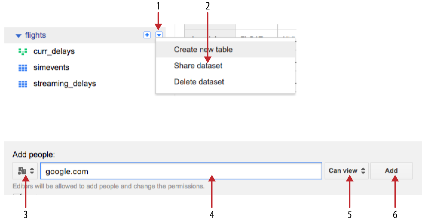
Figure 5-4. Sharing a BigQuery dataset
In some cases, you might find that your dataset contains certain columns that have personally identifying or confidential information. You might need to restrict access to those columns14 while leaving the remainder of the table accessible to a wider audience. Whenever you need to provide access to a subset of a table in BigQuery (whether it is specific columns or specific rows), you can use views. Put the table itself in a dataset that is accessible to a very small set of users. Then, create a view on this table that will pull out the relevant columns and rows and save this view in a separate dataset that has wider accessibility. Your users will query only this view, and because the personally identifying or confidential information is not even present in the view, the chances of inadvertent leakage are lowered.
One of the benefits of a data warehouse is to allow the mashing of datasets across organizational boundaries. So, unless you have a clear reason not to do so, try to make your data widely accessible. Costs of querying are borne by the person submitting the query to the BigQuery engine, so you don’t need to worry that you are incurring additional costs for your division by doing this.
Federated Queries
We do not need to ingest data into BigQuery’s native table format in order to run Cloud SQL queries on the data. We could rely on BigQuery’s “federated query” capabilities. This is the ability of BigQuery to query data that is not stored within the data warehouse product, but instead operate on such data sources as Google Sheets (a spreadsheet on Google Drive) or files on Cloud Storage. Thus, we could leave the files as CSV on Cloud Storage, define a table structure on it, and query the CSV files directly. Recall that we suggested using Cloud Storage if your primary analysis pattern involves working with your data at the level of flat files—this is a way of occasionally applying SQL queries to such datasets.
The first step is to get the schema of the time-corrected files on Cloud Storage. We could have BigQuery autodetect the schema had we still retained the header. However, our files no longer have the header information. So, let’s start from the schema of the simevents table and remove the last three fields that correspond to the event being notified.
To obtain the schema of the simevents table in the flights dataset of our project, we can use the bq command-line tool that comes with the Google Cloud SDK:
bq show --format=prettyjson flights.simevents
Save the result to a file by redirecting the output to a file:
bq show --format=prettyjson flights.simevents > simevents.json
Open this file in an editor and remove everything except the array of fields. Within the array of fields, remove the last three fields (EVENT, NOTIFY_TIME, and EVENT_DATA), as illustrated in Figure 5-5.

Figure 5-5. Fields that need to be removed
You should now be left with the schema of the content of the CSV files. The end result of the edit is in the GitHub repository of this book as 05_bqdatalab/tzcorr.json and looks like this:
[
      {
        "mode": "NULLABLE",
        "name": "FL_DATE",
        "type": "DATE"
      },
      {
        "mode": "NULLABLE",
        "name": "UNIQUE_CARRIER",
        "type": "STRING"
      },
    ...
     {
        "mode": "NULLABLE",
        "name": "ARR_AIRPORT_LON",
        "type": "FLOAT"
      },
      {
        "mode": "NULLABLE",
        "name": "ARR_AIRPORT_TZOFFSET",
        "type": "FLOAT"
      }
]
Now that we have the schema of the CSV files, we can make a table definition for the federated source, but to keep things zippy, I’ll use just one of the 36 files that were written out by the Cloud Dataflow job in Chapter 3:
bq mk --
external_table_definition=./tzcorr.json@CSV=
gs://<BUCKET>/flights/tzcorr/all_flights-00030-of-00036 flights.fedtzcorr
If you visit the BigQuery web console now, you should see a new table listed in the flights dataset (reload the page if necessary). This is a federated data source in that its storage remains the CSV file on Cloud Storage. Yet you can query it just like any other BigQuery table:
#standardsql
SELECT
  ORIGIN,
  AVG(DEP_DELAY) as arr_delay,
  AVG(ARR_DELAY) as dep_delay
FROM
  flights.fedtzcorr
GROUP BY
  ORIGIN
Don’t get carried away by federated queries, though. The most appropriate uses of federated sources involve frequently changing, relatively small datasets that need to be joined with large datasets in BigQuery native tables. There are fundamental advantages to a columnar database design over row-wise storage in terms of the kinds of optimization that can be carried out and, consequently, in the performance that is achievable.15 Because the columnar storage in BigQuery is so fundamental to its performance, we will load the flights data into BigQuery’s native format. Fortunately, the cost of storage in BigQuery is similar to the cost of storage in Cloud Storage, and the discount offered for long-term storage is similar—as long as the table data is not changed (querying the data is okay), the long-term discount starts to apply. So, if storage costs are a concern, we could ingest data into BigQuery and get rid of the files stored in Cloud Storage.
Ingesting CSV Files
We can load the data that we created after time correction from the CSV files on Cloud Storage directly into BigQuery’s native storage using the same schema:
bq load flights.tzcorr
  "gs://cloud-training-demos-ml/flights/tzcorr/all_flights-*"
   tzcorr.json
If most of our queries would be on the latest data, it is worth considering whether this table should be partitioned by date. If that were the case, we would create the table first, specifying that it should be partitioned by date:
bq mk --time_partitioning_type=DAY flights.tzcorr
When loading the data, we’d need to load each partition separately (partitions are named flights.tzcorr$20150101, for example). In our case, tzcorr is a historical table that we will query in aggregate, so there is no need to partition it.
A few minutes later, all 21 million flights have been slurped into BigQuery. We can query the data:
SELECT
  *
FROM (
  SELECT
    ORIGIN,
    AVG(DEP_DELAY) AS dep_delay,
    AVG(ARR_DELAY) AS arr_delay,
    COUNT(ARR_DELAY) AS num_flights
  FROM
    flights.tzcorr
  GROUP BY
    ORIGIN )
WHERE
  num_flights > 3650
ORDER BY
  dep_delay DESC
The inner query is similar to the query we ran on the federated source—it finds average departure and arrival delays at each airport in the US. The outer query, shown in Table 5-2, retains only airports where there were at least 3,650 flights (approximately 10 flights a day) and sorts them by departure delay.
| ORIGIN | dep_delay | arr_delay | num_flights | |
|---|---|---|---|---|
| 1 | ASE | 16.25387373976589 | 13.893158898882524 | 1,4676 |
| 2 | COU | 13.930899908172636 | 11.105263157894736 | 4,332 |
| 3 | EGE | 13.907984664110685 | 9.893413775766714 | 5,967 |
| 4 | ORD | 13.530937837607377 | 7.78001398044807 | 1,062,913 |
| 5 | TTN | 13.481618343755922 | 9.936269380766669 | 10,513 |
| 6 | ACV | 13.304634477409348 | 9.662264517382017 | 5,149 |
| 7 | EWR | 13.094048007985045 | 3.5265404459042795 | 387,258 |
| 8 | LGA | 12.988450786520469 | 4.865982237475594 | 371,794 |
| 9 | CHO | 12.760937499999999 | 8.828187431892479 | 8,259 |
| 10 | PBI | 12.405778700289266 | 7.6394356519040665 | 90,228 |
The result, to me, is a bit unexpected. Based on personal experience, I expected to see large, busy airports like the New York–area airports (JFK, EWR, LGA) at the top of the list. Although EWR and LGA do show up, and Chicago’s airport (ORD) is in the top five, the leaders in terms of departure delay—ASE (Aspen, a ski resort in Colorado), COU (a regional airport in Missouri), and EGE (Vail, another ski resort in Colorado) are smaller airports. Aspen and Vail make sense after they appear on this list—ski resorts are open only in winter, have to load up bulky baggage, and probably suffer more weather-related delays.
Using the average delay to characterize airports is not ideal, though. What if most flights to Columbia, Missouri (COU), were actually on time but a few highly delayed flights (perhaps flights delayed by several hours) are skewing the average? I’d like to see a distribution function of the values of arrival and departure delays. BigQuery itself cannot help us with graphs—instead, we need to tie the BigQuery backend to a graphical, interactive exploration tool. For that, I’ll use Cloud AI Platform Notebooks.
Reading a query explanation
Before I move on to Notebooks, though, we want to see if there are any red flags regarding query performance on our table in BigQuery. In the BigQuery console, there is a tab (next to Results) labeled Explanation. Figure 5-6 shows what the explanation turns out to be.
Our query has been executed in three stages:
-
The first stage pulls the origin, departure delay, and arrival delay for each flight; groups them by origin; and writes them to
__SHUFFLE0.__SHUFFLE0is organized by the hash of theORIGIN. -
The second stage reads the fields organized by
ORIGIN, computes the average delays and count, and filters the result to ensure that the count is greater than 3,650. Note that the query has been optimized a bit—myWHEREclause was actually outside the inner query, but it has been moved here so as to minimize the amount of data written out to__stage2_output. -
The third stage simply sorts the rows by departure delay and writes to the output.

Figure 5-6. The explanation of a query in BigQuery
Based on the preceding second-stage optimization, is it possible to write the query itself in a better way? Yes, by using the HAVING keyword:
#standardsql
SELECT
  ORIGIN,
  AVG(DEP_DELAY) AS dep_delay,
  AVG(ARR_DELAY) AS arr_delay,
  COUNT(ARR_DELAY) AS num_flights
FROM
  flights.tzcorr
GROUP BY
  ORIGIN
HAVING
  num_flights > 3650
ORDER BY
  dep_delay DESC
In the rest of this chapter, I will use this form of the query that avoids an inner query clause. By using the HAVING keyword, we are not relying on the query optimizer to minimize the amount of data written to __stage2__ output.
What do the graphics mean? Each stage is broken into four parts: wait, read, compute, and write. A colored bar is applied to each of the stages, each of which (regardless of color) has three parts, as shown in Figure 5-7.
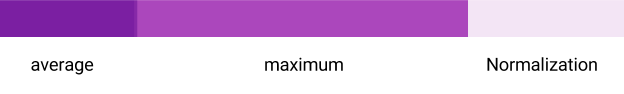
Figure 5-7. Each stage in the query explanation is depicted by a color bar that has three parts
The length of the bar is the time taken by the most time-consuming step in this stage. In other words, the bars are all normalized to the time taken by the longest step (wait, read, compute, or write). For example, in stage 1 of our query, the read step takes the longest time and is the one against which the other steps are calibrated. The bars themselves have two colors. The lighter color indicates the time taken by the slowest worker that executed that step, and the darker color indicates the average time taken by all the workers that executed the step. Ideally, the average and the maximum are close to each other. A large difference between the average and the maximum (as in Figure 5-7) indicates a skew—there are some workers who are doing a lot more work than others. Sometimes, it is inherent to the query, but at other times, it might be possible to rework the storage or partitions to reduce such skew.16
The wait time is the time spent waiting for the necessary compute resources to become available—a very high value here indicates a job that could not be immediately scheduled on the cluster. A high wait time could occur if you are using the BigQuery flat-rate plan and someone else in your organization is already consuming all of the paid-for capacity. The solution would be to be run your job at a different time, make your job smaller, or negotiate with the group that is using the available resources. The read step reads the data required at this stage from the table or from the output of the previous stage. A high value of read time indicates that you might consider whether you could rework the query so that most of the data is read in the initial stages. The compute step carries out the computation required—if you run into high values here, consider whether you can carry out some of the operations in post-processing or if you could omit the use of user-defined functions (UDFs).17 The write step writes to temporary storage or to the response and is mainly a function of the amount of data being written out in each stage—optimization of this step typically involves moving filtering options to occur in the innermost query (or earliest stage), although as we saw earlier, the BigQuery optimizer can do some of this automatically.
For all three stages in our query, the read step is what takes the most amount of time, indicating that our query is I/O bound and that the basic cost of reading the data is what dominates the query. It is clear from the numbers in the input column (21 million to 16,000 to 229) that we are already doing quite well at funneling the data through and processing most of the data in earlier stages. We also noticed from the explanation that BigQuery has already optimized things by moving the filtering step to the earliest possible stage—there is no way to move it any earlier because it is not possible to filter on the number of flights until that value is computed. On the other hand, if this is a frequent sort of filter, it might be helpful to add a table indicating the traffic at each airport and join with this table instead of computing the aggregate each time. It might also be possible to achieve an approximation to this by adding a column indicating some characteristic (such as the population) of the metropolitan area that each airport serves. For now, without any idea of the kinds of airports that the typical user of this dataset will be interested in, there is little to be done. We are determined to process all the data, and processing all the data requires time spent reading that data. If we don’t need statistics from all the data, we could consider sampling the data and computing our statistics on that sample instead.
From the diagram, we notice that stages 1 and 3 have no wait skew. However, there is a little bit of skew in the wait time for stage 2. Can you guess why? Hint: the write step of stage 1 also has a skew. The answer is that this skew is inherent to the query. Recall that we are grouping by airport, and some airports have many more flights than others. The data corresponding to those busier airports will take longer to write out. There is little to be done here as well, unless we are completely uninterested in the smaller airports. If that is the case, we could filter out the smaller airports from our data, write them to a separate table, and query that table instead from here on.
Exploratory Data Analysis in Cloud AI Platform Notebooks
To see why data scientists have moved en masse to using notebooks, it helps to understand the way exploratory data analysis was carried out and the reports disseminated a few years ago. Take, for example, Figure 5-8, which appears in one of my papers about different ways to track storms in weather radar images.

Figure 5-8. This graph was created using a complex workflow
Figure 5-8 was created by running the methods in question (PRJ, CST, etc.) on a large dataset of weather radar imagery and computing various evaluation metrics (VIL error in the graphic). For performance reasons, this was done in C++. The metric for each pair of images was written out to a text file (a different text file for each method), and it is the aggregates of those metrics that are reported in Figure 5-8. The text files had to be wrangled from the cluster of machines on which they were written out, combined by key (the method used to track storms), and then aggregated. This code, essentially a MapReduce operation, was written in Java. The resulting aggregate files were read by an R program that ranked the methods, determined the appropriate shading,18 and wrote out an image file in PNG format. These PNG images were incorporated into a LaTeX report, and a compiler run to create a shareable document in PDF from the LaTeX and PNG sources. It was this PDF of the paper that we could disseminate to interested colleagues.
If the colleague then suggested a change, we’d go through the process all over again. The ordering of the programs—C++, followed by Java, followed by R, followed by LaTeX, followed by attaching the PDF to an email—was nontrivial, and there were times when we skipped something in between, resulting in incorrect graphics or text that didn’t match the graphs.
Jupyter Notebooks
Jupyter is open source software that provides an interactive scientific computing experience in a variety of languages including Python, R, and Scala. The key unit of work is a Jupyter Notebook, which is a web application that serves documents with code, visualizations, and explanatory text. Although the primary output of code in a notebook tends to be graphics and numbers, it is also possible to produce images and JavaScript. Jupyter also supports the creation of interactive widgets for manipulating and visualizing data.
Notebooks have changed the way graphics like this are produced and shared. Had I been doing it today, I might have slurped the score files (created by the C++ program) into a Python notebook. Python can do the file wrangling, ranking, and graph creation. Because the notebook is an HTML document, it also supports the addition of explanatory text to go with the graphs. You can check the notebook itself into a repository and share it. Otherwise, I can run a notebook server and serve the notebook via an HTTP link. Colleagues who want to view the notebook simply visit the URL. Not only can they view the notebook, if they are visiting the live URL, they can change a cell in the notebook and create new graphs.
The difference between a word processor file with graphs and an executable notebook with the same graphs is the difference between a printed piece of paper and a Google Doc in which both you and your collaborators are interacting live. Give notebooks a try—they tie together the functions of an integrated development environment, an executable program, and a report into a nice package.
The one issue with notebooks is how to manage the web servers that serve them. Because the code is executed on the notebook server, bigger datasets often require more powerful machines. You can simplify managing the provisioning of notebook servers by running them on demand in the public cloud.
Cloud AI Platform Notebooks
Cloud AI Platform Notebooks provides a hosted version of JupyterLab on Google Cloud Platform; it knows how to authenticate against Google Cloud Platform so as to provide easy access to Cloud Storage, BigQuery, Cloud Dataflow, Cloud ML Engine, and so on.
You can launch a Notebooks instance from the Google Cloud Platform web console. After a minute or so, the console shows you a JupyterLab link. When you are done using the Notebooks instance, you can delete the instance from the web console. You can also simply stop the instance when you are using it (resources like disk continue to be charged for if you just stop the instance).
After you have launched the Notebooks instance and navigated to JupyterLab, you can create a new notebook. Click the Home icon if necessary, and then navigate to the folder in which you want this notebook to appear and select File > New Notebook. The notebook contains a number of cells. A markdown cell is cell with text content. A code cell has Python code—when you run such a cell, the notebook displays the printed output of that cell.
For example, suppose that you type into a notebook the contents of Figure 5-9 (with the first cell a markdown cell, and the second cell a Python cell).
You can run the cell your cursor is in by clicking Run (or use the keyboard shortcut Ctrl+Shift+Enter). You could also run all cells by clicking “Run all cells.” When you click this, the cells are evaluated, and the resulting rendered notebook looks like Figure 5-10.

Figure 5-9. What you type into the notebook (compare with Figure 5-10)

Figure 5-10. What happens after you execute the cells (compare with Figure 5-9)
Note that the markdown has been converted into a visual document, and note that the Python code has been evaluated, and the resulting output printed out.
You can git clone the repository for this book by typing:
!git clone https://github.com/GoogleCloudPlatform/data-science-on-gcp
You could have also used the git icon or run the above command from a Terminal. Regardless of how you interact with git, get into the habit of practicing source-code control on changed notebooks.
The use of the exclamation point (when you typed !git into a code cell) is an indication to Jupyter that the line is not Python code, but is instead a shell command. If you have multiple lines of a shell command, you can start a cell with %%bash, for example:
%%bash
wget tensorflow …
pip install …
Installing Packages in Cloud AI Platform Notebooks
Which Python packages are already installed in Notebooks, and which ones will we have to install? One way to check which packages are installed is to type the following:
%pip freeze
This lists the Python packages installed. Another option is to add in imports for packages and see if they work. Let’s do that with packages that I know that we’ll need:
import matplotlib.pyplot as plt
import seaborn as sb
import pandas as pd
import numpy as np
numpy is the canonical numerical Python library that provides efficient ways of working with arrays of numbers. Pandas is an extremely popular data analysis library that provides a way to do operations such as group by and filter on in-memory dataframes. matplotlib is a Matlab-inspired module to create graphs in Python. seaborn provides extra graphics capabilities built on top of the basic functionality provided by matplotlib. All these are open source packages that are installed in Cloud Datalab by default.
Had I needed a package that is not already installed in Notebooks, I could have installed it in one of two ways: using pip or using apt-get. You can install many Python modules by using pip. For example, to install the Cloud Platform APIs that we used in Chapter 3, execute this code within a cell:
%pip install google-cloud
Some modules are installed as Linux packages because they might involve the installation of not only Python wrappers, but also the underlying C libraries. For example, to install basemap, a geographic plotting package that uses the C library proj.4 to convert between map projections, you’d run this code within a cell:
%%bash
apt-get update
apt-get -y install python-mpltoolkits.basemap
Often, you will need to restart the Python kernel for the new package to be picked up (you can do this using the Restart Kernel button on the notebook ribbon user interface). At this point, if you run apt-get again, you should see a message indicating that the package is already installed.
Jupyter Magic for Google Cloud Platform
When we used %%bash in the previous section, we were using a Jupyter magic, a syntactic element that marks what follows as special.19 This is how Jupyter can support multiple interpreters or engines. Jupyter knows what language a cell is in by looking at the magic at its beginning. For example, try typing the following into a code cell:
%%html
This cell will print out a <b> HTML </b> string.
You should see the HTML rendering of that string being printed out on evaluation, as depicted in Figure 5-11.

Figure 5-11. Jupyter Magic for HTML rendering
Jupyter magics provide a mechanism to run a wide variety of languages, and ways to add some more. The BigQuery Python package has added a few magics to make the interaction with Google Cloud Platform convenient.
For example, you can run a query on your BigQuery table using the %%bigquery magic environment that comes with Notebooks:
%%bigquery
SELECT
  COUNTIF(arr_delay >= 15)/COUNT(arr_delay) AS frac_delayed
FROM flights.tzcorr
If you get the fraction of flights that are delayed, as shown in Figure 5-12, all is well.
If not, look at the error message and carry out appropriate remedial actions. You might need to authenticate yourself, set the project you are working in, or change permissions on the BigQuery table.

Figure 5-12. The %%biqquery magic environment that comes with Notebooks
The fact that we refer to %%bigquery as a Jupyter magic should indicate that this is not pure Python—you can execute this only within a notebook environment. The magic, however, is simply a wrapper function for Python code.20 If there is a piece of code that you’d ultimately want to run outside a notebook (perhaps as part of a scheduled script), it’s better to use the underlying Python and not the magic pragma:
sql = """
SELECT
  COUNTIF(arr_delay >= 15)/COUNT(arr_delay) AS frac_delayed
FROM flights.tzcorr
"""
from google.cloud import bigquery
bq = bigquery.Client()
df = bq.query(sql).to_dataframe()
print(df)
One way to use the underlying Python is to use the google.cloud.bigquery package—this allows us to use code independent of the notebook environment. This is, of course, the same bigquery package in the Cloud client library that we used in Chapters 3 and 4. The client library includes interconnections between BigQuery results and numpy/Pandas to simplify the creation of graphics.
Exploring arrival delays
To pull the arrival delays corresponding to the model created in Chapter 3 (i.e., of the arrival delay for flights that depart more than 10 minutes late), we can do the following:
%%bigquery df
SELECT ARR_DELAY, DEP_DELAY
FROM flights.tzcorr
WHERE DEP_DELAY >= 10 AND RAND() < 0.01
This code uses the %%bigquery magic to run the SQL statement and stores the result set into a Pandas dataframe named df. Recall that in Chapter 4, we did this using the Google Cloud Platform API. The statistics will not be exact because our query pulls a random 1% of the complete dataset by specifying that RAND(), a function that returns a random number uniformly distributed between 0 and 1, had to be less than 0.01. In exploratory data analysis, however, it is not critical to use the entire dataset, just a large enough one.
After we have the dataframe, getting fundamental statistics about the two columns returned by the query is as simple as this:
df.describe()
This gives us the mean, standard deviation, minimum, maximum, and quartiles of the arrival and departure delays given that departure delay is more than 10 minutes, as illustrated in Figure 5-13 (see the WHERE clause of the query).

Figure 5-13. Getting the fundamental statistics of a Pandas dataframe
Beyond just the statistical capabilities of Pandas, we can also pass the Pandas dataframes and underlying numpy arrays to plotting libraries like seaborn. For example, to plot a violin plot of our decision surface from the previous chapter (i.e., of the arrival delay for flights that depart more than 10 minutes late), we can do the following:
sns.set_style("whitegrid")
ax = sns.violinplot(data=df, x='ARR_DELAY', inner='box', orient='h')
This produces the graph shown in Figure 5-14.

Figure 5-14. Violin plot of arrival delay
A violin plot is a kernel density plot;21 that is, it is an estimate of the probability distribution function (PDF22). It carries a lot more information than simply a box-and-whiskers plot because it does not assume that the data is normally distributed. Indeed, we see that even though the distribution peaks around 10 minutes (which is the mode), deviations around this peak are skewed toward larger delays than smaller ones. Importantly, we also notice that there is only one peak—the distribution is not, for example, bimodal.
Let’s compare the violin plot for flights that depart more than 10 minutes late with the violin plot for flights that depart less than 10 minutes late and zoom in on the x-axis close to our 15-minute threshold. First, we pull all of the delays using the following:
%%bigquery df
SELECT ARR_DELAY, DEP_DELAY
FROM flights.tzcorr
WHERE RAND() < 0.001
In this query, I have dropped the WHERE clause. Instead, we will rely on Pandas to do the thresholding. Because Notebooks runs totally in-memory, I pull only 1 in 1,000 flights (using RAND() < 0.001). I can now create a new column in the Pandas dataframe that is either True or False depending on whether the flight departed less than 10 minutes late:
df['ontime'] = df['DEP_DELAY'] < 10
We can graph this new Pandas dataframe using seaborn:
ax = sns.violinplot(data=df, x='ARR_DELAY', y='ontime',
                    inner='box', orient='h')
ax.set_xlim(-50, 200)
The difference between the previous violin plot and this one is the inclusion of the ontime column. This results in a violin plot (see Figure 5-15) that illustrates how different flights that depart 10 minutes late are from flights that depart early.
Note
The squashed top of the top violin plot indicates that the seaborn default smoothing was too coarse. You can fix this by passing in a gridsize parameter:
ax = sns.violinplot(data=df, x='ARR_DELAY', y='ontime',
inner='box', orient='h', gridsize=1000)

Figure 5-15. Difference between violin plots of all late flights (top) versus on-time flights (bottom)
As we discussed in Chapter 3, it is clear that the 10-minute threshold separates the dataset into two separate statistical regimes, so that the typical arrival delay for flights that depart more than 10 minutes late is skewed toward much higher values than for flights that depart more on time. We can see this in Figure 5-16, both from the shape of the violin plot and from the box plot that forms its center. Note how centered the on-time flights are versus the box plot (the dark line in the center) for delayed flights.23

Figure 5-16. Zoomed-in look at Figure 5-15
However, the extremely long skinny tail of the violin plot is a red flag—it is an indication that the dataset might pose modeling challenges. Let’s investigate what is going on.
Quality Control
We can continue writing queries in the notebook, but doing so on the BigQuery console gives me immediate feedback on syntax and logic errors. So, I switch over to https://console.cloud.google.com/bigquery and type in my first query:
#standardsql
SELECT
  AVG(ARR_DELAY) AS arrival_delay
FROM
  flights.tzcorr
GROUP BY
  DEP_DELAY
ORDER BY
  DEP_DELAY
This should give me the average arrival delay associated with every value of departure delay (which, in this dataset, is stored as an integer number of minutes). I get back more than 1,000 rows. Are there really more than 1,000 unique values of DEP_DELAY? What’s going on?
Oddball Values
To look at this further, let’s add more elements to my initial query:
  #standardsql
SELECT
  DEP_DELAY,
  AVG(ARR_DELAY) AS arrival_delay,
  COUNT(ARR_DELAY) AS numflights
FROM
  `flights.tzcorr`
GROUP BY
  DEP_DELAY
ORDER BY
  DEP_DELAY
The resulting table explains what’s going on. The first few rows have only a few flights each, as shown in Figure 5-17.
However, departure delay values of a few minutes have tens of thousands of flights, which we can see in Figure 5-18.

Figure 5-17. Number of flights at each departure delay

Figure 5-18. Low values of departure delay have large numbers of flights
Oddball values that are such a small proportion of the data can probably be ignored. Moreover, if the flight does really leave 82 minutes early, I’m quite sure that you won’t be on the flight, and if you are, you know that you will make the meeting. There is no reason to complicate our statistical modeling with such odd values.
Outlier Removal: Big Data Is Different
How can you remove such outliers? There are two ways to filter the data: one would be based on the departure delay variable itself, keeping only values that met a condition such as this:
WHERE dep_delay > -15
A second method would be to filter the data based on the number of flights:
WHERE numflights > 300
The second method—using a quality-control filter that is based on removing data for which we have insufficient examples—is preferable.
This is an important point and gets at the key difference between statistics on “normal” datasets and statistics on big data. Although I agree that the term big data has become completely hyped, people who claim that big data is just data are missing a key point—the fundamental approach to problems becomes different when datasets grow sufficiently large. The way we detect outliers is just one such example.
For a dataset that numbers in the hundreds to thousands of examples, you would filter the dataset and remove values outside, say, μ ± 3σ (where μ is the mean and σ the standard deviation). We can find out what the range would be by running a BigQuery query on the table:
#standardsql
SELECT
  AVG(DEP_DELAY) - 3*STDDEV(DEP_DELAY) AS filtermin,
  AVG(DEP_DELAY) + 3*STDDEV(DEP_DELAY) AS filtermax
FROM
  `flights.tzcorr`
This yields the range [–102, 120] minutes so that the WHERE clause would become as follows:
WHERE dep_delay > -102 AND dep_delay < 120
Of course, a filter that retains values in the range μ ± 3σ is based on an implicit assumption that the distribution of departure delays is Gaussian. We can avoid such an assumption by using percentiles, perhaps by omitting the top and bottom 5% of values:
#standardsql
SELECT
  APPROX_QUANTILES(DEP_DELAY, 20)
FROM
  `flights.tzcorr`
This would lead us to retain values in the range [–9, 66]. Regardless of how we find the range, though, the range is based on an assumption that unusually high and low values are outliers.
On datasets that number in the hundreds of thousands to millions of examples, thresholding your input data based on value is dangerous because you can very well be throwing out valuable nuance—if there are sufficient examples of a delay of 150 minutes, it is worth modeling such a value regardless of how far off the mean it is. Customer satisfaction and “long-tail” business strategies might hinge on our systems coping well with usually small or large values. There is, therefore, a world of difference between filtering our data using
WHERE dep_delay > -15
versus filtering it using:
WHERE numflights > 370
The first method imposes a threshold on the input data and is viable only if we are sure that a departure delay of less than –15 minutes is absurd. The second method, on the other hand, is based on how often certain values are observed—the larger our dataset grows, the less unusual any particular value becomes.
The term outlier is, therefore, somewhat of a misnomer when it comes to big data. An outlier implies a range within which values are kept, with outliers being values that lie outside that range. Here, we are keeping data that meets a criterion involving frequency of occurrence—any value is acceptable as long as it occurs often enough in our data.24
Filtering Data on Occurrence Frequency
To filter the dataset based on frequency of occurrence, we first need to compute the frequency of occurrence and then threshold the data based on it. We can accomplish this by using a HAVING clause:
#standardsql
SELECT
  DEP_DELAY,
  AVG(ARR_DELAY) AS arrival_delay,
  STDDEV(ARR_DELAY) AS stddev_arrival_delay,
  COUNT(ARR_DELAY) AS numflights
FROM
  `flights.tzcorr`
GROUP BY
  DEP_DELAY
HAVING
  numflights > 370
ORDER BY
  DEP_DELAY
Why threshold the number of flights at 370? This number derives from a guideline called the three-sigma rule,25 which is traditionally the range within which we consider “nearly all values”26 to lie. If we assume (for now; we’ll verify it soon) that at any departure delay, arrival delays are normally distributed, we can talk about things that are true for “almost every flight” if our population size is large enough—filtering our dataset so that we have at least 37027 examples of each input value is a rule of thumb that achieves this.
How different would the results be if we were to choose a different threshold? We can look at the number of flights that are removed by different quality-control thresholds by replacing SELECT * in the previous query by 20604235 – SUM(numflights)28 and look at the slope of a linear model between arrival delay and departure delay using this query:
 #standardsql
SELECT
  20604235 - SUM(numflights) AS num_removed,
  AVG(arrival_delay * numflights)/AVG(DEP_DELAY * numflights) AS lm
FROM (
  as before )
WHERE
  numflights > 1000
Running this query for various different thresholds on numflights, we get the results shown in Table 5-3.
| Threshold on numflights | Number of flights removed | Linear model slope (lm) |
|---|---|---|
| 1,000 | 86,787 | 0.35 |
| 500 | 49,761 | 0.38 |
| 370 (three-σ rule) | 38,139 | 0.39 |
| 300 | 32,095 | 0.40 |
| 200 | 23,892 | 0.41 |
| 100 | 13,506 | 0.42 |
| 22 (two-σ rule) | 4990 | 0.43 |
| 10 | 2,243 | 0.44 |
| 5 | 688 | 0.44 |
As you can see, the slope varies extremely slowly as we remove fewer and fewer flights by decreasing the threshold. Thus, the differences in the model created for thresholds of 300, 370, or 500 are quite minor. However, that model is quite different from that created if the threshold were 5 or 10. The order of magnitude of the threshold matters, but perhaps not the exact value.
Arrival Delay Conditioned on Departure Delay
Now that we have a query that cleans up oddball values of departure delay from the dataset, we can take the query over to the Jupyter notebook to continue our exploratory analysis and to develop a model to help us make a decision on whether to cancel our meeting. I simply copy and paste from the BigQuery console to the notebook and give the Pandas dataframe a name, as shown here:
%%bigquery depdelay
SELECT
  DEP_DELAY,
  arrival_delay,
  stddev_arrival_delay,
  numflights
FROM (
  SELECT
    DEP_DELAY,
    AVG(ARR_DELAY) AS arrival_delay,
    STDDEV(ARR_DELAY) AS stddev_arrival_delay,
    COUNT(ARR_DELAY) AS numflights
  FROM
    `flights.tzcorr`
  GROUP BY
    DEP_DELAY )
WHERE
  numflights > 370
ORDER BY
  DEP_DELAY
"""
We can display the first five rows of the dataframe using [:5] :
depdelay[:5]
Figure 5-19 shows the result.

Figure 5-19. Pandas dataframe for departure delays with more than 370 flights
Let’s plot this data to see what insight we can get. Even though we have been using seaborn so far, Pandas itself has plotting functions built in:
ax = depdelay.plot(kind='line', x='DEP_DELAY',
              y='arrival_delay', yerr='stddev_arrival_delay')
This yields the plot shown in Figure 5-20.

Figure 5-20. Relationship between departure delay and arrival delay
It certainly does appear as if the relationship between departure delay and arrival delay is quite linear. The width of the standard deviation of the arrival delay is also pretty constant, on the order of 10 minutes.
There are a variety of %%bigquery magics and bq command-line functionalities available from a Jupyter notebook. Together, they form a very convenient “fat SQL” client suitable for running entire SQL workflows. Particularly useful is the ability to create a temporary dataset:
!bq mk temp_dataset
and send the results of a query to a table in that dataset using the following:
%%bigquery
CREATE OR REPLACE TABLE temp_dataset.delays
AS

SELECT
  DEP_DELAY,
  arrival_delay,
  numflights
FROM (
  SELECT
    DEP_DELAY,
    APPROX_QUANTILES(ARR_DELAY,
      101)[OFFSET(70)] AS arrival_delay,
    COUNT(ARR_DELAY) AS numflights
  FROM
    `flights.tzcorr` f
  JOIN
    `flights.trainday` t
  ON
    f.FL_DATE = t.FL_DATE
  WHERE
    t.is_train_day = 'True'
  GROUP BY
    DEP_DELAY )
WHERE
  numflights > 370
ORDER BY
  DEP_DELAY
Now, we can use this table as the input for queries further down in the notebook. At the end of the workflow, after all the necessary charts and graphs are created, we can delete the dataset:
!bq rm -f temp_dataset.delays
!bq rm -f temp_dataset
Applying Probabilistic Decision Threshold
Recall from Chapter 1 that our decision criterion is 15 minutes and 30%. If the plane is more than 30% likely to be delayed (on arrival) by more than 15 minutes, we want to send a text message asking to postpone the meeting. At what departure delay does this happen?
By computing the standard deviation of the arrival delays corresponding to each departure delay, we implicitly assumed that arrival delays are normally distributed. For now, let’s continue with that assumption. I can examine a complementary cumulative distribution table and find where 0.3 happens. From the table, this happens at Z = 0.52.
Let’s now go back to Jupyter to plug this number into our dataset:
Z_30 = 0.52
depdelay['arr_delay_30'] = (Z_30 * depdelay['stddev_arrival_delay'])
             + depdelay['arrival_delay']
plt.axhline(y=15, color='r')
ax = plt.axes()
depdelay.plot(kind='line', x='DEP_DELAY', y='arr_delay_30',
              ax=ax, ylim=(0,30), xlim=(0,30), legend=False)
ax.set_xlabel('Departure Delay (minutes)')
ax.set_ylabel('> 30% likelihood of this Arrival Delay (minutes)')
The plotting code yields the plot depicted in Figure 5-21.

Figure 5-21. Choosing the departure delay threshold that results in a 30% likelihood of an arrival delay of <15 minutes
It appears that our decision criterion translates to a departure delay of 13 minutes. If the departure delay is 13 minutes or more, the aircraft is more than 30% likely to be delayed by 15 minutes or more.
Empirical Probability Distribution Function
What if we drop the assumption that the distribution of flights at each departure delay is normally distributed? We then will need to empirically determine the 30% likelihood at each departure delay. Happily, we do have at least 370 flights at each departure delay (the joys of working with large datasets!), so we can simply compute the 30th percentile for each departure delay.
We can compute the 30th percentile in BigQuery by discretizing the arrival delays corresponding to each departure delay into 100 bins and picking the arrival delay that corresponds to the 70th bin:
#standardsql
SELECT
  DEP_DELAY,
  APPROX_QUANTILES(ARR_DELAY, 101)[OFFSET(70)] AS arrival_delay,
  COUNT(ARR_DELAY) AS numflights
FROM
  `flights.tzcorr`
GROUP BY
  DEP_DELAY
HAVING
  numflights > 370
ORDER BY
  DEP_DELAY
The function APPROX_QUANTILES() takes the ARR_DELAY and divides it into N + 1 bins (here we specified N = 101).29 The first bin is the approximate minimum, the last bin the approximate maximum, and the rest of the bins are what we’d traditionally consider the bins. Hence, the 70th percentile is the 71st element of the result. The [] syntax finds the nth element of that array—OFFSET(70) will provide the 71st element because OFFSET is zero-based.30 Why 70 and not 30? Because we want the arrival delay that could happen with 30% likelihood and this implies the larger value.
The results of this query provide the empirical 30th percentile threshold for every departure delay, which you can see in Figure 5-22.
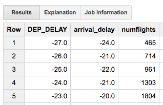
Figure 5-22. Empirical 30% likelihood arrival delay for each possible departure delay
Plugging the query back into Cloud Datalab, we can avoid the Z-lookup and Z-score calculation associated with Gaussian distributions:
plt.axhline(y=15, color='r')
ax = plt.axes()
depdelay.plot(kind='line', x='DEP_DELAY', y='arrival_delay',
              ax=ax, ylim=(0,30), xlim=(0,30), legend=False)
ax.set_xlabel('Departure Delay (minutes)')
ax.set_ylabel('> 30% likelihood of this Arrival Delay (minutes)')
We now get the chart shown in Figure 5-23.

Figure 5-23. Departure delay threshold that results in a 30% likelihood of an arrival delay of <15 min
The Answer Is...
From the chart in Figure 5-23, our decision threshold, without the assumption of normal distribution, is 16 minutes. If a flight is delayed by more than 16 minutes, there is a greater than 30% likelihood that the flight will arrive more than 15 minutes late.
Recall that the aforementioned threshold is conditioned on rather conservative assumptions—you are going to cancel the meeting if there is more than 30% likelihood of being late by 15 minutes. What if you are a bit more audacious in your business dealings, or if this particular customer will not be annoyed by a few minutes’ wait? What if you won’t cancel the meeting unless there is a greater than 70% chance of being late by 15 minutes? The good thing is that it is easy enough to come up with a different decision threshold for different people and different scenarios out of the same basic framework.
Another thing to notice is that the addition of the actual departure delay in minutes has allowed us to make a better decision than going with just the contingency table. Using just the contingency table, we would cancel meetings whenever flights were just 10 minutes late. Using the actual departure delay and a probabilistic decision framework, we were able to avoid canceling our meeting unless flights were delayed by 16 minutes or more.
Evaluating the Model
But how good is this advice? How many times will my advice to cancel or not cancel the meeting be the correct one? Had you asked me that question, I would have hemmed and hawed—I don’t know how accurate the threshold is because we have no independent sample. Let’s address that now—as our models become more sophisticated, an independent sample will be increasingly required.
There are two broad approaches to finding an independent sample:
-
Collect new data. For example, we could go back to BTS and download 2016 data and evaluate the recommendation on that dataset.
-
Split the 2015 data into two parts. Create the model on the first part (called the training set), and evaluate it on the second part (called the test set).
The second approach is more common because datasets tend to be finite. In the interest of being practical here, let’s do the same thing even though, in this instance, we could go back and get more data.31
When splitting the data, we must be careful. We want to ensure that both parts are representative of the full dataset (and have similar relationships to what you are predicting), but at the same time we want to make sure that the testing data is independent of the training data. To understand what this means, let’s take a few reasonable splits and talk about why they won’t work.
Random Shuffling
We might split the data by randomly shuffling all the rows in the dataset and then choosing the first 70% as the training set, and the remaining 30% as the test set. In BigQuery, you could do that using the RAND() function:
 #standardsql
SELECT
  ORIGIN, DEST,
  DEP_DELAY,
  ARR_DELAY
FROM
  flights.tzcorr
WHERE
  RAND() < 0.7
The RAND() function returns a value between 0 and 1, so approximately 70% of the rows in the dataset will be selected by this query. However, there are several problems with using this sampling method for machine learning:
-
It is not nearly as easy to get the 30% of the rows that were not selected to be in the training set to use as the test dataset.
-
The
RAND()function returns different things each time it is run, so if you run the query again, you will get a different 70% of rows. In this book, we are experimenting with different machine learning models, and this will play havoc with comparisons between models if each model is evaluated on a different test set. -
The order of rows in a BigQuery result set is not guaranteed—it is essentially the order in which different workers return their results. So, even if you could set a random seed to make
RAND()repeatable, you’ll still not get repeatable results. You’d have to add anORDER BYclause to explicitly sort the data (on an ID field, a field that is unique for each row) before doing theRAND(). This is not always going to be possible.
Further, on this particular dataset, random shuffling is problematic for another reason. Flights on the same day are probably subject to the same weather and traffic factors. Thus, the rows in the training set, and test sets will not be independent if we simply shuffle the data. This consideration is relevant only for this particular dataset—shuffling the data and taking the first 70% will work for other datasets that don’t have this inter-row dependence, as long as you have an id field.
We could split the data such that Jan–Sep 2015 is training data and Oct–Dec is testing data. But what if delays can be made up in summer but not in winter? This split fails the representativeness test. Neither the training dataset nor the test dataset will be representative of the entire year if we split the dataset by months.
Splitting by Date
The approach that we will take is to find all the unique days in the dataset, shuffle them, and use 70% of these days as the training set and the remainder as the test set. For repeatability, I will store this division as a table in BigQuery.
The first step is to get all the unique days in the dataset:
  #standardsql
SELECT
  DISTINCT(FL_DATE) AS FL_DATE
FROM
  flights.tzcorr
ORDER BY
  FL_DATE
The next step is to select a random 70% of these to be our training days:
  #standardsql
SELECT
  FL_DATE,
  IF(MOD(ABS(FARM_FINGERPRINT(CAST(FL_DATE AS STRING))), 100) < 70,
     'True', 'False') AS is_train_day
FROM (
  SELECT
    DISTINCT(FL_DATE) AS FL_DATE
  FROM
    `flights.tzcorr`)
ORDER BY
  FL_DATE
In the preceding query, the hash value of each of the unique days from the inner query is computed using the FarmHash library32 and the is_train_day field is set to True if the last two digits of this hash value are less than 70. Figure 5-24 shows the resulting table.

Figure 5-24. Selecting training days
The final step is to save this result as a table in BigQuery. We can do this from the BigQuery console using the “Save as Table” button. I’ll call this table trainday; we can join with this table whenever we want to pull out training rows.
In some chapters, we won’t be using BigQuery. Just in case we aren’t using BigQuery, I will also export the table as a CSV file—we can do this by clicking the blue arrow next to the table name, as demonstrated in Figure 5-25.

Figure 5-25. Exporting a BigQuery table as a CSV file
Next, select the “Export table” option. For this exercise, I choose to store it on Cloud Storage as gs://cloud-training-demos-ml/flights/trainday.csv (you should use your own bucket, of course).
Training and Testing
Now, I can go back and edit my original query to carry out the percentile using only data from my training days. To do that, I will change this string in my original query
FROM
  `flights.tzcorr`
to:
FROM
  `flights.tzcorr` f
JOIN
  `flights.trainday` t
ON
  f.FL_DATE = t.FL_DATE
WHERE
  t.is_train_day = 'True'
Now, the query is carried only on days for which is_train_day is True.
Here’s the new query in the Jupyter notebook cell:
%%bigquery depdelay
SELECT
  *
FROM (
  SELECT
    DEP_DELAY,
    APPROX_QUANTILES(ARR_DELAY,
      101)[OFFSET(70)] AS arrival_delay,
    COUNT(ARR_DELAY) AS numflights
  FROM
    `cloud-training-demos.flights.tzcorr` f
  JOIN
    `flights.trainday` t
  ON
    f.FL_DATE = t.FL_DATE
  WHERE
    t.is_train_day = 'True'
  GROUP BY
    DEP_DELAY )
WHERE
  numflights > 370
ORDER BY
  DEP_DELAY
The code to create the plot remains the same:
plt.axhline(y=15, color='r')
ax = plt.axes()
depdelay.plot(kind='line', x='DEP_DELAY', y='arr_delay_30',
              ax=ax, ylim=(0,30), xlim=(0,30), legend=False)
ax.set_xlabel('Departure Delay (minutes)')
ax.set_ylabel('> 30% likelihood of this Arrival Delay (minutes)')
The threshold (the x-axis value of the intersection point) remains consistent, as depicted in Figure 5-26.

Figure 5-26. The departure delay threshold remains consistent with earlier methods
This is gratifying because we get the same answer—16 minutes—after creating the empirical probabilistic model on just 70% of the data.
Let’s formally evaluate how well our recommendation of 16 minutes does in terms of predicting an arrival delay of 15 minutes or more. To do that, we have to find the number of times that we would have wrongly canceled a meeting or missed a meeting. We can compute these numbers using this query on days that are not training days:
  #standardsql
SELECT
  SUM(IF(DEP_DELAY < 16
      AND arr_delay < 15, 1, 0)) AS correct_nocancel,
  SUM(IF(DEP_DELAY < 16
      AND arr_delay >= 15, 1, 0)) AS wrong_nocancel,
  SUM(IF(DEP_DELAY >= 16
      AND arr_delay < 15, 1, 0)) AS wrong_cancel,
  SUM(IF(DEP_DELAY >= 16
      AND arr_delay >= 15, 1, 0)) AS correct_cancel
FROM (
  SELECT
    DEP_DELAY,
    ARR_DELAY
  FROM
    `flights.tzcorr` f
  JOIN
    `flights.trainday` t
  ON
    f.FL_DATE = t.FL_DATE
  WHERE
    t.is_train_day = 'False' )
Note that unlike when I was computing the decision threshold, I am not removing outliers (i.e., thresholding on 370 flights at a specific departure delay) when evaluating the model—outlier removal is part of my training process and the evaluation needs to be independent of that. The second point to note is that this query is run on days that are not in the training dataset. Running this query in BigQuery, I get the result shown in Figure 5-27.

Figure 5-27. Confusion matrix on independent test dataset
We will cancel meetings corresponding to a total of 188,140 + 773,612 = 961,752 flights. What fraction of the time are these recommendations correct? We can do the computation in the notebook (assuming that the dataframe is named eval):
print(eval['correct_nocancel'] /
      (eval['correct_nocancel'] + eval['wrong_nocancel']))
print(eval['correct_cancel'] /
      (eval['correct_cancel'] + eval['wrong_cancel']))
Figure 5-28 presents the results.

Figure 5-28. Computing accuracy on independent test dataset
It turns out when I recommend that you not cancel your meeting, I will be correct 95% of the time, and when I recommend that you cancel your meeting, I will be correct 80% of the time.
Why is this not 70%? Because the populations are different. In creating the model, we found the 70th percentile of arrival delay given a specific departure delay. In evaluating the model, we looked at the dataset of all flights. One’s a marginal distribution, and the other’s the full one. Another way to think about this is that the 81% figure is padded by all the departure delays of more than 20 minutes when canceling the meeting is an easy call.
We could, of course, evaluate right at the decision boundary by changing our scoring function:
%sql --dialect standard --module evalquery2
#standardsql
SELECT
  SUM(IF(DEP_DELAY = 15
      AND arr_delay < 15, 1, 0)) AS correct_nocancel,
  SUM(IF(DEP_DELAY = 15
      AND arr_delay >= 15, 1, 0)) AS wrong_nocancel,
  SUM(IF(DEP_DELAY = 16
      AND arr_delay < 15, 1, 0)) AS wrong_cancel,
  SUM(IF(DEP_DELAY = 16
      AND arr_delay >= 15, 1, 0)) AS correct_cancel
...
If we do that, evaluating only at departure delays of 15 and 16 minutes, the contingency table looks like Figure 5-29.

Figure 5-29. Evaluating only at marginal decisions
As expected, we are correct to cancel the meeting only 30.2% of the time, close to our target of 30%. This model achieves the 70% correctness measure that was our target but does so by canceling fewer flights than the contingency-table-based model of Chapter 3.
Summary
In this chapter, we began to carry out exploratory data analysis. To be able to interactively analyze our large dataset, we loaded the data into BigQuery, which gave us the ability to carry out queries on millions of rows in a matter of seconds. We required sophisticated statistical plotting capabilities, and we obtained that by using a Jupyter notebook in the form of Cloud Datalab.
In terms of the model itself, we were able to use nonparametric estimation of the 30th percentile of arrival delays to pick the departure delay threshold. We discovered that doing this allows us to cancel fewer meetings while attaining the same target correctness. We evaluated our decision threshold on an independent set of flights by dividing our dataset into two parts—a training set and a testing set—based on randomly partitioning the distinct days that comprise our dataset.
1 See https://en.wikipedia.org/wiki/Statistical_hypothesis_testing for an excellent overview of statistical hypotheses testing.
2 John Tukey, 1977. Exploratory Data Analysis. Addison-Wesley.
3 James Shore and Shane Warden, 2007. The Art of Agile Development. O’Reilly Media.
4 I did confirm with the BTS via email that the times in the dataset were, indeed, in the local timezone of the corresponding airport. The BTS being a government agency that was making the data freely available, I didn’t broach the matter of them producing a separate dataset with UTC timestamps. In a contractual relationship with a vendor, however, this is the type of change you might request as a result of EDA.
5 A violin plot is a way of visualizing probability density functions. See http://seaborn.pydata.org/generated/seaborn.violinplot.html for examples.
6 Special Graphics Processing Unit (GPU) instances exist (https://cloud.google.com/gpu/), but for the graphs in this chapter, CPU instances are sufficient.
7 See https://cran.rstudio.com/web/packages/dplyr/vignettes/introduction.html. In this book, for simplicity, I focus on the Python ecosystem of tools for Google Cloud Platform. A parallel R ecosystem also exists.
8 Stored in-place and not sharded onto the compute nodes—see Chapter 2.
9 See https://cloud.google.com/bigquery/pricing#flat_rate_pricing. As of this writing, switching to the flat-rate pricing model requires you to contact your Google Cloud Platform account representative.
10 See Chapter 8 for an example of how to write to BigQuery from a Dataflow pipeline.
11 Especially not Compute Engine instance creation, as this capability will then get hijacked toward bitcoin mining. See https://www.deepdotweb.com/2014/08/08/mining-cryptocurrency-free-cloud-botnet/.
12 A service account is tied to a project, but project membership evolves over time. So, even the subset of users who could have invoked the action might not be known unless you have strict governance over who is allowed to be an owner/editor/viewer of a project.
13 See http://bit.ly/2iviEPO for a gcloud script that will create single-user projects. The users will be editors on the project, but project ownership will reside with the person who has billing administrator rights.
14 Or make a copy or view of the table with anonymized column values—we cover safeguarding personally identifiable information in Chapter 7.
15 See “Column-Stores vs. Row-Stores: How Different Are They Really?” by Abadi, Madden, and Hachem in SIGMOD 2008. Available online at http://db.csail.mit.edu/projects/cstore/abadi-sigmod08.pdf.
16 Reducing the skew is not just about reducing the time taken by the workers who have a lot to do. You should also see if you can rework the query to combine the work carried out by the underworked workers, so that you have fewer workers overall.
17 BigQuery supports UDFs in JavaScript, but the excessive use of UDFs can slow down your query, and certain UDFs can be high-compute queries (see https://cloud.google.com/bigquery/pricing#high-compute).
18 Color was not used because color figures in academic journals carried extra costs.
19 Magics use a syntax element that is not valid in the underlying language. In the case of notebooks in Python, this is the % symbol.
20 See https://github.com/googledatalab/pydatalab/tree/master/datalab/bigquery for the Python code being wrapped.
21 A kernel density plot is just a smoothed histogram—the challenge lies in figuring out how to smooth the histogram while balancing interpretability with loss of information. Here, I’m just letting seaborn use its default settings for the smoothing bandwidth. For more information, see https://en.wikipedia.org/wiki/Kernel_density_estimation.
22 See the discussion of the PDF in Chapter 1.
23 I created this second, zoomed-in violin plot by adding ax.set_xlim(-50, 50).
24 In this dataset, floating-point numbers have already been discretized. For example, arrival delays have been rounded to the nearest minute. If this is not the case, you will have to discretize continuous data before computing frequency of occurrence.
25 For a normal distribution (at each departure delay, the number of flights is in the hundreds to thousands, so usual statistical thinking applies), 68.27% of values lie in the μ ± σ range, 95.45% of values lie in the μ ± 2σ range, and 99.73% of values lie in the μ ± 3σ range. That last range is termed the three-sigma rule. For more information, go to https://www.encyclopediaofmath.org/index.php/Three-sigma_rule.
26 Traditions, of course, are different in different fields and often depend on how much data you can reasonably collect in that field. In business statistics, this three-sigma rule is quite common. In the social sciences and in medicine, two-sigma is the typical significance threshold. Meanwhile, when the Higgs Boson discovery announcement was made, the significance threshold to classify it as a true discovery and not just a statistical artifact was five-sigma or 1 in 3.5 million (see https://blogs.scientificamerican.com/observations/five-sigmawhats-that/).
27 1 / (1 – 0.9973) = 370.
28 20,604,235 is the total number of flights in the dataset.
29 For an explanation of the parameters, go to https://cloud.google.com/bigquery/docs/reference/standard-sql/functions-and-operators#approx_quantiles. This function computes the approximate quantiles because computing the exact quantiles on large datasets, especially of floating-point values, can be very expensive in terms of space. Instead, most big data databases use some variant of Greenwald and Khanna’s algorithm, described in http://dl.acm.org/citation.cfm?doid=375663.375670, to compute approximate quantiles.
30 Had I used ORDINAL instead of OFFSET, it would have been 1-based.
31 By the time we get to Chapter 10, I will have based so many decisions on the split dataset that I will get 2016 data to act as a truly independent test set.
32 See https://opensource.googleblog.com/2014/03/introducing-farmhash.html for a description, and https://github.com/google/farmhash for the code.