Chapter 3. Visualizing your work
- Using visualization for transparency and information sharing
- Making policies explicit
- Using information radiators
- The kanban board
- Mapping your workflow to the kanban board
The first thing that strikes you as you enter the Motomachi Toyota assembly plant is how Toyota uses visualizations and sound to track progress, display status, and communicate. The company has large signs everywhere explaining what different parts of the plant are for, and big Andon boards that show the status of production, including when and where assistance is needed. When you remove a tool from its place, a bright image of the tool is revealed so that everyone knows the tool is gone from its spot and remembers to put it back.
If a worker encounters a problem, he pulls a cord—the famous Andon cord or stop-the-line cord—and his foreman and coworkers are alerted by a tune playing, unique to that workstation, and by flashing lights on the Andon board that indicate which station is in trouble. At the same time, a yellow lamp lights up next to the station; and if the issue isn’t resolved until the vehicle on the assembly line passes a marker for the next station, the lamp turns red and the line stops.
Another big board in this plant is shaped like a car seen from the front; one of its “headlights” is a clock. It hangs from the roof, big and visible to all, displaying information such as the planned number of cars to assemble, the actual number assembled, the plan for the current shift, and the percentage of the target achieved. A light indicates whether a quarter or half an hour of overtime is going to be needed to meet today’s target.

These are only some of the visualizations used to help the workers act and make decisions; there are plenty of others all over the plant. Visualization is so important to “the Toyota Way” that one of its principles is “Use visual control so no problems are hidden.”[1] This seems to be deeply ingrained in Japanese culture. If you have ever been to Japan, you may have noticed that the Japanese use all kinds of nifty visualizations to help in everyday life. When Japanese use the term visualization, or mieruka in Japanese (見える化), they often mean not only presenting things in an easily understandable visual form, but also the goal of greater transparency and information sharing among employees and stakeholders in order to increase the organization’s effectiveness. The term also refers to a series of processes that make use of the visualized results, thinking them over and initiating actions in an appropriate manner.
1 Jeffrey Liker, The Toyota Way: 14 Management Principles from the World’s Greatest Manufacturer (McGraw Hill, 2003, http://amzn.com/0071392319).
To us, this is the essence of the principle “Visualize” in kanban: to make all necessary information visible when people need it, enabling effective collaboration and improvement through understanding how the work works. To achieve this with kanban, you have to make policies explicit and use information radiators.
If you remember from chapter 1, when we introduced kanban to the Kanbaneros team, we started by visualizing their work. At first, they created a sticky note for every item they were working on right now. We have seen many teams experience “Aha!” moments from visualizing work like that. Questions like “Are you working on that? Me too. Maybe we should cooperate!” are quickly brought to the surface.
This chapter will show you the best-known visualization tool for kanban practitioners: the kanban board. After reading this chapter, you’ll be able to set up and start using a kanban board that is customized to your way of working.
3.1. Making policies explicit
Often, when people are working together, a lot of implicit assumptions and policies are at play. People make assumptions about everything from how people are supposed to clean (or not) the toilets after using them to what it means to take responsibility for finishing an important piece of work. Sometimes these assumptions are inconsistent or even conflicting, which can lead to misunderstandings and ineffective teamwork, emotional and subjective discussions of problems, and so on.
If you can make these policies explicit—for example, through visualizing your workflow on a kanban board and talking about what the different steps mean—the inconsistencies have to be dealt with and the conflicts can be resolved. Once the policies are made clear, it’s much easier to hold a rational and empirical discussion about how to improve them. This provides a good foundation for collaborative process improvements.
Remember that the policies are only that: policies—not rules that must be followed. They can, and should, be broken from time to time, but the decision to do so should be made intentionally and often with careful consideration from the whole team.
... the code is more what you’d call “guidelines” than actual rules.
Captain Barbossa in Pirates of the Caribbean
The Kanbaneros in chapter 1 made a lot of their policies explicit by mapping out their workflow as columns on the board. If you remember, they had a long discussion about how their work behaved in different situations. There was a lot going on in those discussions under the surface, because the team had not formalized the way they worked. In the process of doing that, they got insight into what worked and what didn’t.
Other policies that the Kanbaneros made explicit concerned the types (colors) of their work items and how they should be handled, the limits for how many work items they could work with in certain columns, and the expedite lane (an example of a so-called swim lane).
Warning

Sometimes transparency can threaten people. If you have grown accustomed to doing things your own way—maybe you prioritized work in your own way, did favors for “your people,” and managed to fly under the radar for a long time—making policies explicit may not seem like a good thing to you. Introducing an open and visual way of working can seem threatening. Handle this problem by introducing the visualization in small steps, and let the team decide what to visualize and how.
To us, visualizing the work and making policies explicit are inseparable; but because visualization can be more narrowly interpreted, the official kanban definition has “Make process policies explicit” as one of its six core practices, along with “Visualize.” As you’ll see throughout the book, a lot of the kanban practices and patterns are about making policies explicit and using visualizations to do it; the most important and obvious practice is the kanban board itself, an excellent information radiator.
3.1.1. Information radiator

Effective teams have to constantly respond to events together and coordinate their activities. In a fast-paced environment, traditional status meetings often feel dry and dreary, and traditional project documentation feels like unnecessary overhead, inaccurate and incomplete. You want information to be up to date and easily available to all interested parties at the time when it’s needed.
An information radiator displays information in a place where passersby can see it. With information radiators, the passersby don’t need to ask questions; the information simply hits them as they pass.
Alistair Cockburn[2]
2 Agile Software Development (Addison-Wesley, 2001, http://amzn.com/0201699699).
Information radiators typically take the shape of big and visible displays or charts that you can understand at a glance. They can be big posters with charts showing the progress of a project, walls of index cards detailing the actions from a workshop, or whiteboards with columns showing a workflow, with stickies representing the work items. They’re placed so that the team can always see them, but they should also be easily accessible to stakeholders outside the team.
The information radiator should be easy to keep up to date, so that it’s constantly updated with the necessary information and worth visiting. This is why many teams prefer hand-drawn charts and low-tech equipment such as whiteboards, papers, stickies, and index cards. Perhaps more importantly, this also makes it easy to continuously experiment with and improve the information radiator to make it fit your particular context.
There are a lot of electronic tools that mimic boards and card walls and that are invaluable to teams who might not sit together or who for other reasons have chosen to use them over a physical tool. Digital tools can be great for a lot of reasons, but you run the risk of having the tool deciding, and putting limits on, how you improve your process. Especially when creating a new information radiator, you want to be able to change your visualizations quickly and easily, because it’s unlikely that it will be perfect from the start. Choose a technique (electronic or physical) that isn’t difficult to change.
The Kanbaneros created a big board with all their work in a sequence of columns. Each of their work items was represented with a sticky note on the board. From these simple and common visualizations, their current status and workload was easy to see and understand, even for someone who had never seen a kanban board before.
Let’s take a look at some of the things to think about when you create your information radiator.
Don’t hide your info in the fridge
Digital tools sometimes become information refrigerators in which information is hidden. You have to know where to look for it, you have to be able to use the tool, you have to be authorized, it takes effort to go into the tool, and so on. It’s the opposite of radiating information; you don’t know if the information is even there, and you have to open the door and dig around before you find it.
This is an important point if you have picked a tool that doesn’t naturally become an information radiator. A lot of electronic tracking systems today offer a dashboard or screen that looks a lot like a board of stickies. Make sure you display it on a big monitor near the team or even on the wall with a projector. You can read more about tools for kanban teams in appendix B.
There’s a lot of debate in teams all over the world about whether a physical or an electronic board should be used. Because there’s no one right answer for all, you can only weigh the pros and cons against each other and decide for yourself.
Pros with an electronic board:
- Universally accessible, and hence a great help for teams that not are co-located
- No loss of data, whereas with a physical board, stickies can drop on the floor
- Automatic calculation of metrics
- Can store information and discussions about each item
Pros with a physical board:
- Generally bigger
- Draws people from their desks and becomes a natural place to gather
- Generally easier to set up—you only need a whiteboard or a wall
- Easier to change and adjust to your particular needs
The reason we talk more about physical boards is that they’re generally easy to get started with and to change in those early phases. But again, you decide for your team!
Co-location? Luxury!
Maybe you and your team don’t have the luxury of sitting together. You can try to use a common area or hallway, someplace where you can easily gather around the radiator and where it’s easily accessible to others. You could also try to use a digital tool with a projector or a big screen.
The decision to use an electronic tool or not should be left to the team. Marcus had the opportunity to do some coaching as a contractor at Spotify, where Joakim works, and found that two out of the three teams he was assigned to used an electronic tool.
That fact in itself was not so surprising, but the team that didn’t use an electronic tool was not co-located, with a team member in Germany and the rest of the team in Sweden. It was a perfect fit for an electronic tool, but the team felt that using a physical board and sending photos of it once a day was good enough for them.
The other two teams sat not more than 10 meters from each other and still opted for electronic tools, but with big visible monitors that radiated the information to them. That team had strong opinions about using an electronic board, and there was no reason for Marcus to talk them out of that.
There’s no right or wrong, only what you think would suit your team best. Make sure your information is visual for everyone in the team to see; that’s what visualization is all about.
Can. Not. Process.
Avoid information overload. Don’t try to fit too many charts, too much info, or too much detail into your information radiator, because this will make your radiator more difficult to understand.
Go big
This should go without saying, but experience tells us that it’s necessary to point it out at times: make sure the information is big enough to see easily from a few feet away, that text is legible, and so on, so that people can read it without having to get too close and squint.
Use it or lose it!
Don’t use information that isn’t valuable to the team or the stakeholders. There are few things more demoralizing than having to update information that you don’t see the point of and that no one seems to care about. Constantly reevaluate whether you should keep the radiator as is or if you should change it in any way.
1+1 equals 3
When you combine the power of making policies explicit with visualization using information radiators, the policy is in your face, and it helps you do the right thing. If this isn’t helpful enough, your fellow team members will probably apply some positive peer pressure when they can see that what you’re doing, or the visualization of what you’re doing on the information radiator, is diverging from the policy you agreed on (see section 3.1).
The ultimate kanban combination of making policies explicit and visualization of the work through information radiators is the kanban board. Let’s take a closer look at that in the next section.

3.2. The kanban board

When you’re working in a team, there are lots of things you need to know in order to collaborate effectively: things such as who is working on what, whether you’re focusing your efforts on the highest-priority work, that blocked items aren’t left unresolved, and that work isn’t queuing up in front of a bottleneck. You want to be able to track the progress of the work. Not only is this important to the team, it’s also important to other stakeholders. Why not create a good information radiator for all of this?
Kanban teams use a lot of information radiators, but one that stands out as the most common and prominent is the board itself.
3.2.1. The board
The basic board is a whiteboard or some empty wall space where you put up stickies or index cards to visualize your workflow and how the work is progressing. Update it frequently, so everyone can see and act on the most current information.
Using a big board not only makes it a good information radiator, but also makes it easy for a group of people to simultaneously move things around, to discuss what is happening, to create new work items, and so on. It’s here where you gather around and “tell the stories” of what happened and might come in the future, like a campfire that the tribe gathers around. The board becomes the natural place for gathering and sharing.

To maximize the reach of the information on the board, you should aim to set it up in a location that is easily accessible for everyone and in which you have enough space to gather for daily standups (see chapter 7) to discuss the work.
Sometimes it’s difficult to use a big physical board. If the furniture police or a lack of space is the problem, you can always use a foldable board, a board made out of cardboard that you can at least use during standups. If this is too much of a hassle, if the team is distributed in different physical locations, or if something else stops you, there are plenty of good digital boards to go around (see appendix B).
Warning
You should think twice before going completely overboard with electronic tools. Given the benefits of a physical board, you shouldn’t use one or two off-site team members as an excuse to strip these benefits from the rest of the team; using both physical and digital versions and doing a little double bookkeeping is usually a lot less work than you imagine, and it’s often well worth the investment.
The board is a great tool that radiates your current status to the team. Another great practice to combine with the board is to gather around it for short but frequent meetings. In these meetings, you’ll be able to coordinate, share, and learn from each other. Keep the meetings short and to the point; focus on what has happened on the board. This type of meeting is commonly referred to as a daily standup.
A simple recipe for a daily standup can be as follows:
- Decide on a recurring time. The earliest available time in the day that isn’t painful for anyone is a good starting point so that you can use the meeting to begin the day together.
- Keep the meeting short: a max of 15 minutes. A smart way to make sure the meeting doesn’t run long is to stand up during the meeting, ergo daily standup.
- Discussions that don’t involve most people are paused and moved to after the meeting.
For many teams we have coached, these two practices make a big difference: visualize your work so that you easily can see what’s going on, and meet every day to follow up on the work and share problems or concerns. You can learn more about effective daily standups in chapter 7, section 7.3.
OK, so you’ve got a board or a piece of wall or other means to create a board. What should you do with it? What makes up a board? How do you create it? A lot of questions are piling up. In the next section, you’ll find the answers.

3.2.2. Mapping your workflow to the board
If you were clueless about what a kanban board looked like when you picked up this book, you should at least have a hunch by now that it often has a number of columns.[3] The columns represent the different steps the work flows through—but what are these steps? How do you know what to put on your new board?
3 To be frank, the board can look however you want it to. We’ve seen examples of spirals, stairs, and other creative solutions. But the column-based board is by far the most common and probably a good place to start.
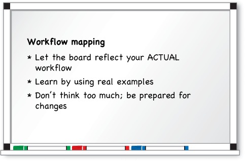
For starters, you want to capture the actual workflow and not the formal, company-standard, on-paper version that you’re supposed to use. An easy way to get started is to identify one or two of the most typical work items and “walk the stream.” You need to find out how the work flows in your particular context.
Getting your workflow correct can be hard; as you recall from chapter 1, the Kanbaneros spent quite a lot of time discussing it. It was time well spent, because it forced them to examine implicit assumptions and gave them a deeper understanding of how they work as a team. Up to the point where they mapped their workflow, there could be many views on how the work was flowing, but making it visual also made it explicit and to the point.
A Word from the Coach

It isn’t the manager, the team lead, or some kind of coach who should design the kanban board; the team members who are going to use it should do that. This creates a sense of ownership and increases the likelihood that they will honor the policies and the processes they agree on.
Next, resist the urge to improve your process here and now. The whole idea of visualization is to understand the work and make improvement opportunities more obvious to you. Let the board help you with that. For now, map your workflow. Who knows, the opportunities might not be where you think they are. They might be somewhere else.
Not all types of work go through the exact same workflow, but that’s OK. You have to decide together how to handle this. Perhaps a certain type of work skips a column or two; for example, maybe bugs don’t have to go through the Analyze column on the board, as the Kanbaneros decided for their bugs in chapter 1.
Sometimes a column’s name might be too specific to suit all types of work, but when you consider what it’s about, a more abstract name makes the workflow work for all cases. An example is Test, which makes sense for code but maybe not for documentation or investigative types of work. But when you change the column name to Verify or Reviewed by Peer, it turns out that they both have the same workflow.
Finally, don’t put too much effort into this up front; rather, be ready to redo the board when you see that your work doesn’t flow as you first thought. We recommend that you draw your board with an erasable whiteboard marker. In this way, you can easily change the board as you see fit. Hold off with the electronic tool and the fancy tape until you feel the design is somewhat stable.
3.3. Queues
Queues can help you to manage handoffs, get a more even flow of work, and give the team members visual signals that work is ready to be started. On a board, this often manifests itself as a separate queue column before or after a column. Here are a couple of examples of queues on a board:
- Todo— The first column of the board
- Ready for Development— Things that have been analyzed and now are ready to be picked up by developers
- Development Done— Items that have been developed and are now ready for testing
- To Test— Stuff that is ready to be tested
As you can see from the last two examples, the same state can be expressed in different ways. Development Done and To Test are more or less the same thing. Both of them signal that development is finished, and testers can pick up the items and start testing them. Where you place the queues (belonging to Development or Test, in our example) is entirely up to you. Here’s a simple board with an example, to clarify this a bit.
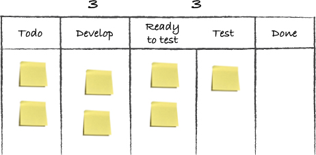
A Done (Development Done, for example) column is the normal case and signals to others in the workflow that this step is finished and someone else can start working on the work item. The person moving it to Done doesn’t need to be aware of what’s going to happen to it next. For Development Done you could imagine that a tester and a product owner do some kind of quick “triage” together to decide where a work item will go next: maybe into Test, maybe to Stakeholder Verification, maybe to Ready for Production.
A Ready column (like the Ready to Test column on the board we just showed you, for example) is always for a known step, because it’s placed in front of a step, ready to be processed by it. Steps like this are used for distinct handoffs, maybe even to other teams. Work is pushed into that step: for example, an Inbox column where work is moved by an event or cadence[4] such as the biweekly planning meeting or when you have three items left in the Inbox column. In our example board, you can see that this team has decided to split the Test column into Ready to Test, and Test. Ready to Test is a queue with work that is ready to be tested. Because the testers allow for three items, you count the items in Ready to Test against that limit.
4 The rhythm or heartbeat of your process; read more in chapter 9.
From this you can see that the testers have two items in the queue (items waiting to be worked on) and another item in the Test column (they’re working on that item).
Entry and exit criteria
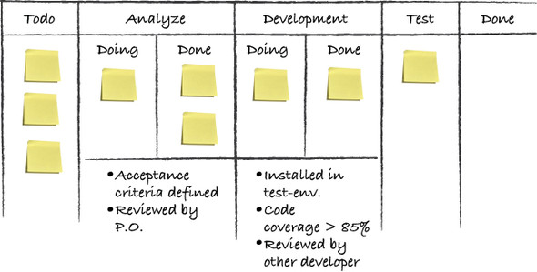
A great way of rooting out misunderstandings and achieving consensus around what the columns, the queues, and the workflow in general mean is to answer the question “Which criteria need to be met in order for me to move a work item to the next column?” These entry and exit criteria can, once they’re made explicit, be captured as bullet points or as a checklist and visualized above or below the column they apply to, for example by writing them on a sticky or directly on the board.
These criteria should then be checked every time you move an item on the board. When you have new or modified criteria, it can be good to use them as a checklist against every item discussed during the daily standup, maybe even adding the policy that at least two people have to agree that the criteria are met before you’re allowed to move the item. The policies are continuously discussed and incrementally changed and improved. Just as with the columns, you could have entry or exit criteria, or both, depending on how and what you want to check as each work item moves through your workflow.
A Word from the Coach
We often find it useful to revisit the entry and exit criteria when something related to the workflow comes up: for example, in conversations during the standup, in team retrospectives, or when doing root-cause analysis for a defect. You ask, “Did we follow the criteria?” If you did, is there anything you could add to the criteria that would help you avoid this issue in the future? If you didn’t, you should examine why you’re not following the policies you’ve agreed on together.
3.4. Summary
This chapter talked about visualizing your work—making work and the policies around it visible where previously they were not:
- Visualizing your work is ultimately about creating the transparency and information-sharing needed to understand how the work works and to collaborate effectively together.
- The process of visualizing work means making information visible that previously wasn’t, making implicit knowledge and policies explicit, and, in doing so, resolving inconsistencies and conflicts that surface.
- The kanban board is a great way to visualize your workflow and share information about priorities, who’s working on what, the progress of individual work items, and so on.
- By using a big, visible board, the information radiates to everyone interested instead of being hidden in people’s brains or inaccessible tools.
- Creating a kanban board is easy: you map the workflow of your work items—that is, the steps they typically go through in order to be completed—to columns you create on a whiteboard or a wall.
The next step is to create the work items, which is the subject of the next chapter.