
Chapter 11. Using metrics to guide improvements
This chapter covers
- Metrics and how they can help you improve
- Some common metrics and visualizations used by kanban teams
- How to find good metrics for your team
Chapter 10 talked a lot about improvements and starting to make changes to your process in order to try to improve. We like to think about it as doing experiments that you’ve not yet validated, because you can’t really know in advance whether you’re improving or not. When conducting these experiments, you need some way of knowing whether they improve your process. To know that, you need to measure how your work works. There’s a strong community around metrics for teams using kanban and Lean. In this chapter, we’ll show you a couple of commonly used metrics and discuss what you could learn and improve by using them.
As with most things in kanban, you want to visualize the metrics in order to know what’s happening. We’ll introduce you to a couple of common visualizations and diagrams. And we’ll show you how to create the diagrams from your workflow data and how to interpret them to see what’s going on in your process.
Let’s dive right in and talk about some common metrics that teams using kanban and Lean often find useful.
11.1. Common metrics
This section takes a look at some common metrics that you can easily capture by using a visualized workflow on a board, like the ones we’ve used so far in the book. This will give you a good indication of how your process is working for you, how fast you’re moving stuff from idea to production, and more.
A Word from the Coach

Remember to always include the team in the process of deciding on a metric so that they have their say about what’s a good metric for them. These are merely suggestions to get your discussion going. Also remember to mix these “process”-related metrics with metrics showing that your efforts are making a business impact.
Let’s start with one metric that’s easy to capture: cycle (and lead) time.
11.1.1. Cycle and lead times
WHAT ARE THEY?
Measure how fast work is moving through your process and where it slows down.
WHAT CAN YOU LEARN FROM THIS METRIC?
By measuring lead time, you can see the actual improvement in time-to-deliver/market and predictability. You can also see the due-date performance—whether a certain item is on target against what you thought it should be. With the lead time captured, you can also analyze where the work item has spent its time and start tracking lead-time efficiency to see whether the work item is mostly waiting, blocked, being reworked, or actually being worked on.
Cycle time refers to the time a work item takes to go through part of the process—for example, doing development and testing. Lead time, on the other hand, refers to the time taken to finish the complete process, from idea to finished feature in production.

Lead time is generally more interesting to track because it shows you the entire process. Cycle time narrows down the focus to only part of it, which might miss another part of the process that could give you valuable information. If you’re improving only for part of the process, you may miss some other bottleneck that slows the lead time.
The following example board shows the cycle times a team tracks for development and testing. The complete lead time is also indicated, as you can see from the complete workflow.

The lead time for the complete process is often a bit harder to get hold of, because you may not have it under your control or visualized on your board. Strive to track the time for work items for as much of the process as possible to get the complete picture.
To better understand the difference between lead and cycle times, consider the first Scrum project that Marcus took part in. The team consisted of six happy developers, and we created working software every third week. The cycle time of our development was therefore three weeks. But was that helpful to the business?
Not that much. When we were “done” after six sprints, we learned that a three-month testing phase was waiting for all the work we had done. And after that, we missed the quarterly release cycle by one week and had to wait another three months before releasing our software to the users.
Sadly, that didn’t matter much for our total lead time, because we understood that the requirements for the application had been written a year and a half before we even started.
The cycle time (considering development only) for a single feature was three weeks, but the lead time for that same feature was two years and four months.

That’s the difference between cycle and lead time. Although reducing the development cycle time may be useful, the big improvement opportunities can be found elsewhere.
The lead time should be as short as possible so that work flows quickly through the complete process. Note that focusing on shortening the cycle times can sometimes be bad for the overall lead time. This is known as optimizing locally. Say you’ve optimized development time, and it’s now a couple of days. This has consequences for others around development; can requirements be written in small chunks to keep the developers busy? Can testers handle being given new items every other day? It may even be wise to slow down the developers in order to have the work flow more smoothly through the process. By measuring lead and cycle times, this is easy to spot. (Read more about that in chapter 7.)
Capturing the metric
Cycle and lead times are metrics that are easy to capture and track. With a visualized workflow like a board, you can start today. Note the date on each work-item card as you put it on the board. When the work item reaches the last column on your board (Done or In Production, for example) note that date. The difference between these two dates is the cycle time for your process. It’s the total lead time if you have the entire process on your board from idea to production.

In this example, you see a work item that entered the board (in the Inbox column) on 2 February 2013. It reached the Done column on 18 March 2013. Subtracting those dates from each other gives a total lead time of 44 days (31 working days in Sweden that year).
Capturing the cycle time is equally simple. Do that by “stamping” the work item with the date it enters the column you’re interested in: for example, when it enters the Dev. column and then again when it reaches the Ready to Deploy column.

You can see that this work item entered the Dev. column on 1 March and reached the Ready to Deploy column on 12 March. That gives a cycle time of 11 days (8 working days).
Analyzing the metric
With these two metrics in hand (lead time of 44 days and a cycle time for development and test of 8 days), the team can now start to do some analysis and ask questions about how their work is behaving. Eight days is only about 20% of the total time. Has this number (eight days) gone up or down? What should it be? Where’s the rest of the time spent? Should they start tracking cycle time for other parts of the process to know more?
When asking questions like that, you’ll soon realize that the individual cycle and lead times aren’t so interesting. The trends over time are much more interesting. It might be that the first item you tracked was exceptionally fast or slow. You need a bigger sample to see whether you’re improving over time. You can do that with statistical analysis (see section 11.2.1 for an example of this) or by visualizing your trends.
When you’ve tracked the lead time, you can also start to analyze it:
- Is the time measured normal for a work item of this size and type? With a large enough sample, you can start to make predictions for work items as they enter the board (see section 9.1.4 on Disneyland wait times).
- You can use the lead time date to make prioritizations. Say, for example, that a medium work item usually takes five to eight days to complete, and you have one with a due date in six days. With that information in hand, you can start to prioritize it over other work if you notice that it begins to slip behind its predicted schedule.
- One interesting exercise is to break the lead time down and see where the actual time is spent. For a total time of 30 days, where is that time mostly spent? How much is spent waiting or blocked? How much is rework? Analyzing that can help you find bottlenecks and make big improvements.
Visualizing the metric
The team tracks the trends of the lead and cycle times on two simple diagrams that they’ve drawn on the whiteboard next to their workflow. This can be done as a simple scatter diagram, like the one shown next. (You could use a tool like Microsoft Excel to draw the diagram, but we’ve found it simpler to get started by plotting it out on the whiteboard.)

The diagram doesn’t have to be correct to the decimal point. The important thing is to visualize the diagram and put it up on the wall for everyone to see. Make it big! You want everyone to see it and be able to reflect and ask questions.
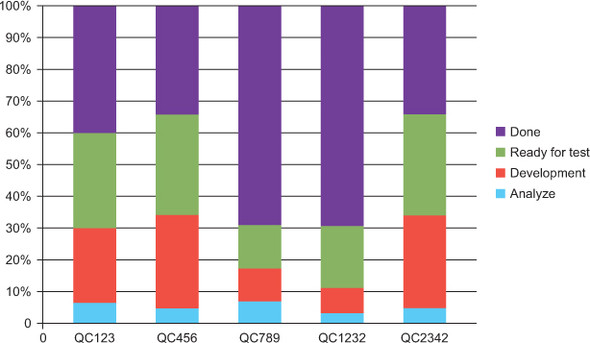
You could track both the cycle time for the different parts of the process and the total lead time. You can display that in a stacked column chart showing the distribution of time in the different stages of the process, as shown in this diagram.
Section 11.2 looks at how to use this data in more advanced diagrams, like a control chart and a cumulative flow diagram. But don’t underestimate simple diagrams like these as a good start.
Even though focusing on shortening lead times is a Good Thing because it leads to a better flow as we talked about in chapter 7, you might miss other information if you focus solely on that metric. For example, if you focus on lead time, you may not notice that it’s been a week since you put something out in production. This is why you can complement your lead-time metric with a focus on the throughput of your process.
11.1.2. Throughput
WHAT IS IT? Measures the rate at which the process produces completed work items.
WHAT CAN YOU LEARN FROM THIS METRIC? You can learn whether your efforts to improve the flow by reducing WIP, slicing stories, and investing in automation such as continuous delivery and so on are paying off. Are you actually improving delivery frequency and thereby shortening feedback loops?
Throughput is defined as the movement of inputs and outputs in a production process[1] and roughly translates to “how much stuff we complete per time unit.” Another way of putting it (that we like better) can be found in the Theory of Constraints community: Throughput is the rate at which a system achieves its goal.

Tracking throughput helps you focus on moving stuff through your process and ensuring that work gets done and not merely worked on. Higher throughput (more items completed per period) is better to strive for, but not at the cost of quality.
Capturing the metric
As with lead time, throughput is pretty simple to capture: count the number of completed work items per week (or month, or whatever suits your granularity needs). On a visualized board, you could count the number of work items in the Done column each Friday and then clear the column.
Visualizing the metric
Throughput is easy to visualize as a scatter diagram or stacked column chart that shows how many items you complete each week, for example. Here’s one example of how that can be visualized:

Again, you could use fancy tools to create this diagram if you wanted to, but you don’t need to. The only thing that’s important is that it’s visualized for the team and others who are interested.
Analyzing the metric
Analyzing throughput can help you focus on getting stuff done. We’ve seen teams where “everything works just fine” but that didn’t deliver anything for a month. By adding a small visualization that showed how much they were getting out the door each week, they started to focus on delivering again.
Throughput can also be a balancing metric for lead-time improvements. If you’re reducing lead time and throughput goes down, it could be that you’ve reduced WIP too much. For example, say that you really try to optimize for great lead time and set your WIP limit to a single work item. That work item can’t move any faster, because every person available on the team is working only with that item. The moment you need someone to help out or answer a question, they have time to do so. But that may be bad for throughput because nothing else except that single item is being worked on. Maybe (and probably) the WIP is too low.
11.1.3. Issues and blocked work items
WHAT ARE THEY? Measure items that are hindering the flow.
WHAT CAN YOU LEARN FROM THIS METRIC? How blocked work items are affecting your lead time/lead-time efficiency. How good/fast are you at unblocking/resolving issues? Are you improving?
Issues and blocked items are things that are hindering the work flow. Issues or defects tell you that you’re not producing at the right quality, and they’re definitely things that you want to be notified about. Blockers stop your work from flowing smoothly. You want to clear those and make sure you have as few of them as possible.

Tracking issues can be the balancing metric that makes sure you don’t run your process too fast. Imagine that you only focused on reducing lead times, for example, and that someone wanted to improve that metric. One way to accomplish that is to be sloppy: that would surely make things go faster.[2] With a quality-focused metric—tracking the number of defects, for example—you make sure the lead-time metric isn’t focused on ad absurdum. You can read more about quality metrics in section 11.1.5.
2 At least for a while. Sloppy code has a tendency to be hard to maintain and becomes slower and slower to move around in.
Blockers often happen when you’re forced to wait for others to take over your work or give you input before you can keep working. Discussions about how to resolve problems like these are easier and more to the point if they’re backed up with data.
For example: “We’ve tracked the number of items that we’re waiting for from you, and it’s increased by 30% in the last month, and here is the data that shows you that trend” is a much better argument than “I feel that we’re waiting for a lot of your stuff.” With concrete data in hand, you can discuss what to do about it. Or suppose you’ve done something about clearing blockages—how can you know whether that measure had any effect? You need some kind of metric, before and after.
Capturing the metric
With a visualized workflow, these two metrics (defects and blockers) are easily captured by counting the number of items on the board:
- Number of defects = Number of pink stickies at any given time, or per week, for example
- Number of blockers = Number of stickies with a blocked marker attached to them
Visualizing the metric
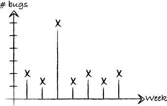
This is easily drawn as a scatter or stacked column chart showing the trends. Are you having more blocked items now? Since you did that bug-fixing week, has the number of new bugs been kept at the new low or is it rising again? What was the reason for having that many bugs in the last week?
You could track other stuff that’s important for your process (making sure you’re always doing a certain number of new or technical maintenance features, for example). You can track and visualize these in the same way we’ve described here.
Analyzing the metric
The number of blockers is interesting to analyze because these are the things that slow you down and reduce your lead-time efficiency. For the blockers that do occur, make sure you’re resolving them fast. Some teams track each day that a work item is blocked with a progress indicator on the blocker sticky (see section 4.4). That data can lead to interesting discussions and improvement opportunities around resolving blockers and how to prioritize that work—or around flow, because you really don’t want to be blocked at all.
11.1.4. Due-date performance
WHAT IS IT? Measures how well promises and deadlines are kept.
WHAT CAN YOU LEARN FROM THIS METRIC? You can see if a due date is likely to be met in the predicted lead time and build a track record that makes you trustworthy and dependable. This in turn helps you build trust with your stakeholders.
If an item has a due date attached, you want to make sure to hit that due date. That date is often there because a business opportunity exists on the date or a fine is due if it’s missed. Some people talk about due dates as part of their service-level agreement (SLA) with surrounding departments and stakeholders.

Capturing the metric
When dates like these are important to your team, you need to track them. It’s not hard to do from your board because you can note the date the work item was completed and compare it to the due date.
Visualizing the metric
For metrics like these, a pie or circle chart probably is the most suitable. This gives you a quick overview of how many work-item due dates are met and missed.

Analyzing the metric
Due-date performance can be something that you use to communicate with other teams and stakeholders, but it also helps you prioritize and motivate your own team. If an item is slipping behind, according to the predicted due date, you can prioritize it higher than other work: “We don’t want to screw up our great track record!”
With a long and solid track record of being on time, you often build trust with teams around you and your stakeholders. But this can also lead to improvement discussions: “We hit 95% of our due dates except for items that have to do with Vendor B. What can we do about that?”
11.1.5. Quality
WHAT IS IT?
Measures the quality of the work and whether features that give value to stakeholders and customers are being delivered.
WHAT CAN YOU LEARN FROM THIS METRIC? Quality is great to use as a balancing metric for other improvements, such as improving lead time. It can also be a metric to see whether your quality-improving efforts (automated testing, paying down technical debt, and so on) are paying off.
Quality is a tricky concept, and a thorough treatment is beyond the scope of this book. It can be interpreted in many different ways. We don’t want to dwell on that big subject here. We’ll adopt Gerald Weinberg’s definition: “Quality is value to some person.”[3]
3 From Quality Software Management: Systems Thinking (Dorset House, 1991, http://amzn.com/0932633226).
This definition is, of course, vague and open to interpretation, but so is quality. A friend of ours was very disappointed to find a lot of spelling and grammatical errors in a book he had written. But it was voted the #1 agile book that year, with more than 20 five-star reviews on Amazon. What is quality for that book? A flawless product that no one uses isn’t quality.
Capturing the metric
There are a lot of alluring metrics around quality that you can capture quite easily:
- The number of defects/bugs per build or release of the product. This is probably best captured as a trend that shows how the number changes over time.
- The number of defect work items on the board per time unit. This shows how much of your resources are spent on fixing bugs.
- You could track most metrics that we’ve mentioned so far (lead time, throughput, and so on) separately for defect work items.
By now you should sense a big but coming up ... and here it comes: but just because these things are easy to track doesn’t mean there’s value in tracking them.
Quality, I patiently explain, is not the absence of something in management’s eyes, that is, defects, but the presence of something in the consumer’s eyes, that is, value.
Alan Weiss[4]
4 Million Dollar Consulting (McGraw-Hill, 2009, http://amzn.com/0071622101).
And yes, that idea of quality is much harder to capture and track, but it’s also more valuable to track for the business impact you’re trying to achieve. In the words of Gojko Adzic: “Don’t cling to defect tracking tools as if they were a safety blanket; define what quality means in your context.”[5]
5 See his blog entry “Bug statistics are a waste of time” at http://mng.bz/kKIT.
How do you know if you’ve created value for some person? That’s a harder metric to capture and can only be answered by asking those for whom you want to create value. There are a lot of different ways to go about that: polls and interviews, net promoter scores (NPS), and number of likes on Facebook are a few we’ve heard about.
You’ve now ventured outside your own process and need to tap the product you’re creating for data in order to capture the metric. Maybe new functionality needs to be built into the product to see and know what users think and how they’re using it.
Google Analytics, Optimizely, and Google Tag Manager are common website tools that monitor traffic and can follow the way users interact with your pages. They can give you a lot of information about the quality of the product and features you’re building.
Visualizing the metric
Quality metrics can take many shapes, so we can’t give you a great tip on one way to visualize yours. We can say this: make it big, make it visual, and put it on the wall. A Google Analytics dashboard on a screen next to the team will gain a lot of attention and trigger praise, questions, and discussions—exactly what you want in order to improve even more.
Analyzing the metric
If you manage to capture the value you’re creating for your users, you’re in a great position for some really interesting analytics. Then you can make small changes to your product (some[6] call them experiments) and see how the metrics you’re capturing are changing based on them. This can even lend itself to what’s known as A/B testing—that is, releasing two versions of the same functionality and seeing which one performs better.
To take a real example that Marcus was involved in, let’s say you want to have as many users as possible registered on your site. Right now you see a big drop-off in the registration module. You think it has to do with the CAPTCHA[7] module that has people reading hard-to-read symbols and entering them in another box. So you devise an experiment and release one version of the registration form with the CAPTCHA turned on and one version with it turned off. Now you can measure the difference in conversion (from unregistered users to registered users) and see whether you should use the CAPTCHA algorithm or not.[8]
8 Can you guess the “winner” of the alternatives? CAPTCHA turned on beat CAPTCHA turned off by 5% over a week’s worth of experimenting. No one in the entire company guessed that. Neither did you, we presume. The result of the experiment contradicted our hypothesis. Now—how would you act on that information?
This is valuable data that can help you improve the business impact you create with your product. This is also a subject that is way bigger than we have room for in this book. To learn more, try the awesome book Impact Mapping by Gojko Adzic (Provoking Thoughts, 2012, http://mng.bz/12J0) as a starting point.[9]
9 See also http://impactmapping.org/.
11.1.6. Value demand and failure demand
WHAT ARE THEY? Measure how much work is caused by systemic failures—work that must be redone, for example.
WHAT CAN YOU LEARN FROM THE METRICS? How to increase capacity for value delivery through systematically reducing failure demand.
Failure demand is a concept invented by Professor John Seddon (I Want You to Cheat! Vanguard Consulting Ltd, 1992, http://amzn.com/095197310X). It can be understood as “demand on a system caused by failure to do something or do something right for the customer.” The opposite of failure demand is value demand, which is the real reason that the system exists. Value demand means things you want the system to do. It goes without saying that you want to minimize failure demand where possible.
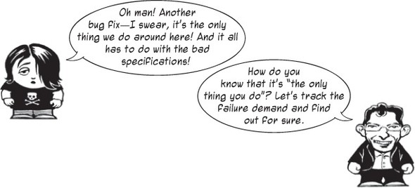
Examples of failure demand are plentiful, sadly, but can range from having to redo work because of bad specifications, to not understanding each other and hence producing the wrong things, to bugs and defects, to overloading support functions due to poor quality or instructions. Failure demand includes anything that takes your focus away from doing the things you want to do: delivering features that make a business impact.
Measuring failure demand versus value demand can be hard because it sometimes comes down to what you think an item is. Implementing a new aspect of a search feature, for example—is that value demand (new feature please) or is it failure demand (you should have included the feature the first time around)?
Capturing the metric
It follows naturally that because it’s sometimes hard to classify work items, it can also be hard to capture the metric. Our suggestion is to not overdo it but rather find an easy way to classify the work item. For example, vote at the end of a work item’s life: was this mostly failure demand or value demand? Some work items (like defects) fall naturally into one category that’s hard to classify as anything other than failure demand.
Visualizing the metric
Once you have a way to classify value demand versus failure demand, you can visualize the trends as two graphs and see how they’re doing against each other. Or you can write a big percentage on the board: “Last week we had 25% failure demand—10% less than the week before.”
Analyzing the metric
This metric can be an eye-opener for many teams—and the stakeholders around them—regarding where the team’s time is really spent. When you have those numbers in front of you, you can start to see what you can do about the situation. Why did the failure demand occur, and what was the root cause of it (see section 10.2)?
11.1.7. Abandoned and discarded ideas
WHAT ARE THEY? Measure how many items in a particular backlog (or inbox column) are discarded instead of going into the development workflow and how many items in the development workflow are discarded.
WHAT CAN YOU LEARN FROM THE METRICS? Too few discarded ideas means you don’t have a lot of options, so maybe you’re not innovating or taking enough risk. Too many items in the development column being discarded means you’re starting work you shouldn’t.
This is a metric that’s easy to overlook because we, in agile methods, encourage changes. It’s even in the word agile—to be able to change quickly. But how many teams have you seen count the ideas or work items taken off the board? Often they’re discarded and not thought about until they resurface.
Capturing the metric
An easy way to track the items you take off the board is to have a trashcan or basket where you move work items that you discard. You can then make note of those items and maybe even count the number of discarded ideas per time unit (per week or month, for example). This data can be the context for a fruitful discussion later.
Analyzing the metric
You can read some interesting facts from those discarded items. Although the first, natural reaction is to think that it’s a bad thing to keep moving items off the board, you still want to discard some items. If you don’t discard anything that’s moved up on the board, you could argue that you’re not innovating enough. The lust for discovery is killed by your steadfast backlog that shouldn’t be changed.
On the other hand, if you discard too many items, it might be hard to keep the goal clear. This is even worse if you start working on items and then discard them. That can be measured by the number of items in development that you then discard. If that number is high, it means you start a lot of work that you shouldn’t have started. That in turn can beg the question whether you should invest more time investigating or discovering in the earlier phases, upstream from your team.
This section took a look at some common metrics that we’ve seen kanban teams use and get value from. The visualization of metrics is an important part of making the metric known and important to everyone on the team and people around the team. Although the simple diagrams in this section are a great start, the next section dives deep into two well-known and powerful diagrams: process-control charts and cumulative flow diagrams.

You already have all the data you need to produce these new, powerful diagrams with a visualized workflow. It’s a matter of drawing them. Let’s see how it’s done.
A Word from the Coach
Probably no team should capture and track all the metrics that we’ve suggested in this section. But for the ones you’re tracking, make sure you have explicit, visual policies in place to help you remember what to track when an item is completed. It can be a simple as a checklist, so-called exit criteria, in the Done column: “This is what needs to be done before the item can be moved off the board.”
11.2. Two powerful visualizations
The previous sections introduced you to a couple of common metrics and gave you hints on how to visualize them. Most of the diagrams suggested are simple to both draw and understand, but they’re also limited in their use. They often show one aspect of your process, and you need to cross-reference several diagrams to get a more holistic view of how things are going.
In this section, we take a look at two commonly used diagrams. They’re a bit more advanced to produce than the simple scatter, pie, and stacked column charts you’ve seen so far, but they also give you more information as a reward for your efforts at drawing them. We show you what kind of data you need to track and how to draw the diagrams, and finally what kind of information you can get out of them.
This section isn’t about how to use Excel (or any other tool, for that matter). We only show you the kind of calculations you need in order to draw a simple version of the diagram.
11.2.1. Statistical process control (SPC)
Statistical process control (SPC) is an approach to quality control that involves much more than just drawing a diagram. Covering SPC is well outside the scope of this book, but we want to introduce you to a diagram that we’ve found useful called the statistical process control chart. There’s an underlying theory that we think you also should know about in order to be able to interpret and understand the SPC chart correctly. It’s called the theory of variation.
Theory of variation
One thing that’s easy to overlook is the natural variation found in every system. We assume that we can reach around the average result every time. But that’s not the case, due to natural variation. John Seddon has formulated a theory of variation[10] that, through four simple principles, says you can’t expect work and workers to perform on the average result that you track and measure.
10 See “There Is a Better Way” at www.systemsthinking.co.uk/variation.asp.
Principle #1: You should expect things to vary—they always do.
There’s natural variation in every system, so you shouldn’t be surprised that you get different results from different people, or from the same people on different days.
With a small sample, you can’t really tell if it’s good or bad, and whether it’s within or outside the normal variation for that kind of work. Using an SPC chart, you can see whether the variation is predictable (within the control limits) or unpredictable (outside the control limits).
For example, the performance of a worker may look excellent. When you get a bigger sample, though, you see that it was just what to expect given natural variation.
Principle #2: Understanding variation will tell you what to expect.
Let’s say you have a team that has tracked the lead time for their work over the last couple of weeks, as visualized in this chart:

Having upper and lower control limits in place tells you that the team’s result will sometimes be as low as the lower limit (in this case, 15) and sometimes as high as the upper limit (in this case, 38), but more often around the average (in this case, 26.5).
Strangely enough, teams often expect to be average (or better) every time. But that’s not going to happen, because we are human beings working on knowledge work in a context that naturally has variations.
Consider the example of setting targets for the lead time in the team just mentioned. If you set it to the average, the team will sometimes be over it (and go home sad) and sometimes be under it (and go home happy). You know this will happen because there’s natural variation in the process. If you set the target toward the upper control limit, the team will often go home sad, because they will miss it a lot. In reality, many teams will begin doing better, because they’re trying to reach that target. But at what cost? It’s not uncommon for teams to start cheating[11] or gaming the system to reach the target.
11 For example, start doing sloppy work that is faster but will come back and slow them down later.
Targets in processes with variations don’t motivate people, but they can demotivate people. If you read the work of Dan Pink (Drive, Riverhead Books, 2001, http://mng.bz/yM3h), you know that what really motivates people isn’t targets but autonomy, mastery, and purpose.
If you give a manager a numerical target, he’ll make it, even if he has to destroy the company in the process.
W. Edwards Deming
Principle #3: Work on the causes of variations, which are always found in the system.
A bad system will defeat a good person anytime.
Attributed to W. Edwards Deming
The majority of performance variation is found in the system itself, outside the control of the individuals who work in it. Consider all the things that affect your current situations: policies, roles, organizational structure, procedures, requirements, funding, and information, to mention a few. All of these are examples of things that (normally) lie outside the control of the team. Things like these also cause the natural variation in the system. Again: the things that cause the natural variation lie outside the control of the team.
Managers should be to try to minimize the variation by working on the things in the system that cause variation.
Principle #4: Understanding variation tells you when something has happened.
In an SPC chart, you can see if a single value is a special cause (lies outside the control limits—see the circled point on the graph) or if it’s a common cause (within the control limits and hence an effect of natural variation). You need to be aware of the difference so you don’t act as if every variation is a special-cause variation.
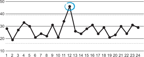
For example, it normally takes Joakim 20–40 minutes to drive to work. But one day he had a flat tire, and the journey took him 1 hour and 25 minutes. Should that single incident change the way he drives? Or should he buy a new car? If it’s super important that he is never, ever late, maybe he should invest in a Vespa and keep it in his trunk in case of future flat tires. But more likely, he should treat that incident as a one-off that won’t impact his driving that much. If he starts to have flat tires often, he might check into his driving habits or the quality of the tires he buys.
The SPC chart
A statistical process control chart (or control chart, or running chart, or SPC chart for short[12]) shows trends on how the process is doing over time. Usually you track lead or cycle times (see section 11.1.1), but you can use a running chart to track other metrics as well.
12 “Beloved child has many names” is a Swedish saying, so it’s safe to say that SPCs are loved, we suppose.
The statistical part of the name implies that you’re applying statistical analysis with the chart, and that’s completely correct. With statistical analysis, you get a better view of the real trend by excluding the occasional highs and lows (also known as outliers) and keep your focus tight on the trend in the data.
What data do you need to draw one?
You don’t need much data to be able to draw a control chart—in fact, you only need the lead time for each work item. That said, you can make the chart more interesting if you have a few more values, all of which you get from your visualized workflow:
- Identifier or title of the work item, so you know which work item a certain point in the diagram refers to.
- Start and stop dates, used to calculate the lead (or cycle) time for the work item. You could just track the lead time as
a single number,[13] but having the Start and Done dates can prove useful for narrowing the scope of the diagram, for example.
13 For example, by noting the date you put the sticky on your board and then counting the days until you moved it into the Done column.
- Work item type, which allows for interesting filtering and scoping (for example: what was the lead time for defects in May?).
As you can see, all that data is sitting on your board, waiting for you. It’s easy to capture.
How do you draw one?
The simplest version is drawn by calculating the lead time (Done date minus Start date) in days and creating a scatter diagram showing this data. You’ve already seen simple diagrams like this in this chapter. Adding a trend line makes it easier to analyze the data.
You can include the identifier or title of the work item if you want a way to refer to it, but the chart can easily get cluttered, and you may take away the focus from the trend.
A slightly more advanced method would be to plot different lines or even different diagrams based on the work-item type. You can easily do that by using filters for your data before you create the diagram.
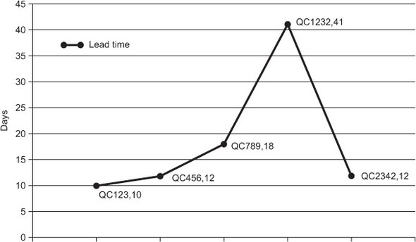
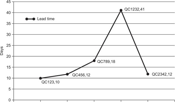
Finally, you want to put the statistical into statistical process control charts, and in order to do that you need some formulas for average lead time, the one sigma, and the upper and lower control limits. Consider the following data:
|
Id |
Title |
Start |
Done |
Lead time in days |
|---|---|---|---|---|
| 123 | Work item #1 | 2013-01-01 | 2013-02-01 | 31 |
| 124 | Work item #2 | 2013-01-10 | 2013-02-02 | 23 |
| 125 | Work item #3 | 2013-01-13 | 2013-02-03 | 19 |
| 126 | Work item #4 | 2013-01-15 | 2013-02-08 | 24 |
| 127 | Work item #5 | 2013-01-18 | 2013-02-09 | 22 |
| 128 | Work item #6 | 2013-01-20 | 2013-02-10 | 21 |
- Average lead time is an easy one: take all the lead times and divide them by the number of items you’ve tracked. For this example, that would be (31 + 23 + 19 + 24 + 22 + 21) / 6 = 24 days.
- One sigma is a bit tricky to understand and calculate. A sigma is a value that helps even out the effects of outliers. A statistical rule called the 68-95-99.7 rule[14] states that 68% of all values lie one standard deviation (called one sigma) from the mean. With two sigmas from the mean, you cover 95% of all values. Finally, with three sigmas, you cover 99.7%.
Calculating one sigma[15] from a sample is pretty advanced mathematics, but thankfully almost all spreadsheet programs have formulas for that in their
arsenal.[16] With this sample, you get STDEVP(31,23,19,24,22,21) ≈ 3.4.
16 In Excel it’s called DSTDEVP, and for Google spreadsheets it’s called STDEVP.
- The upper control limit is now (after doing the mind-bending sigma stuff) easy to calculate. You use an upper control limit of one sigma above the average, therefore, according to the 68-95-99.7 rule, taking 68% of the population into consideration. In this example, this adds one sigma to the average: 24 (average lead time) + 3.4 (one sigma) = 27.1 days.
- The lower control limit is equally easy to calculate. Subtract a sigma from the average. In this case, that would be: 24 (average) – 3.4 (one sigma) = 20.2 days.
How do you read it?
This calculation will produce a diagram that looks something like this:

With this diagram in place, you can get a lot of information:[17]
17 Yes, this is an example, with just a couple of data points. The analyzing you’re doing may be overthrown as new data points—new work items—are completed.
- You don’t have to care too much about the first work item because it’s an outlier (based on the data you have right now). You can easily see that because it lies outside the upper control limit.
- The difference within the control limits isn’t too big, meaning you have a pretty high accuracy for the lead time of your items. But wait a minute. This sample is minimal (and made up), so you can’t say how you’re doing with a bigger sample. What you want to watch out for is whether the spread (the distance between the upper and lower control limits) is big, meaning items are different in size, and predictions are harder to make. Could that be something that you can improve on? How would you do that?
- There’s a nice trend on display here because the lead times go down. Why is that? Are these special work items, or have you changed your ways of working? How can you reinforce this trend? If the trend is going the other way, what do you have to do to stop it?
Remember the theory of variation (covered earlier) and that every system (and process) has natural variation. Take that knowledge into consideration when reading an SPC chart.
A statistical process control chart is a nice tool and not hard to read. It’s also easy to capture the data needed to draw one. Let’s now turn our attention to a diagram that’s a bit more advanced at first glance. After getting used to it, you’ll soon see that it’s not hard to read and that you can get a lot of information out of it: the cumulative flow diagram.
11.2.2. Cumulative flow diagram (CFD)
A cumulative flow diagram (CFD) is full of information that can be useful as background material for a discussion on process improvement. After an initial introduction, it’s easy to read, and the metrics are also easy to capture from your visualized workflow. Drawing the diagram is simple after the discipline involved in gathering the data.
The CFD is growing in popularity in the agile community and has been called the successor to the Scrum burn-down chart.[18] Let’s dive in and see how you can draw one yourself.
18 A burn-down chart is often used by Scrum teams to track their process during a sprint, by showing how much work (often in story points) is left to do.
What data do you need to draw one?
In order to draw a CFD, you need to know the number of work items you have in each step of your board per day.[19] You can easily track that by counting them. The only trick is that you can’t capture this data after you’ve taken the stickies down off the board.[20]
19 Theoretically it could be any regular interval, but a daily interval not only is the most commonly used but also seems appropriate for most teams.
20 If you’re not Sheldon Cooper or have eidetic memory—or have taken a photo of the board each day.
Here’s an example board, as it looked on a certain date (2013-01-10, to be exact):

Over time, the team has counted the number of items in each step and gathered the data in a table like this:
|
Date |
Inbox |
Analysis |
Development |
Testing |
Ready for Deploy |
Deployed |
|---|---|---|---|---|---|---|
| 2013-01-05 | 4 | 1 | 2 | 2 | 2 | 1 |
| 2013-01-06 | 5 | 2 | 4 | 2 | 2 | 1 |
| 2013-01-07 | 4 | 2 | 5 | 2 | 2 | 2 |
| 2013-01-08 | 5 | 2 | 5 | 3 | 3 | 2 |
| 2013-01-09 | 6 | 2 | 5 | 3 | 2 | 4 |
| 2013-01-10 | 6 | 2 | 4 | 2 | 2 | 5 |
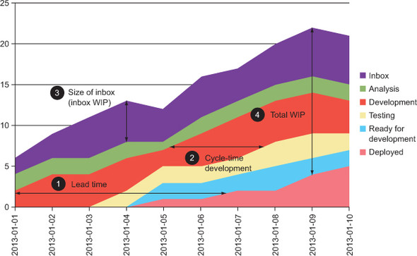
In the table you can see the number of items in each stage of the process at a certain date. The last column is accumulated (hence cumulative flow diagram) as we keep deploying more and more items into production. For example, on 2013-01-09 we had three work items in Testing, and the accumulated number of Deployed items was up to four.
A lot of numbers are displayed here, but don’t feel discouraged. It’s simple to track the data in a spreadsheet. Remember to do it daily, after every daily standup or at another recurring event that happens at regular intervals.
How do you draw one?
Drawing a cumulative flow diagram is easy. If you’re using spreadsheet software, the diagram type you’re looking for is called something like Stacked Area Diagram. You create that diagram by selecting the data and having the software create the diagram for you.
Remember that you need to lay out the areas in the order of the columns in your process. In this example, that gives you the following: the Inbox area needs be on the top in the diagram, followed by Analysis, Development, Testing, and so forth. Some spreadsheet software[21] orders them alphabetically by default and hence messes up the diagram. Make sure the data is in board-chronological order.
21 *cough* Excel *cough*
If you draw this diagram manually, it’s a matter of plotting items from each column for each day. Start from the bottom, and note how many Done items there are. For the next position, add the number of items in the next column to the Done column.
For example, in the Ready for Deploy column on 2013-01-10, we had two items. In the Done column, we had an accumulated value of five. Adding those together (2 + 5) means the Y value should be added at 7 for Ready for Deploy.
Here’s an example of how the data looks in a stacked area diagram, when it’s drawn by Microsoft Excel:

How do you read it?
One of the main reasons for the CFD’s popularity is that it shows you a lot of information. Here are a few things that you can pick out from the diagram (indicated with the same numbers on the previous diagram):
- The lead time can be seen in the diagram as the total horizontal length of the colored area in the diagram, on any given date.
- Cycle times for parts of the process can also be seen as the start of the area of interest. We’ve measured development time here.
- The size of the backlog is shown as the height of the top-level area. That’s the number of items in the Inbox. The same measurement can be done to any area at a given time to see the WIP for that column.
- You can also measure your total WIP at any given date by measuring the height of all the areas down to Deployed (the Done step).
Other things of interest are shown in a CFD:
- You can also see the relation between WIP and lead time. The more work you have in process (number 4 in the previous diagram, the total height of all the areas), the longer your lead time will become (number 1 in the diagram). This can be an eye-opener and a great discussion point for the team to see how lower WIP makes work items flow faster through your process.
- From the areas, you can get a lot of information. For example, the growing Deployed area (the bottom area) shows the number of features delivered over time. And the Development area shows how many items are being developed at any given time.
- The Inbox area (the top area) shows how many items aren’t being worked on yet. In the example diagram, the Inbox is moving with the other areas, which means new stuff is added to the Inbox from time to time. If a project had a backlog that was set already, the Inbox area would shrink over time.
As you can see, there’s quite a lot of data that you can get out of this diagram and look back on for analysis. For example, what happened when you started to pair program? Did the WIP go up or down? At the same time, what kind of effect did that have on the cycle time for Development? Did that also effect the lead time?
All these questions and more can be answered using the CFD, which is a great tool for kanban teams to help them analyze their progress. You need to be diligent when it comes to capturing the data, but it’s also rewarding because the CFD shows a lot of information in a nice way.

11.3. Metrics as improvement guides
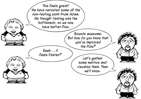
We’ve now talked a lot about different metrics and diagrams and other visualizations, and you may think it will be hard to pick the right one for you and your team. Remember that a metric is (often) not important in itself but is rather a guide for your improvement work. Metrics help you know whether you’re improving or not. With metrics in place, you can take a more experimental approach to learning and improving, because you can’t really know before you start whether you’re going to improve.
This section covers some things to think about for your metrics and how you use them. Kanban is based on three simple principles, one of which is visualize work. You visualize work in order to see and know information that you otherwise would have missed. This information helps you make informed decisions about your process, the status of your work, and how you can improve.
Metrics are like visualization for improvements. Metrics are there to help you determine whether the changes you make, in order to improve, lead to an improvement or whether you should try something else. With a good visualized metric, you can start to have discussions based on data instead of based on hunches or beliefs (anecdotal evidence).
When you measure how your work is behaving, you can also begin to see how changes you make in order to improve affect those metrics. You can do small experiments and see how they affect the metric you’re trying to improve.
Make it visual
One way to visualize metrics is through diagrams like the one below. Visualizing your metrics doesn’t improve your process, but it does start discussions based on the data rather than on a gut feeling. Questions are raised, experiments can be tried, and the effect of those can be tracked in a more controlled way because you can see how the experiment has changed your trend.
If you’re still not convinced, try the simplest possible thing you can come up with from this chapter—tracking lead times, for example. Make the metric visual and big, and put the data on the board. Involve the metric in your discussions; refer to it as you talk about your work. Pretty soon people will begin talking, questioning, and discussing. In these discussions, the team will talk about improvements to the process.
Are you making a business impact or not?
When you’re looking for metrics, you should start out with what’s important for you and your business. What goals are you trying to reach? How do you know if you’re heading in that direction? These are sometimes not easy questions to answer and track metrics around, but you should still strive to find data that shows whether you’re making a business impact.
Let’s say your business is trying to get more users on your site. If you track and visualize that close to your board, you can glance at that number and see if your efforts are impacting that number, reason about the work that you’re doing next, think about the effect it will have on the business goal, and so on. In short, you make the business goal apparent and try to connect it closer to the work you’re doing.
You get what you measure

You get what you measure. Measure the wrong thing and you get the wrong behaviors.
John H. Lingle
Set up a goal or metric, and you’ll soon start seeing people change their behavior to reach that goal. That, at first, might seem obvious and to be something you’d want; but when you think about it, it’s a bit dangerous, too. If you start to measure how long each support call takes in a call center, you’ll find that people begin closing calls early rather than focusing on helping the customer. Workers in the call center will prefer short calls over longer ones, even if that means their customers won’t get the help they need. Metrics may drive the call-center employees toward the wrong behavior.

The knowledge that “you get what you measure” could also be used to your advantage. One such technique is to put a limit on the amount of work in the Done column, sometimes referred to as the cake limit (see chapter 12). When the limit is reached, the product owner comes in with cake and distributes it to the team. What kind of behavior could this drive? The team could start making smaller stories that are done more quickly and hence fill up the Done column with work items more quickly. And that’s a good thing: smaller stories that move faster across the board—yes, please.
Balance your metrics
In your search for a good metric, you should also make sure you don’t focus all your energy on one metric. This could make you forget about other important aspects of your process. Imagine that you have a metric on throughput (number of items completed per week, for example). With a strong focus on only this metric, your team could easily get burned out, making people hate work and even eventually leave. Or they may cut corners with code quality that will only result in more technical debt and finally slow down your process.[22]
22 We’ve actually heard a couple of stories of developers being fired because they cared “too much” about code quality. They were adding tests around a non-tested code base when they “should have put new features into production”—a behavior that might stem from focusing too much on one thing, one metric.
To handle this problem, we suggest that you try to find several metrics that balance against each other. An example could be to focus both on lead time (time it takes for work through the entire process) and quality (number of bugs in production, for example). With these two values, you try to make sure you don’t fall into the trap of starting to take shortcuts to get a lower lead time.
Make them easy to capture
Tracking a metric requires that you gather it in some way and then visualize it or show it to the people who care about it. Make sure the gathering doesn’t take a lot of effort. If the metric is hard to gather, you’ll end up in a situation where you have to prioritize gathering process data against “doing the work,” risking that it won’t be tracked at all. Also, you want the metric to be able to change as your process changes. If you use metrics for which you’ve invested a lot in gathering the data, you risk not wanting to change, or you may even stop caring about them. That could make introducing new metrics harder because now you’re tracking several metrics, which could give you contradicting results.
Prefer real data over estimated data
Try to use real data rather than estimated values. Real data is data you can get from measuring the way your work works, the quality of your work, how the product is being used, and so on.
Unlike estimated data, real data can’t be argued with. You can always question the way an estimate has been done and how the numbers came about, but with real data you’re facing the facts directly. You can still have discussions around the number, why it’s like it is, and what to do about it, which we think is a Good Thing. You want to continuously improve the quality of the data and the ways you gather the data.
Note that real data doesn’t automatically mean precision. Real data can, for example, be asking people to vote with a fist of five[23] to the question “Are we having fun right now?” This is also data.
23 Raising one to five fingers in response to a question.
There’s a firefighting squad at Spotify. Their main responsibility is to handle emergencies that occur in the backend systems and keep them running. Naturally, the team experienced a lot of reactive work. But they soon realized that they had to start doing some proactive work to keep the system in shape and handle problems before they became emergencies.
We decided to try to track where they spent their time: on proactive or reactive work. This is a metric that could prove hard to track: should we use time sheets, track hours on paper, or estimate?
The team came up with a simple yet telling approach. After each day, they posted a sticky on a board that indicated where they had spent their time that day (mostly).

We collected the data during a week and then summarized it to get a bigger picture. Pretty soon we saw trends and could start doing something about it.
That data wasn’t perfect, but it was good enough for our needs.
Use metrics to improve, not to punish
Metrics are powerful motivators that can help you to see and follow your progress toward a better result. But, as with all powerful tools, they can be misused. One common misuse we’ve seen is to set goals for teams and then hold them accountable for the outcome of those goals. Rather than motivate the team, the metric is used to punish the team for bad results.

Don’t get us wrong here; you want the team to strive to reach the goal and be accountable for the result, but there’s a subtle difference in intent. That difference can be found in who sets the goal. Is it a goal that the team has set up and committed to? Or is it a metric that’s been assigned to the team by some outside person, such as a manager or stakeholder?
Make sure you include the team in the development of the metric. Doing so builds commitment and the feeling of the metric being “ours” rather than “theirs.”

11.4. Exercise: measure up!
You now have another opportunity to try this for real in your team. Sit down and discuss the metrics that would help you know the status of your process:
- Do you have any metrics in place already? Are they good? Do they help you to know what’s going on?
- Can any of the suggested metrics be tried and experimented with? How would that help you?
- Are there any other metrics that you want to introduce?
- What kind of behavior do you want to encourage? Will the metric help that?
Start simple and easy. Remember that metrics are often hard to stop measuring once you begin. Make sure everyone knows the purpose of the metric and that you don’t push metrics on the team. They should rather come from the team. “No metrics right now” is a valid outcome of the discussion. Ask again later if you or anyone else sees the need.
11.5. Summary
In this chapter, you learned about metrics and how they can help you track your process:
- In order to know if you’re improving or not, you measure your process behavior and analyze these metrics.
- Metrics are like a visualization of your process’s health.
- The following are common metrics that kanban teams use:
- Cycle time— Time taken to complete part of the process
- Lead time— Time taken to complete the whole process
- Throughput— How many items get done per week (or month or whatever)
- Number of issues and blockers on the board
- Due-date performance
- Value demand versus failure demand— Demand on a system caused by failure to do something or do something right for the customer
- These are common diagrams that kanban teams use:
- Statistical process control (SPC) chart—A visualization of lead and cycle times
- Cumulative flow diagram (CFD)— Shows a lot of information about your process based on the number of items per stage in your process per day
- Finding a good metric can be hard. Remember the following:
- You get what you measure.
- Don’t focus on a single metric—use balanced metrics.
- Use metrics that are easy to capture, or make them so.
- Prefer real data over estimates.
- Use metrics to improve—not to punish.